What is Obon Floating Lanterns?
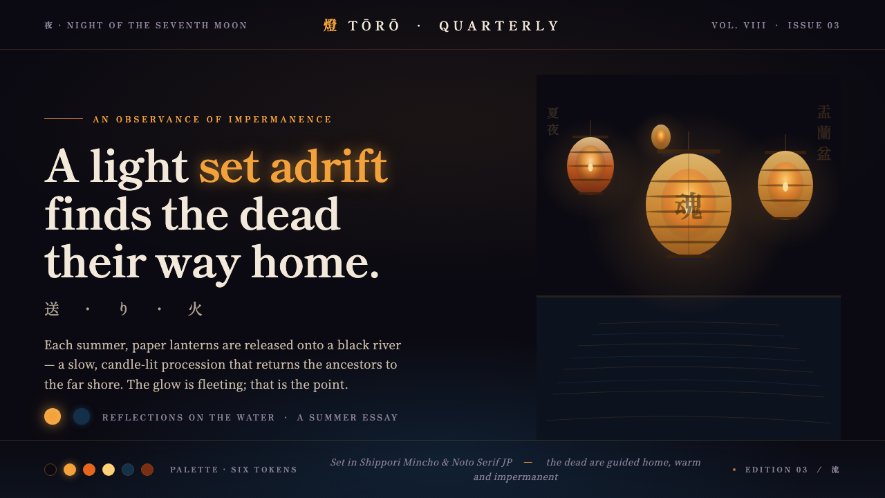
Obon Floating Lanterns turns a night ritual of remembrance into a digital atmosphere of amber light, cool water, and beauty that vanishes while you watch.
Obon Floating Lanterns in brief
Obon Toro Nagashi is a nighttime floating-lantern ceremony in which warm amber washi paper lanterns are set adrift on dark water. Candlelight gathers inside each lantern, while the river catches and unsettles its reflection. The scene is defined by a simple but emotionally charged opposition: an almost black field of water, touched by cool blue, against small human-made lights that feel intimate, fragile, and temporary.
As a digital design system, Obon Floating Lanterns does not try to reproduce a river literally. It translates the ceremony’s visual and emotional conditions into an interface language: near-black grounds suggest night water; amber light establishes focus and care; softened bloom makes illumination feel candle-held rather than electric; mirrored reflections imply movement below the surface. The result should feel solemn without becoming funereal, luminous without becoming theatrical.
The style is closely tied to mono no aware, the sense that beauty is intensified by impermanence. A lantern is meaningful because it floats away; its reflection is compelling because water immediately breaks it apart. In design terms, this produces a restrained visual system. Empty darkness is not unused space, warm light is never casual decoration, and every reflection should feel less stable than the object that created it.
Where does Obon Floating Lanterns come from?
The visual source is Obon, an ongoing Buddhist ancestral observance in Japan, and Toro Nagashi, the floating-lantern rite associated with it. The ceremony takes place at night, when celebrants release candle-lit lanterns onto water. Its imagery is inseparable from remembrance: lights on the river guide the dead home, making illumination both a visible object and a gesture of care toward those who are absent.
Its roots precede 1900, but the tradition remains living rather than archival. That continuity matters when adapting it into a design language. Obon Floating Lanterns should not be treated as a generic Japanese night-market aesthetic or a collection of decorative motifs. Its emotional center is ancestral observance: collective, quiet, and directed toward the passage between presence and departure.
Buddhist temple communities, Toro Nagashi celebrants, and Obon ancestral-rite practitioners carry the ceremony through participation rather than through a single designer or author. The design system therefore takes its cues from communal ritual conditions: repeated lanterns rather than one heroic object, slow visual accumulation rather than spectacle, and darkness that allows individual lights to retain dignity.
Mono no aware gives this image system its final emotional register. The lantern’s warmth is not triumphant because it is surrounded by night and destined to drift away. Reflection makes that impermanence visible: it doubles the light, then breaks its certainty. In contemporary screens, the most faithful interpretation is not nostalgia but attentiveness to transience, silence, and the relationship between a small glow and a large dark field.
What defines the Obon Floating Lanterns look?
Night Water
The foundation is near-black water carrying a cool-blue undertone. It should read as depth rather than as an empty dark backdrop: broad, quiet, and capable of holding reflected light. Dark areas are essential compositional space, giving the lanterns room to appear isolated, precious, and deliberate.
Amber Lantern Light
Warm amber is the primary emotional signal. It belongs to candle-lit washi lanterns, so it should feel contained inside a delicate vessel rather than sprayed broadly across the interface. Use it to draw attention to titles, primary actions, meaningful status, and moments of arrival or remembrance.
Reflection
Every major light can have a quieter visual echo below it. Reflections should feel elongated, broken, softened, or gently displaced by rippling water; they are never exact duplicates. Their role is to deepen the scene and express impermanence, not to create a symmetrical mirror effect.
Washi Translucency
Lantern surfaces suggest translucent washi paper: light is diffused through a thin material, with a softer edge than metal, glass, or a digital badge. Panels, cards, and image treatments can borrow this quality through layered restraint, allowing warmth to emerge gradually from surrounding darkness.
Mincho Typography
Japanese Mincho serif type gives the system ceremonial gravity and literary calm. It works best when allowed to breathe, with clear hierarchy and generous quiet around important phrases. Typography should feel composed and contemplative, never compressed into an urgent technological voice.
Soft Candle Bloom
Light radiates softly from the lantern rather than ending at a hard boundary. This bloom must remain intimate and localized, preserving the contrast between a finite flame and surrounding night. When every element glows, the ritual atmosphere disappears; darkness is what makes warmth legible.
Who shaped Obon Floating Lanterns?
Buddhist temple communities provide the religious setting from which Obon ancestral observance and current Toro Nagashi rites are understood. In the design system, their role is a reminder that the lantern is not merely an atmospheric prop: it carries ritual attention, communal memory, and a relationship to the dead.
Toro Nagashi celebrants animate the ceremony by setting lanterns adrift together. Their participation explains why repeated points of light are central to the style: the image is not one isolated flame but a shared field of individual gestures moving across the same dark water.
Obon ancestral-rite practitioners sustain the observance as an act of remembrance. Their presence gives the style its restraint. A successful application should leave space for reflection and departure, rather than converting ancestral imagery into a loud seasonal entertainment surface.
How do you use Obon Floating Lanterns today?
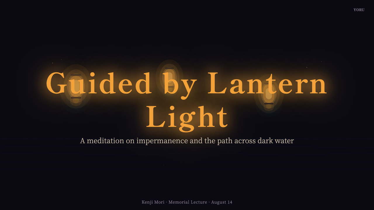
For presentation covers, let one or a small field of amber lantern forms emerge from expansive near-black water. A Mincho title can sit calmly above or beside the light, while a subdued reflection extends downward. Content slides should become quieter: use the dark ground to separate thoughts, reserve warm illumination for the current section or key idea, and let supporting text remain restrained.
Data slides can use the lantern-and-reflection relationship as an information metaphor. A primary value may appear as a warm point of focus, while secondary context sits lower, cooler, or more subdued. The aim is not to turn every chart into an illustration of a river, but to make hierarchy feel like light held against darkness: clear, limited, and meaningful.
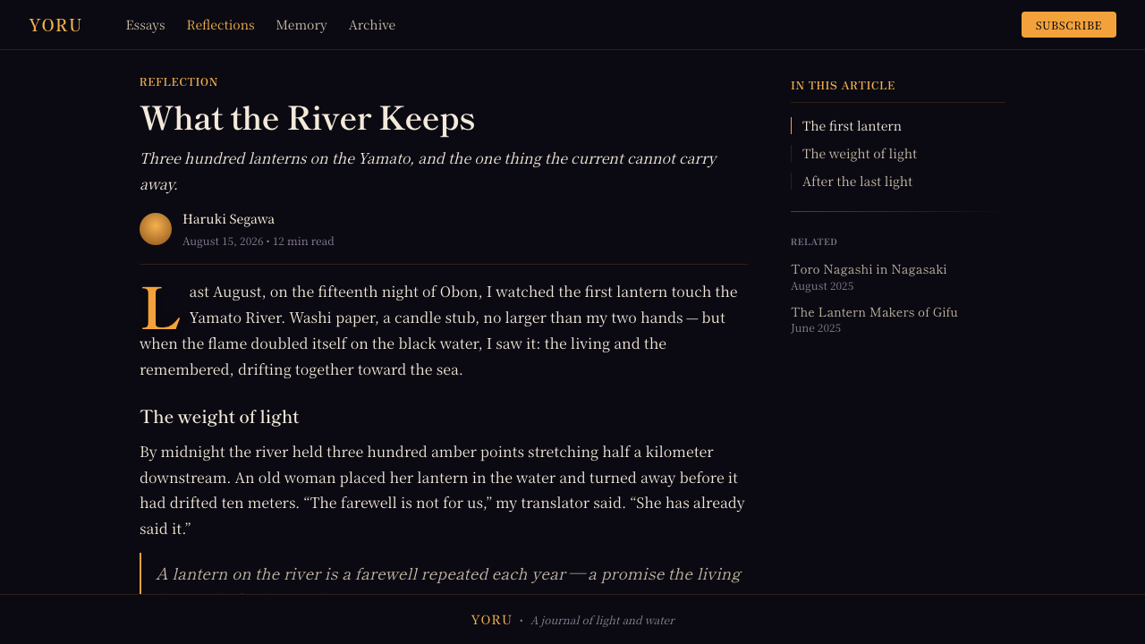
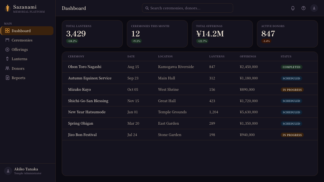
For web interfaces, the style suits reflective dashboards, memorial or cultural archives, premium editorial experiences, and carefully paced pricing pages. Use darkness to organize the screen, not to obscure it. Amber emphasis should identify the most consequential path through the interface, while cool reflected details can support context, history, or less immediate information.
In editorial and marketing work, Obon Floating Lanterns is strongest when narrative and atmosphere reinforce one another. Long-form articles can use large quiet intervals, luminous pull quotes, and reflections as transitions between chapters. Campaign pages can lead with the ritual’s visual contrast, but copy should remain respectful and avoid treating the ceremony as an exotic decorative backdrop.
The common mistake is overusing glow, ripples, and Japanese signifiers until the interface becomes a generic fantasy night scene. The style depends on scarcity: darkness must remain dark, lantern light must retain its value, and reflections must suggest instability rather than become ornamental duplicates. If the design feels busy, cheerful, or constantly illuminated, it has lost the quiet gravity of the source.
Obon Floating Lanterns — FAQ
Is this style simply a Japanese dark-mode aesthetic?
No. The dark field, warm lanterns, and Mincho type derive their meaning from Obon and Toro Nagashi rather than from dark mode alone. Dark mode may share a visual condition with the style, but it does not supply its ritual logic: remembrance, guidance, impermanence, and the relation between a small light and moving water.
Should every lantern have a visible reflection?
Not necessarily. Reflection is a governing principle, not a repetitive stamp. Reserve it for lights that need emotional or compositional depth, and allow some lanterns to fade into darkness or water movement. Variation makes the scene feel like rippling water rather than a mechanically mirrored layout.
Can this style be used for commercial marketing?
Yes, but the product and message should be compatible with contemplation, care, cultural programming, premium storytelling, or remembrance. The visual language becomes inappropriate when it is used to add unearned drama to an unrelated promotion. Respectful context and restrained copy matter as much as the visual treatment.
How can the interface stay readable on such a dark ground?
Treat darkness as structure, not as a reason to lower every contrast. Important text needs a stable, calm reading presence; warm amber should remain an accent rather than becoming the only readable color. Separate content through quiet tonal distinction, clear grouping, and generous space, then use lantern light only where attention truly needs to gather.
Related design styles
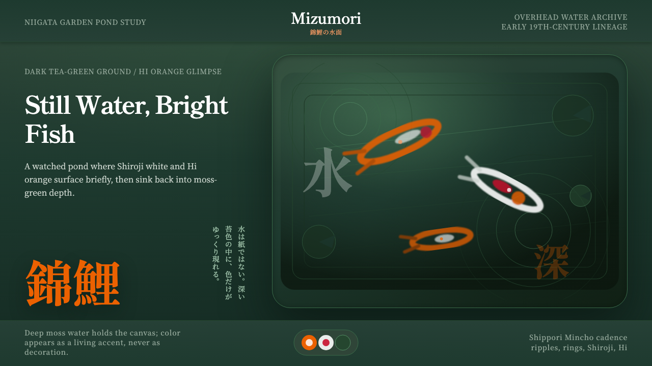 Koi PondQuiet water carries color. Moss depth, Mincho type, and orange koi flashes.
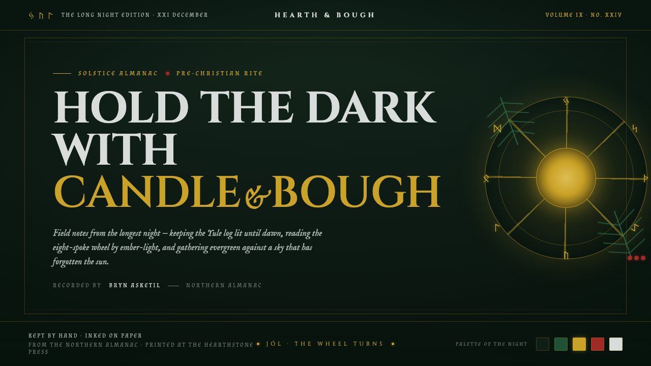 Yule SolsticeHolds the longest night. Pine-dark ground, carved Cinzel gold, an eight-spoke…
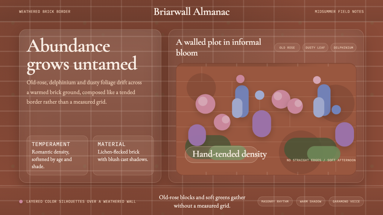 English Cottage GardenAbundance wins. Old-rose Garamond blooms over weathered brick and dusty leaf.
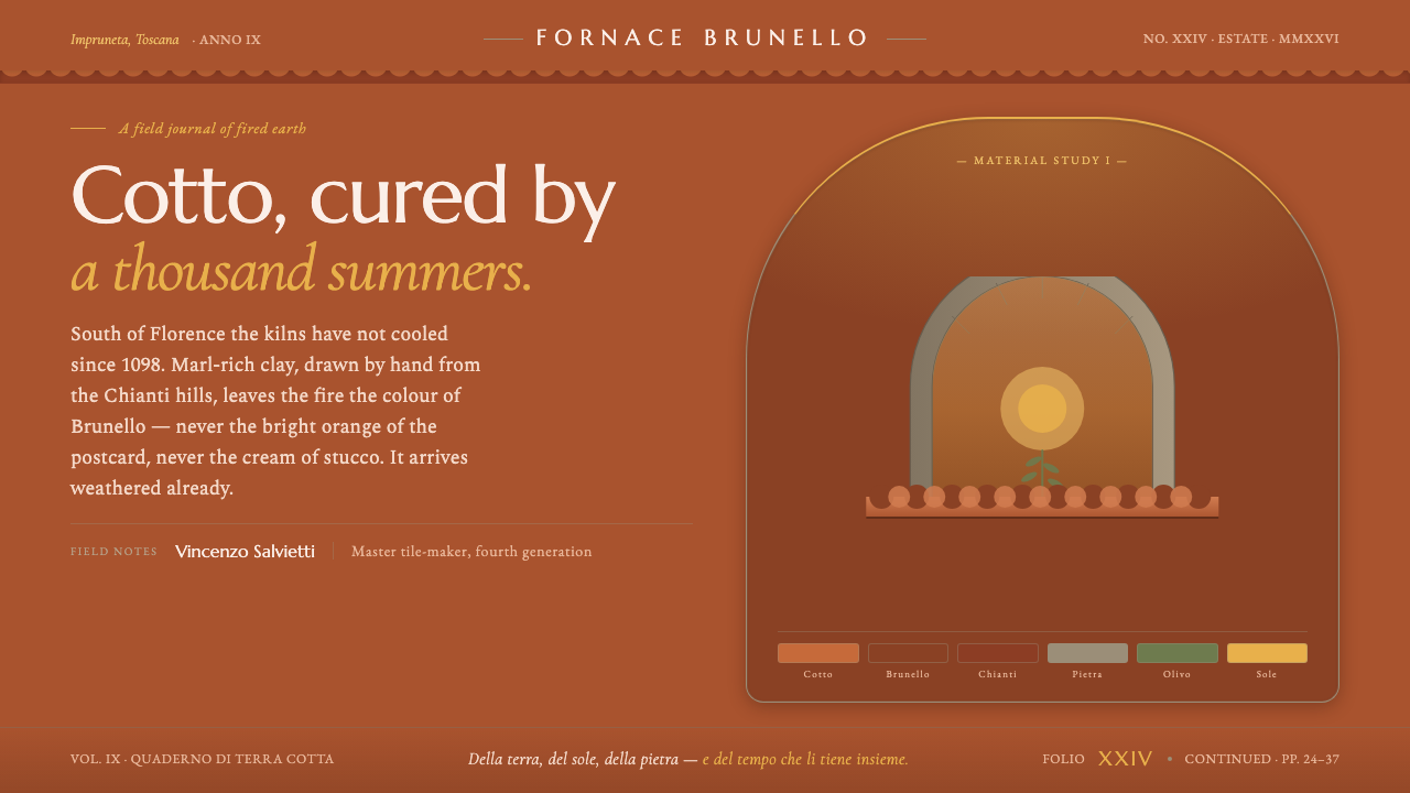 Tuscan TerracottaWeathered fired clay, never cream stucco. Brunello browns and sun ochre on hu…
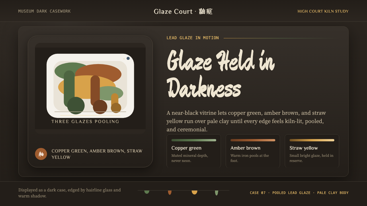 Tang Sancai 唐三彩Museum-dark and molten. Copper green, amber, and straw pools glow in bordered…
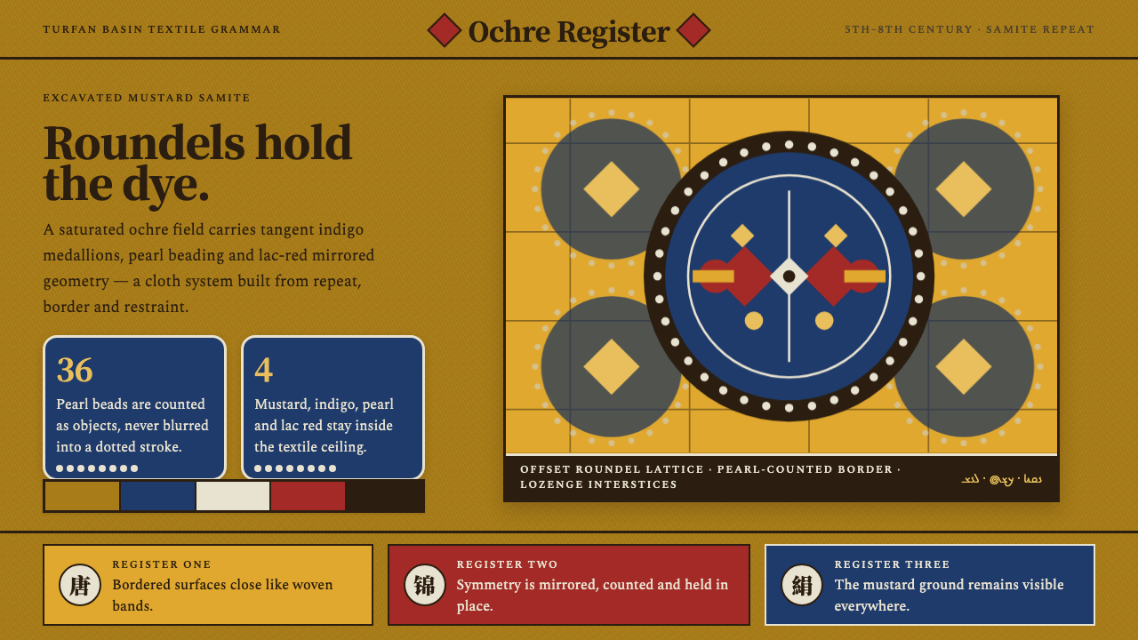 Astana Tomb SilksDye survives as structure. Mustard ground, indigo roundels and pearl beads lo…