What is Windows Phone Metro?
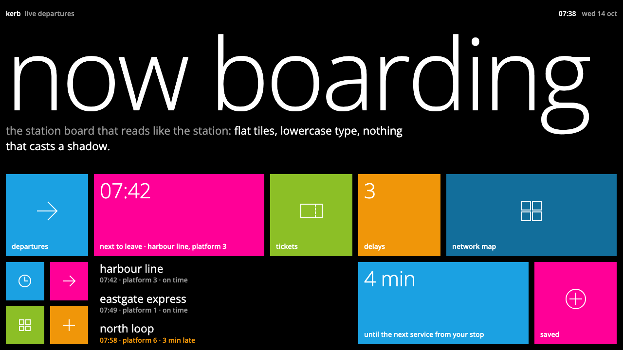
Windows Phone Metro bet an entire operating system on typography and flat colour: black ground, square live tiles, and headlines that run off the edge of the screen.
Windows Phone Metro in brief
Windows Phone Metro is the interface language Microsoft introduced in 2010 with Windows Phone 7. Its signature is a pure black Start screen carrying square live tiles, each filled with a single flat accent colour chosen by the user, each marked with one white line glyph and one lowercase label. Cyan, magenta, lime and mango-orange are the hues most people remember, laid down as solid blocks with no gradient, no gloss and no shadow.
The system is built on the belief that a phone interface should be authentically digital rather than a miniature imitation of physical objects. There are no simulated buttons, no leather stitching, no glass reflections. Content is the interface: a tile does not merely launch an app, it flips over to show a photo, an unread count or a headline. Information that other platforms hid behind an icon is brought to the surface and allowed to move.
Visually, Metro reads more like airport signage or a transit map than like a consumer gadget. Light, lowercase headings are set in a clean humanist sans-serif and are deliberately oversized, so large that they bleed past the right edge of the screen to signal that the page continues sideways. Everything hangs from a strict, repeated left margin, corners stay square, and the whole composition feels printed rather than rendered.

Where does Windows Phone Metro come from?
Metro was announced alongside Windows Phone 7 in 2010, at a moment when Microsoft was in real danger of becoming irrelevant in mobile. Its earlier Windows Mobile line had been built around a stylus, a tiny desktop and nested menus, and the arrival of touch-first competitors had made that approach look obsolete almost overnight. Rather than copy the grid of glossy icons that rivals had popularised, the team in Redmond, Washington, chose to start again from a different set of references, and the phone shipped in October 2010 with an interface that looked like nothing else on the market.
The design lineage is explicitly typographic. The source material for this style names the Swiss International Typographic Style as one of its roots, and the figure of Josef Müller-Brockmann stands in for that tradition: rigorous grids, flush-left text, generous scale contrasts and a conviction that information design should be honest and legible before it is decorative. Metro took the poster-like confidence of that movement and moved it onto a handheld screen. Transit signage and airport wayfinding, which are themselves descendants of the Swiss tradition, supplied the practical vocabulary of pictograms, uppercase-free labels and clear directional cues.
Within Microsoft the language was shaped by a small group of design leaders. Albert Shum is the name most closely associated with the design of Metro, while Joe Belfiore is remembered as a leading figure of the Windows Phone programme itself, the person who had to turn a design philosophy into a shipping product. Steve Matteson appears among the key figures because of his connection with the typographic side of the system, where letterforms were treated as the primary building material rather than as a late-stage skin. The combination of a product team, a design team and a type team is what gave the interface its unusual coherence.
The language matured quickly. The 2011 update known as Mango extended the system with deeper multitasking and richer tiles, but kept the visual rules intact. Metro also arrived at the right historical moment to be grouped with the broader flat design movement: as rival platforms later stripped away their own gloss and texture, Metro's early commitment to flat colour and no ornament looked prophetic. The Metro name itself later gave way to other branding inside Microsoft, yet the visual idea, tiles, flat colour, oversized light type and motion as ornament, survived as one of the most recognisable interface identities of the early 2010s.
What defines the Windows Phone Metro look?
Color
The ground is pure black, and colour arrives as flat accent blocks: cyan, magenta, lime and mango-orange are the signature hues. One accent is chosen per user and applied consistently, so the interface feels personal without becoming decorative. There are no gradients, no glows and no tonal ramps inside a block. Saturation does the work that shading does elsewhere, and white is reserved for glyphs and text so that every colour sits at maximum contrast against its label.
Typography
Type is the main structural device. Headings are light in weight, set in lowercase, and made very large, so large that they run past the right edge of the screen as a deliberate cue that the page scrolls sideways. Body text is set in the same clean humanist sans-serif at modest sizes, and hierarchy comes almost entirely from scale and weight rather than from boxes, rules or colour. The result reads like a transit timetable: calm, legible and confident.
Square Tiles
The tile is the atomic unit of the system. Tiles are square or wide rectangles snapped to a shared grid with tight, even gutters between them, and corners are never rounded. Each tile carries a single white line glyph and a lowercase label tucked into the lower corner. Because every tile obeys the same geometry, the Start screen resembles a mosaic or a signboard, and rearranging them changes the composition without ever breaking it.
Live Content
Tiles are not static launchers. They flip over periodically to reveal photographs, counts of unread items and short headlines, which turns the Start screen into a dashboard of glanceable information. This is the system's answer to the question of what a phone home screen is for: not a shelf of icons waiting to be opened, but a window onto what is happening right now. The flip itself is part of the visual identity, a small rotation that announces new content without a banner.
Flat and Shadowless
Metro refuses every device that simulates depth. There are no drop shadows, no bevels, no highlights and no translucent glass layers. Surfaces are solid, edges are hard and elements sit on a single plane. Hierarchy is created by size, position and contrast rather than by stacking. This discipline is what makes the system feel so different from skeuomorphic contemporaries, and it is also why it reproduces cleanly at any scale or on any screen.
Strict Alignment
Text and tiles hang from a firm, repeated left margin, and spacing follows a small set of consistent steps. This alignment is borrowed directly from the Swiss grid tradition: flush-left setting, a visible vertical axis, and white space that is calculated rather than decorative. Because the margin is so consistent, the oversized headings that break past the right edge feel intentional rather than clipped.
Motion as Ornament
Where other systems add texture, Metro adds movement. Pages swing in like a turnstile, list rows cascade in one after another, and tiles flip to reveal their back faces. Animation carries the personality that ornament would carry elsewhere, and it is used with discipline: motion explains where content comes from and where it goes. A static screenshot of Metro can look severe, but the system in motion feels playful and alive.

Who shaped Windows Phone Metro?
Shum is the name most closely tied to the design of Metro at Microsoft. He is listed among the key figures of this style because the language took shape under his design leadership, translating an interest in signage, typography and honest digital materials into a coherent set of rules that a product team could ship.
Belfiore is associated with the leadership of the Windows Phone programme itself. Where a design language lives or dies by whether it becomes a working product, his role was to carry the Metro philosophy from concept into the devices that reached customers in 2010 and into the Mango update that followed.
Matteson appears among the key figures because of his connection with the typographic side of the system. Metro treats letterforms as the primary building material, so the choice and refinement of the typeface matters as much as any colour or layout decision. His inclusion points to type design as an equal partner in the language's identity.
The Swiss graphic designer is a historical rather than a direct collaborator. His rigorous grids, flush-left typography and poster-scale confidence represent the Swiss International Typographic Style that Metro openly inherits. Anyone studying why Metro looks the way it does should start with his work and the tradition around it.
How do you use Windows Phone Metro today?
Windows Phone Metro is a strong reference when the goal is a confident, information-first interface with almost no decoration. It rewards teams who are willing to let typography and flat colour carry the entire design, and it punishes any attempt to soften it with shadows or texture. The key is to understand that the style's personality comes from restraint, scale and motion, not from added effects.
For presentation slides, Metro suits covers and section dividers especially well. A black field, one oversized lowercase title that deliberately runs toward or past the edge, and a single accent block in one hue create a poster-like opening with almost no elements. Content slides work as tile grids: each idea sits in its own flat square or rectangle, labelled in light lowercase type, with generous even gutters. Data slides gain from the same logic, where charts are made of solid colour blocks and numbers are set large and light.
For web interfaces, the style works naturally on dashboards, status boards, launchers and mobile-first home screens, where a grid of glanceable tiles is the right pattern. Keep the background near black, use one accent colour per context, and let each tile show live content such as a count, a headline or a thumbnail rather than only an icon. Corners stay square, surfaces stay flat, and hierarchy comes from scale. Horizontal panoramas, where a wide heading spills past the viewport, are a distinctive option for galleries and category browsers.
For editorial and marketing work, Metro supplies a strong poster voice. Large light headlines, a tight left margin and blocks of saturated colour can carry a campaign page or an event announcement without any photography at all. Motion is part of the toolkit: staggered entrances for list items and a turnstile-style page transition give a landing page character without adding visual clutter. Pair the colour blocks with short lowercase labels in the manner of transit signage.
The most common mistake is to keep the colour and drop the discipline. Adding a soft shadow, a rounded corner or a gradient to a Metro tile immediately turns it into a generic card and loses the signage quality that defines the style. Another frequent error is using several accent colours at full strength on one screen, which breaks the one-hue logic. Finally, oversized headings only work when the left margin is rigorous; without a consistent alignment, running off the edge looks like a layout bug rather than a cue.

Windows Phone Metro — FAQ
What is the Metro design language?
Metro is the interface language Microsoft introduced in 2010 with Windows Phone 7. It is defined by a black ground, square live tiles in flat accent colours, one white glyph per tile, light lowercase headings and zero shadow. Its guiding idea is that the interface should be authentically digital and content-first, with typography and motion doing the work that decoration does in other systems.
How is Metro related to Swiss design and to flat design?
Metro openly draws on the Swiss International Typographic Style, with its rigorous grids, flush-left type and information-first attitude, and it is commonly grouped with flat design because it dropped shadows, bevels and gloss in favour of solid colour. It is better described as a typographic, signage-inspired cousin of flat design than as a simple minimalist skin: the live tiles and the use of motion give it a character that most later flat interfaces lack.
Why do the headlines run off the edge of the screen?
It is a functional cue rather than a layout accident. The oversized lowercase headings extend past the right edge to tell the user that the page continues sideways, so the typography itself doubles as a scroll indicator. This only works because the left margin is strict and the heading is clearly anchored to it, which makes the overflow read as intentional.
Can I use Metro with a light background?
The canonical form of this style is a black ground, and its saturated accent blocks are tuned to sit against black. A light variant is possible, but you will need to take care that the white glyphs and labels on the coloured tiles keep enough contrast and that the signage quality survives. If you go light, keep everything else unchanged: square corners, flat colour, no shadow and the same oversized light lowercase type.
When is Metro the wrong choice?
Metro is a poor fit for products that rely on warmth, texture or luxurious richness, such as hospitality, craft or lifestyle brands, because the style is deliberately cool, severe and information-led. It can also feel monotonous in long-form reading interfaces if every block is the same square. Choose it when clarity, glanceable data and a confident, modern voice are the goals, and look elsewhere when the brand needs softness.
Related design styles
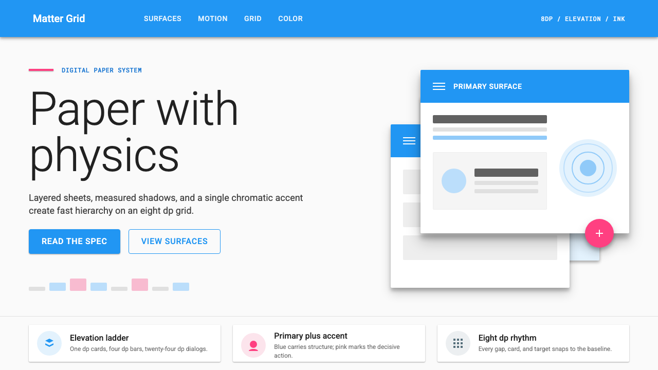 Material Design 1.0Depth made flat usable. Blue app bars, pink FABs, 8dp grids, and crisp paper…
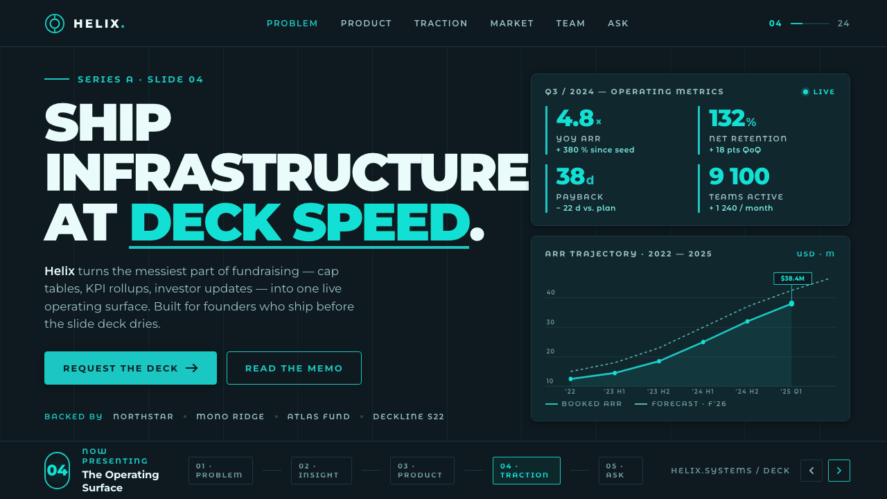 Montserrat StartupSeries-A on a projector. Black Montserrat on charcoal-teal, lit by one bright…
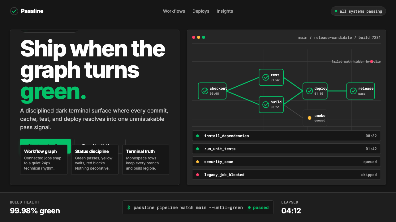 CircleCI Pipeline-GreenConfidence goes green. Emerald status lines cut through terminal-black pipeli…
 Aluminium Flight CaseRoadproof and exact. Diamond-plate gray, stencil type, black frames, blue-red…
 Climbing Topo GuideBeta at a glance. Red route telemetry cuts across near-black stone and conden…
 DestinyLuminous restraint. White-gold rings orbit charcoal plates in clean grotesk t…