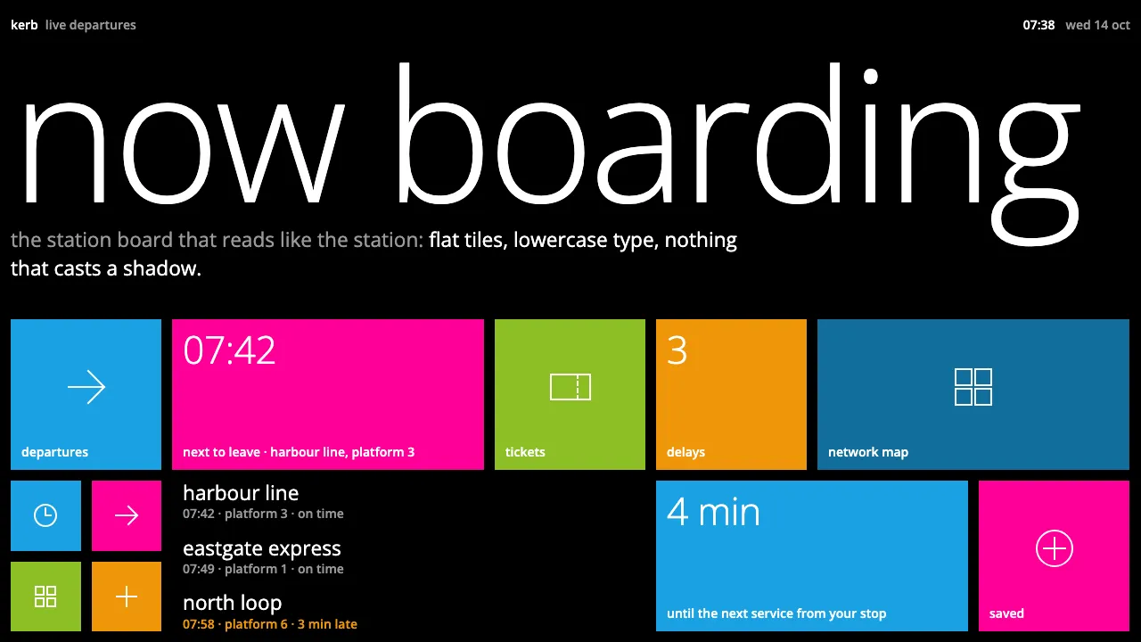
About Windows Phone Metro
Windows Phone Metro is the 2010 phone interface that bet everything on type and flat colour. A black Start screen holds square live tiles in one accent hue, each with a single white glyph and a lowercase label. The tiles flip over to show photos, counts and headlines.
Light lowercase headers run past the right edge to tell you the page scrolls sideways. Text hangs from a strict 12px margin, corners stay square, and there are no shadows. Movement does the work that ornament would do elsewhere: pages turnstile in and list rows cascade.
- Origin
- Redmond, Washington, United States
- Era
- 2010–2012: Windows Phone 7 (October 2010) and 7.5 Mango (2011)
- Key figures
- Albert Shum · Joe Belfiore · Steve Matteson · Josef Müller-Brockmann
- Movements
- Microsoft Metro design language · Swiss International Typographic Style · Flat design
Windows Phone Metro design spec
Colors
Typography
The other 11 sections — buttons, cards, spacing, motion, techniques and more — open once you unlock. Download the DESIGN.md or send it to your AI in one click. Unlock once, yours forever.
Sign up nowStyles similar to Windows Phone Metro
Also inspired by brands & products, with a close feel.
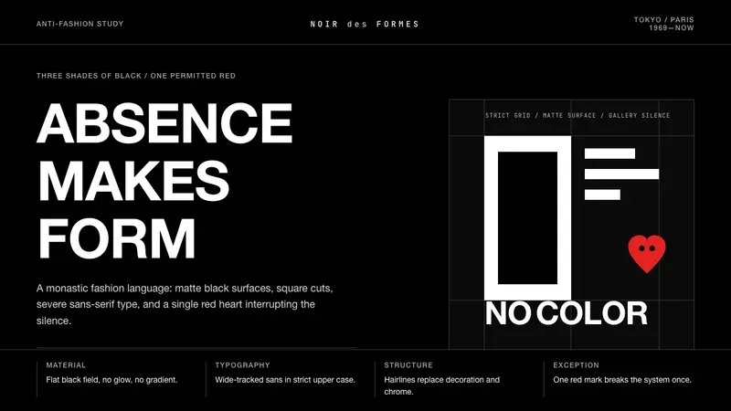 Comme des Garçons (Rei Kawakubo)Austerity becomes the event. Pure black, wide sans type, and one red heart break the silence.
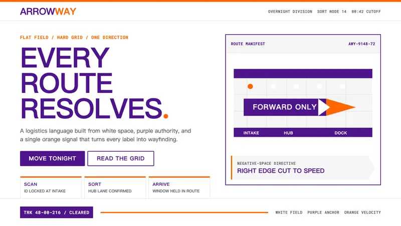 FedExDirections, not decoration. Purple authority and one orange bar organize a flat white grid.
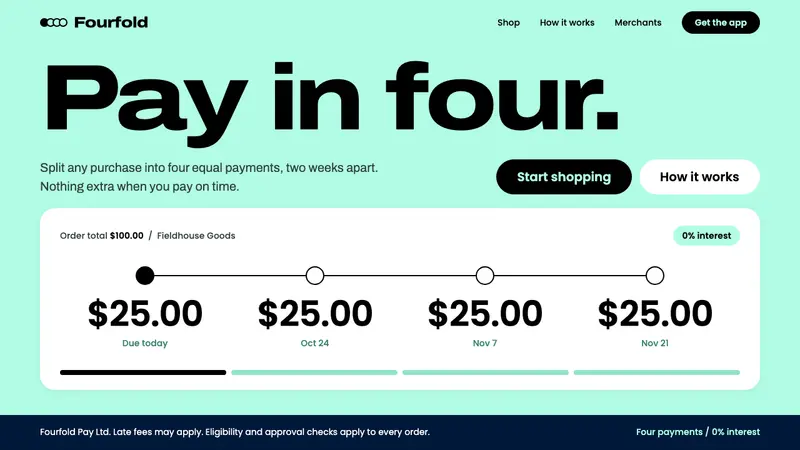 AfterpayA mint you can stand on. Full-bleed mint field, black expanded type, and a four-dot payment row.
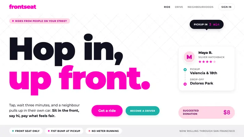 LyftA friend's car, not a taxi. Neon pink on white, heavy Montserrat, pill shapes everywhere.