What is Wildfire Drone Command?
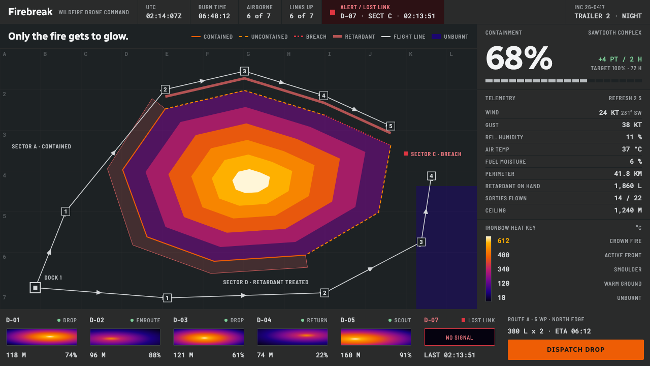
Wildfire Drone Command is a dark operational interface in which only the fire is allowed to glow: thermal colour on charcoal panels, hairline gutters and monospaced readouts.
Wildfire Drone Command in brief
The Wildfire Drone Command style imagines the screen inside a mobile incident trailer at two in the morning. It combines a dark operational basemap of the kind fire agencies use to publish a fire perimeter, an infrared video feed rendered in FLIR’s Ironbow colour ramp, drone flight lines drawn over a perimeter that is still moving, and a docked rail of telemetry for wind, humidity and tank volume.
Darkness here is functional. Infrared imagery starts from black, and a night crew cannot afford a bright display that ruins their adaptation to the dark. The heat scale is data with a legend, so orange and white appear only where something is actually burning. Everything else is flat panels, hairline gutters and monospaced numbers.
The feel is closer to cockpit instrumentation than to a game interface. It suits emergency operations, monitoring and mapping tools, infrastructure dashboards, telemetry screens and any product where colour must carry real meaning and calm must be preserved under pressure.

Where does Wildfire Drone Command come from?
The style belongs to the period from about 2015 to the present, when thermal cameras on small drones became a standard tool for wildfire crews. Operators could see through smoke, find hot spots in the dark and watch a fire perimeter change. The design is also projected forward, to a future in which autonomous aerial suppression is routine. It draws on real tools and real conventions rather than invented sci-fi, which is why its regions of reference are the Western United States, Australia and the Mediterranean coast, all places with serious fire seasons.
One root is the graphics of the incident command system. Fire agencies share maps, perimeters, drop zones and resource lists with a standard visual grammar, so that many crews arriving from different places can read the same picture. This leads to flat, functional symbols, restrained colour and a clear hierarchy between the map and the operational information laid over it. The style adopts that sobriety.
A second root is the conventions of thermal imaging. The Ironbow palette from FLIR maps cool areas to dark tones and moves through purple and red into orange, yellow and white as temperature rises. The reason this palette matters for design is that it is a legend: viewers learn that brighter and warmer means hotter. The style therefore treats it as data and refuses to use those hot colours for anything decorative.
A third root is dark-canvas operational cartography. Maps for night operations are drawn on dark grounds so that lights, lines and overlays stand out and so that eyes are not dazzled. Companies in the drone and aerial-response field, including Drone Amplified, FlytBase and the fire-retardant maker Phos-Chek, supply the equipment, software and materials around which such screens are built, and their products give the system its realistic vocabulary of flight plans, payload drops and tank levels.
What defines the Wildfire Drone Command look?
Only Fire Glows
The governing rule is that luminous colour is reserved for heat. Panels, borders and text are low-key charcoal and grey, so the thermal palette is the brightest thing on the screen. If an interface element glows, it should mean something is burning or demands urgent attention. Decorative glow, neon accents and colourful gradients are excluded.
Ironbow Heat Ramp
The infrared view uses a continuous ramp from near black through deep purple and red to orange, yellow and white at the hottest. A legend always accompanies it so that the colour reads as a measurement. The ramp is used for imagery, perimeters and hot-spot markers, and it is not borrowed for ordinary buttons or labels.
Charcoal Panels
Surfaces are matte, dark and flat. Panels are distinguished by small shifts in value, not by shadows or glass. Nothing floats on blur or translucency. This keeps contrast stable and prevents glare, which matters for people working in the dark for hours.
Hairline Gutters
Regions of the layout are divided by very thin lines rather than thick borders or gaps of empty space. This yields a dense, orderly screen that feels like instrumentation, where every region has a job and a boundary. The lines are muted so that they organise the screen without competing with the data.
Monospaced Telemetry
Numbers such as wind speed, humidity, altitude and tank volume are set in a monospaced face so that digits line up and changes are easy to scan. Units sit quietly beside values. Labels are small and plain. The telemetry rail is docked at the side and updates continuously without shifting the layout.
Flight Lines and Perimeters
Drone paths are drawn as clean line segments over the basemap, with waypoints and drop points marked by simple geometric symbols. The fire perimeter is a boundary that is visibly still in motion, and may be drawn with a dashed edge or in stages. The map remains the foundation, and the interface layers sit lightly above it.

Who shaped Wildfire Drone Command?
FLIR is a maker of thermal imaging cameras, and its Ironbow colour ramp is the thermal palette that this style adopts. The ramp supplies the central visual rule that colour should encode temperature.
Drone Amplified is a company in the field of drone-based fire operations. Its work stands for the practical tools that make aerial ignition and suppression workflows possible, which the interface language represents with flight lines and payload information.
FlytBase is a drone operations software company. It stands in this system for the fleet-management and mission-planning layer that sits behind the screen, meaning route planning, status monitoring and multi-aircraft coordination.
Phos-Chek is a name associated with fire retardant. Retardant drops and tank levels are part of the operational vocabulary of the screen, so the brand stands for the suppression material that the drones deliver.
How do you use Wildfire Drone Command today?
Wildfire Drone Command is best when the interface is about live data, monitoring or operations. It fits emergency tools, environmental monitoring, logistics maps, energy and infrastructure dashboards, security consoles and any product where colour carries a measurement. It is a poor choice for friendly consumer onboarding or lifestyle content.
For presentation slides, use a charcoal background with a map or a thermal image occupying most of the cover, and a small amount of mono-set text for the title and date. Content slides use hairline-divided panels, each with one metric in monospaced type. Data slides should reserve the heat colours for the one series that represents temperature or intensity, and render everything else in greys.
For web interfaces, build a dark workspace with a map or main view in the middle and a docked telemetry rail on one side. Keep panels flat and matte with thin dividers. Buttons are quiet outlined or low-contrast fills, and only alerts, critical states or the actual heat data use bright colour. Status changes can be shown with small marks and numerals rather than animations.
For editorial and marketing work, the style suits technical stories, field reports and product pages for monitoring tools. Photograph or illustrate with thermal imagery and dark maps, set captions in monospaced type, and use a legend whenever a colour appears. The tone is calm and exact, not dramatic.
A common mistake is to treat the orange and white of the heat ramp as a brand accent and put it on buttons, headings and decorations. That destroys the rule that bright colour means heat, and it also makes the screen tiring in the dark. Another mistake is to add glow, glass blur or neon for atmosphere. The darkness here is for the operator’s eyes, not for mood.

Wildfire Drone Command — FAQ
Why is the interface dark?
Because the work happens at night with infrared imagery, which starts from black, and because a bright display would damage the crew’s night vision. Darkness is a working requirement here, not an aesthetic preference, and it lets the heat colours stand out.
What is the Ironbow palette?
Ironbow is a thermal colour ramp used by FLIR. Cool areas appear dark, and as temperature rises the colour moves through purple and red into orange, yellow and white. In this style it works as a legend-backed measurement scale.
Can I use the heat colours for buttons?
It is not recommended. The central rule is that bright, warm colour means something is hot or urgent. If ordinary controls use the same colours, operators can no longer trust what they see. Use muted outlines or low-contrast fills for interface controls.
Why monospaced type?
Monospaced digits line up in columns, so changing numbers can be scanned and compared quickly. This is a long-standing habit in instrumentation, and it gives the telemetry rail a precise, technical character without decoration.
Is this a game-style interface?
No. It borrows from aviation instruments and operational mapping, not from video-game heads-up displays. It avoids glow, ornamental frames and dramatic effects, and favours flat panels, thin lines and plain readouts.
Related design styles
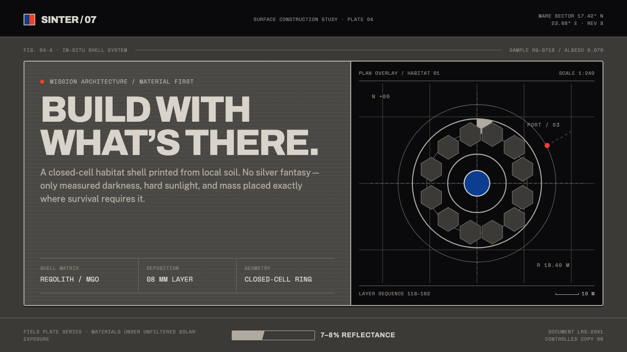 Lunar Regolith SettlementMoonlight without the myth. Regolith gray, hard terminators, and a strict tec…
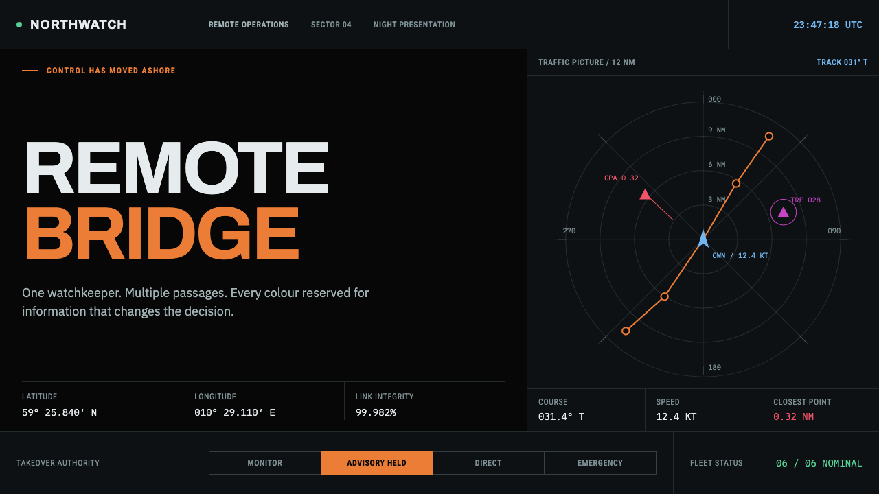 Autonomous Cargo Ship BridgeColour is protocol. Near-black chart grids reserve orange for decisions that…
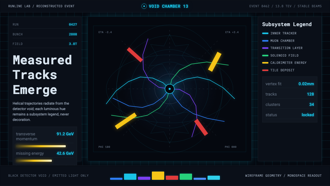 CERN CollisionData, not spectacle. Cyan tracks on black wireframes make every subsystem col…
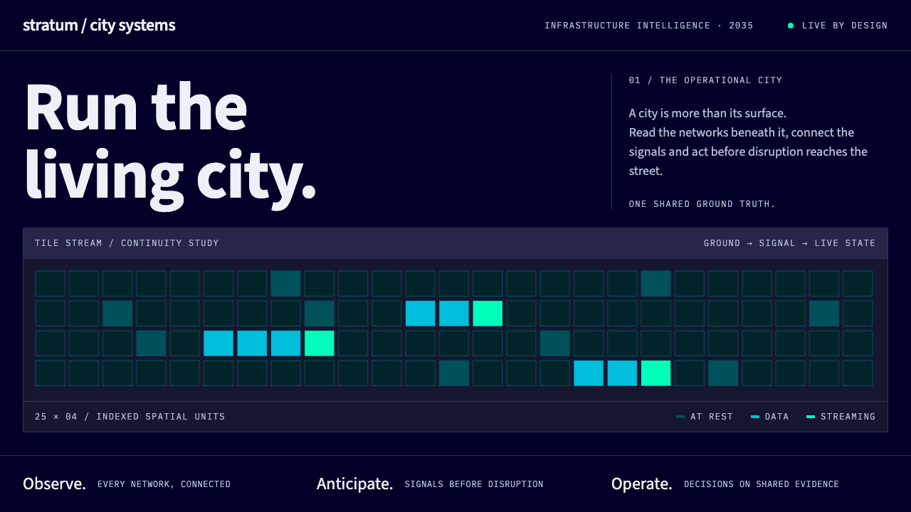 Digital Twin City OpsColour reports, never decorates. Deep blue grids reserve cyan and green for d…
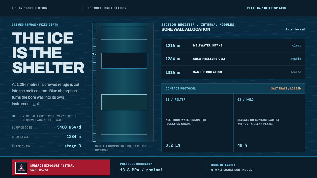 Europa Ice Drill StationShelter is a depth, not a room. Blue bore axis, hard tables, and earned radia…
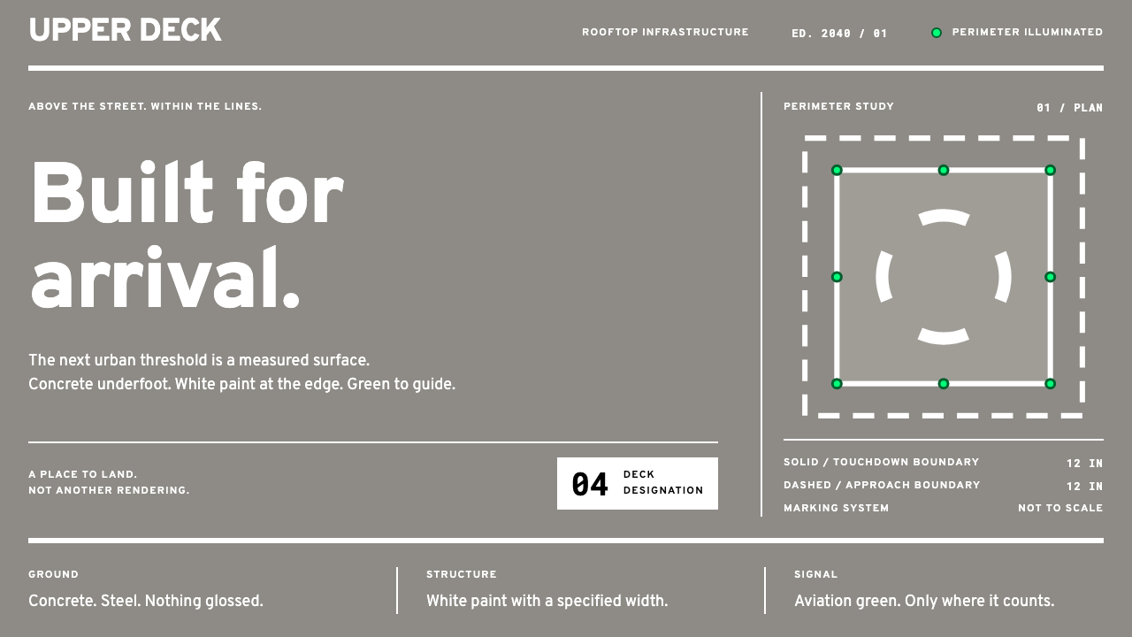 eVTOL VertiportEvery mark has a purpose. Wide white paint on concrete grey; aviation green s…