What is eVTOL Vertiport?
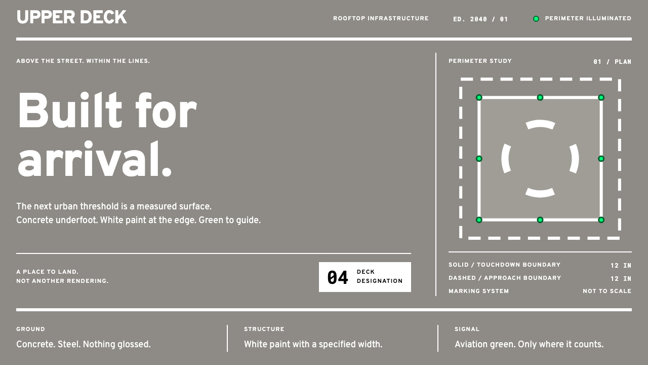
eVTOL Vertiport is the interface as a painted deck: grey concrete for the page, wide white lines for structure, and a single aviation green reserved for the edge.
eVTOL Vertiport in brief
eVTOL Vertiport is a design style drawn from the markings and lighting of a rooftop landing deck for electric vertical take-off and landing aircraft. It is built on a real document. Engineering Brief 105, published by the US Federal Aviation Administration in September 2022, is the text that turned urban air mobility from a rendering into a dimensioned drawing. It specifies the deck in lines: a wide solid white line around the touchdown area, a dashed line of the same width around the final approach area, a broken-wheel identification symbol, and a black-on-white box stating the weight limit.
This style builds an interface out of those figures. Grey concrete is the page. White paint is the structure, and it has real width, because on a deck a line is a measured band of paint, not a hairline. Aviation green, the chromaticity mandated for every perimeter light, is the only saturated colour in the system. Orange belongs to the wind cone and to hazard marking. Nothing here is decoration: every mark is a line with a specified width, and every colour has a job.
The look is calm, practical and outdoor. Surfaces are matte and mid-light, like weathered concrete under open sky. Layouts read as plan views, as if looking down from above, with wide white lines marking zones and a small set of signs for identity and limits. Even the theme's working label looks ahead, placing the scene in 2040, but every rule it follows is written down today.

Where does eVTOL Vertiport come from?
Rooftop heliport engineering was already an established field before this style existed, and ICAO Annex 14 sets international standards for heliports. Engineering Brief 105 brought that practice to a new class of aircraft, the electric vertical take-off and landing craft at the centre of Advanced Air Mobility, by specifying how their landing sites should be marked and lit. It comes from the FAA Office of Airports, was published in September 2022, and is followed by a revision, EB-105A.
The real movement behind the look is the standardisation of airfield marking and lighting. Every convention in the system exists because a pilot has to understand it quickly from above: line widths are specified, solid and dashed lines carry different meanings, and the identification symbol and weight-limitation box follow set forms. The design language inherits that economy. It has few elements, each of them consistent, and none of them added for taste.
Colour is regulated too. The aviation green used here is the chromaticity defined for perimeter lights through the SAE AS 25050 lighting-colour committee, rather than a hue a designer chose. That matters for how the style treats it: green is not a brand colour or a general success colour but the colour of an edge. Orange is kept for the wind cone and hazard marking. The white of the paint, the grey of the concrete and the black of the weight-limitation box complete a palette that reads as a set of functional materials rather than a scheme.
The setting is the roof. The FAA's airfield standards are applied to rooftop decks worldwide, which is why the style carries no local ornament and no regional flavour. It is concrete, paint and light, which is much the same everywhere, and the result is an aesthetic with the feel of infrastructure: neutral, durable and built to be read at a glance.
What defines the eVTOL Vertiport look?
Concrete Grey Page
The base is the grey of concrete and steel, a neutral mid-light tone with a slightly cool, matte quality. It is the surface everything else is painted onto, so it should feel solid and uniform rather than glossy or textured. Large areas of it are normal: the grey is meant to carry the layout the way a deck carries a landing.
White Paint as Structure
White is not empty space here. It is paint with a measured width, and it draws every structural element: frames, dividers, outlines and zones. Lines are wide enough to read as bands, not hairlines. Structure is therefore visible and sturdy, and you can see exactly where each region of the interface begins and ends.
Solid and Dashed Grammar
The difference between a solid line and a dashed line carries meaning, as it does around the touchdown and approach areas. In an interface this becomes a grammar: solid for the committed zone, dashed for the approach or transitional one. Used consistently, it teaches readers the code without a legend.
Aviation Green Edge
Aviation green is the only saturated colour, and it is used for edges: perimeters, active boundaries, selection outlines and the lights that mark where something ends. Because it is not a decorative colour, it should never become a large fill or a general positive-status colour. It signals a boundary, and a boundary only.
Orange for the Wind Cone
Orange is held back for the wind cone and for hazard marking. In an interface that means warnings, direction or live conditions that a user must notice. Like green, it is never used for decoration, and the two colours are not blended into gradients or paired together for effect.
The Placard
Information that has to be absolutely clear is set as a black-on-white placard, like the weight-limitation box. These are plain rectangles with square corners and large, unambiguous type. They are used for limits, identifiers and rules, and they are the most legible things in the layout.
Plan-View Flatness
Layouts are flat and seen from above, the way an arriving pilot sees a deck. There are no drop shadows, no glass and no gloss. Depth is not a design resource here: position, line weight and colour do all the work, and the matte surfaces behave the way painted concrete behaves in daylight.

Who shaped eVTOL Vertiport?
The FAA Office of Airports is the body behind Engineering Brief 105, published in September 2022 and followed by the EB-105A revision. Its work supplies the line widths, the solid and dashed boundaries, the identification symbol and the weight-limitation box that give the style its structure. For a designer, it represents the rare case where the rules of a visual language are written down, measured and public.
The SAE AS 25050 lighting-colour committee is the source of the aviation green mandated for perimeter lights. Because its colour is specified rather than chosen, the style treats green as a signal with a defined meaning, not a decorative accent. It is the reason the palette has one saturated colour and a firm rule about where it goes.
ICAO Annex 14 sets the international standards for heliports, the established frame into which rooftop vertiports fit. It explains why the style looks the way it does everywhere: a deck seen from above should read the same in any country. The standard stands for the idea that a visual system gains authority from being shared.
How do you use eVTOL Vertiport today?
eVTOL Vertiport is a style for products where clarity of boundaries and states matters more than expression. A quick test of fit: if the interface helps someone approach, enter, check or leave something, the style will serve it. If it needs to feel warm, playful or intimate, it will not.
On presentation slides, the cover works as a deck seen from above: a grey field, a wide white frame around the title zone, and a small green line along one edge. Content slides treat every section as a marked area, using solid white frames for the main content and dashed frames for supporting or upcoming material. Data slides are excellent here. Charts are drawn with wide white lines on grey, with green used only to mark a threshold, boundary or target, and a black-on-white placard carries the headline figure or limit.
For web interfaces, the style fits dashboards, logistics and operations tools, booking flows, status boards and admin panels. Cards become marked zones with white outlines, selected items gain a green edge rather than a green fill, and limits and rules appear in placards. Pricing pages can present tiers as marked bays, with the recommended tier edged in green. Forms stay flat, with high-contrast white outlines and square corners, and focus is shown as a green edge.
In editorial and marketing work, the style suits infrastructure stories, transport and mobility features, technical explainers and announcements for hardware or services that operate in the physical world. A page can be built like a site plan, with wide white lines separating sections and a single green line marking the key takeaway. Photography of rooftops, runways and city skylines sits naturally on the grey ground, and captions can be set as placards.
The most common mistake is to treat green as a brand colour. Used on buttons, backgrounds and icons all over a page, it stops being an edge signal and the style loses its logic. Other frequent errors are hairline strokes where a wide painted line is needed, soft shadows and gradients that have no place on a flat deck, and orange and green used together at equal weight so that neither reads as a warning or a boundary. The last is decoration: if a mark has no job, remove it.

eVTOL Vertiport — FAQ
What is Engineering Brief 105?
It is the FAA document, published in September 2022, that specifies how a vertiport for electric vertical take-off and landing aircraft should be laid out, marked and lit. It describes a solid white line around the touchdown area, a dashed line around the final approach area, an identification symbol and a weight-limitation box. This style takes those marks as its entire visual vocabulary.
Why is green used only for edges?
Because aviation green is defined as the colour of perimeter lights. It means this is where the surface ends, and the style honours that meaning. If green appears as a button fill or a background, it no longer marks anything, and the one saturated colour in the palette loses the job that makes it special.
Is this a light or a dark style?
It is a light-to-mid style. The page is a daylit concrete grey, and the white paint depends on that grey to read as structure. Turning the whole system dark would change the logic, since the green would become a glowing light source rather than an edge marking. If you need a night feel, keep the grey ground and let the green carry the glow, rather than inverting everything.
Can I use it for products that have nothing to do with aviation?
Yes, when the product is about boundaries, states or limits: logistics, operations, scheduling, monitoring, booking, infrastructure. The aviation language simply gives those ideas a disciplined visual form. It is a poor match for emotional or intimate brands, where the unornamented, rule-bound character would feel cold.
How is it different from industrial or brutalist styles?
Industrial and brutalist styles tend to celebrate weight, rough texture and raw material. This style is flat, matte and measured. Its grey is a neutral surface, not a texture to admire, and its force comes from signage logic: wide painted lines, defined colours and plain placards. It feels like an airfield sign system rather than a concrete sculpture.
Related design styles
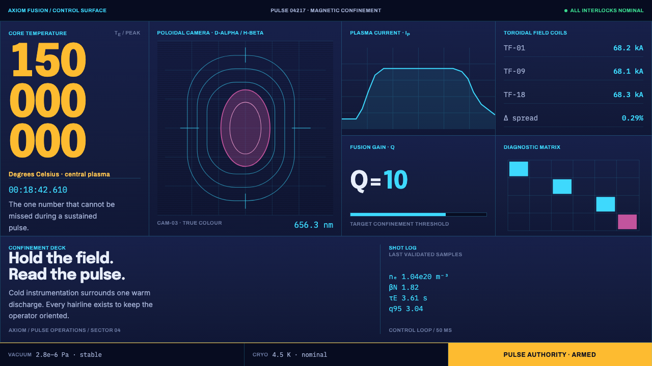 Tokamak Confinement DeckFusion control without softness. Navy panels isolate cyan telemetry, Noon Yel…
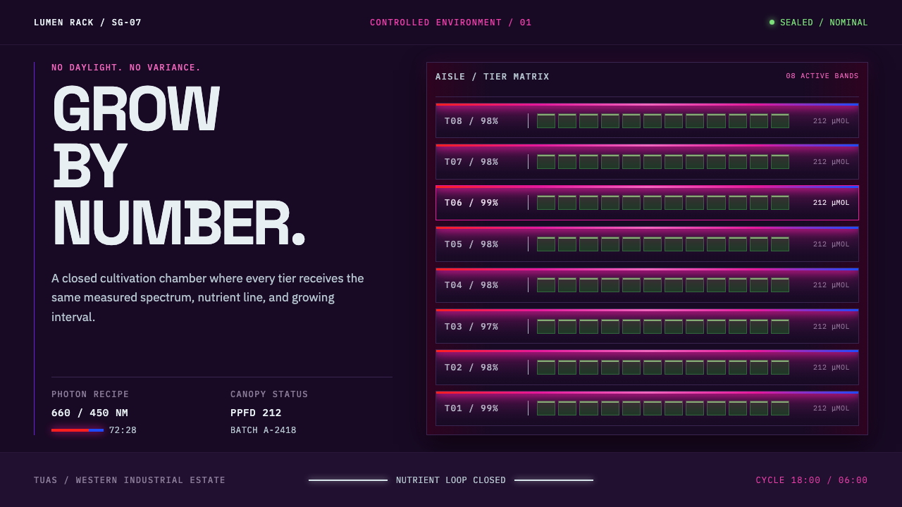 Vertical Farm TowerFood production without daylight. Magenta LED tiers cut through a near-black…
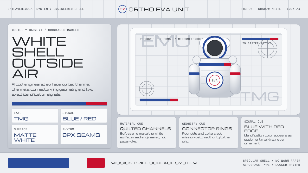 NASA EMU SpacesuitEngineered white, never warm. Quilt seams, blue ID stripes and worm red mark…
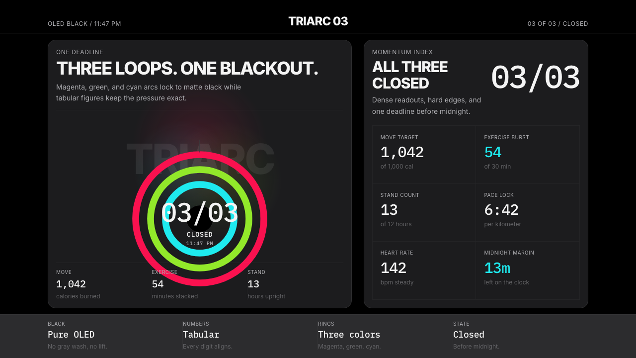 Apple Fitness Rings Closed (2024)Midnight feels exact. Magenta, green, and cyan rings lock onto OLED black.
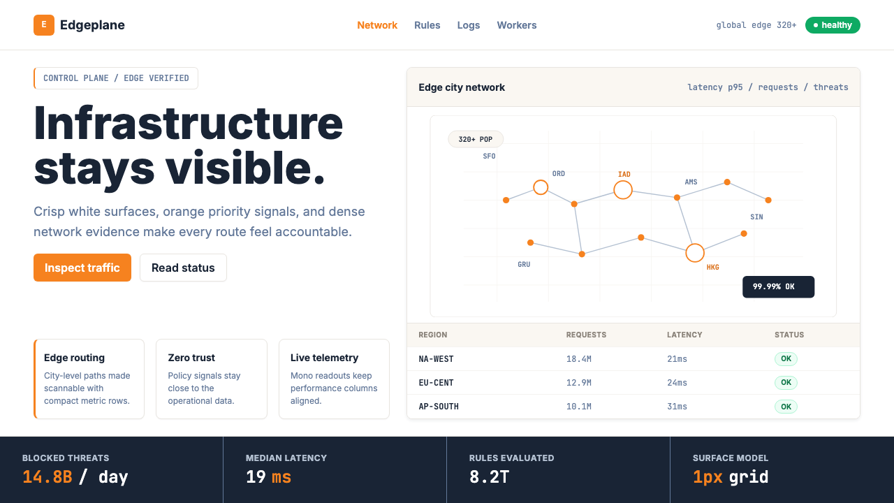 Cloudflare Orange EdgeOperational clarity wins. Orange accents, hairline grids, and mono metrics ma…
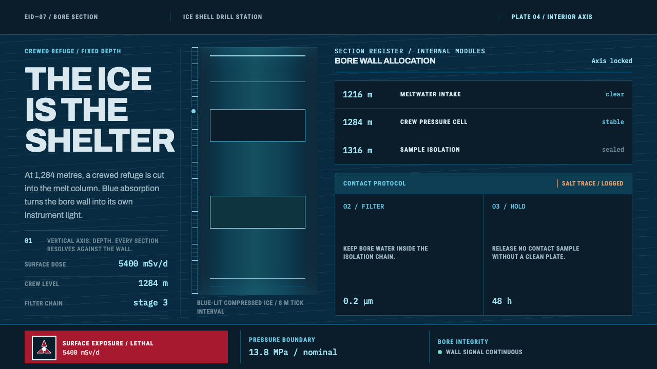 Europa Ice Drill StationShelter is a depth, not a room. Blue bore axis, hard tables, and earned radia…