What is Tokamak Confinement Deck?
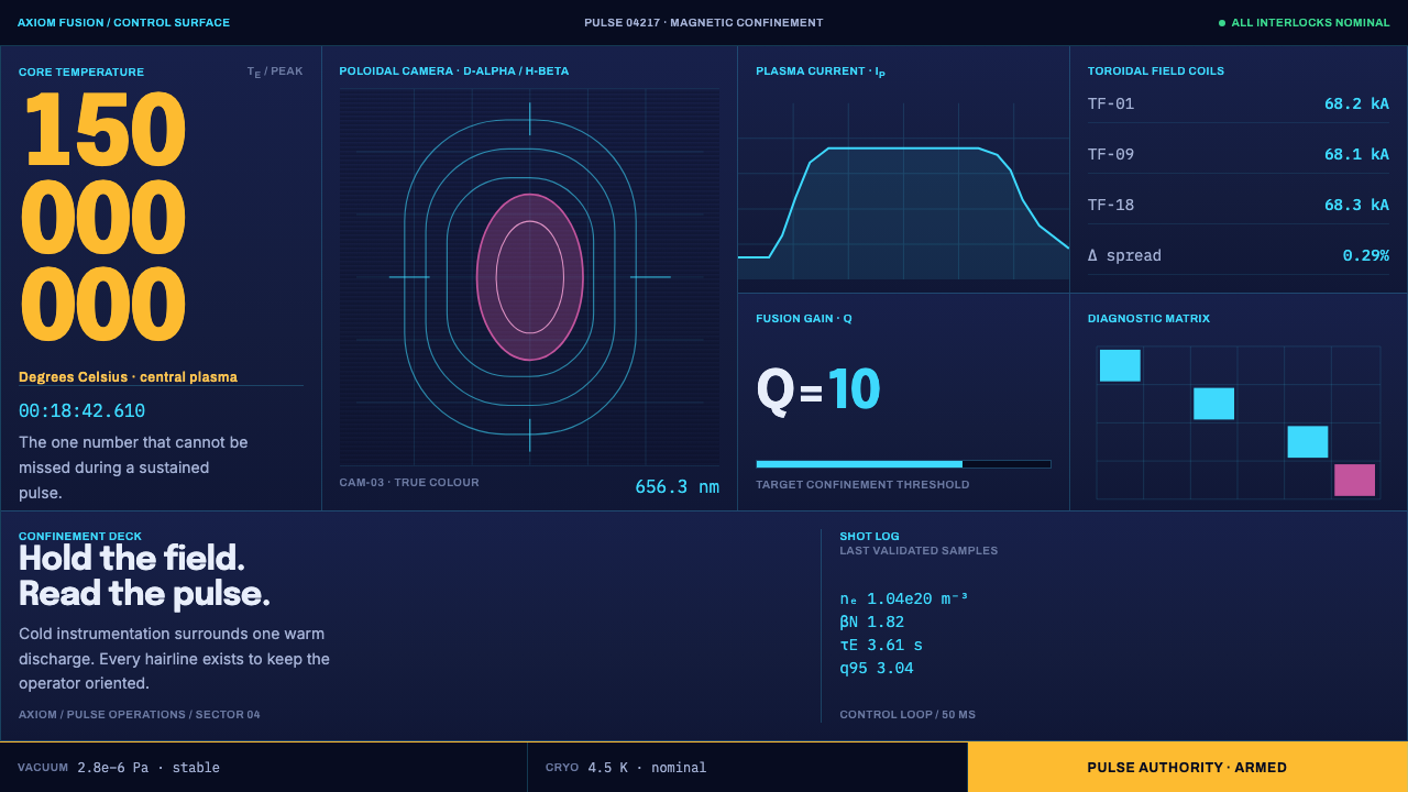
Tokamak Confinement Deck is the interface of a fusion control room: navy panels packed edge to edge, cyan instrument lines, one yellow number that matters, and a plasma that glows true magenta.
Tokamak Confinement Deck in brief
Tokamak Confinement Deck is a design language drawn from the control rooms of magnetic-confinement fusion, the experiments in which a ring of superheated gas is held away from the walls of a doughnut-shaped vessel by magnetic fields. The surface it describes is a dim navy wall of diagnostic panels, thin cyan instrument lines, a single yellow reserved for the one number that matters, and a magenta plasma that is the only warm object on the screen. It is a dark, dense and entirely functional style.
Where most dashboards treat density as a problem to be managed with white space, this system treats it as the point. Poloidal cross-sections, fusion-gain readouts, coil currents and disruption banners are packed edge to edge, with no outer margin and nothing decorative between them. The reason is operational: in a real control room every part of the display pays for itself, and anything that carries no information is taking space from something that does.
The style is also a lesson in the discipline of colour. Cyan means instrument, yellow means the primary action or the key number, magenta means plasma, and red means disruption. Everything else stays instrument-cold. Numbers are tabular so that digits do not jitter, alarms are literal rather than decorative, and the grid never softens. The result looks like science fiction only by accident. It is an interface built for people who must act correctly when something goes wrong.
Where does Tokamak Confinement Deck come from?
The tokamak itself is a Soviet invention. Its name comes from a Russian acronym describing a toroidal chamber with magnetic coils, and the idea of confining a hot plasma in a ring by a combination of magnetic fields emerged from the Soviet atomic programme in the 1950s, associated with the physicists Igor Tamm and Andrei Sakharov. The first machine in the lineage, T-1, dates to 1958, and the programme was later led by Lev Artsimovich, whose group made the tokamak the leading approach to magnetic-confinement fusion.
From there the design travelled. Laboratories in Europe, the United States and Japan built tokamaks of their own, and the work concentrated in a few places. The source highlights two: Culham in Oxfordshire, in the United Kingdom, a long-standing home of British fusion research, and Saint-Paul-lès-Durance in southern France, where the international ITER project is being assembled. Each generation of machine brought a larger vessel, stronger magnets and more diagnostics, and with them a larger and more crowded control room.
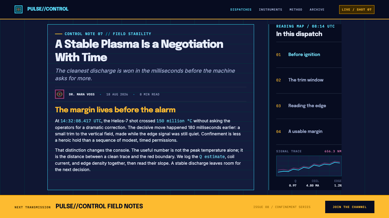
The visual language of this style comes from three overlapping traditions. The first is magnetic confinement fusion engineering itself, which supplies the geometry: the D-shaped contours of the poloidal cross-section, the concentric rings of the field coils, the vocabulary of shots, currents and gain. The second is control-room human factors, the discipline of making information readable and actionable under stress, which supplies the hierarchy: restrained colour, literal alarms, tabular figures and a strict layout. The third is scientific false-colour imaging, the practice of assigning colour to measurements and spectral lines, which supplies the palette.
The programme that gives the style its present urgency is ITER, whose assembly and first-plasma schedule runs through the 2020s and into the 2030s under Director-General Pietro Barabaschi. ITER is not only a machine but also a communication problem: a multinational project that must show its status to engineers, partners and the public through a shared visual vocabulary. This design language borrows from that moment, taking ITER's own deep navy as its ground and treating the screen as an instrument rather than a poster.
What defines the Tokamak Confinement Deck look?
Navy Ground
The ground is a deep, dim navy, the colour associated with ITER's own identity, chosen for a room where screens are watched for hours. It is dark without being black, and it lets cyan and yellow stand out without glare. Panels sit on this ground as slightly lighter or darker fields, separated by hairlines rather than by shadows or gaps.
Cyan Is the Instrument
Cyan belongs to the instrument. It is used for icons, diagnostic labels, grid lines and trend curves, which is to say for everything that reports on the machine rather than acts on it. Because it is a cold colour used consistently, the viewer learns to read it as measurement, and any other colour signals a different category of information.
Noon Yellow, Rationed
Noon Yellow is reserved for two things only: the primary action button and the one number that must be seen at a glance. It is never used for decoration, hover states or secondary labels. The scarcity is what gives it authority. On a dense screen, a single yellow figure is the first thing the eye finds, and that is precisely the job it has been given.
Magenta Is the Plasma
Magenta is not a brand accent. It is the colour of the plasma itself, because a deuterium discharge photographs magenta: a red D-alpha line and a blue-cyan H-beta line blend in a colour camera. It is the only warm object on the deck, and it appears only where the plasma is being depicted, such as the poloidal cross-section or the discharge trace. Used anywhere else it would stop meaning anything.
Edge-to-Edge Panel Grid
Diagnostic panels fill the screen from edge to edge, with no outer margin and no ornamental gaps. Panels are divided by hairline cyan rules, and each holds one instrument or a small cluster of readouts. The density is deliberate and the grid never softens: corners are square, rows align, and no panel floats above the rest.
Tabular, Literal Numbers
Numbers are set in tabular, monospaced digits so that columns align and changing values do not jitter. Shot numbers, timestamps, gain values and coil currents all share this discipline. Headlines and the large key number use a wide display face, interface text and tables a neutral sans, and equipment nameplates a sturdy industrial grotesque. Alarm text is literal, and red appears only for a disruption, as a full-width banner that cannot be missed.
Geometry of the Torus
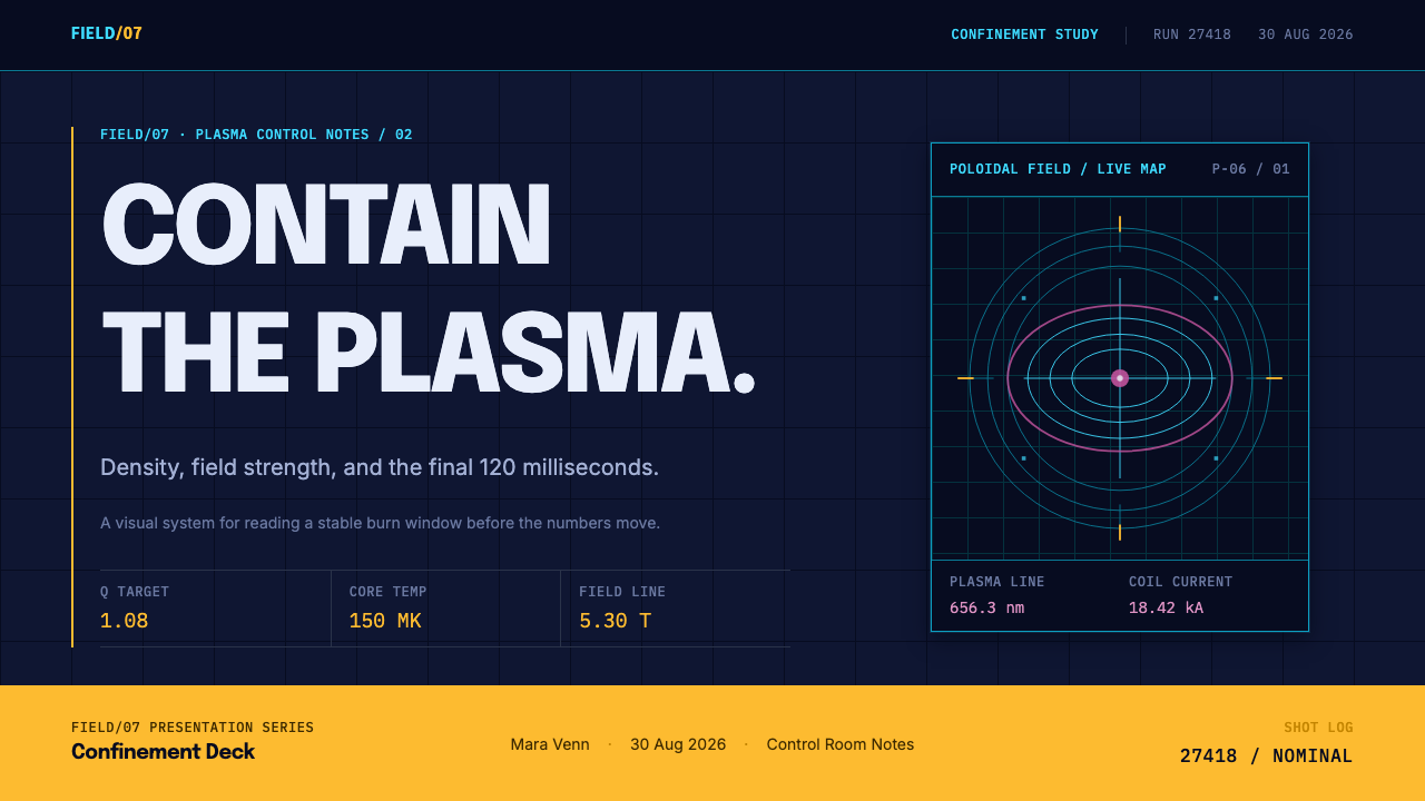
Shapes come from the machine: the D-shaped contours of the poloidal cross-section and the concentric rings of the field coils, all wrapped inside a strict rectangular telemetry grid. Curves exist only where the physics has them. There are no rotating holograms, no floating three-dimensional rings and no rounded capsule cards, because this is an instrument panel, not a film set.
Who shaped Tokamak Confinement Deck?
A Soviet physicist who, with Sakharov, proposed the magnetic-confinement concept from which the tokamak grew. Tamm's name stands for the idea behind the geometry: a plasma held in a ring by fields rather than by walls. That idea is why the interface's central image is a toroidal cross-section, and why decoration has no place on the surface around it.
A physicist who worked with Tamm on the toroidal confinement approach and later became widely known as a human-rights advocate. In the story of this style he represents the theoretical foundation: the currents, fields and confinement figures on the deck descend from the calculations of that early work, and every number on the screen is a descendant of a derivation.
Led the Soviet fusion programme and its experimental culture, and under his leadership the tokamak became the leading confinement design. He is associated with the rigour of measurement: a machine is only as credible as its diagnostics. The deck's emphasis on instruments, readouts and diagnostic panels reflects that conviction that a result has to be seen to be believed.
Director-General of the ITER Organization, responsible for the assembly programme and the project's path to first plasma. His name anchors the contemporary end of the story: the screens this style describes are the ones ITER's operators and partners will watch, and they must communicate status clearly across institutions, disciplines and languages.
How do you use Tokamak Confinement Deck today?
Tokamak Confinement Deck suits products where people monitor, decide and act on dense, live information: monitoring dashboards, scientific and engineering tools, energy and infrastructure platforms, developer consoles, operations screens and data-heavy B2B products. It also works for presentations about science, energy or deep technology that want to look credible. It does not work where the goal is to relax the viewer, because the whole system is tuned to alertness.
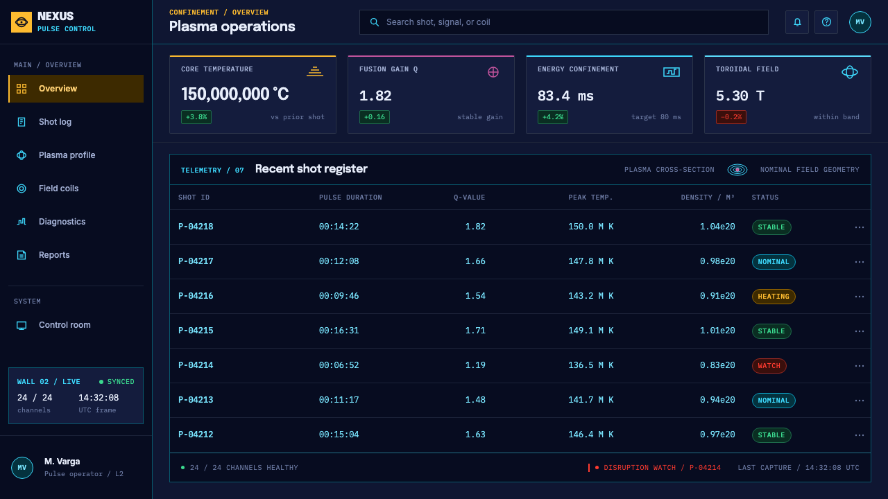
For presentation slides, treat the page as a monitoring wall rather than a poster. A cover can be a navy field with a single large yellow figure, a hairline grid and a small magenta toroidal cross-section as the only warm shape. Content slides divide the page into panels separated by thin cyan lines, each carrying one headline number or chart. Data slides are the natural home of the style: trends in cyan, the key series or target in yellow, anomalies in red, and monospaced figures throughout.
For web interfaces, build dashboards on an edge-to-edge panel grid with no outer page margin and no floating cards. Navigation reads as a status strip, filters are compact, and tables use tabular digits. Keep the yellow for a single primary action and for the most important value on each view. Alerts are full-width banners in red with literal text. Use magenta only for something that is genuinely the live thing, such as a stream, a signal or a running job.
In editorial and marketing work, the style suits long-form pieces about science, energy and engineering, and landing pages for deep-tech companies that want to appear instrumented rather than glossy. Diagrams should be drawn as measured figures with labelled axes, not as concept art. Pull-out numbers can take the large yellow treatment. Photography should show real hardware and real control rooms, used sparingly, and any stylised plasma or torus must follow the geometry of the machine rather than the cinematic version.
The most common mistake is to read the style as generic sci-fi. Glowing gradients, rotating holograms, floating three-dimensional tori, rounded capsule cards and decorative glass effects all contradict the system's logic. The second mistake is spending the colours: yellow on every button, magenta as a brand accent, red for non-critical warnings. Each colour is a category, and a category loses meaning when it is used for decoration. The third is adding margin and white space. This style wants density, and loosening the grid makes it look like an ordinary dark mode.
Tokamak Confinement Deck — FAQ
Why is the plasma magenta?
Because that is what a deuterium discharge looks like in a colour camera. Its emission is dominated by two hydrogen-family spectral lines, a red one called D-alpha and a blue-cyan one called H-beta, and a camera combines them into a pink-violet. The style borrows the colour as a fact, not as a decoration, which is why magenta is reserved for the plasma and is not used as a general accent or a brand colour.
Is this just a generic dark mode?
No. A dark mode usually inverts a light interface, keeping its margins, rounded cards and soft shadows. This system is natively dark and natively dense: panels run edge to edge, hairlines replace shadows, colour is divided into fixed categories, numbers are tabular, and alarms are literal. If you remove the density and the colour discipline, what remains is a navy theme and not this style.
Can the style work on a light background?
It can, with care, for print or for accessibility reasons. Use a pale instrument-paper ground, darker versions of the cyan for lines and labels, and keep the colour categories exactly as they are: yellow for the one key figure and action, magenta for plasma, red for disruption. You will lose the glow and the sense of a dimmed room, so a light variant is best treated as a documentation or report version rather than the primary interface.
Doesn't such density hurt readability?
Density only works here because it is balanced by strict alignment, tabular digits, a small number of colour categories and a single dominant figure per view. The eye can scan because everything is where it is expected and because colour always means the same thing. Without those controls, density becomes clutter. This is also why the style fits operators who return to the same screen daily, and fits casual or first-time visitors less well.
Is the style only for fusion subjects?
No. Fusion supplies its geometry and its palette logic, but the underlying idea is transferable to any live-monitoring interface: operations, energy, logistics, observability and scientific data. It works best when the information is truly dense and time-sensitive and when colour categories can be held fixed. For a casual consumer product, borrowing the surface without the density and the categories will look like costume rather than design.
Related design styles
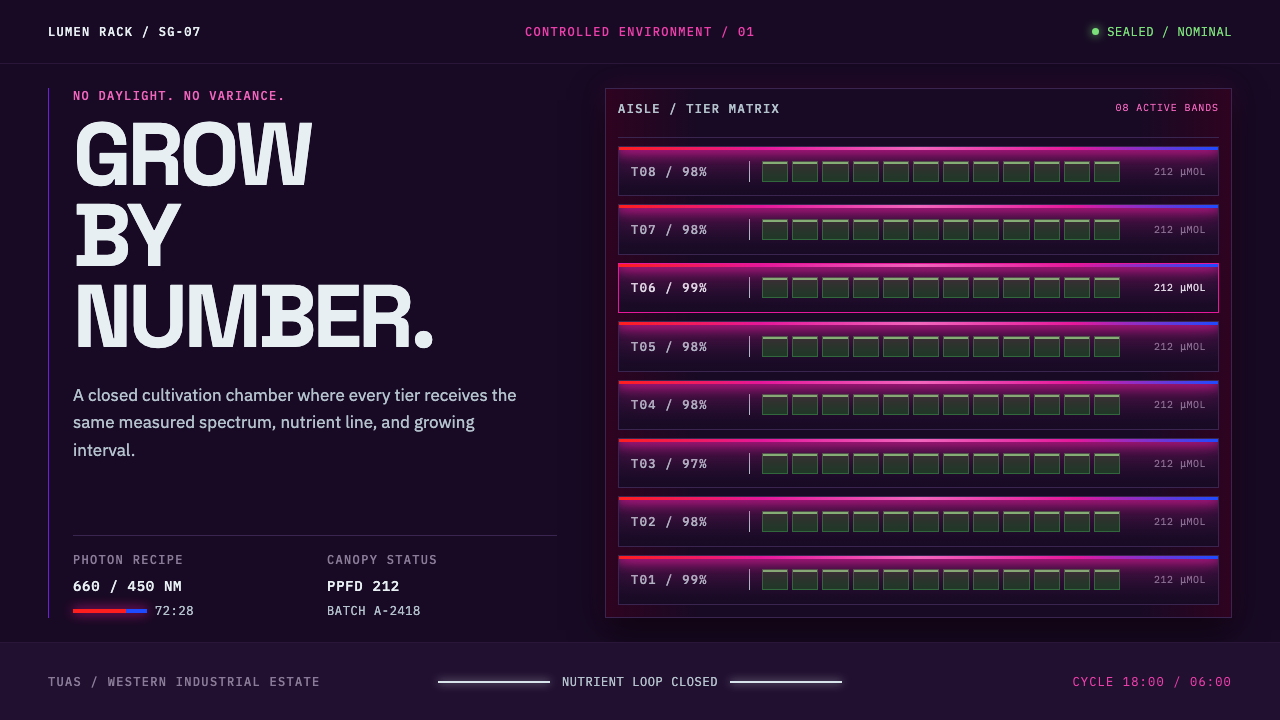 Vertical Farm TowerFood production without daylight. Magenta LED tiers cut through a near-black…
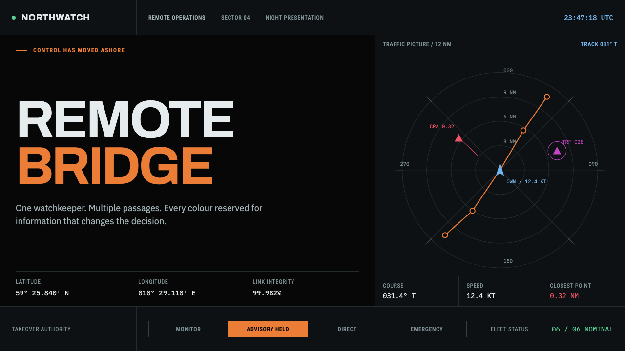 Autonomous Cargo Ship BridgeColour is protocol. Near-black chart grids reserve orange for decisions that…
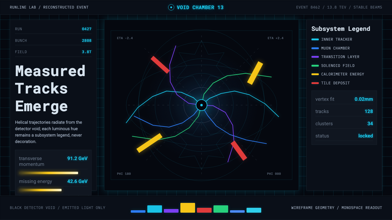 CERN CollisionData, not spectacle. Cyan tracks on black wireframes make every subsystem col…
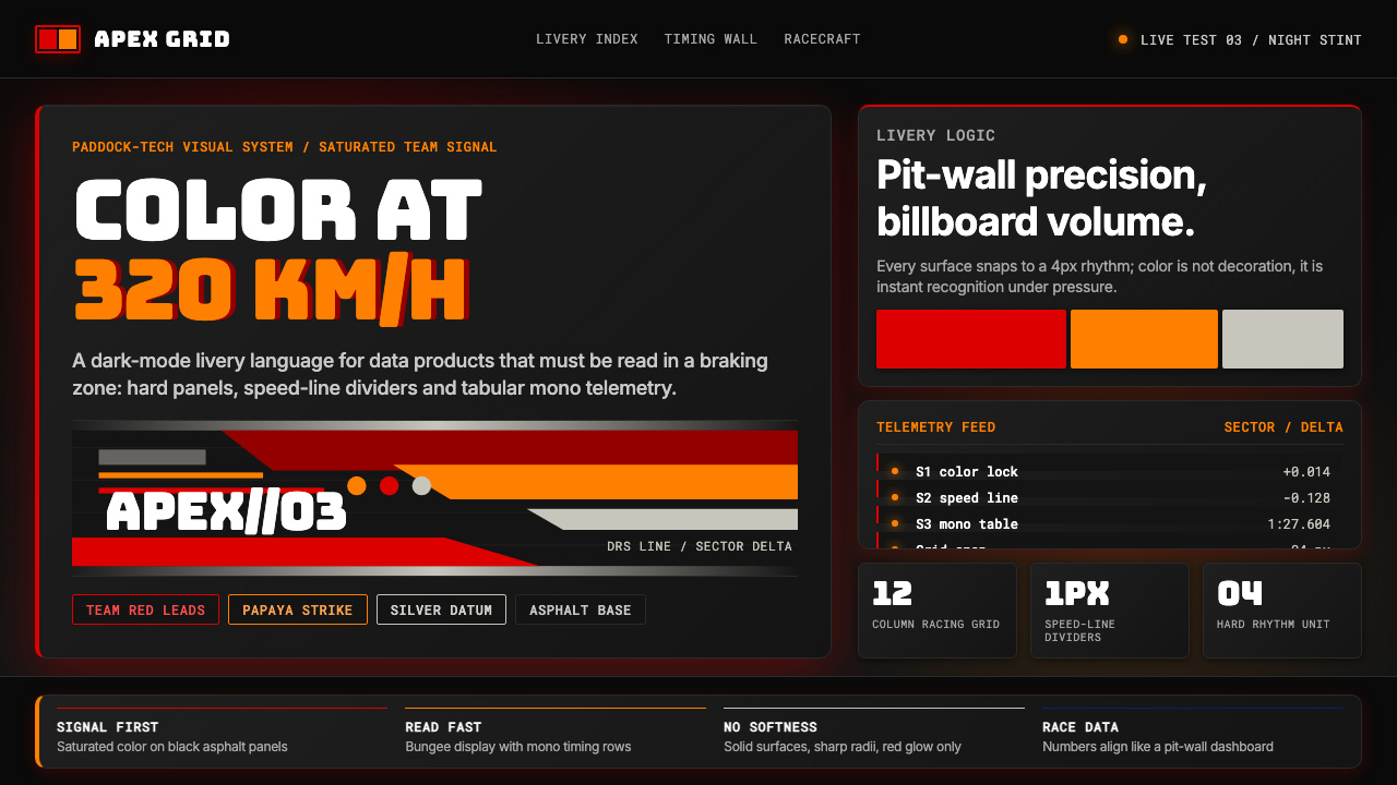 F1 Formula One LiverySpeed is legible. Ferrari red and papaya speed-lines cut through black teleme…
 Fencing PisteTurns darkness into signal. Rajdhani HUD type frames a white piste and red-gr…
 NASA EMU SpacesuitEngineered white, never warm. Quilt seams, blue ID stripes and worm red mark…