What is NASA EMU Spacesuit?
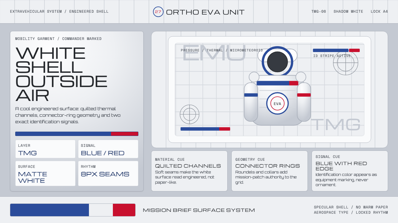
NASA EMU spacesuit design turns survival hardware into a visual system: engineered white, quilted seams, mission markings, and the quiet authority of a surface built for vacuum.
NASA EMU Spacesuit in brief
The Extravehicular Mobility Unit, or EMU, is the white hard-shell spacesuit designed to keep a human alive outside a spacecraft. Its visual character begins with that obligation. Nothing about the shell asks to feel domestic, luxurious, or decorative; it reads as a protective assembly whose surface has been organized around heat reflection, layered material, sealing, identification, and mission use.
The suit’s outer Thermal Micrometeoroid Garment uses layered Ortho-Fabric made from Gore-Tex, Kevlar, and Nomex. Engineered white is therefore not a neutral styling choice. It reflects solar heat and gives the garment its unmistakable cool grey-white appearance. The surface is interrupted by quilted channels, seams, rings, and joints, so even a largely white object never becomes blank or soft.
As a design language, NASA EMU spacesuit style translates this literal hardware vocabulary into disciplined visual communication. Cool white grounds replace warm paper tones; restrained identification blue and commander worm red act as functional markers; wide aerospace display lettering, connector-ring geometry, and mission-patch roundels establish an atmosphere of human-spaceflight procedure. The result is less like fashion than a mission brief made physical.
Where does NASA EMU Spacesuit come from?
This visual system belongs to EMU and Thermal Micrometeoroid Garment engineering developed across the period from 1950 to 1990, spanning Apollo and Skylab through Shuttle-era EMU development. It emerged within North American human-spaceflight design, centered at NASA Johnson Space Center, where a spacesuit had to operate as an environmental boundary rather than simply as clothing.
That origin explains the style’s unusual relationship to whiteness. The shell is engineered white because its outer layer must reflect solar heat. The resulting palette is practical before it is aesthetic: a cool, reflective field that exposes construction lines, quilting, interfaces, and attached identification. It avoids the warmth of ordinary textiles because the suit’s visual logic is governed by exposure to space, not by interior comfort.
NASA suit engineers and ILC Dover are the named forces behind the source material’s development context. Their work is represented here not through a personality-led design story, but through a system of material decisions: layered Ortho-Fabric, seams that create visible channels, a hard-shell silhouette, and markings that remain sparse enough to preserve immediate legibility on a complex protective surface.
What defines the NASA EMU Spacesuit look?
Engineered White
The ground should feel cool, reflective, and technical rather than creamy, parchment-like, or invitingly warm. White is treated as a working surface shaped by solar reflection and material performance. Slight grey variation can suggest layered fabric and shadow, but the overall impression must remain clean, controlled, and aerospace-specific.
Quilted Structure
Quilt seams are not embellishment. They describe the layered Thermal Micrometeoroid Garment and create channels that make the surface readable at a glance. In an interface or composition, repeated seams can become restrained dividers, shallow recessed tracks, or field boundaries, always serving organization rather than pattern-making.
Deep-Space Shadow
Depth comes from seams cut by decisive shadow, not from atmospheric softness. Dark areas should read as occlusion around joints, channels, and connection points. This gives components the feeling of assembled protective hardware: separate layers meet, overlap, and disappear into controlled darkness.
Identification Markings
NASA identification-stripe blue and commander worm red are sparse, high-purpose interruptions in the white shell. They work best as identifiers, status signals, selection states, or a single mission-critical callout. Their rarity is essential: once these colors become ambient decoration, the suit’s operational clarity is lost.
Connector Geometry
Circular rings, mechanical interfaces, and enclosed joints provide the style’s geometric vocabulary. They should feel engineered rather than ornamental: roundels define access points, frame information, or indicate systems that connect and disconnect. Geometry has a clear job, as though every circle belongs to a sealed interface.
Mission-Brief Typography
Wide aerospace display type gives headings a clear, procedural voice. It should feel legible from equipment distance, with strong hierarchy and generous surrounding space. Supporting text remains calm and factual; the visual rhythm comes from labels, codes, and aligned information blocks rather than expressive typographic flourish.

Who shaped NASA EMU Spacesuit?
NASA suit engineers represent the systems-thinking behind the EMU. Their contribution is visible in the relationship between survival requirements and surface appearance: engineered white for heat reflection, visible construction channels, hard-shell interfaces, and markings that preserve recognition without competing with the suit’s functional structure.
ILC Dover is named within the EMU development context. In this style’s vocabulary, that association reinforces the importance of material construction over decorative authorship. The outer garment is understood through its layered Ortho-Fabric, its quilting, and the evidence of protection built directly into its surface.
NASA Johnson Space Center is the institutional center named for this North American human-spaceflight design lineage. It frames the EMU not as an isolated object but as part of mission infrastructure, where visual decisions must support orientation, identification, procedure, and the practical realities of operating outside a spacecraft.
How do you use NASA EMU Spacesuit today?
For presentation covers, use a cool white field as though it were a suit shell, then establish a single dominant connector ring, patch-like roundel, or seam-driven crop. A wide mission-brief title can sit beside it with a small blue identifier or red critical marker. Content slides should rely on aligned information bays and quilt-like dividers rather than floating decoration.
Data slides benefit from the style’s operational clarity. Treat charts, diagrams, and status summaries as mission hardware: place values within framed systems, use circular geometry to indicate interfaces or completion, and reserve blue and red for identification or exception. The white field should remain spacious enough for data to look inspected rather than crowded.
For web interfaces, the style suits dashboards, fleet views, technical documentation, and pricing pages that need controlled hierarchy. Build panels as components of a protective assembly, with recessed seam lines, circular connectors, direct labels, and clear status markers. The visual tone should be precise and calm, never sterile for its own sake.
Editorial and marketing layouts can borrow the suit’s close-up material drama. Use broad white fields interrupted by sharply cropped quilting, mechanical rings, or patch-inspired metadata. A campaign page can move between an expansive technical overview and tightly framed system details, allowing the identity markings to direct attention without turning the page into a patriotic costume.
The common mistake is to interpret spaceflight design as generic sci-fi decoration. Random stars, glowing interfaces, excessive blue light, or an abundance of red warnings weaken the EMU reference. The defining discipline is the opposite: a cool engineered shell, visible material logic, scarce markings, and typography that reads like a reliable operational document.
NASA EMU Spacesuit — FAQ
Is this style simply white minimalism?
No. Its white ground has a material and environmental purpose: the outer garment is engineered white to reflect solar heat. The style depends on visible evidence of construction, including quilted channels, seams, interfaces, and identification markings. A blank white page without this operational logic will feel generic rather than EMU-derived.
How should blue and worm red be used?
Use them as purposeful identifiers, not as a broad palette. Blue can distinguish a system, section, or selected state; worm red can signal a commander-related or mission-critical point of attention. Their power comes from contrast against engineered white and from their rarity across the composition.
Does the style require literal spacesuit imagery?
No. The reference can be structural rather than illustrative. Cool white material fields, seam-based organization, connector rings, patch roundels, direct labels, and restrained mission markings can evoke the EMU system without showing an astronaut or reproducing the suit as a graphic object.
Where does NASA EMU spacesuit style work best?
It works best where trust, inspection, technical systems, and mission readiness matter: dashboards, documentation, scientific or educational material, hardware-oriented products, and information-heavy presentations. It is less suitable for work that needs softness, nostalgia, handmade warmth, or richly decorative storytelling.
Related design styles
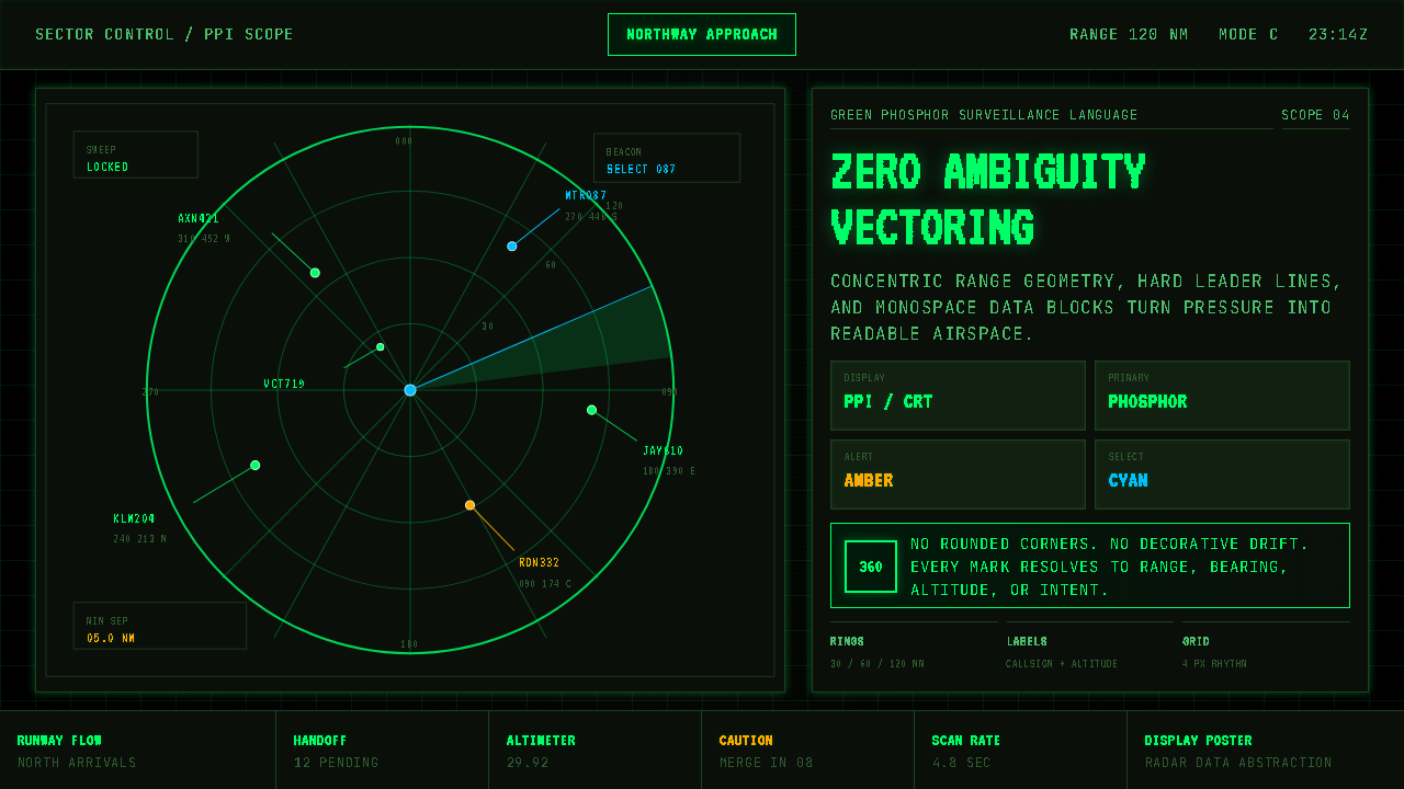 Air Traffic Control RadarOperational gravity. Phosphor green rings, sweep wedges, and monospace blips…
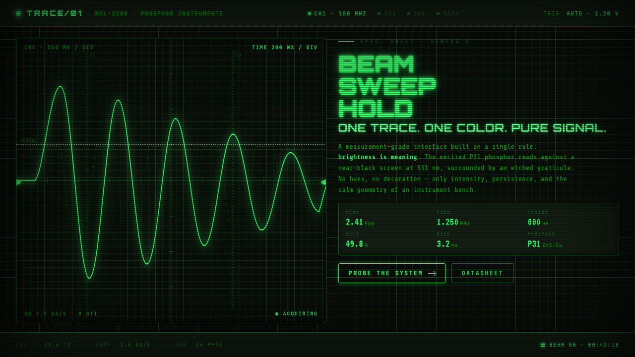 Oscilloscope WaveformBrightness is meaning. One P31 phosphor trace glowing across an etched gratic…
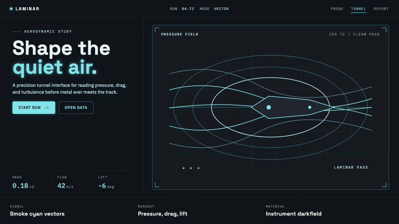 Wind TunnelMakes darkness feel measurable. Cyan-white streamlines and monospace ticks gl…
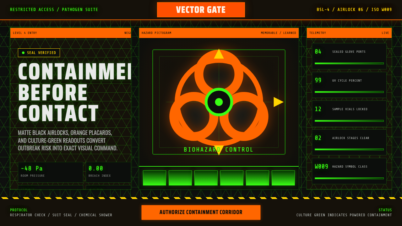 BSL-4 Biohazard LabContainment feels lethal. Black airlock grids glow with culture green and haz…
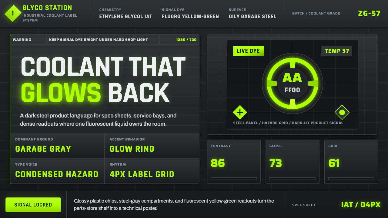 Fluorescent Antifreeze GreenCoolant becomes hazard signal. Fluoro green burns through steel-gray label gr…
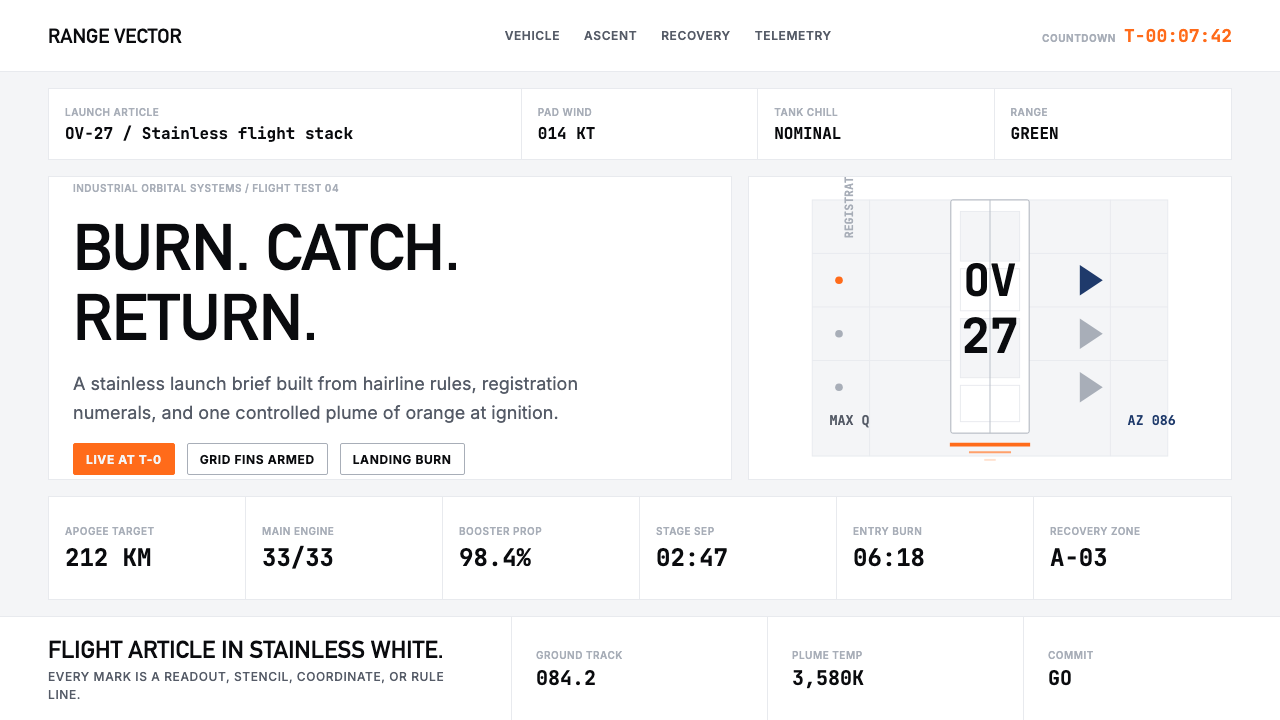 SpaceX Starship / FalconOrbital restraint. Stainless white grids, DIN-like type, and one orange burn…