What is Weekly Shōnen Jump?
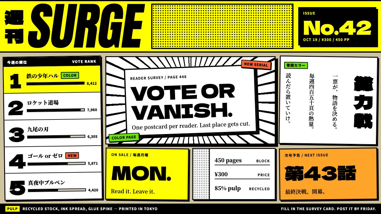
Weekly Shōnen Jump is a design language made from cheap pulp paper, heavy black ink and one blast of hi-vis yellow: loud, dense, tilted and meant to be thrown away after reading.
Weekly Shōnen Jump in brief
The Weekly Shōnen Jump style is a visual system modelled on the physical magazine published by Shueisha in Tokyo: a thick block of recycled pulp pages sold cheaply every week. Its ground is a dull yellowish-grey stock that lets the reverse side show through. Its ink is black line art, screentone dots and speed lines. Its single loud colour is a high-visibility yellow masthead band carrying black type.
As a design language it takes the object literally. The page is packed edge to edge. Panels tilt and break the frame. Heavy black rules separate everything. Shading comes from dots and hatching rather than gradients or shadows, and text for the story content can run in vertical columns read from right to left. Yellow is only ever used as a printed block of colour, never as thin type laid directly over the paper.
The mood is energetic, crowded and a little rowdy. It suits content that wants to feel like a weekly rush of action: sports, battle, rivalry, training and comic fandom, or any interface that wants to be dense, fast and unashamedly loud.

Where does Weekly Shōnen Jump come from?
The first issue of Weekly Shōnen Jump appeared on 2 July 1968, published by Shueisha in Tokyo, and the magazine became a weekly in 1969. It entered a crowded field of boys’ magazines, and its early editors, among them Nobuhiko Horie, built their identity around new serials and an unusually close relationship with reader response. The magazine ranked its stories by reader survey, so artists who did not hold attention were pushed out of the line-up quickly. That pressure shaped the pages themselves, which had to grab a reader within a few panels.
The material form is part of the style. Each issue was hundreds of pages, printed on cheap recycled pulp, and sold at a price low enough to be an impulse purchase. Readers finished it on a train and left it behind. Because the paper was thin and coarse, the ink looked heavy and high-contrast, the grey-yellow ground was never white, and the show-through of the reverse side became part of the texture. This disposable print culture is the first of the movements the style draws on.
The magazine’s popularity grew steadily and reached a peak circulation of 6.53 million in 1995. Over those decades its covers developed a recognisable formula: the main characters of that week’s serials crowded together, jostling for space, beneath a bright masthead. Artists such as Akira Toriyama and Eiichiro Oda became the best-known names associated with its pages, and editors such as Hiroki Gotō are part of the magazine’s history. Together they established a house look of bold line, strong silhouette and a kinetic page.
The visual language has stayed continuous to the present. Even as production has moved from letterpress-era habits to digital workflow, the idea has stayed the same: the magazine should feel cheap, fast and full. The design system built on it does not try to modernise this; it keeps the pulp, the heavy rules, the tilted frames and the yellow band, and turns them into a repeatable set of rules for contemporary layouts.
What defines the Weekly Shōnen Jump look?
Pulp Ground
The base is a dull, slightly yellowish grey, like recycled pulp that was never bleached white. A faint show-through from the reverse side is part of the effect. The ground is never pure white and never glossy; the whole point is that the page looks cheap and used. It gives black ink its strong contrast without needing any other colour.
Hi-vis Yellow Masthead
The only loud colour is a high-visibility yellow band at the top, with black type set on it. It behaves like printed spot colour: a filled block, never a tint applied to text on the paper. Using it sparingly, once per spread or screen, is what keeps it loud. Spread it everywhere and the effect is lost.
Heavy Black Rules
Panels, boxes and dividers are drawn in thick black lines. Borders carry the structure of the page, so there is little need for background fills, cards or spacing tricks. Corners are sharp, line weights vary on purpose, and some frames deliberately break their own edge as a figure or an effect bursts out.
Tilted, Broken Panels
Panels lean, overlap and cut across each other to create motion. Layouts avoid a tidy grid in favour of diagonal slashes and irregular shapes. A single large panel may take half the page for an impact moment, while a strip of narrow ones speeds up the reading. The page should feel like it is moving even when it is still.
Screentone and Speed Lines
Shading and atmosphere come from printed dot patterns, hatching and radiating speed lines, not from gradients, blur or shadow. These marks are crisp and mechanical, and they give a flat page both depth and velocity. Dense areas of tone mark shadow or emotion, while white bursts mark impact.
Vertical Text
Story text and dialogue can run in vertical columns read from right to left, which reflects how the magazine is actually read. Where horizontal text is needed for an interface, headings can be set very bold and tightly packed. Display type is heavy and compressed, and often shouts.
Edge-to-edge Density
Nothing is wasted on empty margins. Pages and screens are filled right up to the edge, with ads, captions, sound effects and bursts crammed into every gap. The density is a feature: it signals value for money and constant activity, and it makes quiet moments, when they appear, hit harder.

Who shaped Weekly Shōnen Jump?
Horie is one of the editors associated with the magazine’s early editorial direction, which centred on new talent, serialised stories and strong reader feedback. His name is linked to the formative period in which the magazine’s hard-driving, audience-led identity took shape.
Gotō is another editor whose name belongs to the magazine’s history. Editors in this tradition worked closely with artists on pacing, cliffhangers and the layout of each weekly instalment, which is the craft behind the dense pages the style reproduces.
Toriyama is one of the best-known artists associated with the magazine. His work helped define the sense of bold line, clear silhouette and kinetic action that readers still link with its pages.
Oda is another leading artist of the magazine, known for packed, exuberant compositions in which crowds of characters fill the page. His pages are a good reference for the edge-to-edge density the design system borrows.
How do you use Weekly Shōnen Jump today?
Weekly Shōnen Jump works best where energy and density are the goal. Think sports content, game guides, event posters, fan communities, youth-oriented promotions and product pages that want a loud, playful voice. It is not a style for calm reading or for brands that depend on restraint.
For presentation slides, a cover can feature a tall yellow band across the top with a heavy black title, below it a pulp-coloured field with a tilted panel holding the key image. Content slides use thick black frames to separate points, with short, punchy text and a few speed lines or dot patterns for emphasis. Data slides should be bold and flat, with black bars on pulp ground and one yellow block to mark the key number.
For web interfaces, think of every module as a panel. Use heavy black borders, sharp corners and slightly rotated blocks for featured items, and keep the yellow for a single masthead or a call to action. Cards are drawn as panels, not floating tiles. Dashboards and pricing grids can be packed tightly, but keep contrast high and interactive targets obvious so the density does not turn into confusion.
For editorial and marketing work, build pages like a magazine spread. Lead with a bold masthead band, fill the grid with a mix of large and small panels, and use sound-effect style lettering and bursts for emphasis. Vertical text columns can be a deliberate accent on long-form story or quote blocks, as long as the content remains readable.
A common mistake is to use yellow as a text colour on the pulp ground, which makes it unreadable and ruins the idea that yellow is a printed block. Another is to soften the page with gradients, shadows or rounded cards; this removes the cheap-print feel. Finally, avoid making everything tilted and loud at once, since a few clean, level panels give the busy ones something to push against.

Weekly Shōnen Jump — FAQ
Why is yellow only a filled block and never text colour?
In the printed magazine, the yellow is a flat band of ink with black type on top. It is a block, not a tint. Light yellow type on a pulp-coloured ground would be very low in contrast and would look like a mistake. Keeping yellow as a filled area preserves both readability and the printed-object logic.
Is the style only suited to manga content?
No. It is rooted in a manga magazine, but its qualities of density, bold framing and loud accent colour apply to many kinds of content: sports, games, events, youth products and any message that benefits from high energy. It is less suitable for quiet or luxury positioning.
Why does the style avoid gradients and shadows?
Because the original is printed on cheap pulp with black ink. Tone is made with dots and hatching, and depth comes from line weight and overlap. Gradients and soft shadows would look like a different medium and remove the sense of a rough, fast weekly print.
How should vertical text be handled on the web?
Use it as a deliberate accent for short passages such as quotes, labels or story blocks, and keep ordinary interface text horizontal so that navigation and forms stay usable. The right-to-left reading order belongs to the original magazine, so apply it only where the content context makes it meaningful.
How do I keep a dense page from becoming cluttered?
Rely on the heavy black frames to give structure, keep a single loud colour, and vary panel sizes so there is always a clear main panel. Contrast must stay high and text must stay short. A few quiet, level areas help the loud ones read as intentional.
Related design styles
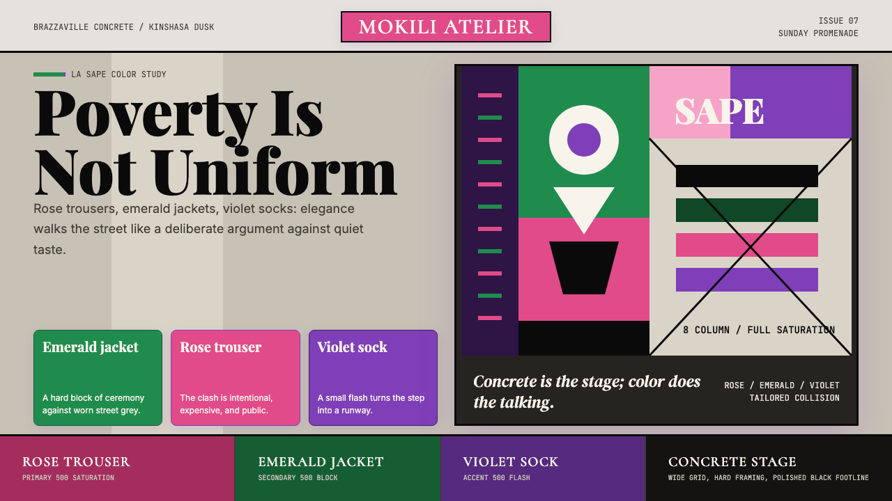 Congolese Sapeur (Kinshasa Suit)Defiant elegance. Rose, emerald, and violet clash on concrete in an asymmetri…
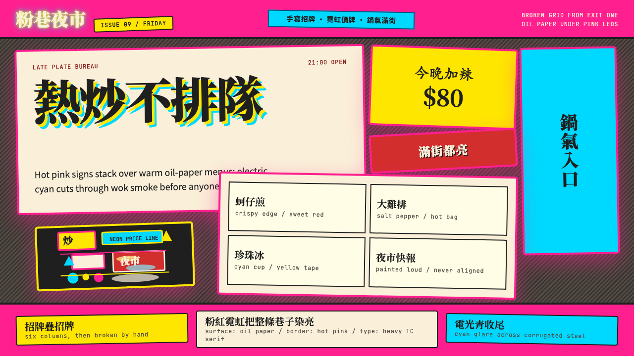 Taipei Shilin Night Market NeonLoud by design. Hot pink, neon yellow, and stacked TC serif signs break the g…
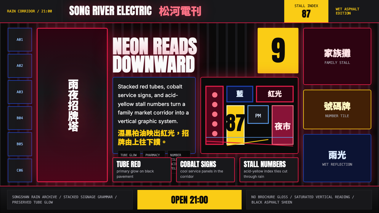 Taiwanese Raohe Night Market NeonTaipei night reads vertically. Neon red, cobalt panels, and acid-yellow numbe…
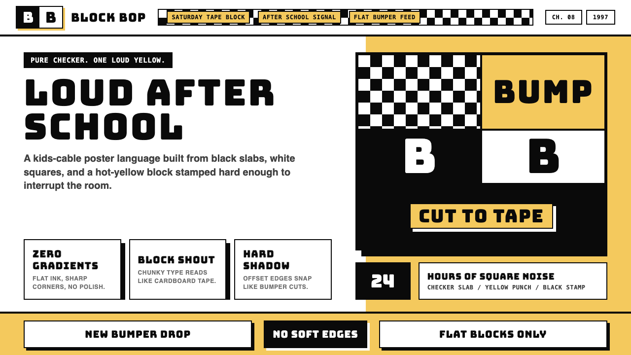 Cartoon Network 90s BlocksKids-cable noise, squared. Black-white checkerboards crash into hot-yellow Bu…
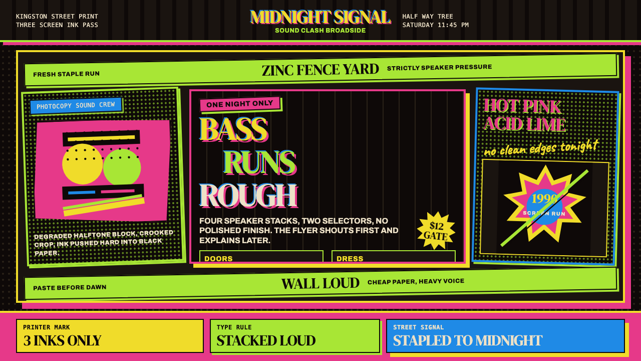 Jamaican Dancehall 1990 PosterMidnight volume. Acid lime and hot pink type stack like screenprint ink on bl…
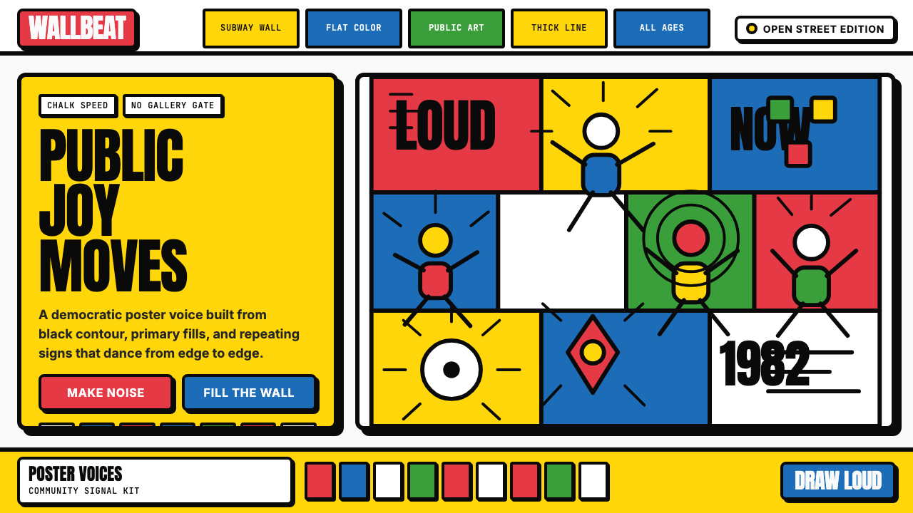 Keith Haring PopJoy refuses the gallery. Thick black contours pack primary color into a danci…