What is Weather Control Array?
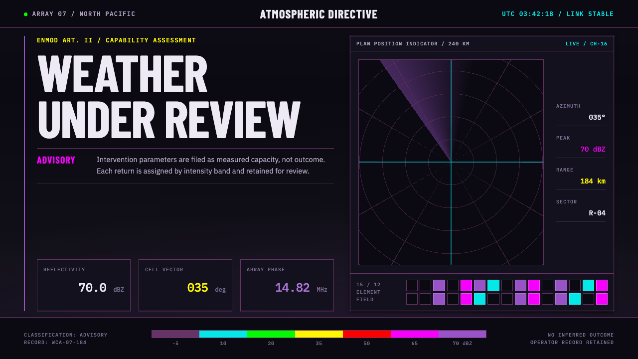
Weather Control Array imagines the weather-modification operations room using only instruments that already exist, and it keeps the careful, hedged voice of a technology that is still under review.
Weather Control Array in brief
Weather Control Array is a design style for a night-shift control room where the weather is monitored, measured and, in principle, influenced. It is built entirely from instruments that already exist. The colours are lifted from a National Weather Service radar reflectivity legend, where violet marks the top of the scale and the kind of storm that drops catastrophic hail. The type is split between a monospaced face for every figure and a condensed warning-sign face for anything that needs to alert.
Nothing here is decoration. Hue encodes intensity, columns encode units, and the console ground stays black so the radar echoes can carry. Range rings, azimuth rays, an antenna-array grid and a full-disc satellite cloud image provide the structure of the screen. The result looks like operational meteorology, because its parts are operational meteorology, and that borrowed credibility is its main strength.
Its tone is as important as its look. The style adopts the register of the 1977 ENMOD convention on environmental modification: a capability described carefully, under review, and never presented as settled. Weather control is still a contested idea, so the interface does not pretend otherwise. It is official, restrained and full of reservations, the visual equivalent of a document that says what is known and what is not.
Where does Weather Control Array come from?
The roots of the style lie in a real and contested field. Weather modification grew out of cloud-seeding experiments in the mid-twentieth century and became entangled with geopolitics when governments considered using it as a tool of war. The era window for this style opens in 1967, with the United States military's cloud-seeding programme known as Operation Popeye, and closes in 1977 with the ENMOD convention, which restricted hostile uses of environmental modification. That decade of secrecy, controversy and arms-control paperwork gives the style its guarded, documentary voice.
The visual material, however, comes from instruments. The colours are read off the reflectivity legend used by the National Weather Service, in which radar returns are sorted into quantised intensity bands with a stepped colour ramp, and where the top band is a violet that signals the most violent hail-bearing storms. The legend belongs to the era of NEXRAD radar, represented here by the WSR-88D of 1988. The cloud imagery draws on Himawari-8, the Japanese geostationary satellite of 2014, whose full-disc picture of the Earth supplies the large circular view at the centre of the interface.
The setting is East Asia, especially Japan and China, overlaid with American radar and ionospheric research programmes. That mixture explains the bilingual interface text and the sense of an international operations room, where several national instruments feed a single screen. Because the style is extrapolated forward from existing data standards, it is a plausible near future rather than a fantasy, and that restraint is what keeps it believable.
Three strands of tradition stand behind the design: operational meteorology display standards, the geoengineering debate and ENMOD-era arms-control documentation. The first provides the look, with its black screens, ramps and rings. The second provides the ethical weight, since any control claim invites a question about who decides. The third provides the grammar of caution, with its numbered items, defined terms and carefully hedged verbs. Together they produce an interface that looks authoritative while openly declining to claim certainty.
What defines the Weather Control Array look?
Ground: the black console
The ground is near-black, tinted very slightly toward violet, like the sky above an antenna array in a polar night. It is dark so that radar echoes and warning colours can carry, and it is never lightened for comfort. Panels are defined by thin lines and fine tonal shifts, not by brightness, so the screen reads as a lit instrument in a dark room.
Colour: a stepped reflectivity ramp
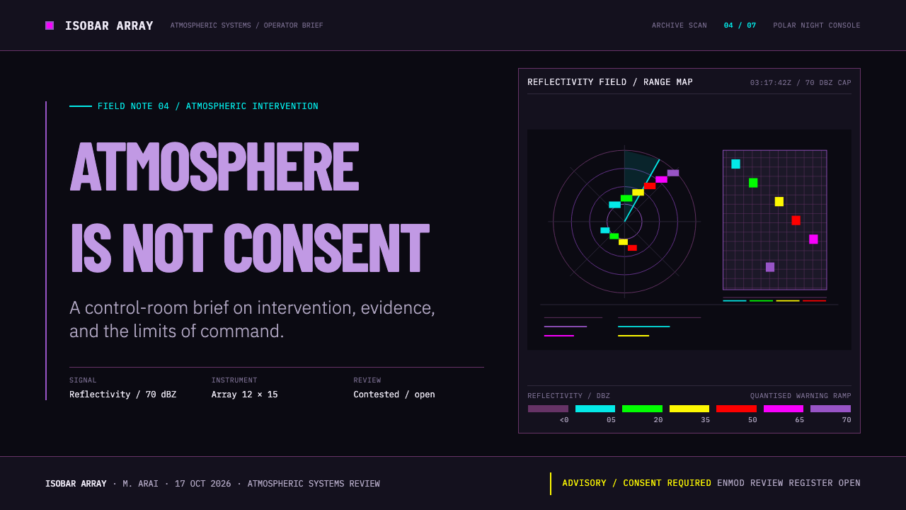
Colour is not chosen but read from the legend. Green, yellow, red and magenta each correspond to an intensity band, and violet marks the top of the scale. There is no smooth gradient between them, because the real legend is quantised into steps. Hue always means intensity, so using these colours for anything else would be a false statement, and the style protects that meaning.
Type: readings and warnings
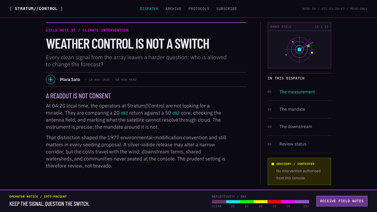
Type takes two attitudes. A monospaced face handles every reading, coordinate, timestamp and channel number, with digits of equal width and right-aligned so columns compare at a glance. A condensed sans-serif, descended from the German sign-lettering tradition, handles warning banners and large numerals. Japanese interface text is set in matching Japanese sans-serif faces, which supports the international operations-room feel.
Layout: array, rings and rays
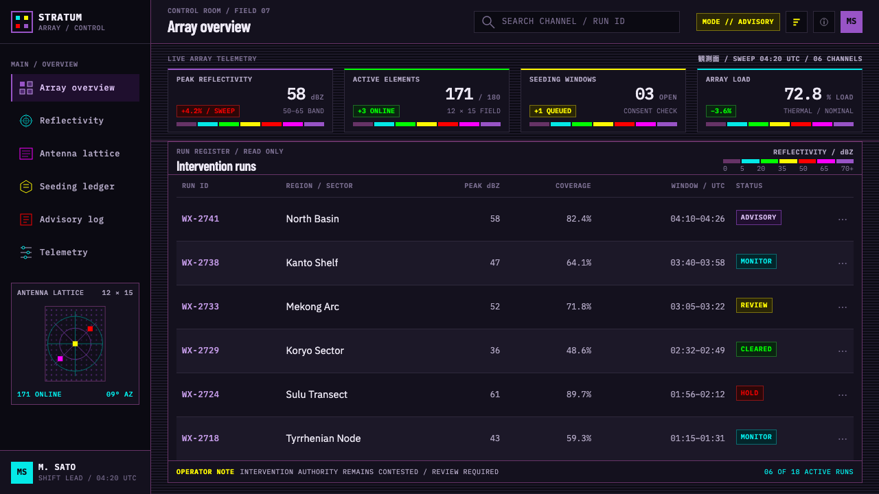
The screen is organised around an antenna-array grid, concentric range rings, azimuth rays and a full-disc satellite image. These are not backgrounds but functional geometry: rings show distance from a site, rays show bearing, and the grid shows which element of the array is reporting. Panels are tiled around the centre like instruments on a console, each with a clear label.
Columns encode units
Tables are not for show. Each column carries one unit, headings state it plainly, and numbers align so that a change in one row is visible against the others. Dense but orderly information is the norm, and long strings of figures are an asset rather than clutter. The impression is of a record that could be audited line by line.
Register: careful and under review
The voice is that of a formal document: measured, qualified and unwilling to overclaim. Labels say pending, advisory or under review rather than complete. Status text avoids triumphant language, and the interface leaves room for caveats. This register is part of the style, not an afterthought, because it is how a technology still in dispute should be described.
Who shaped Weather Control Array?
Vincent Schaefer is one of the three scientists named for this style, and he is associated with the early cloud-seeding experiments that opened the field of weather modification. His part in the story is the practical demonstration that a cloud could be altered by deliberate action. That claim, plausible in a laboratory and fiercely contested at scale, is the root of the style's guarded tone.
Bernard Vonnegut was an atmospheric scientist known for identifying a compound whose crystals could help ice form in clouds, which made seeding more practical. His work links the style to laboratory chemistry and to the question of how little material it takes to change what a cloud does. That asymmetry between a small input and a large atmospheric effect is the intellectual hook of the whole idea.
Irving Langmuir was a Nobel-winning chemist who supervised the early research and lent it scientific prestige. His presence in the lineage shows that weather modification began as serious laboratory science, not fringe speculation. For design, he stands for the respectable face of the subject: rigorous, instrumented and documented, which is the face this interface adopts.
The reflectivity legend is not a person but the most important single source for the look. It converts radar returns into a stepped ramp of colours, from weak echoes up to the violet that signals extreme hail. Its authority comes from long operational use. The style borrows that authority by reproducing the legend's logic exactly, including its steps and the meaning of its colours.
The 1977 ENMOD convention and the paperwork around it supply the style's voice. Its numbered clauses, defined terms and carefully qualified verbs produced a register in which a capability is described without being endorsed. The interface adopts that register wholesale: it names what the instruments show, flags what remains unsettled, and avoids any language of triumph.
How do you use Weather Control Array today?
Weather Control Array suits subjects that are technical, high-stakes and ethically unsettled: monitoring dashboards, risk and incident consoles, climate and geoengineering reporting, speculative design, science fiction interfaces and games. It works best when the audience should feel that real instruments are speaking and that someone is being careful. It is a poor fit for friendly consumer products or celebratory messages.
For presentation slides, a cover can be a black field with a range-ring motif, a condensed warning-style title and a small monospaced status line. Content slides can be built as console panels, each with a short label and one figure. Data slides are the natural home of the stepped ramp: maps, heat tables and bar charts coloured by intensity, with a legend whose steps are visible and a note stating the units.
For web interfaces, the style fits operations dashboards, observability and alerting tools, status pages and any product where thresholds matter. Use the black ground throughout, align every number in a monospaced face, and reserve the ramp colours for intensity or severity. Warning banners take the condensed face in capitals. Pricing, if needed, can be presented as a table of channels with clear units, in the same restrained register.
For editorial and marketing work, the style suits long-form science and policy features, explainers on climate intervention, report covers and festival or film materials about the near future. Set body text in a calm, readable face and keep the instrument aesthetic for figures, captions and side panels. Copy should match the register: precise, qualified and free of hype, with phrases such as under review used honestly rather than as decoration.
A common mistake is to replace the stepped ramp with a smooth rainbow gradient, which destroys both the authenticity and the readability. Another is to use the ramp colours decoratively, so that violet appears where nothing extreme is happening, which turns the legend into a lie. Others include adding neon glow, making the interface cheerful, or writing copy that announces control as an accomplished fact. Finally, avoid making everything uppercase; the condensed warning face is for warnings, and the rest should stay quiet.
Weather Control Array — FAQ
Is Weather Control Array a real weather-control system?
No. It is a design style that imagines a weather-modification operations room using real instruments and display standards, such as radar reflectivity legends and satellite imagery. Weather modification itself, from cloud seeding to larger interventions, remains contested, and the style deliberately presents the capability as unsettled, under review and described with care.
Why use a stepped colour ramp instead of a smooth gradient?
Because the real reflectivity legend is quantised into discrete intensity bands, and each colour step has a defined meaning. A smooth gradient would imply precision the instrument does not offer and would make bands harder to read. Stepped colour also helps accessibility, since viewers can identify a band at a glance instead of judging a continuous shade.
What is the ENMOD convention?
ENMOD is the 1977 convention on the prohibition of hostile uses of environmental modification techniques. It followed a period in which weather modification, including the American cloud-seeding programme known as Operation Popeye, had been used or explored in a military context. For this style it matters less as law than as a register: a careful, qualified way of describing a capability that is not presented as settled.
Can I use the ramp colours for non-weather data?
Only if the data truly shares the logic: an ordered scale of intensity or severity where the top band is meaningfully extreme. In that case the ramp works well and keeps its authority. If you apply it decoratively or to categories with no order, the colours lose their meaning, and viewers who know the radar convention will read a danger signal that is not there.
Does the style work on a light background?
Not really. The black console ground is what lets the stepped colours carry like radar echoes, and a light ground would weaken both the contrast and the control-room atmosphere. If you must present on white, such as in print, set the key figures and legend on a black panel and treat it as an inset instrument.
Related design styles
 Cloudflare Orange EdgeOperational clarity wins. Orange accents, hairline grids, and mono metrics ma…
 Container PortIndustrial dusk, standardized. Slate grid, RAL-blue stacks, and crane-yellow…
 Netflix 2024Cinema UI goes dark. Near-black chrome, poster rails, and one surgical red ac…
 Olympic ArcheryPrecision is the drama. Gold-red-blue rings snap from a dark stadium grid.
 Vertical Farm TowerFood production without daylight. Magenta LED tiers cut through a near-black…
 Air Traffic Control RadarOperational gravity. Phosphor green rings, sweep wedges, and monospace blips…