What is Amateur Architecture Studio?
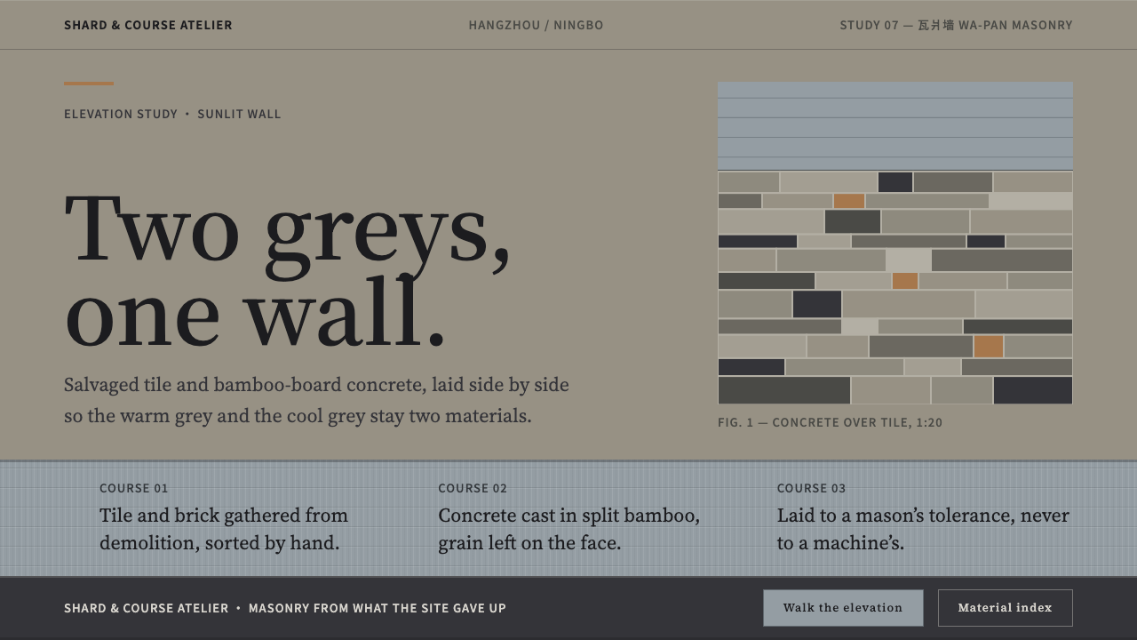
Amateur Architecture Studio turns a wall of salvaged brick, tile and bamboo-cast concrete into a design language where two greys stay two materials and type sits directly on the masonry.
Amateur Architecture Studio in brief
The Amateur Architecture Studio style is a visual language drawn from the buildings of the Hangzhou practice founded by Wang Shu and Lu Wenyu. Its defining image is the wa-pan wall: courses of salvaged grey brick, black roof tile and shards of porcelain, laid by local masons and meeting, without a joint detail to soften the change, a band of concrete poured against bamboo formwork.
As a screen or print system it treats that sunlit wall as the page itself. A warm tile grey and a cool, slightly bluish concrete grey are kept as two clearly different materials rather than blended into one neutral. Serif type is set straight onto the surface, small labels use a plain sans, and nothing floats above the wall: there are no soft shadows, no glossy cards and no rounded buttons.
The result is quiet, earthy and tactile. It suits museums, architecture offices, local craft and village-revitalisation projects, and any subject where the story is about reuse, handwork and the memory held in old materials rather than about novelty.

Where does Amateur Architecture Studio come from?
The studio was founded in 1997 in Hangzhou by Wang Shu and his partner Lu Wenyu. The name was chosen deliberately: ‘amateur’ is a stance against the professionalised, template-driven building industry, a claim that architecture should stay close to craft, to the hand and to ordinary people who build. The practice grew up alongside a period of very fast demolition and rebuilding across Chinese cities, and its working method answers that context directly. Rather than clearing the past away, it collects what demolition leaves behind and puts it back into new walls.
The campus at Xiangshan, built between 2004 and 2007, was an early public demonstration of this approach. Its buildings gather different roof forms, courtyards and walkways in a loose arrangement that recalls the planning of Chinese literati gardens, where movement and view matter more than a single axis. Materials are used with their age visible. That project made the practice's method legible: reused masonry, handmade-looking surfaces, and a rejection of the glossy, uniform finish common in new development.
The Ningbo History Museum, completed in 2008, is the most cited example of the wa-pan technique. Its facades are wrapped in recycled grey brick, black roof tile and porcelain fragments, assembled by local masons who understood how to mix and course such uneven material. In places the masonry gives way to concrete cast in bamboo boards, which leaves the grain of the bamboo imprinted on the surface. The two materials sit against each other without a transition strip. Nothing is painted over, and the join is left as an honest edge.
In 2012 Wang Shu received the Pritzker Prize, which brought the studio’s thinking to an international audience and placed it within the conversation about critical regionalism: the idea that modern building should respond to local climate, craft and memory instead of copying a global style. The design language that carries its name today reads that body of work as a system. It keeps the logic of the wall, which is to say reuse, honesty of material and restraint, and translates it into colour, type and layout for contemporary screens.
What defines the Amateur Architecture Studio look?
Two Greys
The palette is built on a warm grey that comes from fired tile and brick, and a cooler, slightly bluish grey that comes from concrete. The rule is that they must read as two materials. Blending them into one average neutral would erase the very thing the wall is about, so they appear as adjacent fields with a clear edge between them. A small number of earthier accents, close to clay and weathered wood, may support them, but the two greys lead.
Type on Masonry
Headings and body copy use a Song-style serif, with a plain sans reserved for small annotations and captions. Text is placed directly on the wall colour, without a white panel or a drop shadow underneath it. The serif brings the feel of printed books and architectural monographs, while the sans keeps technical notes quiet and legible. Scale contrasts are modest; weight and spacing do most of the organising.
Laid Courses
Layouts are assembled in horizontal bands, much as a mason lays courses. Sections stack in layers of unequal height instead of floating as separate cards. Edges are straight and meet hard against one another. Variety comes from the rhythm of band thickness and material change, never from decorative dividers or ornamental frames.
Square Corners
A button is treated as a single brick laid flat. It has square corners and a solid fill, and it does not lift off the surface with a shadow. Pressed and hover states change the tone of the brick rather than adding motion or glow. This keeps interaction feeling like part of the wall instead of a layer sitting on top of it.
Visible Grain
The bamboo-board impression on cast concrete is the one decorative gesture the system allows, and it is not decoration in the usual sense, since it is a trace of how the surface was made. Subtle linear texture can appear in large fields to hint at it. Photographic textures should be restrained, and nothing should be faked with gloss or bevels.
Reuse as Content
The imagery that suits this system is craft, repair, construction sites, old tile and the people who build. Photographs tend toward natural light and muted colour. Mixed fragments, such as shards, offcuts and mismatched pieces, are celebrated instead of being tidied away, which echoes the porcelain pieces set into the museum wall.
Garden-like Pacing
Because the studio’s planning draws on literati gardens, long pages can be paced like a walk: a change of material, a pause, a view onto the next section, rather than a fixed hierarchy of identical blocks. Spacing is generous but not empty, and the eye is invited to wander before it settles.

Who shaped Amateur Architecture Studio?
Wang Shu co-founded the studio in 1997 in Hangzhou and is the architect most associated with its approach to salvaged materials and the wa-pan wall. He received the Pritzker Prize in 2012. His work is regularly discussed in relation to critical regionalism and to the continuity of Chinese building craft.
Lu Wenyu is the studio’s other founder and Wang Shu’s partner in practice. The Amateur Architecture Studio is a joint project, and the sensibility of the buildings and this design language reflects both of their positions on craft, reuse and the role of the architect.
The wa-pan wall depends on skilled local masons who know how to course mixed brick, tile and porcelain so that the wall holds and reads as a whole. Their craft knowledge is part of the method, which is why the style insists on visible handwork and irregularity.
How do you use Amateur Architecture Studio today?
This style is most convincing when the subject genuinely concerns place, craft or memory. A museum, an architecture office, a local heritage project or a rural revitalisation initiative will feel natural inside it, while a high-speed fintech product will not. The test is whether reuse and honest material are part of the story you are telling.
For presentation slides, a cover can be built from two broad bands, one warm grey and one cool grey, meeting along a clean horizontal edge, with the title set in serif directly over the join or on one of the fields. Content slides use the same banding to separate sections, with text left-aligned and generous margins. Data slides work best with flat, solid bars in the two greys and one earthy accent, with no gradients or glows, and labels placed straight onto the field.
For web interfaces, treat the page as a wall of stacked bands. Navigation can be a simple row of serif labels, and primary actions are rectangular blocks with square corners and a solid fill. Cards should not float: separate them with a change of tone or a hard edge instead of a shadow. Pricing or dashboard views can be built the same way, using rows and columns of flat tone rather than raised panels.
For editorial and marketing work, the system suits long-form storytelling about buildings, makers and materials. A narrow, comfortable text column in serif, with captions in the plain sans, sits well beside full-width photographs of walls, tile and construction. Section breaks are marked by a change of grey rather than a decorative rule, and pull quotes can be set large directly on the surface.
The most common mistake is to merge the two greys into one soft, mid-tone neutral, which makes the result look generic and loses the point of the wall. A second error is to add rounded corners, drop shadows or glass effects because they feel contemporary; these float elements off the masonry and contradict the style’s central idea. Keep the materials separate, the corners square and the type on the surface.

Amateur Architecture Studio — FAQ
What is a wa-pan wall?
A wa-pan wall is a masonry technique in which salvaged grey brick, roof tile and fragments of porcelain are laid together in courses by local masons. It is associated with the Ningbo History Museum, where it wraps the facade and meets concrete cast in bamboo formwork. In this design system it is the visual model for the whole page.
Why must the two greys stay separate?
Because the wall is about two materials meeting honestly. Warm tile grey and cool concrete grey are different in origin and in feel. If they are averaged into a single neutral, the visual argument about reuse and material truth disappears, and the page becomes a generic grey layout.
Can this style be used for a modern software product?
Yes, if the product’s story fits. It works for cultural, heritage, craft, architecture and editorial products, and for tools that want a calm, tactile tone. It is a poor fit for products whose identity depends on speed, glow or playful motion. In interface terms, use flat bands, square corners and solid fills instead of floating cards.
Does the style allow any texture or ornament?
It allows one: the faint linear grain left by bamboo formwork on concrete, because it records how the surface was made. Other ornament, such as glossy highlights, bevels, flourishes and decorative borders, is avoided. The guiding rule is that any visible mark should be evidence of material or process.
How does it relate to critical regionalism?
Critical regionalism argues that modern design should respond to local climate, craft and memory rather than import a uniform global style. The studio’s buildings are often discussed in that context. The design language carries the idea over by using materials, proportions and type that feel rooted in a place and its making, rather than a universal template.
Related design styles
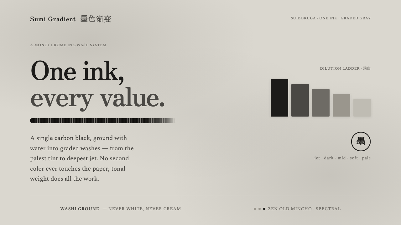 Sumi Grayscale GradientOne ink, every value. A single carbon black diluted into graded grays, marked…
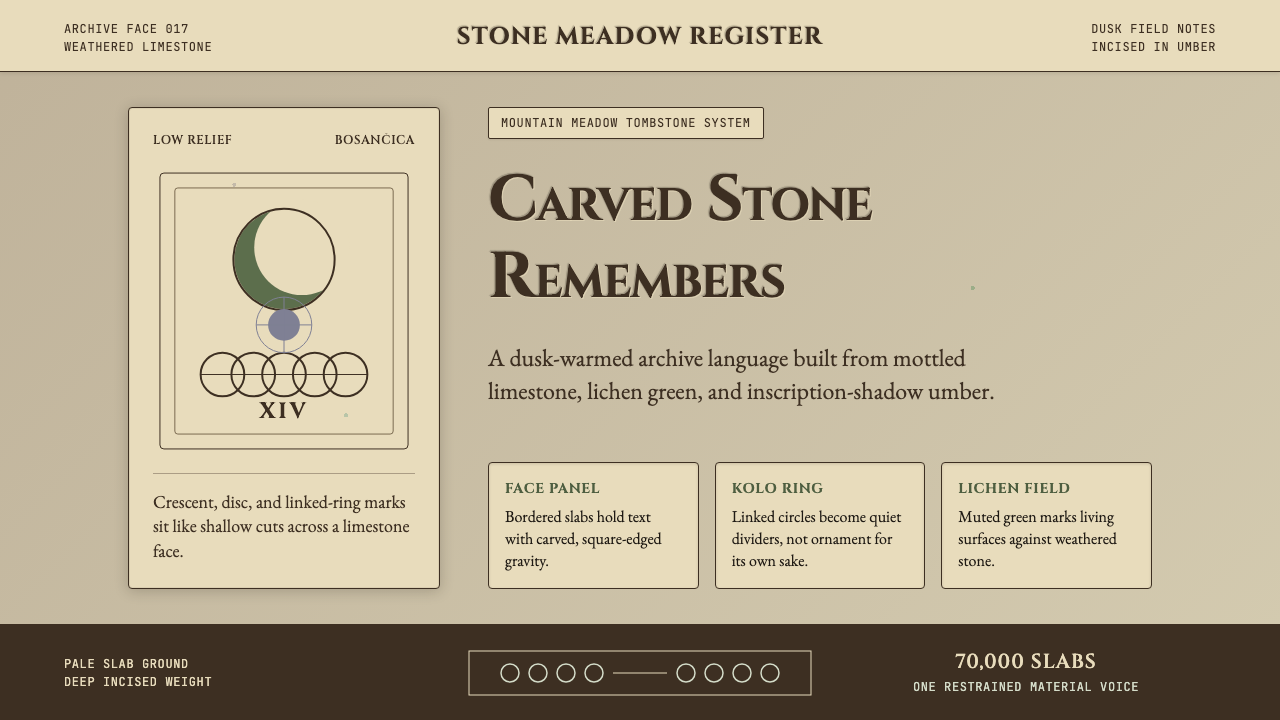 Bosnian Stećak Medieval TombstoneStone remembers quietly. Lichen green and Cinzel cuts sit on weathered limest…
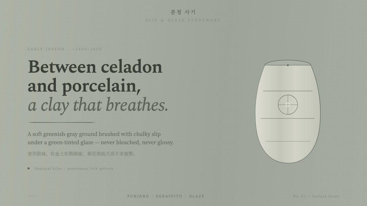 Buncheong Gray Slip WareBetween celadon and porcelain. Greenish-gray clay, chalky slip brushwork, dar…
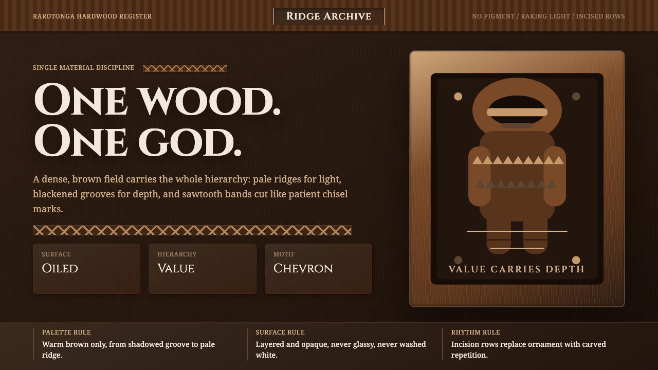 Cook Islands Tangaroa CarvingOne-material gravity. Warm browns, sawtooth rows, and raking light carve hier…
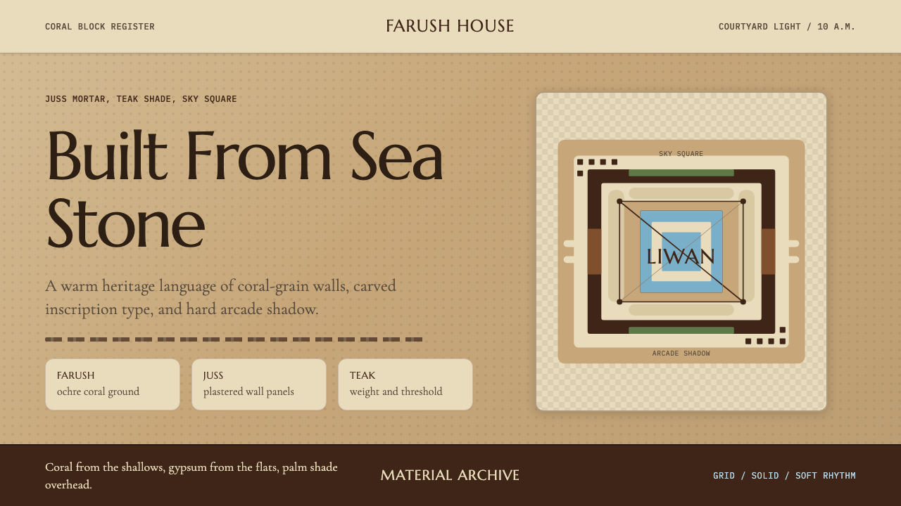 Emirati Bait Al Naboodah Coral HouseFeels built, not styled. Coral ochre, teak brown, and a sky-square courtyard…
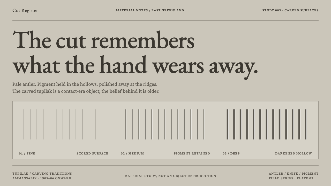 Greenlandic TupilakThe cut holds the pigment. Antler-grey fields, incised lines and quiet serif…