What is Voyager Golden Record?
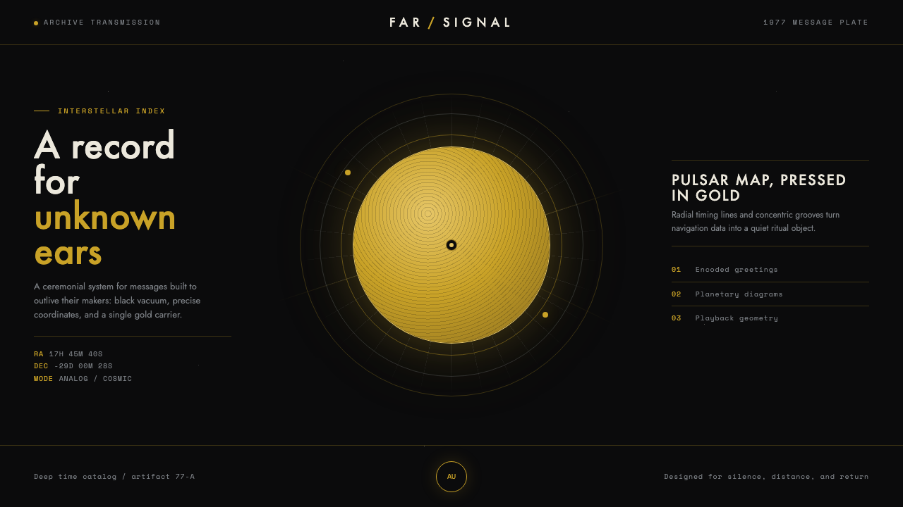
The Voyager Golden Record style sends silence across the void: a warm-gold disc, exacting diagram lines, and the disciplined darkness of interstellar space.
Voyager Golden Record in brief
The Voyager Golden Record is a gold-plated copper phonograph disc launched in 1977 aboard Voyager 1 and Voyager 2, conceived as a message in a bottle for interstellar space. Its visual identity begins with an unusually direct proposition: a durable physical object carries meaning through image, proportion, and diagram before any listener can hear what it contains.
The artifact’s aluminum cover carries a pulsar map, a hydrogen-atom diagram, and playback instructions. These are not illustrations in the decorative sense. They are compact scientific propositions, drawn with the restraint of a technical instrument: circles, radial marks, ruled paths, measured intervals, and symbols arranged to communicate across an unknown distance.
As a contemporary design system, Voyager Golden Record distills that tension between warmth and precision. A single luminous gold disc floats against matte black, while sparse engravings and geometric NASA-diagram lettering establish order around it. The result is dark, scientific, quiet, and deliberately free of visual chatter.
Where does Voyager Golden Record come from?
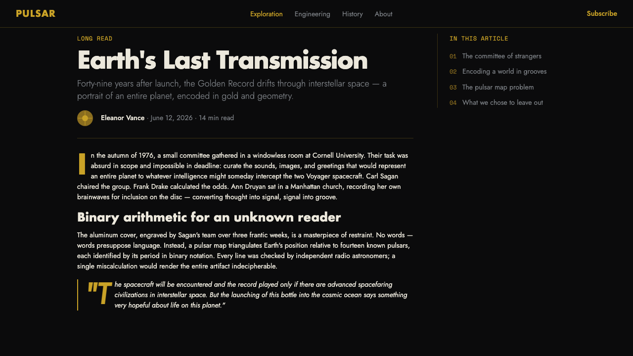
The style originates in the Voyager Golden Record itself, an artifact launched in 1977 on Voyager 1 and Voyager 2. Its setting matters: this was not a poster, a product package, or a screen interface. It was an object intended to travel through interstellar space, so its cover had to make meaning legible through durable marks rather than through contextual explanation.
Carl Sagan chaired the committee responsible for the record, with Frank Drake, Ann Druyan, and Jon Lomberg identified among its key figures. The approved visual language centers on the engraved aluminum cover and the compact set of scientific graphics placed on it. The design therefore belongs as much to communication design as to space exploration: it asks what can be understood when language, culture, and shared conventions cannot be assumed.
Its formal roots are space-age scientific illustration, geometric modernist diagram design, and pulsar cartography. Those influences converge in a vocabulary of circular systems, directional lines, radiating paths, and concise notation. The graphics are exact without becoming crowded; every mark appears to have an informational reason for being present.
The contemporary adaptation preserves the artifact’s essential contrast. Gold supplies a human, physical presence against a black field that reads as open space. Diagrammatic lettering and engraving-like lines prevent the gold from becoming luxurious ornament. It should feel less like jewelry and more like a carefully made instrument carrying a fragile human signal.
What defines the Voyager Golden Record look?
Gold on Void
The palette is governed by warm gold against matte black. Gold is the singular luminous object, not a general-purpose accent. Black should feel expansive and absorbent, allowing the disc and its markings to appear suspended rather than placed on a conventional background.
The Central Disc
A single circular record acts as the composition’s gravitational center. It is physical, calm, and unmistakable. Supporting elements should orbit, align with, or derive their logic from this disc rather than competing with it as separate visual attractions.
Compass-Precise Lines
Lines resemble engraved scientific notation: clean, sparse, geometric, and purposeful. Radial routes, arcs, ticks, and measured intersections communicate direction or relation. They should never become a decorative wireframe or a dense ornamental pattern.
Diagram Typography
Typography takes cues from NASA-style diagrams rather than expressive display lettering. Characters should feel engineered, clear, and spatially disciplined. Type serves identification, annotation, and hierarchy; it should read as part of the instrument panel, not as a separate personality layer.
Sparse Engraving
The system gains authority from what it withholds. Marks are isolated, given room, and grouped only when they form a readable system. Empty black space is not an unfinished area; it is the visual equivalent of distance, silence, and the unknown.
Matte Scientific Restraint
The style avoids cream grounds, soft atmospheric decoration, and ornamental richness. Its warmth comes from the gold disc, while its authority comes from matte surfaces and measured geometry. The emotional effect is contemplative rather than theatrical.
Who shaped Voyager Golden Record?
Sagan chaired the committee responsible for the Voyager Golden Record. In this design narrative, his importance lies in the record’s central premise: a human message can be compressed into an artifact whose visual instructions must remain meaningful beyond familiar earthly context.
Drake is named among the record’s key figures. The presence of scientific diagram language in the artifact makes his inclusion part of the style’s wider commitment to concise, structured communication rather than decorative storytelling.
Druyan is named among the record’s key figures. Within the visual system, that collective authorship matters: the gold disc is never merely a technical object, but a human message expressed through scientific means.
Lomberg is named among the record’s key figures. His association reinforces the artifact’s hybrid character, where visual composition, information design, and cosmic scale meet in a single engraved surface.
How do you use Voyager Golden Record today?
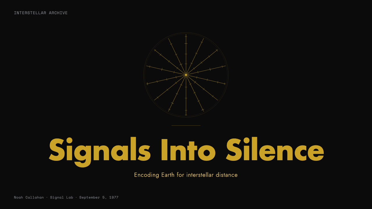
For presentation slides, treat the cover as a transmission into darkness. Let one gold disc or diagrammatic circular form establish the whole composition, then position the title as a precise annotation rather than a promotional slogan. Content slides should retain the black field and use sparse ruled lines to group ideas. Data slides work best when charts are simplified into orbit-like paths, radial relationships, or disciplined comparative marks rather than colorful business graphics.
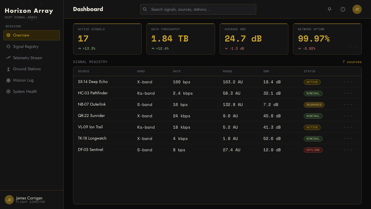
For web interfaces, this style suits dashboards, research tools, observability views, and pricing pages that benefit from calm authority. Use the central-disc logic as a hierarchy model: one primary metric, artifact, or action receives visual gravity while secondary information sits in quieter diagrammatic clusters. Navigation and controls should be terse, legible, and visibly aligned to an underlying system of lines and intervals.
For editorial and marketing work, Voyager Golden Record is strongest when the subject concerns discovery, archives, science, durable objects, or long-term ambition. A feature page can open with a gold object in a black field, then move through short annotations, sectional diagrams, and spacious text passages. Marketing should frame the product as a signal worth receiving, not overwhelm the reader with spectacle.
The common mistake is treating the style as generic black-and-gold luxury. That substitution loses its meaning immediately. Gold must behave like an artifact or signal, while diagram lines must carry real structure or explanation. Filling the page with metallic effects, decorative stars, crowded grids, or dramatic cosmic imagery turns interstellar restraint into theme-park space imagery.
Voyager Golden Record — FAQ
Is Voyager Golden Record style simply a black-and-gold visual theme?
No. Black and warm gold are the visible entry point, but the style depends on the relationship between an artifact, an unknown void, and purposeful scientific marks. If gold is used as luxury decoration or black is used merely for drama, the communication logic disappears.
Why is the central disc so important?
The disc is the system’s physical and conceptual anchor. It recalls the gold-plated copper phonograph record while giving the composition a single source of gravity. Without that concentrated object, the style can drift into a general technical diagram aesthetic.
Can the style use photographs or imagery?
It can, but imagery should remain subordinate to the artifact-and-diagram system. A photograph should be treated as evidence, an observed object, or an annotated specimen rather than as a cinematic scene. The cover’s scientific graphics set the preferred visual tone: concise, legible, and explanatory.
Where does this style work poorly?
It struggles where immediate warmth, playful abundance, or dense social energy is central to the experience. Its silence and distance can make everyday lifestyle, celebratory, or highly expressive work feel remote. It is best when the subject can credibly carry ideas of signal, inquiry, precision, and long duration.
Related design styles
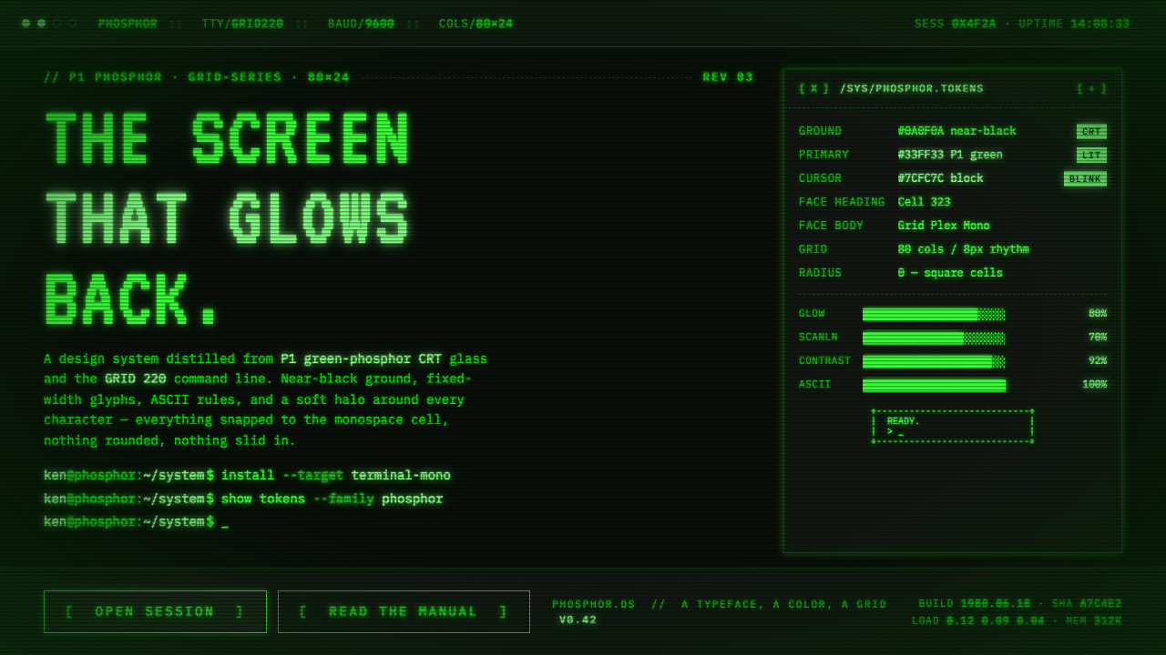 Unix Terminal MonoNear-black CRT glass that glows back. P1 phosphor green, VT323 mono, ASCII ru…
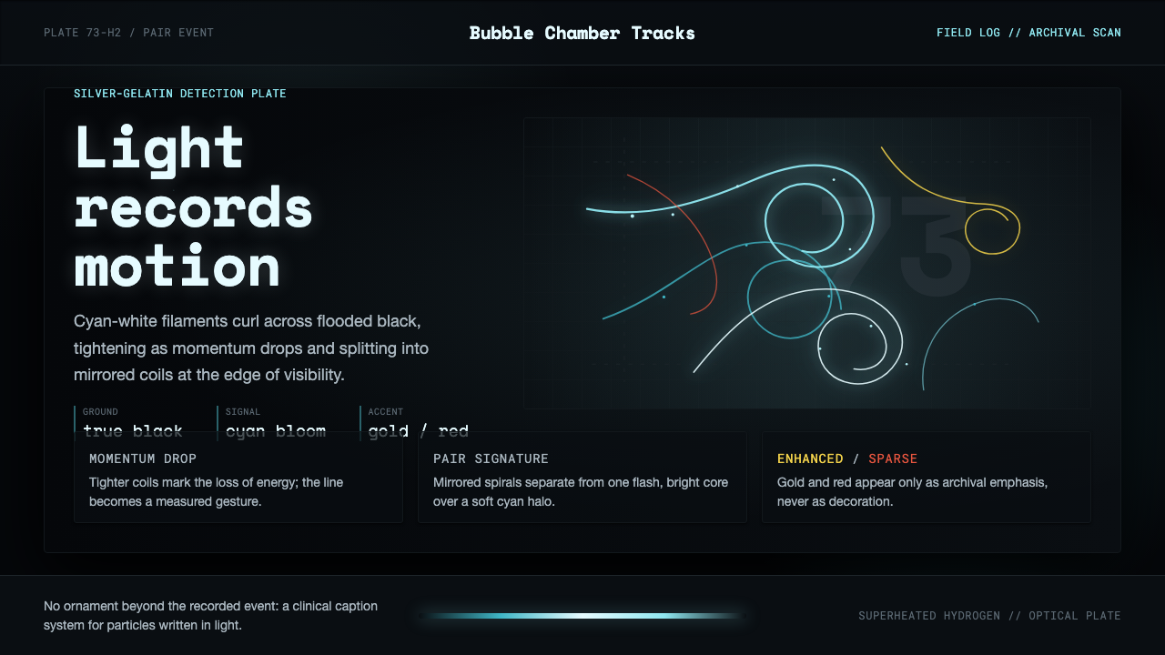 Bubble Chamber TracksPhysics becomes calligraphy. Cyan-white spirals glow on true photographic bla…
 Microfiche ArchiveRecords as lit frames in a matrix. Cyan-blue back-lit panel, glowing mono typ…
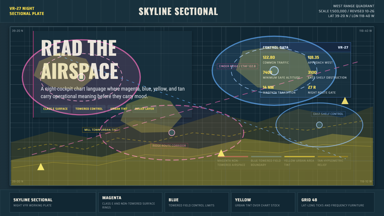 Aeronautical ChartReads like cockpit data. Magenta-blue airspace rings cut through dense dark-c…
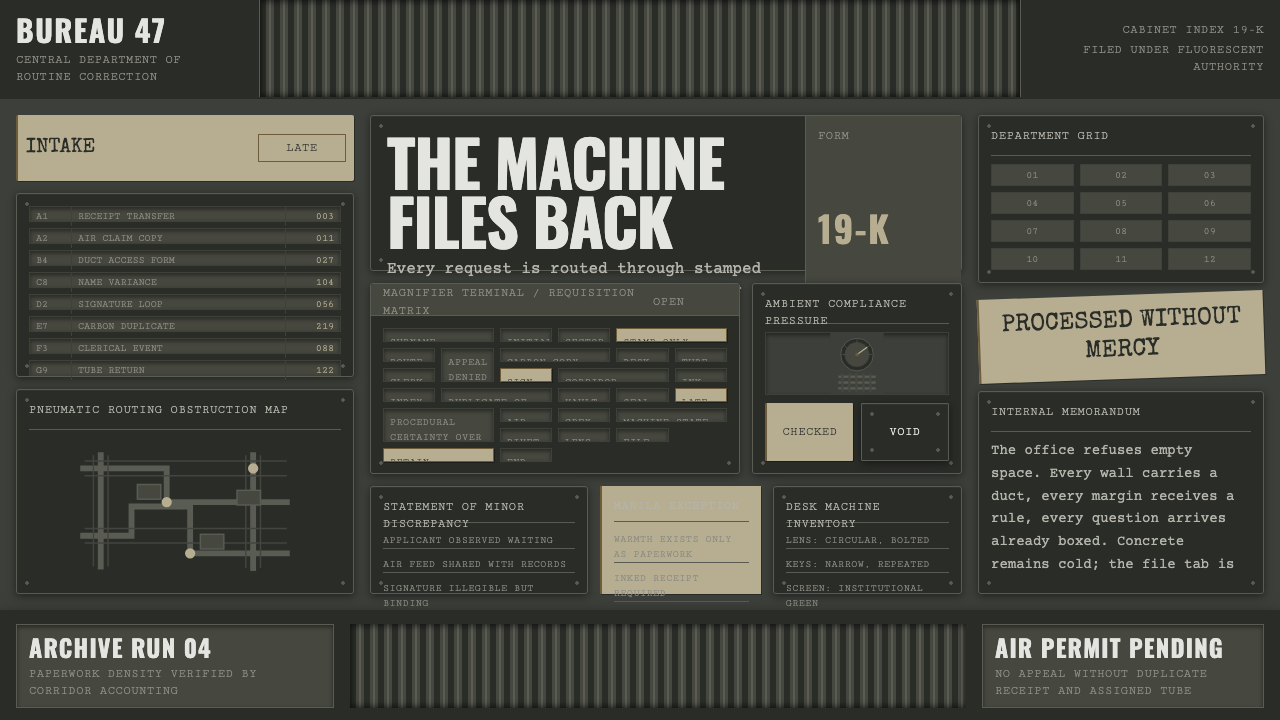 Brazil (1985)Bureaucracy turns hostile. Gray-green grids, duct bands, and manila stamps cr…
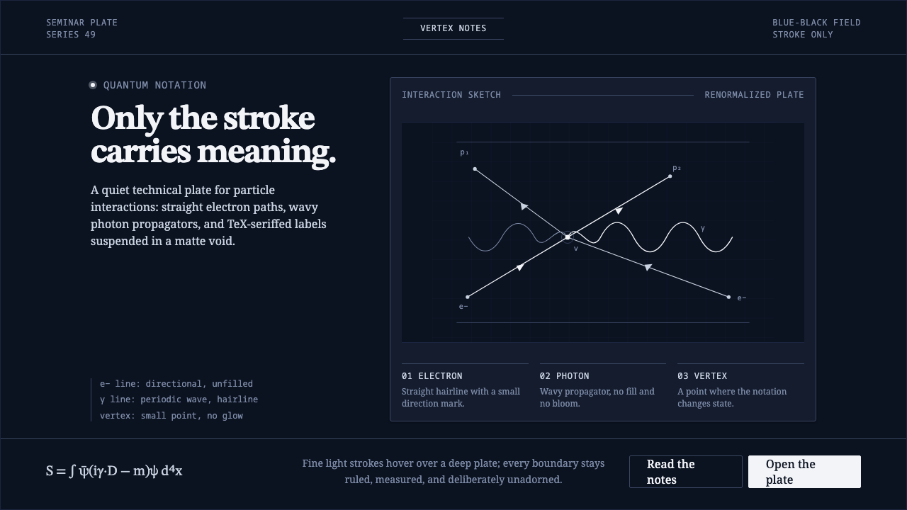 Feynman Diagram QEDMeaning reduced to strokes. Pale QED lines and TeX serif type float on blue-b…