What is Bubble Chamber Tracks?
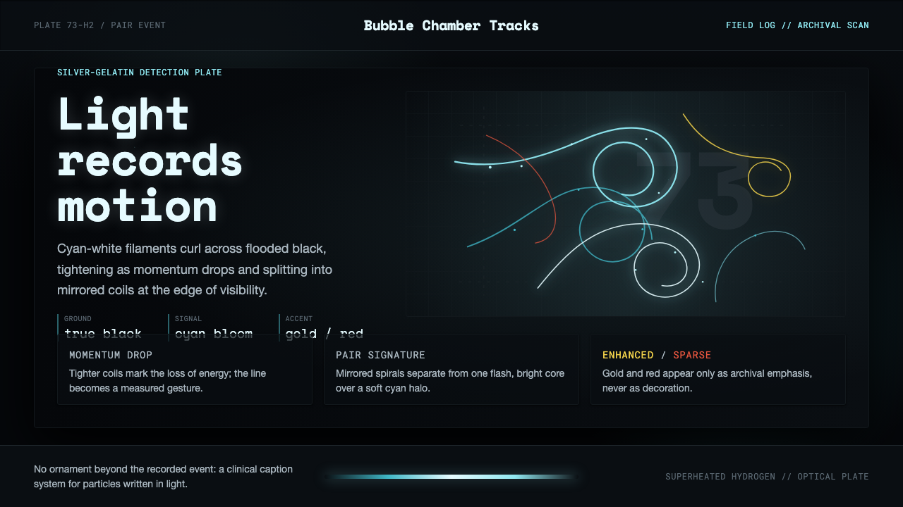
Bubble Chamber Tracks turns high-energy physics into calligraphy: cyan-white particle spirals glow across a true photographic black, with every curve preserving the evidence of motion.
Bubble Chamber Tracks in brief
Bubble Chamber Tracks is a visual language drawn from silver-gelatin plates produced by CERN’s Big European Bubble Chamber. Those plates recorded charged particles passing through superheated liquid hydrogen as luminous trails, making an invisible event legible through pale cyan-white filaments, broken arcs, and coils scattered across a flooded near-black field. The result is not an illustration of physics but a reading of a physical event.
Its central drama is kinematic. A trail curls tighter as momentum drops, while an electron-positron pair splits into mirrored coils under the influence of a magnetic field. Each curve therefore carries two identities at once: it is a measurable trace and a physical gesture, a line of evidence that also resembles handwriting.
The palette remains faithful to the plate: deep photographic black, glowing filaments, and sparse colour-enhanced accents in gold and red. Typography extends the same documentary logic. Clinical sans-serif lettering carries laboratory explanation, while monospaced labels identify measurements and archive records. Nothing is added merely to decorate the image; every mark should feel as though it belongs to the record.

Where does Bubble Chamber Tracks come from?
The story begins in 1952 with Donald Glaser’s invention of the bubble chamber, at the intersection of postwar accelerator physics and particle detection. The important shift was not simply technical. Bubble-chamber imagery gave high-energy events a visible vocabulary: paths could be examined as forms, compared as patterns, and read as evidence left in a material medium.
The style’s photographic character comes from silver-gelatin scientific photography. A plate is not a diagram drawn after the fact; it is a surface that receives the trace of an event. That distinction explains the visual authority of the theme. The black ground feels deep because it belongs to the photograph, while the luminous tracks feel discovered rather than illustrated.
CERN in Geneva provides the central institutional setting, with Berkeley forming the other geographic pole named in the source material. The Big European Bubble Chamber recorded charged particles moving through superheated liquid hydrogen. Magnetic bending turned their passage into curls, and particle pairs could appear as mirrored coils. The apparatus made physical behavior visible through the language of line.
The 1970s were the golden age associated with this visual world, and the BEBC became operational in 1973. Bubble Chamber Tracks translates that period’s scientific photography into a contemporary design system without removing its evidentiary character. Its darkness, glow, labels, and restrained accents all serve the same purpose: to preserve the feeling that the viewer is looking at a record recovered from an experiment.
What defines the Bubble Chamber Tracks look?
Photographic Black
The ground is true photographic black rather than a generic dark interface colour. It should feel dense, submerged, and capable of holding light. The black is not an empty backdrop; it is the medium from which the tracks emerge, giving every luminous filament the authority of a recorded event.
Cyan-White Luminescence
Cyan-white is the primary expression of the particle trail. Its glow should remain filament-like and concentrated, with brightness gathered along the path rather than spread as a decorative haze. The effect is luminous but clinical, closer to photographic exposure than to theatrical neon.
Kinetic Curvature
Curves are never arbitrary decoration. A trail tightens as momentum drops, so curvature becomes a visual account of changing physical conditions. The line may feel calligraphic, but its elegance comes from measured motion: each bend suggests force, resistance, and the passage of a charged particle.
Mirrored Pairing
The electron-positron pair introduces a disciplined form of symmetry. Two coils can face one another like a visual correspondence, but the pairing is meaningful because it describes an event. Symmetry should therefore feel discovered within the plate, not imposed as a decorative composition.
Clinical Typography
Explanatory text uses a clinical sans-serif voice borrowed from CERN laboratory documentation. Letterforms should be clear, restrained, and unemotional, allowing the imagery to carry the atmosphere. Headlines can be direct and declarative, while supporting text should read like a concise scientific annotation.
Monospaced Archive
Measurements, catalogue references, and archive identifiers belong to a monospaced register. The even rhythm of the characters suggests instrumentation and filing without turning the interface into a control panel. These labels are evidence of handling: they tell the viewer that the image has been observed, indexed, and preserved.
Sparse Chromatic Accents
Gold and red appear as colour-enhanced accents rather than competing palettes. They can distinguish a selected trail, a notable event, or a layer of interpretation, but they should remain rare. Their value comes from contrast with the cyan-white field and the photographic black, not from saturation or abundance.

Who shaped Bubble Chamber Tracks?
Donald Glaser is the origin figure named in the source material, whose invention in 1952 establishes the beginning of the bubble-chamber story. Within this design language, he represents the moment when particle detection acquired a visible, photographic form.
Luis Alvarez is named among the key figures of the theme and belongs to its Berkeley connection. His presence places Bubble Chamber Tracks within the wider geography of postwar accelerator physics, linking the laboratory image to a scientific culture that extended beyond CERN.
CERN in Geneva is the principal institutional setting of the visual language. Its laboratory context gives the imagery its documentary tone: the tracks are not abstract marks floating in darkness, but observations made, recorded, and preserved within experimental work.
The Big European Bubble Chamber, operational from 1973, is the central apparatus behind the theme. Its silver-gelatin plates and superheated liquid hydrogen connect the visual surface directly to particle detection, magnetic curvature, and the luminous trails that define the system.
How do you use Bubble Chamber Tracks today?
For presentation slides, the cover should establish the world immediately: true photographic black, a luminous cyan-white spiral, and a concise title that feels like a laboratory record. Content slides should let tracks carry the visual rhythm, using clinical sans-serif explanations beside the imagery and monospaced archive labels for measurements. Data slides can treat paths, coils, and event markers as the chart language itself, with gold or red reserved for meaningful distinctions.
For web dashboards, Bubble Chamber Tracks works best when the product already concerns experiments, measurements, archives, or complex systems. A selected event can glow more clearly than surrounding traces, while labels remain quiet and catalogue-like. Panels should feel embedded in the photographic field rather than floating as generic cards. The dark ground must preserve legibility and depth without turning the interface into a decorative science-fiction cockpit.
Pricing pages can borrow the system when the product has a technical, research-driven, or archival identity. Plan differences should be expressed through clear hierarchy and restrained accent colour, not through a collection of bright neon surfaces. A gold or red highlight can identify a recommended tier or important limitation, while cyan-white remains associated with the core product experience and the evidence of capability.
For editorial and marketing work, the style suits essays about science, technology, laboratories, archives, and the history of observation. A feature page can open with a large track image, follow with concise documentary captions, and use generous darkness to separate sections without ornamental dividers. Marketing campaigns should let the physical trace remain the hero: the message gains credibility when the visual feels recovered from a plate rather than manufactured as a mood.
The common mistake is to turn the theme into generic neon futurism. Too many glowing lines, loud gradients, decorative circuitry, or frequent red and gold accents destroy the photographic discipline. Another mistake is making the type playful or overly futuristic. The system depends on contrast between mysterious physical evidence and restrained laboratory language; remove either side and the work loses its identity.

Bubble Chamber Tracks — FAQ
Is Bubble Chamber Tracks a space or science-fiction style?
Not primarily. Its visual source is particle detection and silver-gelatin scientific photography, not imagined space travel. The darkness and glow may feel otherworldly, but the system should remain grounded in physical evidence: charged-particle trails, magnetic curvature, photographic black, laboratory typography, and archive notation.
Why must the background be true photographic black?
Because the ground is part of the source material’s identity. It recalls the photographic plate and gives the luminous trails somewhere to emerge from. A generic dark surface can make the work feel like an ordinary dark interface, while photographic black preserves the sense of depth, exposure, and recovered evidence.
How should gold and red accents be used?
They should remain sparse and interpretive. Use them to distinguish a selected trail, an important event, or a layer of colour enhancement, while keeping cyan-white as the main luminous language. If gold and red become frequent or dominant, they stop reading as meaningful annotations and begin to compete with the photographic record.
Why combine clinical sans-serif type with monospaced labels?
The two voices separate explanation from record-keeping. Clinical sans-serif type carries laboratory description in a clear, restrained tone. Monospaced lettering gives measurements and archive identifiers an indexed, instrument-like rhythm. Together they support the theme’s central tension between poetic tracks and disciplined observation.
What kind of product suits this style best?
It suits products and editorial work concerned with science, measurement, archives, experiments, technical systems, or the history of observation. It is less convincing when the goal is softness, warmth, or decorative abundance. The style asks the audience to look closely at evidence, so its strongest applications are those that can give the imagery and its labels a genuine subject to describe.
Related design styles
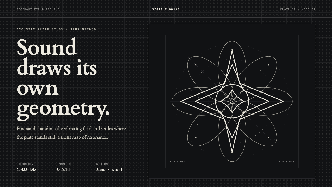 Chladni Acoustic FiguresSound becomes geometry. Bone-white nodal lines settle with exact symmetry on…
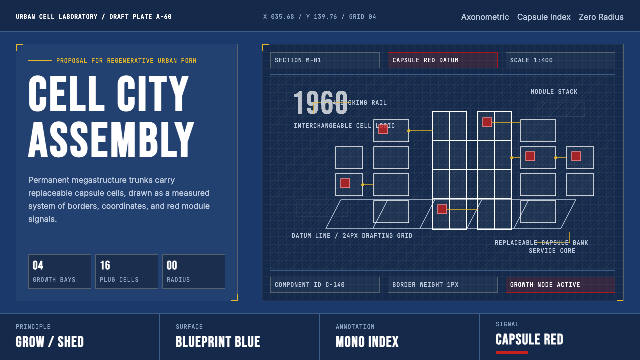 Metabolism Tokyo (1960)Cities become diagrams. Blueprint blue, mono labels, and capsule red mark mod…
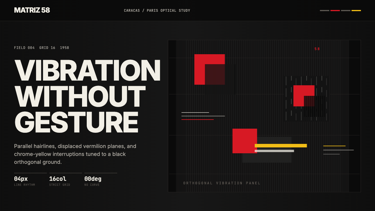 Venezuelan Cinético Soto 1958Optical tension holds still. Matte black, Inter, hairlines, and vermilion off…
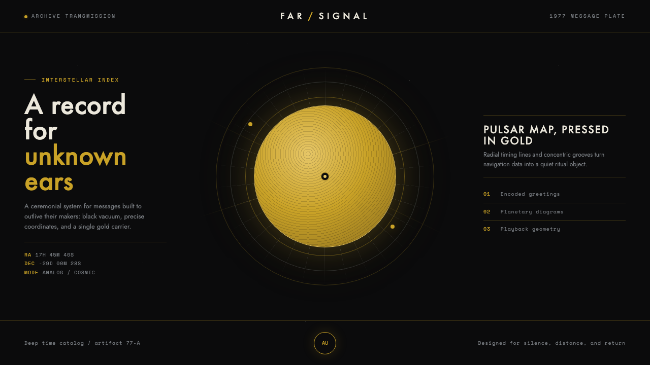 Voyager Golden RecordSends silence across the void. Warm gold on matte black, with compass-precise…
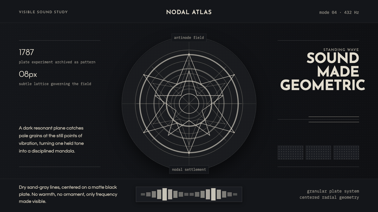 Cymatics Standing WaveSound becomes geometry. Sand-gray nodal rings settle on a dark resonant plate.
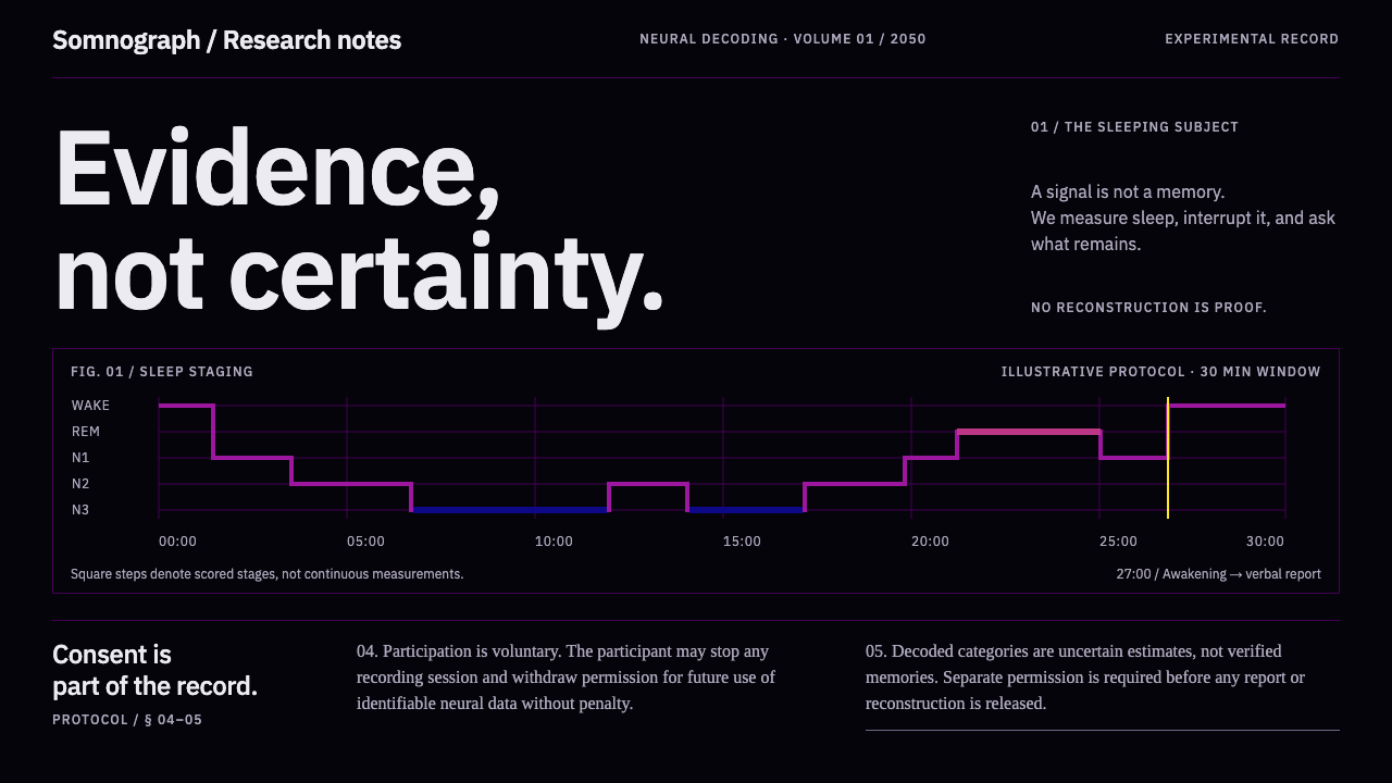 Dream Recording LabEvidence, not certainty. Plasma sleep-stage traces on black; consent stays fu…