What is Chladni Acoustic Figures?
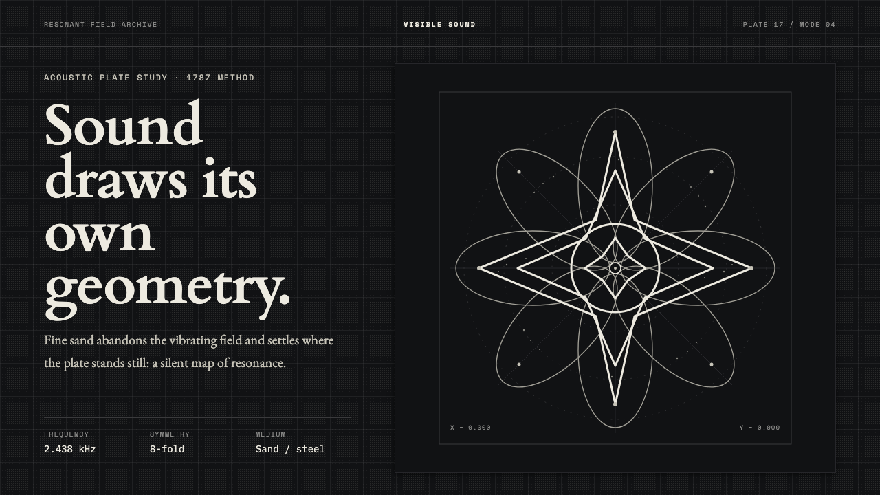
Chladni acoustic figures turn sound into geometry — bone-white nodal lines settling with exact symmetry on a near-black plate.
Chladni Acoustic Figures in brief
Chladni acoustic figures are visual records of sound made visible. When Ernst Chladni bowed the edge of a sand-dusted metal plate, vibration moved through the surface and the sand fled the active antinodes. It settled instead along the still nodal lines, revealing the hidden structure of standing waves as stars, rosettes, and grids.
As a design language, the system takes that physical image literally. Its surface is a near-black plate; its drawing is warm bone-white sand; its supporting tones are restrained gray. The composition is centered, austere, and measured. There is no decorative color system competing with the figure, no ornamental surface treatment, and no simulated atmosphere. The visual interest comes from symmetry, density, and the precise boundary between motion and stillness.
The result feels both scientific and ceremonial. A Chladni-inspired interface or page should appear as though it is displaying a phenomenon rather than decorating a surface. Every curve, axis, and repeated branch suggests an underlying vibration. The style is quiet but not empty: darkness establishes the field, the pale figure carries the message, and geometry provides the hierarchy.

Where does Chladni Acoustic Figures come from?
The documented origin of the system is 1787, in Leipzig, Germany, during the Enlightenment era of experimental physics. Ernst Chladni bowed the edge of a metal plate covered with fine sand and observed the pattern produced by vibration. The experiment made an invisible acoustic condition legible through movement: sand left the places that were vibrating strongly and gathered where the surface remained still.
This was an early contribution to experimental acoustics and to the visualization of sound and standing waves. The importance of the image lies in its directness. Nothing is drawn by hand to imitate a wave. The plate, the vibration, and the sand establish the picture through physical behavior. What appears is therefore both an image and evidence, a geometric arrangement produced by the event it records.
The resulting figures belong to a visual world of organized repetition. Symmetric stars, rosettes, and grids emerge from a process that begins with sound but ends in structure. Their beauty is not separate from their explanatory value. The pattern is compelling because it gives form to an otherwise inaccessible phenomenon, allowing the viewer to read stillness, vibration, balance, and recurrence in a single surface.
The design style preserves that relationship between method and appearance. It does not borrow the figures as generic decoration while ignoring their origin. Near-black fields recall the dark plate, bone-white marks recall the settled sand, and gray provides the subdued register of an instrument or laboratory surface. The overall discipline is intentionally narrow: sound becomes geometry, and geometry remains visibly tied to the experiment that produced it.
What defines the Chladni Acoustic Figures look?
Monochrome Discipline
The palette is held to near-black, bone-white, and restrained gray. Black establishes the plate-like field, bone-white carries the figure, and gray supports secondary information without creating a competing focal point. The limited range gives every pale mark unusual authority and keeps the design tied to the physical contrast between dark metal and settled sand.
Nodal Geometry
The primary marks should feel like nodal lines rather than illustrations of sound. Curves, crossings, radial branches, and enclosed fields are arranged as the visible residue of vibration. The geometry may be intricate, but it should never feel improvised. Repetition and correspondence imply that an unseen physical rule is governing every turn.
Centered Symmetry
Composition is organized around a stable center. Symmetry does not mean lifeless duplication; it creates a calm frame in which the internal complexity of the figure can be examined. Titles, controls, and supporting text should respect that centered logic, allowing the acoustic form to remain the unmistakable subject.
Plate and Sand
The surface relationship is essential. The background should read as a dark plate, while the pale marks should appear deposited, traced, or settled onto it. This does not require literal texture. The impression can come from contrast, density, and the careful treatment of edges, so the figure feels physically present without becoming tactile or illustrative.
Measured Density
A figure can be open and airy or tightly woven, but its density should feel intentional. Empty space is not leftover room; it is the quiet field that makes the nodal lines legible. Dense clusters belong near the visual event, while labels and controls should remain sparse enough to preserve the sense of an observed phenomenon.
Austere Precision
The style avoids expressive excess. No ornamental flourishes, decorative color, or atmospheric effects should soften the logic of the figure. Hierarchy comes from placement, contrast, scale, and the relationship between silence and activity. The mood is not hostile; it is focused, like a quiet demonstration whose authority comes from what can be seen.

Who shaped Chladni Acoustic Figures?
Chladni is the central figure of the system and the experimenter whose work made the visual language possible. In 1787, in Leipzig, he bowed the edge of a sand-dusted metal plate and observed sand gathering along still nodal lines. His method connected sound, vibration, and visible geometry in a single documented event.
Chladni represents the observational discipline behind the figures. The patterns are not arbitrary symbols for music; they are forms produced when material responds to vibration. This distinction gives the style its unusual authority and explains why its geometry should remain centered, measured, and visibly related to the plate.
Chladni also gives the system its defining bridge between early experimental acoustics and visual communication. His figures let viewers read standing waves through stars, rosettes, and grids. Any contemporary adaptation should preserve that bridge: the image must suggest a phenomenon being revealed, not a motif added for visual richness.
How do you use Chladni Acoustic Figures today?
For presentation slides, use the acoustic figure as the organizing instrument. A cover can place one centered rosette or star against a near-black field, with the title kept quiet and clearly subordinate to the form. Content slides should preserve generous darkness and use bone-white text sparingly. Data slides can treat charts as measured wave traces or nodal arrangements, but the data must remain readable before the metaphor becomes noticeable.
For web interfaces, the style suits dashboards and pricing pages that need a composed, analytical atmosphere. A near-black surface can hold a central visualization, while gray labels and bone-white active states establish a restrained hierarchy. Cards should feel like plates or instrument panels rather than floating objects. Pricing tiers can be separated through spacing, line structure, and tonal contrast, with the pale accent reserved for the selected or most important state.
For editorial and marketing work, Chladni figures work best when the page behaves like an observation sheet. Lead imagery can occupy a quiet central field, while the article title, metadata, and explanatory copy sit around it with deliberate restraint. Marketing pages can frame a product or idea as something being measured, revealed, or brought into focus. The visual voice is strongest when the copy is precise and the image is allowed to carry wonder without theatrical effects.
For slides and interfaces alike, motion should be treated as a change in state rather than decoration. A figure may appear to settle, clarify, or resolve, but the final composition should remain still enough to inspect. Interaction can reveal layers of a pattern or move between related forms while preserving the same dark field and pale geometry. The system works when every transition reinforces the idea of sound becoming structure.
The common mistake is to treat the style as a generic dark theme with decorative line art. Adding neon colors, glowing effects, soft atmospheric haze, random waveform graphics, or many unrelated patterns breaks the relationship between plate, sand, and vibration. Another mistake is allowing the figure to become so intricate that it overwhelms the information. Keep the palette narrow, the composition centered, and the geometry purposeful.

Chladni Acoustic Figures — FAQ
Are Chladni acoustic figures simply decorative geometric patterns?
No. Their defining quality is that the geometry refers to a physical process: sand leaves vibrating antinodes and settles along still nodal lines on a metal plate. A contemporary design may simplify the image, but it should preserve the impression that the pattern is the visible result of vibration rather than an arbitrary ornament.
Why is the palette so dark and limited?
The near-black field recalls the metal plate, while bone-white marks recall the sand that settled on its surface. Restricting the supporting tones to gray keeps attention on the figure and protects its measured, laboratory-like clarity. More color can be introduced in a contemporary product, but it changes the visual system and should not be mistaken for the core language.
Does every composition need to be perfectly symmetrical?
Not necessarily, but centered symmetry is the strongest starting point because it reflects the organized figures associated with the experiment. Small asymmetries can support hierarchy or interaction, provided they do not make the composition feel casual or break the sense of an underlying rule. The viewer should still feel that the form is governed rather than improvised.
How should imagery be handled in a Chladni-inspired layout?
Imagery should be treated as an observed figure on a plate. Use clear silhouettes, centered arrangements, controlled contrast, and enough surrounding darkness for the geometry to remain legible. Avoid imagery that introduces unrelated texture, scenic atmosphere, or decorative color. The strongest image is one that appears to reveal a structure already present in the field.
What kinds of products suit this style best?
It suits products that value observation, structure, analysis, and quiet authority, especially dashboards, scientific or educational tools, pricing systems, and editorial experiences built around explanation. It is less suitable when the product depends on warmth, playful abundance, or rich sensory texture. The decision should follow the product's character: Chladni works when the experience should feel measured, focused, and revealing.
Related design styles
 Bubble Chamber TracksPhysics becomes calligraphy. Cyan-white spirals glow on true photographic bla…
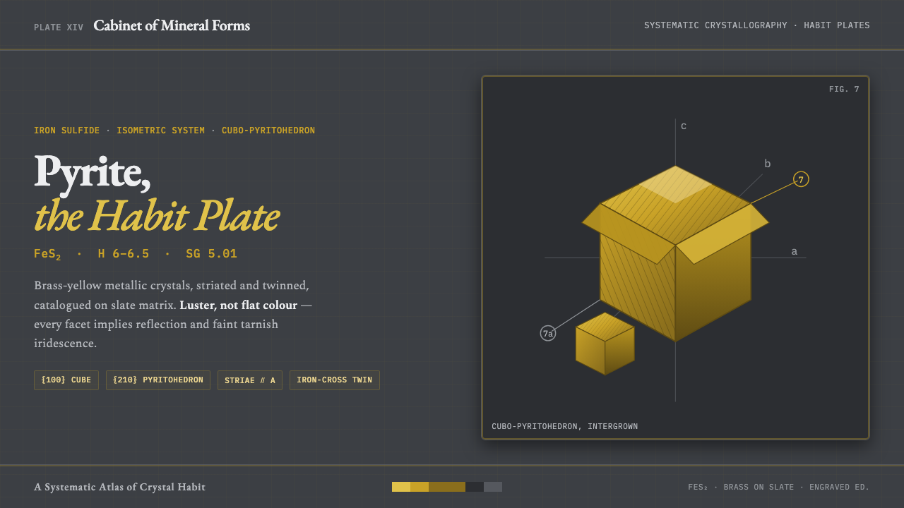 Pyrite Crystal HabitFool's gold under the loupe. Striated brass pyritohedra on slate, serif names…
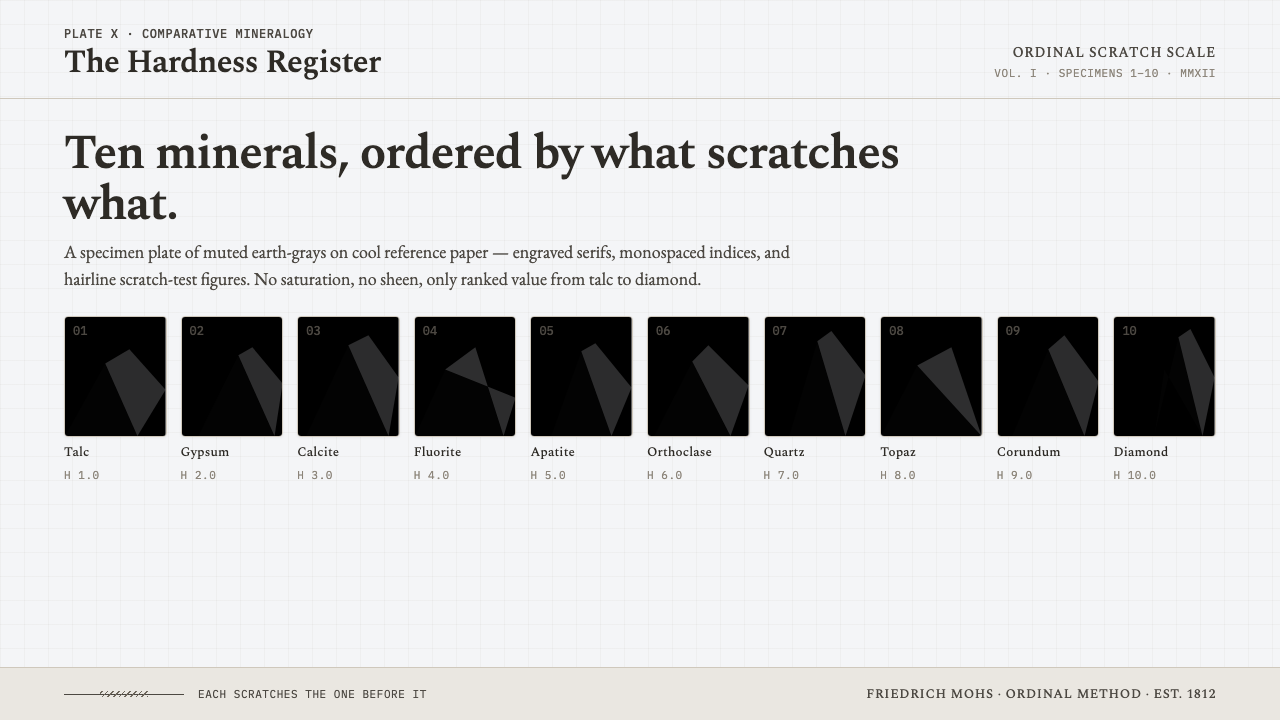 Mohs Hardness ScaleRanked by what scratches what. Ten mineral-gray chips on cool chart-white, en…
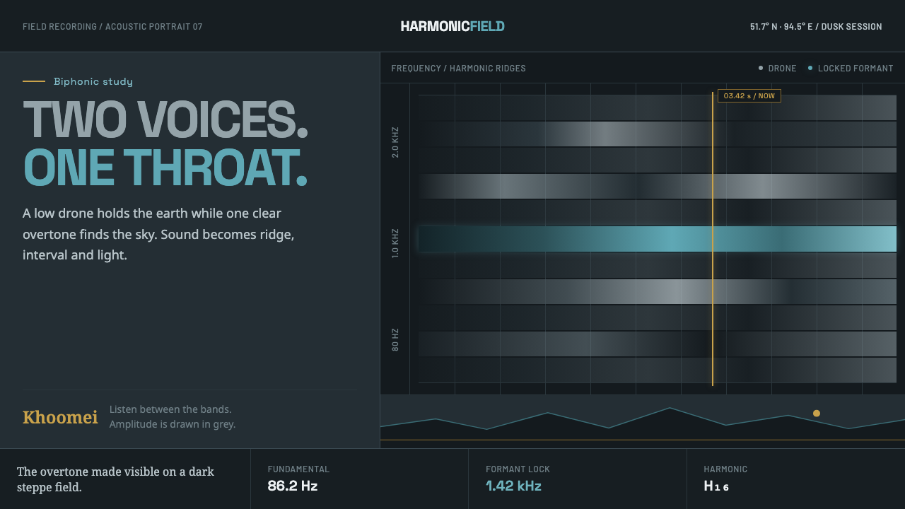 Tuvan Khoomei Throat-Song VizThe overtone becomes terrain. Grey harmonic ridges glow cyan over a slate-dar…
 Armenian Vishapakar Dragon StoneAncient, cold, unmoved. Basalt gray slabs, incised grooves, sparse olive lich…
 Cloud Atlas PlateObservation becomes atmosphere. Gray-blue wash, soft clouds, and sepia Latin…