What is Voroneț Blue?
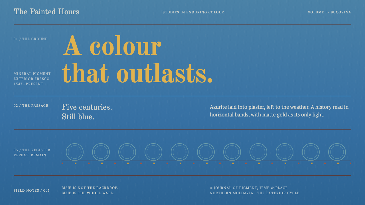
Voroneț Blue treats a whole page the way a sixteenth-century Moldavian painter treated a church wall — one unbroken field of azure, ruled into registers, with matte gold held back for the halos.
Voroneț Blue in brief
Voroneț Blue is a design language drawn from the west wall of the church of St George at the Voroneț monastery in Bucovina, northern Romania. That wall carries a Last Judgement painted in 1547, and the first thing a visitor registers is not a figure or a scene but a colour: a deep, saturated blue that fills the wall like a single sheet of cloth. The pigment is azurite, identified on site by Raman spectroscopy, and it has stood outdoors for roughly five centuries without going grey. Romanians give the colour its own proper name and mention it in the same breath as Veronese green and Rubens red.
As a visual system it makes one decisive move: the azure is the page, not a panel placed on the page. Everything else is organised against that field. Content stacks in hard horizontal registers, the way the Last Judgement itself is stacked in bands of saints and a river of fire, and each register is divided from the next by a plain red-brown rule. Figures stand frontal on a shared ground line, and size follows rank rather than perspective.
The palette is deliberately short. Azure supplies the ground, a hard red-brown draws the lines, and matte gold — opaque, never metallic — marks what is holy: the halo on the wall, the headline or the key figure on the page. It is a dark theme in the sense that the ground is a deep colour, but its contrast comes from pigment set against pigment, not from light set against a void.

Where does Voroneț Blue come from?
The church of St George at Voroneț was founded in 1488 under Stephen III the Great, ruler of the Principality of Moldavia, in the region of Bucovina that now lies in Suceava County, northern Romania. For close to six decades the building stood without the exterior that would make it famous. The wall that gives this style its name came later, and it came as a deliberate act of patronage rather than as an accident of weathering or restoration.
In 1547 the exterior fresco cycle was painted, and the west wall received the Last Judgement. The name usually attached to that campaign is Grigorie Roșca, the churchman associated with the exterior decoration. A fresco in the strict sense is painted into the wall's fresh plaster, so the image and the masonry become one body; there is no picture hanging on a surface, only a surface that has been coloured. That fact is the root of the design logic here: the ground and the image are the same material, which is why the system refuses to treat the blue as a background behind the content.
Painting the outside of a church is the signature of Moldavian practice. Much of the Orthodox world kept its images inside, but in Moldavia the façades were turned into open-air picture books that could be read from outside the building, and the group of buildings now known as the Painted Churches of Northern Moldavia shares that habit. Art historians describe the tradition as post-Byzantine: it keeps the Byzantine grammar of frontal saints, strict hierarchy and horizontal bands, but applies it to a new surface, in a new climate, for a new audience. Voroneț is the example in which that grammar is most completely given over to a single colour.
The colour is also a small scientific mystery. Azurite, a mineral blue, was confirmed in place by Raman spectroscopy, yet the medium that bound it has not been named, and the question of why this blue survived five hundred years of weather when other outdoor blues faded remains partly open. That gap is part of the colour's reputation. A designer using the style is therefore borrowing something between a pigment and a legend: a blue that has become a proper noun in its own country.
What defines the Voroneț Blue look?
Azure as the Page
The defining move is that the blue is the whole surface, edge to edge, rather than a header band or a hero panel. It reads as a mineral blue — deep, matte and slightly cool — and every other element has to be justified against it. Because there is no white page for the blue to sit on, there is no tonal ladder of tints to climb down; hierarchy comes from placement, rule and gold rather than from stepping the blue lighter or darker.
Hard Horizontal Registers
Content is arranged in stacked bands that run the full width of the layout, the way a Last Judgement is read from the heavens down to the river of fire. Each register has a single job — a heading and its row of items, a figure and its caption — and bands do not overlap, float or cantilever. The page therefore scans top to bottom in clear steps, and a reader can always tell which band they are in.
Red-Brown Rules
Registers are separated by plain, hard rules in a red-brown earth tone. They are not decorative borders and they carry no ornament, gradient or glow; they are the visual equivalent of a painted band between two scenes. The rule is the only structural device the system allows, which means it does the work that cards, boxes and shadows would do elsewhere.
Matte Gold, Never Metallic
Gold is the single bright note and it is treated as a pigment, not as a material. It is opaque and flat, the way a painted halo is, with no highlights, no bevel and no shimmer. Because it is rare, it carries rank: it marks the title, the one figure that matters, the active state. The moment gold appears in more than a few places, or acquires a metallic gradient, the halo logic is lost.
Frontal Figures on a Shared Ground Line
Subjects, whether saints in the original or images and cards on the page, face the viewer squarely and stand on one common baseline within a register. There is no depth recession and no staggered, overlapping arrangement. This frontality gives a ceremonial, iconic calm: each thing is presented, not caught in action.
Scale by Rank
In the painted wall, size follows importance, not distance. A holy figure is large because it is holy; lesser figures are smaller regardless of where they stand. Translated to layout, this means the biggest element is the most important one, and relative size is a statement of rank, never an effect of perspective or a decorative flourish.
Serif Inscription Type
Lettering is set in a serif with the authority of an inscription, rendered in matte gold against the azure. Headings behave like painted captions on the wall: short, upright and sparing. Body copy stays calm and legible and avoids ornamental effects, because on a dark, saturated ground the letterform itself has to carry the dignity that a decorated border might supply elsewhere.

Who shaped Voroneț Blue?
Ruler of the Principality of Moldavia and founder of the church at Voroneț in 1488. His patronage is the reason there is a wall at all, and his reign sits at the centre of the late-medieval Moldavian court culture in which this church-building tradition took shape. In the design system he stands for the foundation beneath the image: the structure that has to exist before any ornament can.
The churchman usually associated with the 1547 exterior fresco cycle, including the Last Judgement on the west wall. His name anchors the second chapter of the building's life, when a finished church was turned into an open-air image. It is this campaign that supplied the wall, the azure and the register structure that the design system borrows.
A team of painters, as work on this scale required, laid the Last Judgement directly into the wall's fresh plaster and achieved a blue that has outlasted five centuries outdoors. Their craft is the real subject of the style: choosing a mineral pigment, committing to one dominant colour and organising an enormous narrative into disciplined bands. The design system honours that collective discipline rather than any single signature.
How do you use Voroneț Blue today?
Voroneț Blue is a strong, narrow-purpose style, and it rewards designers who take its rules at face value. It is not simply blue with gold accents. It is a way of organising a surface: one colour owning the whole field, content hung in bands, and a single precious note used to say that something matters. Treat those three decisions as the system, and the colours as their consequence.
For presentation slides, let the azure run edge to edge with no frame. On a title slide, set the heading in matte gold serif in the upper part of the slide and divide the page with one red-brown rule so the layout already reads as a register. Content slides work best as two or three stacked bands, each with its own heading line and a quiet rule beneath; avoid cards, floating panels and soft shadows. Data slides suit horizontal bar charts, timelines and tables, because these already behave like registers, with items standing on a common line. Reserve gold for the one number or phrase the audience must remember.
For web interfaces, the style suits documentation, archives, heritage and museum sites, reading apps and any dashboard that wants a calm, ceremonial tone. Make the page background the azure itself and separate sections with full-width red-brown rules rather than boxes. The navigation can sit as a top register; pricing tiers or feature lists can be stacked as bands instead of arranged as cards in a grid. Mark interactive states with gold, used as sparingly as halos are on the wall, and let hover change line or lettering rather than adding glow. Because the ground is dark, body text needs a generous size, open line spacing and a warm, pale tone rather than stark white.
For editorial and marketing work, the style gives a reverent, heritage voice: long-form essays, exhibition catalogues, announcements from cultural institutions, restoration and craft stories, and products with a provenance narrative. Place images as frontal, centred subjects inside a band instead of bleeding them across the page in cinematic sweeps, and treat pull quotes as inscriptions in gold serif. In landing pages the register structure doubles as a storytelling device, because each band can be exactly one beat of the argument.
The most common mistake is to use the blue as a panel colour on a white page, which reverses the logic of the wall. The second is to render the gold with a metallic gradient or glow, which turns a matte pigment into game-interface trim. A third is to over-use gold: if half the page is gold, nothing is a halo any more. Finally, mixing in a bright neon or pastel blue as an accent breaks the single-pigment effect; the point is that every blue on the page is recognisably the same mineral.

Voroneț Blue — FAQ
Why is the entire page blue instead of just a hero section?
Because the source is a wall, not a banner. On the west wall at Voroneț the azure is the ground that every figure, band and inscription stands on, and the image and the plaster are one body. A blue hero section on a white page makes the blue a decoration; making it the page makes it the world the content lives in. That is the difference between a blue brand colour and Voroneț Blue.
Is this a dark theme, and does it need a light version?
It is classed as a dark-ground style, but its darkness is a deep saturated colour rather than black. A faithful light version does not really exist: lightening the azure or putting it on a white page discards the premise. If you need a light variant for accessibility or printing, treat it as a different style that borrows the register structure and the red-brown rules, and keep the original as its own dark specimen.
How is it different from an ordinary dark-blue corporate interface?
A corporate navy interface uses blue as a brand colour layered with cards, soft shadows and gradient buttons. Voroneț Blue uses the blue as a single flat pigment, builds hierarchy with full-width bands and hard rules rather than boxes, keeps gold matte and rare, and forbids light simulation. It feels closer to a manuscript page or an inscription than to a SaaS dashboard, even when it is used for one.
Can it handle data-heavy screens and long tables?
Reasonably well, if the data is arranged the way the style prefers. Tables, timelines and horizontal bar charts all map naturally onto registers, and the red-brown rule is an effective row separator. Where it struggles is multi-series charts that need many distinguishable colours, since the palette is intentionally short. In those cases lean on position, labels and line weight rather than introducing extra hues, and keep gold for the single series or value that matters.
Why must the gold be matte and not metallic?
On the wall the gold is a painted halo: an opaque, flat shape that says holiness through placement and rarity, not through reflection. A metallic gradient imitates a physical material catching light, and that brings back the very light simulation the style avoids. Flat gold also stays legible as lettering on the azure and reproduces consistently across screens, print and projectors, where gradients tend to band or wash out.
Related design styles
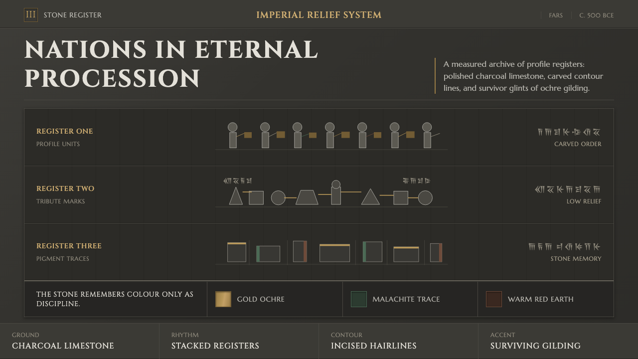 Achaemenid Persepolis ReliefImperial restraint in stone. Charcoal registers carry ochre, green, and red p…
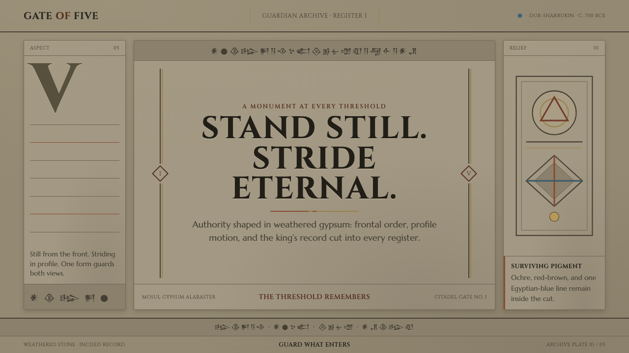 Assyrian Lamassu ReliefAuthority carved into silence. Buff-gray stone, monumental capitals, and cune…
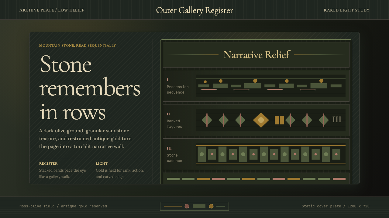 Cambodian Angkor Bas-ReliefStone speaks in shadow. Olive registers and antique gold carve a torchlit arc…
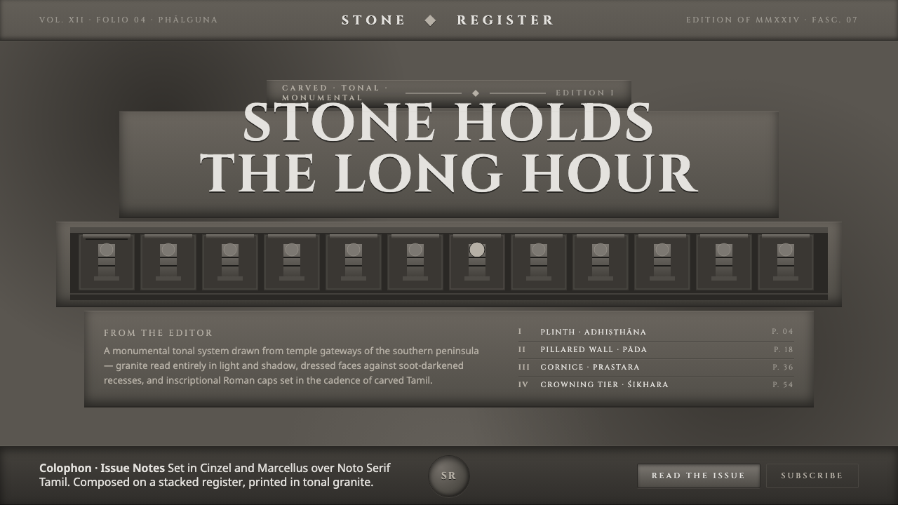 Dravidian Granite GrayscaleRead entirely in grayscale. Soot-dark recesses against dressed granite, Cinze…
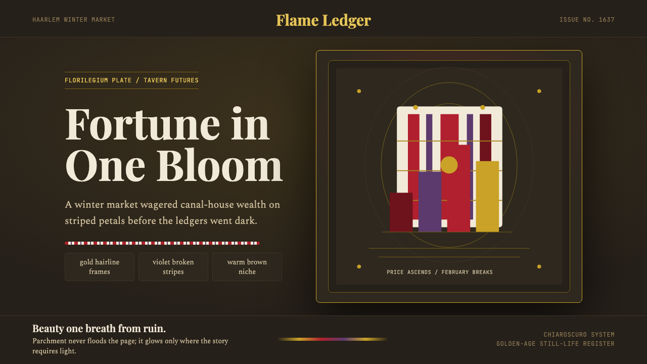 Dutch Tulip ManiaSpeculation burns in shadow. Flame red petals, violet stripes, gold frames on…
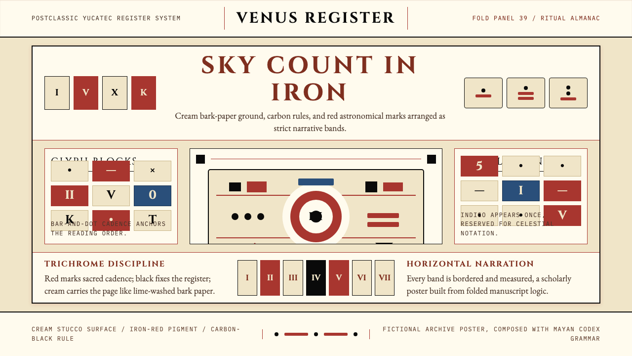 Mayan Dresden CodexSacred astronomy, measured. Cream registers, iron-red glyphs, carbon rules.