What is Visayan Pintados?
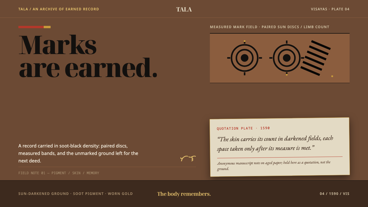
Visayan Pintados treats the page as skin — a dark, sun-browned ground where soot-black marks accumulate as deeds accumulate, and a single aged sheet of paper is admitted only as a quotation.
Visayan Pintados in brief
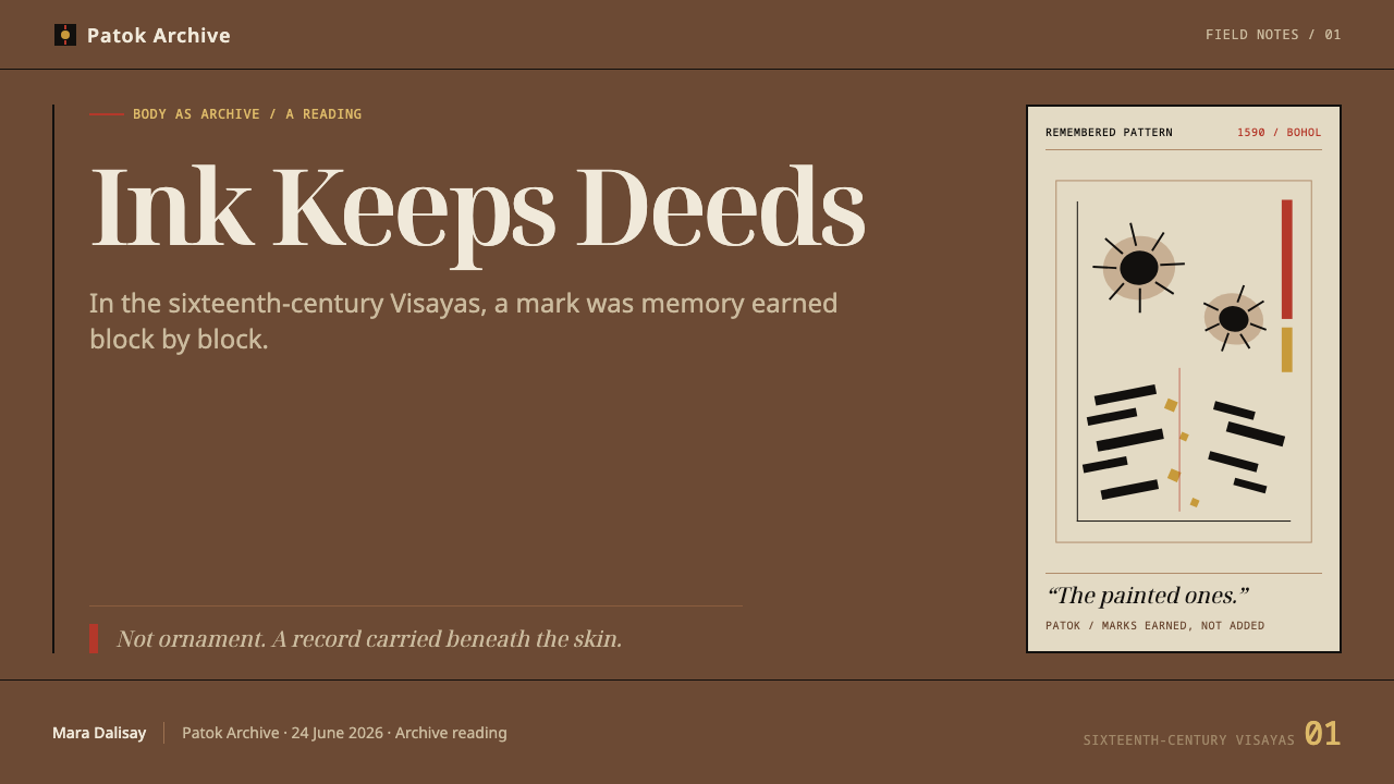
Visayan Pintados is a design system drawn from the tattooing tradition of the Visayan islands in the central Philippines, as Spanish observers met it in the sixteenth century. Its visual language is a dark, sun-browned ground carrying soot-black marks — paired sun discs, banded runs, dense and uneven clusters — with one framed plate of aged paper set inside the composition as a quotation from a manuscript dated 1590.
The founding idea is that a record can be worn rather than displayed. On an ordinary page, content sits on top of a neutral surface. Here the surface is part of the subject: the ground is skin, the content is what has been earned onto it, and density is a measure of accumulated history. Where there is more to record, the marks crowd together; where there is less, the skin is left bare. Asymmetry is therefore a principle rather than a taste — a centred, evenly balanced layout would claim that every part of the body had done equal work.
Visually the system is tonal and heavy rather than bright. Deep brown and blackened tones dominate, and the marks read less through contrast than through sheer density and edge. Gold appears only as a small, hard point of emphasis, and red is confined to cloth and textile elements, never allowed to touch the marks themselves. The effect is grave, tactile and documentary — closer to an ethnographic plate than to a product page — which is exactly why it suits subjects that need weight and provenance.
Where does Visayan Pintados come from?
When Spanish ships reached the Visayas in the sixteenth century, they found warriors whose bodies were marked so densely that observers compared the skin to printed cloth. The Spaniards called these people Pintados — 'the painted ones' — and the name settled on the region's inhabitants in colonial writing. The label was a misreading in the most literal sense: nothing had been painted on. The marks were permanent, and they were not decoration in the way an outsider might assume.
The technique is what the system's visual logic depends on. Soot pigment was punctured into the dermis and healed to a blue-black that never lifts. The practice, recorded in the source material under the names batok and patok, proceeded in stages. Sun discs were set in pairs across the chest and the thighs; banded, serpentine runs followed the arms and the lower legs. Each block had to be earned through deeds, and a warrior did not receive the next one until he had accumulated enough. A tattooed body was therefore a cumulative ledger: dense where achievement was dense, sparse where it was not, and legible to anyone who knew the code.
The main pictorial witness is a manuscript dated 1590, known as the Boxer Codex after Charles Ralph Boxer, the twentieth-century historian who owned it; it is now held at the Lilly Library of Indiana University. Its illustrations of Visayan men and women, painted on paper of Chinese manufacture, show tattooed bodies through a European ethnographic convention. The manuscript is associated with the circle of the Spanish governors of Manila: Gómez Pérez Dasmariñas, who led the colony around the date of the manuscript, and his son Luis Pérez Dasmariñas, who later governed in his own right.
The design system makes a deliberate decision about this document. The codex is a colonial record: Spanish eyes, a European way of picturing other people, produced for administrators. Letting it become the frame would put the observer in control of the subject. So the system admits the plate only as a quotation — a framed sheet of yellowed paper set inside the body of the page, never covering it. The pre-colonial practice stays the ground; the colonial picture of it is a citation. The practice itself largely did not survive in its original form after conversion and colonial rule, which is one more reason for the design to treat what remains with care rather than as raw pattern.
What defines the Visayan Pintados look?
The Ground Is Skin
The base surface is a sun-darkened, warm brown, neither paper nor a neutral dark mode. It is meant to be read as a body: slightly uneven in tone, never glossy, never a flat void. Everything on the page is something marked onto that surface, so panels, cards and containers give way to marks and clusters that sit directly on the ground.
Soot-Black Marks
The marks are a blue-tinged black, the colour soot pigment heals to under the skin, and they are the system's primary ink. They serve for pattern and for structural lines alike. Because they sit on a dark ground, they register through density and edge rather than through strong contrast, which gives the composition a quiet, low-key intensity that rewards a second look.
Sun Discs and Banded Runs
Two motifs recur. The sun disc is set in pairs and placed on broad areas such as the chest and thighs; the banded run is a long serpentine strip that follows a limb. In layout terms the discs behave as paired focal points on a wide field, and the bands behave as directional lines along a narrow one. Neither is scattered as filler; each belongs where the part of the body it came from would put it.
Accretion and Asymmetry
Marks gather where deeds gather. The composition follows an accumulation logic: some regions are heavily worked, others are left open, and the whole is deliberately out of balance. A reader should feel that the page has a history, that the heavy areas are heavy for a reason, rather than sense that it was poured into a template.
Small, Hard Gold and Cloth-Only Red
Colour discipline is strict. Gold is a small, hard accent — a point, not a wash — and never a large fill or gradient. Red belongs to cloth: a garment, a band of fabric, a textile edge. It must not land on a mark. The separation keeps the idea that the marks are permanent and the cloth is worn, and it stops the palette drifting into generic warm-earth decor.
The Quoted Plate
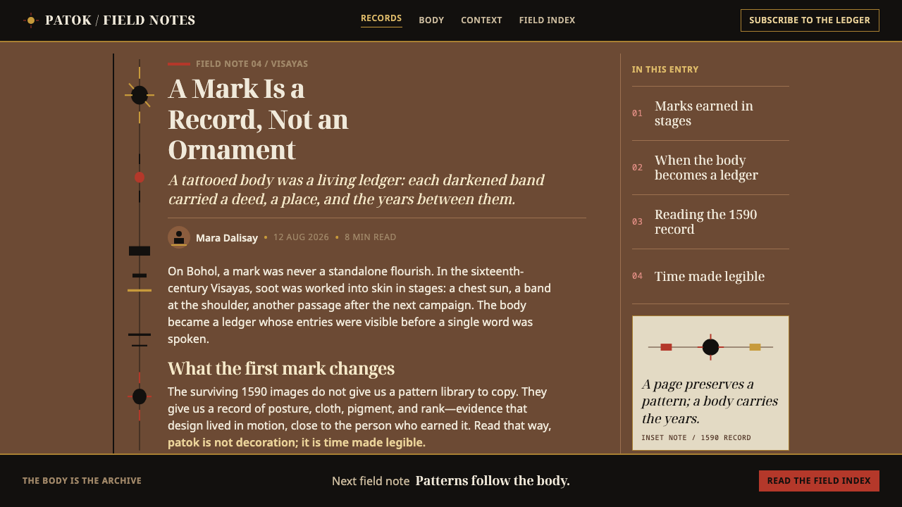
The 1590 codex enters as one framed plate on aged, yellowed paper, nested inside the composition. It has a clear frame, a visibly different texture from the skin ground, and caption-like text. It may sit within the body of the layout but must never cover or crop the marks around it. The plate gives the page a scholarly voice and a source line without letting that voice take over.
Who shaped Visayan Pintados?
Boxer was a historian of the Portuguese and Dutch overseas empires, and the twentieth-century owner whose name the 1590 manuscript carries. Naming it after a collector rather than its compilers is itself a reminder that the document reached modern readers through private hands before it reached an archive. For the design system, his role is that of the custodian whose name sits on the plate's caption, not on the body it depicts.
Dasmariñas governed the Spanish Philippines around the time the manuscript is dated, when Manila was Spain's Asian outpost and a port where Spanish officials, Chinese traders and local communities met. That setting explains the object itself: an ethnography from within the Spanish colonial circle, painted on Chinese paper. The design treats his world as the frame of the quotation, which is why the plate is set apart in tone and texture from the ground it sits on.
The son of Gómez Pérez Dasmariñas, Luis later held the governorship himself, and his family name stays attached to the manuscript's early history. In the system's logic he stands for continuity of the colonial gaze across a generation: the same administrative circle that commissioned the record also inherited it. That is a useful reminder when applying the style, since the plate is evidence of how Visayan bodies were seen, not an authority on how they were lived.
How do you use Visayan Pintados today?
Visayan Pintados is best used where a page has to carry weight, provenance or accumulated achievement. It is a poor fit for light, playful or purely transactional design, but for subjects with history and gravity it offers something few systems can: a surface that already looks like a record.
For presentation slides, a cover works as a single dark field with a cluster of paired discs or a banded run entering from one edge, leaving most of the surface open and the title set quietly against the ground rather than blazing across it. Content slides should follow the accretion logic: let the slide with the most to say carry the densest cluster of marks, and keep quiet slides sparse. Data slides suit timelines, ledgers and cumulative charts, where bars or counts literally build up and a small gold point can mark the figure that matters. The quoted plate works well as a single source slide: an excerpt, a document, a map.
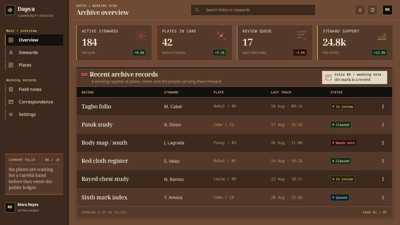
On the web, the system is a good match for archives, museum and heritage sites, long-form history features, and dashboards that track cumulative achievement — milestones, streaks, ledgers of work completed. Replace card containers with clusters of marks and open regions on the dark ground; reserve gold for the one action or number that matters; use the aged plate for featured documents and quotations. Pricing pages are possible but unusual: tiers can be shown as increasing density of marks, with gold held back for a single recommended plan.
For editorial and marketing work, the style supports slow, serious storytelling. An article layout can open with a large dark field, run text in a narrow, restrained column, and use the plate as a pull-quotation from a primary source. Campaign pages for books, exhibitions and documentaries can use a single paired-disc motif as a recurring seal. The tone is quiet authority, so copy should be sparing and specific; the system punishes hype.
The most common mistake is to treat the marks as a pattern fill — tiling them evenly as decorative texture or scattering them like confetti. That throws away the logic that makes them meaningful: placement, pairing and density. A second mistake is to tint the marks red or gold for energy, or to let the codex plate dominate the page. A third is cultural: the marks come from specific peoples at a specific time, so use the system for subjects connected to them or to the idea of earned, worn records, and give context when the source itself is the subject.
Visayan Pintados — FAQ
Does Visayan Pintados reproduce real tattoo designs?
No. It borrows structure, not a catalogue of patterns: paired sun discs for broad areas, banded runs for limbs, and accumulation by deed. The motifs are stylised for layout use, not copied from any individual's body or from the plates of the codex. If your project is about the history itself, pair the system with proper sourcing and captions rather than relying on the visuals alone.
Why is the ground skin instead of paper?
Because the whole premise is that a record can be worn. On paper, content is applied to a neutral surface; on skin, the surface itself has a history and an owner. Treating the ground as skin changes layout decisions: marks cluster where achievement does, cards and panels disappear, and the page stops pretending that every part of it matters equally.
Why is red allowed only on cloth?
It is a rule drawn from the source: the marks are soot pigment under the skin, blue-black and permanent, while cloth is worn and removable and can carry other colours. Keeping red off the marks preserves that distinction visually. It also guards against a common failure of warm, dark palettes, where every accent drifts toward the same hot colour and the page loses its sense of order.
Why is the Boxer Codex included only as a quotation?
Because the codex is a colonial document: it shows Visayan bodies through Spanish and European conventions, for an audience of administrators and readers abroad. The system uses it as evidence — a framed, aged plate with a source line — but refuses to let it become the frame of the page. Keeping it inside the body, never over it, means the design always speaks from the side of the practice and cites the observer, instead of the other way round.
Where does Visayan Pintados struggle?
It struggles wherever lightness, speed or friendliness is the point: playful consumer apps, children's products, bright promotional pages. Dense dashboards with many equally important regions are also awkward, because the system wants hierarchy by accumulation and asymmetry, not a uniform grid of equal panels. Long passages of small text on a dark, textured ground need extra care with contrast and spacing. Use it where gravity and provenance are a feature.
Related design styles
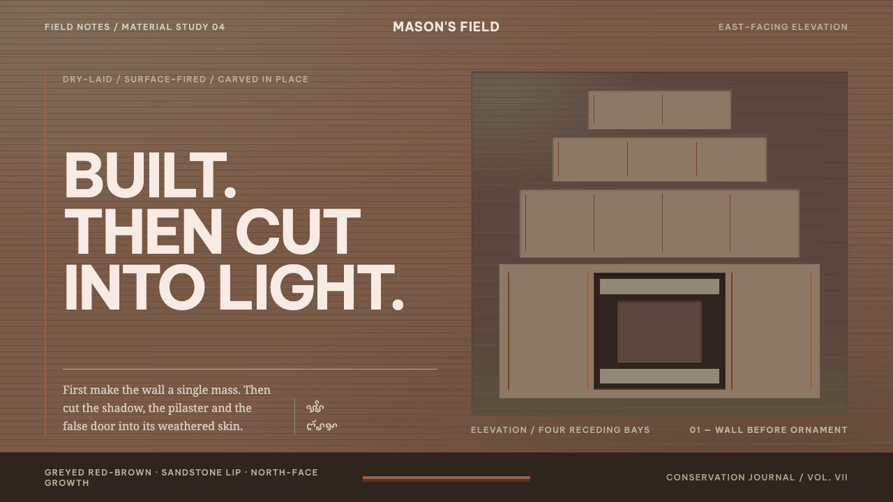 Cham My Son TowersWall before ornament. Greyed brick bays recede around cut shadows and sandsto…
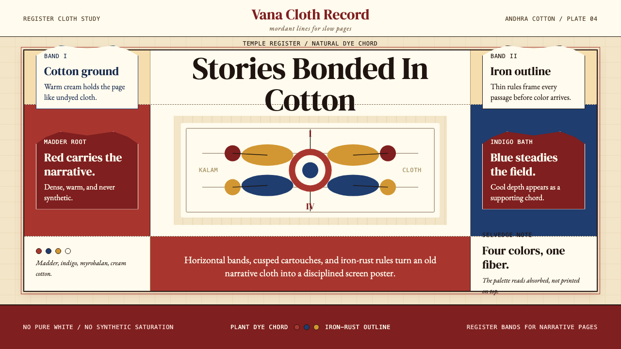 Kalamkari (Andhra Pradesh)Cloth becomes narrative. Madder bands, indigo panels, and iron rules stack li…
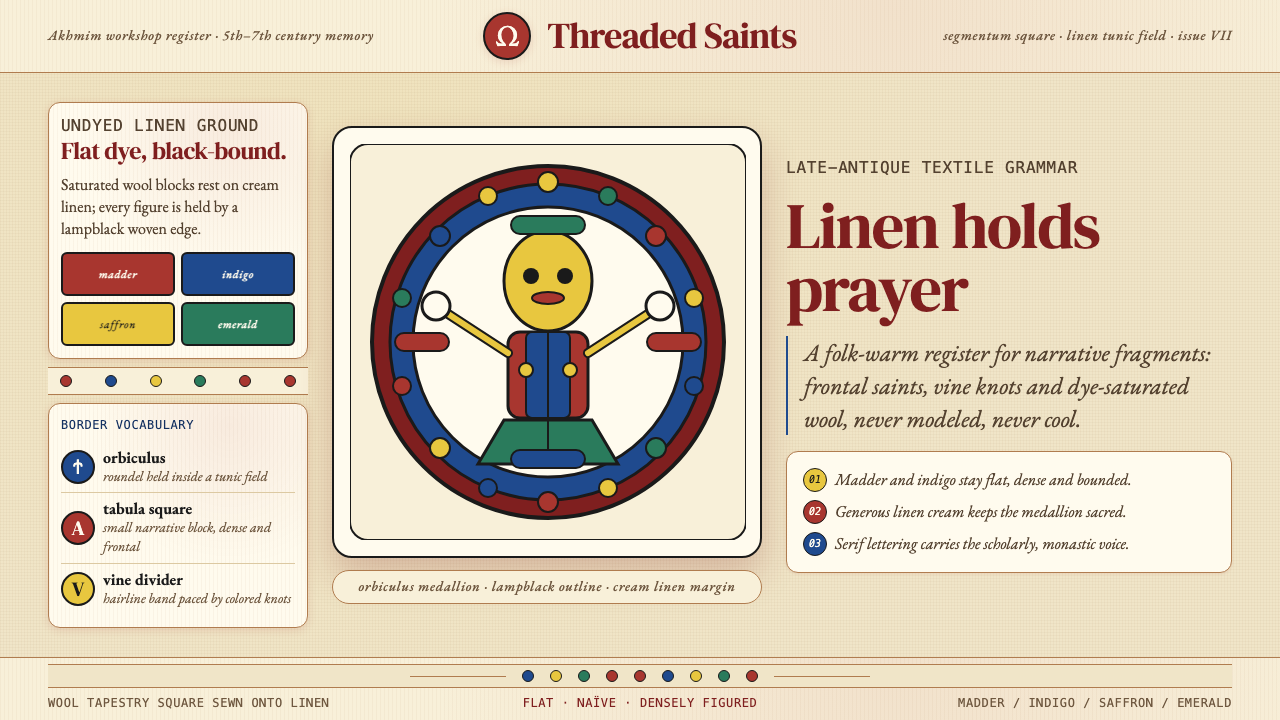 Egyptian Coptic TextileWarmth woven flat. Madder, indigo and saffron medallions sit on linen cream.
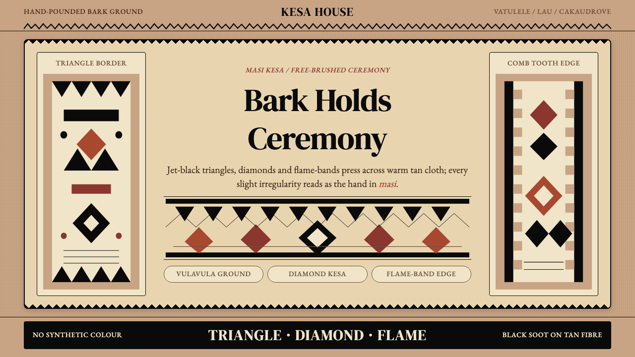 Fijian Masi (Tapa Cloth)Ceremony hits in black. Tan bark ground carries diamonds, zigzags and flame-b…
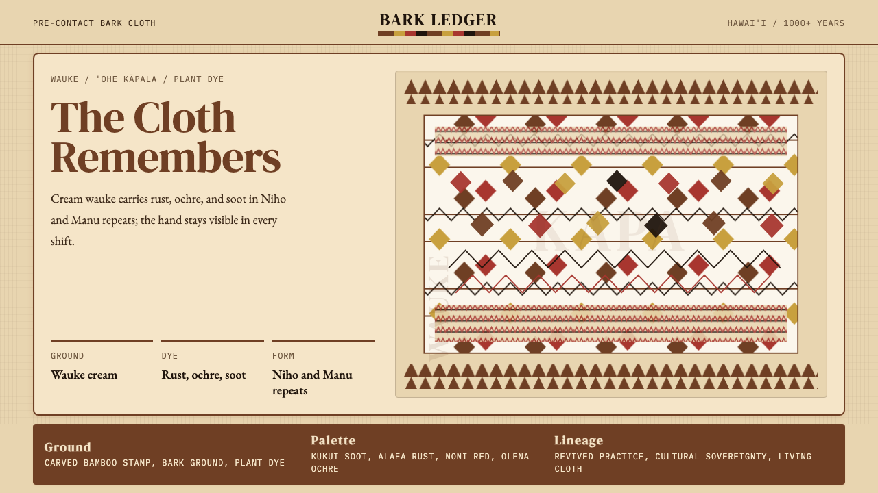 Hawaiian Kapa (Bark Cloth)Ceremonial geometry. Cream wauke, rust, ochre, and soot stamped in repeat.
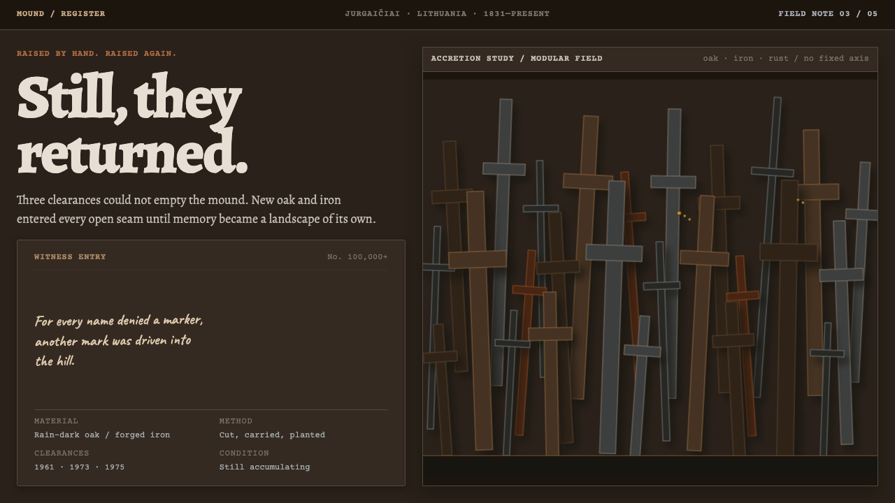 Hill of CrossesMemory returns by hand. Rain-black oak and rusted iron overlap until density…