What is Cruz-Diez Physichromie?
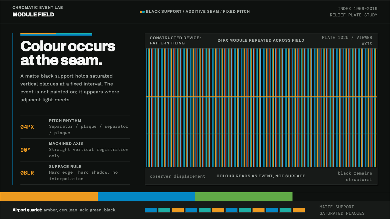
Cruz-Diez treated colour as an event, not a coat: narrow cyan, teal and amber bands cut into structural black, changing as you walk past.
Cruz-Diez Physichromie in brief
Cruz-Diez Physichromie is the visual language of Carlos Cruz-Diez's Physichromies, the colour constructions he began in Caracas in 1959 and kept making for the rest of his career. A black support carries a row of upright separator strips, and narrow plaques of colour sit in the channels between them. The viewer walks past, reflected light mixes at the seams, and the colour changes.
He did not think of colour as a property painted onto a surface. He treated it as something that happens, which is why the working units of the system are colour-event modules: narrow bands set side by side at a fixed pitch. As a design language, this means colour arrives as stripes and never as a wash, and the stripes are always cut into a ground that holds them in place.
The black is not a stylistic mood but a structural need. Without a dark ground to hold back stray light, the additive mixing at the seams would fall apart. Around that black the rest of the system is machined and exact: grotesque type, straight cut edges, a fixed rhythm of bands, and no gradient, no blur and no warped curve anywhere.
Where does Cruz-Diez Physichromie come from?
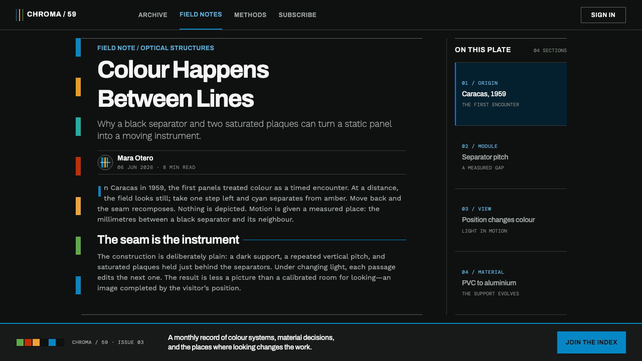
Carlos Cruz-Diez was a Venezuelan artist who made the first Physichromie in Caracas in 1959 and went on developing the series through to 2019, which means a single idea ran across his whole career. He later worked between Caracas and Paris. The long span matters for design: this is not a passing look but a method that was refined for decades, and its rules are consistent for that reason.
He belonged to the Venezuelan current known as Cinetismo, Venezuelan kineticism, which pushed abstraction toward movement and light and formed part of the wider kinetic art and Op art of the mid-twentieth century. Jesús Rafael Soto and Alejandro Otero are the names most often placed beside his in that story. What they share is the conviction that a work of art can be an experience in front of the viewer rather than an image on a wall.
The Physichromies are physical objects built to behave optically. Vertical separator strips stand proud of the black support, and narrow colour plaques are set in the channels between them. The strips act as a screen that controls which light reaches the eye from each position, so the viewer sees different colours from different places, and the reflected light of one band spills onto its neighbour and mixes additively at the seam. The work is therefore not a fixed image but a set of conditions for seeing.
From the mid-1970s the series was also made on aluminium plates, an industrial surface that suited its machined character. Colour pairs were chosen for how they react where their reflected light meets, not for their order in the spectrum. The design language built on this work pairs it with grotesque type in the lineage of Univers and Helvetica, a neutral, machined companion for a machined surface.
What defines the Cruz-Diez Physichromie look?
Structural Black
Black is the ground, and it is there for physical reasons. It holds back stray light so that the colour at each seam can be seen cleanly, and it makes the narrow bands read as bright and separate. In an interface this means the dark background is not a theme preference but the thing that makes the colour work. The system does not have a light mode that simply flips it.
Narrow Adjacent Bands
Colour appears only as narrow bands set side by side at a fixed pitch, in the manner of the colour-event modules. It is never a flat wash, a large filled panel or a soft background. The consistent spacing is what makes the stripes read as a system, so a band that is wider, narrower or off the rhythm looks like an error instead of an emphasis.
Cyan, Teal and Amber
The working palette is a small set of cool and warm hues: cyan, teal and amber. They are chosen less for beauty than for how they behave together, since a cool band beside a warm one produces a distinct reaction in reflected light. The range is deliberately narrow, which keeps each stripe significant and prevents the surface from becoming a rainbow.
Pairs Chosen by Seam Reaction
Adjacent colours are picked for how they react at the seam, not for their place in the spectrum. A pair is good because of what happens where it meets. In practice this means a designer should resist ordering colours in a spectrum-like sequence and should instead test pairs next to each other, keeping the ones that produce a vivid edge and discarding those that merely sit politely.
Machined Edges
Every edge is straight, square and cleanly cut, like a strip standing proud of a plate. There are no rounded corners, no soft shadows, no blur and no glow. Depth is expressed by the literal relief of strips against the support, not by simulated light, and what a layout needs from its geometry is accuracy rather than softness.
Grotesque Type
Type follows the Univers and Helvetica lineage: neutral, even, unornamented grotesque letterforms. It acts as the quiet companion to the colour, leaving all chromatic drama to the bands. Titles and labels are set in a single family with disciplined size steps, and nothing about the lettering competes with the stripes for attention or tries to look expressive.
Change Without Interpolation
The work changes as the viewer moves, but it never blends smoothly from one state to another. Colour shifts by stepping from one band to the next, not by gradient. In a digital version, a hover or scroll should switch which band is active or shift the pitch in discrete steps, because a tweened, smoothed transition belongs to a different visual logic.

Who shaped Cruz-Diez Physichromie?
The Venezuelan artist who made the first Physichromie in Caracas in 1959 and kept developing the series until 2019. He treated colour as an event that takes place in the viewer's presence, not a property fixed on a surface, and built structures of strips and plaques so that reflected light does the mixing. Later pieces moved onto aluminium plates, and he worked between Caracas and Paris.
A Venezuelan kinetic artist and one of the names most often placed alongside Cruz-Diez in the story of Cinetismo. Like Cruz-Diez, he built work in which the viewer's movement is part of the piece, and his art belongs with the same mid-century turn from fixed image to optical experience. His presence in the story is a reminder that this style comes from a movement, not a lone invention.
A leading Venezuelan abstract artist of the same period, associated with the push toward kinetic and optical work. Otero helps explain why Caracas became a centre for this kind of art, with a group of artists treating abstraction as something that moves, vibrates and changes with the viewer, and with colour as a physical phenomenon rather than a decorative one.
How do you use Cruz-Diez Physichromie today?
This is a dark, precise, high-clarity style for work that wants to feel optical and engineered. It suits data tools, product launches, design studios, galleries, audio and visual brands, and anywhere a sense of motion and exactness matters. The guiding principle is that colour is rare, narrow and structural, while black does most of the work of holding the page together.
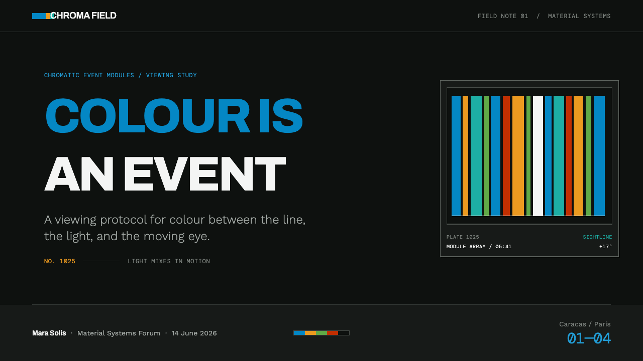
For presentation slides, a cover works as a black field with a short run of narrow cyan, teal and amber bands cut into one edge or running as a column, with the title in plain grotesque type. Content slides remain black, and bands appear as dividers and section markers at an even pitch. Data slides are a natural fit: bars drawn as narrow banded strips, with each series assigned one of the hues, and no gradient fills or glows.
For web interfaces, dashboards and tools suit the style well. Keep the background dark and square-cornered, set text in a neutral grotesque, and use colour only as narrow bands, such as an active-tab strip, a progress track built of fixed-pitch segments or a status edge on a card. Interactions should step: a hover or scroll that switches the active band in discrete moves, not a smooth fade, so that the interface feels like a mechanism rather than a painting.
For editorial and marketing work, the style gives a strong, exact, contemporary identity. Posters and landing pages can set a large black field with a precise run of stripes, type in a single grotesque family and generous empty ground. Photography should be restrained, ideally of objects and light, and the stripes can mark scroll position or chapter changes. Everything should look machined, cut and placed, not brushed.
The most common mistake is to turn the stripes into a gradient or a rainbow. Smooth blends, spectrum-ordered colours and big filled colour panels all destroy the idea that colour is a narrow, seam-driven event. Rounded corners, soft glows, blur and a white page ground take away the structural black the system depends on. And too many hues dilute the effect: a few colours at a consistent pitch beat a busy palette.
Cruz-Diez Physichromie — FAQ
What is a Physichromie?
It is the name Carlos Cruz-Diez gave to a series of colour constructions he began in Caracas in 1959. A black support carries upright separator strips, and narrow plaques of colour sit in the channels between them. As the viewer moves, reflected light mixes additively at the seams and the perceived colour changes. The word points to colour as a physical event, not a pigment applied to a surface, and this style takes that principle literally.
Why is the background always black?
Because the effect needs it. A dark support holds back stray light, so the additive mixing at each seam remains clean and the bands look bright and separate. It is a structural requirement rather than an aesthetic preference, which is why the style does not have a convincing light version. If you need a light mode, treat it as a separate design problem and keep the stripes narrow and fixed-pitch.
Why are there no gradients?
Because the colour change is meant to happen between bands, as a seam effect, not within a smooth blend. A gradient would turn the narrow, discrete stripes into a continuous wash, which is exactly what the system avoids. The same logic applies to blur, glow and rounded corners: the character here is exact, machined and stepped, so anything that interpolates smoothly runs against it.
How do I convey colour change in a static layout?
Repeat narrow bands at a fixed pitch and let adjacent colours differ, so the eye supplies the shift. Place a run of stripes where the page edge or a divider would sit, and let different sections use different pairs. In an interactive version, switch active bands in discrete steps on hover or scroll. Either way, the change should come from the sequence of bands, never from a gradient inside one band.
Is this just Op art?
It is related but not identical. Cruz-Diez belongs to Cinetismo, Venezuelan kineticism, which formed part of the wider kinetic and Op art currents of the mid-twentieth century. What marks this style out is its specific interest in colour physics: strips and plaques arranged so that reflected light mixes at the seam, with black as the structural ground. It is less about vibrating black-and-white pattern and more about colour that appears only in the viewer's movement.
Related design styles
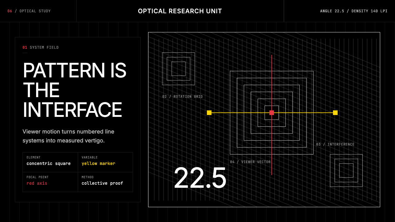 GRAV Op-Kinetic (1960)Vertigo by calculation. White line fields on black, with red and yellow as co…
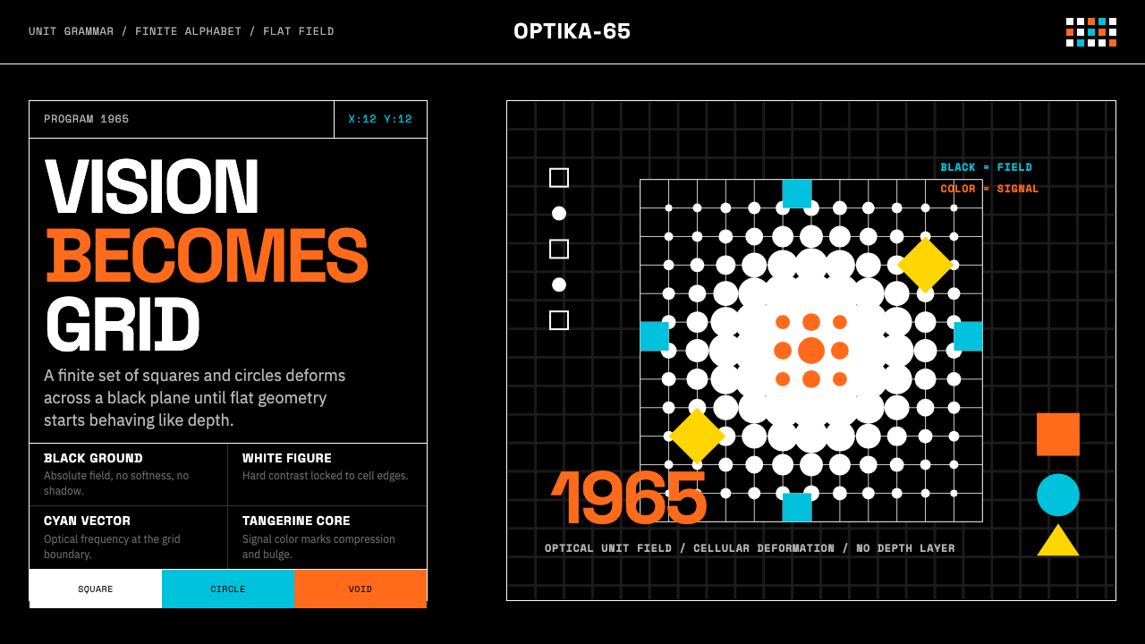 Hungarian Vasarely Op Art (1965)Mathematics makes vision pulse. Black grids, white units, cyan and tangerine…
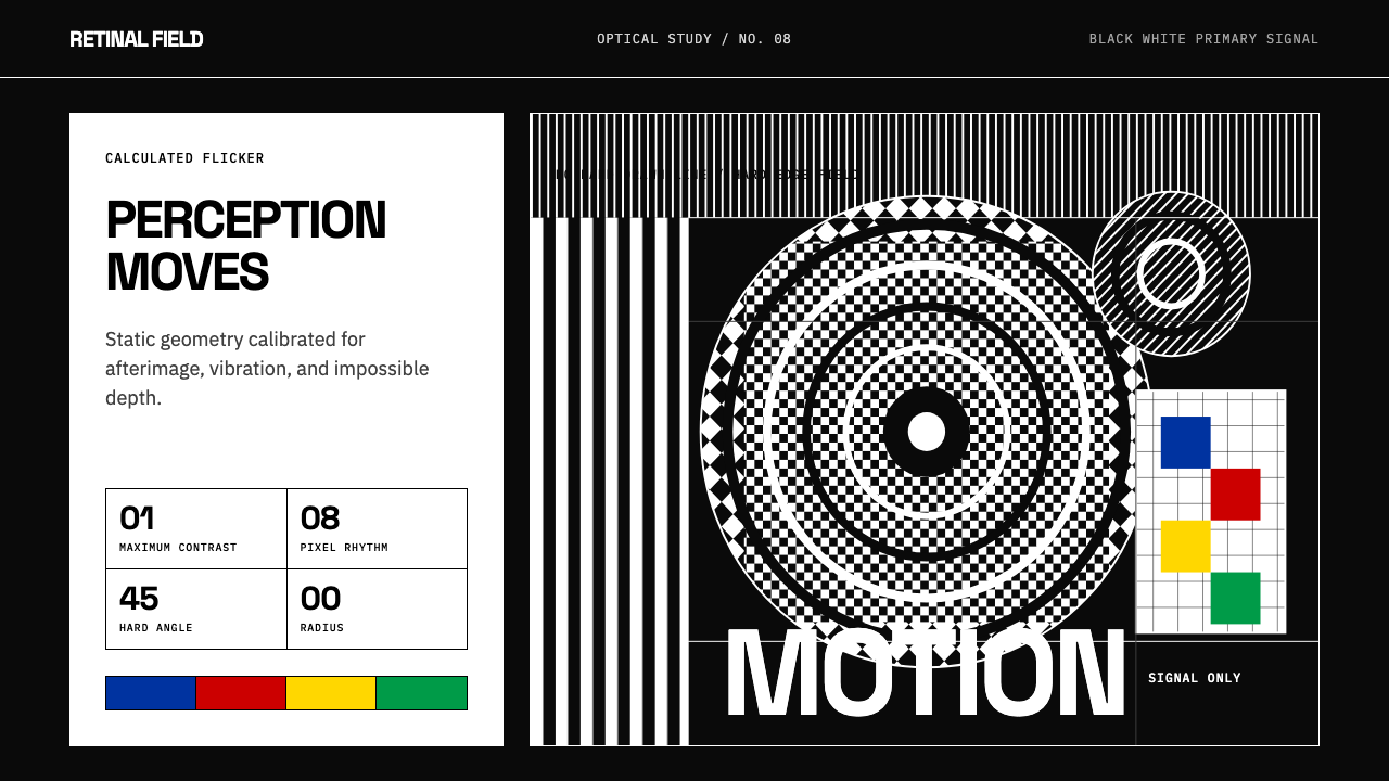 Op Art (Riley / Vasarely)Perception is engineered. Black-white grids and primary signals make static g…
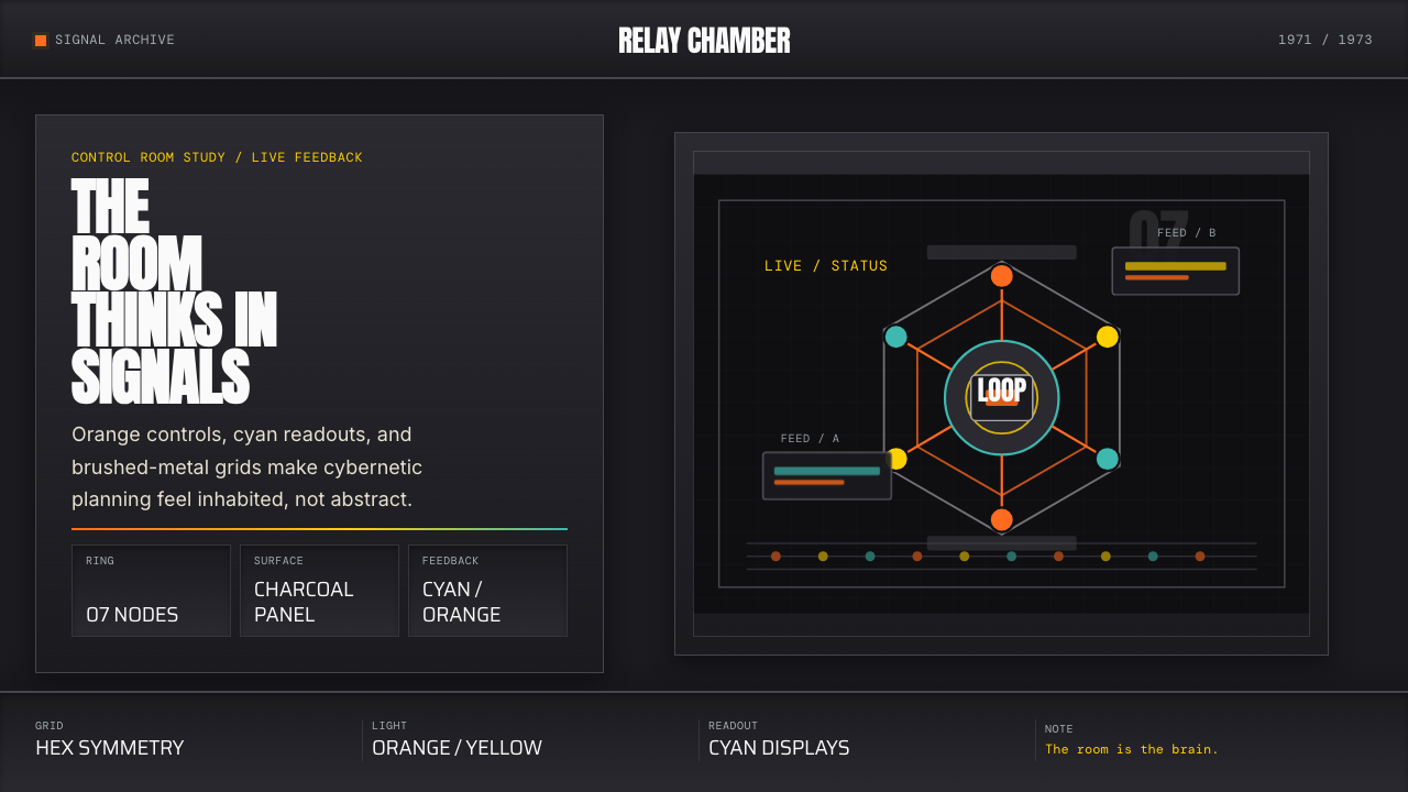 Cybernetic 1968 (Stafford Beer)Mission-control severity. Charcoal panels, orange buttons, cyan readouts, hex…
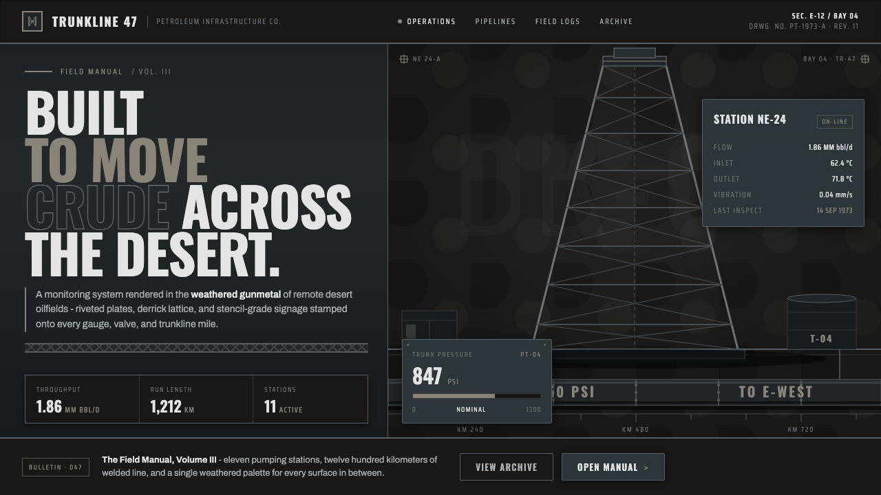 Gulf Oil Derrick IndustrialEngineered, not decorative. Soot-darkened gunmetal, derrick lattice, condense…
 Kharkiv Constructivism (Derzhprom)Monumental, made structural. White-black-red triad on raw concrete, slab caps…