What is Venetian Plaster White?
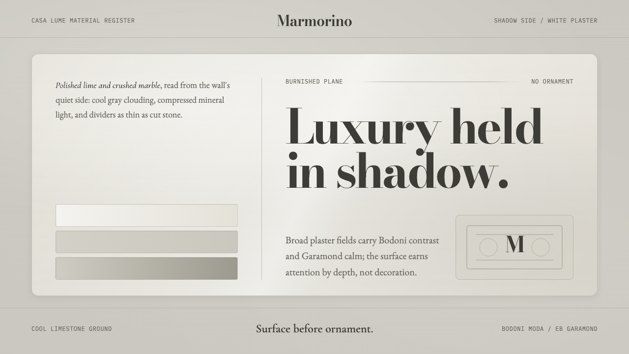
Venetian Plaster White finds quiet luxury in the shadowed side of a polished wall, where Bodoni and Garamond sit across cool, clouded mineral planes.
Venetian Plaster White in brief
Venetian Plaster White is a visual system derived from Venetian Marmorino: a polished wall plaster made from lime and crushed marble. Traditionally kept white to echo the Istrian stone used in pre-1900 Venice, Marmorino gains its character through repeated trowel work. The packed mineral surface develops a faint sheen, while compressed areas hold cool-gray depth rather than obvious decoration.
This interpretation begins with the wall’s shadow side instead of its brightest face. Its ground is a cool neutral gray, never a warm cream. Broad, calm fields suggest cloudy trowel marks and restrained chiaroscuro; fine stone-like dividers establish order without becoming graphic ornament. The resulting atmosphere is spacious, composed, and materially aware.
Typography supplies the system’s clearest contrast. High-contrast Bodoni gives titles a poised, sculptural presence, while Garamond carries longer reading with a quieter elegance. Together, the type does not compete with the plaster surface. It behaves like an inscription on a finished wall: precise enough to feel formal, soft enough to remain at home in the surrounding haze.
Where does Venetian Plaster White come from?
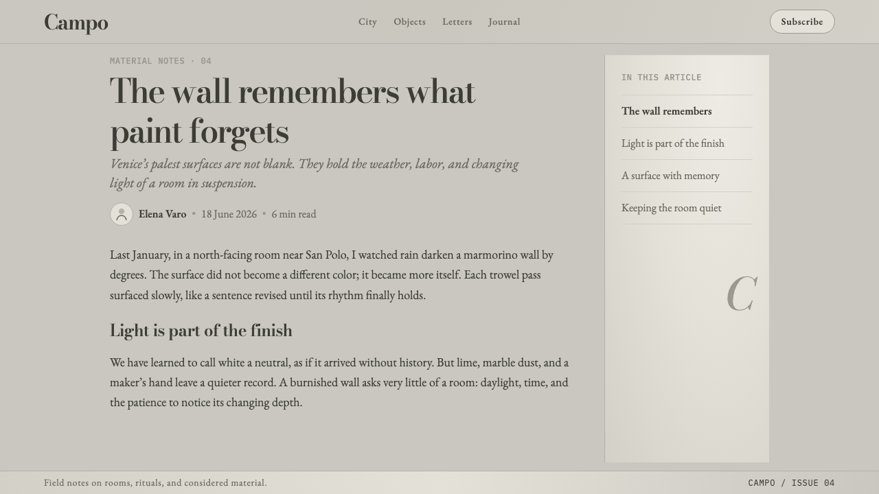
The material foundation is Venetian Marmorino, a lime-and-crushed-marble plaster associated with traditional building craft in Venice and the Veneto. Its lineage reaches back through Roman and Renaissance Italy, placing the finish within a long mineral-plaster tradition rather than a modern decorative trend. White was not merely an absence of color: it was the means by which the plaster could resemble Istrian stone.
Before 1900, Istrian stone was a familiar architectural reference in Venice, and white Marmorino developed as an imitation finish responsive to that reference. The aim was not painted illusion in the conventional sense. Lime, crushed marble, compaction, and trowel handling produced a surface whose pale mineral body could carry variation from within.
Venetian stuccatori and Marmorino lime-mortar artisans shaped this tradition through craft practice. Their medium asked for control of pressure, layering, and burnishing. The characteristic finish is therefore inseparable from process: trowel strokes create clouded transitions, while the packed marble develops a restrained micro-sheen and a sense of cool depth.
Venetian Plaster White translates that craft lineage into a contemporary design language without treating it as historical costume. It retains the material logic of the finish: subdued mineral color, broad calm planes, shadow-led variation, and luxury earned by surface. Bodoni and Garamond introduce editorial refinement, but the plaster remains the governing image.
What defines the Venetian Plaster White look?
Cool Mineral Ground
The base is a cool neutral gray drawn from the shadowed face of polished white plaster. It should feel mineral and settled, not creamy, domestic, or overtly colored. This temperature gives the system its reserve and allows both display type and surface variation to remain legible.
Clouded Trowel Surface
Broad planes carry soft, cloud-like tonal shifts inspired by the trowel finish of Marmorino. The variation should appear compressed into the material rather than laid over it as an effect. It is gentle, irregular, and quiet enough to preserve a sense of continuous wall surface.
Burnished Micro-Sheen
The plaster reference permits a soft micro-sheen, never an assertive gloss. It comes from the idea of packed crushed marble catching light at the surface. The result should imply careful finishing and density, while avoiding the polished spectacle of a reflective luxury material.
Bodoni Display
Bodoni provides the high-contrast display voice. Its sharp transitions and formal poise create a deliberate counterpoint to the diffuse plaster field. Use it where a title, name, or short declaration needs ceremonial clarity, not where continuous reading requires the surface to recede.
Garamond Reading Tone
Garamond gives longer text an elegant, literary rhythm. Beside Bodoni, it softens the hierarchy without weakening it: display type announces, reading type lingers. This pairing makes the system feel editorial and cultivated, while the plaster prevents it from becoming overly precious.
Hairline Stone Dividers
Fine dividers recall joints, edges, and subtle changes within stone rather than decorative rules. They should guide grouping and pacing with almost no visual noise. Their restraint matters: a divider belongs to the wall’s structure, not to an ornamental frame placed on top of it.
Who shaped Venetian Plaster White?
Venetian stuccatori represent the plaster workers whose handling of lime-based finishes established the craft context behind Marmorino. Their importance lies in process rather than signature authorship: layering, compaction, and trowel finishing are what allow a white mineral surface to hold clouded depth and restrained sheen.
Marmorino 石灰砂浆工匠延续了以石灰和碎大理石塑造墙面的方法。他们的工作说明,这种视觉语言并非靠附加图案取得效果。材质、压力和收面共同构成了表面,而表面的细微变化本身就是最重要的装饰。
The Istrian-stone imitation tradition provides the visual reference for white Venetian Marmorino. It frames the finish as an architectural material response: a plaster surface seeks the pale, mineral presence of stone while retaining the cloudy transitions and micro-sheen made possible by lime and packed marble.
How do you use Venetian Plaster White today?
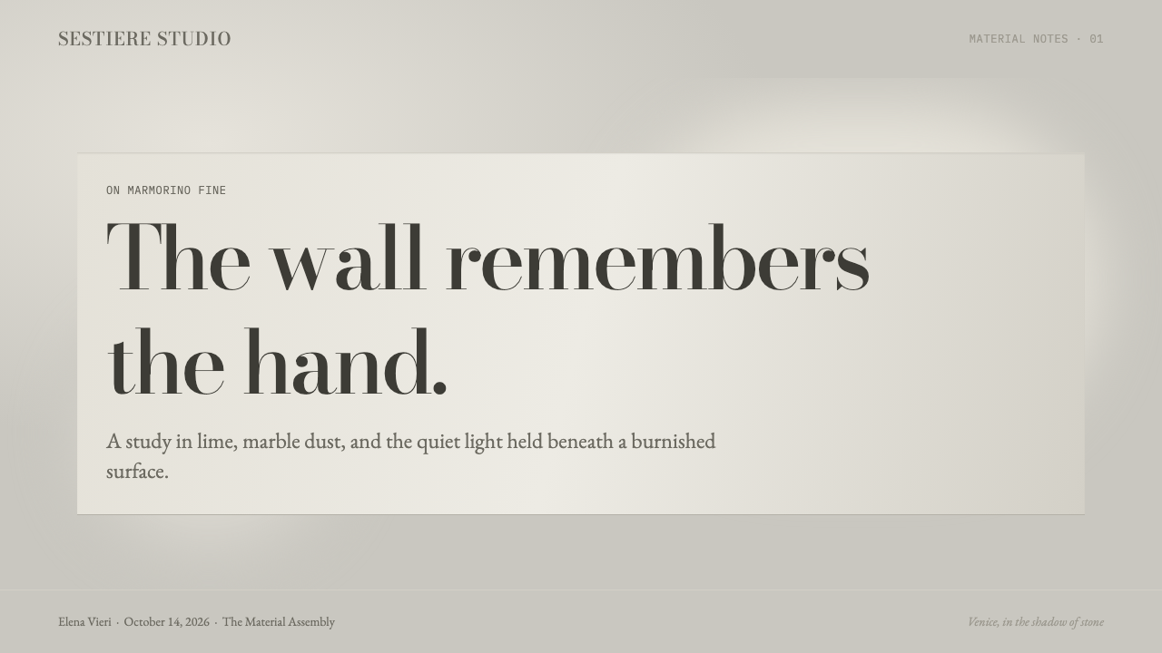
For presentation covers, Venetian Plaster White is strongest when the plaster field is allowed to arrive before the message. Let a broad cool plane establish the atmosphere, then place a concise Bodoni title with generous surrounding silence. A hairline divider or a restrained Garamond subtitle can provide orientation. The cover should feel like an invitation into a finished interior, not a poster crowded with decorative gestures.
Content slides benefit from a clear distinction between announcement and reading. Use Bodoni for section markers, headings, or short statements; reserve Garamond for explanation and supporting detail. Keep clouded surface movement calmer behind dense information than behind an opening title. On data slides, favor quiet editorial framing: the mineral ground can hold labels and comparisons, while the strongest contrast belongs to the information rather than the plaster.
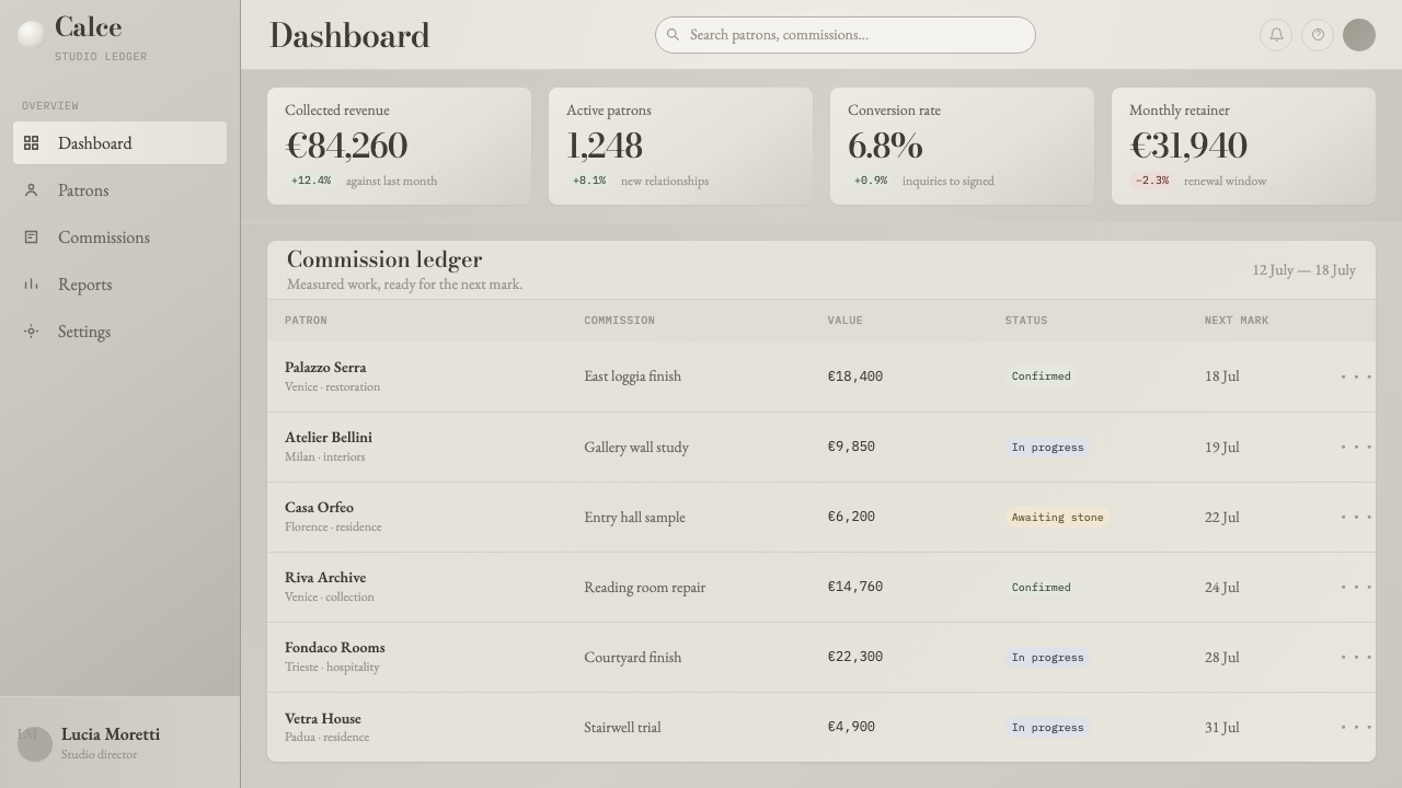
For web interfaces, the style is especially suited to dashboards, premium service pages, and pricing contexts that need composure without sterility. Broad neutral panels can group information, while fine dividers replace heavy card decoration. Bodoni should remain selective for moments of emphasis, such as product names or major headings; Garamond can make explanatory copy feel considered without turning a functional interface into a magazine spread.
In editorial and marketing work, Venetian Plaster White supports narratives about craft, hospitality, architecture, material culture, and restrained premium value. A long-form page can alternate expansive plaster intervals with focused reading areas, allowing the surface to reset attention between sections. Marketing statements gain credibility when they are brief and typographic rather than amplified by excessive visual effects. The system works best when its luxury is sensed before it is announced.
The common mistake is to confuse material richness with visual abundance. Too much sheen, too much mottling, too many dividing lines, or Bodoni applied to every sentence makes the result theatrical and weakens the quiet authority of the reference. Likewise, warming the gray ground changes the premise: this system belongs to cool shadow. Let the plaster variation remain subordinate to reading, and let ornament stay absent unless it can be understood as part of the material structure.
Venetian Plaster White — FAQ
Is Venetian Plaster White simply a marble style?
No. Its source is Marmorino, a lime-and-crushed-marble plaster whose visual identity comes from trowel compaction, cloudy layering, and a subtle burnished sheen. Istrian stone is the historical reference for its white appearance, but the system is not trying to reproduce marble veining. It is about a finished mineral wall, especially the cooler and quieter side of that wall.
Why are Bodoni and Garamond paired here?
They establish a controlled contrast that mirrors the material. Bodoni brings high-contrast, formal definition to titles; Garamond makes extended text feel elegant and settled. The pairing lets typography carry hierarchy without asking the plaster surface to become louder. It is a division of labor: display type gives the composition its edge, while reading type preserves its calm.
Can the system use a warm white or cream background?
That would move it away from its defining premise. Venetian Plaster White takes its ground from the cool shadow side of burnished white plaster, not from a sunlit or domestic cream surface. A warm ground can still support elegant typography, but it changes the material association and weakens the particular tension between clouded gray planes and high-contrast display type.
How visible should the plaster texture be?
It should be felt before it is inspected. The useful reference is a broad, clouded shift in a compacted mineral surface, not a busy pattern applied behind content. If the viewer reads the texture as a separate illustration, it has become too assertive. Its role is to create atmosphere, depth, and a sense of finished material while leaving typography and information unmistakably primary.
Related design styles
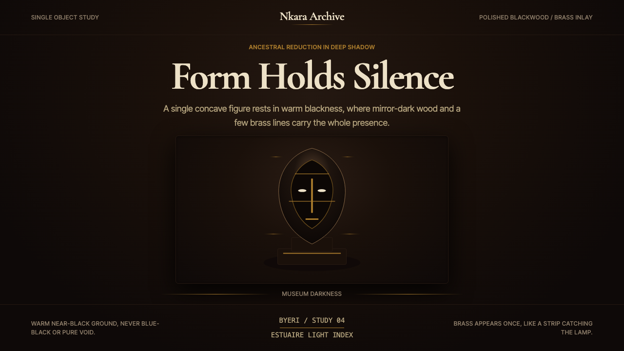 Gabonese Fang Mask & ByeriStillness has weight. Mirror-black forms, brass hairlines, and museum shadow…
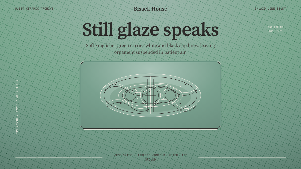 Goryeo Celadon 高麗青瓷Stillness carries ornament. Bisaek jade ground holds white and black hairline…
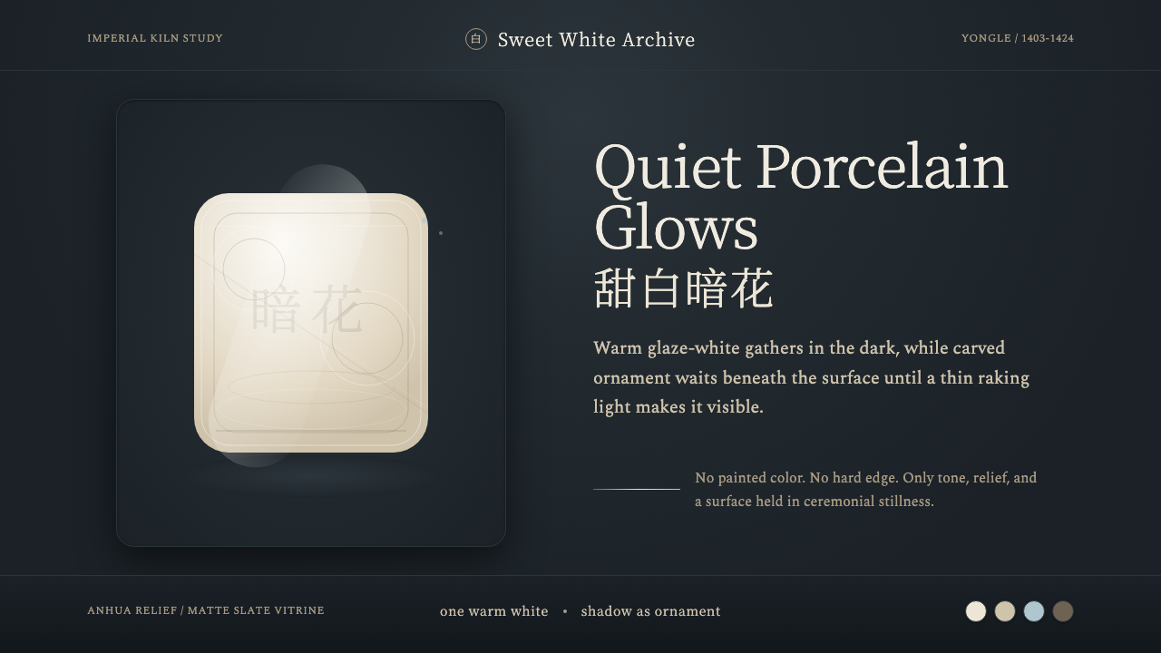 Jingdezhen BlancQuiet porcelain glows. Warm glaze-white on slate reveals hidden anhua incisio…
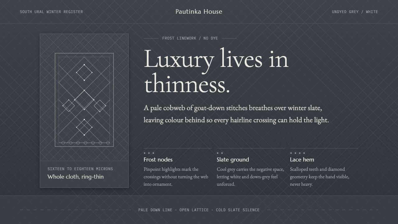 Orenburg Goat-Down Gossamer ShawlLuxury in thinness. Pale Cormorant type and down-lace lines breathe on Ural s…
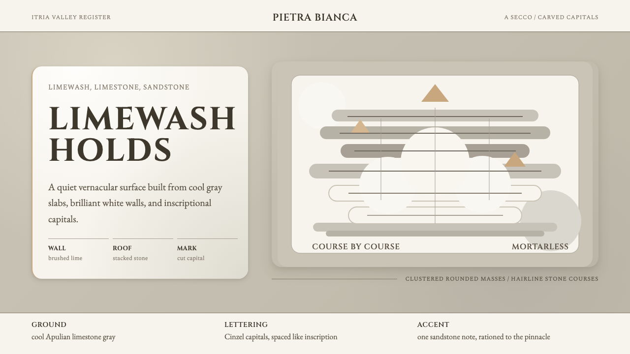 Trulli AlberobelloQuietly monumental. Cool limestone, limewash fields, and Cinzel capitals stac…
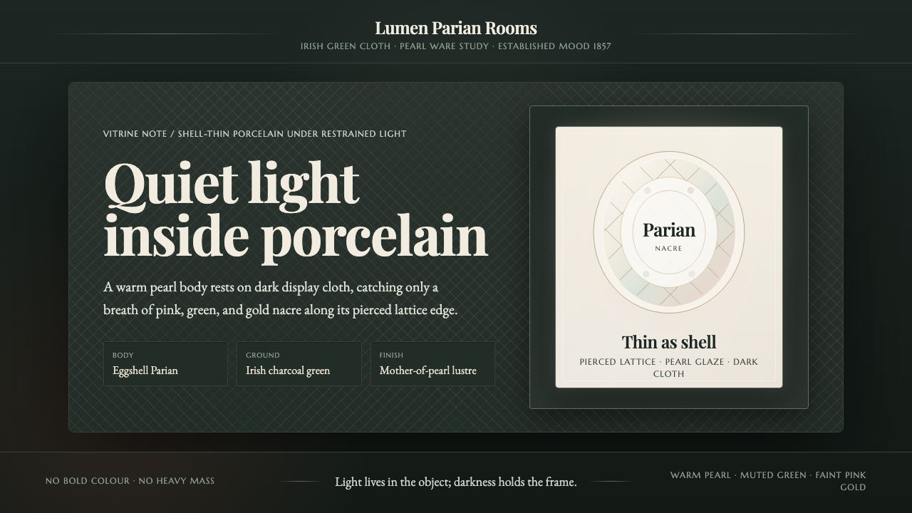 Belleek Parian ChinaPorcelain glows in restraint. Pearl white, nacre tints, and lattice sit on da…