What is Basque Lauburu?
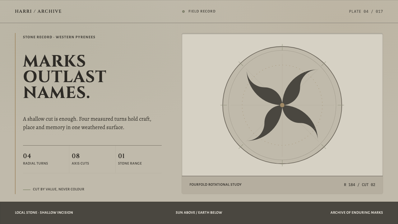
Basque Lauburu stonework turns the carved grave disc of the Basque Country into a design system: warm grey stone, shallow incision, four measured turns, and depth built from light and dark alone.
Basque Lauburu in brief
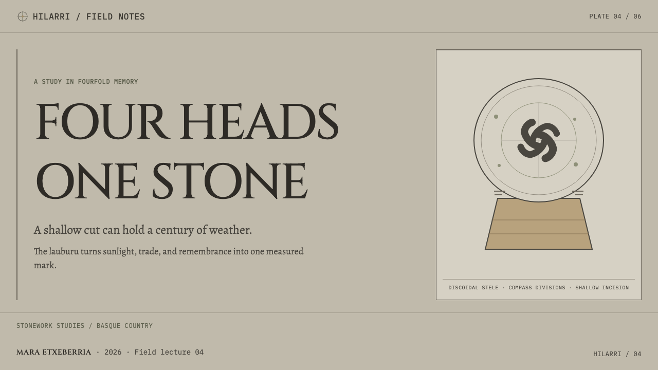
Basque Lauburu stonework is the visual language of the hilarri, the Basque funerary stele: a stone disc set on a trapezoidal base, placed at the head of a grave or leaned against a church wall. It is cut from sandstone or limestone quarried within walking distance, and it weathers to a lichen-flecked warm grey. Into its face is carved, in shallow incision, the lauburu, 'four heads', a figure of four comma-shaped lobes turning in rotational symmetry, beside rosettes, plain crosses, astral discs and the tools of the trade of whoever lies below.
Curio's system takes the stone itself as the page. Contrast is value, not colour: a dark line where the chisel went in, a lit arris where the sun catches the edge. Depth grows inside the surface of the stone rather than being faked by a shadow laid over it. Layouts begin from a circle scribed with compasses and sit on a base that widens downward: sun above, earth below.
The effect is quiet, monumental and strangely intimate. Planes are warm grey, shifts in tone are slow, and the single most active element, the four-lobed turn, is made of measured, evenly spaced curves. Nothing is ornamented for its own sake. Every mark is either structure, symbol or a trace of the life the stone commemorates.
Where does Basque Lauburu come from?
The hilarri belongs to the Basque Country on both sides of the Pyrenean border: Gipuzkoa, Bizkaia and Navarre on one side, Labourd and Lower Navarre on the other. The discoidal stele, a disc set on a base, is a tradition of the western Pyrenees and, in Basque hands, a form of popular stonecraft. It is dated to the sixteenth and seventeenth centuries onward, with medieval antecedents, and steles are still cut today, so the tradition has never fully closed.
The stone is local by necessity and by principle. Sandstone is easy to chisel; limestone lasts. Quarried a short walk from where it will stand, each stone gets rounded at the edges by wind and rain over the years, settles under lichen and falls to a warm grey. The style takes that weathering as part of the surface: matte, gently mottled and softly worn, with no polish and no gloss.
The carving is always shallow incision, never relief. A line is cut into the surface, and the chisel leaves a dark groove on the inside and a lit edge where the sun catches the arris. That is the whole technique of depth in the system: value, not colour. The lauburu, four comma-shaped lobes turned around a centre, is the best-known figure. Beside it come rosettes, plain crosses, astral discs and, as personal marks, the tools of the trade of the person buried there. Its symbolism belongs to the family of solar and geometric folk symbolism.
Curio's reference points for the tradition include Louis Colas, José Miguel de Barandiarán and San Telmo Museoa. The system translates the stele into a page: a disc drawn with a compass on a widening base, a dark line for the chisel cut, a pale edge for the sunlight and a restricted palette of stone. The geometry stays strict and the surface stays modest, which is how a grave marker carries a whole life in a very small amount of cut line.
What defines the Basque Lauburu look?
Value-Only Contrast
Contrast is made from light and dark, never from hue. Where the chisel went in there is a dark line; where the sun catches the edge there is a pale one. Every shape is described by that pair and nothing else. No colour accents are needed to separate things, and no drop shadows are laid on top, so the surface stays honest: what you see is what was cut.
Warm Grey Stone
The ground is a warm grey, the colour sandstone and limestone fall to once weathered and speckled by lichen. It is matte and gently mottled, with slow shifts in tone from plane to plane. This is the palette of the whole system, and the warmth stops it from feeling clinical. It reads as handled, outdoor, long-lived material.
Shallow Incision
Figures are cut into the stone and not raised from it. This is engraving, a line of removed material, not a relief standing out from the ground. For interface work it means elements are drawn as inset lines and recesses, not as pillows or embossed plates. The surface stays one continuous plane, and everything lives within it.
Four Measured Turns
The lauburu is four comma-shaped lobes arranged in rotational symmetry around a centre. Each lobe is the same curve, turned a measured step from the last, so the figure has motion without ever losing balance. It is the one active shape in a quiet system, and it works as an emblem, a mark or a loading figure rather than as a pattern to repeat across a page.
The Disc and the Base
Layouts start with a circle scribed with a compass, set above a trapezoid that widens downward. The disc is the sun and the base is the earth, so the composition is always read as something above something. A page, a card or a slide can use this as a framing logic: a rounded, centred field above a broader, quieter ground.
Companion Marks
Beside the lauburu sit a few other marks: rosettes, plain crosses, astral discs and, as personal records, the tools of the trade of the person commemorated. The vocabulary is small and each sign is simple. The marks keep the surface from being abstract while leaving the geometry in charge, and a spare handful of them is always enough.
Local Material
The stone comes from within walking distance, sandstone for easy cutting and limestone for lasting. The style inherits that locality as a principle: one material, one family of tones, no imported colour. The palette is the stone, and the economy is the point. Everything is made of the same stuff, so everything belongs together.
Who shaped Basque Lauburu?
Louis Colas is named among the key figures associated with the study of the Basque funerary stele. His place in the story is that of a recorder: someone who looked at these stones as a body of work, with common forms and signs, rather than as isolated markers in churchyards. That view of the steles as a tradition is what makes it possible to translate them into a consistent visual system.
José Miguel de Barandiarán is the Basque priest and ethnographer whose name is tied to the study of Basque culture and its folk symbolism. He is listed here because the lauburu and the discs belong to that wider world of solar and geometric signs. His importance for the style is the framing: these marks are part of a living symbolic culture, not a decorative catalogue.
San Telmo Museoa is the Basque museum named as an institution connected to the tradition. Its role is that of a keeper and presenter: a place where steles are preserved and read as objects with a history. Institutions of this kind matter to the style because they anchor it in real stones with real provenance, and they remind designers that the tradition is cultural heritage and not a generic motif.
How do you use Basque Lauburu today?
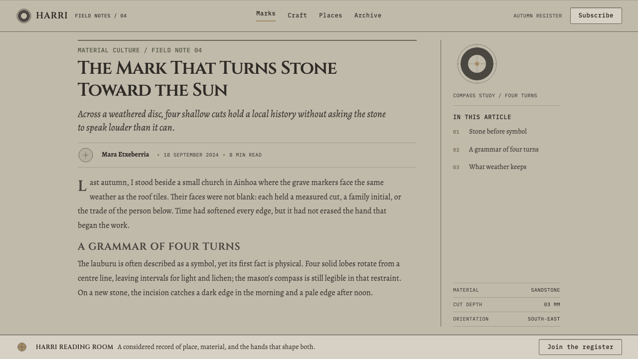
Basque Lauburu stonework suits subjects of memory, craft, heritage and place. It is calm, nearly monochrome and structural, so it rewards work that can stay quiet and let geometry and surface carry the meaning.
For presentation slides, the cover is a warm grey field with a single large circle drawn as an incised line, the title set beneath or within it and, if you wish, a broad trapezoid forming a base. Content slides keep the same warm stone ground, with panels described by a dark inner line and a pale edge instead of boxes or shadows. Data slides suit round forms in particular: dials, donut charts and radial diagrams look natural, while bars can be carved blocks defined by a dark inner edge and a lit upper edge. Colour is not needed; value does the separating.
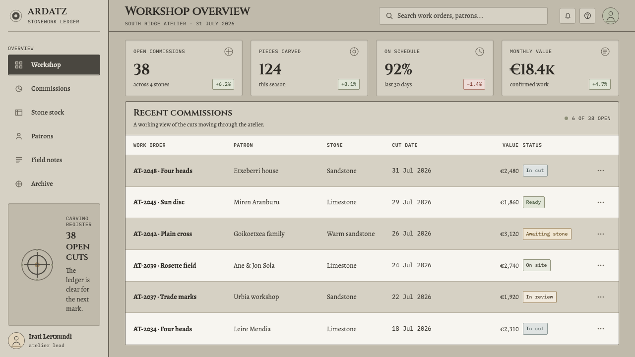
For web interfaces, the style fits calm dashboards, documentation, membership and archive products, and anything where trust and a sense of permanence matter. Build cards and panels as flat planes of stone, with depth described by an incised dark line on one side and a pale edge on the other. Buttons and inputs are engraved recesses; hover and pressed states deepen the line rather than adding a glow or a colour. The four-lobed turn works well as a single emblem or loading mark. Pricing tiers differ by size and line weight, not by hue.
For editorial and marketing work, the style gives gravity to stories about place, tradition, memorials and making. A chapter opener can pair a scribed circle with a short title, with the text column resting on a broad, quiet base. Marketing pages can alternate planes of grey stone with carved-line illustrations, and let one emblem carry the brand. Because the tradition is a funerary one, a certain solemnity comes with it, and the best work uses that tone deliberately, for craft and heritage subjects, rather than for anything flippant.
The most common mistake is to add colour, because the identity is a single family of warm stone tones and one bright accent turns it into a generic UI. The second mistake is trading incision for effect: soft drop shadows, glows and embossed plates replace the inset-line logic with something that looks like a different system. A third is over-using the lauburu as wallpaper; it is an emblem, and repeating it endlessly empties it of meaning. Finally, avoid raised, bevelled or gradient-filled surfaces. A stone does not shine, and a carved line is not a button with a highlight.
Basque Lauburu — FAQ
What is a lauburu?
The lauburu is the Basque 'four heads': a figure made of four comma-shaped lobes arranged in rotational symmetry around a centre. It is the most recognisable mark carved on the hilarri, the Basque discoidal grave stele, where it sits alongside rosettes, plain crosses and astral discs. In this style it is used as a single emblem, with the four lobes forming a measured turn that suggests motion while staying balanced.
Why is contrast made from value rather than colour?
Because stone has no pigment to spend. A carved line shows up only because the chisel leaves a dark groove and the sun catches a lit edge. By building every shape from that pair of tones, the system stays faithful to its material and avoids relying on hue to separate things. A useful side effect is that it holds up well in grayscale, in print and under glare, since the structure never depended on colour.
Why incision and not relief?
Because that is how the steles were made. The carving is shallow incision cut into a flat face, never a relief that stands out from it. In design, that translates into inset lines, recesses and engraved boundaries rather than raised plates. It keeps the surface a single continuous plane and makes depth a matter of light and dark inside the surface, not of objects hovering above it.
Can I use colour at all?
Very sparingly. The palette is a family of warm grey stone tones, and the style works because everything belongs to that family. If an interface needs a status colour, such as an error or a success state, keep it small and functional, a tiny marker rather than a field, and let value remain the main way of separating elements. A bright brand colour across headings and buttons will turn the stone into a themed template.
Is a funerary style appropriate for commercial products?
It can be, with care. The stele is a grave marker, so the tone is solemn and lasting, and that suits heritage, craft, place, memorial and cultural subjects well. It is less suitable for anything playful or ephemeral. If you use the lauburu or the disc-and-base form, name their Basque origin, use them as emblems and not as decoration, and keep the treatment respectful. The more the work honours the tradition, the better the style performs.
Related design styles
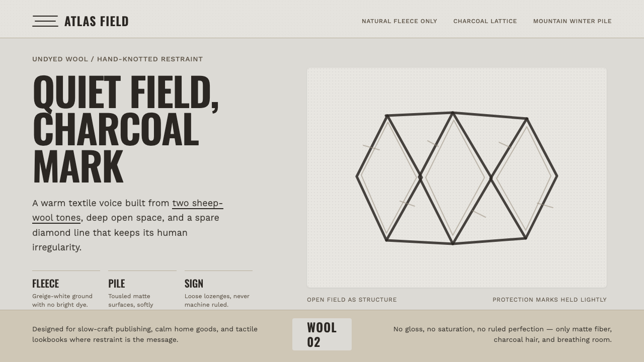 Beni Ourain Berber CarpetRestraint feels tactile. Greige wool field, Oswald type, and a loose charcoal…
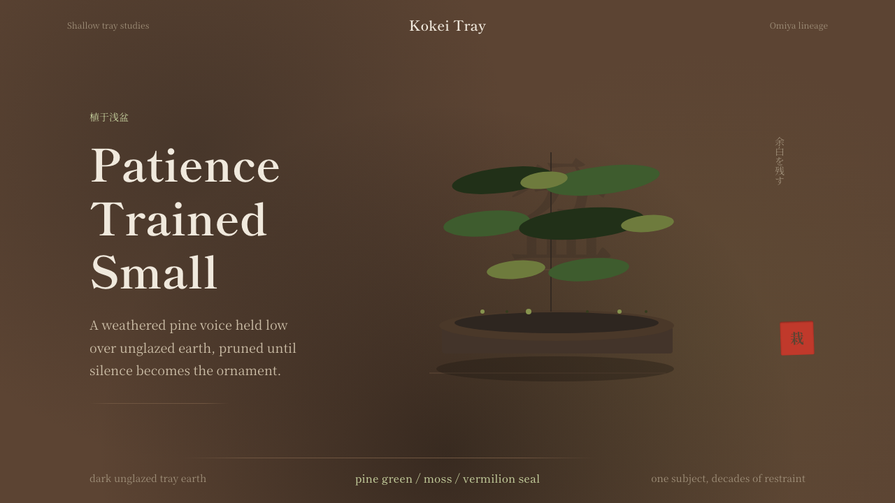 Bonsai CultivationQuiet asymmetry. Pine green rests on dark tray earth, sealed by one vermilion…
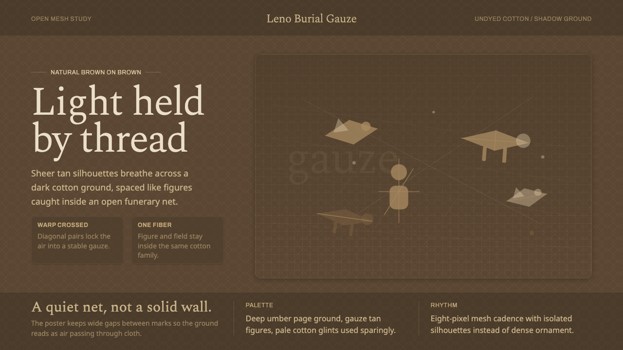 Chancay Gauze TextileQuiet woven dignity. Tan silhouettes float through a dark open cotton mesh.
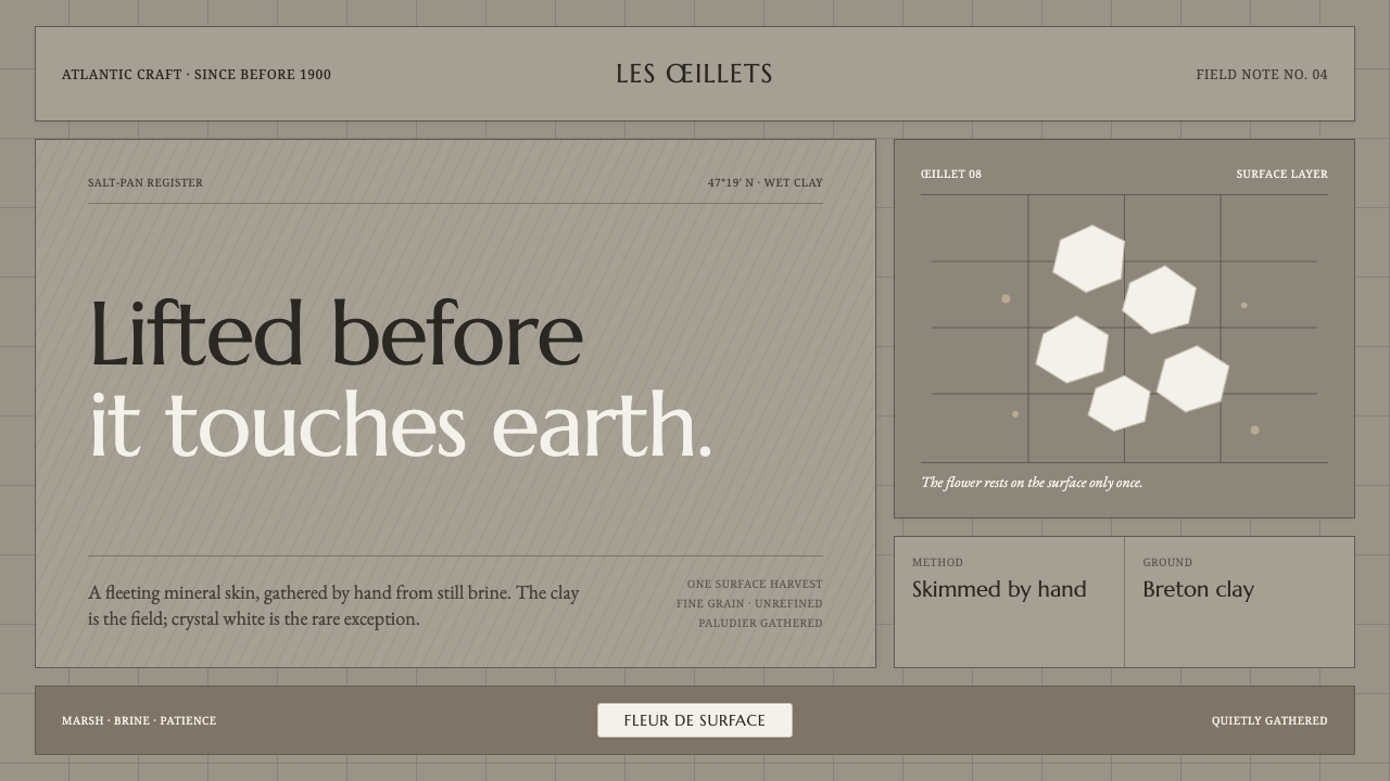 Guérande Fleur de SelCrystal white is the exception. Mineral serif and hairline grids rise from we…
 Hindu Widow White SariRestraint carries the weight. Ash-toned khadi, quiet serif type, and vertical…
 Japanese Tea CeremonyStillness has weight. Tatami straw, matcha green, and Mincho type leave room…