What is Chust Pichak Knife Craft?
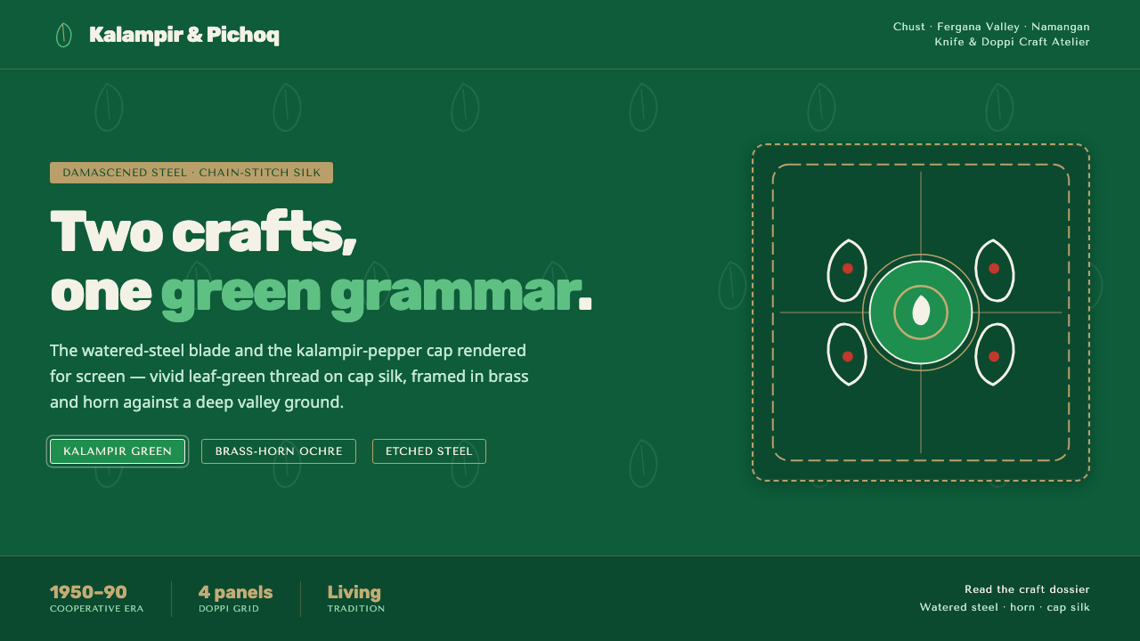
Chust Pichak Knife Craft brings blade, brass, horn, silk, and pepper-pod embroidery into one deep-green visual grammar of protection and vitality.
Chust Pichak Knife Craft in brief
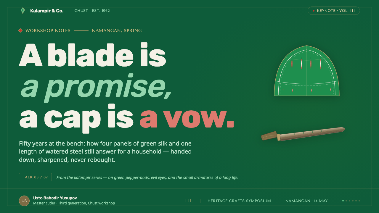
Chust Pichak Knife Craft is a design language rooted in the Fergana Valley town of Chust, Uzbekistan, where two enduring crafts meet: the pichoq knife and the embroidered doppi cap. The knife contributes etched and damascened steel, brass framing, and horn handles. The cap contributes white silk, dense chain-stitch, and the vivid kalampir chili-pepper motif. Together they form a visual system that feels made rather than merely decorated.
Its central image is kalampir: a bright green pepper-pod motif worked in chain-stitch on cap silk. In Chust craft, the motif signals vitality and is used to ward off the evil eye. On screen, that meaning should not be reduced to a loose floral accent. The repeated pod, its curling line, and its hand-stitched density become organizing forces: they define borders, section rhythm, emphasis, and the direction in which the eye moves.
The style is dark, saturated, and tactile without becoming rustic nostalgia. Deep valley green acts as the field; silk white creates places for breath and inscription; steel-grey brown records the blade’s etched surface; brass gives selected edges a warm, ceremonial glint. Its energy comes from contrast between a sharp instrument and soft embroidery, between the dark ground and intensely alive green stitching.
Where does Chust Pichak Knife Craft come from?
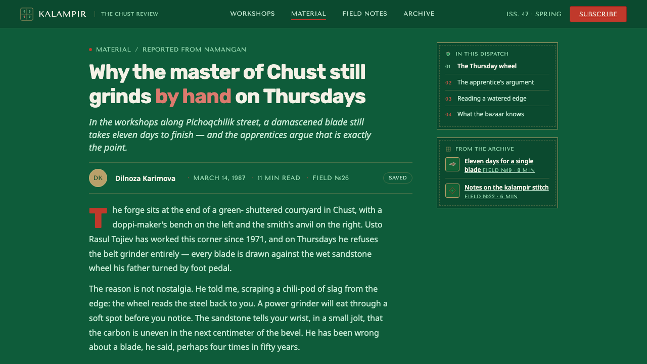
The setting is Chust in Uzbekistan’s Namangan region, within the Fergana Valley. The approved historical frame is the Soviet-era craft cooperative period from 1950 to 1990, understood alongside a living tradition rather than as a closed historical episode. The style therefore belongs to a continuing craft environment: it carries inherited visual forms into the present instead of treating them as museum fragments.
Its first source is Uzbek Fergana metalcraft, expressed through the pichoq. The blade is described through etching, damascened patterning, and watered steel; the handle through horn; the surrounding hardware through brass. These are not interchangeable luxury signals. They establish a hierarchy of surfaces: steel is marked and directional, horn is dark and grounding, and brass identifies joins, frames, or moments of emphasis.
Its second source is tubeteika, or doppi, embroidery. Chust doppi embroiderers and doppi makers’ workshops sustain a language of silk surfaces and chain-stitch patterns. The kalampir variation gives this language its particular intensity: green pepper-pods spread across white silk as a compact, repeated field. The meeting of knife and cap is the style’s defining proposition, because both crafts can speak through contour, framing, repetition, and protective symbolism.
What defines the Chust Pichak Knife Craft look?
Deep Green Ground
Deep green is the governing field, recalling the valley while giving the brighter elements a dark stage. It should feel dense and calm rather than flatly black. Large green surfaces allow brass, white silk, and kalampir stitching to emerge with the concentrated presence of materials held against shadow.
Kalampir Chain-Stitch
The chili-pepper pod is the primary motif. Its value lies in a chain-stitch logic: linked, curling, repeated, and visibly rhythmic. Use it as a border, path, divider, or cluster with an evident hand-worked cadence. A single generic leaf cannot carry the same protective and vital charge.
Steel and Etched Detail
Steel-grey brown details should suggest an etched, watered, damascened blade rather than polished digital chrome. Pattern remains close to the surface, directional and restrained. It is an instrument’s detail: it adds grain, lineage, and tension without competing with the green embroidery for attention.
Brass Framing
Brass is a framing material, not a blanket finish. It belongs on selected outlines, joints, medallion-like enclosures, and decisive separators. Its warmth should make the interface feel assembled from crafted parts. Excess brass weakens the contrast and turns a structural accent into costume jewelry.
Silk White Relief
White recalls the silk ground of the doppi and gives the system relief from its dark field. It should be reserved for reading surfaces, labels, short declarations, and places where the embroidery needs to be seen clearly. The contrast is textile-like: white is a cloth ground receiving thread, not an empty modernist void.
Paired Craft Tension
Every composition should preserve the pairing of blade and cap: sharp beside soft, metallic beside textile, protective object beside protective motif. This can appear through a precise line next to a stitched curve, a brass edge around an organic pod, or a compact embroidered field held by a knife-like frame.

Who shaped Chust Pichak Knife Craft?
Chust pichoqchi, the town’s knifesmiths, are the human source for the style’s blade vocabulary. Their craft supplies the etched and damascened surface, watered steel, horn handle, and brass-framed precision that keep the system from becoming embroidery alone. In design terms, they represent edge, assembly, material contrast, and disciplined ornament.
Chust doppi embroiderers carry the style’s textile intelligence. Their work gives kalampir its linked stitch, repeated pod form, and saturated green intensity on silk. They are essential because the motif is not simply botanical; through embroidery it becomes a field of vitality and a sign used to ward off the evil eye.
Chust doppi makers’ workshops provide the setting in which silk ground, embroidery, and finished cap form belong together. Their presence keeps the visual language tied to an object with a surface, an edge, and a use. For contemporary work, that is a reminder to compose patterns as constructed surfaces, not as detached decorative stickers.
How do you use Chust Pichak Knife Craft today?
For presentation slides, let the cover establish the paired-craft premise immediately: a deep green field, one decisive brass-like frame or blade line, and a contained kalampir cluster on a silk-white area. Content slides should separate reading from decoration. Use the white surface for headings and concise text, then let one stitched path or steel detail mark a section boundary rather than surrounding every block. Data slides can use green, white, steel, and brass as a restrained hierarchy, with the kalampir rhythm reserved for milestones or annotations rather than chart fill.
For web interfaces, this language suits dashboards, catalogues, collections, and pricing pages that need a strong sense of identity without sacrificing orientation. Treat deep green as the enclosing environment and silk white as the focused working surface. Brass should identify navigation edges, selected states, or significant actions; steel detail can organize dense information; kalampir should appear at transitions, empty states, or section introductions. The result should feel like a crafted instrument: rich at the perimeter, clear where decisions are made.
For editorial and marketing work, use the contrast between knife and cap to build a narrative. A long article can begin with the dark green field, then open into white reading pages where a stitched pepper-pod line carries the reader between sections. Product or campaign pages can alternate close material details with generous text surfaces, allowing brass frames to mark featured stories. Keep imagery and motifs closely cropped and purposeful so that the system retains its dense, hand-worked character.
The common mistake is to use green, brass, pepper shapes, and vague ornamental texture all at once. That produces a generic luxury-folk surface and loses the source material’s clarity. This style needs a hierarchy: deep green carries atmosphere, white carries legibility, steel carries blade detail, brass carries structure, and kalampir carries symbolic intensity. If every element tries to be vivid, neither the knife nor the embroidery can be felt.
Chust Pichak Knife Craft — FAQ
Is this style only about knives?
No. The pichoq is one half of the system. Its etched steel, horn, and brass provide structure, edge, and material discipline, while the doppi contributes silk, chain-stitch, and kalampir. A convincing application keeps both crafts present, even when it shows no literal knife or cap.
Can kalampir be used as a generic floral pattern?
It should not be treated that way. The kalampir pepper-pod motif is specifically associated here with vitality and warding off the evil eye. Its linked chain-stitch character matters as much as its silhouette. Use repetition and contour with purpose, rather than scattering isolated green leaves as casual decoration.
Why is the background so dark when the cap silk is white?
The dark green field lets the two craft vocabularies meet without losing their contrast. Silk white can read as a surface for thread and text; brass can frame it; steel can remain legible; vivid green stitching can carry its full intensity. The darkness is an enclosing field, not a replacement for the cap’s white ground.
Where does this style work best?
It works best where cultural specificity, craft, and deliberate material contrast support the message: editorial features, heritage collections, product catalogues, themed dashboards, and campaigns with a strong story. It is less suitable when the task calls for neutral anonymity or a light, playful visual tone, because its dark field and protective symbolism are inherently assertive.
Related design styles
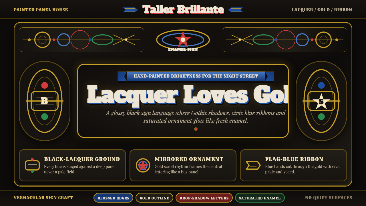 Fileteado Porteño Sign ArtBlack lacquer turns maximal. Gold scrolls, blue ribbons and Gothic shadows gl…
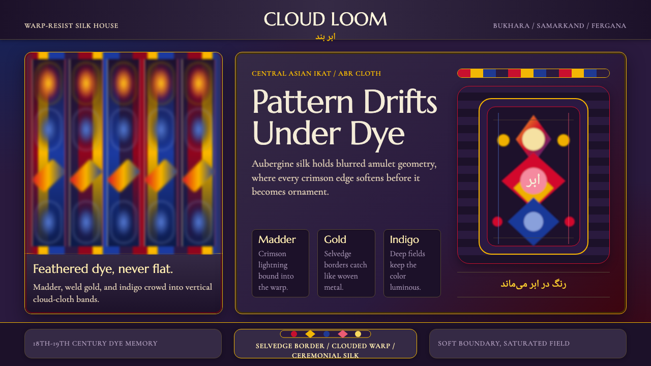 Central Asian IkatMaximal silk haze. Madder, gold, and indigo warp bands feather across aubergi…
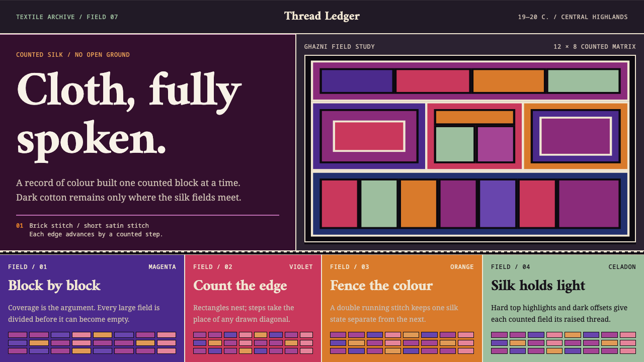 Hazara EmbroideryCoverage is the argument. Magenta silk blocks meet on a dark counted lattice.
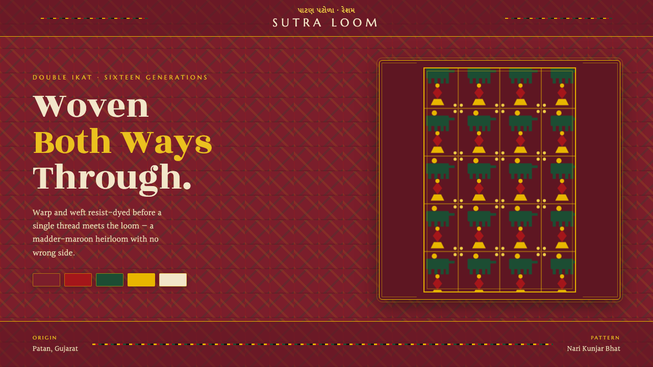 Patan Patola Double IkatReversible by design. Madder-maroon ground, a strict red-green-gold lattice,…
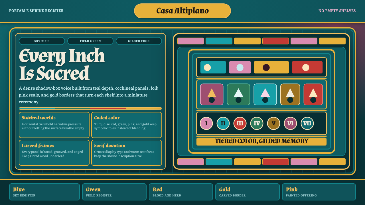 Ayacucho Retablo BoxSacred density. Deep teal shelves pack turquoise, cochineal, folk pink, and g…
 Bamileke Elephant MaskRoyal density. Indigo bead fields lock white triangle rows into ceremonial po…