What is Patan Patola Double Ikat?
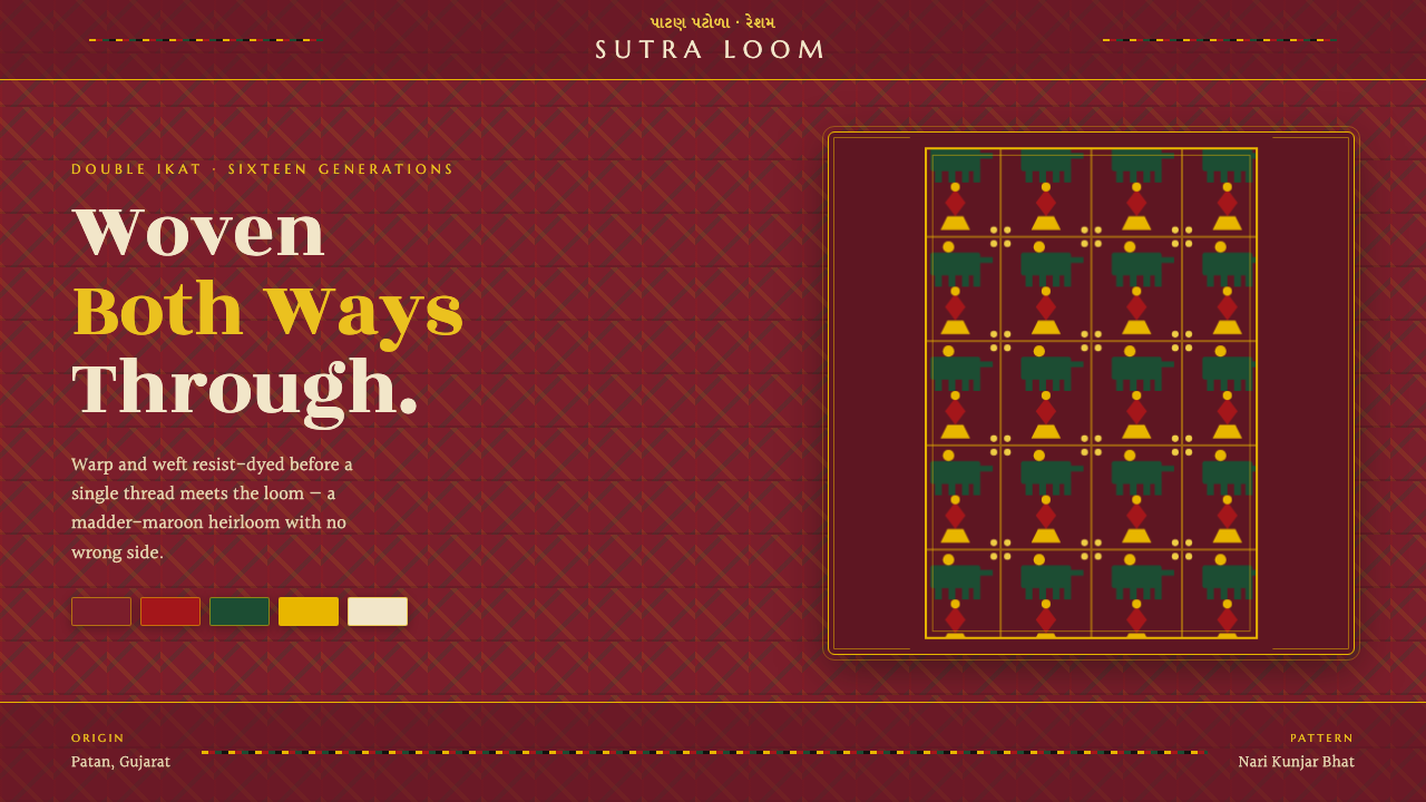
Patan Patola turns precision into radiance: a reversible field of madder maroon, mirrored figures, and resist-dyed silk whose feathered edges make exact geometry feel alive.
Patan Patola Double Ikat in brief
Patan Patola is the double-ikat mulberry-silk saree associated with the Salvi weaving family of Patan, Gujarat. Its defining achievement is technical before it is decorative: both warp and weft threads are resist-dyed before weaving. Pattern is therefore not printed onto a completed cloth or added as a surface layer. It is embedded in the meeting of prepared threads, allowing the finished textile to read as a fully reversible heirloom rather than as a front with a secondary reverse.
The visual field is built around a deep madder-maroon ground and the disciplined Nari Kunjar grid. Women, elephants, parrots, and dancing figures appear within a tightly controlled lattice, organized through mirror symmetry rather than free illustration. Bold red, green, yellow, and black establish the patterned structure, while undyed cream-yellow resist flecks provide the only true lift in value. The result is dense, ceremonial, and highly ordered without becoming mechanically flat.
As a digital design language, Patan Patola Double Ikat is not a generic ornamental textile treatment. It asks for saturated darkness, repeated mirrored modules, clear lattice logic, and edges that retain the soft uncertainty of resist dye. The system’s tension is its character: geometry must remain strict enough to communicate craft discipline, while each colored boundary must feel gently feathered, as though color has traveled through silk rather than been stamped onto a screen.
Where does Patan Patola Double Ikat come from?
The tradition belongs to Patan in Gujarat, India, and is identified in the supplied lineage as a pre-1900 practice sustained through sixteen generations of the Salvi family. That continuity matters because Patola is not simply a historic motif bank. It is a living mode of weaving in which the method, the visual grammar, and the status of the cloth as an heirloom remain inseparable. The current weaving tradition is described as ongoing, so any contemporary adaptation should treat it as an active cultural practice rather than an extinct period style.
Its place within Indian double-ikat silk weaving explains the unusually integrated relationship between image and structure. Double ikat requires preparation on both directions of the cloth before they are woven together. In Patola, the image emerges from alignment: the warp carries part of the visual instruction, the weft carries the other part, and the woven surface resolves them into one coherent field. Reversibility is therefore not an optional visual effect. It follows from the constructional premise that neither side should depend on a superficial finish.
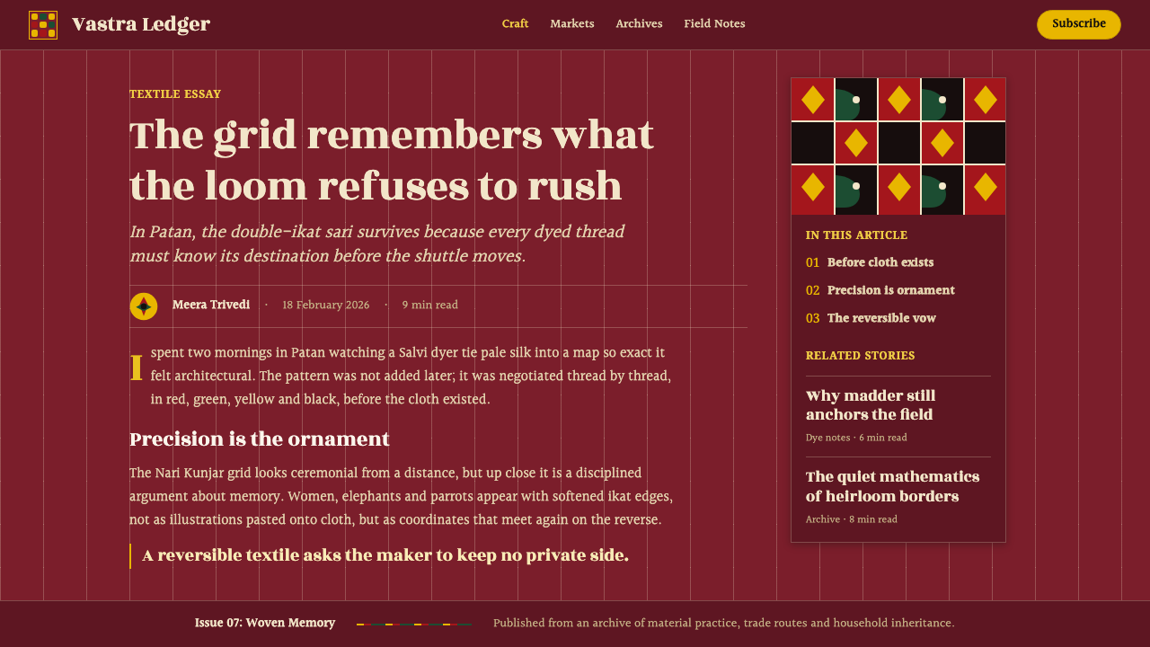
The Nari Kunjar pattern provides the tradition’s most legible organizing framework in this design system. It is a grid of women, elephants, parrots, and dancing figures, arranged in a disciplined, mirror-symmetric order. The repeated figures do not function like isolated illustrations placed on a background. Each motif is part of a larger lattice, and the lattice gives the figures their rhythm, spacing, and collective authority. When adapted digitally, that relationship should remain visible: a single motif may attract attention, but the repeated field is the actual composition.
The source also places Patola within a Navaratna geometric textile tradition. This connection clarifies why a design inspired by the cloth should privilege reciprocal pattern, symmetry, and woven continuity over pictorial depth. The strongest interpretation is not one that imitates fabric photographically. It is one that preserves the logic of a dark maroon field, concentrated chromatic figures, restrained cream-yellow resistance, and a repeating geometry that appears coherent from every direction.
What defines the Patan Patola Double Ikat look?
Reversible Construction
The governing idea is reversibility. Because both warp and weft are resist-dyed before weaving, the pattern belongs to the cloth’s construction rather than to a privileged display side. Digital work should echo this equality by avoiding compositions that only resolve from one narrow viewpoint. Mirrored modules, balanced edge conditions, and patterns that remain legible when repeated or reflected are more faithful than a single hero illustration placed over a textile-like backdrop.
Madder-Maroon Ground
A saturated madder-maroon field establishes the emotional temperature of the system. It is not an empty neutral background; it is the dense ground against which every patterned decision gains force. The dark field should feel continuous and immersive, with red, green, yellow, and black emerging as woven participants rather than as unrelated interface accents. Large unbroken areas of maroon give the lattice gravity and prevent the visual language from becoming festive but weightless.
Mirror-Symmetric Lattice
The Nari Kunjar arrangement is strict, repeated, and reciprocal. Women, elephants, parrots, and dancing figures gain meaning through their placement within the lattice, not through naturalistic scale or isolated storytelling. A faithful layout repeats modules with disciplined alignment, uses symmetry as a governing relationship, and lets the field extend beyond a card, page, or section boundary. Cropping can be bold, but it should imply that the pattern continues rather than that it has been casually scattered.
Resist-Dyed Feathering
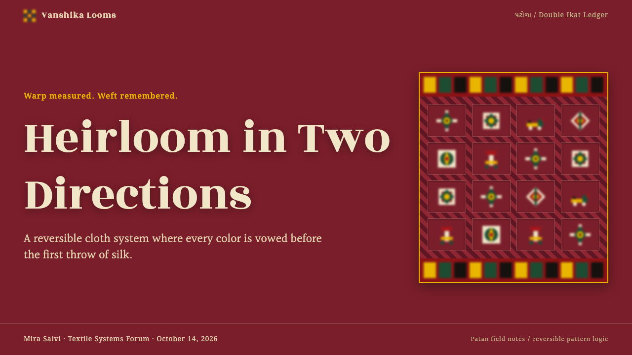
Soft feathering is the indispensable counterpoint to strict geometry. Resist dye does not read like a digitally perfect hard boundary; color meets color with a softened, lightly diffused edge. In a digital interpretation, that softness should remain local and material rather than becoming atmospheric blur across the whole composition. The lattice must still be exact. What softens is the transition at the motif boundary, giving the pattern the lived, silk-born character that a purely vector-clean treatment would lose.
Cream-Yellow Resistance
Undyed cream-yellow resist flecks are the system’s only light. Their role is selective: they open the dense maroon field, sharpen the reading of adjacent motifs, and make the woven process visible through absence of dye. They should never become broad white panels or generalized decorative sparkle. Their power comes from scarcity and contrast, functioning as small moments of resistance inside a saturated, highly structured surface.
Chromatic Discipline
Red, green, yellow, and black belong to a fixed patterned vocabulary on the maroon ground. They should be used as interdependent threads in a system, not as a broad palette inviting unlimited variation. Green and yellow can clarify figures against the ground; red can intensify the field while remaining distinct through placement; black gives the pattern definition and internal structure. The effect depends on disciplined recurrence, not on adding novelty colors for each section.

Who shaped Patan Patola Double Ikat?
The Salvi weaving family is the sole named lineage in the supplied material and the carrier of the Patan Patola tradition across sixteen generations. Their role is central because the style’s visual identity cannot be separated from the double-ikat method: the maroon field, patterned figures, feathered resist edges, and reversibility all depend on weaving knowledge rather than on an applied decorative surface.
Warp threads are one half of the double-ikat system. They are resist-dyed before weaving and carry part of the pattern’s eventual alignment. In a digital adaptation, they are best understood as the directional discipline behind the composition: the structural lines, repeated axes, and continuity that keep the pattern from reading as a collection of independent motifs.
Weft threads form the complementary half of the construction. Also resist-dyed before weaving, they meet the warp to resolve the Nari Kunjar field. Their conceptual value for designers is reciprocity: no single direction completes the image alone. Interfaces and layouts inspired by Patola should therefore let repeated elements answer one another across the composition rather than concentrating all meaning in a single top-to-bottom hierarchy.
Nari Kunjar is the named grid motif of women, elephants, parrots, and dancing figures carried across the deep maroon ground. It is the principal visual figure of this design system, but it should be treated as an ordered lattice rather than a character illustration. Its authority comes from recurrence, mirror symmetry, and the way each figure participates in a reversible patterned whole.
How do you use Patan Patola Double Ikat today?
For presentation covers, use the maroon field as a complete environment rather than as a backdrop behind ordinary content. Let a cropped Nari Kunjar lattice enter from an edge or occupy one side, and reserve the opposing area for a concise title with deliberate visual calm. A cover should feel like a section of a larger cloth, not like a decorative frame around a conventional slide. Keep cream-yellow light rare so that the title and pattern do not compete for the same visual role.
Content slides should translate the woven lattice into editorial discipline. Organize headings, body copy, captions, and supporting figures around a repeated alignment system, while allowing a restrained fragment of pattern to mark section changes or a side rail. The main reading area needs generous calm against the dense textile language. Pattern works best as a structural counterweight at the edge, behind a label, or as a carefully cropped field; it should not sit beneath every paragraph and reduce legibility.
For data slides, treat the palette as a semantic system rather than a decorative scheme. A dark maroon ground can carry charts with red, green, yellow, and black used consistently to distinguish related categories, while cream-yellow is held back for the one insight that deserves immediate attention. Charts should remain direct and readable, with patterned geometry framing the data rather than replacing it. Mirrored or repeated motifs can establish a section rhythm, but quantitative marks must remain the clearest visual evidence on the page.
On the web, this style is especially effective for dashboards, pricing pages, and other interfaces that benefit from a strong sense of system and collection. A dashboard can use the lattice to identify navigation zones, account states, or grouped modules, while large uninterrupted maroon surfaces establish a coherent application shell. A pricing page can give each offer a precise place in a symmetric field, using color relationships and cream-yellow resist-like highlights to distinguish the preferred action without making every control equally loud. The pattern should support orientation, not obstruct it.
For editorial and marketing work, Patola supports rich storytelling when the page alternates between dense pattern and clear reading space. Open an article with an immersive textile field, then let text live in quieter regions where the maroon ground and a few controlled accents carry the identity. Campaigns can use repeating Nari Kunjar fragments as a recognizable signature across formats. The common mistake is to treat the style as a generic dark ethnic pattern: random motifs, hard digital edges, unstructured color variation, and broad light panels erase the logic of double ikat. Preserve the mirror lattice, the limited chromatic vocabulary, the rare undyed light, and the resist-dyed softness together.
Patan Patola Double Ikat — FAQ
What makes Patan Patola double ikat different from a printed textile pattern?
Its image is formed through preparation before weaving. Both warp and weft threads are resist-dyed, then woven so their prepared pattern information meets in the cloth. A printed pattern sits on a finished surface; Patola’s pattern is inseparable from the woven construction. That distinction also explains its full reversibility and why a convincing digital adaptation needs structural alignment, not merely a textile image placed in the background.
Why are the edges feathered if the lattice is so strict?
The contrast is fundamental to the style. The Nari Kunjar field depends on precise, mirror-symmetric organization, while resist-dyed silk gives colored boundaries a soft feathered character. Removing either quality changes the identity: an entirely sharp pattern becomes sterile digital geometry, while an entirely soft pattern loses the disciplined woven order. The meeting of exact placement and gently diffused dye is the signature tension to preserve.
Can the pattern be used on a light background?
The supplied design system is built around a saturated madder-maroon ground, with undyed cream-yellow resist flecks as its only light. A broad light-background inversion would weaken the central contrast between dense ground and selective resistance. Lighter areas can still appear in small resist-like moments or as carefully separated reading regions, but the dominant experience should remain the maroon field carrying the red, green, yellow, and black lattice.
How should imagery be combined with a Patola-inspired layout?
Treat imagery as a distinct layer with a clear boundary, not as something to dissolve indiscriminately into the textile field. The Nari Kunjar lattice already carries women, elephants, parrots, and dancing figures as patterned visual content, so additional imagery should have a specific informational role. Give photographs or illustrations calm space beside the lattice, crop pattern decisively at the edge, and retain the maroon ground as the unifying field. This prevents the interface from becoming a crowded collage of unrelated visual languages.
What is the most common mistake in a digital Patola interpretation?
The most common mistake is borrowing the colors and motifs while abandoning the constructional logic. Random repetition, unmirrored figures, uniformly crisp boundaries, or abundant pale decoration may look textile-inspired, but they do not express Patola’s double-ikat identity. Start with the reversible, mirror-symmetric lattice; use the maroon field as the dominant ground; keep cream-yellow light scarce; then introduce feathered resist-dye transitions. The order of those decisions matters.
Related design styles
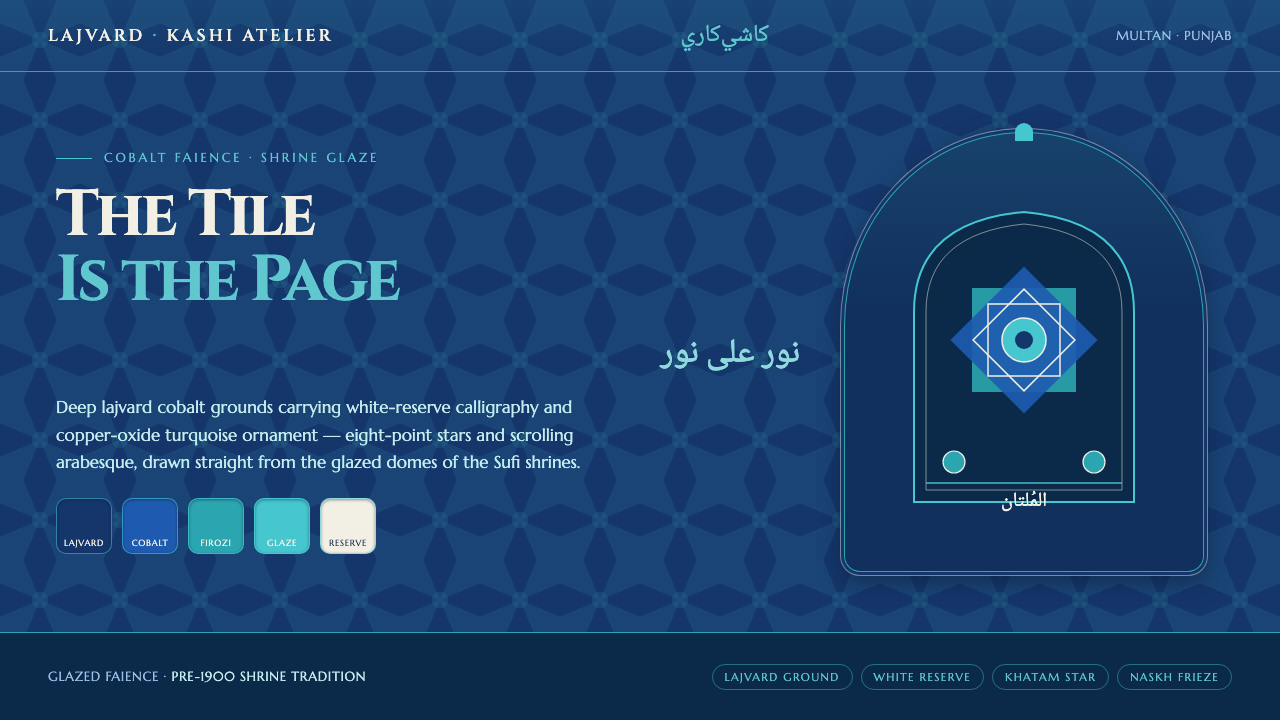 Multani Kashi TileworkThe cobalt tile is the page. Lajvard grounds carry white-reserve script and f…
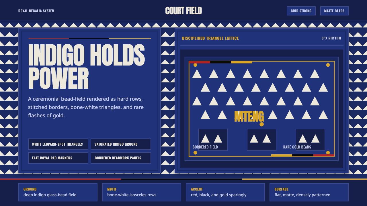 Bamileke Elephant MaskRoyal density. Indigo bead fields lock white triangle rows into ceremonial po…
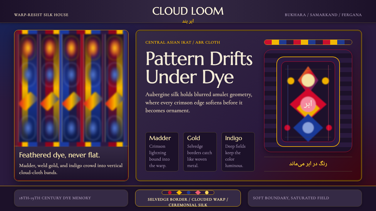 Central Asian IkatMaximal silk haze. Madder, gold, and indigo warp bands feather across aubergi…
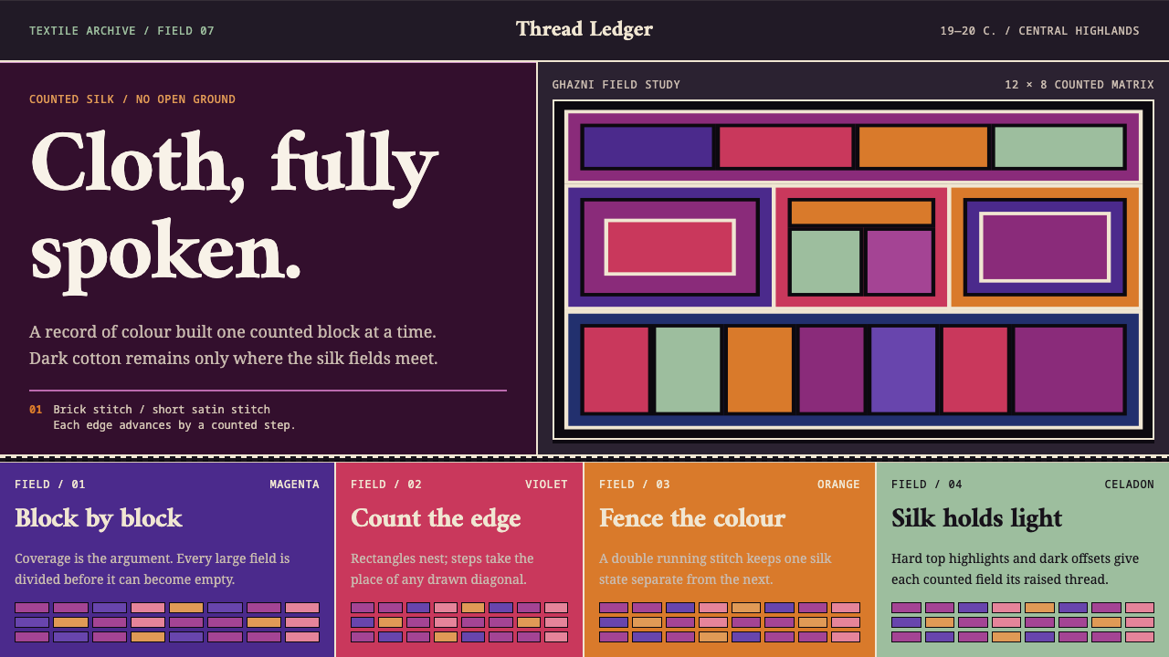 Hazara EmbroideryCoverage is the argument. Magenta silk blocks meet on a dark counted lattice.
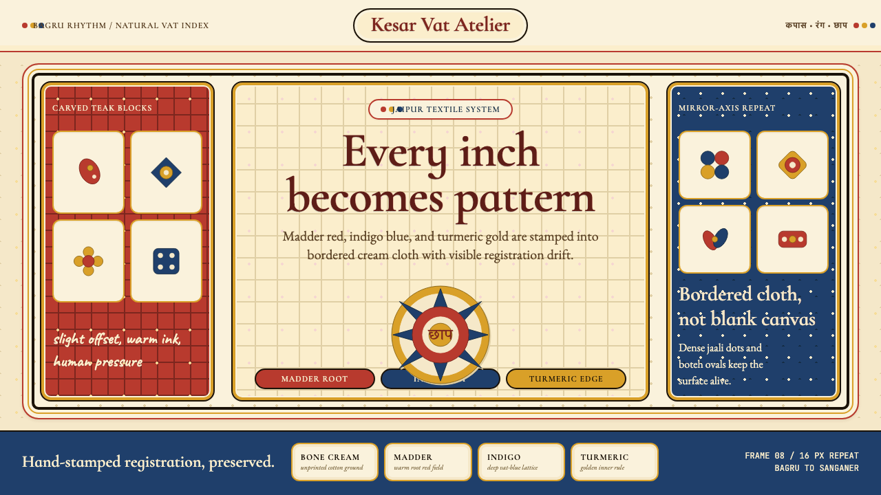 Indian Block PrintPattern claims every inch. Madder, indigo and turmeric stamp dense bordered c…
 Russian KhokhlomaOrnament is the message. Antique gold curls and crimson dots crowd a black la…