What is Pipli Appliqué?
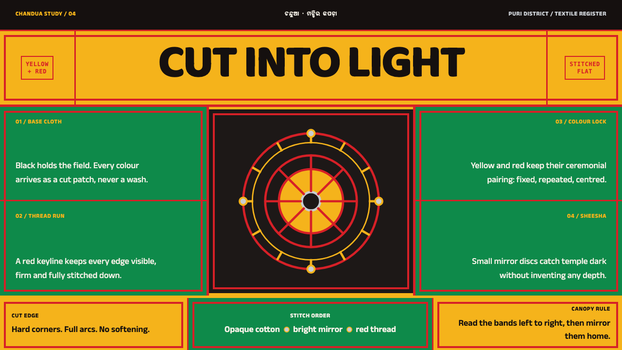
Pipli appliqué cuts ceremony flat: shapes scissored from dyed cotton, stitched onto black cloth and locked to the colours of the deities.
Pipli Appliqué in brief
Pipli Appliqué is a design style drawn from chandua, the appliqué craft of Pipli, a roadside village in Puri district, Odisha. For generations, hereditary tailor families there have cut and stitched canopies, banners, ceremonial umbrellas and the covers that dress the chariots of the Rath Yatra for the Jagannath temple. The method is simple and exacting: shapes are scissored from dyed cotton, laid on an opaque base cloth, held down with buttonhole and satin stitch, and ringed with small mirrors that catch light in the dark of the temple.
The design system takes the cloth literally. The page is the black base, and everything else is a patch sitting on it. A small set of canonical shades carries the entire look, and colours are locked to deities rather than chosen screen by screen. Depth is refused outright: a shape is separated from its ground by a stitch line and a change of colour, never by a shadow or a gradient. The result is flat, graphic, bold and unmistakably handmade.
It is also a style of rules. Corners are either a clean right angle, as if cut by scissors, or a full arc, with nothing in between. Bands repeat and mirror one another across an axis, as they do on a canopy. Each decision has a reason in the craft, which is why the style reads as coherent rather than merely decorative.

Where does Pipli Appliqué come from?
Pipli is a village in Puri district, in the eastern Indian state of Odisha, and the craft that bears its name is tied to the Shree Jagannath Temple in Puri. The record gives the era as before 1900 and continuing to the present, a temple-service craft that follows the calendar of the Rath Yatra, the great chariot festival. The makers are the hereditary Darji tailor families of Pipli, who have cut and stitched chandua appliqué for the temple longer than anyone kept records.
The objects they make are the textiles of ceremony: canopies, banners, ceremonial umbrellas and, above all, the large covers that dress the three chariots of the Rath Yatra. These are working textiles, made to be seen from a distance in the open air, and the technique reflects that. Dyed cotton is cut into shapes, laid on a dark base cloth and fixed with buttonhole and satin stitch that doubles as an outline. Small mirrors ring the edges and flash in the dim light of the temple.
The colours are not a matter of taste. In the system's record they are matched to deities: yellow with red belongs to Jagannath, green with red to Balabhadra, and black with red to Subhadra. The three chariots of the festival belong to these three, and the covers carry the corresponding pair. The design system adopts this logic directly. A colour pair stands for a category, and once a category has its pair it keeps it everywhere, instead of being re-chosen for each card or each page.
The record names Pipli's appliqué as a GI-registered craft, a legal recognition that ties the name to the place, and lists Odishan temple craft and Rath Yatra chariot decoration among its movements. The two key figures are collective: the hereditary tailor families of Pipli and the temple administration in Puri. That is worth noticing. This style comes from an institution and a community, not from a named designer, and the discipline of the system is the discipline of a trade handed down within families.
What defines the Pipli Appliqué look?
Black base cloth
The ground is a black base, opaque and even, and the whole page is that cloth. Nothing is transparent, and nothing floats above it; every element is a patch laid on the base. The black is not a mood but a material, the dark of the temple against which colour and mirrors show. Layouts built on a pale ground lose the premise.
Colours locked by deity
A small set of canonical shades does all the work: deity yellow, temple red, leaf green, saffron orange and the white of cut cloth. They come in fixed pairs. Yellow with red is Jagannath, green with red is Balabhadra, black with red is Subhadra. In an interface, that means one pair per category, used consistently, never recoloured at will.
Patches, not layers
Every shape is a piece of cloth sitting on another piece of cloth. It is separated from its ground by a stitch line and a change of colour, never by a shadow, a blur or a gradient. Elevation, glow and glass effects have no place. When one patch overlaps another, the join is shown by a visible stitched edge and the colour contrast between the two.
Stitch as outline
Buttonhole and satin stitch hold each patch down, and in the finished cloth they also draw its edge. The style turns this into a rule: shapes are outlined by an evenly spaced stitched line, a border made of small repeated marks. The outline is visible, regular and the same around every patch, which makes the surface feel assembled by hand.
Mirrored bands
Motifs run in bands, and the bands mirror across an axis as they do on a canopy or a banner. Repetition gives rhythm, and symmetry gives a ceremonial calm. A band can serve as a header, a divider or a frame. The mirroring is a structure for ordering content, not a device for filling space.
Square cut or full arc
There are only two kinds of corner: the right angle left by scissors and the complete arc. Nothing in between, no softly rounded rectangles. A button can be square or a full pill, an avatar can be a circle, a card can be a sharp-cornered patch. This either-or is what keeps the surface looking cut from cloth rather than moulded.
Small mirrors
In the craft, small mirrors ring the edges of the cloth and catch the dim light of the temple. They are the one place where light is allowed to appear. A design that borrows the idea can echo it with tiny round points of brightness at the ends of bands or on key items, while keeping the cloth itself matte and never adding glow or glossy surfaces.

Who shaped Pipli Appliqué?
The first of the two key figures in the record is a community: the hereditary Darji tailor families who have cut and stitched chandua appliqué for the Jagannath temple. They are the real authors of the style, and the craft is learned within families, which is why its rules feel so consistent. A designer who borrows from Pipli is borrowing from their trade, and should credit it as such.
The temple administration in Puri is the second key figure, and it stands for the setting in which the craft exists: temple service on the calendar of the Rath Yatra. The textiles are made for ceremony, and their forms, colours and pairings answer to the temple's needs. This is why the style has so many fixed rules, and why it should be treated as a ceremonial system, not a free decorative one.
The three deities of the Rath Yatra govern the palette. Yellow with red belongs to Jagannath, green with red to Balabhadra and black with red to Subhadra, and the pairings dictate how colour is allocated in the style. They are not characters to be illustrated. In the design system they appear only as colour logic, and respect for that logic means never mixing the pairs for convenience.
How do you use Pipli Appliqué today?
Pipli Appliqué suits work that carries ritual weight and wants to be bold: festival and event sites, cultural platforms, craft marketplaces, storytelling projects, museum and heritage content and any product with clear categories that deserve a stable identity. It is flat, graphic and high-contrast, and it works best where the content can be broken into distinct pieces. It is a poor fit for airy, quiet, corporate minimalism, where its insistent colour and stitched edges would feel loud.
In presentation slides, a cover can be a black field with a few large patches in a single deity pair, edged with a stitched outline, and a title set on one of the patches. Content slides use mirrored bands as headers and dividers, with one patch per idea. Data slides are particularly good: bars, segments and tiles become flat patches, each series is locked to a pair, and there are no gradients, shadows or three-dimensional effects.
On the web, think of festival programmes, cultural and craft sites, category-coded boards and dashboards where each category keeps its pair of colours across every view. Cards are patches with stitched outlines, buttons are square-cut or full pills, and hover states change colour or outline instead of lifting with a shadow. Keep the black base throughout, use the white of cut cloth for body text where legibility demands it, and treat mirrored bands as the main navigation device.
For editorial and marketing work, the style supports posters, festival guides, craft catalogues and long features on textile traditions. Mirrored bands can mark the beginning of each section, photographs of the actual cloth can take the place of illustration, and captions should name the makers. Because the craft belongs to named communities, the strongest editorial use credits the Darji families and the temple setting plainly, in the copy.
The most common mistake is to treat the palette as a rainbow, using every shade at once and ignoring the fixed pairs. Close behind are rounding corners halfway, adding drop shadows or gradients to make cards pop, and mixing deity pairs inside a single category. A subtler error is to use the sacred colour logic as pure decoration, or to illustrate the deities themselves as stock clip art. The pairs should carry meaning in the layout, and the figures should be left to the people whose tradition they belong to.

Pipli Appliqué — FAQ
What is chandua appliqué?
Chandua is the appliqué craft of Pipli village in Puri district, Odisha. Shapes are cut from dyed cotton, laid on an opaque base cloth and fixed with buttonhole and satin stitch, then ringed with small mirrors. It is made by hereditary tailor families for the Jagannath temple, as canopies, banners, ceremonial umbrellas and the covers of the Rath Yatra chariots, and it is registered as a geographical-indication craft.
Why are the colours tied to deities?
Because in the craft the colours are not a free choice. Yellow with red belongs to Jagannath, green with red to Balabhadra and black with red to Subhadra, and the covers of the three Rath Yatra chariots follow those pairings. The design system borrows the logic for interfaces: each category gets one fixed pair and keeps it everywhere, so colour carries meaning instead of mood.
Why does the style refuse shadows and gradients?
Because the craft is made of flat cloth. A patch lies on another patch, and what separates them is a stitch line and a change of colour, not a lighting effect. Shadows and gradients would suggest a volume that does not exist and would make the surface look moulded or printed. Refusing them keeps the interface honest to its material.
Why only square corners or full arcs?
A pair of scissors leaves two kinds of edge: a straight cut with a clean corner, or a deliberate curve all the way round. A slightly rounded rectangle is neither, and it belongs to moulded plastic and software conventions, not to cut cloth. In an interface the rule is simple: pick square or full-round for every component and never settle on a middle radius.
Can I use it outside festival or religious contexts, or on a light background?
Outside festivals, it works well for craft, culture, storytelling and any category-coded product, provided the colour pairs are applied with discipline. A light version is possible, but the black base is the premise of the system, and the colours are chosen to glow against it. Wherever you use it, remember the pairs are sacred in origin, and credit the tradition.
Related design styles
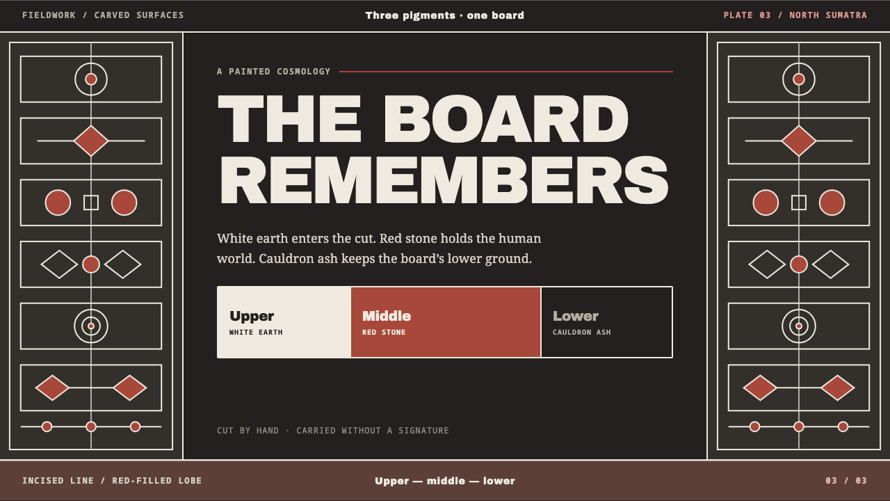 Batak GorgaCosmology cut into wood. Chalk-white lines and batu hula red hold a blackened…
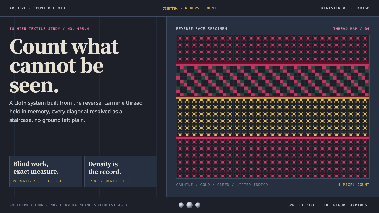 Mien Yao Cross-StitchDensity is the achievement. Carmine counted stitches saturate near-black indi…
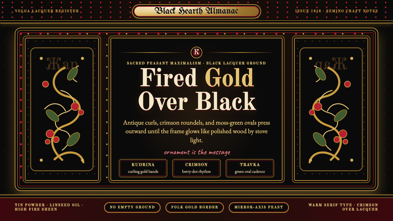 Russian KhokhlomaOrnament is the message. Antique gold curls and crimson dots crowd a black la…
 Tibetan Butter SculptureDevotion made dense. Cinnabar, lapis, and gold relief glow from altar black.
 Central Asian IkatMaximal silk haze. Madder, gold, and indigo warp bands feather across aubergi…
 Khevsur Cross EmbroideryDensity carries meaning. Rust crosses tile near-black wool; silver coins punc…