What is Fileteado Porteño Sign Art?
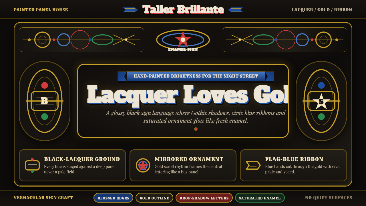
Fileteado porteño turns the black lacquered surface into a stage: gold scrolls, flag-blue ribbons, jewel-like color, and Gothic shadows make everyday lettering feel ceremonial.
Fileteado Porteño Sign Art in brief
Filete porteño is the ornamental sign-painting language that emerged in Buenos Aires around 1900. It began on collectivos, trucks, and other working vehicles, where immigrant craftsmen transformed practical painted panels into lavish compositions of acanthus-like leaves, curling vines, ribbons, flowers, and emphatic lettering. The result was not merely decoration applied to transport: it gave a vehicle a public personality.
Its essential visual drama comes from contrast. Saturated gold, blue, red, and green sit on glossy black grounds, so color appears to glow against the lacquered darkness. Bold Gothic-influenced letters are surrounded by scrollwork and painted shadows, making words feel dimensional, precious, and deliberately theatrical. Precision and exuberance operate together: every flourish is carefully controlled, yet the overall effect remains generous and alive.
Fileteado porteño is also a vernacular language of civic identity. Its blue-and-white ribbons invoke Argentina while its ornamental vocabulary carries the hand-painted knowledge of Italian and Spanish immigrant craft. Today it appears on shopfronts, tango posters, and street murals as well as vehicles. UNESCO recognized the practice as Intangible Cultural Heritage in 2015, affirming that its value lies not only in its images but in the living craft tradition behind them.
Where does Fileteado Porteño Sign Art come from?
Filete porteño developed in Buenos Aires around 1900, in the working visual culture of transport. Buses and trucks offered broad painted surfaces that moved constantly through the city, and the sign-painter’s task was both practical and expressive: identify, personalize, and dignify the vehicle. The decorated panel became a mobile announcement of character, pride, and craft.
Italian and Spanish immigrant craftsmen were central to this beginning. Their decorative habits met the needs of porteño transport culture and produced an idiom that was neither imported whole nor formally academic. Scrolling leaf forms, ribbons, floral ornament, and shaded lettering became a shared vocabulary through repeated workshop practice, adaptation, and visible competition among painted vehicles.
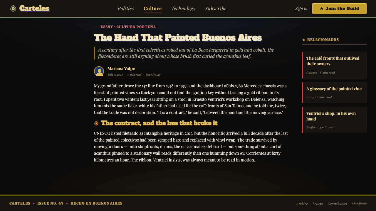
The style flourished through the twentieth century because it could hold opposing qualities in one surface. It is highly disciplined in brushwork and symmetry, yet Baroque-derived in its appetite for movement and embellishment. It is rooted in commercial sign painting, yet capable of carrying civic symbols and emotional display. A black lacquered field gave the composition a unified ground on which every colored detail could announce itself.
Its continuity into the present reflects its adaptability without abandoning its visual code. Fileteado moved from transport panels into shop signs, tango imagery, and murals while retaining ornamental lettering, ribbons, jewel-toned flourishes, and strong dark-ground contrast. The 2015 UNESCO inscription recognized a collective tradition maintained by fileteadores and painting workshops rather than a style belonging to a single celebrated author.
What defines the Fileteado Porteño Sign Art look?
Lacquered Darkness
Glossy black is the visual foundation rather than empty background. It compresses the composition into a dramatic field and makes painted gold, blue, red, and green appear enamel-like. The dark ground gives ornament a sense of depth before any shadow is added.
Scrollwork and Vines
Curling acanthus-like leaves, vines, and floral flourishes frame the lettering and keep the eye moving. Their purpose is not quiet refinement. They create an ornamental current that makes the panel feel animated, full, and proudly hand-made.
Gothic Lettering
Lettering is bold, formal, and treated as an illustrated object rather than neutral information. Gothic-influenced forms bring authority and ceremony, while painted outlines and shadows make each word seem carved, raised, or set into the surface.
Jewel-Toned Contrast
Gold, blue, red, and green are used as intense painted accents against black. The palette is rich because the colors are separated and given room to shine; their force comes from adjacency to darkness, not from indiscriminate saturation across every surface.
Ribbons and Civic Symbols
Ribbons give the compositions ceremonial movement and provide a place for Argentine civic feeling, especially through flag-blue and white associations. They tie lettering and ornament together, making the image read as a crafted emblem rather than a loose accumulation of motifs.
Hand-Painted Precision
The style depends on controlled brushwork. Curves must remain confident, mirrored elements must feel related, and shadows must reinforce rather than blur the form. Its exuberance is therefore disciplined: abundance works because the painter keeps every line legible.
Who shaped Fileteado Porteño Sign Art?
The fileteadores are the anonymous practitioners who kept filete porteño alive through hand-painted work. Their importance lies in a shared craft vocabulary rather than individual authorship: scrollwork, lettering, shadow, lacquered contrast, and civic ornament are transmitted through practice.
Italian immigrant craftsmen helped establish the ornamental sensibility that entered Buenos Aires transport painting. Their contribution is visible in the scrolling foliage, floral elaboration, and appetite for decorative movement that gave working vehicles an unexpectedly ceremonial presence.
Spanish immigrant craftsmen formed the other essential current in the tradition’s early collective making. Alongside Italian craft knowledge, their work helped turn vehicle personalization into a recognizable porteño visual language with durable public character.
Transport-company painting workshops gave the style its practical setting and repeated public exposure. They connected decorative skill to vehicles in everyday circulation, allowing the language to develop through applied work rather than through a detached art world.
How do you use Fileteado Porteño Sign Art today?
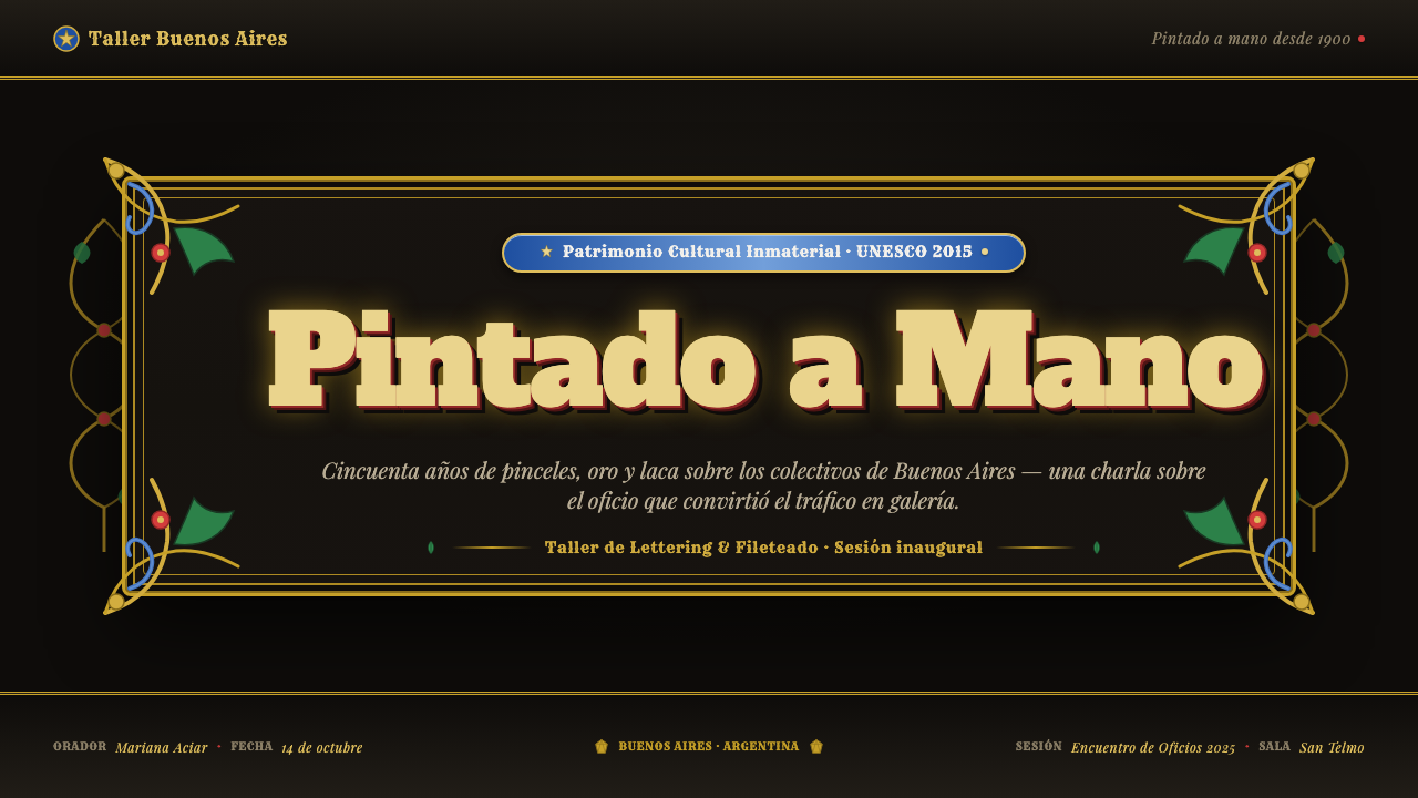
For presentation covers, filete porteño works best when the title is treated as the central painted event. Set expressive, Gothic-influenced lettering on a deep black field, then let scrollwork and a ribbon frame rather than bury it. Keep the composition ceremonial and frontal: the surface should feel like a signboard with a clear name, not a generic dark slide decorated with random flourishes.
Content and data slides need a more selective adaptation. Use the dark lacquered ground to establish atmosphere, then reserve gold-like accents and colored ribbons for titles, key figures, or category markers. Charts should remain readable first; ornamental borders can frame a data block, but leafwork must not compete with labels or distort the comparison the chart is meant to communicate.
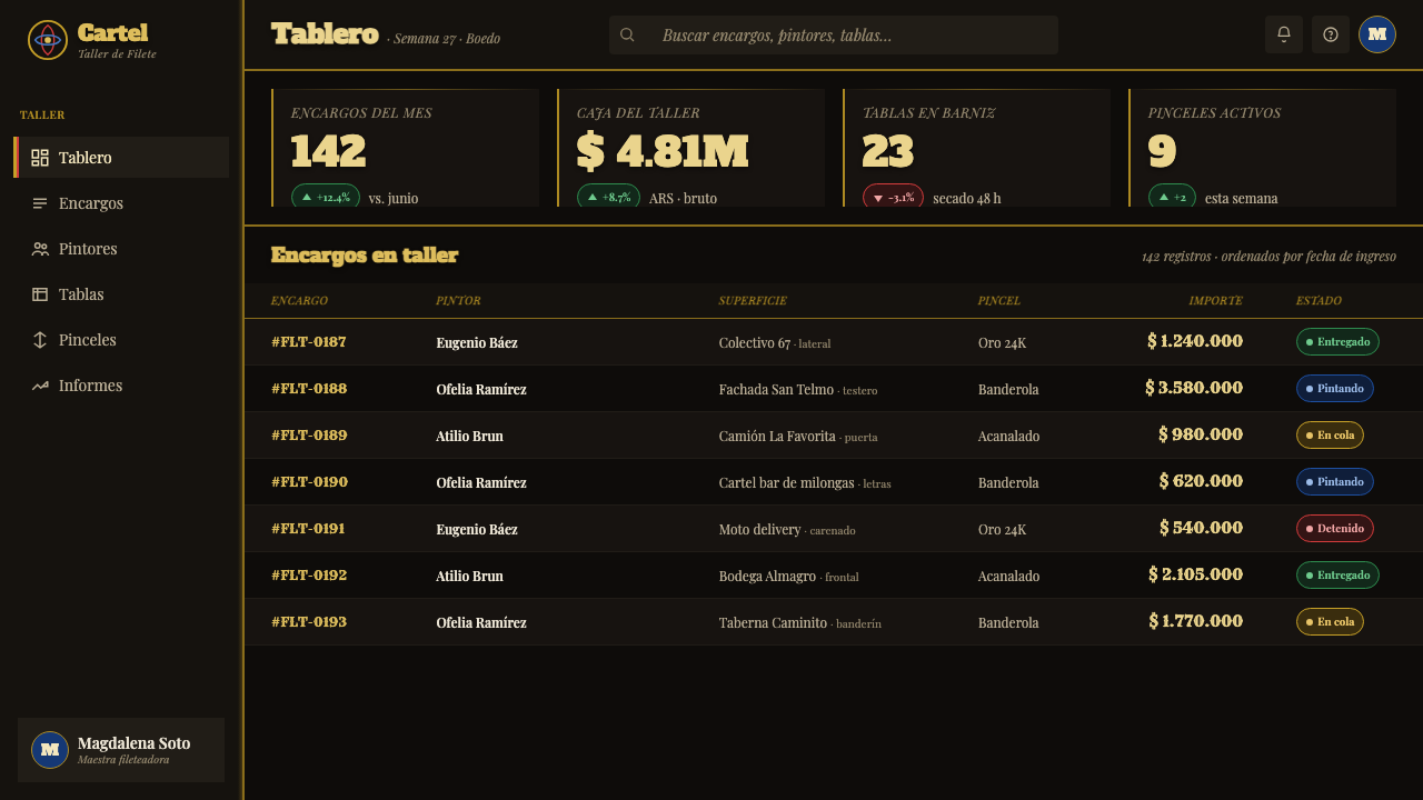
In web interfaces, the style is strongest for branded dashboards, campaign pages, venue pages, or pricing experiences that can support theatrical identity. Use black as the unifying stage, employ rich colored accents sparingly for navigation states and priority information, and give display lettering a role in headings rather than body copy. Functional controls should remain direct and legible even when surrounded by decorative framing.
For editorial and marketing work, fileteado porteño can turn a headline, promotion, poster, or storefront-like landing page into an emblem. Use ornamental framing to introduce sections, ribbons to carry short messages, and shadowed lettering for a small number of high-value words. It is especially apt where tango, Buenos Aires, craft, celebration, movement, or civic pride is genuinely part of the subject rather than an arbitrary visual costume.
The common mistake is to interpret fileteado as permission to cover every area with gold curls and multicolored decoration. Its richness depends on hierarchy: lettering has to remain dominant, black has to remain visible, and ornament needs clear paths around the main message. Another mistake is replacing hand-painted confidence with soft, vague effects; this tradition needs crisp curves, decisive shadows, and deliberate contrast.
Fileteado Porteño Sign Art — FAQ
Is filete porteño simply a form of Baroque decoration?
It draws on Baroque-derived scrollwork and exuberance, but it is a distinct vernacular sign-painting language of Buenos Aires. Its identity comes from the union of ornamental vines, Gothic-influenced lettering, black lacquered panels, transport culture, immigrant craft, and Argentine civic symbolism. Baroque abundance is an influence, not a complete description.
Why is black so important to the style?
The glossy black ground creates the contrast that makes gold and jewel-like pigments seem luminous. It also holds a dense composition together: ribbons, letters, leaves, shadows, and colored flourishes can remain distinct because the lacquered darkness gives them a shared visual stage.
Can the style be used without Gothic-influenced lettering?
A contemporary adaptation can vary the lettering, but it should preserve the principle that words are a central visual object. If the type becomes neutral while ornament carries all the personality, the result can lose the sign-painting character that makes filete porteño distinctive. Strong outlined, shadowed, carefully composed display lettering is the more faithful direction.
Where does filete porteño work poorly in contemporary design?
It can struggle in products that require quiet neutrality, dense routine reading, or a restrained institutional tone. Because the style is ceremonial and visually assertive, it can overwhelm utilitarian workflows when applied everywhere. It works best as a strong identity layer around selected moments, rather than as decoration forced onto every interface and every message.
Related design styles
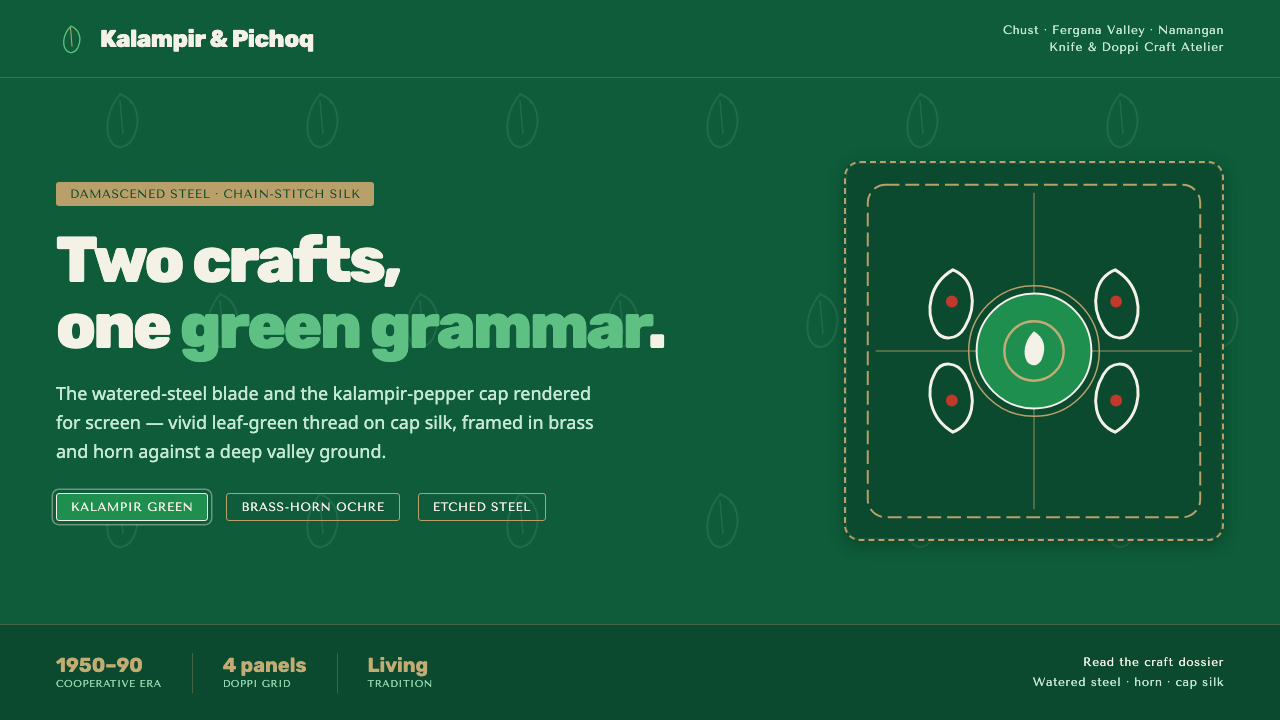 Chust Pichak Knife CraftTwo crafts, one green grammar. Vivid kalampir chain-stitch on cap silk, brass…
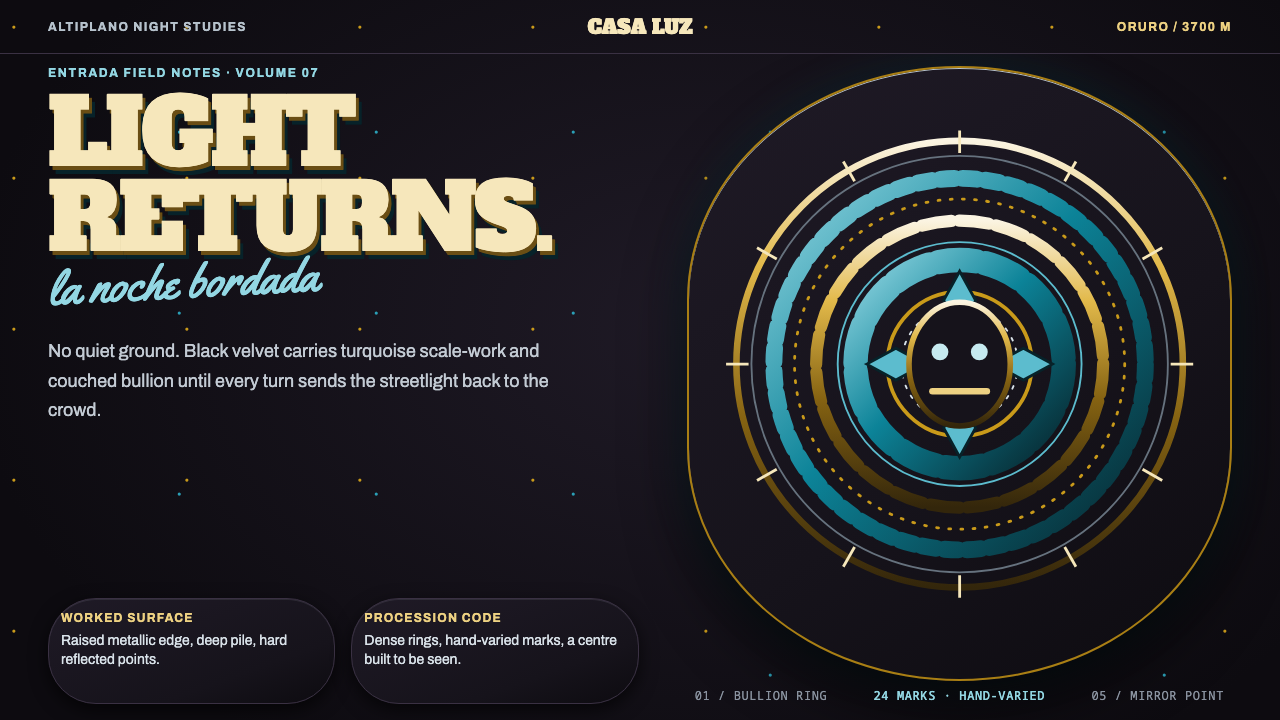 Diablada de OruroDensity throws light back. Turquoise scale-work and bullion rings electrify b…
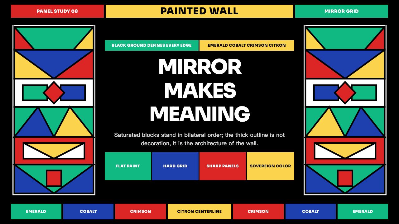 Ndebele Geometric MuralSymmetry declares presence. Emerald, cobalt, crimson and citron lock into bla…
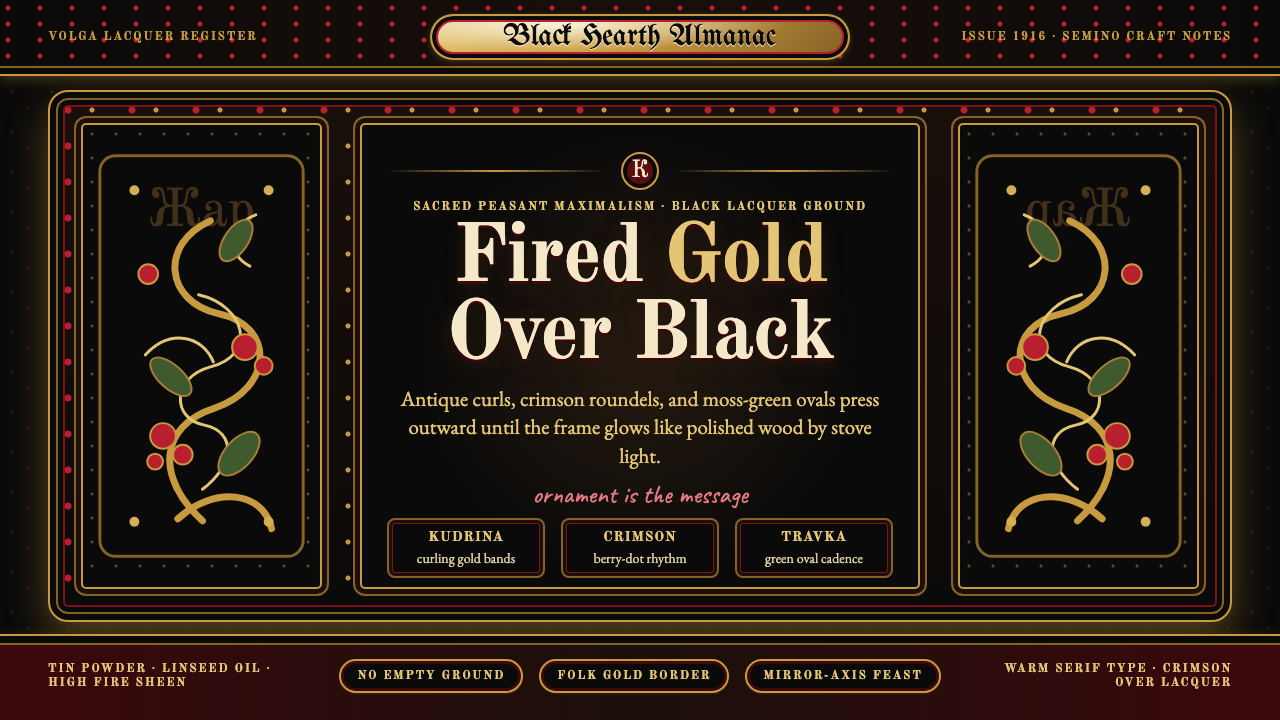 Russian KhokhlomaOrnament is the message. Antique gold curls and crimson dots crowd a black la…
 Tibetan Butter SculptureDevotion made dense. Cinnabar, lapis, and gold relief glow from altar black.
 Batak GorgaCosmology cut into wood. Chalk-white lines and batu hula red hold a blackened…