What is Univers Frutiger Numbered Grid?
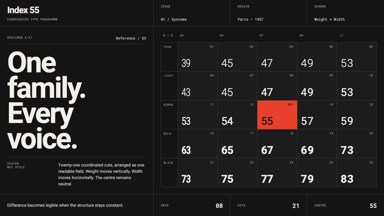
Difference becomes a system: grey numbered type locks to a dark modular grid, while a single red centre turns classification into a visual event.
Univers Frutiger Numbered Grid in brief
Univers Frutiger Numbered Grid is a dark reinterpretation of the canonical Univers specimen: a systematic matrix of numbered type styles, arranged with severe Swiss clarity and interrupted by one red cell at its centre. The composition does not use type as decoration. It makes the organization of type visible.
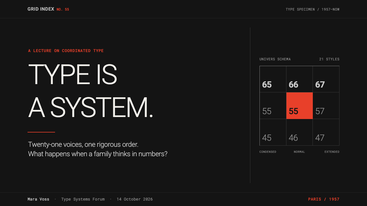
Univers was conceived as a coordinated type system rather than a loose family of related faces. Its 21 styles are identified through a numbered schema in which one digit establishes weight and the other establishes width. A reader is invited to see difference as ordered variation: each entry is distinct, but none is arbitrary.
In this theme, the historic achromatic specimen is inverted onto a dark ground. Grey lettering performs the quiet work of hierarchy, the grid regulates every placement, and the red mark remains singular. The result is controlled rather than expressive: flush-left alignment, repeated modules, restrained contrast, and one deliberate exception.
Where does Univers Frutiger Numbered Grid come from?
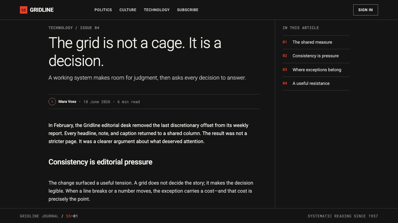
The system begins in 1957, with Univers associated with Paris, France, Switzerland, Adrian Frutiger, and the type foundry Deberny & Peignot. Its historical importance lies in the premise stated by its structure: type can be designed as an intelligible family whose internal relationships are named rather than merely sensed.
The numbered arrangement is the core historical idea. Instead of treating weight and width as isolated stylistic labels, Univers places them in a matrix. The first digit fixes weight; the second fixes width. The resulting specimen turns a type catalogue into a map, where visual variety can be read as a consistent field.
That logic belongs to the International Typographic Style and to systematic type design. The canonical specimen presents black type on a disciplined grid and assigns one central red cell to Univers 55 Roman. The dark theme preserves the numbered schema, the flush-left rigor, the modular matrix, and the isolated signal-red centre while reversing the original light-dark polarity.
What defines the Univers Frutiger Numbered Grid look?
Numbered Difference
The numbered styles are content as much as form. A number names a precise position within the family, allowing weight and width to read as coordinated variables rather than expressive labels. Repetition makes the system legible; variation gives it purpose.
Dark Polarity
The canonical black-on-light specimen is reversed into a dark field. This is not a change of personality so much as a change of polarity: the grid remains strict, the type remains systematic, and contrast is carried by quiet greys rather than ornamental effects.
Modular Grid
Every element appears to snap into a shared matrix. The grid is not background texture; it is the governing condition of spacing, grouping, and position. Empty modules matter as much as occupied ones, because they make the system’s discipline perceptible.
Flush-Left Rigor
Flush-left alignment gives the composition a stable edge from which differences can be measured. The eye repeatedly returns to that edge, then travels across rows of numbered variation. The alignment is functional: it prevents a dense type field from becoming ornamental noise.
Grey Hierarchy
Grey performs the understated work normally assigned to many colors. It separates supporting information from stronger typographic statements without competing with the primary system. On the dark ground, this restraint makes the numbered family feel ordered, technical, and calm.
Single Red Centre
The red centre is an exception with a structural role. Because every surrounding cell is restrained, the mark can identify Univers 55 Roman without becoming a decorative accent scattered across the page. Its rarity gives it authority.

Who shaped Univers Frutiger Numbered Grid?
Adrian Frutiger is the named designer associated with Univers. Within this theme, his significance is inseparable from the family’s systematic premise: typographic difference is organized through a coordinated numbered structure rather than presented as a collection of unrelated styles.
Deberny & Peignot is the type foundry associated with Univers in 1957. Its place in the story anchors the system in the practical world of type production, where a family must be identified, grouped, and understood as a coherent whole.
Univers 55 Roman is the style identified by the single red central cell in the canonical specimen. In the dark interpretation, it remains the system’s focal point: not an invitation to add more accent color, but proof that one exception can organize a field.
How do you use Univers Frutiger Numbered Grid today?
For presentation covers, use the numbered grid as the principal image rather than adding illustration. Let a short title occupy a clear module or edge, keep supporting information subordinate in grey, and reserve the red centre for the one item that must be remembered. The cover should feel like a specimen sheet with a declared subject.
On content slides, retain the flush-left anchor and treat each section as a controlled row or group within the matrix. Use large numbered labels to establish sequence, then let quieter text explain the point. For data slides, turn categories into a disciplined field of aligned labels and cells; the red mark should identify one meaningful reference, not every important value.
For web interfaces, the theme suits dashboards, inventories, comparison tools, and pricing pages where users need to scan structured differences. Build around stable columns and repeated modules, give navigation a typographic role, and use grey hierarchy to distinguish utility information from primary decisions. The dark field should support concentration, not become a theatrical backdrop.
For editorial and marketing work, it is effective when the message concerns classification, range, options, or a technical system. A feature page can introduce a product through a numbered matrix, while a longer article can use aligned metadata, repeated section markers, and a single red editorial focal point. The visual voice is precise, institutional, and intentionally spare.
The common mistake is to treat the red centre as a general-purpose accent and the grid as a decorative pattern. Once multiple elements demand the same red attention, or text begins drifting away from the shared matrix, the central idea disappears. This style succeeds through controlled difference: many greys, repeated alignment, and one unmistakable exception.
Univers Frutiger Numbered Grid — FAQ
Is this simply a dark version of Swiss typography?
It is specifically a dark reinterpretation of the Univers specimen system. Its connection to the International Typographic Style is visible in the grid, flush-left rigor, and restraint, but the numbered relationship between weight and width is the defining mechanism. The dark ground changes polarity, not the system.
Why is only one cell red?
The canonical specimen uses a single central red cell to identify Univers 55 Roman. Keeping that mark singular gives it structural force. It establishes a centre and a reference point without weakening the grey typographic field through repeated accent color.
Does the numbered system replace typographic hierarchy?
No. The numbers identify relationships within the Univers family; hierarchy still comes from placement, grouping, scale contrast, grey value, and the grid. The strength of the theme is that classification and hierarchy support one another instead of competing.
Can the red mark be moved away from the centre?
It can, but the change should be intentional because the centre is part of the specimen’s visual logic. Moving it turns the mark from a canonical reference into a directional or editorial signal. It should remain solitary and attached to a meaningful system role.
Where does this style work least well?
It is least convincing when the content has no meaningful structure to reveal. If a page depends on abundant expressive imagery, many equal-priority messages, or continuously changing visual moods, the numbered matrix can feel imposed. Its discipline works best when difference genuinely needs organization.
Related design styles
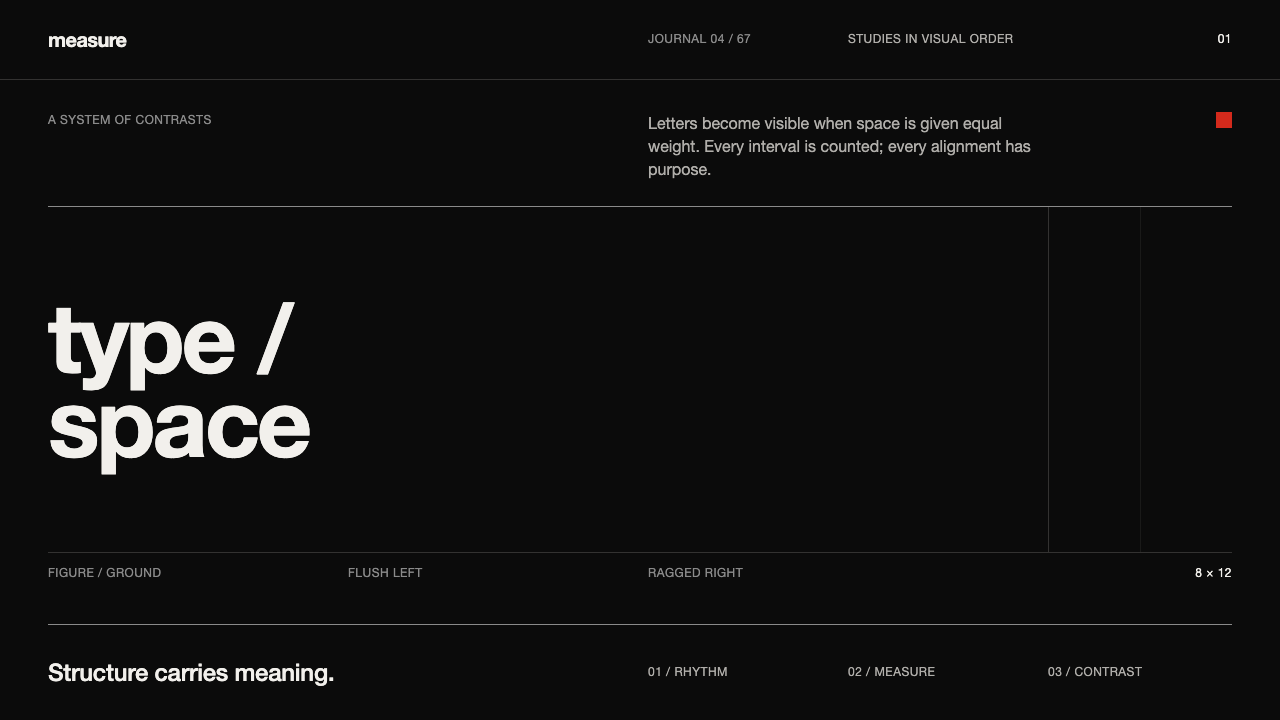 Emil Ruder TypografieDiscipline makes type visible. Near-white grotesque and measured space cut th…
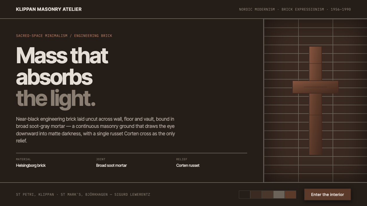 Lewerentz Dark BrickMass that absorbs light. Near-black engineering brick, broad soot mortar, one…
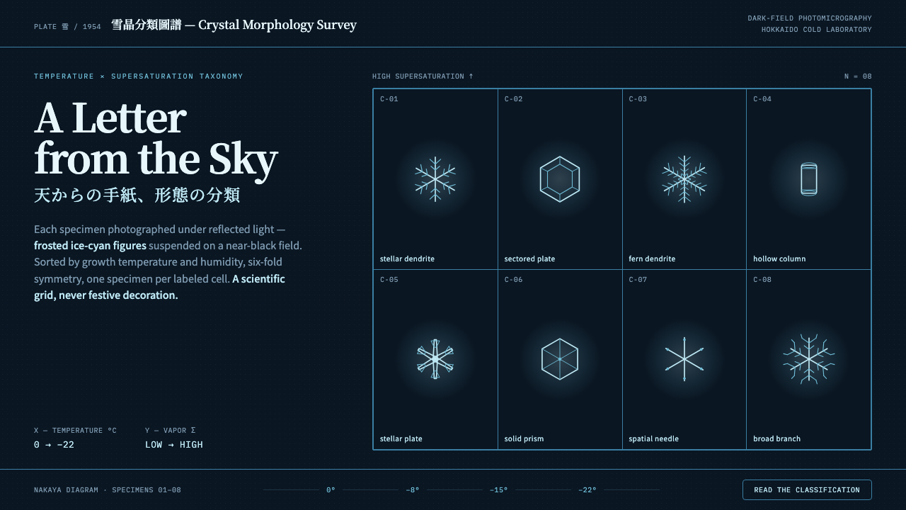 Snow Crystal ClassificationSnow as taxonomy, not decoration. Frosted ice-cyan crystals on a near-black d…
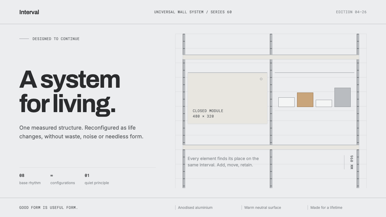 Vitsœ 606 ShelvingQuiet form, built to endure. Brushed silver rails impose rhythm on cool plast…
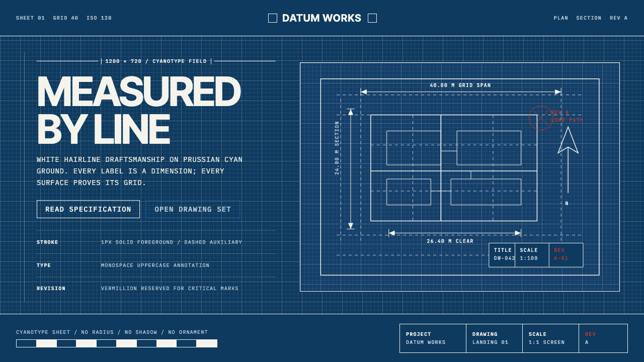 Architectural BlueprintMeasurement, not mood. Prussian cyan grid with white hairlines and vermillion…
 Bengali Art-House CinemaLight becomes restraint. Near-black ground, silver serif, and Bengali script…