What is Umm Kulthum Concerts?
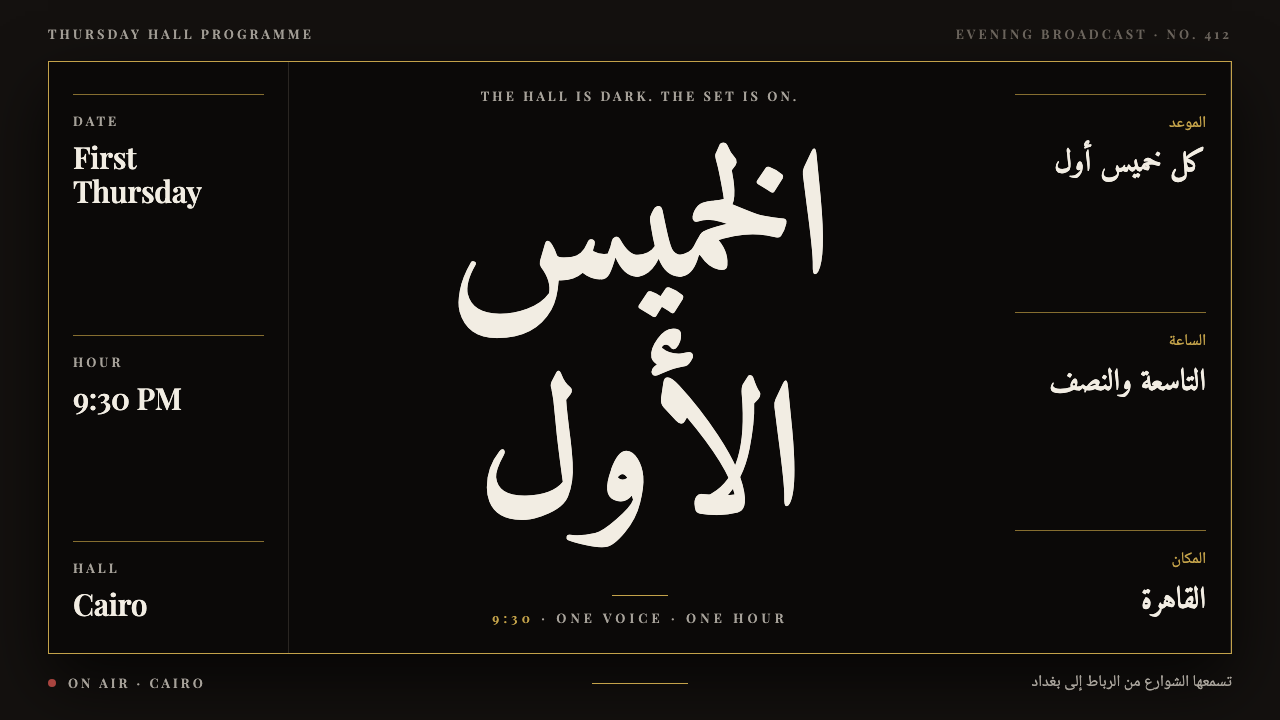
Umm Kulthum Concerts is a dark hall with one lit figure: gravure black, gold hairlines and Arabic set at poster scale.
Umm Kulthum Concerts in brief
Umm Kulthum Concerts is a dark visual system built from the memory of one recurring event: the first Thursday of every month, 9:30 in the evening, Cairo. A single figure in dark glasses, holding a white handkerchief, would stand on stage and sing for about an hour, while a radio audience stretching from Rabat to Baghdad stopped what it was doing to listen. The design takes its form from that scene: darkness all around, and the light falling on one person.
Visually, the style sits on a ground of deep gravure black, the ink-heavy black of mid-century press plates. Images are silver-grey halftones, with the coarse dot texture of newspaper photography left visible. The only colors are gold foil, used for hairline frames and ornament, and curtain red, used for accents. Text is led by Arabic at poster scale in Amiri, with Latin billing set below in wide-spaced capitals.
The mood is theatrical but not decorative. Everything on the surface behaves like a printed object from the era: a concert poster, a press photograph, the sleeve of a record. The system asks for large type, strong contrast and generous black, and rewards restraint. Because the subject is a voice rather than a spectacle, the design keeps the stage almost empty so that attention has somewhere to rest.

Where does Umm Kulthum Concerts come from?
Umm Kulthum was the great voice of twentieth-century Egyptian and Arab music, active from the 1930s until the mid-1970s. The source material for this system places her career between 1934 and 1975, and treats her monthly first-Thursday concerts, at their height through the 1950s and 1960s, as the defining event. Those evenings were broadcast live by radio across the Arab world, and the idea that streets emptied while people listened is part of the shared memory the design tries to hold.
Her art belongs to the tradition of Egyptian tarab, the music of ecstatic emotional response, in which a singer and an audience move together through long, improvised-feeling melodic arcs. Songs could last well over half an hour, with lines repeated and transformed again and again as the audience answered. Composers who shaped her repertoire included Mohammed Abdel Wahab and Riad Al Sunbati, two giants of the Egyptian song who gave her material both modern and deeply rooted in classical Arabic poetry. The visual system does not illustrate their music; it echoes its scale and patience.
The look of the design comes from how this era was documented. What survives of her stage life is largely printed matter: press photographs reproduced by gravure, and record sleeves from labels such as Odeon and Sono Cairo, often dark, dignified and sparse. Mid-century gravure press photography had a particular quality, a deep ink black with a halftone screen visible in the midtones, which is why the system builds its images as silver-grey dot fields on black instead of clean digital color. Gold and red come from posters, programs and the curtain of the stage.
Typography carries the cultural argument. The Arabic is set in Amiri, a typeface that revives the naskh style of the Bulaq Press, the historic printing house in Cairo whose cuts shaped how Arabic books looked in Egypt. Using it ties the design to her own city and to the print culture that carried her name. Latin text is set in Playfair Display in wide capitals, echoing billing lines on international-style posters of the period. The two scripts are given equal dignity, and the layout reads naturally in the right-to-left direction of the main language rather than treating Arabic as a translation of a Latin original.
What defines the Umm Kulthum Concerts look?
Gravure black ground
The background is a deep, ink-saturated black rather than a flat digital dark. It suggests press plates and the heavy black of record sleeves. Large fields of it are intentional: empty black is the hall around the performer, and it is what makes the few lit elements feel precious.
Silver halftone imagery
Photographs are rendered as silver-grey halftones with a visible dot screen, never as glossy full-color pictures. The coarse texture recalls newspaper reproduction and hides detail in shadow, which keeps the single figure mysterious. Images sit within thin frames, like prints pinned in a program.
Gold foil hairlines
Gold appears as very fine lines and small ornaments: frames, rules, corner marks and numerals. It evokes foil stamping on a poster or record cover. Because it is thin and sparing, it reads as a refinement of the darkness rather than a decoration laid over it.
Curtain red accent
A deep theatrical red is the only warm color besides gold. It is used for a date, a ticket stub, a single line of emphasis or a small band, recalling the stage curtain. It is never used as a background flood, which would break the sense of a dark hall.
Arabic at poster scale
The main Arabic title is set very large in Amiri, with the flowing strokes of naskh given room to breathe. It leads the hierarchy, and the layout reads from right to left. Calligraphic rhythm replaces the need for illustration.
Wide Latin capitals
Latin billing lines are set in a high-contrast serif in capitals with generous letter-spacing, small and calm beneath the Arabic. They provide dates, venues and credits in the manner of period concert posters, supporting but never competing with the main title.

Who shaped Umm Kulthum Concerts?
The singer whose monthly Thursday concerts, broadcast across the Arab world, are the entire subject of the system.
A leading Egyptian composer and singer whose songs for her blended modern arrangements with classical forms.
A major Egyptian composer who wrote some of her best-known long songs, central to the tarab tradition the design honors.
How do you use Umm Kulthum Concerts today?
For slides, this style is a strong choice for keynote moments, cultural talks and any presentation built around a single subject. A cover can be nearly all black, with the Arabic or main title in very large type and a thin gold frame. Content slides work as one image, one idea: a halftone portrait with a short line of text. Data slides should be sparse and mostly typographic, with figures in gold and notes in grey, so the audience keeps looking at one thing at a time.
For web and app interfaces, it suits music, audio, radio, podcast, archive and event platforms, especially those with heritage content. A hero section can be a single large image on black with a title overlaid; track lists and schedules can become gold-ruled rows. Dark navigation, thin dividers and generous padding fit naturally. Avoid dense dashboards, because the style gets its power from emptiness.
For editorial and marketing work, it is ideal for concert announcements, anniversary features, commemorative editions and cultural magazines. Posters can place one halftone figure beneath a large Arabic headline and a small row of Latin billing. Because the system comes from an Arabic-language context, it is especially convincing in bilingual layouts where Arabic leads and Latin follows.
The main mistake is to add color. Brightening the palette with extra hues or gradients breaks the single-light-in-the-dark idea. A second mistake is to treat the Arabic as a translation set small beneath English; the style gives it first place. A third is to over-polish photographs, replacing halftone grain with crisp digital imagery, which removes the historical texture that makes the black feel inked rather than merely dark.

Umm Kulthum Concerts — FAQ
What is the Umm Kulthum Concerts design style?
It is a dark, print-inspired style based on her monthly Thursday concerts in Cairo: gravure black ground, silver halftone images, gold hairlines and curtain red, with large Arabic type in Amiri and wide Latin capitals beneath.
Why does the design use halftone images?
Most surviving visual records of her concerts are mid-century gravure press photographs and record sleeves. Halftone grain reproduces that texture and keeps the performer slightly mysterious in the dark.
What is Amiri and why is it used?
Amiri is an Arabic typeface that revives the naskh style of the Bulaq Press in Cairo. Using it ties the design to her city and to the print culture of her era, and gives the Arabic text real calligraphic dignity.
Is this a light or dark theme?
It is a dark theme. The black ground is central to the idea of a dark hall with a single lit figure, and a light version would lose its meaning.
Which projects fit this style?
Music and radio platforms, archives, concert posters, commemorative editions, cultural magazines, and bilingual Arabic and Latin layouts that want a dignified, theatrical tone.
Related design styles
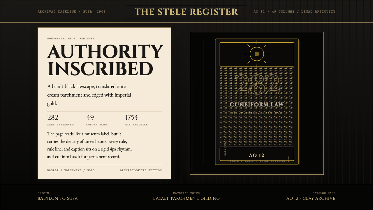 Babylonian Hammurabi SteleAuthority carved in stone. Basalt-black grids, parchment panels, and imperial…
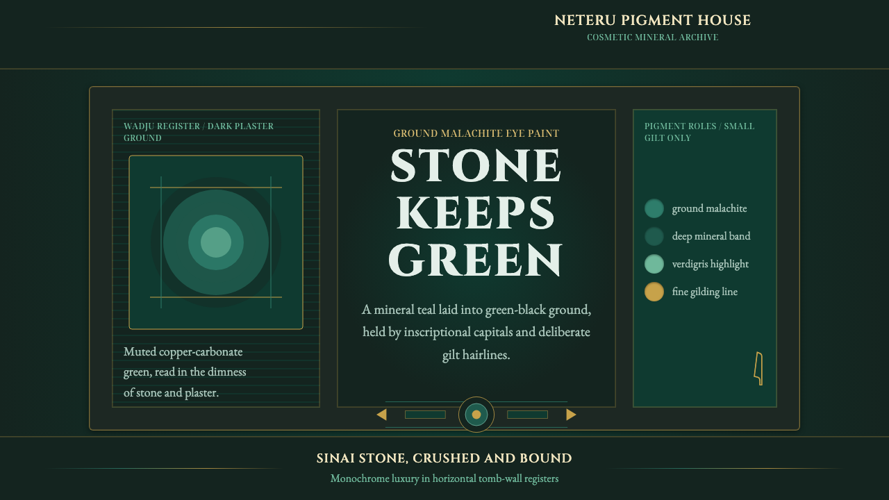 Egyptian Malachite PigmentGrave mineral green. Muted malachite bands on green-black stone, cut by fine…
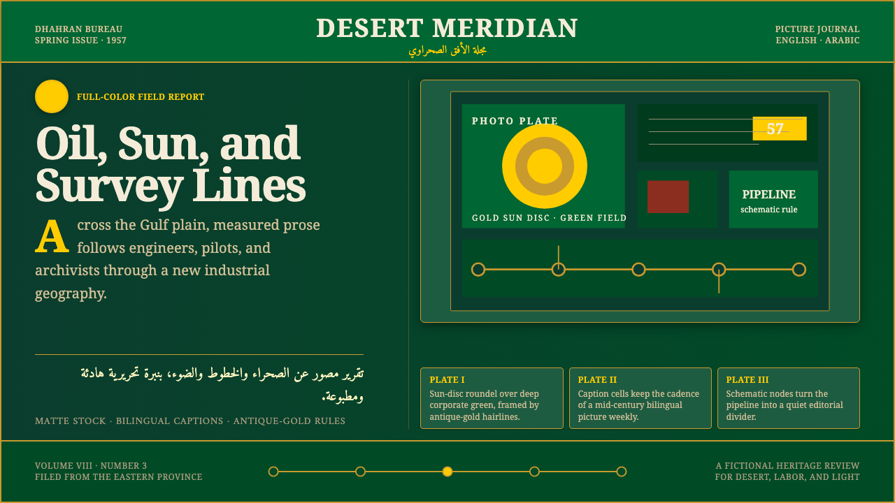 Aramco World MagazineMatte Gulf modernism. Desert green, gold sun-discs, classic serif, and naskh…
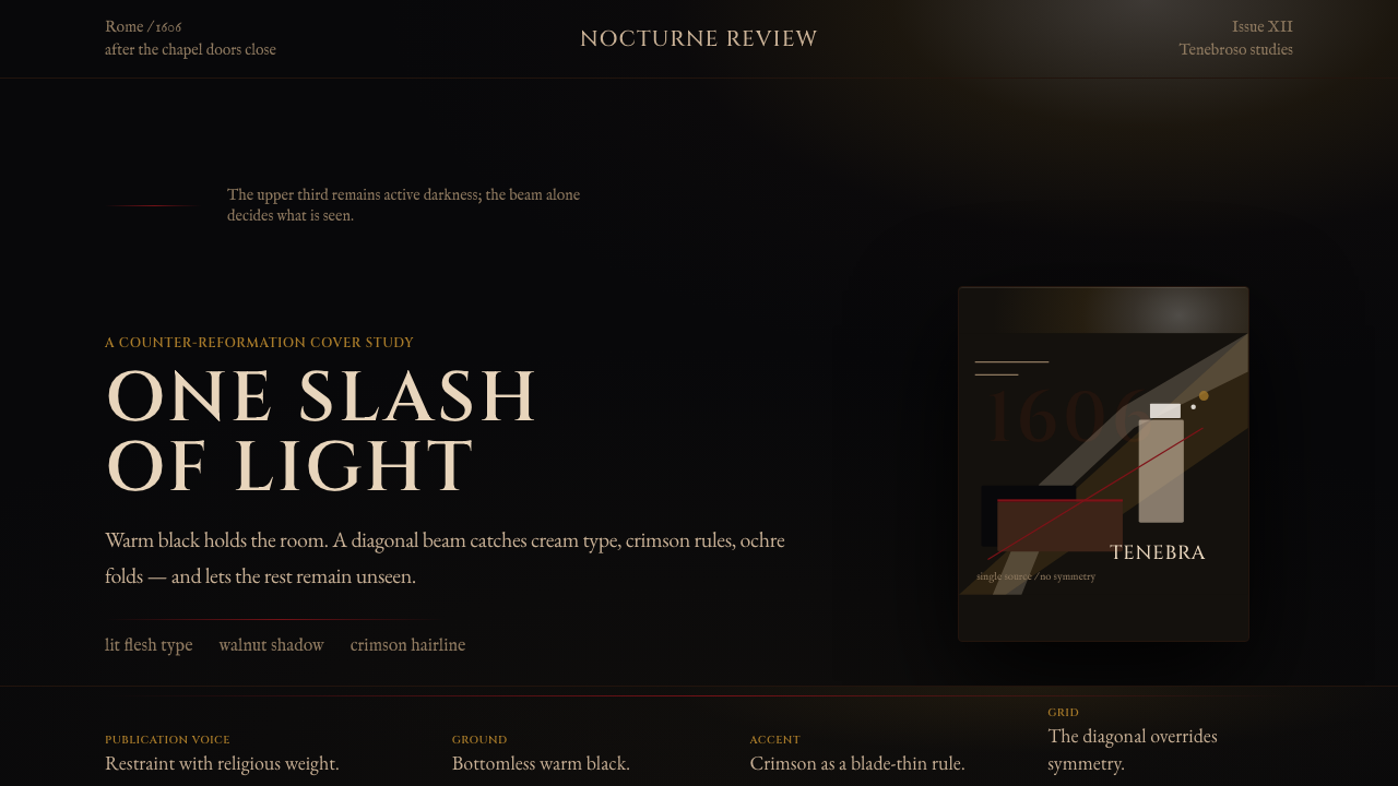 Caravaggio TenebrismDarkness acts first. Warm-black voids, Cinzel capitals, and one ochre raking…
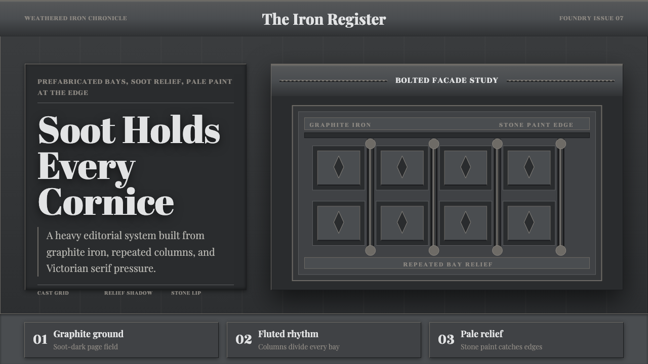 Cast Iron SoHo FacadesIron remembers the city. Graphite bays, Didone type, and pale stone-paint edg…
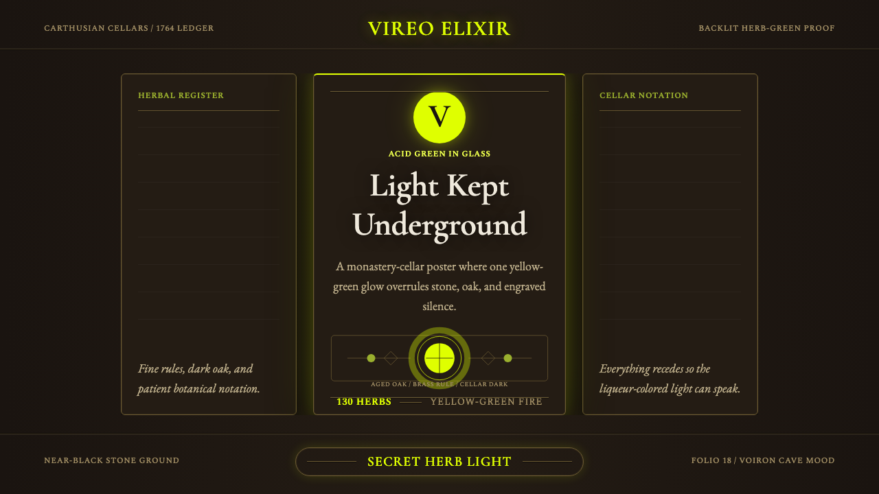 Chartreuse Liqueur GreenAcid glow rules the cellar. Cormorant Garamond and brass hairlines frame yell…