What is Petrykivka Folk Painting?
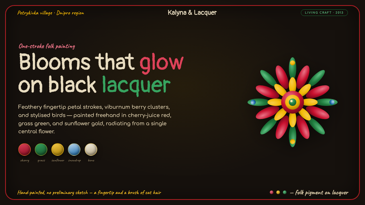
Petrykivka Folk Painting is folk maximalism made luminous: red, green, and yellow blossoms radiate across black lacquer with the immediacy of a hand still in motion.
Petrykivka Folk Painting in brief
Petrykivka is a Ukrainian decorative folk-painting tradition from the village of Petrykivka in Ukraine’s Dnipropetrovsk region. Its imagery is floral, animated, and unmistakably handmade: feathery one-stroke petals, clusters of viburnum berries, abundant bouquets, and stylised birds appear in vivid natural-pigment color. The visual language does not seek naturalistic description. It turns flowers, fruit, and birds into energetic signs, each one shaped by a quick, visible gesture.
The style is built through accumulation rather than reduction. A central flower or bouquet becomes the organizing force, while smaller petals, leaves, berries, and curling details extend outward in a balanced radiating composition. This fullness is not visual noise. Repeated marks establish rhythm, and the contrast between delicate brushwork and saturated pigment lets even dense ornament remain legible.
Its widely recognized Soviet-era presentation places painted bouquets on a black-lacquer varnished ground. Against this deep field, cherry-like reds, grass greens, and sunny yellows appear to glow like enamel. The result is theatrical but not heavy: black creates depth and silence, while the painted forms supply all movement, warmth, and life. Since 2013, Petrykivka painting has been recognized by UNESCO as Intangible Cultural Heritage.
Where does Petrykivka Folk Painting come from?
The roots of Petrykivka painting predate 1900 and belong to the folk decorative culture of Petrykivka, a village in eastern Europe. Its survival as a named tradition matters because its identity is not limited to a single motif. It is a shared visual practice: flowers, berries, birds, pigment, brush gesture, and ornamental composition form a coherent vocabulary that can be recognized across individual works.
Village master-painters are central to that continuity. The tradition depends on marks that carry human variation: a petal can taper, a leaf can flick outward, and a berry cluster can tighten or expand according to the painter’s hand. This makes Petrykivka fundamentally different from a fixed decorative pattern. Its consistency comes from recurring principles and motifs, not from mechanical repetition.
During the Soviet era, especially from the 1930s and 1940s onward, black-lacquer grounds became a defining convention. This presentation intensified the style’s natural-pigment color, making bouquets read as concentrated light against a varnished dark surface. The black ground is therefore more than a backdrop in contemporary interpretation; it is part of the visual memory through which many people recognize the style.
Soviet Petrykivka workshops, alongside figures including Tetiana Pata and Fedir Panko, are named within the tradition’s public lineage. Their presence points to a practice carried through painters and workshops rather than detached from making. UNESCO’s 2013 recognition situates Petrykivka within a wider international understanding of living cultural heritage: a tradition valued not only for its finished images, but for the knowledge and handwork that sustain them.
What defines the Petrykivka Folk Painting look?
Black-Lacquer Ground
The dark ground is deep, glossy in implication, and deliberately quiet. It creates a stage on which colored marks can appear illuminated rather than merely placed. In a digital adaptation, the ground should feel continuous and lacquer-like, with ornament carrying the visual activity instead of competing panels, textures, or decorative backdrops.
Radiating Bouquet
Composition begins from a center and grows outward. Larger blooms establish the focal mass, then leaves, berries, and smaller floral gestures extend into the surrounding field. Symmetry here is living rather than rigid: the arrangement feels balanced around a center, but individual strokes retain asymmetry and hand-painted surprise.
One-Stroke Petals
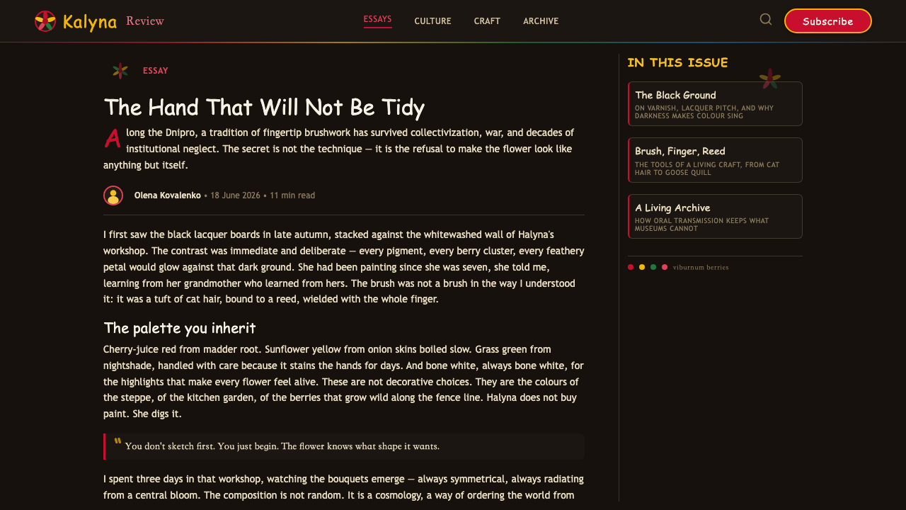
Feathery petals are the style’s most immediate evidence of touch. A single stroke can carry a broad beginning, a narrow finish, and a directional sweep that suggests growth. These marks should never look like generic vector petals. Their value lies in visible pressure, taper, irregularity, and the sense that every flower was formed by a hand rather than assembled from parts.
Pigment Glow
Cherry red, grass green, and bright yellow are read as pigments, not as abstract interface accents. Their saturation gains force from the surrounding black, and their role is expressive as well as structural. Red can carry floral weight, green supplies leaves and branching movement, while yellow creates sparks of warmth among the darker field.
Berries and Birds
Viburnum berries and stylised birds broaden the floral vocabulary without breaking its decorative unity. Berries create compact rhythmic clusters; birds introduce recognizable life while remaining ornamental rather than naturalistic. Both should be integrated into the bouquet’s flow, as if they emerged from the same painted ecosystem as the petals and leaves.
Hand-Painted Type
When typography participates, it should feel painted, brushed, or closely allied to the gesture of the ornament. It must remain readable, but it should not introduce a cold mechanical tone that separates words from image. The strongest hierarchy comes from allowing a title to sit like a confident inscription beside the bouquet, with supporting text kept calmer and more restrained.
Who shaped Petrykivka Folk Painting?
Village master-painters represent the tradition’s foundational human source. Petrykivka is sustained through practiced gesture, motif knowledge, and decorative judgment, all of which are carried by makers rather than by an impersonal recipe. Their role explains why the style can remain recognizable while individual flowers and bouquets still feel alive.
The Soviet Petrykivka workshops are part of the tradition’s named lineage and belong to the period in which black-lacquer presentation became a familiar convention. They connect the painting language to workshop practice and to a historical setting where bouquets, pigment, and varnished dark grounds could be carried forward as a recognisable system.
Tetiana Pata is named among Petrykivka’s key figures. Within a tradition defined by hand-painted ornament, the significance of such a figure is inseparable from continuity: named painters make visible that folk decoration is not anonymous surface styling, but a living body of knowledge shaped through people and practice.
Fedir Panko is likewise named as a key figure in Petrykivka’s public lineage. His inclusion places individual artistic participation beside village masters and workshops, reinforcing the scale on which the tradition operates: intimate enough to preserve brush gesture, yet shared enough to become a cultural language recognized far beyond its place of origin.
How do you use Petrykivka Folk Painting today?
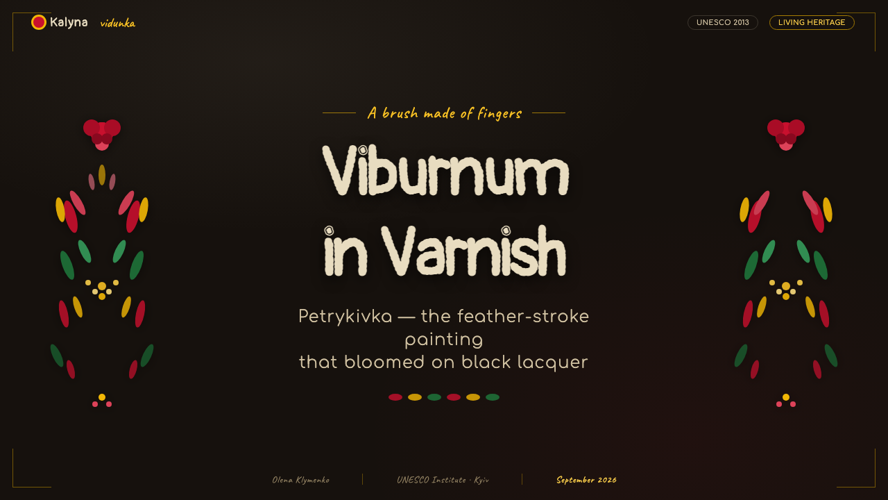
Petrykivka works best when treated as a compositional system, not as a floral sticker pack. For a presentation cover, let a single radiating bouquet occupy a corner, edge, or central field against a black-lacquer ground. Place the title where the painted motion opens a calm area, and allow the lettering to feel related to brushwork without forcing every word into ornament.
Content slides need more restraint than a cover. Use floral clusters to establish section changes, frame a key statement, or lead the eye toward a diagram, while leaving broad dark areas for reading. On data slides, berries can act as repeated visual units and stems can suggest flow or direction, but charts must stay clear enough to read independently. The painting should support information rather than camouflage it.
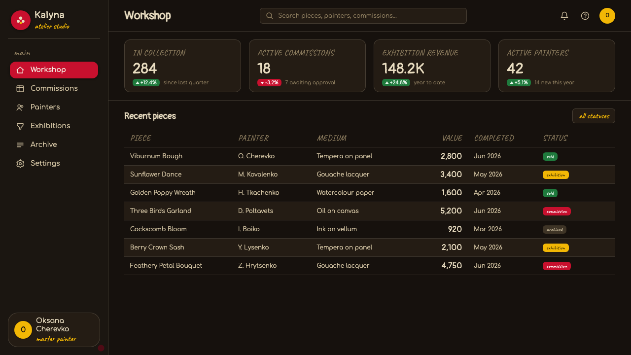
For web interfaces, the style is particularly effective for editorial dashboards, cultural collections, premium storytelling pages, or pricing experiences that need a sense of craft and ceremony. A deep black ground can unify navigation, cards, and feature areas, while bouquet fragments mark focal actions or important states. Keep ordinary controls quiet and dependable; reserve the most elaborate painted forms for moments that deserve attention.
In editorial and marketing work, Petrykivka is strongest when it creates a sequence of reveal and rest. A dense painted opening can introduce a story, a product collection, or a seasonal campaign; later sections should use cropped leaves, berry clusters, or small birds as recurring signals. This preserves the tradition’s abundance without making every paragraph compete with a full bouquet.
The common mistake is to use every flower, berry, bird, and color at the same intensity everywhere. That produces generic folk decoration rather than a Petrykivka-derived composition. Begin with a center, decide where the densest bloom belongs, and create breathing room around it. Also avoid making the brushwork too smooth or perfectly mirrored: controlled irregularity is essential to the tradition’s painted vitality.
Petrykivka Folk Painting — FAQ
Is Petrykivka simply a floral pattern?
No. Flowers are central, but Petrykivka is a complete decorative language shaped by brush gesture, radiating composition, berries, stylised birds, and vivid pigment on dark grounds. Treating it as a repeatable flower pattern misses the relationship between center, movement, and hand-painted variation that gives the style its identity.
Why is the background often black?
The black-lacquer varnished ground is a Soviet-era convention associated with the tradition from the 1930s and 1940s onward. It makes saturated reds, greens, and yellows appear enamel-like and luminous. In a contemporary screen adaptation, black should therefore create contrast and depth, not become a substitute for unrelated dark-theme decoration.
Can the style be used without a full bouquet?
Yes, provided the fragment still respects the system. A cluster of berries, a spray of leaves, or a single stylised bird can work as a smaller cue when it retains directional brush movement and a relationship to an implied center. Isolated motifs become more convincing when they feel cropped from a living composition rather than dropped in as icons.
How should typography relate to the painting?
Typography should respect the painting’s expressive hand without overwhelming legibility. A brush-like display treatment can give a title an inscribed presence, while supporting copy should remain calm and easy to scan. The important contrast is between ornamental energy and informational clarity; if every line imitates a painted flourish, the hierarchy collapses.
What makes a digital version feel respectful rather than generic?
Respect begins with preserving the tradition’s internal logic: visible brush gesture, floral radiance from a center, a meaningful dark ground, and motifs that belong together. Do not flatten it into interchangeable folk imagery or make the ornament mechanically perfect. The aim is not to imitate every historical object, but to carry forward the relationship between pigment, hand, balance, and abundance.
Related design styles
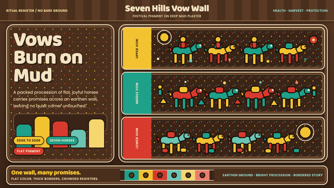 Pithora Rathwa Ritual WallVows fill the wall. Bright horse rows crowd deep mud-brown plaster edge to ed…
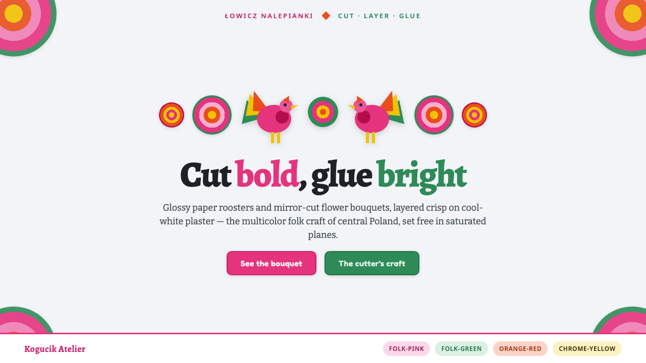 Polish Wycinanki PinkFolk papercut maximalism. Hot-pink roosters and mirror-cut bouquets layered o…
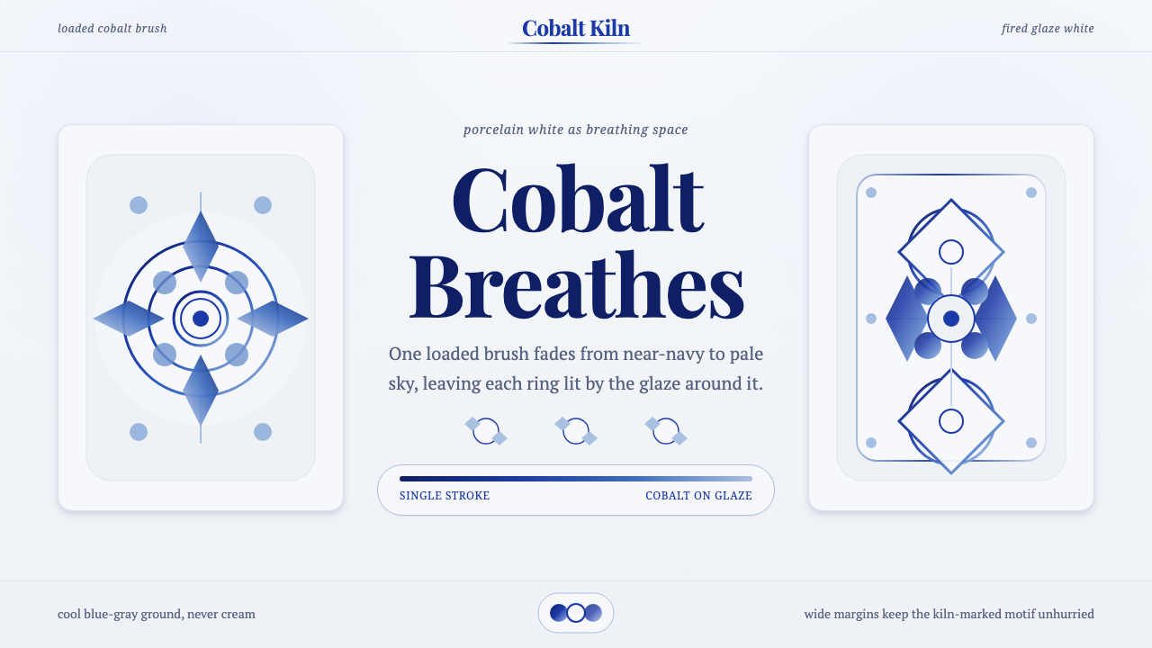 Gzhel Blue PorcelainPorcelain breathes. Cobalt gradients bloom across cool glaze-white space.
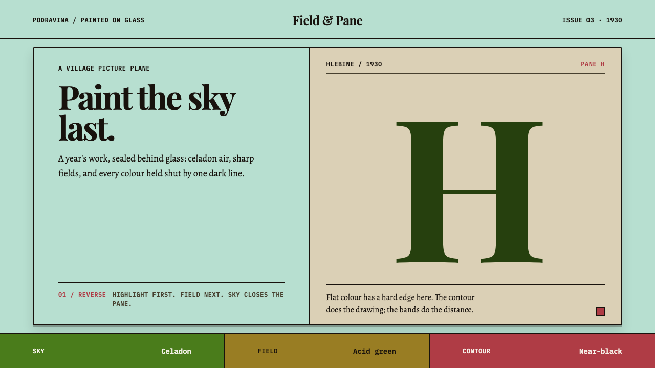 Hlebine Naïve PaintingPainted colour stays fresh. Celadon, field green and dark contours stack the…
 Mexican Folk Art (Frida-era)Defiance painted on tin. Cobalt ground, crimson vows, marigold borders, hard…
 Polish Poster School (1960s)Painterly rebellion. Mustard board, oxblood collage, and fat serif letters re…