What is Gzhel Blue Porcelain?
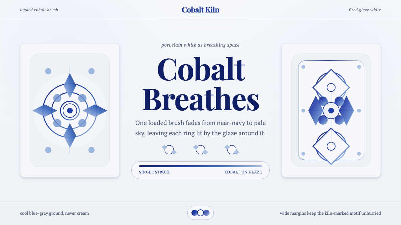
Gzhel turned a single loaded brushstroke into an entire visual language — cobalt blue fading to pale sky across glaze-white porcelain, painted by hand in villages outside Moscow.
Gzhel Blue Porcelain in brief
Gzhel is a Russian folk ceramic tradition — cobalt-blue underglaze painting on white porcelain — that took its now-recognizable form in the nineteenth century in a cluster of villages near Moscow. As a design system, it reduces the world to two colors only: a cool, faintly blue-grey fired-glaze white, and a single pigment, cobalt, deployed across its entire tonal range from near-black saturation to the palest wash of sky. Nothing else enters the palette.
The style's defining technical signature is the 'brush-shadow' stroke: a painter loads one side of the brush heavier than the other, pulls a single continuous mark, and the stroke itself fades from deep cobalt to pale blue without a second color ever touching the surface. A rose petal, a bird's wing, a curling leaf — each is rendered as one gesture that carries its own built-in light and shadow. This is the opposite of flat, evenly-filled color; every mark has a gradient baked into the hand that made it.
Where many folk and craft traditions fill their surfaces edge to edge, Gzhel treats the white ground as active negative space — something the cobalt motifs float on rather than cover. Botanical and bird motifs (roses, curling stems, peacocks, firebirds) cluster and breathe rather than tile densely, so the porcelain white reads as continuous air behind the ornament, not as background waiting to be filled in.
Where does Gzhel Blue Porcelain come from?
The Gzhel region — a cluster of some two dozen villages roughly forty miles southeast of Moscow — sits on a bed of unusually pure white clay, and potters there had been firing utilitarian ceramics since at least the fourteenth century. For most of that history the output was ordinary: earthenware jugs, tiles, and simple majolica in the polychrome palette typical of Russian folk pottery, closer in spirit to the multicolor ceramics of other peasant traditions than to the blue-and-white style the name now conjures.
The turn to cobalt-on-white was a nineteenth-century development, and it was less an isolated Russian invention than a local response to a much older international current. Chinese blue-and-white export porcelain, and the Dutch Delftware that had imitated it since the seventeenth century, had already demonstrated across Europe that cobalt oxide was uniquely suited to underglaze painting: one of the few pigments that could survive the high firing temperature needed to vitrify a glaze without burning out or shifting color. Gzhel's potters adapted that blue-and-white logic to distinctly Russian botanical and folkloric subject matter — roses, berries, birds drawn from peasant embroidery and woodcut imagery rather than the willow-pattern chinoiserie of Delft.
What made the mature Gzhel style distinct from its blue-and-white cousins was the brush-shadow technique itself — the single loaded stroke that produces its own tonal gradient. This was a village craft passed down through family workshops rather than an academy or court manufactory, and the technique was a practical solution as much as an aesthetic one: a skilled painter could render a convincingly three-dimensional petal or feather in one confident pass, without mixing intermediate tones on a palette, which mattered in a production built around speed and repetition across thousands of pieces.
Gzhel production was disrupted through the Soviet period — village cooperatives were absorbed into state-run ceramic combines, and quality and continuity varied — but the tradition was deliberately revived and codified as a named folk-art brand in the mid-twentieth century, with art historians and master painters standardizing the motif vocabulary and brush technique into a teachable, recognizable system. That codification is why Gzhel today reads as a coherent design language rather than a loose regional habit: it was consciously assembled from surviving village practice into an emblem of Russian craft identity.
What defines the Gzhel Blue Porcelain look?
Color
The palette is exactly two elements: a cool glaze white with a faint blue-grey undertone (the fired porcelain ground itself, never pure paper-white) and cobalt blue used across its full tonal range. There is no secondary hue, no black, no gold accent. Depth and hierarchy come entirely from how dark or pale the cobalt sits at any given point, not from introducing a second color family.
Brushwork and Gradient
The single most important visual signature is the loaded-brush gradient: one continuous stroke fades from saturated cobalt at its origin to a near-transparent pale wash at its tail, with no hard edge between the two. This is fundamentally different from a flat fill or a mechanically smooth digital gradient — the fade is uneven, alive, slightly asymmetric, because it comes from pigment thinning against the brush hair in real time. Anything that renders as a perfectly even, symmetrical gradient misses the point of the technique.
Botanical and Bird Motifs
The motif vocabulary draws almost entirely from a recurring set of subjects: the stylized rose (often shown as a rosette or full bloom seen from above), curling stems and berries, and birds — peacocks and firebird-like creatures with elaborately fanned tails. These motifs recur across generations of painters with variation in execution but not in subject; a Gzhel piece is identifiable by its cast of characters as much as by its color.
Negative Space
The white ground is not a passive backdrop waiting to be covered but an active compositional element with its own weight. Motifs cluster into loose, breathing arrangements rather than tiling densely across the full surface, so a generous share of any composition remains open glaze-white. This restraint is what keeps individual brush-shadow strokes legible — crowding the surface would blur every gradient into visual noise.
Line and Outline
Fine cobalt contour lines, thinner and more even than the gradient strokes, are used to define edges — the outer silhouette of a leaf, the structure of a rosette's petals — and to add secondary ornamental detail like veining or feather barbs. These lines sit at a different register from the brush-shadow strokes: they are drawn, not painted, and they organize the looser gradient marks into a legible botanical or figurative shape.
Form and Silhouette
Historically the style lived on rounded, generously curved porcelain forms — teapots, pitchers, figurines — whose surfaces gave the loaded brush room to travel in long uninterrupted strokes. Applied outside ceramics, this suggests a preference for soft, organic silhouettes and generously rounded containers over sharp rectilinear ones, since the brush-shadow technique reads most naturally across a surface with some curvature rather than a flat rigid plane.
Restraint and Density
Even at its most ornamental, Gzhel does not read as busy, because every element is filtered through the two-color rule and the breathing negative space. Ornament accumulates through repetition of a small motif vocabulary rather than through variety — the same rose, the same bird, redrawn with slight variation — which keeps a densely decorated piece feeling unified rather than cluttered.
Who shaped Gzhel Blue Porcelain?
The tradition has no single named founder in the way academy-trained movements often do; it is the cumulative output of generations of anonymous and semi-anonymous village craftspeople working in family workshops across the Gzhel cluster of villages from at least the fourteenth century onward, who shifted the local output from polychrome earthenware to the cobalt-on-white porcelain style in the nineteenth century.
In the twentieth-century revival, a generation of named master painters and ceramic designers worked to rescue the craft from Soviet-era industrial standardization and codify its motif vocabulary and brush technique into a teachable system — the version of Gzhel now recognized internationally as a named Russian folk-art brand, taught in workshops and produced under quality-marked cooperatives rather than left to drift as an informal regional habit.
Not Gzhel figures themselves, but the essential international precedent: centuries of Chinese cobalt-underglaze export porcelain, and the Dutch Delft tradition that imitated it from the seventeenth century onward, established across Europe and Russia that cobalt oxide was the pigment uniquely suited to surviving high-temperature glaze firing. Gzhel's nineteenth-century turn to blue-and-white adapted this proven technical logic to a distinctly Russian botanical and folkloric motif set.
How do you use Gzhel Blue Porcelain today?
Gzhel is a striking but demanding style to transpose outside ceramics, because its entire visual identity is built on a technique — the loaded-brush gradient — rather than on a fixed set of colors or shapes that can simply be swapped in. Applying it well means preserving the logic of the single fading stroke and the breathing white ground, not just recoloring a layout blue and white.
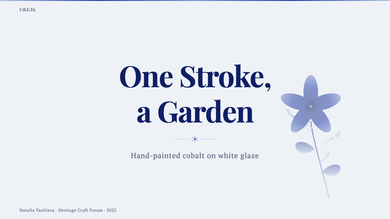
For presentation slides, Gzhel is best suited to cover pages and light content moments rather than dense data slides. A cover works well with one or two large botanical or bird motifs rendered with visible brush-shadow gradients, floating in generous glaze-white space, with the title set in restrained dark type that doesn't compete with the illustration. Content slides should keep text on plain white ground and reserve the cobalt motifs for corners, dividers, or section markers — using them as recurring emblems rather than covering every slide edge to edge. Dense data visualization is a poor fit for this style; its strength is in ornamental warmth, not analytical clarity, so charts and tables should stay plain and let a small Gzhel motif frame the slide rather than decorate the data itself.
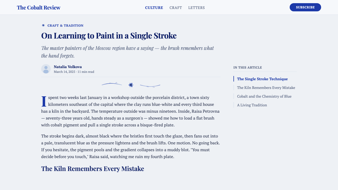
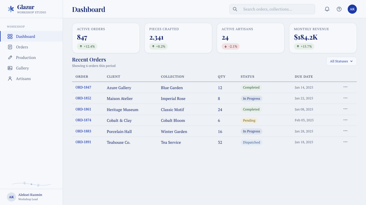
For web interfaces, Gzhel translates best into contexts that want warmth and a sense of handmade heritage rather than into dense functional dashboards. It can work for a pricing page or landing hero if the cobalt motifs are used sparingly as accents — a bird or rose illustration anchoring one corner, plain white cards or panels for the actual content — rather than as an all-over pattern behind text, which would fight with body copy for attention. It struggles in dashboard contexts where information density and quick scanability matter more than atmosphere, since the style's gradients and organic forms don't compress well into small UI components like buttons or data tags.
For editorial and marketing work, the style suits food, hospitality, craft, and heritage-brand storytelling especially well — contexts where a sense of tradition and handmade care is the message. A magazine-style layout can use a single large Gzhel-style illustration as a full-bleed opener, then drop back to plain typography for body text, treating the motif the way a woodcut might serve as a chapter opener rather than a repeating wallpaper. Marketing pages benefit from using the motifs as occasional full-color moments against mostly white space, echoing the restraint of the original craft rather than maximizing pattern density.
A common mistake when applying Gzhel is treating it as simply 'blue and white' and filling large areas with flat, evenly saturated cobalt or a mechanically smooth digital gradient. That erases the technique's entire point — the fade has to look like it came from a single loaded brush pulled across a curved surface, uneven and slightly asymmetric, not from a color-picker gradient tool. A second common mistake is crowding the composition with motifs edge to edge; without generous white breathing room, the individual gradient strokes lose their legibility and the whole thing reads as a busy floral wallpaper rather than the restrained, air-filled compositions that define the style.
Gzhel Blue Porcelain — FAQ
Is Gzhel the same as Delftware or Chinese blue-and-white porcelain?
They share the same underlying technical logic — cobalt oxide painted under a glaze, because cobalt is one of the few pigments that survives high-temperature firing without burning out — but they are visually and culturally distinct. Chinese blue-and-white export porcelain and Dutch Delftware, which imitated it from the seventeenth century, tend toward flatter, more evenly toned brushwork and motifs like willow-pattern landscapes and chinoiserie scenes. Gzhel, codified in nineteenth-century Russian villages, is built around the single loaded-brush gradient stroke and a specifically Russian folk motif set — stylized roses, curling stems, peacocks, firebird-like creatures. Think of Delft and Chinese export ware as flatter and more evenly painted; Gzhel as more painterly, with visible light-to-dark gradation built into every individual stroke.
Can Gzhel work with a dark background instead of white?
The style is historically and structurally light-ground — the cool glaze-white porcelain surface is not an incidental choice but half of the two-element color logic, and the fired-white tone is itself part of what gives the cobalt its particular coolness by contrast. Inverting to a dark background removes that foundational contrast and works against the style's core identity; a dark-mode Gzhel treatment risks looking like generic blue ornament on black rather than a recognizable Gzhel system. If a darker surface is unavoidable, it is safer to keep large areas of a pale, cool off-white present within the composition — behind a card or panel, for instance — rather than eliminating the light ground altogether.
Why does Gzhel avoid using any color besides cobalt blue?
The restriction is partly technical and partly aesthetic. Cobalt oxide was, historically, one of the very few pigments reliable enough to survive the high-temperature firing needed to vitrify a porcelain glaze without shifting hue or burning out — many other pigments simply could not be trusted at that temperature, which is part of why blue-and-white traditions arose independently in multiple ceramic cultures. Aesthetically, restricting the palette to one pigment across its full tonal range forces every visual effect — depth, shadow, highlight, hierarchy — to come from tone and brushwork rather than from color variety, which is exactly what makes the single loaded-brush gradient stroke so central to the style: it has to do all the expressive work that a wider palette would otherwise carry.
What kinds of brands or products does Gzhel suit, and where does it struggle?
Gzhel suits contexts where warmth, craft heritage, and a handmade sensibility are the message: food and hospitality brands, artisanal or heritage-positioned products, cultural and museum-adjacent storytelling, gift and home-goods categories. It struggles wherever information density, speed of scanning, or a sense of technological modernity is the priority — data-heavy dashboards, fintech and analytics tools, or any interface where the loaded-brush gradient's organic irregularity would read as noise rather than warmth. It can also clash with brands whose identity depends on cool, corporate neutrality, since the style's motif vocabulary and painterly texture carry a strong specific cultural signature that is difficult to make feel generic.
Related design styles
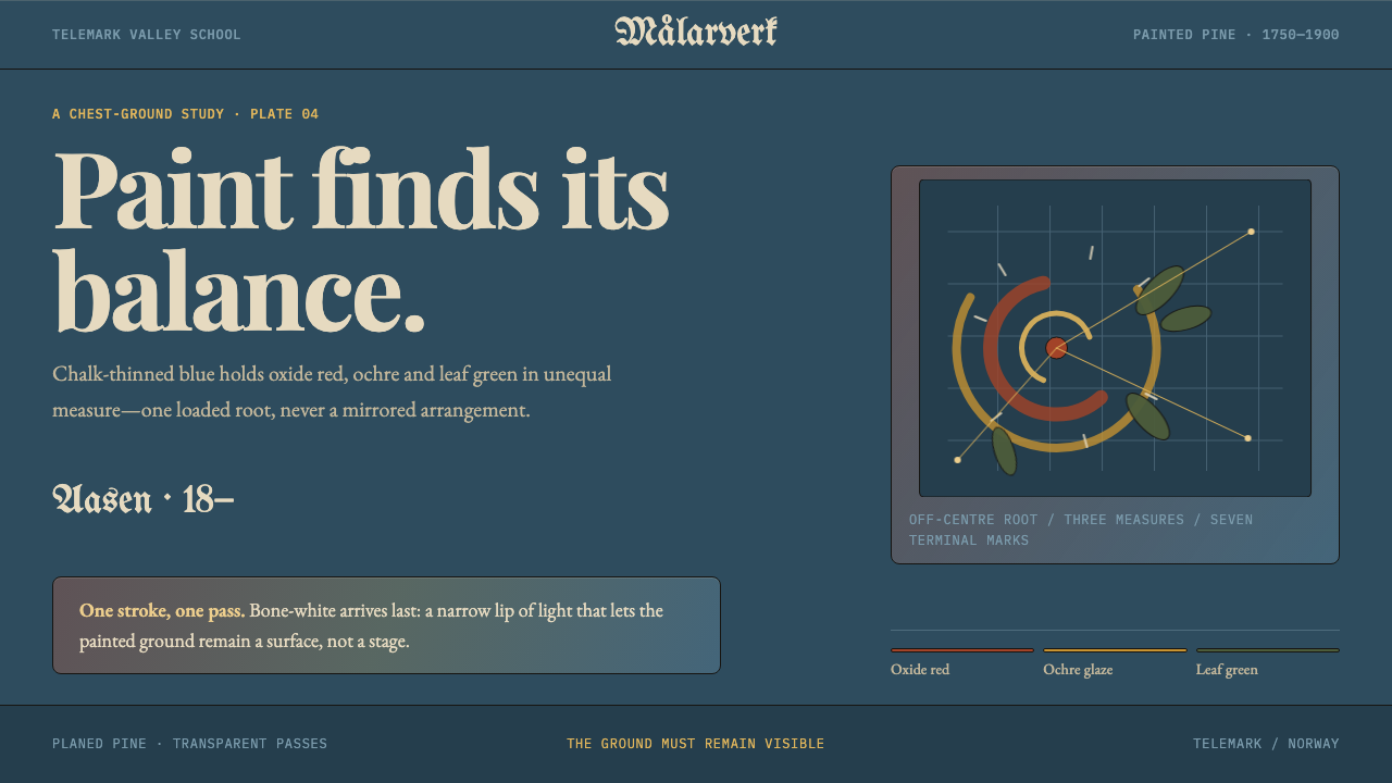 Telemark RosemalingAsymmetry made by hand. Oxide-red scrolls balance on chalky Prussian blue wit…
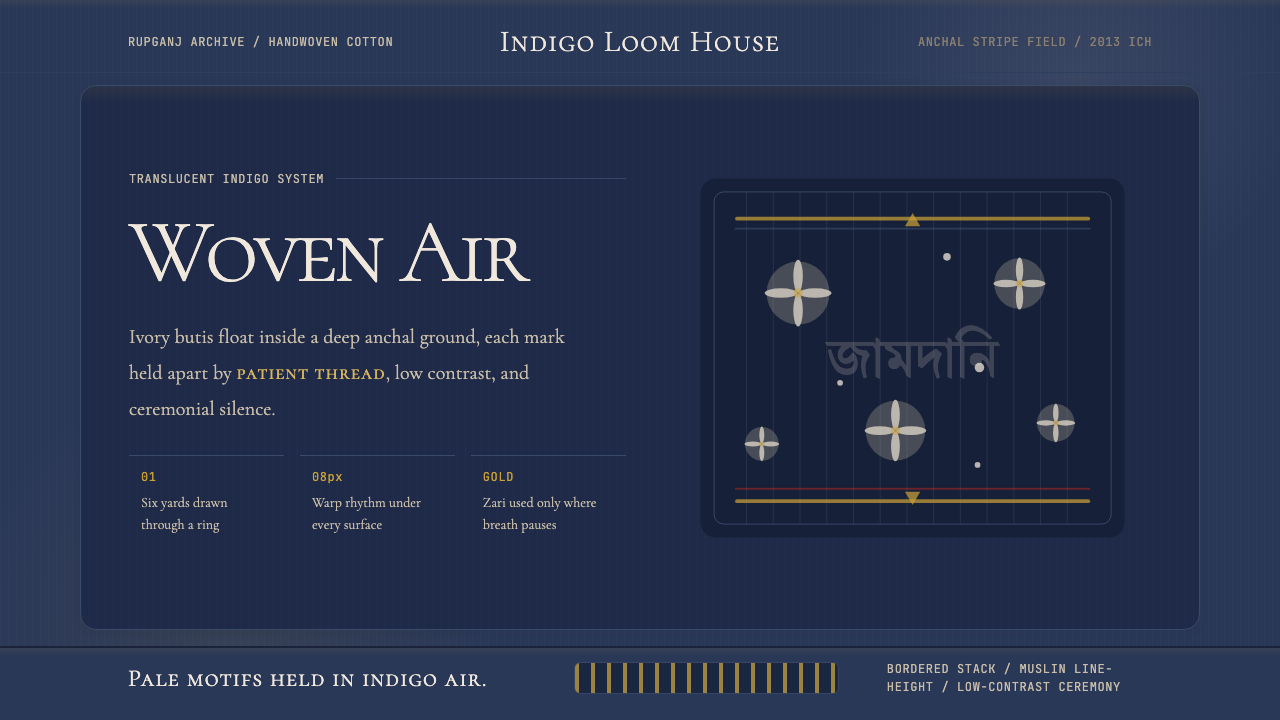 Bengali Jamdani MuslinBreathes like woven air. Indigo ground, ivory butis, and threadline borders s…
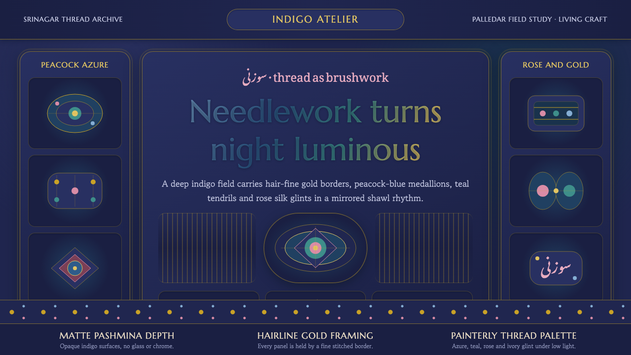 Kashmiri Sozni Shawl EmbroideryNight made luminous. Indigo ground, gold hairlines and silk medallions stitch…
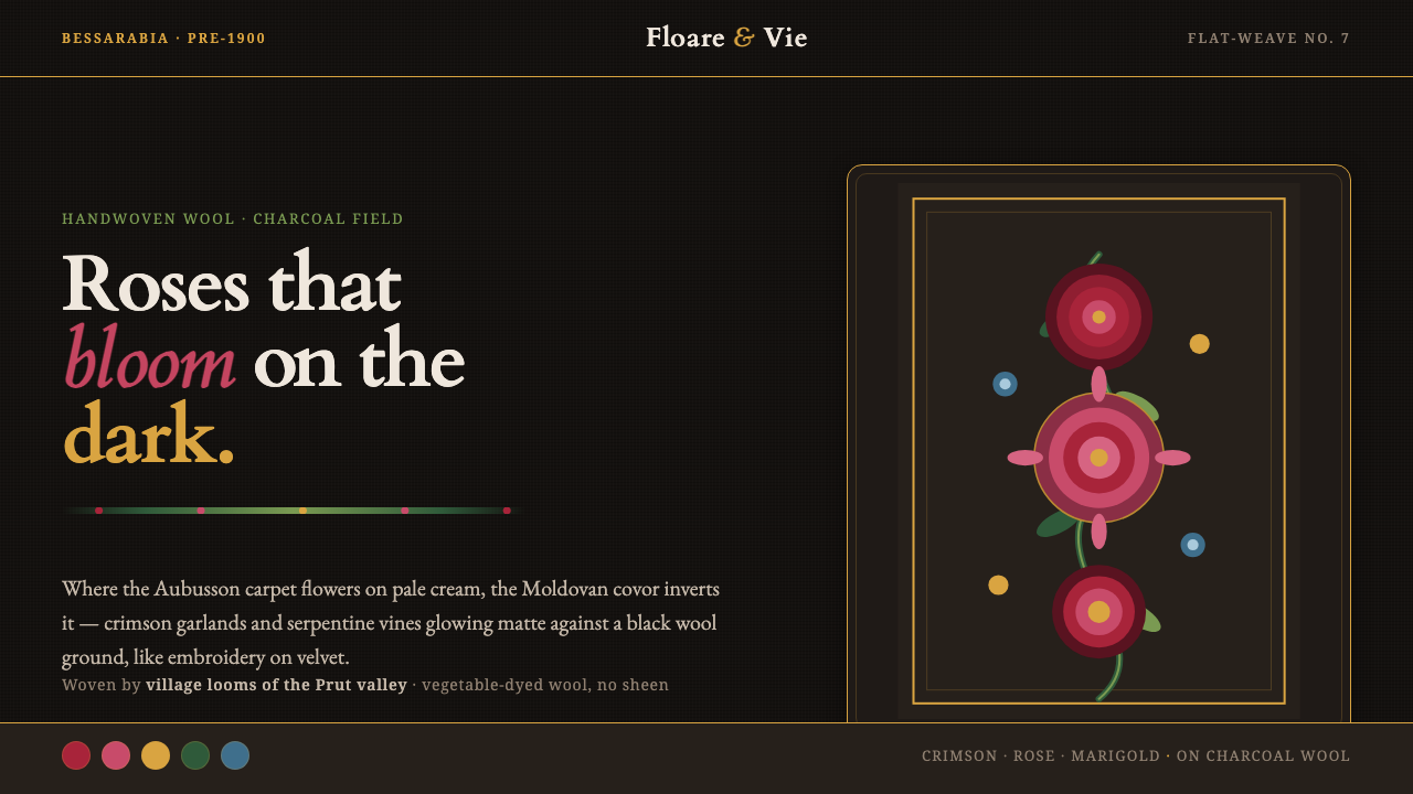 Moldovan Covor KilimRoses that bloom on the dark. Crimson garlands glow matte on a charcoal wool…
 Mother-of-Pearl NacreQuietly expensive shimmer. Nacre blue ground with pearl panels and pink-viole…
 Vologda Bobbin LaceOne thread never lifts. Warm white linen loops glow across a quiet slate-blue…