Design style guide设计风格指南
What is Balinese Canang Sari (Daily Offering)?什么是 Balinese Canang Sari (Daily Offering)?
The canang sari — a palm-leaf tray filled each morning with flowers in four sacred colors — is arguably the most-produced artwork in human history, and one of the most quietly complex design systems ever to emerge from daily ritual.卡南萨里——每天清晨用棕叶托盘盛放四色鲜花的供品——或许是人类历史上产量最大的手工艺品,也是从日常仪式中生长出来的最深邃、最内敛的设计体系之一。
Balinese Canang Sari (Daily Offering) in briefBalinese Canang Sari (Daily Offering) 速览
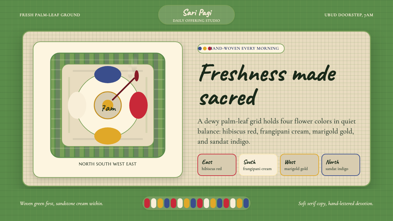
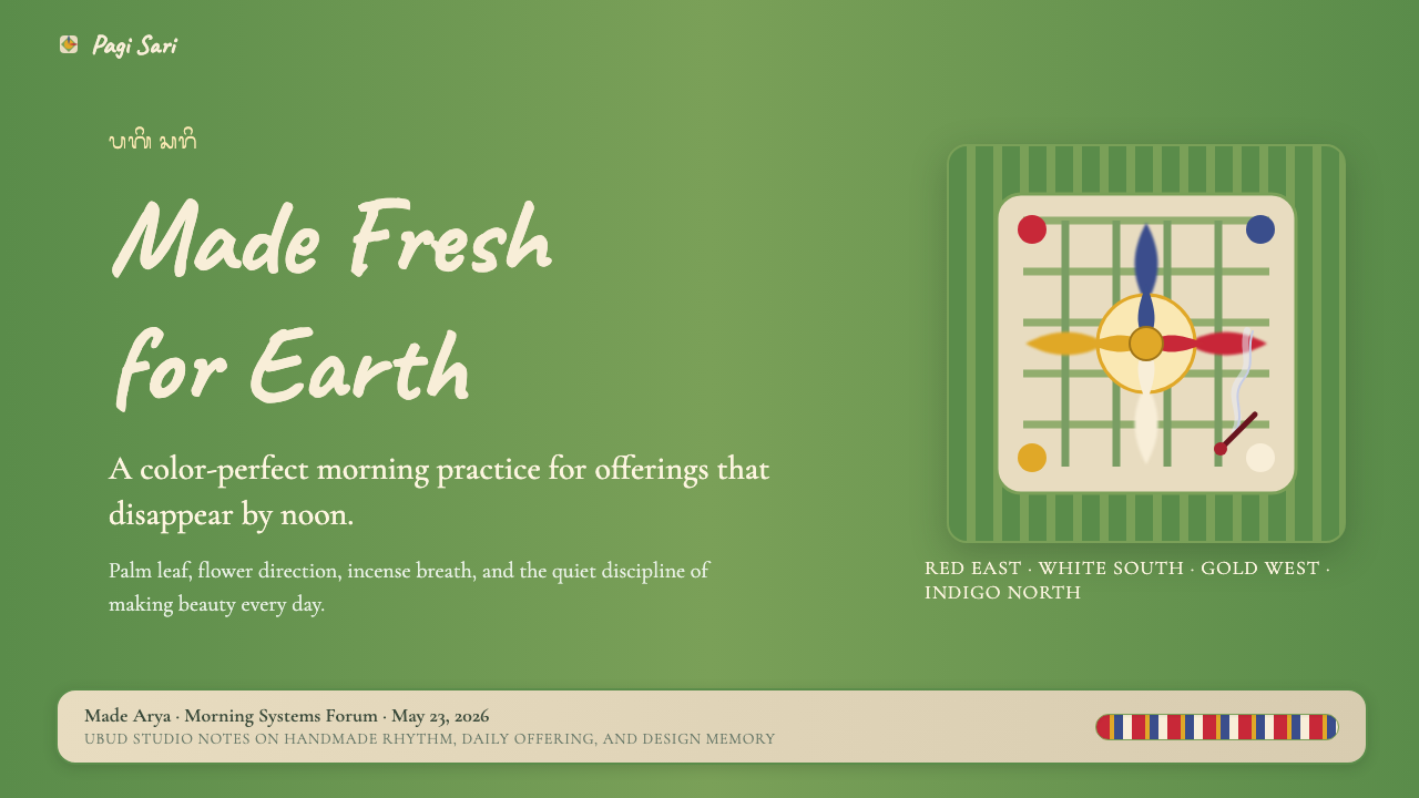
The Balinese Canang Sari is a daily offering — a small, hand-woven palm-leaf tray no larger than an open hand, filled with flowers arranged according to the four cardinal directions. Hibiscus anchors the east, frangipani the south, marigold the west, and champaca the north. A sliver of betel nut, a coin, and a stick of incense complete each tray. Millions are assembled every morning across Bali and placed on doorsteps, beside motorbike seats, at temple gates, and at the feet of roadside shrines. By midday, most will have been stepped over, rained on, or absorbed back into the ground. By the following dawn, the cycle begins again.巴厘岛卡南萨里是一种日常供品——一只不大于摊开手掌的手编棕叶托盘,里面按东南西北四个方位摆放鲜花:木槿居东,鸡蛋花居南,万寿菊居西,占芭花居北。每只托盘还配有槟榔片、一枚硬币与一柱线香。每天清晨,全岛数百万只这样的托盘被人们摆在门口、放在摩托车旁、置于庙门前和路边神龛脚下。到了正午,大多数已经被踩过、被雨水打湿,或悄然融回泥土。次日黎明,一切重新开始。
As a visual system, canang sari is built on a logic of cardinal color — four hues assigned not by aesthetic preference but by directional cosmology. The colors are not decorative; they are locational. Each one marks a quadrant of sacred space, and together they create a complete, balanced field. The ground beneath the flowers is the pale, fibrous weave of split palm leaf: a warm, textured neutral that reads as neither white nor beige but as something specific to the tropical island where it grows. Against this ground, the flower colors sit with an almost shocking directness — saturated, perishable, and entirely free of shadow or gradient.作为视觉体系,卡南萨里建立在方位色彩的逻辑之上——四种颜色不是出于审美偏好而指派,而是由宇宙方向论所决定的。这些颜色不是装饰;它们是定位符号。每一种颜色标记神圣空间的一个象限,合而为一,构成一个完整、均衡的场域。花朵之下是剖开的棕榈叶的浅色纤维编织纹理:一种温暖、有肌理的中性色,既不是白,也不是米黄,而是某种专属于这座热带岛屿的特有色泽。在这片底色之上,各色花朵以几乎令人屏息的直接感落坐——饱满、易逝,不带任何阴影或渐变。
What distinguishes canang sari as a design language is its combination of strict formal rule and intensely material warmth. The arrangement follows a law — cardinal directions, specific species, prescribed colors — yet every completed tray is slightly different because every hand is different, every leaf yields differently to the fold, and every morning's flowers are slightly richer or paler than yesterday's. The system enforces repetition while celebrating variation within that repetition. This is not ornament for ornament's sake; it is ritual given a visual form, and the visual form has been refined daily for at least a thousand years.卡南萨里作为设计语言的独特之处,在于它将严格的形式法则与强烈的材料温度融为一体。排列遵循规律——方位、花种、色彩各有所归——但每一只完成的托盘又都略有不同,因为每双手都不同,每片叶子折叠的方式都略有差异,每天清晨的花朵也比昨天更深或更浅一分。这套体系在强制重复的同时,于重复之中礼赞变奏。这不是为装饰而装饰,而是被赋予视觉形式的仪式;而这种视觉形式,已经在千年以上的每日实践中被打磨至今。
Where does Balinese Canang Sari (Daily Offering) come from?Balinese Canang Sari (Daily Offering) 从何而来?
The practice of canang sari is rooted in the syncretic religious tradition of Bali — a form of Hinduism that absorbed animist and Buddhist elements over many centuries of contact between South Asian traders, Javanese court culture, and the island's own indigenous beliefs. The word canang refers to the palm-leaf tray itself, while sari means essence or flower. Together the name designates the offering as the essential thing — the concentrated expression of gratitude and acknowledgment to the divine forces that sustain daily life. The Tri Hita Karana philosophy, central to Balinese life, identifies three relationships that must remain in harmony: between humans and the divine, between humans and each other, and between humans and the natural environment. The canang sari enacts all three simultaneously — it requires the weaver's labor, uses materials from the natural world, and is directed toward spiritual beings.卡南萨里的传统植根于巴厘岛的混融宗教体系——一种在南亚商人、爪哇宫廷文化与岛屿本土信仰数百年交汇中,吸纳了万物有灵论与佛教元素的印度教形式。“卡南”(canang)指棕叶托盘本身,“萨里”(sari)意为精华或花朵。合而言之,这个名字将供品定义为本质之物——对维系日常生活的神圣力量表达感恩与认可的凝练表达。巴厘岛生活的核心哲学“三和谐”(Tri Hita Karana)识别出必须保持和谐的三层关系:人与神圣之间、人与人之间、人与自然环境之间。卡南萨里同时践行三者——它需要编织者的劳动,取材于自然世界,并被奉献给精神存在。
The specific assignment of flower colors to the cardinal directions reflects a broader Hindu cosmological map in which colors, deities, elements, and compass points are bound together in a coherent sacred geography. The eastern direction corresponds to Iswara and carries the color white in some traditions or the warm red of the hibiscus in the canang sari convention. The south corresponds to Brahma and the warm range; the west to Mahadewa and the golden or yellow register; the north to Wisnu and the deep indigo-adjacent tones. These associations are not arbitrary decorative decisions — they are mnemonic keys to a complete worldview in which every visual choice is simultaneously spatial, theological, and practical.花色与方位的特定对应,反映的是更宏观的印度教宇宙图景——在这张图景中,色彩、神祇、元素与罗盘方位被编织进一幅连贯的神圣地理之中。东方对应伊斯瓦拉(Iswara),在某些传统中携带白色,在卡南萨里惯例中则以木槿的暖红呈现;南方对应梵天(Brahma),属于暖色域;西方对应摩诃提婆(Mahadewa),在金黄色调一端;北方对应毗湿奴(Wisnu),对应深靛近色。这些对应关系不是随意的装饰决定——它们是一套完整世界观的记忆钥匙,在其中,每一个视觉选择同时是空间的、神学的,也是实用的。
Margaret Mead and Gregory Bateson, who conducted extensive fieldwork in Bali in the 1930s, documented canang sari practice in photographs and ethnographic writing that introduced the form to Western audiences. Their collaborator, the Balinese painter and cultural scholar Ida Bagus Sutarja, helped translate Balinese aesthetic categories into terms that Western observers could engage with. Later, anthropologist Hildred Geertz's work deepened scholarly understanding of the relationship between Balinese visual culture and its ritual context, arguing that Balinese art should not be understood as a discrete category separated from religious and social life but as an integrated practice.1930年代在巴厘岛进行大量田野调查的玛格丽特·米德与格雷戈里·贝特森,以照片和民族志书写记录了卡南萨里的实践,将这一形式介绍给西方受众。他们的合作者、巴厘画家兼文化学者伊达·巴古斯·苏达尔贾帮助将巴厘美学范畴翻译成西方观察者能够理解的语言。此后,人类学家希尔德里德·格尔茨的研究加深了学界对巴厘视觉文化与其仪式语境之间关系的理解,她主张:巴厘艺术不应被理解为与宗教和社会生活相割裂的独立范畴,而是一种整合性实践。
Despite Bali's rapid development as a global tourist destination over the past half century, canang sari practice has not diminished — if anything, it has intensified. The economics of tourism created both the wealth to sustain daily offerings on a massive scale and, paradoxically, new spiritual anxieties that the ritual addresses. Balinese women — the primary makers of canang sari — weave the trays before dawn, a task that can take between thirty minutes and two hours depending on the complexity of the day's ceremony. The practice is considered a form of active meditation as much as a religious obligation. The aesthetic character of the finished offering — perishable, handmade, color-coded, and placed with spatial precision — is inseparable from its meaning.尽管过去半个世纪巴厘岛作为全球旅游目的地迅速发展,卡南萨里的实践并未因此式微——若说有什么变化,反而是更为强化。旅游经济一方面带来了大规模维系日常供奉所需的财富,另一方面也制造了新的精神焦虑,而仪式恰恰应对着这些焦虑。巴厘妇女——卡南萨里的主要编织者——在黎明前便开始编织托盘,视当天仪式的繁简,这项工作可能需要三十分钟到两小时不等。这一实践被视为与宗教义务同等重要的主动冥想形式。完成的供品所呈现的美学特征——易逝、手工制作、按色编码、以空间精度放置——与其意义不可分离。
What defines the Balinese Canang Sari (Daily Offering) look?Balinese Canang Sari (Daily Offering) 的视觉特征是什么?
Cardinal Color Field方位色彩场
The defining visual logic is the assignment of four distinct flower colors to the four compass points. Rather than a palette chosen for visual harmony, the colors carry directional and cosmological meaning — each hue is a marker of sacred orientation. Used together, they do not compete; they divide and complete a whole. The visual effect is one of organized abundance: saturated botanical color placed with deliberate spatial intention against a neutral woven ground.定义性的视觉逻辑是将四种不同花色分配给四个罗盘方位。这些颜色的选取不是出于视觉和谐,而是承载方位与宇宙意义——每种色调都是神圣定向的标记。合在一起,它们不相互竞争,而是分割并完成一个整体。视觉效果呈现为有序的丰盛:饱满的植物色彩以有意的空间意图,置放于中性的编织底色之上。
Palm-Leaf Weave as Ground棕叶编织底色
The base material — split and folded green palm leaf — provides the dominant ground texture. It is neither flat nor uniform: the weave creates a subtle diagonal grid of light and shadow, and the green carries a slight natural variation in tone. This woven ground sets canang sari apart from any design system that uses painted or printed surfaces. The base is active, organic, and slightly impermanent, and every visual element placed on it inherits that quality.基底材料——剖开并折叠的绿色棕榈叶——提供了主要的底色肌理。它既不平整也不均匀:编织纹路形成细微的对角线光影网格,绿色带有轻微的天然色调变化。这种编织底色使卡南萨里有别于任何使用涂刷或印刷表面的设计体系。底面是活跃的、有机的、略带短暂性的,放置其上的每个视觉元素都因此染上这种特质。
Temple Cream as Content Surface庙宇米色内容面
Where the offering rests against the stone and stucco of Balinese temple walls or doorstep pavers, a warm sandstone cream serves as the secondary ground — the surface onto which the palm-leaf tray is placed and from which it is read. This warm, aged-stone tone is neither white nor yellow but something between, carrying the quality of sunlit masonry. Applied as a content surface in contemporary design, it softens the contrast between the botanical colors and the woven green without neutralizing either.当供品置放在巴厘庙宇石壁或门前石板上时,一种温暖的砂岩米色充当次级底面——棕叶托盘被置于其上、被读取于其中。这种温暖的风化石色既非白也非黄,而是两者之间某种携带着阳光下砖石气息的色调。作为当代设计中的内容面色,它柔化了植物色与编织绿之间的对比,同时不消解两者的各自个性。
Perishability as Aesthetic Principle易逝性作为美学原则
No canang sari is meant to last more than a day. The flowers wilt, the palm leaf dries and curls, the incense burns to ash. This built-in impermanence is not a defect but a feature: the offering is meaningful precisely because it was made fresh, used once, and released. Translated into design terms, this suggests an aesthetic that favors the dewy, the just-made, and the moment of peak vitality — surfaces that look freshly touched rather than permanently polished, colors that carry the warmth of a flower at full bloom rather than the flatness of a printed swatch.没有一只卡南萨里是为持续超过一天而制作的。花朵凋萎,棕榈叶干燥卷曲,线香燃尽成灰。这种内置的易逝性不是缺陷,而是本质:供品之所以有意义,正是因为它被新鲜制作、一次性使用,然后释放归还。转化为设计语言,这种特质意味着一种偏爱“刚制成”的美学——表面看起来是刚被触碰过的,而非被永久抛光的;颜色携带着盛开花朵的温度,而非印刷色卡的平板。
Hand-Lettered, Serif Typography手写衬线字体排印
The script traditions associated with Balinese sacred practice — from inscriptions on lontar palm-leaf manuscripts to ceremonial banners — favor letterforms that are flowing, weighted, and warm rather than geometric or mechanical. Applied to contemporary design, canang sari calls for typography that carries a hand-drawn quality: slightly irregular in rhythm, with visible variation in stroke weight, warm in color, and never clinically precise. Serifs are appropriate; they carry the calligraphic weight of a tradition that sees writing as a sacred act.与巴厘神圣实践相关联的书写传统——从棕榈叶手抄本上的铭文到仪式旗幡——倾向于流畅、有分量感而温暖的字形,而非几何或机械的形态。应用于当代设计,卡南萨里要求具有手绘质感的字体:节奏略带不规则性,笔画粗细有可见变化,颜色温暖,绝不冷峻精准。衬线是恰当的;它承载着将书写视为神圣行为的传统的书法分量。
Organic Grid, Not Geometric Grid有机网格,而非几何网格
The arrangement within a canang sari tray is structured but not mechanically precise. The four quadrants are defined by the compass points, but within each quadrant, the flowers are loosely gathered rather than rigidly placed. This is a composed order rather than a calculated one — the kind of layout that emerges from skilled hands working quickly and confidently, not from a ruler and a grid. Applied to design, this suggests compositional structures that feel organized without feeling rigid: loose columns, breathing margins, and a sense that every element has been placed by someone who knows exactly where it belongs.卡南萨里托盘内部的排列是有结构的,但并非机械精确。四个象限由罗盘方位划定,但每个象限内的花朵是松散聚拢的,而非刚硬摆放的。这是一种编排出来的秩序,而非计算出来的秩序——那种由熟练的双手快速自信地运作所呈现的布局,而非来自尺规和网格。应用于设计,这意味着一种感觉有序而不感觉僵硬的构图结构:松弛的栏位、有呼吸感的留白,以及每个元素仿佛都被某位清楚知道它该在哪里的人放置的感觉。
Sacred Incense as Atmosphere神圣香气作为氛围
The smoke of the incense stick — rising in a thin, curling column from the completed tray — is itself a visual element in the canang sari experience. It demarcates the offering as active, as present, as in the process of being received. In design terms, this translates to an attention to atmospheric quality: gentle graduated light effects that suggest softness without becoming gradient fills, or layered translucent elements that carry a sense of something rising, opening, or being offered. The mood is quietly reverent, never loud.线香的烟雾——从完成的托盘上升起的一道细细的、卷曲的烟柱——本身就是卡南萨里体验中的一个视觉元素。它标记着供品是活的、在场的、正处于被接受的过程中。以设计语言表达,这转化为对氛围质感的关注:柔和的渐层光效暗示着温柔却不成为渐变填充;或透叠的半透明元素传达出某种正在升腾、展开或被奉献之物的感觉。整体气质是安静的虔敬,绝不喧嚣。
Who shaped Balinese Canang Sari (Daily Offering)?谁塑造了 Balinese Canang Sari (Daily Offering)?
The American cultural anthropologist conducted extensive fieldwork in Bali during the 1930s alongside Gregory Bateson, producing an influential body of photographic and ethnographic documentation of Balinese ritual life. Her work helped establish canang sari and related Balinese aesthetic practices as subjects of serious scholarly attention in the West. Mead's interest in the relationship between culture, personality, and visual practice shaped how subsequent researchers approached the study of Balinese design culture.这位美国文化人类学家在1930年代与格雷戈里·贝特森一同在巴厘岛进行了大量田野调查,留下了对巴厘仪式生活具有深远影响的照片与民族志文献。她的工作帮助卡南萨里及相关巴厘美学实践在西方获得严肃学术关注的地位。米德对文化、个性与视觉实践之间关系的兴趣,塑造了后继研究者研究巴厘设计文化的视角。
Bateson was a British anthropologist and theorist who collaborated with Mead on the Bali project, producing the landmark photographic study Balinese Character (1942). His interest in cybernetics, communication, and pattern led him to analyze canang sari and related visual practices not as art in the Western sense but as information systems — structured messages addressed to spiritual receivers. Bateson's systems-thinking approach to Balinese visual culture remains influential in design theory and cultural analysis.贝特森是英国人类学家与理论家,与米德合作完成了巴厘项目,共同出版了里程碑式的摄影研究著作《巴厘人的性格》(1942年)。他对控制论、传播与模式的兴趣促使他将卡南萨里及相关视觉实践分析为信息系统——向精神接受者传递的结构化信息,而非西方意义上的艺术。贝特森以系统思维研究巴厘视觉文化的方法,至今在设计理论与文化分析领域仍具影响力。
A Balinese painter and cultural scholar who worked with Mead and Bateson during their Bali fieldwork, Sutarja served as both interpreter and informant, helping Western researchers understand the cosmological logic underlying Balinese aesthetic choices. His role was not merely translational; he actively shaped how the visual grammar of offerings and ceremonies was articulated in cross-cultural terms, ensuring that the sacred geometry of practices like canang sari was not reduced to mere decoration in outside accounts.巴厘画家兼文化学者,曾在米德与贝特森的田野调查期间担任合作者,既充当翻译也充当信息提供者,帮助西方研究者理解巴厘美学选择背后的宇宙观逻辑。他的角色不仅仅是翻译性的;他积极塑造了供品与仪式的视觉语法在跨文化语境中的表述方式,确保卡南萨里等实践的神圣几何不在外界叙述中被简化为单纯的装饰。
American anthropologist Hildred Geertz, working in Bali in the latter half of the twentieth century, produced scholarship that resisted the aestheticization of Balinese ritual objects by Western observers. Her work argued that canang sari and related practices could only be understood within their full social, religious, and ecological context — that separating the visual form from its meaning was itself a form of misreading. Her insistence on contextual integrity remains relevant to designers working with culturally specific visual traditions.美国人类学家希尔德里德·格尔茨在二十世纪下半叶于巴厘岛开展研究,其学术工作抵制西方观察者对巴厘仪式物品的审美化倾向。她的研究主张:卡南萨里及相关实践只能在其完整的社会、宗教与生态语境中被理解——将视觉形式与其意义相剥离,本身就是一种误读。她对语境完整性的坚守,对当代处理文化特定视觉传统的设计师仍具有持续的相关性。
Not an individual but the institutionalized form of Balinese Hinduism formally recognized by the Indonesian state in 1958, Agama Hindu Dharma codified the daily ritual obligations — including canang sari — that had previously been transmitted through village and family practice. By providing a doctrinal framework, it helped preserve the design practice through rapid modernization. The movement also articulated the Tri Hita Karana philosophy, which remains the closest Balinese equivalent to a design philosophy: the idea that good life — and by extension, good making — depends on maintaining balance between human, divine, and natural worlds.这不是某个具体人物,而是1958年被印度尼西亚国家正式承认的巴厘印度教制度化形式。阿加玛·印度·达尔玛将日常仪式义务——包括卡南萨里——编入规范,而这些义务此前是通过村落和家庭传统传授的。通过提供教义框架,它帮助这一设计实践在快速现代化进程中得以保存。该运动还阐明了“三和谐”哲学,这是巴厘岛最接近设计哲学的表述:良好的生活——以及延伸而言,良好的制作——有赖于维持人、神与自然世界之间的平衡。
How do you use Balinese Canang Sari (Daily Offering) today?今天怎么用 Balinese Canang Sari (Daily Offering)?
The canang sari visual language is best understood not as a color palette to be sampled but as a relational system — four colors that mean something only in relation to each other and to a spatial structure. Applying it correctly begins with grasping that logic: the four flower colors must be deployed with spatial intentionality, and the woven-green ground must be present as the unifying base. Without that ground, the colors read as random botanical cheerfulness rather than as structured ritual. The system rewards restraint — it does not benefit from being supplemented with additional colors or textures.卡南萨里的视觉语言最好不要被理解为一套可以取样的色板,而应理解为一套关系系统——四种颜色只有在彼此关联、并在空间结构中才具有意义。正确应用的起点,是把握这一逻辑:四种花色必须以空间意图部署,编织绿底色必须作为统一底面存在。没有这片底色,这些颜色读起来只是随机的植物欢快感,而非有结构的仪式。这套系统回报克制——它不因添加更多颜色或肌理而获益。
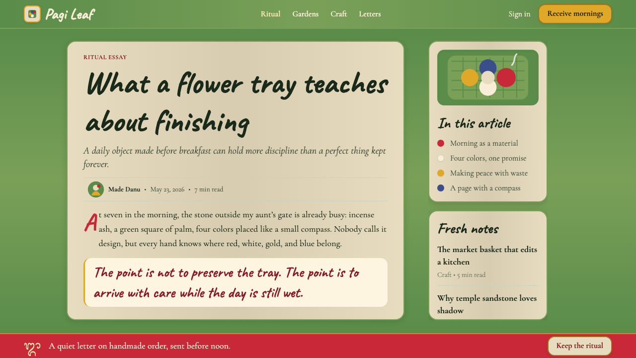
For presentation slides, canang sari works exceptionally well on covers and thematic divider pages. A cover that uses the woven-palm texture as the primary background, with the four directional flower colors appearing in a deliberate spatial arrangement — one per quadrant, or used sequentially to mark a four-part structure — will feel both grounded and alive. Content slides should be simpler: warm temple cream as the background, one accent from the flower palette for emphasis, and hand-weighted serif typography for all text. Data slides can carry light botanical motifs as decorative elements in margins without allowing them to compete with the information itself.对于演示文稿,卡南萨里在封面和主题分隔页上表现尤为出色。以棕榈编织肌理作为主背景,四种方位花色以刻意的空间排列出现——每个象限一种,或依次使用以标记四段式结构——封面将因此呈现出既有根基又充满生机的感觉。内容页应当更简洁:温暖的庙宇米色作为背景,从花色系中选取一种作强调,所有文字使用手感沉稳的衬线字体。数据页可以在页边距以轻盈的植物母题作装饰元素,但不应让它们与信息本身竞争。
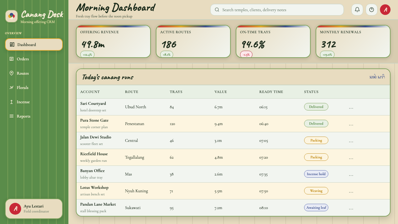
For web interfaces, the style is most at home in wellness, hospitality, cultural, and editorial contexts. A dashboard or pricing page in the canang sari register would use the palm-green as a subtle section background, temple cream as the dominant content surface, and the four flower colors as categorical markers — one per plan tier, one per content type, one per navigational zone. Components should feel tactile rather than technical: gently rounded rather than sharp-cornered, with soft warmth rather than clinical precision. Avoid applying the style to products where authority and machine-like efficiency are the primary value signals; the style's warmth will undercut those messages.对于网页界面,这种风格最适合健康、待客、文化与编辑类语境。采用卡南萨里风格的仪表板或定价页面,可以用棕榈绿作为微妙的区块背景色,庙宇米色作为主导内容面,四种花色作为分类标记——每个方案层级一种、每种内容类型一种、每个导航区域一种。组件应当感觉触感丰富而非技术冷峻:边角微圆而非锐利,带有柔和温度而非临床精准。避免将这种风格应用于权威性与机器般效率是主要价值信号的产品;该风格的温度会削弱这些信息。
For editorial and marketing work, the style supports sensory richness. An editorial layout that uses a full-width palm-woven texture band as a section break, with the body text sitting on warm cream, will carry the reader through a long piece with visual continuity and calm. Marketing pages benefit from the style's poster-like botanical directness: full-page flower-color sections alternate with the palm-ground background, and headlines are set in warm, weighted serif type. The rhythm should feel like something assembled by hand — not random, but also not mechanical.对于编辑与营销内容,这种风格支持感官丰富性。以全宽棕榈编织肌理带作为分段分隔线、正文置于暖米色之上的编辑版面,将以视觉连续性与平静感带领读者穿越长篇内容。营销页面得益于这种风格的海报式植物直接感:整页花色区块与棕榈底色背景交替出现,标题以温暖、厚重的衬线字体排版。节奏应当感觉像是由双手编排而成——不是随机的,但也绝非机械的。
A common mistake when applying the canang sari palette is treating it as a generic tropical or floral theme. The system is not about tropical cheerfulness; it is about sacred orientation. Using the four flower colors interchangeably or adding additional warm tropical hues dilutes the directional logic entirely. Similarly, replacing the woven-palm ground with a clean white or pale grey background removes the material specificity that gives the palette its character. The style also does not benefit from hard geometric grids or tight modular spacing — the organic grid of the offering tray, with its slight variations and breathing room, is as integral to the aesthetic as the colors themselves.应用卡南萨里色板时最常见的错误,是将它视为通用的热带或花卉主题。这套系统与热带欢快感无关;它关乎神圣的定向。将四种花色互换使用,或添加额外的暖热带色调,会彻底稀释方位逻辑。同样,将编织棕榈底色替换成干净的白色或浅灰背景,会抹去赋予这套色板个性的材料特殊性。这种风格也不因硬朗的几何网格或紧密的模块间距而获益——供品托盘的有机网格,带着轻微的变异与呼吸空间,与颜色本身同样是美学的有机组成。
Balinese Canang Sari (Daily Offering) — FAQBalinese Canang Sari (Daily Offering) · 常见问题
Is this a religious style, and does using it require cultural sensitivity?这是一种宗教风格吗?使用它需要特别的文化敏感度吗?
The canang sari visual system is derived from living religious practice, which means cultural sensitivity is genuinely important — not as a legal matter but as a design matter. The system's power comes from the specificity of its meaning: the four colors are not arbitrary; the spatial arrangement is not decorative. Designers who treat it as a generic tropical palette will produce work that misrepresents the source and will look hollow to anyone familiar with the tradition. Using the style with fidelity — understanding that the colors mean something, that the ground is not just a texture, that the arrangement carries spatial logic — is both more respectful and more effective. Avoid using the system for products or messages that would contradict the values of Tri Hita Karana: environmental destruction, social division, or purely extractive commerce.卡南萨里视觉体系源自活着的宗教实践,这意味着文化敏感度真实重要——不是作为法律问题,而是作为设计问题。这套系统的力量来自其意义的特殊性:四种颜色不是随意的,空间排列不是装饰性的。将其视为通用热带色板的设计师,会做出曲解源头的作品,在熟悉这一传统的人看来将显得空洞。忠实地使用这种风格——理解这些颜色有其含义、底色不只是肌理、排列携带空间逻辑——既更为尊重,也更为有效。避免将这套系统用于与“三和谐”价值相悖的产品或信息:环境破坏、社会分裂,或纯粹的攫取性商业。
How does this style differ from other Southeast Asian or tropical design traditions?这种风格与其他东南亚或热带设计传统有何不同?
The canang sari system is distinct from other tropical visual traditions in several ways. Unlike Thai or Cambodian ceremonial aesthetics, which often feature gold leaf and lacquer in deep jewel tones, canang sari is built around botanical perishability — the freshness of a flower at peak bloom, not the permanence of precious materials. Unlike Indonesian batik, whose visual richness comes from dense, intricate patterning on cloth, canang sari's visual language is one of open space and deliberate placement within a simple structure. And unlike generic tropical design vocabularies, which tend toward loose organic forms and uniformly warm color, canang sari is spatially structured around a directional cosmological logic that gives it a rigorous internal order.卡南萨里体系在几个方面有别于其他热带视觉传统。与泰国或柬埔寨的仪式美学(通常以金箔与漆器配合深宝石色调)不同,卡南萨里围绕植物的易逝性而建立——是花朵盛开时刻的新鲜感,而非珍贵材料的永恒性。与印度尼西亚蜡染(其视觉丰富性来自布料上密集繁复的图案)不同,卡南萨里的视觉语言是开阔的空间与在简单结构内的刻意放置。与通用热带设计词汇(倾向于松散的有机形态与统一的暖色)不同,卡南萨里在空间上由方向性宇宙观逻辑所结构,赋予其严格的内在秩序。
Can the four directional colors be used independently, or do all four need to appear together?四种方位颜色可以单独使用,还是必须四种同时出现?
In the ritual context, all four colors appear together because completeness is the point — a canang sari with only three directional colors would be an incomplete offering. In design application, the answer is more flexible, but the logic should be respected. Using one or two of the colors in isolation is possible and can be effective, but the directional meaning is lost. If the goal is to invoke the full canang sari system — the sense of sacred balance, spatial completeness, and ritual wholeness — all four should be present. If the goal is simply to draw on the warmth and botanical quality of the palette, individual colors can be used, but the designer should be aware that doing so produces something closer to a floral reference than a canang sari reference.在仪式语境中,四种颜色必须同时出现,因为完整性本身就是目的——只有三个方位颜色的卡南萨里将是一份不完整的供品。在设计应用中,答案更为灵活,但逻辑应当被尊重。单独使用一两种颜色是可能的,也可以有效,但方位意义会随之消失。如果目标是唤起完整的卡南萨里体系——神圣平衡、空间完整与仪式整全的感觉——则四种颜色都应出现。如果目标只是借用这套色板的温度与植物质感,单独使用各种颜色也无妨,但设计师应当意识到,这样做产生的更接近于花卉参照,而非卡南萨里参照。
How does the style handle dark mode or high-contrast digital environments?这种风格如何处理深色模式或高对比度数字环境?
The canang sari palette was conceived in full tropical daylight — the offering is made at dawn and read in morning sun, not under artificial light or against a dark ground. A strict dark-mode inversion is therefore slightly contrary to the system's nature. That said, a dark variant is possible if handled carefully. The deep green of a palm leaf in night shadow — rather than the bright, fresh weave of a morning offering — can serve as a dark ground, and against it, the saturated flower colors remain legible and warm. The temple cream shifts to a warm, amber-tinged mid-tone for secondary content. The key is to retain the botanical warmth; a cold, grey-black dark ground will strip the system of the quality that makes it distinct.卡南萨里色板是在热带正午的完整光线下构想的——供品在黎明制作,在晨光中被读取,而非在人工光线下或深色底面上。因此,严格的深色模式反转与这套系统的本质略有相悖。尽管如此,深色变体是可能的,只要处理谨慎。夜晚阴影中棕榈叶的深绿——而非清晨供品的明亮、新鲜编织绿——可以充当深色底面,在这片底色上,饱满的花色仍然清晰可读且富有温度。庙宇米色则转为温暖的、略带琥珀调的中间色用于次级内容。关键是保留植物的温度;冰冷的灰黑色深色底面会剥夺这套系统最与众不同的特质。
What does it mean for a design to feel “hand-woven” rather than digitally precise?设计感觉“手编的”而非数字精确,具体意味着什么?
In the context of canang sari, hand-woven means that the structure is evident but the execution is organic. A hand-woven tray has a regular underlying grid — the weave pattern — but within that grid, each individual intersection is slightly different. Applied to digital design, this means: use consistent proportional systems but allow visible micro-variation in sizing and spacing; choose type that has subtle ink-trap or optical compensation rather than mathematically perfect uniformity; prefer textures that show grain over surfaces that show none; and keep backgrounds warm and slightly varied rather than flat and neutral. The goal is not to simulate handicraft artificially but to achieve a quality of presence — the sense that something was made with attention, by a person, in a specific moment — that digital precision alone cannot produce.在卡南萨里的语境中,“手编的”意味着结构是清晰可见的,但执行是有机的。一只手编托盘有规律的底层网格——编织纹路——但在这个网格内,每一个交叉点都略有不同。应用于数字设计,这意味着:使用一致的比例系统,但允许在尺寸与间距上有可见的微变异;选择有微妙墨水陷阱或光学补偿的字体,而非数学上完美统一的字形;偏好有颗粒感的肌理而非毫无纹理的表面;保持背景温暖且略有变化,而非平板中性。目标不是人为模拟手工艺,而是实现一种“在场感”——某物是由一个人、在一个特定时刻、以专注之心制作的感觉——这是单靠数字精度无法产生的。
Related design styles相关设计风格
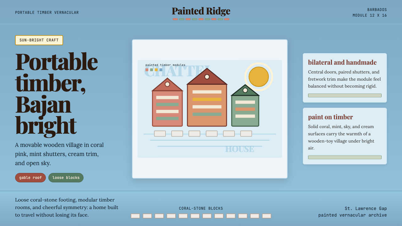 Barbadian Chattel HouseJoy made portable. Coral pink timber, mint shutters, sky-blue space, modular…可移动的快乐:珊瑚粉木墙、薄荷百叶与天蓝网格。
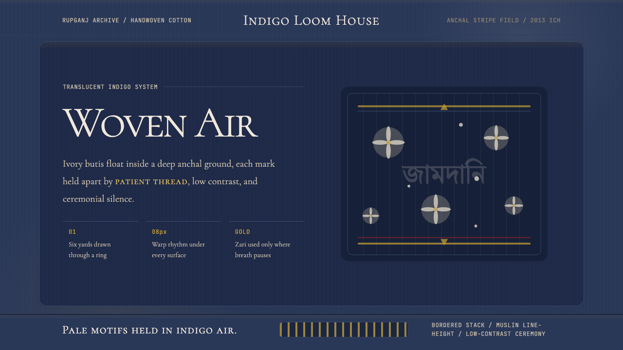 Bengali Jamdani MuslinBreathes like woven air. Indigo ground, ivory butis, and threadline borders s…如织空气般呼吸:靛蓝底、象牙布蒂与细线边框保持低对比。
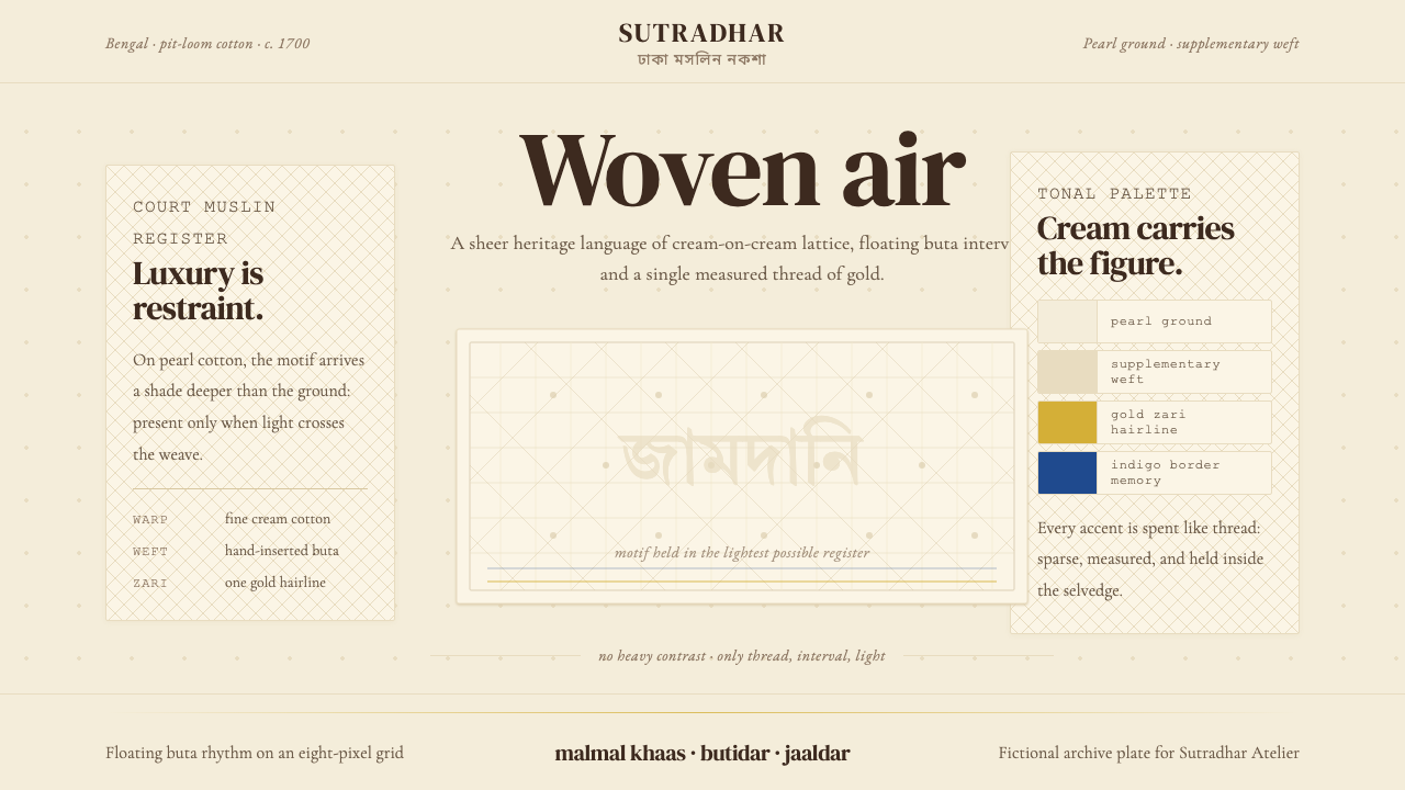 Bengali Jamdani WeavingLuxury whispers. Pearl cream, tonal buta, and one gold hairline make woven ai…奢华低语:珍珠奶白、浅色布塔与一线金丝,让织空气可见。
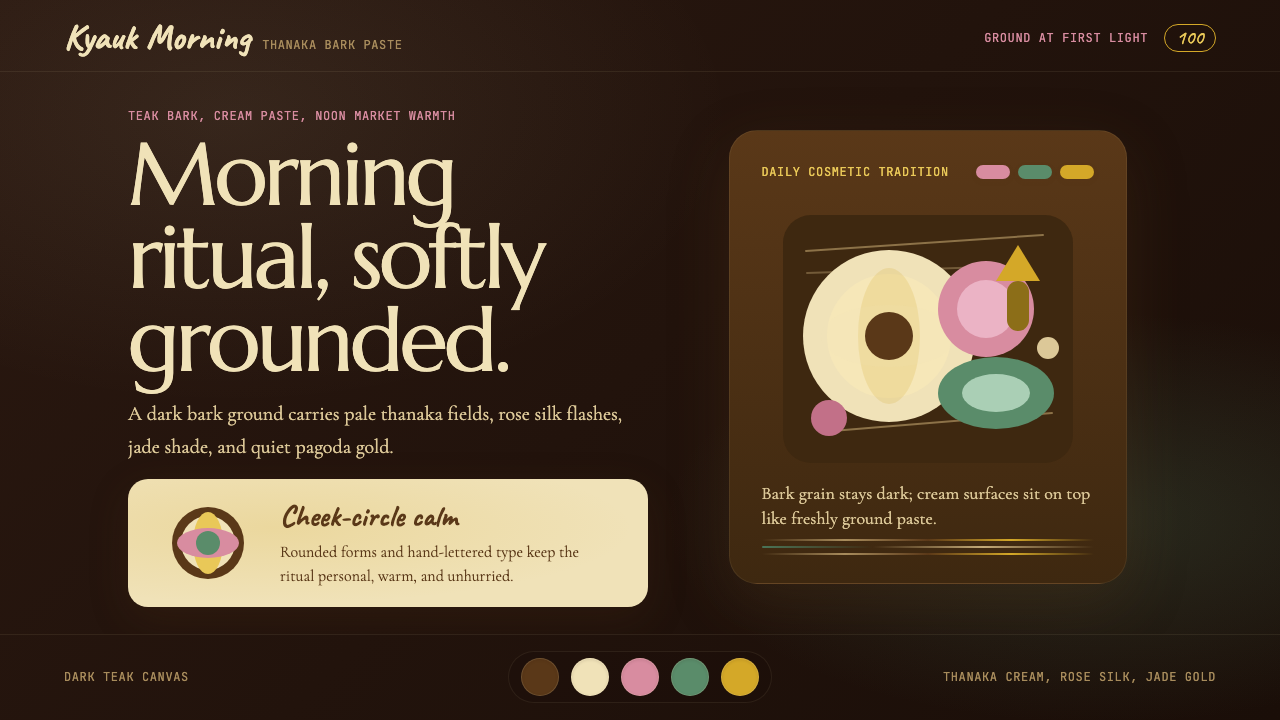 Burmese Shan Thanaka (Bark Paste)Handmade warmth on dark bark. Thanaka cream roundels soften rose, jade, and g…深色树皮上的手作暖意。特纳卡奶油圆斑柔化玫瑰、翡翠与金色。
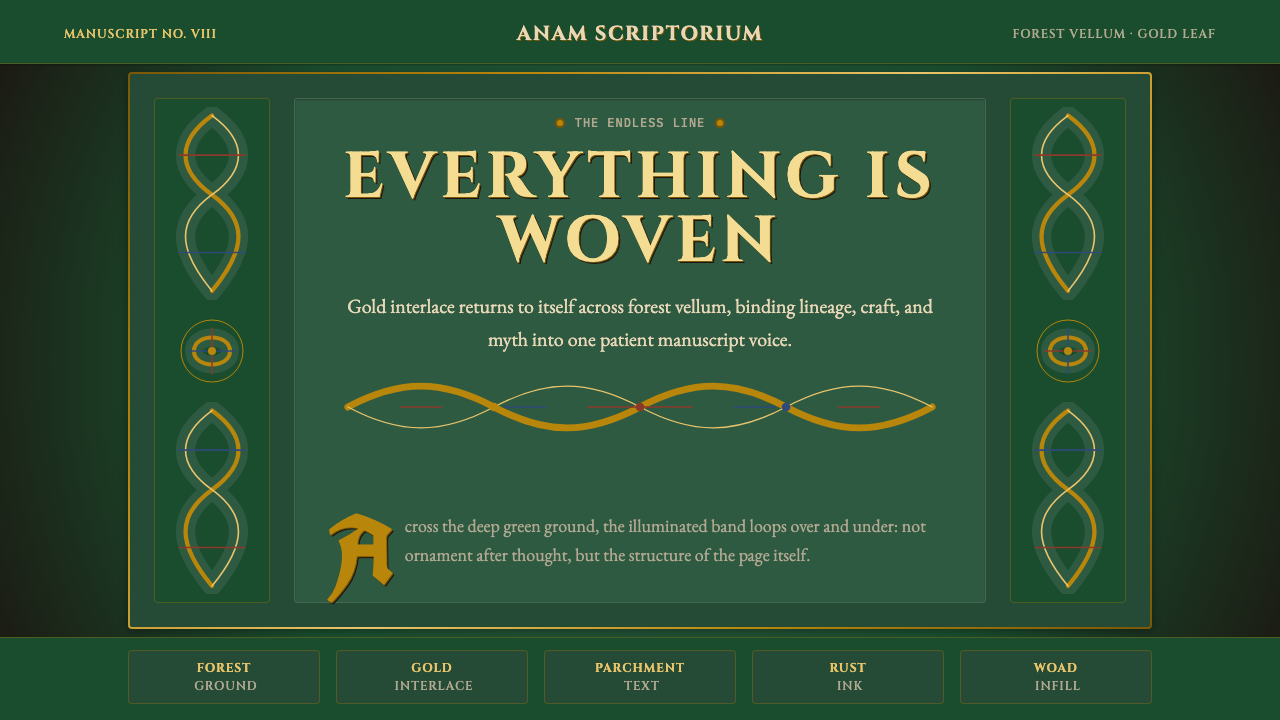 Celtic KnotworkEverything is connected. Gold Cinzel interlace frames forest-green vellum.万物相连:金色绳结与Cinzel字形框住森林绿羊皮纸。
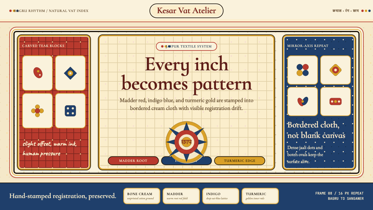 Indian Block PrintPattern claims every inch. Madder, indigo and turmeric stamp dense bordered c…每寸皆成纹:茜草红、靛蓝与姜黄拓印出密集边框布面。