What is Transistor Cloudbank?
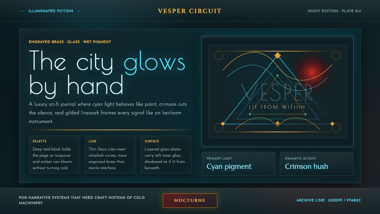
Transistor Cloudbank makes science fiction feel painted, gilded, and alive with light rather than assembled from cold machinery.
Transistor Cloudbank in brief
Transistor Cloudbank is a dark, painterly science-fiction style derived from the visual world of Transistor and its city of Cloudbank. Its central image is a teal-black night field animated by luminous turquoise, cyan pigment, amber-gold ornament, and occasional crimson emphasis. Rather than treating illumination as a technical effect, the style treats light as color laid onto a surface: it blooms along edges, pools inside panels, and gives decorative detail the density of wet paint.
The system combines the whip-like curves associated with Art Nouveau and the gilded geometry associated with Art Deco. Curving filigree, engraved borders, glass-like layers, and controlled geometric framing make interfaces feel crafted rather than engineered. The result is futuristic, but not sterile. It suggests a near future in which advanced technology has inherited the ceremonial richness of jewelry, signage, lacquer, and illuminated illustration.
Its most important departure from familiar cyberpunk is emotional temperature. Transistor Cloudbank avoids a vocabulary of glitches, exposed circuitry, harsh neon noise, and aggressively fragmented information. It replaces those cues with warmth, restraint, and visual continuity. A screen in this style should feel like an artifact discovered in a luminous city at night: luxurious, legible, slightly mysterious, and visibly made by human hands.
Where does Transistor Cloudbank come from?
The style belongs to the painterly near-future cyberpunk context of 2014 and is rooted in San Francisco, North America. Its source is Transistor, where Cloudbank was imagined not as a conventional digital metropolis but as a city rendered from within by color and glow. This framing matters because it establishes the style as an illustrated world before it becomes an interface language.
Art director Jen Zee shaped the visual direction around turquoise and gold marks against a deep teal-black night. The source material identifies two historical design movements within that direction: Art Nouveau and Art Deco. Art Nouveau contributes the long, energetic curve and ornamental flow; Art Deco contributes the sense of symmetry, precious material, and deliberate geometric containment.
The combination produces a useful tension. Curves keep the system organic and musical, while gilded geometry prevents it from becoming loose or sentimental. Panels may feel like glass, but they are held by structured borders. Ornament may flourish, but it follows a frame. Light may appear painterly, but it is organized around important information rather than scattered as atmospheric decoration.
Supergiant Games and Darren Korb are listed alongside Jen Zee as key figures in the source context. Within the Transistor Cloudbank system, their presence signals that the style should be understood as a shared authored world rather than a generic retro-futurist recipe. Its visual cues are strongest when they preserve that relationship between painted atmosphere, crafted ornament, and a coherent science-fiction setting.
What defines the Transistor Cloudbank look?
Luminous Dark Ground
The dominant field is teal-black, not empty black. It behaves like a painted night surface that can absorb color and make nearby cyan and gold appear internally lit. Darkness is therefore a material condition, not merely a background choice. Large open areas should remain calm enough for illuminated edges and ornament to register clearly.
Light as Pigment
Cyan and turquoise illumination should read as brushwork, bloom, or deposited pigment rather than as a generic electronic glow. The effect is most convincing when it gathers at contours, seams, and meaningful transitions. Light should reveal a form and give it atmosphere at the same time, never flattening the whole surface into uniform brightness.
Amber Filigree
Amber-gold lines carry the style’s sense of luxury and handcraft. They resemble engraved brass, illuminated trim, or decorative metalwork framing glass. Filigree should guide attention, divide important regions, and establish ceremonial hierarchy. If it is applied everywhere, it loses its precious quality and turns into noise.
Curves and Geometry
Art Nouveau-like curves provide movement, while Art Deco-like geometry supplies discipline. The system works when flowing motifs meet clear frames, medallion-like details, or decisive panel boundaries. Neither language should erase the other: uncontrolled curves become decorative excess, while geometry without ornament becomes too cold for the Cloudbank atmosphere.
Glass and Engraved Panels
Panels should feel like layered glass held within engraved metal rather than ordinary floating cards. Their depth comes from luminous edges, translucent-looking fields, and ornamental containment. This makes information surfaces feel embedded in a crafted object, not detached boxes resting above a generic dark interface.
Crimson Accent
Crimson is an accent, not a competing ambient color. Against cyan, teal-black, and amber, it introduces urgency, drama, or a point of emotional heat. It is most useful for a singular state, a high-priority action, or a focal detail. Its rarity gives it narrative force.
Who shaped Transistor Cloudbank?
Jen Zee is identified as the art director behind the visual world from which Transistor Cloudbank is drawn. The source material attributes its luminous painted city, turquoise-and-gold marks, deep night field, Art Nouveau curves, and Art Deco geometry to this visual direction.
Supergiant Games is named as a key figure in the origin context for Transistor Cloudbank. Its inclusion situates the style within the authored world of Transistor rather than within an abstract category of futuristic interface design.
Darren Korb is listed among the key figures connected to the source context. In an educational use of the style, that attribution reinforces the importance of preserving a unified authored atmosphere: ornament, color, darkness, and futuristic luxury should feel like parts of one world.
How do you use Transistor Cloudbank today?
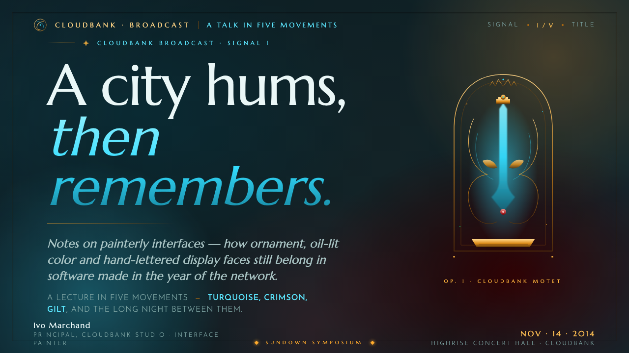
For presentation covers, use the dark field as a stage for one dominant title and one concentrated illuminated motif. A cyan edge, amber frame, or curved ornamental form can carry the cover without filling it. Content slides should become quieter panels within the same world: clear text regions, restrained luminous separators, and decorative treatment concentrated at the perimeter rather than behind every line of copy.
For data slides, preserve readability before atmosphere. Charts can use cyan for the primary story, amber for comparison or framing, and crimson only for an exceptional point requiring attention. Treat each chart as an engraved instrument or illuminated display, with generous dark space around it. Dense grids, rainbow-coded series, and excessive glow weaken the painterly hierarchy.
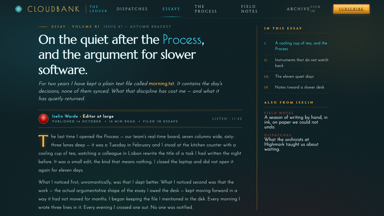
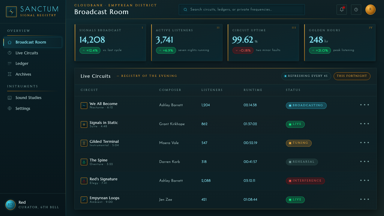
For web interfaces, the style is particularly suited to dashboards, creative tools, premium memberships, and pricing experiences that benefit from a sense of crafted value. Use teal-black as the environmental field, then let glass-like panels hold the practical interface. Navigation, status, and actions should remain calm and typographic, while cyan illumination marks interactive focus and amber ornament gives key regions a sense of occasion.
Editorial and marketing pages can use the style to turn explanation into atmosphere. Long-form content works best when a luminous heading field introduces each major section and the reading area remains substantially quieter. Marketing sections may alternate between expansive night scenes and tightly framed glass panels, using filigree to connect related ideas rather than treating it as a decorative border around every block.
The most common mistake is mistaking Transistor Cloudbank for generic neon cyberpunk. Flooding every control with cyan glow, adding glitch effects, exposing technical motifs, or scattering crimson across the page removes the style’s warmth and craft. The stronger approach is selective illumination: dark surfaces, a few radiant contours, deliberate gold detail, and enough unlit space for the painted quality to breathe.
Transistor Cloudbank — FAQ
Is Transistor Cloudbank simply a cyberpunk style?
It belongs to painterly near-future cyberpunk, but it deliberately differs from the cold and glitch-driven vocabulary often associated with cyberpunk. Its defining qualities are warmth, painted light, crafted ornament, and a luxurious sense of material. The science fiction is present, but it is expressed through brass-and-glass richness rather than visual aggression.
How should cyan and amber be balanced?
Cyan should primarily establish luminous atmosphere and interactive focus, while amber should provide structure, ornament, and value. Cyan feels like light deposited onto the scene; amber feels like the crafted frame that contains it. When both appear at equal intensity everywhere, the composition loses hierarchy. Give one role to light and the other to material.
Can this style work for information-heavy dashboards?
Yes, provided that decoration remains secondary to information. The dark ground can create strong contrast for illuminated states, and glass-like panels can separate groups of data clearly. The essential discipline is restraint: use filigree at section boundaries, reserve crimson for exceptions, and ensure that the most important figures are clearer than the atmospheric treatment around them.
What makes a panel feel authentic to the style?
An effective panel feels embedded in a crafted artifact. It has a dark or translucent-looking interior, a selectively luminous contour, and a frame that suggests engraving, brass, or decorative glasswork. It should not merely be a generic card placed on a dark page. The frame, light, and contents need to appear designed as one object.
Where does the style become overdone?
It becomes overdone when every surface glows, every edge is gilded, and every empty area receives ornament. The source aesthetic depends on contrast between quiet night, painted illumination, and precious detail. Remove the quiet areas and the luxury disappears. The most convincing work lets darkness carry part of the composition.
Related design styles
 Cast Iron SoHo FacadesIron remembers the city. Graphite bays, Didone type, and pale stone-paint edg…
 Deus Ex: Human RevolutionDystopia wears gold. Near-black panels glow with amber bevels and hex motifs.
 Prey (2017)Luxurious horror in orbit. Gold Deco sunbursts glint out of near-black Typhon…
 Wicked Elphaba EmeraldGreen made monumental. Jewel emerald spotlit on a black-box void, in engraved…
 Egyptian Malachite PigmentGrave mineral green. Muted malachite bands on green-black stone, cut by fine…
 Om Kalthoum Record SleeveOpulence pressed into cardboard. Struck gold Aref Ruqaa on aubergine, rosette…