What is Tokaj Aszú Label?
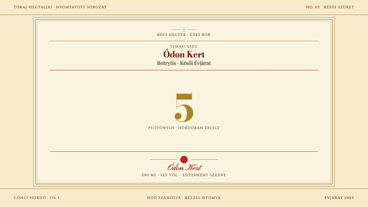
Tokaj Aszú Label reads a century-old Hungarian wine label as a layout grammar — an oxblood frame, flat ochre rules, and one amber numeral that outranks everything else on the page.
Tokaj Aszú Label in brief
Tokaj Aszú Label is a light, dense, heraldic design language drawn from the letterpress labels of Tokaj-Hegyalja, the wine district of north-east Hungary, around 1910. Its subject is a sweet wine made from grapes shrivelled by noble rot, and its logic is unusual for a wine label: the single most important piece of information is not the estate name but the grade, shown as one large numeral.
The look is built from a small set of strict elements. A double-rule frame is inset from the trim. A centred axis organizes everything inside it. Horizontal rules divide the page into registers, like the registers of a coat of arms or a banknote. Display lettering is in a deep oxblood red, secondary lettering is in wide-set capitals, and a flat ochre-gold ink carries the rules and the numeral. The ground is simply the paper, aged to a warm yellow.
What the style rejects is as definite as what it uses. It is not minimalist, and it does not pursue white space. It is symmetrical, packed, and ceremonial. Gold is a printed ink, never foil or a gradient, and the background is not a separate textured layer but the stock itself. It is made for contexts that need weight and age without falling into the clichés of the modern minimalist wine label.

Where does Tokaj Aszú Label come from?
Tokaji aszú is graded by the puttony, a carrying basket, which in English is a hod. The method is traditional and specific. Berries touched by noble rot (Botrytis) are picked one by one, then tipped by the 25 kg puttony into a Gönci barrel of 136 litres. The number of baskets that go into a barrel, from three to six, defines the style of the wine: the more baskets, the sweeter and more concentrated the result. That count, rather than a brand name, became the label's main message and is printed larger than anything else on the paper.
The region has a long paper trail. The source dates the first written reference to aszú to 1571 and a classification of the region's vineyards to 1730, which together describe a place that had named and ranked its wine long before most of the world. The label style that this system borrows comes later, from surviving labels of around 1910 from Tokaj-Hegyalja. They set the house style: a crowned coat of arms, ochre-gold rules, oxblood display lettering, a red seal, and Hungarian text set in wide capitals.
The labels belong to the printing culture of the Habsburg-era Hungarian lands, in which letterpress was the everyday technology of commercial print. Typefaces with strong contrast between thick and thin strokes, in the Bodoni manner, were the standard voice of authority. Heraldic conventions, the crown, the shield and the seal, translated a family or an estate into a guarantee. A label of this kind was a small document: it announced who made the wine, where it came from, and, most prominently, how concentrated it was.
The design system turns these labels into a reusable grammar rather than a reproduction. It keeps the structure: a double-rule frame inset from the trim, a strict centred axis, horizontal rules dividing every register, and one large numeral that carries the weight. It also keeps the materials logic: flat printed ochre in place of foil, and the aged stock as the ground, with no added layer. The puttonyos grading system, heraldic wine labelling and Habsburg-era letterpress are the three traditions it draws on.
What defines the Tokaj Aszú Label look?
The Grade Numeral
One large numeral, in amber ochre, is the hero of the page and is larger than any other element, including the name. It stands for the number of baskets, and the design logic is that the most decisive fact gets the most space. In other contexts the numeral becomes whatever your product's one decisive figure is: a tier, a vintage, an edition number, a rating.
Oxblood Display Lettering
Titles are set in a deep, slightly brownish red, in a high-contrast serif of the Bodoni kind, with thick vertical strokes and hairline serifs. The color reads as old ink rather than as bright red, and it gives the label a ceremonial weight. It is used for names and headings, never for body text or decoration, so that it keeps its authority.
Wide-Set Capitals
Secondary text, such as the district, the vintage, and descriptive lines, is set in capitals with generous letter spacing, as the Hungarian wording on the original labels was. The wide setting gives short lines a monumental, inscriptional character and lets small text sit calmly between the rules. Lowercase is reserved for the few places where a quieter voice is needed.
Flat Ochre Gold
Gold here is a printed ochre ink, a muted, warm yellow-brown laid flat. It is never foil, shine, bevel or gradient. The rules, frames and numeral share this single tone, which holds the composition together and keeps it from looking luxurious in the glossy sense. Its quality is that of an old press run, not a premium finishing option.
Aged Stock as Ground
The ground is the paper itself, a warm, yellowed, slightly uneven off-white, with no additional texture layer placed on top. This honesty about material is what makes the label feel printed, not decorated. Contrast with the oxblood and ochre is moderate and comfortable, which suits reading in low or candle-like light.
Double Frame and Centred Axis
Two parallel rules form a frame inset from the trim, leaving a margin of paper outside it. Inside, everything aligns to a strict vertical axis at the centre. This is the architecture of coins, certificates and banknotes: symmetry as a sign of seriousness. Departing from the centre, or breaking the frame for effect, would weaken the page's claim to being a document.
Registers and Heraldry
Horizontal rules divide the page into stacked registers, each with its own job: crest at the top, name and grade in the middle, details below. A crowned coat of arms and a red seal supply the ceremonial marks. The page is dense by intention; each register is full, and the density is the source of the label's authority, not a lack of discipline.

Who shaped Tokaj Aszú Label?
Count Tihamér Somssich appears in the source among the key figures attached to the c. 1910 label style. The title gróf marks an aristocratic landholder, and his name stands in the theme for the proprietors whose coats of arms and seals such labels carried. For a designer, the point is the logic of the label: it works as a personal and territorial guarantee, which is why heraldry sits at its top.
The Rákóczi family is a princely Hungarian name that tradition ties closely to Tokaj-Hegyalja and to the prestige of its wine. The source lists them as a key figure for the theme. They represent the aristocratic and heraldic dimension of aszú: the idea that this was a wine with lineage, whose label could carry crowns because the product itself was held in courtly regard.
The anonymous printers who set these labels in metal type are the unnamed authors of the style. Working with a limited number of faces, a few inks and standard paper, they made labels that were dense, symmetrical and exact. The source names Habsburg-era Hungarian letterpress as one of the movements behind the theme, and its constraints are the reason for the flat ochre and the strict rules.
Behind the numeral stand the people who picked each berry by hand and the coopers who made the Gönci barrel into which the baskets were tipped. They are not named in the source, but the grading system could not exist without them: the 25 kg puttony and the 136-litre barrel are working units of labour. The label turns their counting into its most visible mark.
How do you use Tokaj Aszú Label today?
Tokaj Aszú Label is one of the more distinctive historical styles to adopt, because it asks for density and symmetry when most contemporary design asks for space and asymmetry. It works best when the content has real hierarchy, a single decisive number, and a reason to be ceremonial. It works poorly when used as light vintage seasoning on an otherwise modern layout.
For presentation slides, build the cover as a label: a double-rule frame, a centred title in oxblood, a short line of wide-set capitals beneath, and one large amber numeral, perhaps the year, the edition or the key metric. Content slides can be organised as stacked registers separated by rules, with one idea per register. A data slide can lead with a single oversized figure and let supporting numbers appear in small capitals underneath, in the manner of a grade statement.
For web interfaces, the style fits premium goods, heritage and craft brands, restaurant and wine-list sites, event invitations, certificates, and product pages where a tier or grade is the main selling point. A pricing page can make sense of it: each plan is a framed label with its tier as a large numeral. Keep the page centred, use a single column or a small number of equal frames, and let ochre rules do the work of cards and dividers.
For editorial and marketing work, it supports features on wine, food, history and craftsmanship, and packaging concepts that want an archival feel. Use long-form text with generous leading under a centred title block, separate sections with ochre rules, and place a coat of arms or seal-like mark as a signature. It suits invitations, menus and limited-edition announcements, where a sense of ceremony is part of the message.
The most common mistake is to add what the original never had: foil effects, gradients, glow, drop shadows or embossing, which turn flat printed ochre into a luxury cliché. The second mistake is to dilute the density by adding large margins and generous white space in the modern manner, which removes the label's authority. A third is to give every number the same size; the whole system depends on a single numeral outranking everything else.

Tokaj Aszú Label — FAQ
What does puttonyos mean, and why is it on the label?
A puttony is a carrying basket, or hod, and puttonyos is the count of those baskets. In the traditional method, berries touched by noble rot were gathered in 25 kg baskets and tipped into a 136-litre Gönci barrel. The number, three to six, indicated how sweet and concentrated the wine was, so it became the label's main message and is printed larger than the name.
Why is the gold flat rather than metallic?
Because the original labels were letterpress prints in ochre ink, not foil. Flat ochre is the historically accurate material and it gives the page a quiet, documentary feel. Metallic or gradient gold would make the label look like modern luxury packaging, which is the opposite of the sober, aged character the system is built around.
Can I use it for something other than wine?
Yes. The label is a grammar: frame, axis, registers, one decisive numeral. Any product with a grade, edition, vintage or tier can borrow it, including coffee, chocolate, spirits, books, certificates, invitations, awards and premium subscriptions. What it needs is a real hierarchy and a reason for ceremony. Without them the density will feel fussy.
How does it relate to modern minimalism?
It is nearly the opposite. Modern minimalist labels subtract until a name and a mark remain. This system keeps everything the original had and arranges it with strict order: symmetry, rules, registers. The restraint is in the discipline of the layout and the narrow palette, not in emptiness. It suits brands that want weight and history, not those that want to look light.
Do I need to use Hungarian text?
No. The original labels carried Hungarian in wide capitals, and a few Hungarian words can add authenticity when the subject is Tokaj itself. For other uses, the grammar works in any language: set the text in capitals with generous spacing, keep to the centred axis, and let the numeral lead. Only avoid mixing in casual lowercase sans-serif headings, which break the voice.
Related design styles
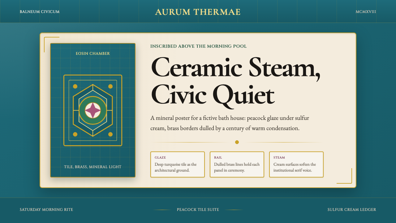 Budapest Thermal Bath Art DecoCivic steam, made ceremonial. Peacock turquoise, brass borders, and Garamond…
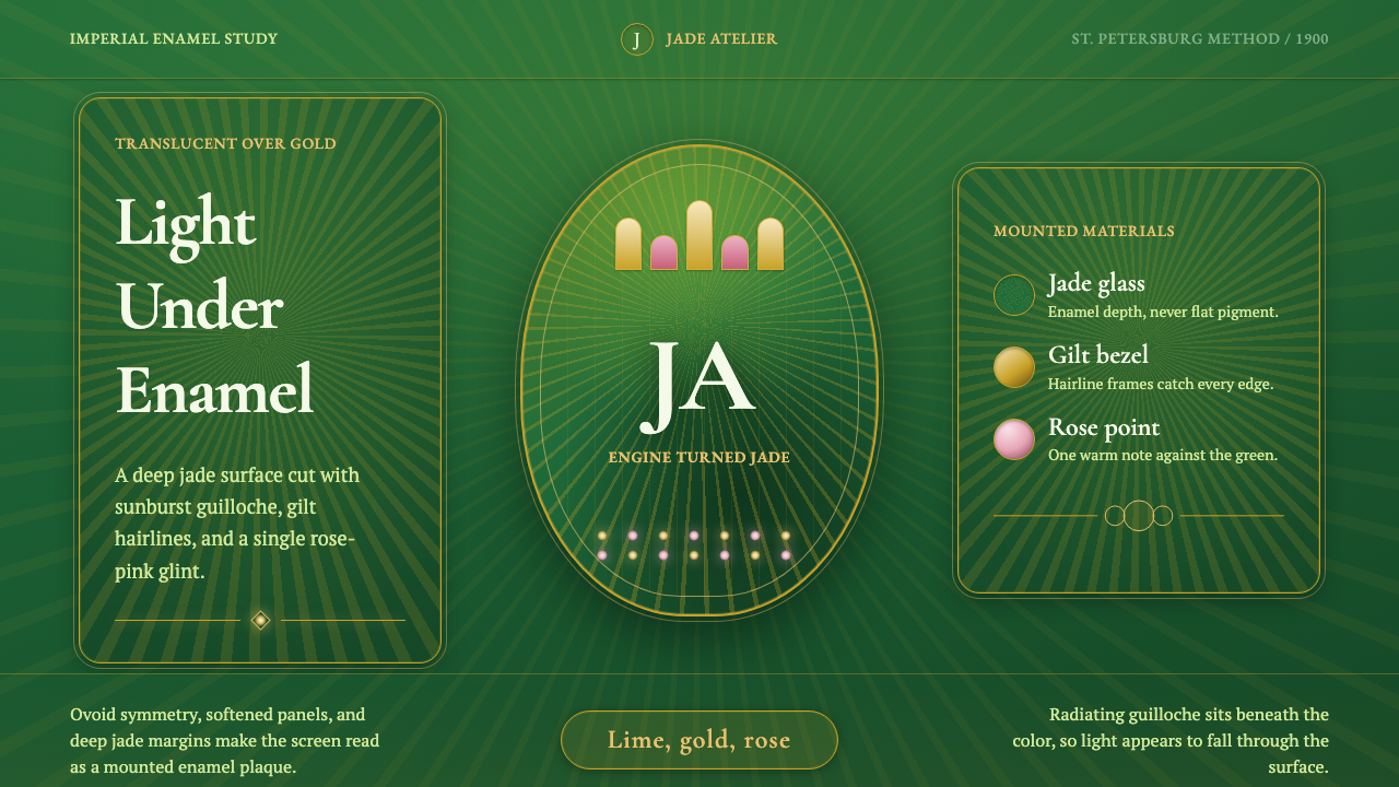 Faberge Guilloche EnamelImperial enamel glows. Jade guilloche, gilt hairlines, rose-pink points.
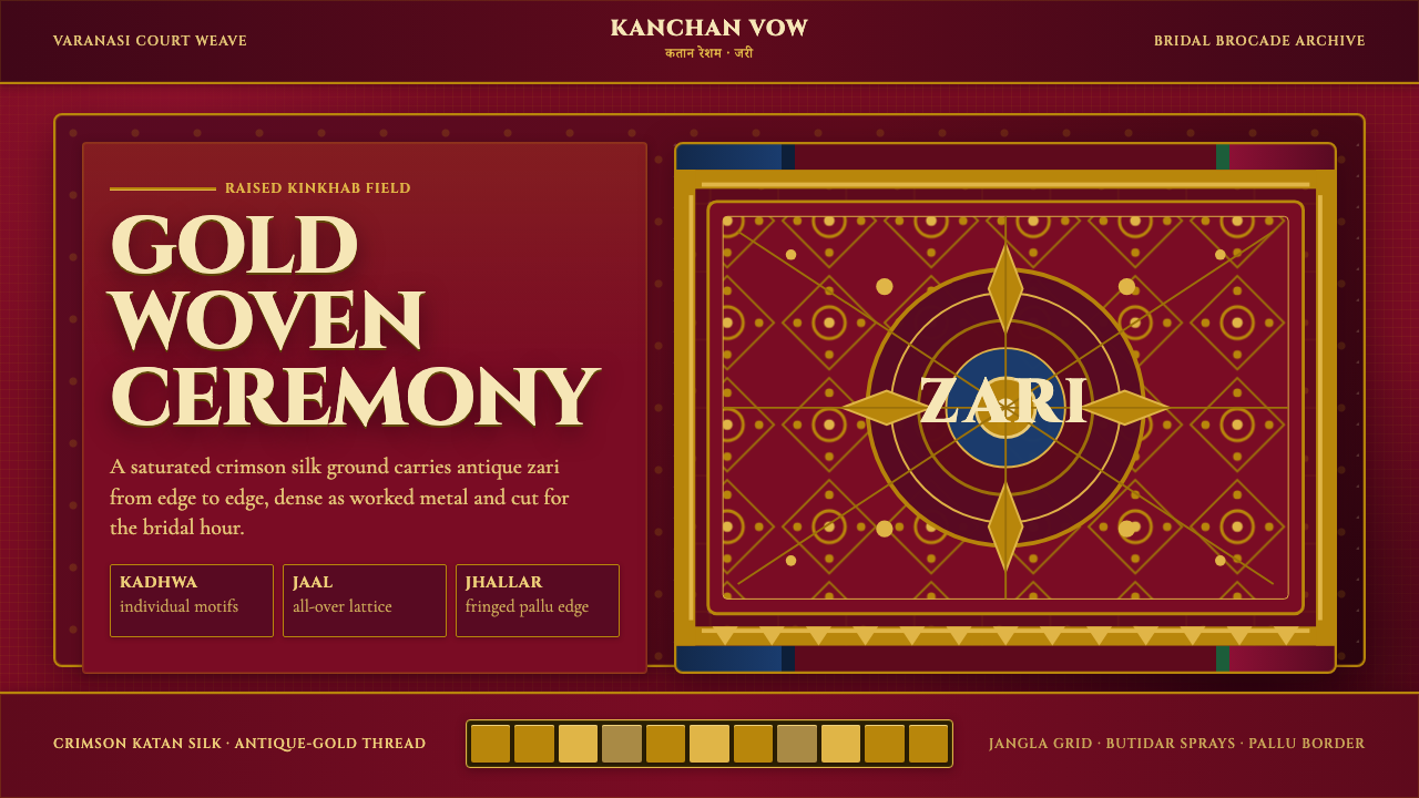 Banarasi Brocade SareeBridal maximalism, woven dense. Crimson silk grid carries raised antique-gold…
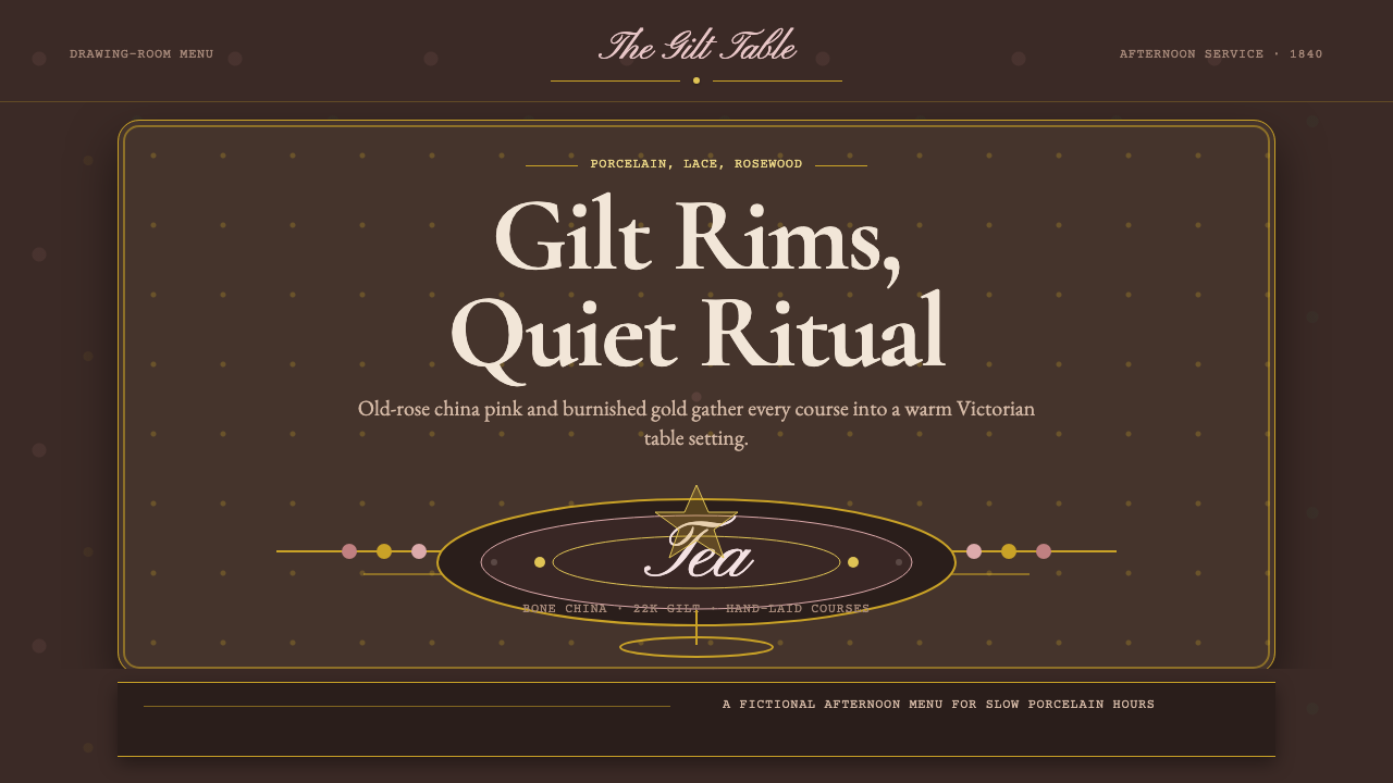 English Afternoon TeaOrnament is the ritual. Old-rose porcelain, gilt rims, and script rest on ros…
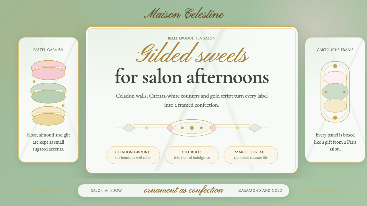 French PâtisserieOrnament is the luxury. Celadon ground, gilt cartouches, Garamond and script…
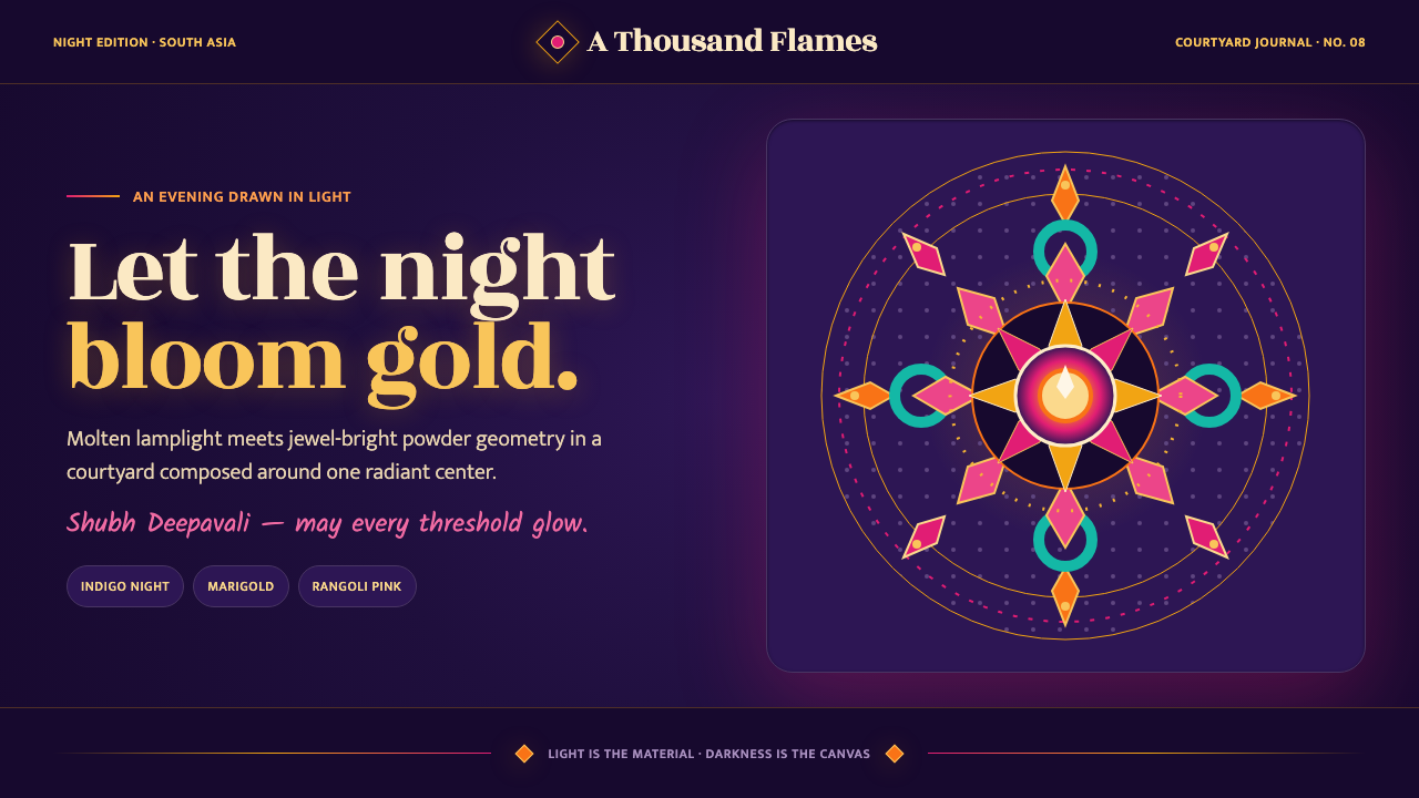 Diwali Festival of LightsNight blooms from within. Molten gold and jewel-bright rangoli radiate across…