What is Fabergé Guilloché Enamel?
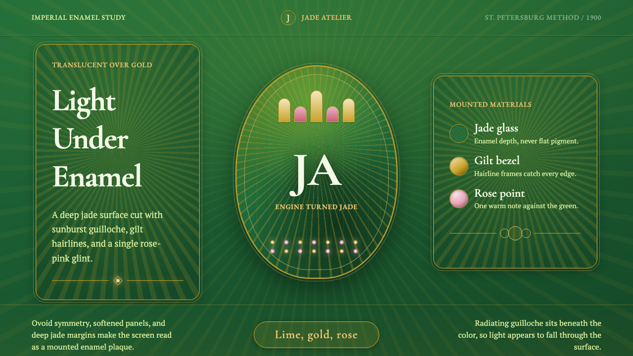
Fabergé guilloché enamel turns ornament into illumination — translucent jewel color suspended above patterned gold, edged with gilt hairlines, and awakened by rose-pink points of light.
Fabergé Guilloché Enamel in brief
Fabergé guilloché enamel is the visual language associated with the House of Fabergé’s imperial eggs and objets de fantaisie. Its defining technique places translucent vitreous enamel over engine-turned guilloché gold. Light passes through the colored surface, meets the engraved pattern beneath, and returns as a shifting internal radiance. The object appears less like painted metal than a jewel whose ornament has been sealed inside it.
The characteristic palette centers on apple green and deep jade, supported by luminous lime-green highlights, fine gilt mounts, and occasional rose-pink accents recalling rose-cut diamonds. These colors do not behave as equal blocks. Jade establishes the enveloping enamel field, lime reveals the brightest paths of light, gold defines boundaries and construction, and pink appears as a rare point of contrast.
Translated to the screen, the style depends on layered luminosity rather than literal imitation of an antique object. A digital surface should suggest translucent glaze, a patterned metallic ground, and light moving between them. Radiating sunbursts, concentric waves, or tightly repeated curves supply the guilloché structure; restrained gold lines frame it like mounts. The result is dark, ceremonial, and opulent, but its richness comes from depth and precision rather than an abundance of unrelated decoration.
Where does Fabergé Guilloché Enamel come from?
The style belongs to the world of Russian imperial jewellery, objets de vertu, and fin-de-siècle court goldsmithing in St. Petersburg. Its peak workshop era is identified with Romanov-period Fabergé production between 1900 and 1950. Within that setting, precious objects were conceived not simply as containers for expensive materials but as tightly integrated encounters between metalwork, patterned surfaces, enamel color, and reflected light.
The House of Fabergé perfected the combination of translucent vitreous enamel and engine-turned guilloché gold. Engine turning supplied an ordered ground of radiating or repeated lines before the enamel was placed above it. Because the upper layer remained translucent, the pattern was not merely visible beneath the color; it appeared to generate the color’s shimmer. The visual identity therefore emerged from the cooperation of two surfaces, one physically patterned and metallic, the other smooth, colored, and luminous.
Imperial eggs and objets de fantaisie became the most recognizable carriers of this language. Apple-green enamel glowing over a sunburst ground could be enclosed by gilt gold and punctuated with rose-cut diamonds. The contrast was carefully structured: broad enamel fields created continuity, gold mounts articulated edges and divisions, and small brilliant points interrupted the green with concentrated flashes. Each material played a distinct optical role.
Peter Carl Fabergé, Michael Perchin, and Henrik Wigström are the key figures named with this workshop tradition. Their association with its peak production places the style within a collaborative house practice rather than the mythology of a solitary artist. What survives as an aesthetic is likewise a system of coordinated decisions: engraving beneath transparency, colored enamel above metal, mounts at the perimeter, and gemstone-like accents used with restraint.
What defines the Fabergé Guilloché Enamel look?
Enamel Color
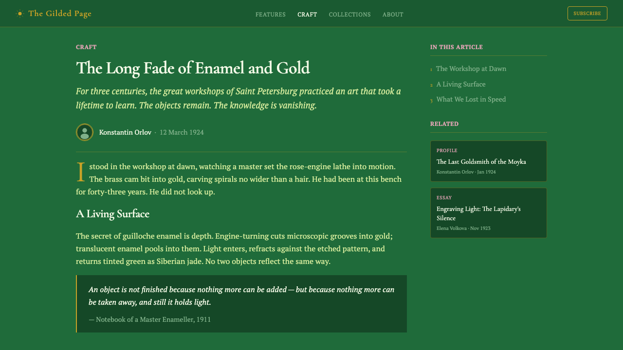
Deep jade is the governing field, while apple green and luminous lime describe places where light seems to gather beneath the enamel. The greens should feel mineral and internally lit rather than botanical or fluorescent. Rose pink is a companion accent, not a competing primary; it works best as a small point that intensifies the surrounding green through contrast.
Guilloché Pattern
Guilloché provides the hidden architecture. Radiating sunbursts, concentric curves, and disciplined repetitions should appear to continue beneath the visible surface rather than sit on top as printed decoration. Their rhythm is exact and continuous, creating controlled movement without turning into illustrative imagery.
Translucent Depth
The enamel is never perceived as a flat fill. Darker zones suggest the body of the glaze, while brighter passages imply light reaching the metallic pattern below and returning through color. Depth emerges from overlapping illumination, subtle shifts of saturation, and the partial visibility of the ground rather than from heavy cast shadows.
Gilt Hairlines
Gold appears as a mount, rim, seam, or precise hairline. It separates enamel fields, clarifies construction, and introduces warm metallic tension against the cool jade. Broad areas of gold would weaken the effect; its authority comes from scarcity, continuity, and the sense that every line belongs to the object’s making.
Gemlike Highlights
Highlights are concentrated and jewel-like. Small rose-pink or near-white points can recall rose-cut diamonds, while narrow green gleams reveal the curvature or direction of the enamel. These accents should feel discovered by light rather than sprinkled decoratively across the surface.
Imperial Framing
Compositions are enclosed and ceremonial. Oval medallions, framed panels, nested borders, and centered jewel forms suit the language because they recall mounted precious objects. Symmetry may establish dignity, but small asymmetries in highlights or accent placement keep the surface alive and prevent the design from becoming static.
Controlled Opulence
Richness comes from the interaction of a few coherent materials, not from indiscriminate ornament. Jade enamel, guilloché rhythm, gilt structure, and rose-pink brilliance form a limited hierarchy. Adding unrelated motifs, many metallic colors, or equally bright accents everywhere dissolves the sense of craftsmanship into generic luxury.
Who shaped Fabergé Guilloché Enamel?
Peter Carl Fabergé is the principal named figure of the House whose identity became inseparable from imperial eggs and objets de fantaisie. Within this aesthetic, his significance lies in the integrated workshop language: translucent enamel is not isolated from goldwork or gemstones, but coordinated with them so that structure, pattern, color, and light read as one precious object.
Michael Perchin is identified among the key figures associated with peak Romanov-era Fabergé workshop production. His place in the source tradition underscores that the celebrated appearance was produced through a house practice, where the visible enamel surface depended on coordinated decisions about the engraved ground, gold mounting, and the placement of brilliant accents.
Henrik Wigström is likewise named as a key figure in the Fabergé workshop tradition. His association with the style reinforces its character as disciplined court goldsmithing rather than free ornament. The enamel’s glow, the regularity of guilloché, and the restraint of gilt and gemstone-like details are best understood as parts of a precise production system.
How do you use Fabergé Guilloché Enamel today?
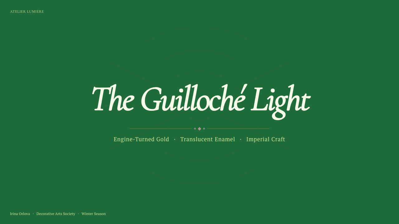
For presentation slides, the style is strongest when the cover is treated as a precious mounted object. A deep jade field can hold a large oval, medallion, or radiating sunburst, enclosed by a fine gold rim. The title should occupy a calm, clearly bounded area rather than compete with the patterned center. Rose pink belongs in a single jewel-like point, such as a small marker or emblem, while luminous green supplies the main moment of attraction.
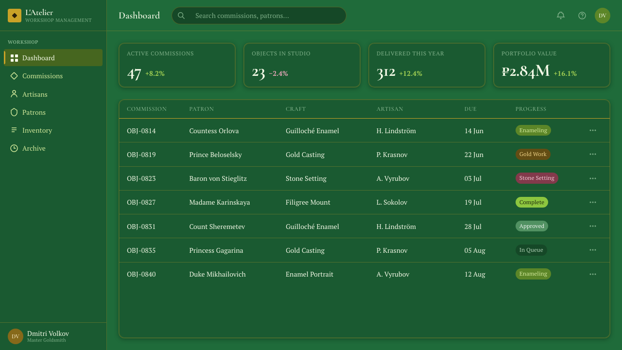
Content and data slides require stricter restraint. Keep most text on quieter enamel fields where the guilloché is subdued, then reserve brighter patterning for section markers, key figures, or selected callouts. Tables and charts should use gold lines as structural divisions and distinguish important series through shifts among jade, apple green, and rose pink. Data remains legible when the decorative ground behaves like a watermark beneath information instead of demanding equal attention.
For web interfaces, Fabergé guilloché enamel suits premium dashboards, membership areas, pricing pages, and ceremonial onboarding moments. Navigation and long-form controls should remain relatively calm, while summary cards or selected states receive the full enamel treatment. A pricing page can frame each tier like a mounted panel, using luminous green to establish the recommended choice and rose pink for a rare secondary distinction. Fine gold boundaries should clarify containment and hierarchy, not imitate a heavy ornamental frame around every component.
Editorial and marketing layouts benefit from alternating intensity. A hero section may display the complete combination of jade depth, radiating guilloché, gilt framing, and gemstone highlights; subsequent sections should separate those ingredients so the eye can recover. Product stories can place portraits, objects, or quotations inside medallion-like frames, while campaign dividers borrow the continuous rhythm of engine-turned lines. The style is especially persuasive when a brand wants luxury to feel crafted, historical, and luminous rather than merely expensive.
The common mistake is to confuse imperial richness with maximal decoration. Covering every panel in bright guilloché, outlining every element in gold, and scattering pink highlights uniformly destroys the hierarchy that makes the style convincing. Another error is rendering the green as a flat digital fill with a decorative pattern pasted above it. Begin with the optical relationship instead: patterned metal beneath, translucent color above, gilt structure at the edges, and only a few concentrated points where light appears to break through.
Fabergé Guilloché Enamel — FAQ
Is Fabergé guilloché enamel simply a dark luxury style?
No. Darkness supplies contrast, but the identity comes from a specific layered construction: patterned gold beneath translucent enamel, fine gilt mounts around it, and gemstone-like accents above or beside it. A dark green interface with gold borders may look luxurious, yet without the impression of light traveling through color to a guilloché ground, it does not express the central Fabergé enamel principle.
Why is guilloché essential rather than optional decoration?
Guilloché is the source of the enamel’s apparent movement. Its repeated lines catch and organize light beneath the translucent colored layer, making the surface shimmer differently across its field. Removing that ground leaves only colored gloss. In digital work, the pattern may be subtle, but it must still appear structurally related to the light rather than added as a superficial motif.
Can the style use colors beyond green, gold, and rose pink?
The provided system is specifically built around deep jade enamel, apple and lime luminosity, gilt hairlines, and a rose-pink companion accent. Introducing other colors risks weakening that identity, especially when several compete at equal intensity. Variation is better achieved through changes in translucency, darkness, reflection, and pattern density within the established palette.
How should typography behave within such an ornate visual system?
Typography should provide composure and hierarchy rather than imitate engraved jewellery. Titles may feel formal and ceremonial, but body text must remain calm and highly readable. Gold is best reserved for short headings, labels, or rules, while longer passages need strong contrast against a quiet jade field. The guilloché should recede wherever reading is sustained.
Where does Fabergé guilloché enamel struggle in contemporary design?
It struggles where neutrality, extreme information density, or casual friendliness is the main requirement. The ceremonial framing and jewel-like light can give ordinary controls too much importance, while patterned surfaces may interfere with dense reading. The style works best in selected moments of emphasis and in products whose identity can support imperial formality, crafted luxury, and deliberate visual drama.
Related design styles
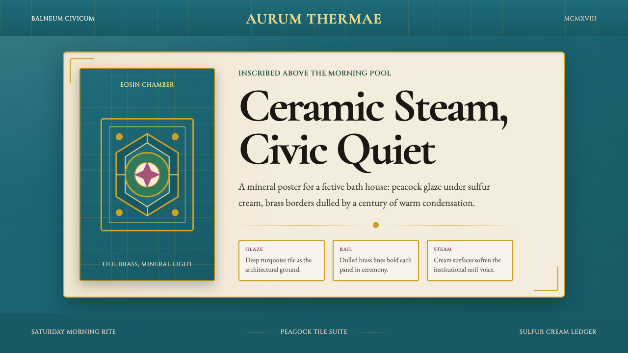 Budapest Thermal Bath Art DecoCivic steam, made ceremonial. Peacock turquoise, brass borders, and Garamond…
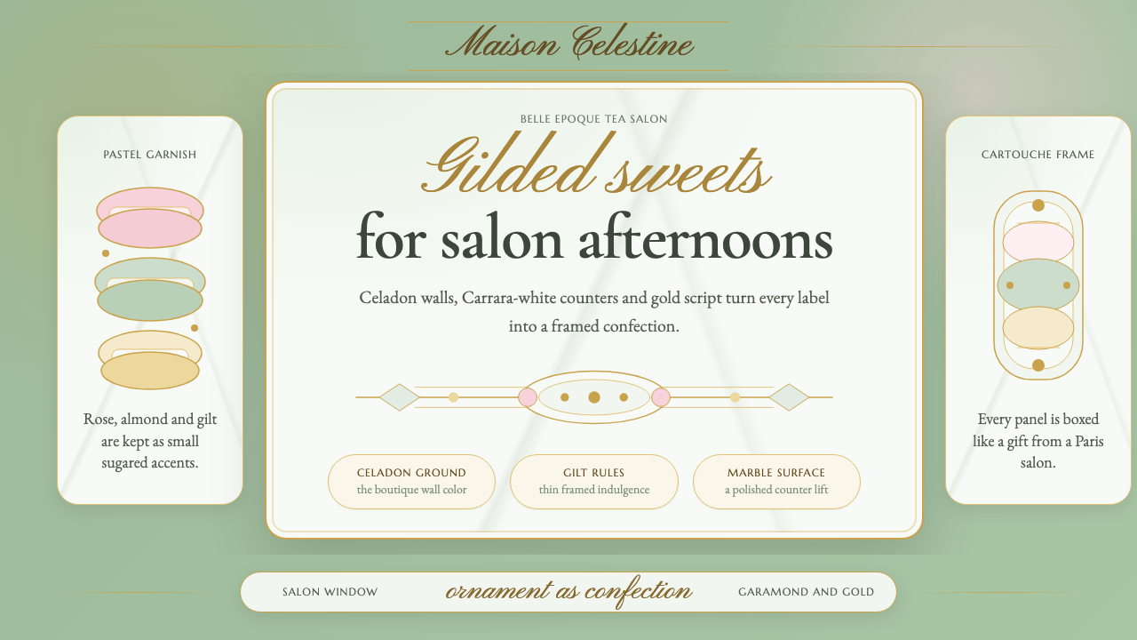 French PâtisserieOrnament is the luxury. Celadon ground, gilt cartouches, Garamond and script…
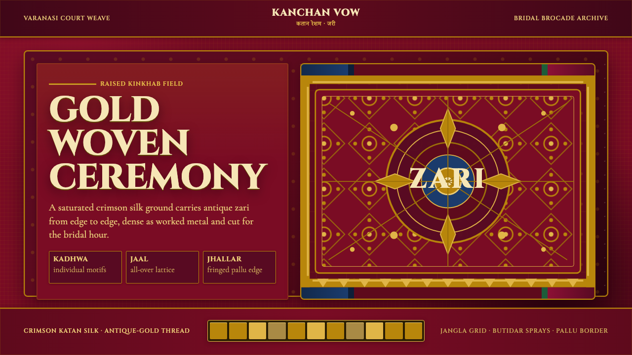 Banarasi Brocade SareeBridal maximalism, woven dense. Crimson silk grid carries raised antique-gold…
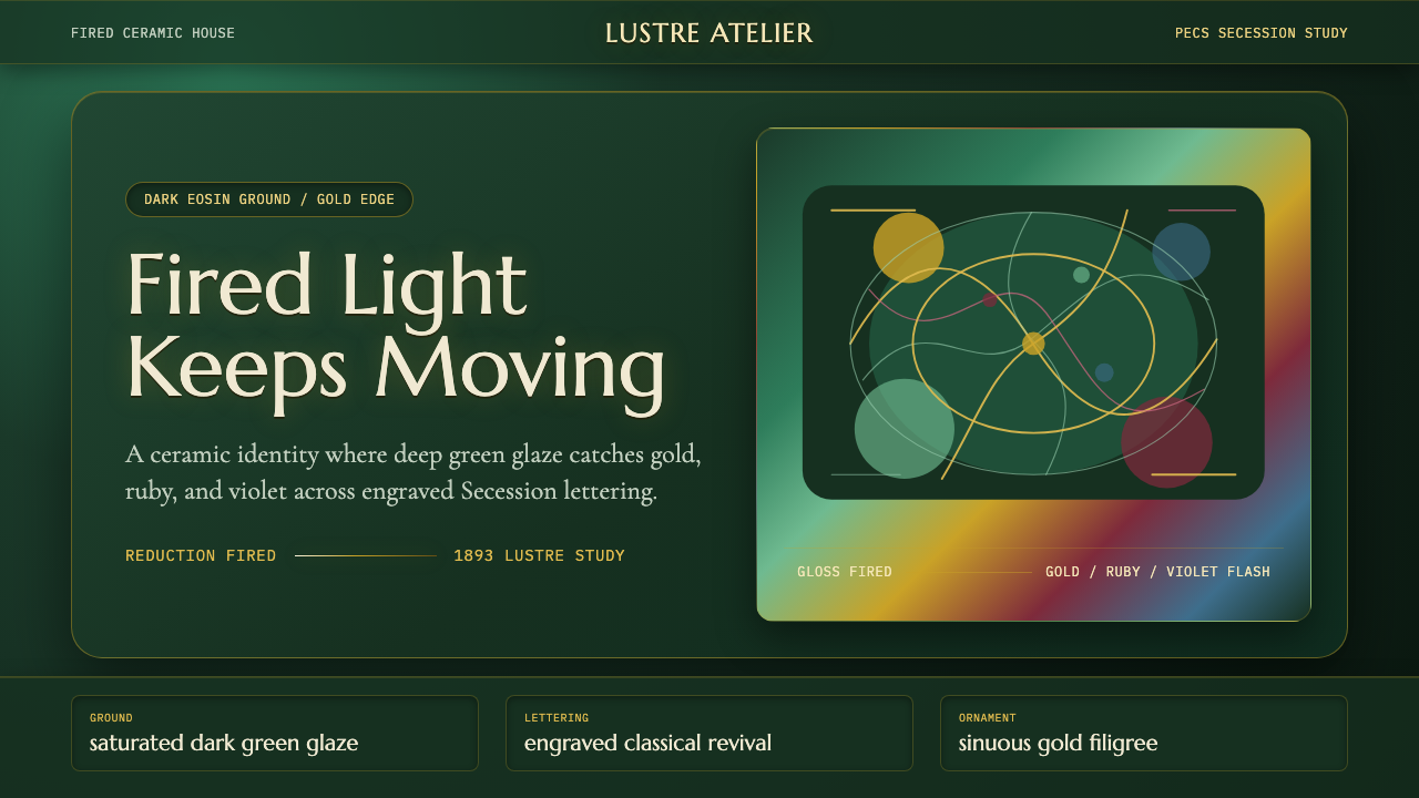 Zsolnay Eosin CeramicsGlaze becomes theater. Dark eosin green flashes gold, ruby, and violet throug…
 Arabian Oud Attar BottleResinous luxury, gilded. Chocolate oud lacquer frames Cinzel caps and ruby-am…
 Bohemian Cut CrystalOpulence glows in shadow. Ruby and cobalt facets sit on velvet under gilt rim…