What is Diwali Festival of Lights?
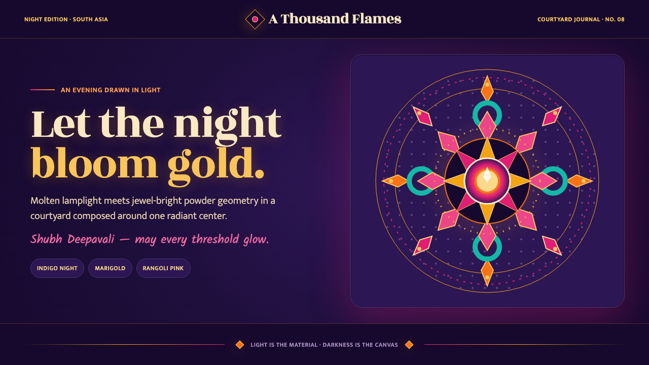
Diwali turns darkness into a surface for radiance — molten-gold lamps, jewel-bright rangoli, marigold orange, and indigo night arranged so that every flame appears to bloom from within.
Diwali Festival of Lights in brief
Diwali, the Festival of Lights, is an ancient South Asian festival associated with India, Nepal, and the wider diaspora. Its visual language begins with a simple inversion: darkness is not an absence to be eliminated but a deep field that allows light to become visible. Rows of small clay diya lamps burn against indigo-purple night, while marigold garlands, oil flames, reflective surfaces, and floor patterns build a world of concentrated warmth. The resulting aesthetic is ceremonial rather than merely festive. It treats illumination as both material and meaning.
The Diwali visual system combines handmade ornament with radiating order. Rangoli and kolam floor art spread from a center through mirrored geometry, petal-like repetitions, looping lines, and jewel-bright powder. The pattern may feel abundant, but it is not visually chaotic: symmetry gives the color a calm architecture. Pichwai devotional painting contributes saturated floral density and reverent frontal composition, while Mughal night-scene miniatures contribute a sense of darkness as atmosphere rather than emptiness. Indian calendar-art oleography adds the clarity and emotional directness of widely circulated devotional imagery.
The defining tension is between cool night and warm radiance. Deep indigo, purple, and near-black grounds establish depth; molten gold, saffron, vermilion, magenta, and peacock green gather around the light sources. Ornament is never neutral. A lamp becomes a point of welcome, a garland becomes a border of abundance, and a rangoli becomes a threshold between the ordinary floor and a charged ceremonial space. Applied well, the style feels luminous, generous, handmade, and symbolically alive without becoming visually muddy.
Where does Diwali Festival of Lights come from?
Diwali belongs to an ancient South Asian festival tradition whose Sanskrit references reach back to roughly the first millennium CE. Its visual identity developed across a region rather than from a single school or court. India, Nepal, and diaspora communities have carried the festival through changing materials, homes, climates, and technologies, while preserving a shared emphasis on lamps, thresholds, floral abundance, devotional imagery, and the transformation of night through collective making.
Rangoli and kolam are among the most important sources for the style's spatial logic. These floor arts turn an entrance, courtyard, or domestic threshold into a temporary image. Powder, pigment, grain, and chalk-like materials are arranged through repeated marks and balanced symmetry, often radiating from a central point. The work is handmade and impermanent, yet its temporary nature intensifies its ceremonial value: the pattern is made for a particular welcome, a particular evening, and a particular gathering.
The visual canon also crystallized through devotional and courtly image traditions. Pichwai devotional painting contributed floral richness, frontal presence, and a saturated sense of sacred enclosure. Mughal-era miniatures contributed the poetic possibilities of the night scene: dark skies, concentrated illumination, intimate gatherings, and small points of brilliance set within a vast field. In these images, darkness is not simply background color. It creates a stage on which lamps, garments, architecture, and faces can hold attention.
In the nineteenth and twentieth centuries, Indian calendar-art oleography helped carry devotional imagery into broader public circulation. This print tradition reinforced the style's legibility: strong silhouettes, luminous focal points, rich but readable color, and compositions that communicate immediately from a distance. Raja Ravi Varma, Anant Pai, and Jivya Soma Mashe stand as named figures within the wider visual lineage surrounding this article. Together with rangoli and kolam, Pichwai, Mughal night scenes, and calendar-art printing, they help locate Diwali aesthetics within a living field of image-making rather than reducing it to a decorative palette.
What defines the Diwali Festival of Lights look?
Night as Canvas
The ground is deep, cool, and atmospheric: indigo-purple, midnight blue, or near-black rather than flat neutral gray. This darkness should feel spacious enough to hold radiance. It is not a heavy frame around the content; it is the visual material that gives every lamp and jewel tone its intensity. Large quiet fields are essential because brilliance needs contrast in order to read as light.
Molten Light
Light is represented as a warm, concentrated substance rather than a pale wash. Gold, saffron, amber, and flame-orange gather around diya lamps, points, borders, and devotional details. The brightest elements should remain selective. A field covered uniformly in glow loses the sensation of flame; radiance works best when it emerges from distinct centers and leaves surrounding darkness intact.
Jewel Color
Against the night ground, color arrives with mineral richness: vermilion, magenta, saffron, marigold orange, peacock green, and luminous gold. These hues should feel saturated and ceremonial, never dusty or diluted. The palette gains its authority from adjacency and repetition: a color returns in a flower, a lamp rim, a rangoli segment, or a small garment detail so that the entire composition feels woven rather than randomly decorated.
Radial Pattern
Rangoli-inspired motifs organize ornament around a center. Petals, dots, loops, scalloped borders, and mirrored marks expand outward in measured repetition. The pattern may be intricate, but its center should remain perceptible. Radial structure creates a sense of blessing, invitation, and contained abundance, making it especially powerful around buttons, cards, ceremonial headings, image frames, or thresholds.
Handmade Ornament
The style should retain evidence of making. Slight variation, powder-like marks, floral irregularity, and crafted borders keep the work from becoming a sterile digital pattern. Handmade does not mean careless: the overall rhythm remains intentional, while local variation suggests touch, ritual, and repetition by human hands. Decorative elements should feel placed, drawn, strung, or lit rather than generated from a perfectly uniform machine grid.
Ceremonial Symmetry
Symmetry provides calm beneath the abundance. Mirror relationships, paired lamps, centered emblems, and balanced floral clusters make the composition feel prepared for welcome rather than merely filled with objects. Symmetry is not an excuse to make every area identical. It establishes a ceremonial axis, then allows color, texture, and small handcrafted differences to create life around it.
Who shaped Diwali Festival of Lights?
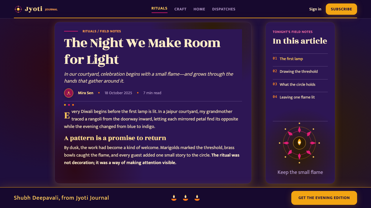
Raja Ravi Varma belongs to the visual history surrounding Diwali through the tradition of Indian devotional and calendar-art imagery. His place in this article is less about literal festival illustration than about the circulation of luminous, emotionally direct images that could carry sacred presence into domestic and public life. The qualities associated with this lineage — clear focal figures, rich color, theatrical light, and immediate readability — help explain why Diwali aesthetics can feel both intimate and widely legible.
Anant Pai is named here within the public image-making culture that connects illustration, devotional storytelling, and Indian calendar-art sensibility. His relevance to the Diwali system lies in the power of accessible images to establish a shared visual vocabulary: bright figures against dark fields, expressive gestures, symbolic objects, and compositions that communicate clearly without abandoning ornament. This is the same balance the style seeks when it combines ceremonial richness with immediate recognition.
Jivya Soma Mashe is included as a reminder that the wider Indian visual field is not exhausted by courtly, printed, or urban image traditions. His presence places handmade mark-making and patterned observation beside the more familiar festival vocabulary of lamps, flowers, and devotional scenes. For this design system, that perspective matters: the strongest ornament feels lived and made, with repeated signs carrying memory, rhythm, and communal attention rather than functioning as surface decoration alone.
How do you use Diwali Festival of Lights today?
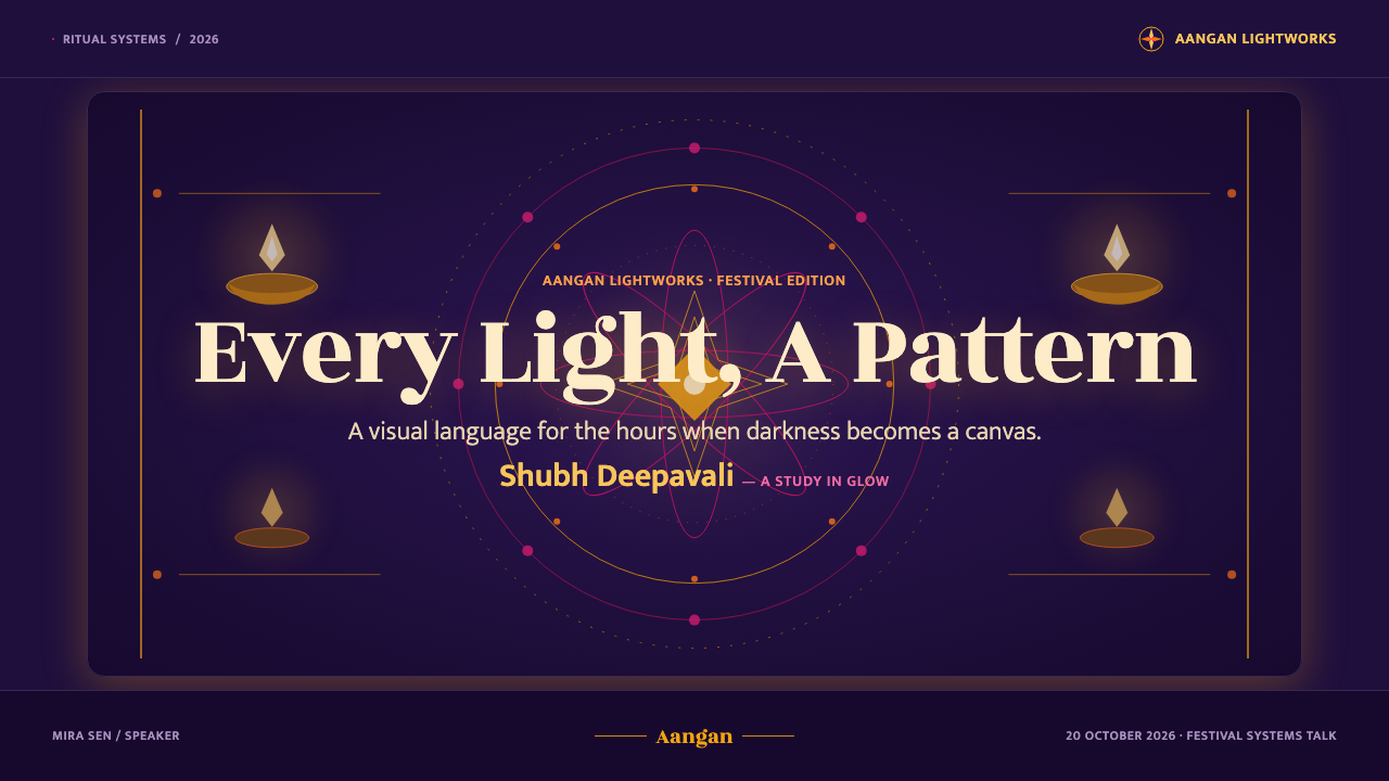
For presentation slides, Diwali works best when the cover establishes a quiet night before introducing the abundance. Use a deep indigo or near-black field, a small constellation of diya-like points, and one radiating rangoli or floral emblem as the visual anchor. Content slides should preserve that contrast: keep the main text area calm, then use warm gold, saffron, or jewel tones to mark the active idea. Data slides can turn charts into ceremonial arrangements, with one luminous focal series and restrained secondary colors. Avoid covering every slide with equal ornament; the feeling of light depends on protected darkness.
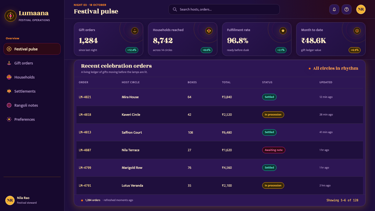
For web interfaces, the style suits dashboards, pricing pages, event platforms, and products that want to communicate warmth without losing authority. A dark interface can use indigo as the structural field, molten gold for primary actions, and jewel tones for status or category distinctions. Cards should feel like illuminated objects within the night rather than generic panels: use clear boundaries, concentrated highlights, and occasional radial motifs. Navigation should remain readable and calm, while decorative rangoli details appear at thresholds, empty states, celebrations, or moments of completion.
For editorial and marketing work, Diwali provides a strong language for launches, seasonal campaigns, cultural programming, hospitality, and community-centered storytelling. Use large areas of night color to frame short, confident messages, then let a garland, lamp row, or rangoli pattern carry the emotional charge. Editorial layouts can place a bright devotional or festival image beside generous dark margins, allowing the page to feel contemplative rather than crowded. Marketing compositions benefit from the contrast between handmade abundance and controlled structure: a rich image, a clear headline, and one unmistakable invitation.
A common mistake is to treat the style as a generic dark theme with gold gradients and random ornamental motifs. That approach produces luxury gloss, not Diwali radiance. The system depends on specific relationships: warm light against cool night, pattern organized around a center, jewel colors repeated with intention, and visible traces of hand-making. Another mistake is to use every bright color at equal intensity. Let one source of light lead, allow surrounding colors to support it, and preserve enough darkness that the composition can still breathe.
Diwali aesthetics also require cultural care. Lamps, rangoli, garlands, and devotional references should not be reduced to interchangeable festive stickers or detached exotic decoration. Their strength comes from threshold, welcome, memory, repetition, and shared ritual. When adapting the style for a contemporary product, retain those underlying values: make the light feel offered rather than merely displayed, make the pattern feel placed rather than pasted on, and give ornament a role in guiding attention, marking transition, or creating a sense of belonging.
Diwali Festival of Lights — FAQ
Is Diwali style simply a dark theme with gold accents?
No. A dark ground and gold accent are only the starting conditions. The deeper system depends on the relationship between cool night and warm light, the ceremonial organization of rangoli-like pattern, jewel-toned repetition, floral abundance, and visible handmade variation. If the result could be described as generic luxury, nightclub glow, or metallic branding, it has probably lost the festival's sense of welcome, ritual, and shared making.
Why is darkness so important in this visual language?
Darkness acts as the canvas that makes illumination legible. Diya lamps, gold details, marigold orange, and jewel tones appear radiant because they are surrounded by a cool and spacious field. If every surface is equally bright, the eye can no longer identify a source of light, and the composition becomes muddy. The night is therefore not a backdrop to decorate; it is the condition that allows the festival's central idea to appear.
How should rangoli-inspired patterns be used in contemporary design?
Treat the pattern as an organizing device rather than a background texture. Let it radiate from a perceptible center, frame a threshold, mark a completed state, or gather attention around a key message. Keep the repetition intentional and allow enough quiet space around it. A rangoli-inspired motif becomes stronger when it has a role in the composition, not when it is repeated across every available surface.
Can this style work without religious imagery?
Yes, but the underlying values should remain visible. The system can be adapted through lamps, flowers, thresholds, pattern, welcome, and concentrated light without reproducing devotional figures or sacred scenes. What matters is not borrowing isolated symbols but understanding the visual logic of illumination, offering, abundance, and gathering. A respectful adaptation should avoid treating cultural motifs as decorative shorthand detached from their meanings.
What makes the style feel handmade rather than digitally ornamental?
Preserve controlled irregularity. Let repeated petals, powder marks, floral edges, lamp groupings, or border details vary slightly while keeping the larger symmetry intact. Use visual evidence of placement and making rather than perfectly uniform repetition. The goal is not simulated imperfection for its own sake; it is the feeling that someone prepared the surface, arranged the light, and made the pattern for a particular moment of welcome.
Related design styles
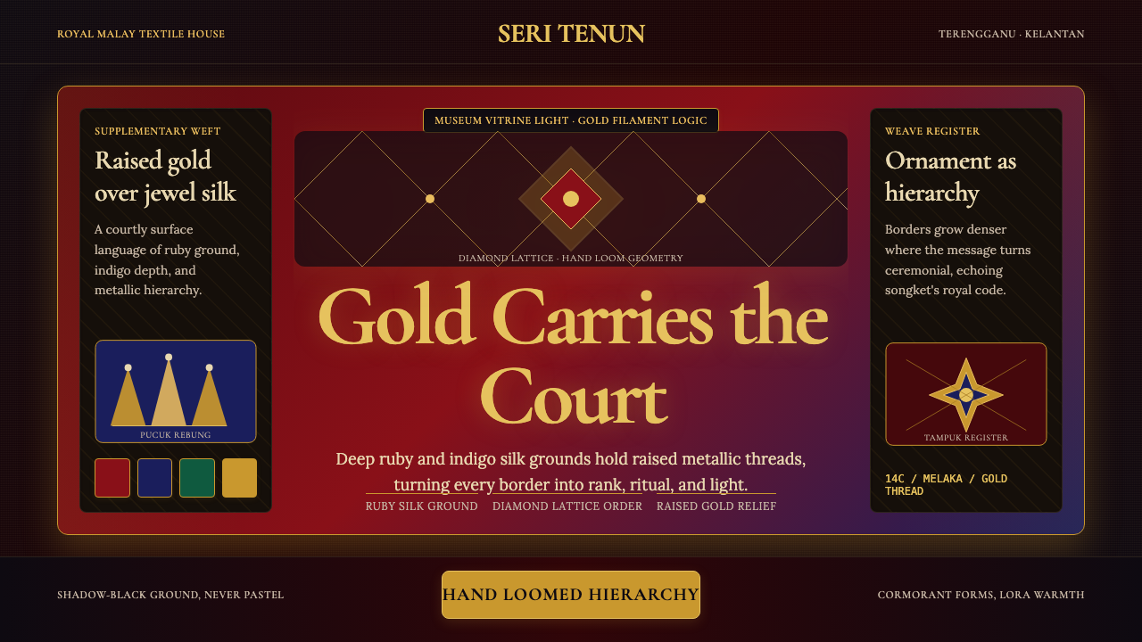 Malaysian Songket (Gold-Thread Weave)Royal textile opulence. Ruby and indigo silk grids lift gold-thread relief.
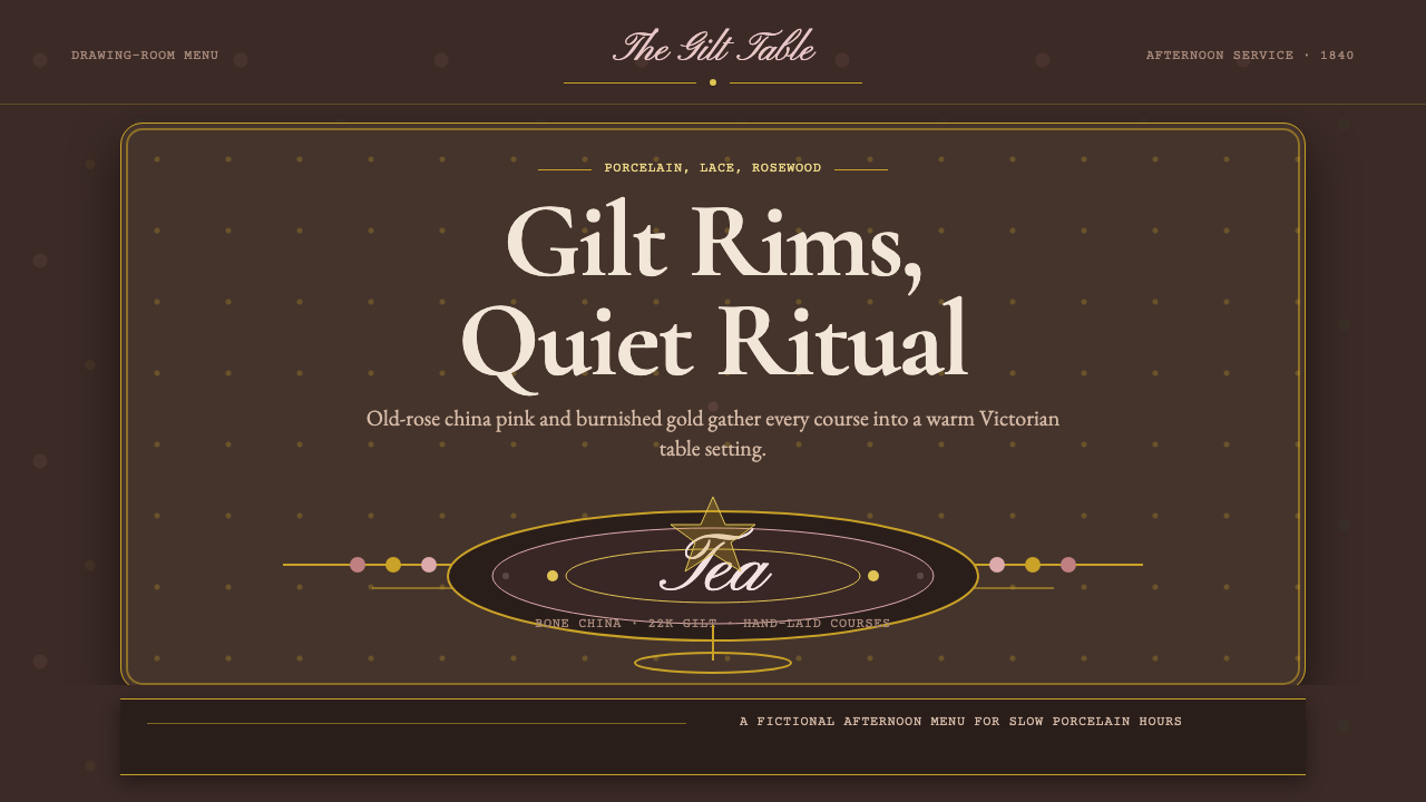 English Afternoon TeaOrnament is the ritual. Old-rose porcelain, gilt rims, and script rest on ros…
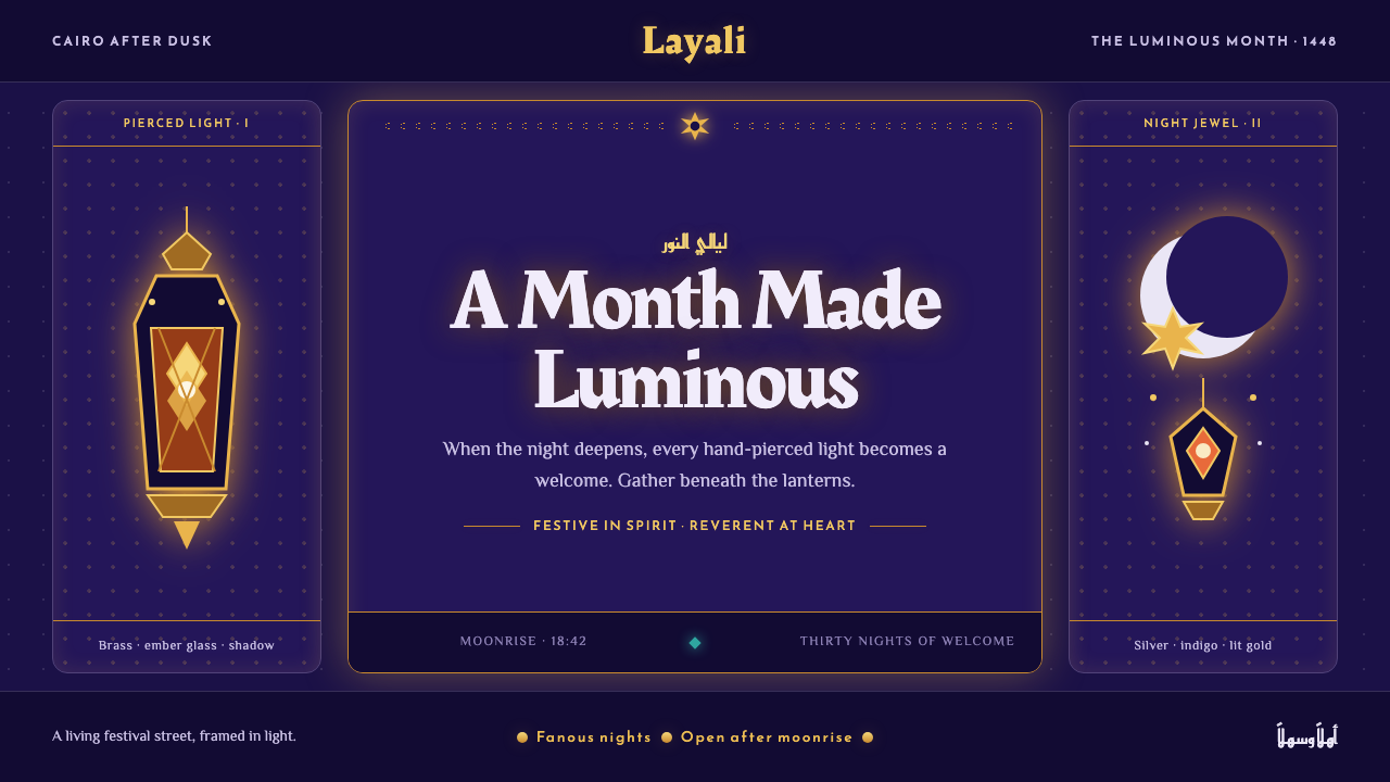 Ramadan Lanterns (Fanous Nights)Night becomes sacred light. Pierced brass and amber glow burn across bottomle…
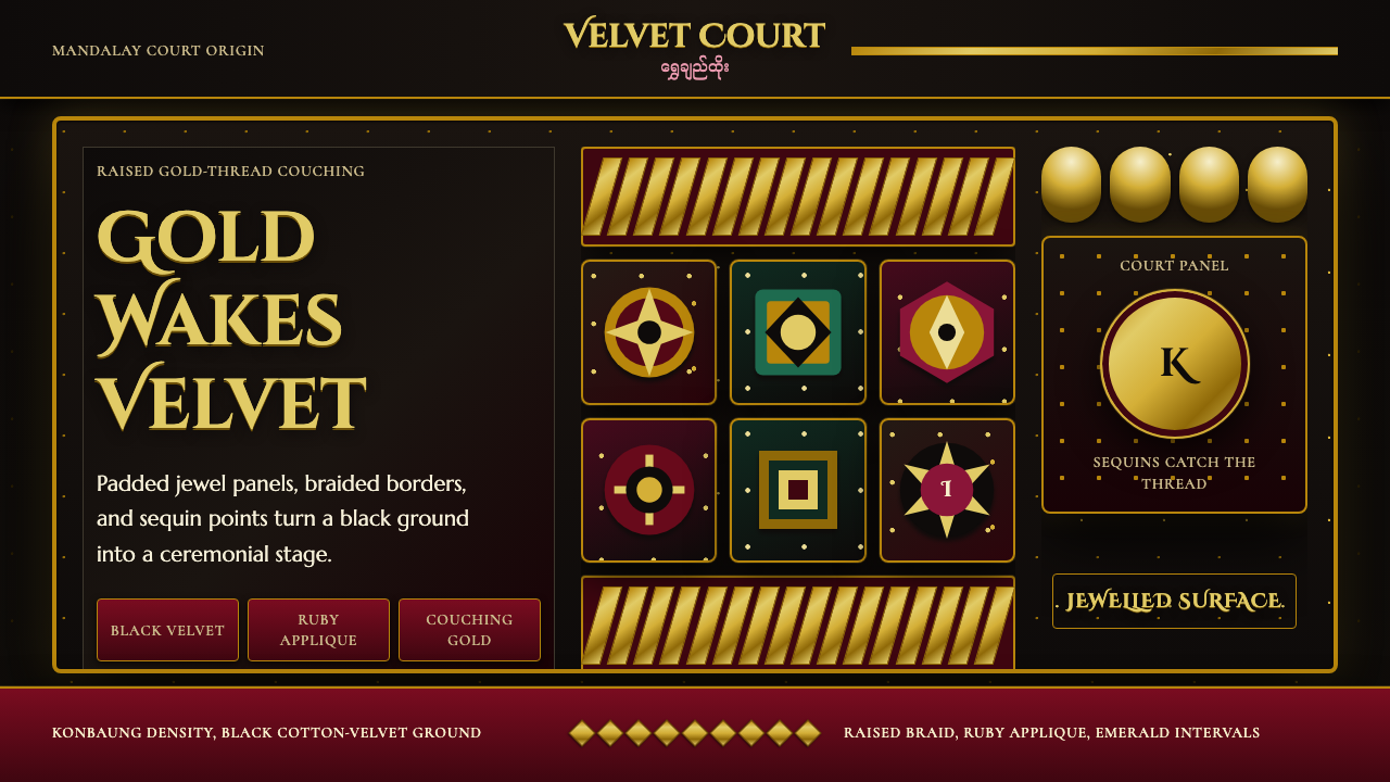 Burmese Kalaga TapestryVelvet becomes theater. Black ground, gold-thread borders, ruby and emerald p…
 Persian Termeh BotehRoyal brocade, densely alive. Antique-gold boteh climbs across lustrous bottl…
 Uzbek Samarkand Shah-i-ZindaOpulent tile memory. Cobalt grids, turquoise bands, and saffron medallions cr…