What is Toblerone Matterhorn (1908)?
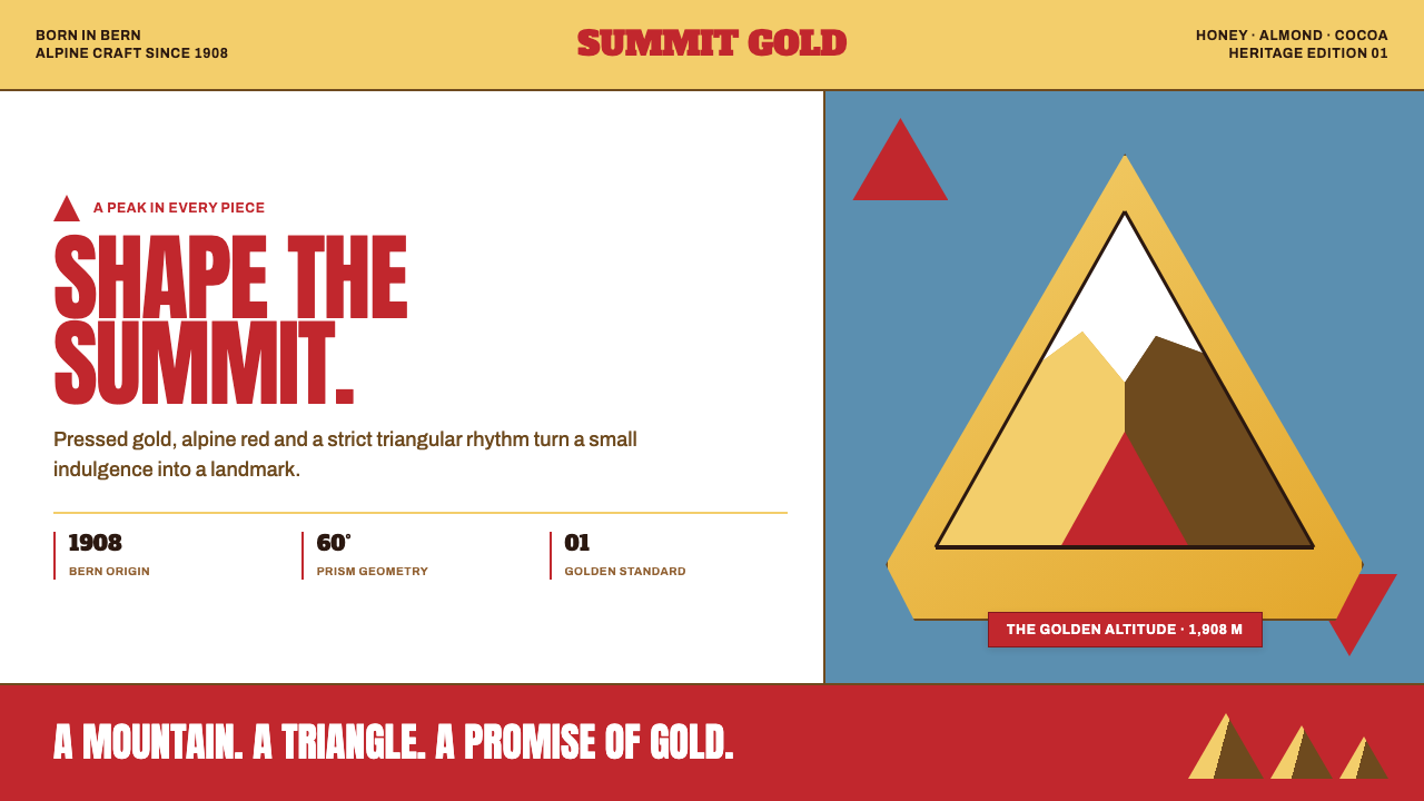
Toblerone compresses a mountain into a mark: foil gold, alpine red, and disciplined triangles turn a chocolate bar into an unmistakable Swiss silhouette.
Toblerone Matterhorn (1908) in brief
Toblerone Matterhorn is a packaging-led identity language rooted in Bern and established with the product in 1908. Its central idea is unusually literal: the bar is a mountain made physical. An equilateral triangle provides the basic form, while the hooked summit of the Matterhorn gives that geometry an alpine character. The resulting silhouette is designed for recognition at distance, where a single serrated profile can carry more memory than an illustrated scene.
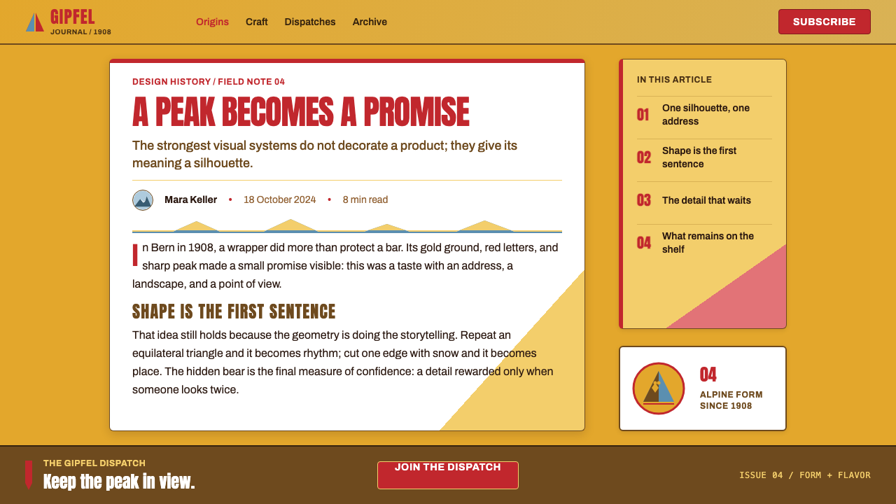
The visual system extends the product’s triangular cross-section into every supporting surface. Repeating prisms suggest rows of chocolate peaks; zigzag dividers create a horizon of ridges; folded facets make cards, labels, and panels feel as though they have been pressed from foil. This is not geometry applied as generic decoration. Each triangle recalls the object itself, so the package, display, and promotional composition all appear to belong to the same structural family.
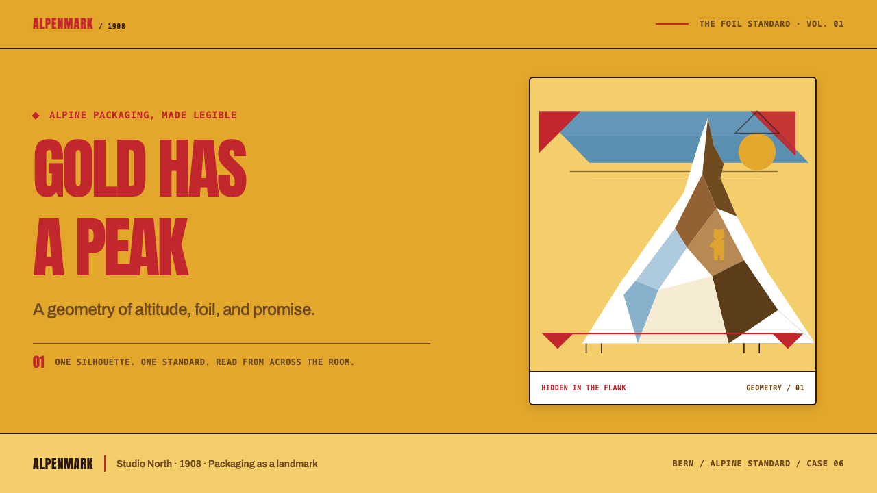
Gold foil and alpine red give the system its warmth and confidence. Gold should read as metal under pressure rather than as a soft yellow field, while red behaves like an inherited trademark: saturated, direct, and visible from a distance. The hidden bear in the rock adds a second level of recognition. It rewards close looking without weakening the mountain’s immediate clarity, making the mark work both as a broad silhouette and as a small discovery.
Where does Toblerone Matterhorn (1908) come from?
Toblerone was born in Bern, Switzerland, in 1908. Its founding context joins early twentieth-century packaging design with Swiss brand heraldry and alpine tourism iconography. Rather than treating the package as a neutral wrapper around a product, this approach makes the wrapper, the bar’s profile, and the brand image reinforce one another. The mountain is not an illustration placed beside the name; it is the organizing idea from which the visible system proceeds.
Theodor Tobler, Emil Baumann, and Jean Tobler are the key figures named in the origin of the identity. The early system consolidated from 1909 through the 1920s, a period in which its recognizable elements became a coherent language rather than isolated package details. The important outcome is continuity: triangular form, alpine reference, foil-like richness, and a confident trademark color operate as one recognizable whole.
The Matterhorn supplies more than scenic association. Its hooked peak gives an abstract triangle a distinctive personality, moving the identity away from anonymous geometry and toward a particular alpine image. It also makes repetition useful: when peaks accumulate across a surface, the pattern can imply a mountain range while retaining the structural regularity of the chocolate bar’s prism rows.
The Matterhorn-with-bear crest has been part of the identity since 1970. The bear hidden in the rock establishes a deliberate shift in scale. From afar, viewers receive the mountain; at closer range, they encounter an embedded emblem. That two-stage reading is central to the system’s durability: it is emphatic enough for packaging and signage, but sufficiently detailed to reward handling, inspection, and retelling.
What defines the Toblerone Matterhorn (1908) look?
Triangular Structure
The equilateral triangle is the governing unit, not an accent shape. It appears in the bar’s cross-section, in repeated peak rows, in dividers, and in folded panels. Compositions should feel built from a stable prism logic: peaks align, facets meet cleanly, and diagonal movement always points back to the mountain form. Curves can appear only when they support the mountain’s hooked summit or the concealed bear within it.
Mountain Silhouette
The Matterhorn reference turns strict geometry into a specific emblem. Its hooked summit should read as a decisive contour, rather than as a naturalistic landscape drawing. The strongest applications use one large peak or a disciplined row of peaks, leaving ample open field around the silhouette so that the mountain remains legible across a room.
Foil Gold
Gold is the system’s material signal. It should feel pressed, reflective, and slightly faceted, as though light changes across folded metal rather than across a painted gradient. Gold surfaces gain their character from sharp planes, restrained highlights, and contrast with surrounding red or pale ground. The effect is celebratory but still structural: metal-like richness follows the triangular construction.
Alpine Red
Alpine red functions as heritage signal and visual anchor. It is warm, saturated, and declarative, most effective when allowed to hold a broad field or frame a gold focal element. It should not dissolve into a collection of small decorative accents. In this language, red carries trademark confidence and directs the eye toward the central name, peak, or offer.
Hidden Heraldry
The bear hidden in the rock gives the mark an intimate layer without turning it into a puzzle. It belongs inside the mountain silhouette and should emerge through careful positive and negative shape relationships. This detail works best as a reward for closer attention, never as an independent mascot competing with the Matterhorn for primary recognition.
Warm Swiss Confidence
The overall tone is open, saturated, and assured. It avoids pastel softness, anonymous luxury minimalism, and ironic distance. Typography and copy should feel clear enough to sit beside a strong trademark, while spacing should give peaks, foil fields, and product information room to breathe. The result is heritage-forward rather than nostalgic: precise, generous, and proudly visible.

Who shaped Toblerone Matterhorn (1908)?
Theodor Tobler is named among the key figures in Toblerone’s 1908 origin. Within the identity’s public story, that founding moment matters because it establishes Bern as the geographic and cultural source of a product whose mountain form, heraldic cues, and packaging presence are designed to read as one unified Swiss proposition.
Emil Baumann is identified as a key figure in the product’s origin. The enduring identity associated with that origin does not depend on a separate campaign device; it depends on a tightly linked set of recognizable materials and forms. Triangle, mountain, foil-like gold, alpine red, and the later bear crest all support a single visual memory.
Jean Tobler is also named among the key figures in the Bern origin. The identity consolidated across 1909 through the 1920s, demonstrating the value of repetition in packaging design: when product shape and graphic language tell the same story, familiarity can accumulate across handling, display, and distance viewing without requiring visual reinvention.
How do you use Toblerone Matterhorn (1908) today?
For presentation covers, use the mountain as the principal act of composition. A broad gold-like field can meet a deep alpine-red plane along a crisp diagonal, with one large hooked peak carrying the title area. Keep the title direct and highly legible; the silhouette should supply the drama. Content slides should continue the same logic through triangular section markers, restrained peak dividers, and generous open fields rather than through literal chocolate imagery on every page.
For content and data slides, treat the triangular cross-section as an information framework. Comparison groups can sit in adjacent prism-like panels, process stages can step upward as a mountain ridge, and chart segments can use a limited red-and-gold hierarchy against a quiet ground. Labels must remain calmer than the geometry. The goal is not to make every chart resemble a novelty package, but to give information a consistent directional structure and a memorable focal silhouette.
For web interfaces, the language suits product landing pages, gifting journeys, retail discovery, and brand-led dashboards. A navigation area can remain clear and typographic while a single triangular mark establishes orientation. Cards work best as folded facets with firm edges and carefully controlled contrast, not as soft floating containers. Pricing or bundle pages can use mountain-like tier groupings, with the central offer given the strongest gold-and-red relationship and supporting information held in calm, readable order.
For editorial and marketing work, build campaigns around the tension between distant recognition and close discovery. At a large scale, let the Matterhorn silhouette and red field do the work; at a closer scale, reveal the bear, foil folds, ingredient or gift details, and product ridges. Promotional pages can move between broad saturated statements and pale breathing space, so the identity feels celebratory without becoming visually exhausting. Repeated zigzags are most effective as pacing devices for sections, not as a texture spread indiscriminately across every surface.
A common mistake is to reduce the style to generic triangles plus metallic-looking gold. That loses the essential relationship between form and product. Another is to add too many competing facets, peaks, and red accents until the hierarchy collapses. Use one dominant mountain gesture, make gold feel materially purposeful, reserve red for confident anchors, and allow the hidden bear to remain a secondary discovery. The identity succeeds through compression and recognition, not ornamental complexity.
Toblerone Matterhorn (1908) — FAQ
Is the Toblerone Matterhorn style simply a triangle-based design system?
No. The triangle is necessary, but its meaning comes from its connection to the chocolate bar’s prism cross-section and the Matterhorn’s distinctive peak. Generic triangles do not carry that product-and-place relationship. A convincing application lets geometry explain structure, repeat the mountain rhythm, or frame the brand’s central silhouette rather than serving as a detached decorative motif.
How should gold be handled in this visual language?
Gold should suggest pressed foil and folded metal. Its value comes from planes, edges, restrained reflection, and contrast with alpine red or a pale surrounding field. It should not become a vague luxury wash. When gold follows the triangular construction, it makes the identity feel tactile and package-specific; when it ignores that structure, it becomes interchangeable with many unrelated premium styles.
Why is the hidden bear important if the mountain is already recognizable?
The bear gives the crest a second reading distance. The mountain delivers immediate recognition from afar, while the embedded animal rewards closer attention. This is useful for packaging because it creates a small moment of discovery during handling without diluting the principal silhouette. The bear should therefore remain integrated into the rock, not be promoted into a separate dominant character.
Can this style work without showing the full Matterhorn crest?
Yes, provided the supporting forms retain a clear relationship to the core identity. Prism rows, disciplined zigzag dividers, folded foil-like facets, alpine red, and a single decisive peak can establish the language without reproducing the entire crest. The key is consistency of structural reference. If the mountain disappears and the triangles no longer recall the bar, the result becomes a generic geometric system.
Where does the style struggle most in contemporary use?
It struggles when every surface is made equally loud. The system is strongest when one mountain gesture dominates, red acts as a confident anchor, gold provides material richness, and quieter fields preserve readability. Overusing peak patterns, reflective effects, or hidden details turns its compressed clarity into noise. The most successful work preserves the sensation that a large alpine idea has been reduced to a few exact, memorable decisions.
Related design styles
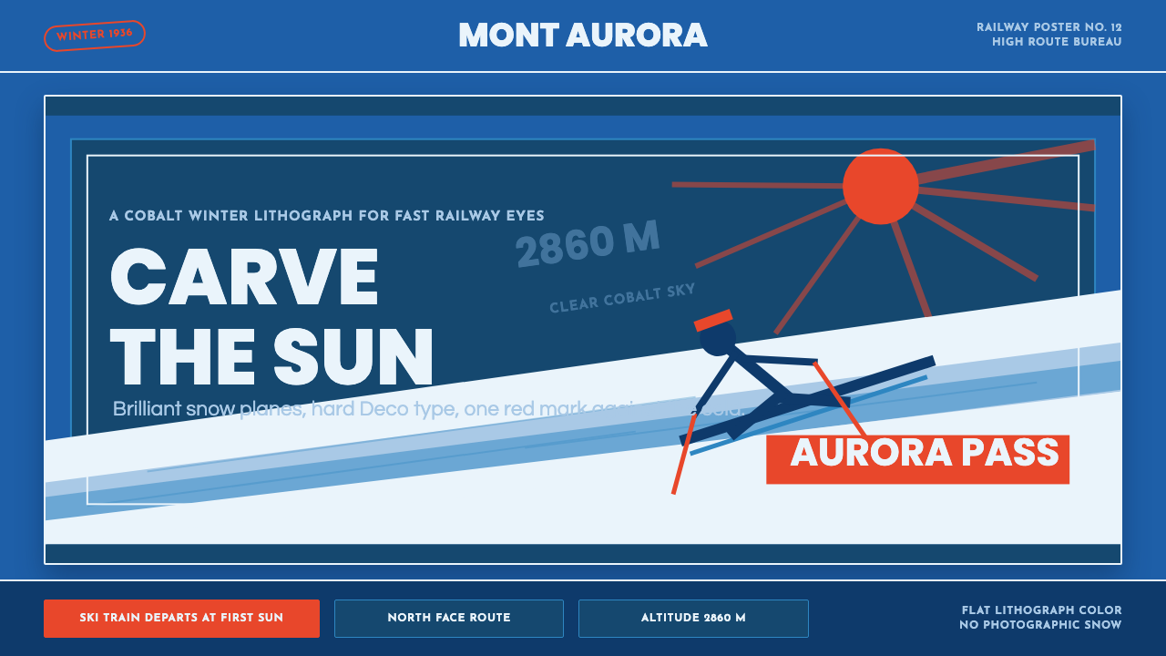 Alpine Ski PosterCold speed sells winter. Cobalt sky, snow planes, sun rays, and one resort-re…
 Bavarian Beer HallHearty regional ceremony. Deep flag-blue, Fraktur signage, gold trim, and whi…
 Havana Club Cuban RumSunset in print. Crimson slab type and ocean teal rules age on chalk-white pa…
 Poster Stamp (Cinderella)Blazes in miniature. Vermilion stamps, chrome keylines, and toothed edges on…
 Vegemite Jar LabelInstant pantry recall. Golden yellow, vermilion oval type, and hard black key…
 Art Deco Teal BathroomColour was the modern bath. Water-duck teal glaze, snazzy black trim, Limelig…