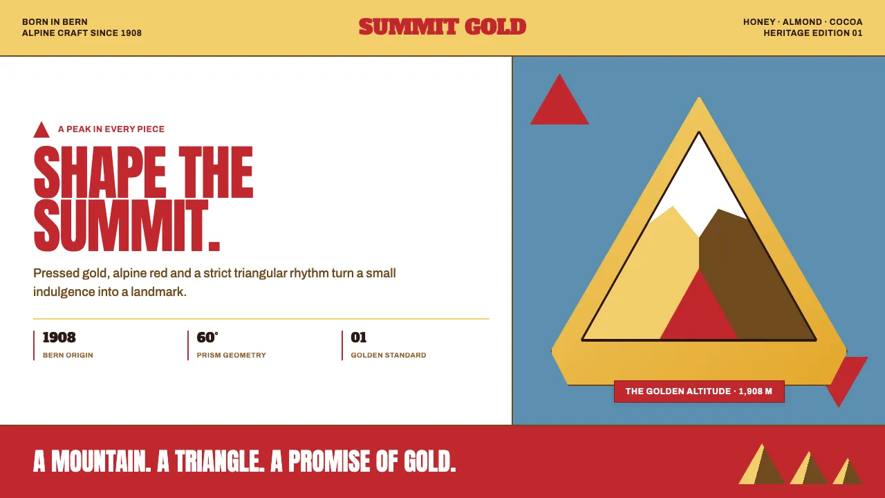
About Toblerone Matterhorn (1908)
Toblerone is a mountain compressed into a shape. Born in Bern in 1908, it fused an equilateral triangle, the Matterhorn's hooked peak, and a bear hidden in the rock into one silhouette readable from across a room. The design language runs on gold foil, alpine red, and a strict triangular geometry.
This system treats the chocolate bar's cross-section as a structural grid: prism rows, zigzag peak dividers, and folded-facet cards that catch light like foil. Warm and saturated, never pastel — the gold reads as pressed metal, the red as a heritage trademark, and the whole thing wears its Swiss confidence openly.
- Origin
- Bern, Switzerland
- Era
- 1908 founding; identity consolidated 1909–1920s; Matterhorn-with-bear crest since 1970
- Key figures
- Theodor Tobler · Emil Baumann · Jean Tobler
- Movements
- Swiss brand heraldry · early 20th-century packaging design · alpine tourism iconography
Toblerone Matterhorn (1908) design spec
Colors
Typography
The other 11 sections — buttons, cards, spacing, motion, techniques and more — open once you unlock. Download the DESIGN.md or send it to your AI in one click. Unlock once, yours forever.
Sign up nowStyles similar to Toblerone Matterhorn (1908)
Also inspired by brands & products, with a close feel.
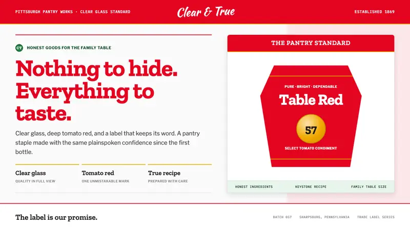 Heinz Ketchup (1869)Nothing to hide. Tomato red and slab serif lock clear-glass honesty into a keystone label.
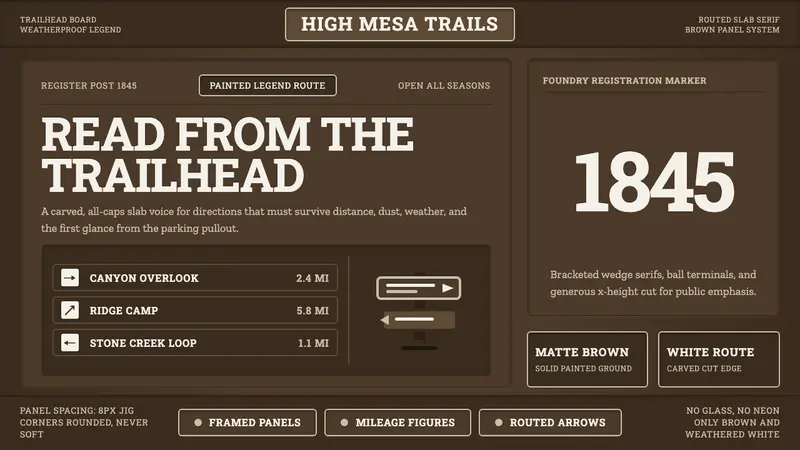 Clarendon Slab SerifBuilt for distance. Routed white slab legends cut into dark park-sign brown.
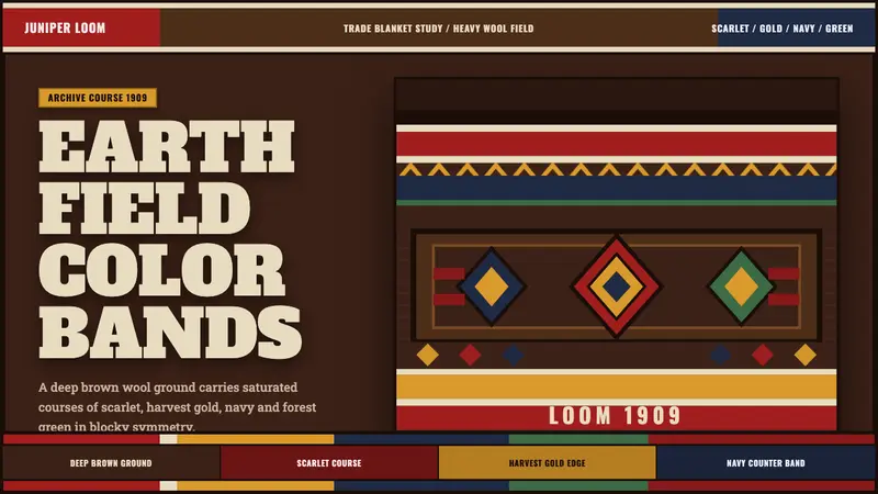 Pendleton Wool BlanketWoven authority. Scarlet-gold-navy bands lock into diamonds on dark brown wool.
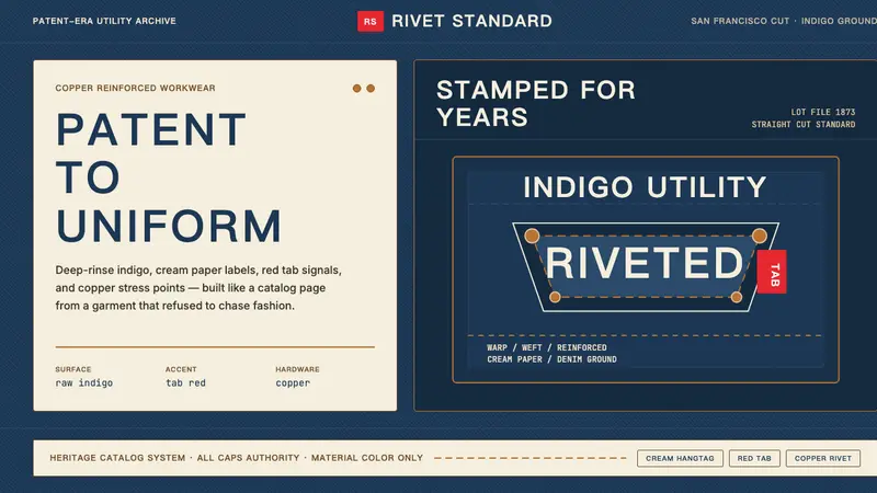 Levi's 501Utility becomes permanent. Indigo ground, cream hangtag panels, red tab and copper rivets.