What is Seed Packet 1920?
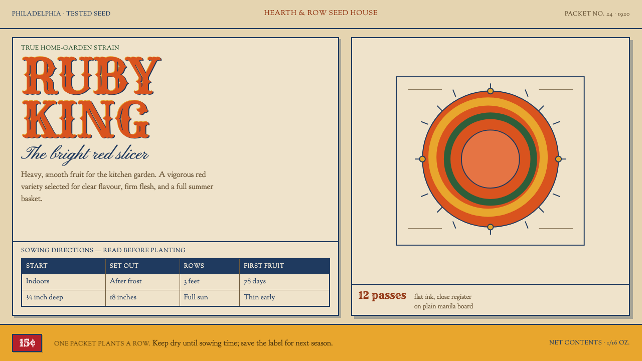
A 1920s seed packet had to sell loudly and instruct densely on the same scrap of manila paper — and the style keeps that split exactly as it was, with no empty margin pretending to be taste.
Seed Packet 1920 in brief
Seed Packet 1920 is a design style drawn from the humble paper envelope in which American seed houses sold flower and vegetable seed by mail and over the counter. A packet of this period is a throwaway wrapper, yet it is asked to do two jobs at once: persuade a buyer in a shop or a catalogue, and then teach that buyer how to sow. The style is the visual record of how commercial printers solved that double brief with the cheapest materials and the most ordinary tools.
The two jobs are kept physically apart. The face is a chromolithograph, usually a single tomato or zinnia printed past the point of plausibility, with the variety name arched over it in wood type or in copperplate script. The back is letterpress: planting depth, row spacing, thinning distance and days to germination, ruled into a table small enough that you hold it up to the light to read. One side shouts and the other side explains.
Nothing in the style is precious. The stock is unbleached manila, the colours are flat overprints that drift a hair out of register, and the ornament is whatever rules, banners and scalloped borders the job shop happened to have in its type case. That frankness is what makes it distinctive. It is a design language of commerce and instruction, honest about being cheap, and confident enough in its two-part structure that it never needs to dress itself up.
Where does Seed Packet 1920 come from?
The style is centred on the 1920 packet and the mail-order catalogues that surrounded it, within an era the source dates broadly to 1900–1950. Its home is Philadelphia and the seed houses of the northeastern United States, where the business of selling seed by post had grown into a major industry. The packet was the last link in a chain that began with a catalogue: the buyer chose a variety from a printed picture, received a small paper envelope, and had only that envelope to guide the planting.
Three printing traditions meet on that envelope. The first is chromolithography, the colour-lithographic process that let printers lay down flat, saturated colour in stacked layers and made the glowing fruit and flower pictures of the period possible. The second is the world of trade cards and advertising labels, short-lived printed pieces designed to catch the eye of a passer-by and name a product in a single glance. The third is American job printing, the everyday practice of small shops turning out whatever was ordered with the type, rules and ornaments in their cases.
The source names four key figures: W. Atlee Burpee, David Burpee, Paul de Longpré and Alois Lunzer. Together they stand for both halves of the form. The Burpee name belongs to the Philadelphia seed trade that built the mail-order business and made the packet a standard commercial object. De Longpré and Lunzer belong to the other side of the craft, the painted and drawn flower picture that gave the seed house its face. The commercial and the pictorial grew up together, and neither makes sense without the other.
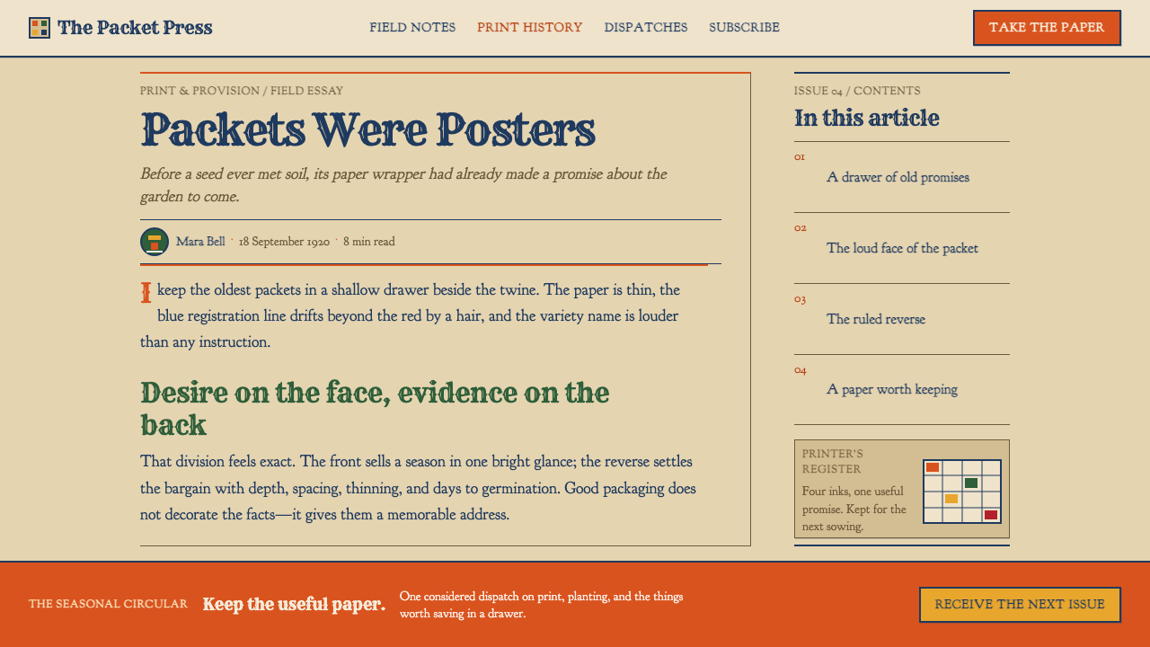
What the Curio system takes from this inheritance is a structure rather than a nostalgia. It keeps the split between a loud face and a dense back, the cheap warm paper, the flat inks slightly off their marks, and the stock ornament of the job shop. It also keeps the moral of the packet: that information should be given to a reader who is about to act, in a form they can use with dirty hands in a garden, and not softened into decoration.
What defines the Seed Packet 1920 look?
Two Faces, Two Voices
The defining structure is a deliberate split: a loud front that sells and a dense back that instructs. They do not blend. The front has one dominant picture and one dominant name; the back has a ruled table, short rules and small type. In an interface this suggests separating persuasion from procedure, giving each its own surface, and never half-hiding instructions behind marketing gloss.
Overprinted Flat Colour
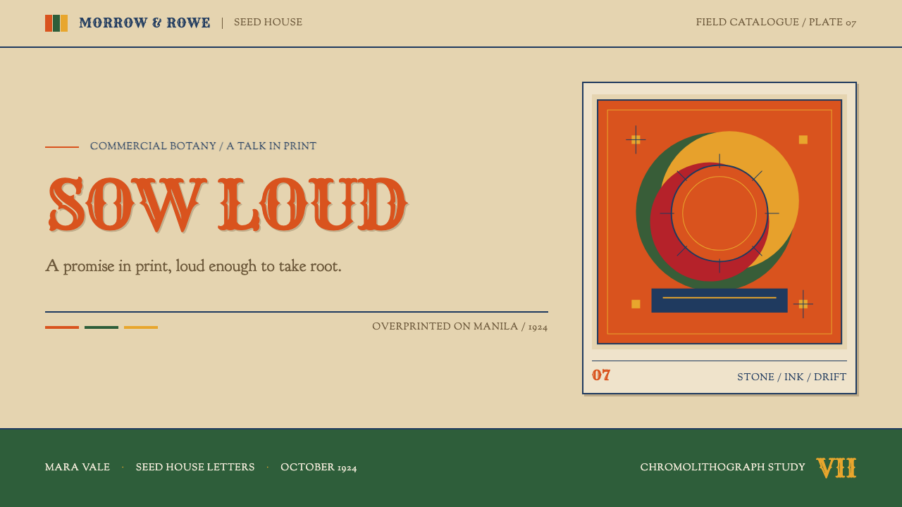
Colour is flat, saturated and printed in layers, led by a loud red. Inks overlap rather than blend, and edges drift a hair out of register, leaving thin accidental slivers of paper or a darker third tone where two layers meet. There are no smooth gradients and no soft shadows. The effect is vivid but plainly mechanical, the colour of ink pressed onto paper rather than light on a screen.
Arched Display Lettering
The variety name is the headline, set in heavy, wide wood type or in flowing copperplate script and bent into an arch over the picture. Display lettering is big, shaped and confident, sometimes outlined or shadowed in a second ink. It behaves like a sign painter's banner. The curve is a signal of salesmanship, a way of making a plain word feel like an event.
The Sowing Table
The back of the packet carries a small ruled table of facts: depth, spacing, thinning, days to germination. Set in a dense, sturdy old-style book serif and divided by hairline rules, it is built to be consulted, not admired. Columns are tight and numbers are plain. This is the style's most useful gift to modern interfaces, an honest, compact, scannable block of data.
Manila Stock
The ground is unbleached manila, a warm buff paper that was cheap commodity board. It is neither white nor decorative. All the inks sit on it and are slightly dulled by it, which is why loud reds feel warm and printed rather than electric. Bright white backgrounds would break the illusion; a pale tan base is the foundation of the whole look.
Job-Shop Ornament
Decoration comes from the stock case of a small printer: plain and ruled borders, ribbon banners, scalloped edges, stars and small corner pieces. These are standard parts rather than bespoke art, and they are placed with practical logic to frame a name or box a table. Used in moderation they give the system its period flavour without turning it into costume.
Who shaped Seed Packet 1920?
Burpee is the name most closely tied to the Philadelphia seed trade that the style comes from. His place in the story is as a founder-figure of the American mail-order seed house, the business model that made the catalogue and the packet into a matched pair. The packet's habit of selling vividly while also giving practical sowing guidance belongs to this commercial culture of earning trust through useful printed matter.
David Burpee carries the family name into the next stage of the same business, which is why he appears beside W. Atlee Burpee in the source. His relevance to the style is continuity: the mail-order catalogue and the packet kept evolving under the same house, absorbing new printing methods while holding on to the two-sided structure of a showy front and an informative back.
De Longpré is listed for the other half of the craft: the flower picture. Seed houses depended on flowers and fruit being drawn or painted so convincingly, and so glowingly, that a buyer would believe in the crop before it was ever sown. His name stands for the tradition of detailed, loving floral illustration that chromolithographers reproduced in flat, layered ink on catalogues and packets.
Lunzer is the fourth name given in the source, standing with de Longpré for the pictorial side of the seed trade. Together the two represent the idea that the face of the packet was a made image, not a photograph: a hand-prepared subject that printers converted into stacked colours. The style's loud, impossible fruit and flowers descend from that pictorial labour.
How do you use Seed Packet 1920 today?
Seed Packet 1920 suits anything that has to persuade and instruct in the same breath: garden and food brands, product packaging, onboarding flows, recipe and how-to content, tutorials, and small-business sites with a hands-on character. Its main lesson is structural. Give selling and teaching separate, honest surfaces, and let each be as dense or as loud as it needs to be.
For presentation slides, a cover can be built like the face of the packet: one oversized illustrated subject, a single loud ink, and a title arched or banner-framed above it, set on a warm tan ground. Content slides work as the back of the packet: a ruled table or a short, tightly set list with small, sturdy serif text and thin dividing lines. Data slides can borrow the sowing table directly, replacing glossy charts with clean ruled grids, where each row is one fact and each column one measure.
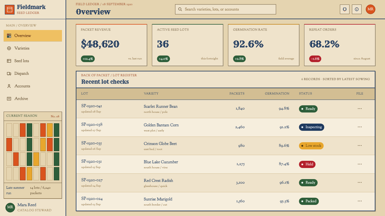
For web interfaces, treat a product page as a two-sided object. A hero area carries the picture, the name and a strong call to action, while below it a compact specification panel behaves like the back of the packet, with a ruled table of sizes, times, quantities or requirements. Pricing and dashboards can use warm paper tones, flat colour blocks, and thin ruled dividers instead of cards with soft shadows. Keep contrast strong and the text dense but readable.
For editorial and marketing work, the style rewards bold typographic headlines and practical sidebars. A magazine page or landing page can open with a big arched or bannered title over a single saturated illustration, then continue in a tight serif column with ruled boxes for facts, steps or quotations. Printed collateral can lean fully into the look with off-white kraft or manila stock, one or two loud inks and deliberately slight misregistration, always keeping the information itself legible.
The most common mistake is to keep the nostalgia and lose the discipline. A vintage badge, a faded sepia filter and a lot of empty margin make a design look old-fashioned but not like a seed packet. The real thing is crowded, useful and frank: it uses every inch for either selling or telling. Another mistake is making the back as loud as the front. If the table cannot be read quickly with the eye close to the page, it has failed at the one job it had.
Seed Packet 1920 — FAQ
What makes this different from a generic vintage style?
It is built on a working structure, not a mood. A seed packet has a loud illustrated face and a dense, ruled instruction table on the back, printed in flat overprinted inks on unbleached manila. A generic vintage look borrows faded colour and old fonts; this style borrows a division of labour between selling and instructing, and it leaves no empty margin pretending to be taste.
Why is the paper colour so important?
Because every ink in the system is designed to sit on warm, unbleached stock. On manila, a loud red looks printed and slightly dulled rather than electric, and the flat overprints feel physical. Put the same colours on bright white and they become cold and screen-like. The tan ground is part of the palette, not a neutral backdrop.
How should I handle the imperfect registration of the inks?
Use it lightly and consistently. The slight drift between layers is part of the charm because it shows ink printed on paper by a machine, but it should read as a small, systematic offset, not as random blur. Keep the effect to display elements and illustrations, and keep the instruction table crisp, since it must stay readable.
Can the style be used for serious data and dashboards?
Yes, and the sowing table is the reason. Its ruled, compact, old-style serif table is a legitimate way to present dense information, with each row a fact and each column a measure. A dashboard in this idiom would use warm paper tones, flat colour blocks and thin ruled lines, and would keep its single loud accent for what truly demands attention.
Where does the style struggle?
It struggles where calm, luxury or minimal quiet is the goal. It is a style of crowded, frank, useful pages that fill the space, so it does not suit premium positioning, meditative products or interfaces that depend on generous whitespace. It also resists being used purely as decoration: without the loud face and dense back, it loses its logic.
Related design styles
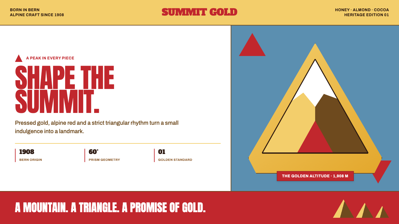 Toblerone Matterhorn (1908)A mountain compressed into a mark. Foil gold, alpine red and strict triangles…
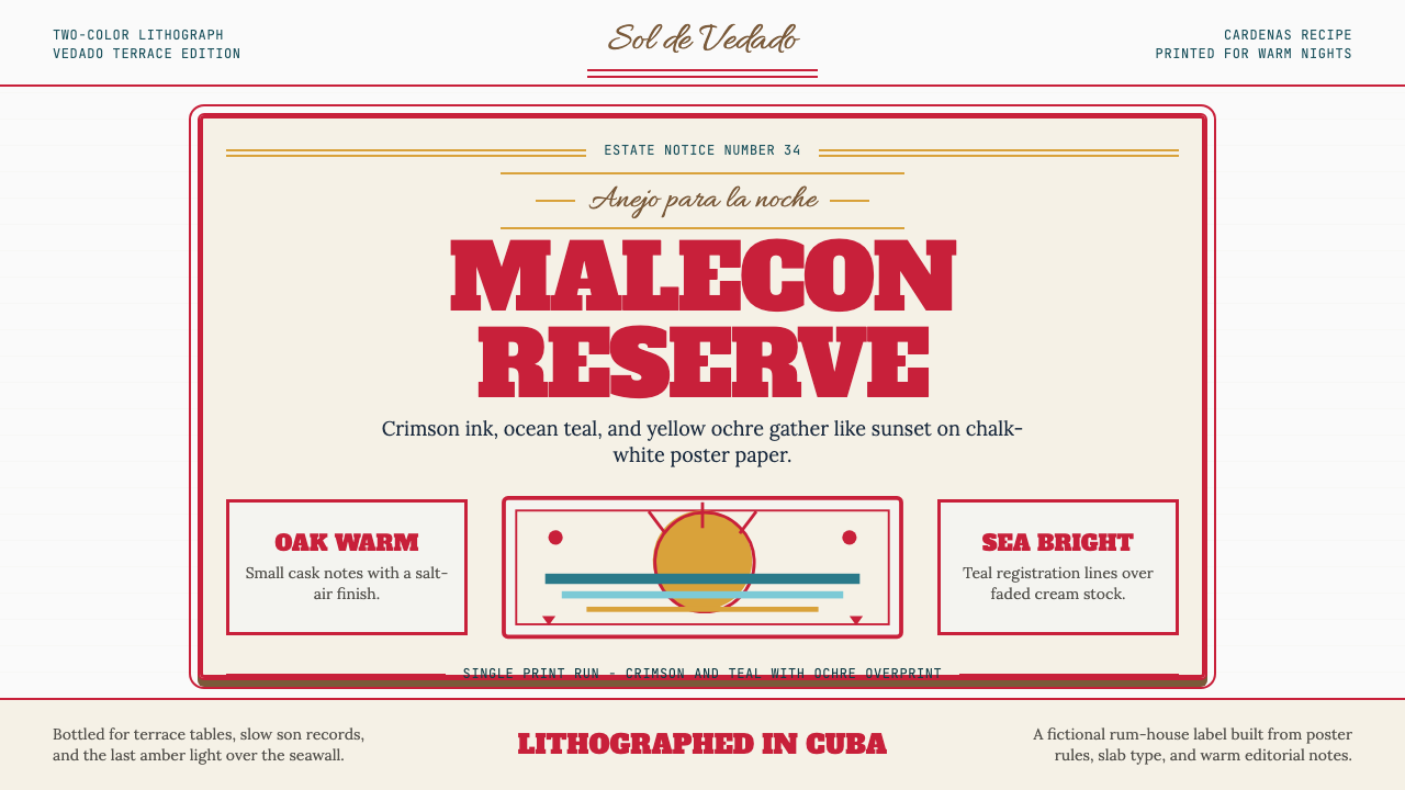 Havana Club Cuban RumSunset in print. Crimson slab type and ocean teal rules age on chalk-white pa…
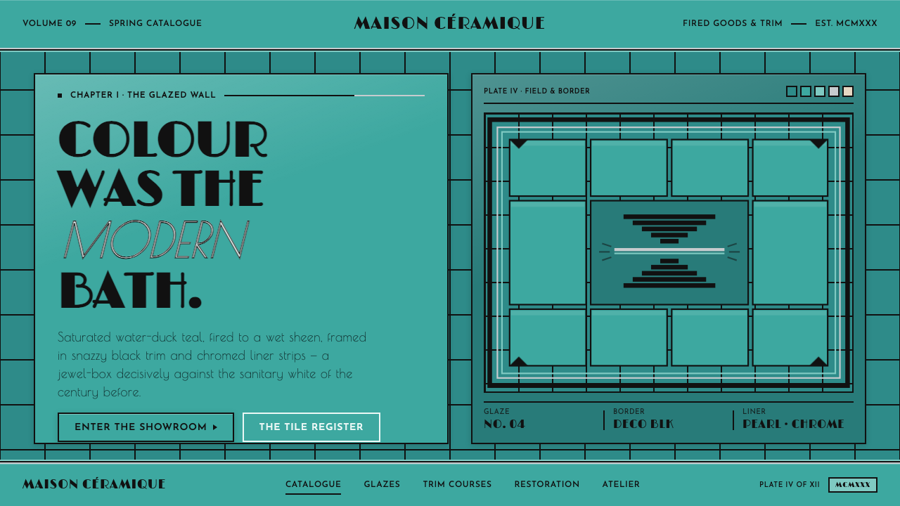 Art Deco Teal BathroomColour was the modern bath. Water-duck teal glaze, snazzy black trim, Limelig…
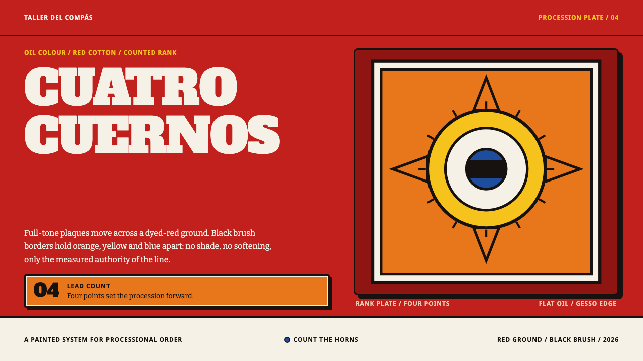 Diablos de YareRank is painted, not implied. Red cotton carries flat orange, yellow and blue…
 Fiestaware Radioactive Red-OrangeGlows like a collector's secret. Chartreuse rims cut through a dark deco case.
 Harley Orange & BlackBuilt like a tank badge. Burnt orange, chrome hairlines, gothic type on near…