What is Tintype Wet Plate?
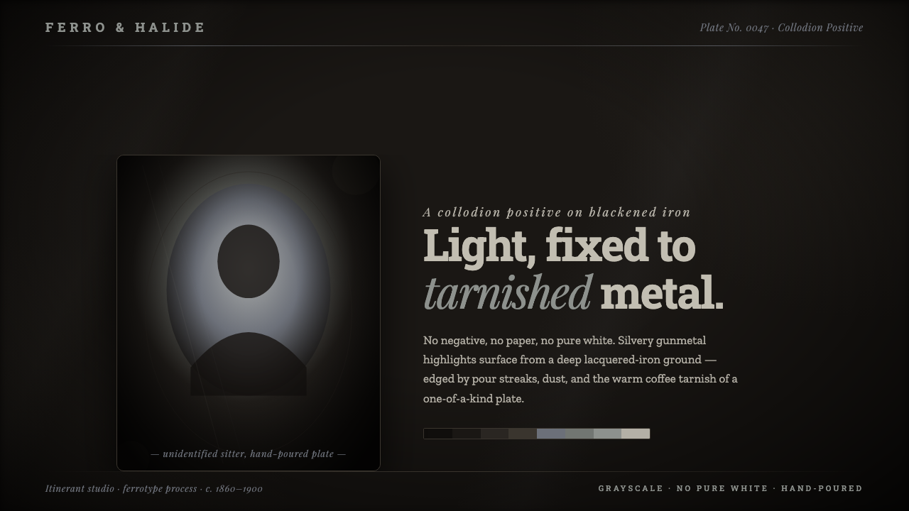
Tintype Wet Plate treats the screen as blackened iron: light rises slowly from tarnished metal, never quite reaching paper-white.
Tintype Wet Plate in brief
Tintype Wet Plate draws from the ferrotype, or tintype: a positive photograph fixed directly onto a blackened, japanned iron plate. It is not an image reproduced from a negative onto paper. Each plate is a singular physical object, carrying its own surface, chemical behavior, and imperfect edge.
Its visual language is built from compressed grayscale. A near-black metallic field holds the composition while silvery gunmetal highlights emerge from it in restrained steps. Bright areas feel like reflected metal rather than blank space, so the image remains dense, dark, and materially continuous even where attention is concentrated.
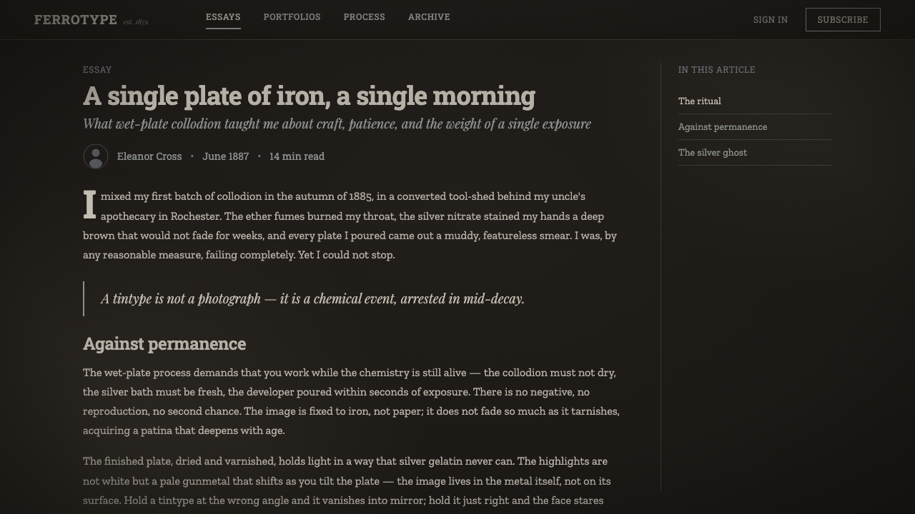
The style also preserves the evidence of making. Tarnish, pour streaks, bromide marks, dust, scratches, and vignetted edges are not decorative nostalgia applied over a clean image. They evoke a hand-poured wet-plate surface whose irregularities make the object feel handled, chemical, and irreducibly individual.
Where does Tintype Wet Plate come from?
The tintype belongs to the wet-plate collodion world of the nineteenth century. Its era is commonly placed from around 1853 to 1900, when the collodion positive process made it possible to create a direct positive image on a darkened support. In the tintype form, that support was blackened, japanned iron rather than paper.
North America became a major setting for the process. Itinerant studios could make portraits as physical keepsakes, while Civil War field photographers used the medium in a period when photography was becoming an immediate record of people, uniforms, places, and events. From roughly 1860 to 1900, millions of tintypes were made through these studio and field practices.
Hamilton Smith and Adolphe-Alexandre Martin are identified as key figures in the history attached to this process. Their presence situates tintype within the broader development of wet-plate collodion photography, alongside ambrotype and tintype portraiture. The important design lesson is not a period costume but a material premise: an image can be both depiction and object, with its support visible in every tonal decision.
What defines the Tintype Wet Plate look?
Blackened Iron Ground
The base should read as lacquered iron rather than black paper. It is deep, metallic, and slightly resistant to light, giving the whole composition the density of a dark physical plate. Empty space is never neutral; it is the exposed substrate.
Gunmetal Highlights
Light arrives as silvery gunmetal gray, not as clean white. Highlights should feel plated onto the dark surface and capped before they become weightless. This restraint keeps faces, type, images, and interface marks inside the same metallic atmosphere.
Tarnish and Warmth
Warm coffee-toned tarnish interrupts the cool grayscale without turning the system into sepia paper. It appears as aging within metal: a quiet stain, an oxidized edge, or a faint unevenness that suggests the plate has a history before the image begins.
Chemical Edges
Edges are evidence of a poured process. Pour streaks, bromide artifacts, and darkened borders can frame content, but they should remain irregular and subordinate to the image. Their role is to reveal the plate boundary, not to become ornamental trim.
Honest Surface Damage
Dust, scratches, and small marks give the plate a hand-worked presence. They work best when sparse, local, and varied, as if inherited from handling and chemistry. Repeated distressed motifs quickly turn material texture into a generic vintage effect.
Vignetted Depth
Depth comes from falloff toward the plate perimeter, not from polished digital illumination. A vignette gathers attention inward and makes the center seem to emerge from the metal. It should feel chemically or optically accumulated, never like a soft decorative glow.

Who shaped Tintype Wet Plate?
Hamilton Smith is identified among the key figures associated with the ferrotype and tintype era. In this visual lineage, his name anchors the process within the nineteenth-century history of direct positive photography on darkened metal.
Adolphe-Alexandre Martin is likewise named as a key figure in the process history. His association places tintype beside the wider wet-plate collodion tradition rather than treating it as an isolated antique effect.
Itinerant studios made tintypes into portable portrait objects for a broad public. Their work explains why the plate format carries intimacy: the image was not merely seen, but held, kept, and passed from hand to hand.
Civil War field photographers form the other major North American context named for tintype. Their presence gives the medium a documentary gravity, joining the private portrait to a darker history of field record and material witness.
How do you use Tintype Wet Plate today?
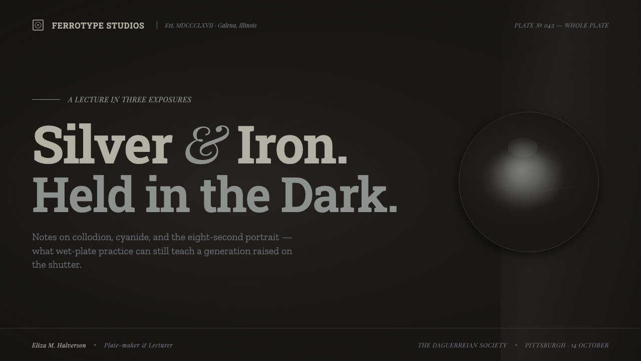
For presentation slides, Tintype Wet Plate is strongest when a cover behaves like a single plate: a near-black field, one restrained image or title, and a small area of gunmetal light emerging from the center. Content slides should remain spare, using tonal separation and plate-like borders to organize ideas. On data slides, charts should be treated as quiet etched marks, with emphasis created through contrast in gray and selective metallic brightness rather than a rainbow of categories.
For web interfaces, the style suits archival browsers, cultural collections, editorial dashboards, and premium tools that benefit from seriousness and material atmosphere. Navigation, controls, and cards should appear to sit within the iron surface rather than float above it. Reserve the strongest silvery values for active information, selected states, or primary actions, so interaction reads as light catching metal.
For editorial and marketing work, use the style to make provenance, craft, memory, or scarcity tangible. A feature story can pair a dark plate field with a single photograph, a compact caption, and an imperfect edge that suggests an artifact rather than a poster. Marketing pages should let one image carry the emotional burden; too many distressed panels make the system feel theatrical instead of historical.
The common mistake is treating tintype as a dark background plus random scratches. That removes the medium's central logic: light is physically constrained by blackened metal, and damage belongs to a one-of-a-kind chemical plate. Avoid paper-white text blocks, glossy modern gradients, repeated dirt overlays, and bright accent colors that break the tonal world. The style succeeds when every bright mark feels earned from darkness.
Tintype Wet Plate — FAQ
Is Tintype Wet Plate simply a black-and-white vintage style?
No. Its defining condition is not age alone but the direct positive image on blackened, japanned iron. The tonal range, tarnish, dark plate ground, chemical edge behavior, and one-of-a-kind surface all follow from that material identity. A generic monochrome treatment may look old, but it does not necessarily feel like light fixed to metal.
Why should bright areas stop short of pure white?
Because the visual reference is a blackened iron plate, not white photographic paper. Gunmetal and silver-gray highlights preserve the sensation that the image is rising from a metallic support. Pure white can make the composition feel printed on paper or lit by a contemporary screen, breaking the compressed tonal atmosphere.
Can this style work with modern interface content?
Yes, especially where atmosphere supports comprehension rather than competes with it. The key is to preserve clear hierarchy through tonal contrast, restrained highlights, and calm grouping. Modern controls can remain legible, but they should participate in the same dark metallic field instead of importing bright, glossy visual conventions from another system.
How much damage and texture is appropriate?
Use enough to establish a hand-poured plate, but never so much that reading becomes secondary. The most convincing marks are irregular, localized, and connected to an edge, a darkened corner, or a particular surface area. Uniform scratches spread everywhere tend to read as a repeated filter rather than as evidence of chemistry and handling.
Related design styles
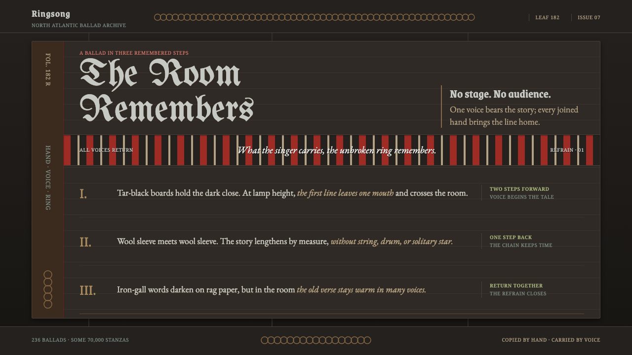 Faroese KvæðiThe room sings as one. Silver type and red refrain bands rule a tar-black man…
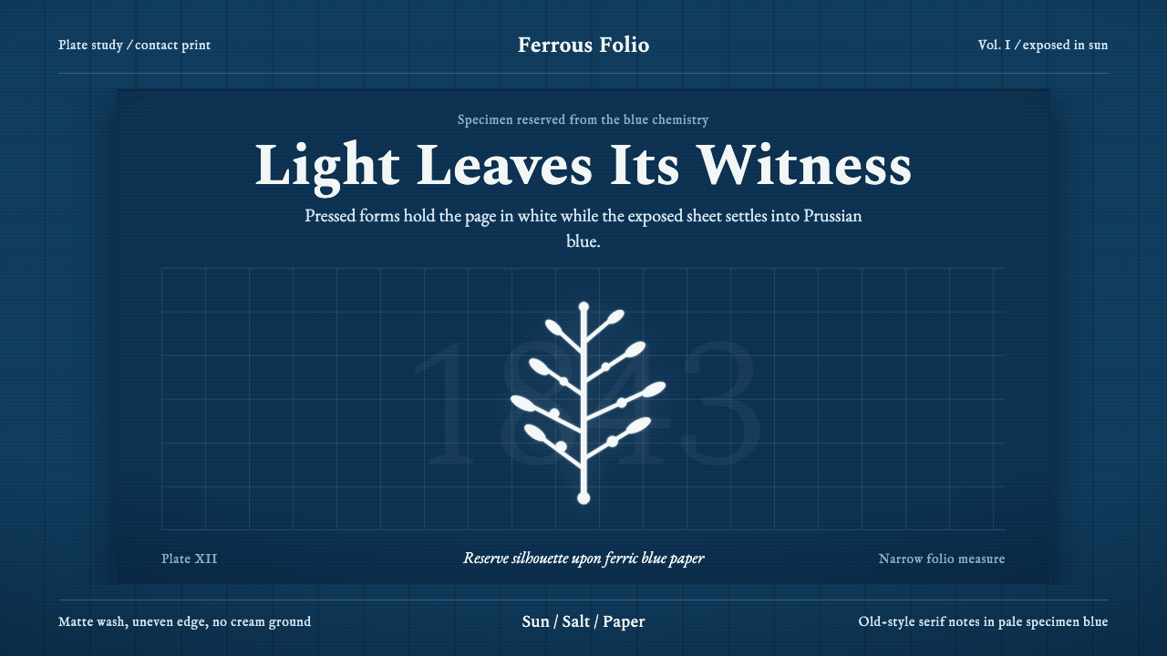 Anna Atkins CyanotypeScience turns spectral. Prussian blue ground, white reserves, Victorian serif…
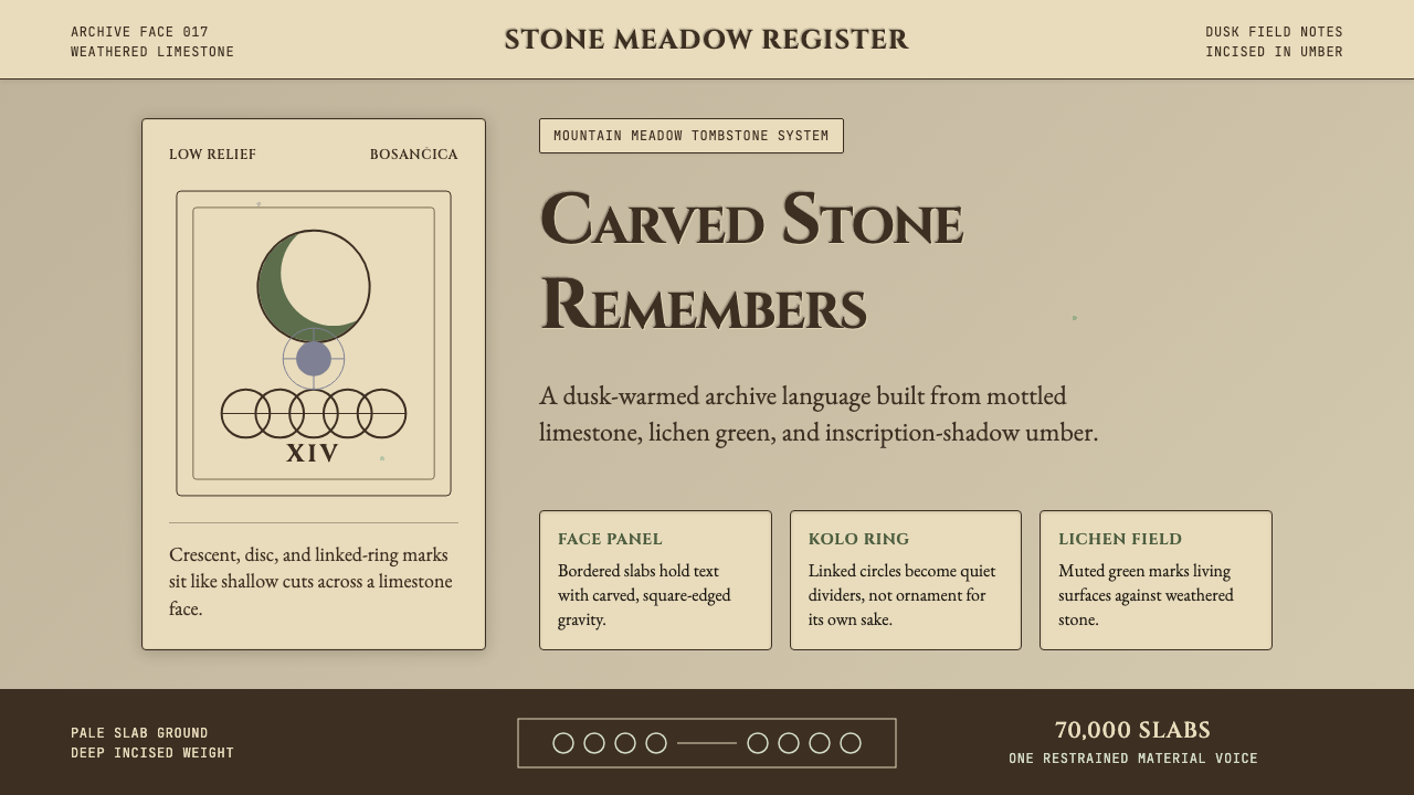 Bosnian Stećak Medieval TombstoneStone remembers quietly. Lichen green and Cinzel cuts sit on weathered limest…
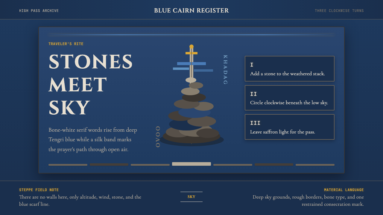 Mongolian Ovoo (Cairn Prayer Site)Sacred austerity. Steppe-blue ground, bone serif type, and one silk-blue pray…
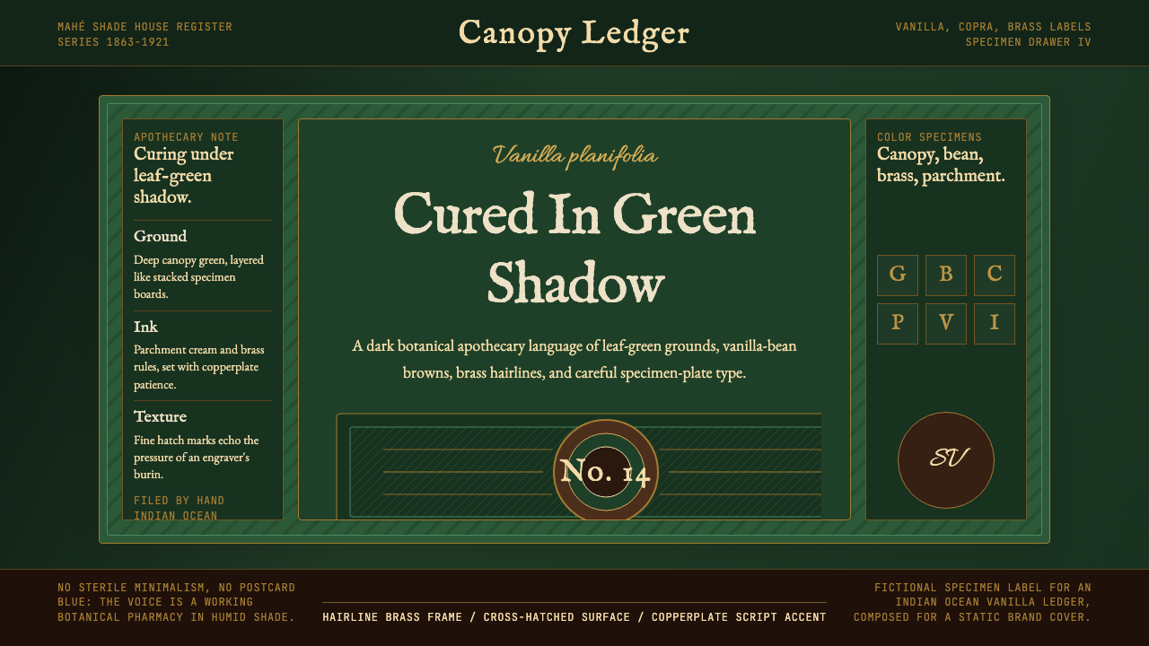 Seychellois Vanilla TakamakaBotanical apothecary in shadow. Deep green, brass hairlines, and copperplate…
 Desert VarnishStone remembers. Sandstone glyphs cut through near-black varnish in stacked f…