What is THX 1138?
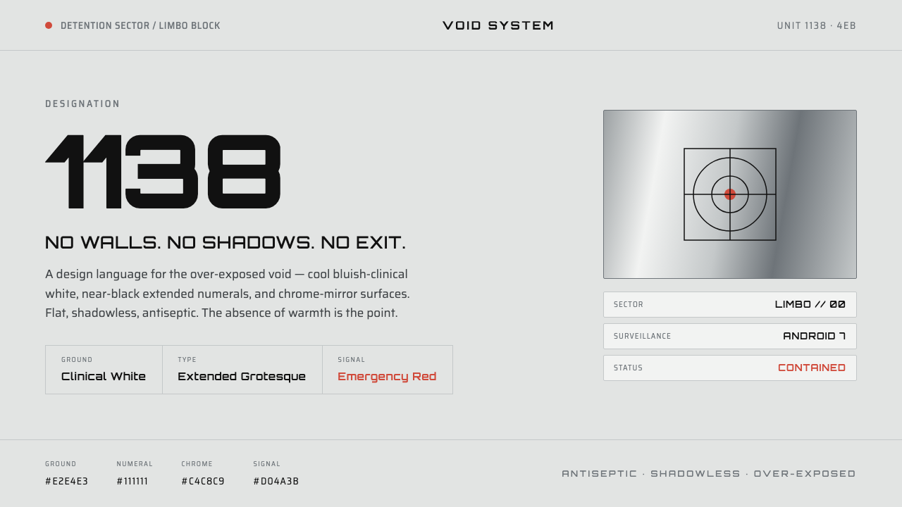
THX 1138 turns conformity into an over-exposed void: clinical white, black identification numerals, chrome surfaces, and one red signal with nowhere human to hide.
THX 1138 in brief
THX 1138 is George Lucas’s 1971 feature debut, set within a dystopia whose most memorable visual condition is an apparently infinite white interior. The space is not warmly minimal. It is antiseptic, shadowless, and over-exposed enough to weaken ordinary cues of distance, shelter, and individuality. Shaved heads and repeated identities seem to dissolve into the same blank field.
Its graphic language is equally severe: stark black sans-serif numerals against a blinding ground, with squarish Eurostile-style grotesque letterforms carrying the mechanical authority of a system. These marks do not decorate the void; they classify what remains visible inside it. The black type feels less like a voice than an administrative imprint.
As a contemporary design system, THX 1138 translates this condition into cool bluish-clinical white surfaces, near-black numerals, chrome-silver accents, and a single emergency red. Flatness is essential. No soft depth, cozy texture, or atmospheric shadow should rescue the interface from its institutional clarity. The emotional effect comes precisely from that refusal of warmth.
Where does THX 1138 come from?
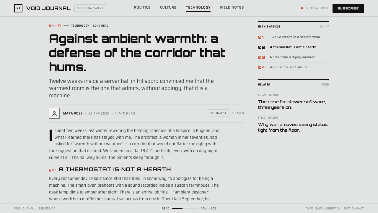
The visual language belongs to THX 1138, developed around the 1969–1971 period and released as a North American film in 1971. Its stated movement context combines antiseptic minimalist science fiction, New Hollywood, and a dystopian conformity aesthetic. Those descriptors matter because the imagery does not merely present a futuristic setting; it makes control legible through exposure, repetition, and the erasure of visual comfort.
George Lucas is the named central figure because THX 1138 was his feature debut. The source material also identifies Walter Murch and Albert Whitlock as key figures associated with the film’s visual world. Taken together, these names anchor the style in a film production rather than a later design trend or a generic science-fiction mood board.
The defining image is a white void with no reassuring boundary. It is paired with shaved-head conformity, black extended numerals, squarish grotesque typography, and clinical chrome-silver police androids. This is why the style has unusual discipline when borrowed for graphic design: the white field must feel like an environment of control, not simply an empty background.
The result is a vocabulary of subtraction. Darkness is reserved for identification and command; metallic silver suggests impersonal apparatus; red exists as an interruption, not a festive accent. In this system, visual scarcity is not a convenience. It is the mechanism through which conformity becomes visible.
What defines the THX 1138 look?
Clinical White Field
The dominant ground is a cool, bluish-clinical white that feels over-exposed rather than airy. It should swallow edges and reduce the sense of enclosure. Large empty areas are not neutral breathing room; they create the unease of a space in which warmth, weather, and private life have been removed.
Identification Typography
Near-black numerals are the system’s strongest graphic event. Use black sans-serif type with a squared, extended Eurostile-style grotesque character, especially where identifiers, section codes, or status labels must dominate. The type should read as classification before expression: broad, blunt, mechanical, and difficult to sentimentalize.
Shadowless Exposure
Depth is deliberately withheld. Surfaces should appear flat, fully exposed, and detached from any comforting sense of natural light. Avoid treatments that imply soft illumination, textured material, or cinematic atmosphere. The absence of shadow makes the interface feel observed continuously, as if there were no corner in which a person could disappear.
Chrome-Silver Apparatus
Chrome-silver surfaces refer to the film’s clinical police androids and should be used as apparatus, not luxury. Their role is to signal an impersonal system: rails, housings, separators, operational controls, or machine-like objects. Keep the metallic effect controlled and cold so it reads as equipment rather than ornament.
Emergency Red
Red is singular and consequential. It should interrupt the pale field only when something requires immediate recognition: a warning, failure state, irreversible action, or emergency route. Repeating red casually drains it of force and turns a controlled alert language into ordinary brand decoration.
Conformity Through Repetition
Repeated codes, aligned labels, shaved-down visual variety, and strict serial structure create the style’s social meaning. Repetition should feel institutional rather than playful. When modules resemble one another too closely, the viewer senses a system that values legibility and order above distinct personal character.
Who shaped THX 1138?
Lucas is the central named figure in THX 1138 because the 1971 film was his feature debut. The style’s white void, black numerals, and dystopian conformity are therefore best understood as elements of this particular film language, not as a detached retro-futurist template.
Walter Murch is listed among the key figures associated with THX 1138. Within this design reference, his name belongs to the film’s originating creative context and helps keep the visual system tied to its approved cinematic source rather than expanded through unverified attribution.
Albert Whitlock is likewise named as a key figure in the source material. The association reinforces the importance of the film’s controlled environment: its blankness, chrome severity, and over-exposed condition work as a coherent world, not as isolated graphic effects.
How do you use THX 1138 today?
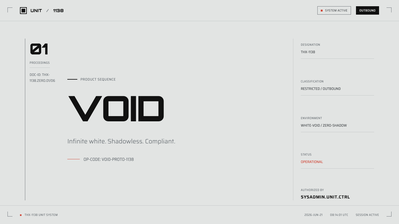
For presentation covers, let the clinical white field carry most of the composition. Place a large black identifier or title with ample exposed space around it, then introduce chrome-silver structure sparingly. Emergency red can mark a subtitle, warning phrase, or decisive datum, but it should feel like a breach in the system rather than a cheerful highlight.
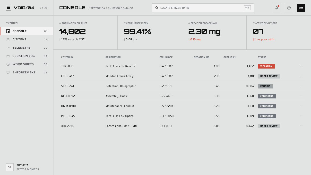
Content and data slides should behave like records from an impersonal archive. Use repeated labels, severe alignment, and black numeric hierarchy to make comparison immediate. Tables, charts, and status summaries benefit from the style because numbers already belong to its visual vocabulary. Keep surrounding decoration absent so that variation in data, not variation in presentation, becomes the event.
For web interfaces, this language suits dashboards, system monitors, account controls, operational tools, and pricing pages that want an institutional sci-fi edge. White panels should merge into a larger white field rather than float as friendly cards. Near-black labels establish navigation and hierarchy, chrome-silver separates functional zones, and red is reserved for risk, urgency, or a genuinely consequential call to action.
Editorial and marketing layouts can use the same tension more selectively. A headline or product code against a near-empty white spread can create a striking campaign opening, while repeated captions make an article feel catalogued or monitored. The style works best when the subject can withstand cool distance: technology, systems, speculative culture, disciplined tools, or a deliberately dystopian concept.
The common mistake is treating THX 1138 as generic white minimalism with a few futuristic letters. That loses its central pressure. Avoid warming the palette with friendly illustration, soft shadow, casual gradients, colorful interface states, or decorative metallic shine. The goal is not sleekness alone; it is an over-exposed system where human warmth has been visibly designed out.
THX 1138 — FAQ
Is THX 1138 simply a minimalist sci-fi style?
No. Minimalism describes reduction, but THX 1138 gives that reduction a specific emotional and social charge. Its cool white void, shaved-down visual variety, identifiers, chrome apparatus, and emergency red all imply conformity under an impersonal system. A clean interface without that pressure may be minimalist, but it is not necessarily THX 1138.
Why must red be used so sparingly?
Because the source language defines a single emergency red against a predominately clinical field. Its scarcity makes it read as alarm, interruption, or danger. If red appears in routine navigation, decorative accents, and ordinary buttons, it stops carrying emergency meaning and the entire hierarchy becomes less convincing.
Can this style use photographs or imagery?
It can, but imagery should preserve the system’s exposed, clinical condition. Treat images as evidence within the white field, not as rich atmospheric escapes from it. A visual that adds warmth, deep shadow, organic texture, or intimate humanity will shift the result away from the source material’s antiseptic dystopian character.
Where does THX 1138 work poorly?
It struggles where reassurance, playfulness, sensory richness, or personal intimacy are the product’s central values. Hospitality, children’s experiences, celebratory campaigns, and emotionally supportive services can find its institutional coldness counterproductive. Use it where controlled distance and systemic clarity support the message rather than undermine trust.
What is the fastest way to make a THX 1138 layout feel wrong?
Adding comfort. Soft shadows, friendly rounded decoration, busy accent colors, warm photography, and luxurious chrome all weaken the over-exposed void. The style depends on disciplined lack: a white field that withholds shelter, black type that assigns identity, and red that appears only when the system has something urgent to declare.
Related design styles
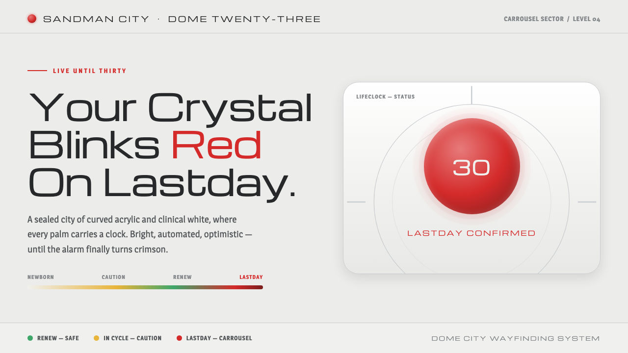 Logan's RunLive until thirty, then your palm crystal blinks red. Clinical mall-white, ch…
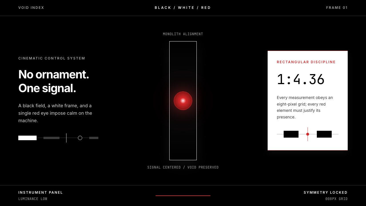 2001 — A Space OdysseyAbsolute restraint. Black void, white monolith geometry, one HAL-red signal.
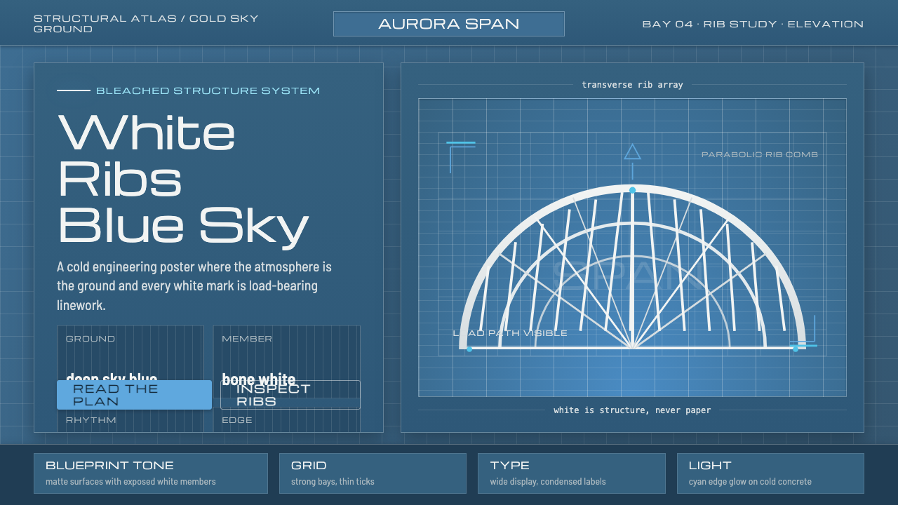 Calatrava White RibsArchitecture becomes blueprint. Bone-white ribs cut through deep Valencian sk…
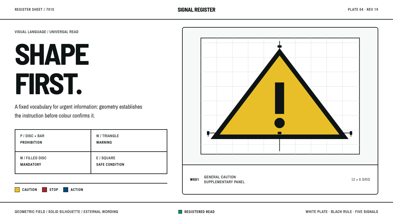 ISO Safety SymbolsShape speaks before colour. Black-on-signal geometry sits on a rigorously rul…
 Massimo Vignelli NYCClarity becomes infrastructure. Black rules and route stripes lock the white…
 NYC Subway VignelliThe city as a circuit diagram. Flat trunk-line color on black, angles locked…