What is ISO Safety Symbols?
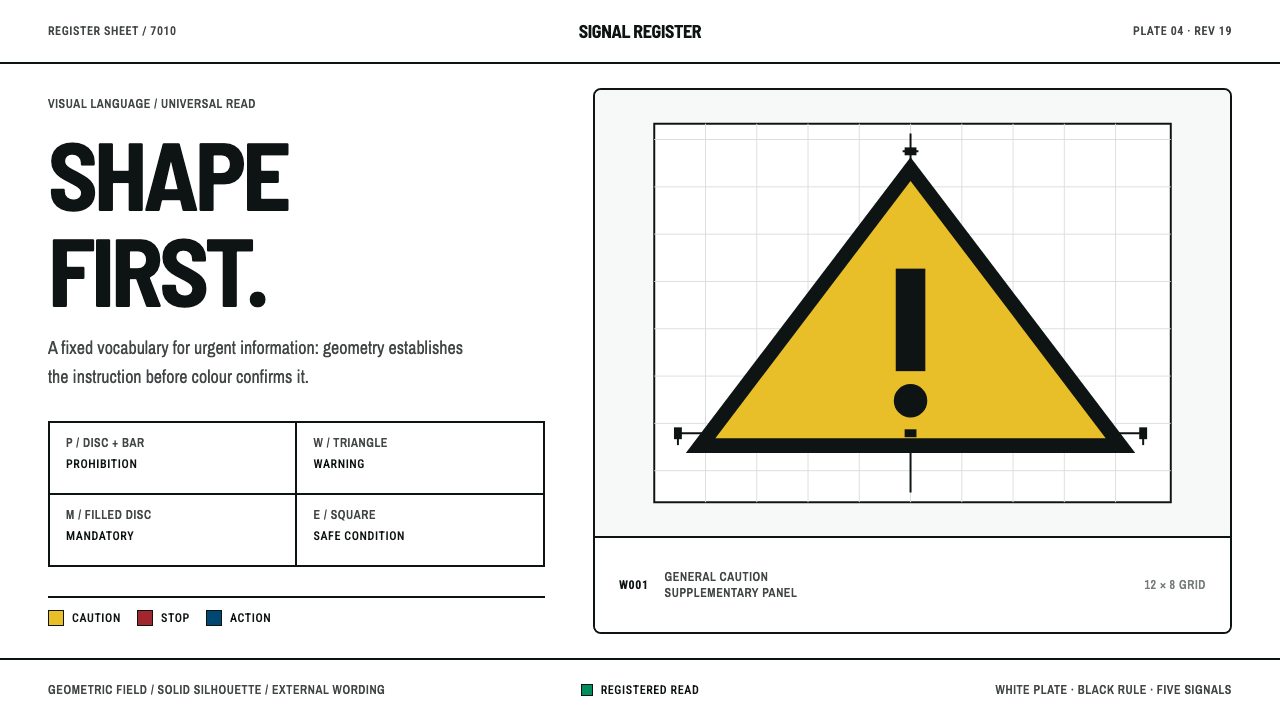
Shape speaks before colour in this style: a white plate, a hard-edged geometric field and a solid black pictogram that tells the reader what to avoid, what to do, or where to go.
ISO Safety Symbols in brief
ISO Safety Symbols is the visual language of registered safety signs: the sheet-and-plate look of the pictograms catalogued in the ISO 7010 registry, and of the physical signs made from them. A white plate carries a coloured geometric field, and inside that field sits a solid black pictogram. There is no gradient, no shadow, no texture and no ornament. Every element is present because a standard says it must be.
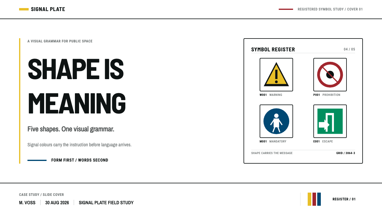
The core idea is that shape carries the message before colour does. A circle crossed by a diagonal bar forbids. A triangle warns. A filled circle commands. A square reassures, marking safe conditions and fire equipment. A reader who cannot see the colour, cannot read the language, or glances at the sign for a fraction of a second still receives the category. Colour then confirms and reinforces what the geometry has already said, rather than introducing a new meaning of its own.
As a design system, the style reads as discipline made visible. Five safety colours are fixed to published colour references and are never darkened, lightened or restyled to suit a brand. Human figures are not drawn but constructed on a shared grid, so a pictogram from one sign sits comfortably beside a pictogram from another. Words are kept off the symbol entirely; when text is needed it lives on a separate supplementary panel beneath the sign. Translated to a screen, the same discipline produces a white ground, hard edges, solid fills, a heavy dark outline, a short code under each symbol, and any explanation set outside it.
Where does ISO Safety Symbols come from?
The look descends from a long effort to make danger legible to everyone. As industrial work, building and public infrastructure expanded across Europe in the decades after the Second World War, warning signs multiplied, and with them the problem of inconsistency: every country, trade and company had its own wording, its own colours and its own habits about where a sign should hang. The source material for this style dates the consolidation to roughly 1950 through 1990, when German industrial signage rules, issued through the national standards body DIN, were folded into international safety-colour and safety-sign standards under ISO 3864.
The motive was practical and humane rather than aesthetic. A sign that depends on a sentence in one language fails the migrant worker, the visitor and the person in a hurry. A sign built from a small set of shapes and colours with a pictogram at its centre can be learned once and recognised anywhere. That is why the standards fix the meaning of each outline shape — prohibition, warning, mandatory action, safe condition, fire equipment — and why they pin the colours to published references rather than leaving them to a printer's judgement. The same thinking explains why the figures are constructed instead of drawn: a head of one fixed proportion, squared shoulders, limbs folded at set angles, so that a fall, a shock or a crush reads the same on every sign no matter who produced it.
The pictogram idea itself has an older lineage. The Isotype tradition, an earlier twentieth-century movement to communicate statistics and social facts through simple, repeatable pictures that cross language barriers, had already shown that a disciplined set of figures could carry meaning at scale. Safety signage inherited that conviction and added regulatory weight. The registry that grew out of this work, ISO 7010, was first published in 2003 and its current edition dates from 2019. Each sign in it has a code, usually a category letter followed by a number, so that it can be cited, ordered and written into regulation without ambiguity.
Three names anchor the source material. ISO/TC 145 is the technical committee responsible for graphical symbols, the body in which the shared grid, colours and registry are negotiated between countries. DIN, the German standards institute, supplied the industrial signage tradition on which international work was built. Ludwig Goller is listed among the figures associated with that German tradition. What unites them is not authorship in the artistic sense but stewardship: the symbol sheet is a collective artefact, revised in committee, and it is valuable precisely because no individual hand survives in it.
What defines the ISO Safety Symbols look?
Shape Before Colour
Meaning is assigned to outline first. Prohibition is a circle with a diagonal bar, warning a triangle, command a filled circle, reassurance a square. Colour is a second, confirming channel, which is why the system holds up in greyscale, for readers with colour-vision differences, and at a glance. When you borrow the style, protect this ordering: if removing the colour would change what a symbol means, the symbol has been designed backwards.
Fixed Safety Colours
A small family of safety colours is pinned to published colour references and never tuned by taste. Red prohibits and marks fire equipment, yellow warns, blue commands, green reassures. They appear as flat, solid fields, undiluted by tints, gradients or transparency, so a signal always carries the same strength. The colours do not drift to match a brand; the brand adapts to them.
Constructed Pictograms
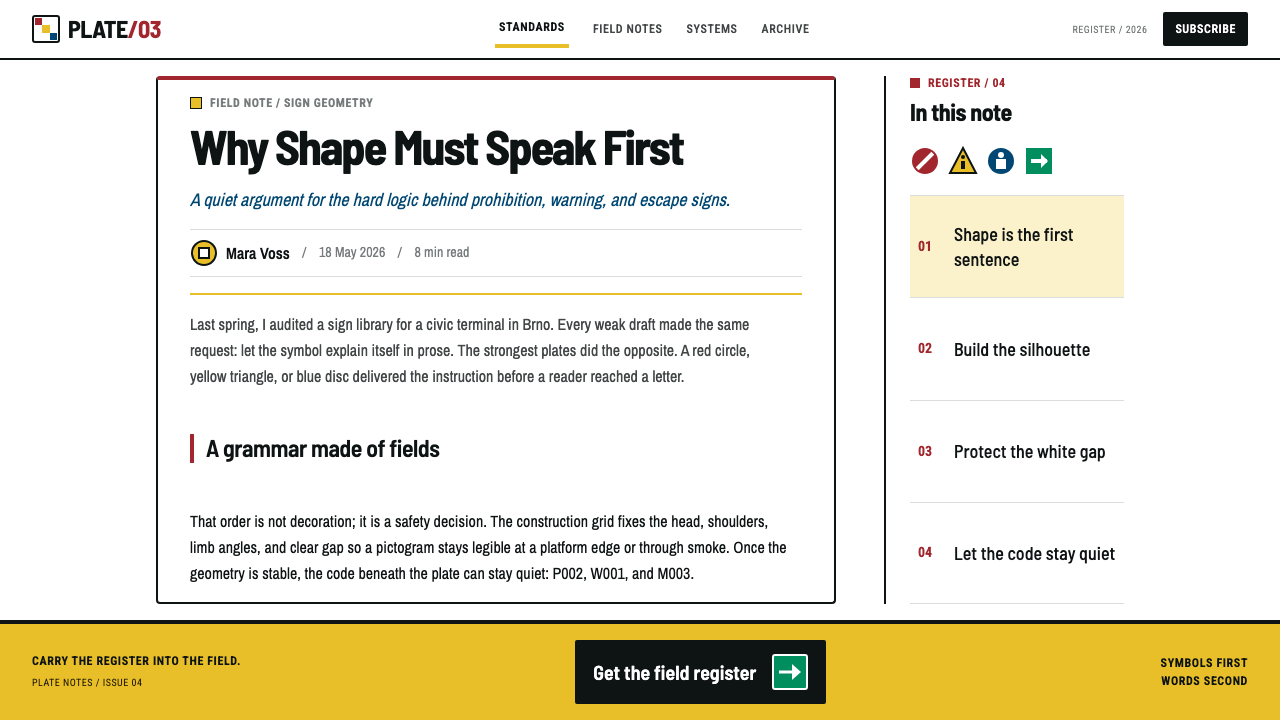
The black figure is a silhouette built on a construction grid: a round head, squared shoulders, limbs bent at set angles. It has no outline detail, no facial features and no personality. This anonymity is the point. The figure stands for anyone, in any country, and any two figures from the same registry look like members of one family because they were assembled from the same parts by the same rules.
The White Plate
Everything sits on a clean white ground, like a page in a register. The plate gives the coloured field a stable contrast partner and a clear boundary, and the regular margin around each symbol keeps it from being crowded by its neighbours. White is not emptiness here but a working surface: it is where specimens are laid out, compared and read.
Hard Edges and Heavy Outline
Edges are decisive, fills are solid and borders are a heavy, even dark stroke. There are no soft shadows, no glow and no texture. The sign looks printed rather than rendered, and it stays legible when reproduced small, photocopied, scratched or seen at an angle. Every choice favours survival under poor conditions over visual richness under good ones.
Words Live Elsewhere
Text never enters the symbol. An explanation, a warning sentence or a translation sits on a supplementary panel directly beneath the sign, visually attached but structurally separate. This keeps the pictogram language-neutral and lets one sign be paired with any number of languages without redrawing it. The rule is easy to state and easy to break, and breaking it is the quickest way to ruin the look.
Code Below, Meaning Outside
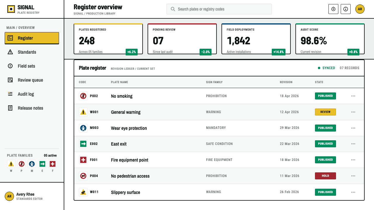
Each symbol is identified by a short registry code placed beneath it, with the fuller explanation outside the symbol area. The result is a layout of three clean tiers: figure, code, caption. It scales from a single wall sign to a full catalogue sheet, and it gives the style its characteristic feel of a document that wants to be cited rather than admired.
Who shaped ISO Safety Symbols?
The ISO technical committee for graphical symbols. It is where countries negotiate the construction grid, the shape-and-colour grammar and the registry of signs that together define this style. Its output is deliberately impersonal: the committee's achievement is that no individual hand is visible in the finished symbols, which is exactly what lets a sign from one country be read in another.
The German national standards body, whose industrial signage rules formed the national foundation on which the international safety-sign standards were consolidated across the second half of the twentieth century. The German standardisation culture — exact, documented, repeatable — runs through the whole look: the fixed colours, the construction grid and the insistence that a sign mean the same thing everywhere.
Ludwig Goller is cited among the names associated with the German industrial signage tradition that fed into the international standard. Individual attribution matters less here than the tradition he stands for: the move from locally improvised warning notices to symbols whose meaning is fixed by agreement and can be taught once, to anyone, and trusted afterwards.
How do you use ISO Safety Symbols today?
ISO Safety Symbols is a rare style whose first job is communication rather than mood. Used well, it gives a design the authority of an official notice: clear categories, unambiguous states and no decoration to argue with. The trick is to borrow the grammar — shape, fixed colour, construction, separation of text — rather than simply pasting warning triangles onto a layout.
On slides, a cover works best as a plain white plate with one large geometric field and a short code-style label beneath the title, like a specimen card. Content slides can run a three-tier rhythm: a bold shape-and-figure on one side and a caption panel on the other. For data slides, let shape encode category and colour encode severity: a triangle for risks, a circle for required actions, a square for confirmed safe states, with a legend sheet laid out in the register manner. Charts stay flat, with solid bars and heavy outlines and no gradients, so that every mark reads like a sign.
In web interfaces the style suits dashboards, status pages, compliance tools, onboarding checklists and anything where states must be recognised instantly. Alerts, validation and permission prompts map neatly onto the shape grammar: a triangle for warnings, a barred circle for blocked actions, a filled circle for required steps, a square for success. This also solves a real accessibility problem, because status never depends on colour alone. On pricing pages the supplementary-panel idea is useful: keep the plan name and price in the main plate, and place conditions and fine print on a separate panel beneath it, never inside the headline element.
For editorial and marketing work, the register sheet is a strong layout metaphor: a catalogue of numbered specimens, each with a code, a figure and a caption, laid out on a regular grid. It suits manuals, guides, onboarding documents, product safety sheets and campaign pages that want to feel official and trustworthy. Use one signal colour per section, keep the white plate generous, and let the black figures carry the visual weight.
The most common mistake is to treat the style as a skin and break its logic. Putting words inside the symbol, using a triangle for something that is not a warning, tinting the safety colours to match a brand palette, adding a drop shadow or a gradient, or drawing freehand figures that ignore the construction grid will each make the result look like a parody of a safety sign. A second mistake is overuse: when everything is a warning triangle, nothing is. Reserve strong signals for what truly matters and let the white plate do the quiet work.
ISO Safety Symbols — FAQ
Is this the same as the ISO 7010 standard?
No. ISO 7010 is the registry of standardised safety signs. This style borrows its visual grammar — the shape-and-colour logic, the constructed pictograms and the white plate — for design work. Using the style does not make a sign compliant, and real safety signage should use the official registered symbols and follow the regulations that apply where it is installed.
Why does shape come before colour?
Because colour is the least reliable channel. It can be lost in printing, washed out by lighting, or be invisible to someone with colour-vision differences. Shape survives all of that and can be recognised at a glance and from a distance. The system gives each category its own outline and then adds colour as reinforcement, so the message arrives even when the colour does not.
Can I use it for ordinary apps and websites?
Yes, and it works particularly well for status, alerts, permissions and compliance flows. It is less suited to playful or expressive brands, because its strength is the absence of personality. Treat it as a way of making states unmistakable rather than as a general mood, and combine it sparingly with whatever voice your product already has.
How is it different from Isotype?
Isotype is an earlier picture-language tradition aimed at communicating statistics and social information, and it shaped pictogram thinking in general. ISO safety symbols are a regulated descendant of that conviction, with fixed shapes, fixed colours and a registry code system. Isotype is more illustrative and varied; safety symbols are rigid by design, because a sign that can be interpreted freely is a sign that can be misread.
Does it work on a dark background?
The canonical form is a white plate, and that is where the colour references are designed to perform. A dark layout can borrow the shapes and the construction grid, but the signs themselves should then be kept as white or light panels inside the dark page, so the signal colours still sit on the ground they were meant for rather than fighting a black surround.
Related design styles
 Helsinki Metro OrangeOne orange does the work. Archivo signage cuts across an 8px concrete tile gr…
 Massimo Vignelli NYCClarity becomes infrastructure. Black rules and route stripes lock the white…
 NYC Subway VignelliThe city as a circuit diagram. Flat trunk-line color on black, angles locked…
 THX 1138Conformity as over-exposed void. Bluish-clinical white, black extended numera…
 Airport Wayfinding GeometricLegibility becomes command. Signal yellow, black sans, and green route bands…
 Beirut Brutalist GrayStructure is the only ornament. Scarred bush-hammered grey, monumental Oswald…