What is Logan's Run (1976)?
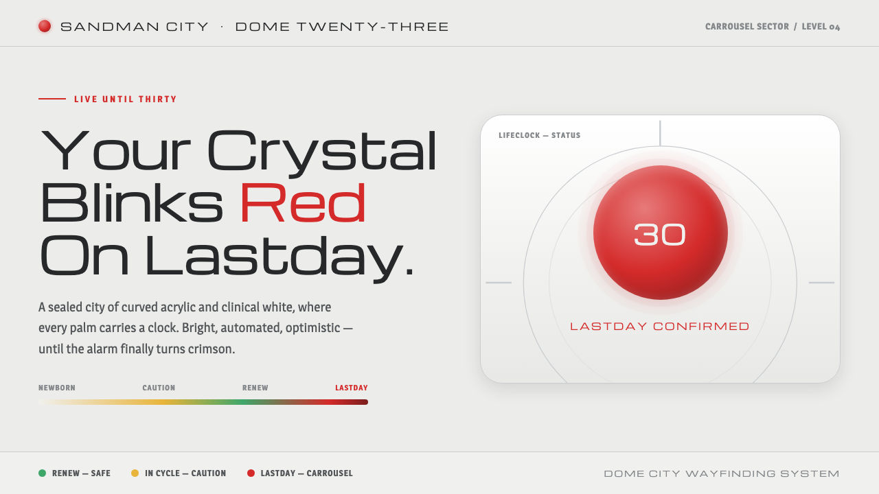
Logan’s Run turns the shopping mall into a future city: immaculate white, polished chrome, and one red palm crystal that makes mortality impossible to ignore.
Logan's Run (1976) in brief
Logan’s Run is a 1976 science-fiction visual world set in the twenty-third century, inside a domed pleasure-city where life ends at thirty. The city presents death as a clean civic ritual rather than a tragedy: on Lastday, a crystal embedded in the palm begins to blink red. That contradiction — bright pleasure built around enforced mortality — is the system’s central design idea.
Its atmosphere is not dark, ruined, or industrial. The ground is clinical mall-white, the surfaces are curved acrylic and polished chrome, and the overall environment appears optimistic, spacious, and technologically reassuring. The horror sits inside the order. Nothing needs to look threatening when the city’s own materials, signage, and rituals quietly organize the end of a human life.
The design system distills this world into a restrained visual grammar: cool white fields, geometric squared signage type, clean structural forms, and a single signature red accent representing the lifeclock crystal. Yellow and green may appear as part of the crystal’s cycle, but red remains the moment of alarm. The result is bright, hygienic, and controlled, with one impossible-to-ignore signal of danger.
Where does Logan's Run (1976) come from?
The film was released in 1976 and imagines a domed city in the twenty-third century. Its citizens inhabit a pleasure-oriented environment in which the apparent promise of a perfect future is inseparable from a strict rule: life ends at thirty. Lastday turns that rule into a visible event, because the palm crystal does not merely record age; it announces the approaching ritual through light.
Production designer Dale Hennesy built the city from curved acrylic, chrome, and shopping-mall-modern white interiors. These materials create a future that feels manufactured for public consumption: smooth, bright, reflective, and carefully maintained. Curvature softens the architecture while chrome and white surfaces reinforce a sense of cleanliness. The setting therefore feels inviting on first inspection, even as its social order is profoundly dystopian.
The visual lineage combines 1970s mall-modern futurism with atomic-age optimism turned dystopian. It also draws on geometric signage modernism, translating the city’s rules into a language of squared forms and legible signals. The system is futuristic without being remote or abstract; it resembles a perfected commercial interior whose promise of convenience has expanded until it governs existence itself.
This Curio system focuses on the film’s strongest contrast rather than reproducing every production detail. A cool clinical white ground establishes the public environment, chrome-like brightness suggests polished technology, and the lifeclock red becomes the focal alarm. Yellow and green extend the crystal’s cycle, but they do not compete with the red signal. The visual world remains controlled until that color breaks the surface.
What defines the Logan's Run (1976) look?
Clinical White
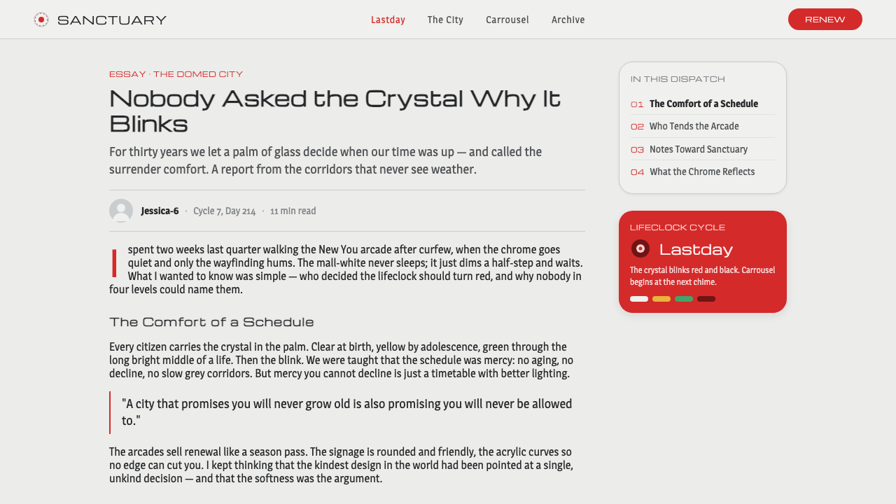
White is not treated as empty space but as the city’s governing atmosphere. It feels cool, public, and continuously maintained, closer to a shopping mall or civic interior than to a home. Use it as the dominant ground so that every colored signal appears intentional and every dark mark reads as information rather than decoration.
Lifeclock Red
Red is the signature accent and the emotional center of the system. It belongs to the palm crystal, Lastday, and the recognition of mortality. Because the surrounding field is restrained, red should be scarce and decisive: a status state, a warning, a focal marker, or a single call to attention. Its power comes from exclusion.
Crystal Cycle
Yellow and green extend the lifeclock vocabulary without displacing red. They can indicate earlier or less urgent stages of a cycle, while red marks the terminal signal. The palette should feel procedural rather than decorative, as though color is reporting a condition inside a civic system. Meaning must remain more important than variety.
Squared Signage Type
Typography should resemble geometric environmental signage: squared, direct, and engineered for immediate recognition. Letterforms carry the authority of a civic instruction rather than the personality of a literary voice. Keep hierarchy clear through scale, placement, and contrast, while avoiding ornate, soft, or highly expressive type that would weaken the regulated atmosphere.
Curved Hard Surface
The material language combines the softness of curved acrylic with the hard brilliance of chrome. This is not an organic, tactile futurism; it is a polished public surface designed to be seen, cleaned, and trusted. In digital work, translate that logic through smooth silhouettes, crisp edges, restrained depth, and a controlled sense of reflection.
Optimism Under Control
The defining mood is bright optimism with a hollow center. Interfaces and compositions should appear helpful, spacious, and calm before the red signal introduces unease. This tension is more important than theatrical darkness. The design works when the surface promises comfort while the system underneath reveals surveillance, ritual, and an unavoidable end.
Who shaped Logan's Run (1976)?
Michael Anderson is named in the source as one of the key figures associated with Logan’s Run. Within this design system, his inclusion reinforces that the film’s visual world should be understood as a collaborative production rather than the expression of a single isolated style. The system therefore treats the city, its rituals, and its signals as a unified visual environment.
Dale Hennesy, the production designer identified by the source, gave the city its defining material vocabulary: curved acrylic, chrome, and shopping-mall-modern white interiors. His contribution explains why the world feels both futuristic and commercially familiar. The design system depends on preserving that duality — public comfort on the surface, controlled mortality underneath.
L.B. Abbott completes the three key figures named in the approved origin material. Because the source does not assign him a separate visual department or isolated motif, the most accurate reading is collaborative: Logan’s Run’s visual identity emerges from a production system in which architecture, surface, signage, and ritual operate together. His place in the record supports that collective authorship.
How do you use Logan's Run (1976) today?
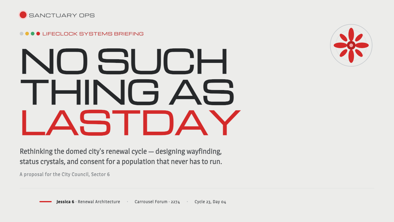
For presentation slides, use the white ground as a continuous civic environment. A cover can place a large, quiet title beside a single red crystal-like signal, allowing the accent to carry the drama. Content slides should feel like clear public signage: short headings, squared type, generous open space, and sharply separated information groups. Data slides can use yellow and green for progressing conditions, reserving red for the decisive warning or terminal state.
For web interfaces, the system suits dashboards, monitoring tools, and pricing pages that need to communicate status without visual clutter. Keep panels bright and orderly, use geometric labels, and let color explain condition rather than decorate the surface. Red can mark an expiring state or urgent intervention; yellow can indicate attention; green can indicate continuation. Chrome-like highlights should remain restrained so the interface does not become glossy or toy-like.
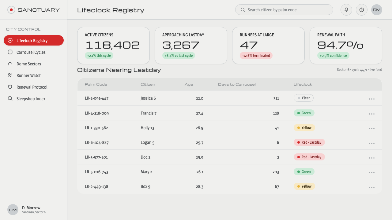
For editorial work, treat the page as a public document from a perfected future city. Use a cool white field, direct headings, compact informational blocks, and occasional red markers that interrupt the calm. Long-form articles benefit from a strong contrast between measured explanatory text and brief alarm-like callouts. Curved containers or rounded image crops may echo acrylic, but they should remain clean and structural.
For marketing, Logan’s Run works best when the promise is polished, convenient, and slightly unsettling. A campaign can present a bright, frictionless surface before introducing a red message that exposes the cost of the system. Product pages may use chrome-like framing and geometric signage to suggest engineered reliability, while the lifeclock accent gives calls to action a sense of urgency without requiring an aggressive dark palette.
The common mistake is treating the style as generic retro-futurism by adding too many nostalgic effects, colored accents, or metallic decorations. The approved system is defined by restraint: white establishes the world, chrome supplies controlled polish, and red carries the narrative burden. Yellow and green belong to the crystal cycle, not to an unrestricted rainbow palette. If every element is dramatic, the lifeclock loses its authority.
Logan's Run (1976) — FAQ
Is Logan’s Run a dark visual style?
No. Its defining ground is bright, clinical, and commercially inviting. The dystopian quality comes from the contrast between that optimistic surface and the rule that life ends at thirty. A dark treatment may create a different science-fiction mood, but it would move away from the system’s essential tension: mortality hidden inside cleanliness and pleasure.
Why are white and chrome so important?
They make the future feel polished, public, and trustworthy. Curved acrylic softens the environment, while chrome and white suggest maintenance, technology, and commercial abundance. Together they create a world that appears safe enough to accept without question. The later appearance of the red crystal becomes powerful precisely because it interrupts this material calm.
How should red, yellow, and green work together?
Treat them as a cycle of conditions rather than as equal decorative colors. Yellow and green can describe earlier or continuing states, while red is reserved for the lifeclock alarm and the recognition of an approaching end. The palette works when viewers understand the colors as signals inside a system. If all three compete equally, the hierarchy disappears.
What kind of typography belongs to the system?
Use geometric, squared signage type that feels designed for public recognition and institutional instruction. It should be direct rather than expressive, with hierarchy created through size, spacing, placement, and contrast. Decorative scripts, soft editorial serifs, and overly playful display faces weaken the sense that the city is organized by a precise civic system.
Can the style be used outside science-fiction projects?
Yes, especially when a project needs polished clarity with an undercurrent of urgency. It can support dashboards, pricing, monitoring, editorial information, and campaigns about systems or deadlines. Its limits are equally clear: products seeking warmth, organic tactility, or relaxed informality may find the clinical white, geometric signage, and lifeclock red too controlled. The style should match the product’s underlying story.
Related design styles
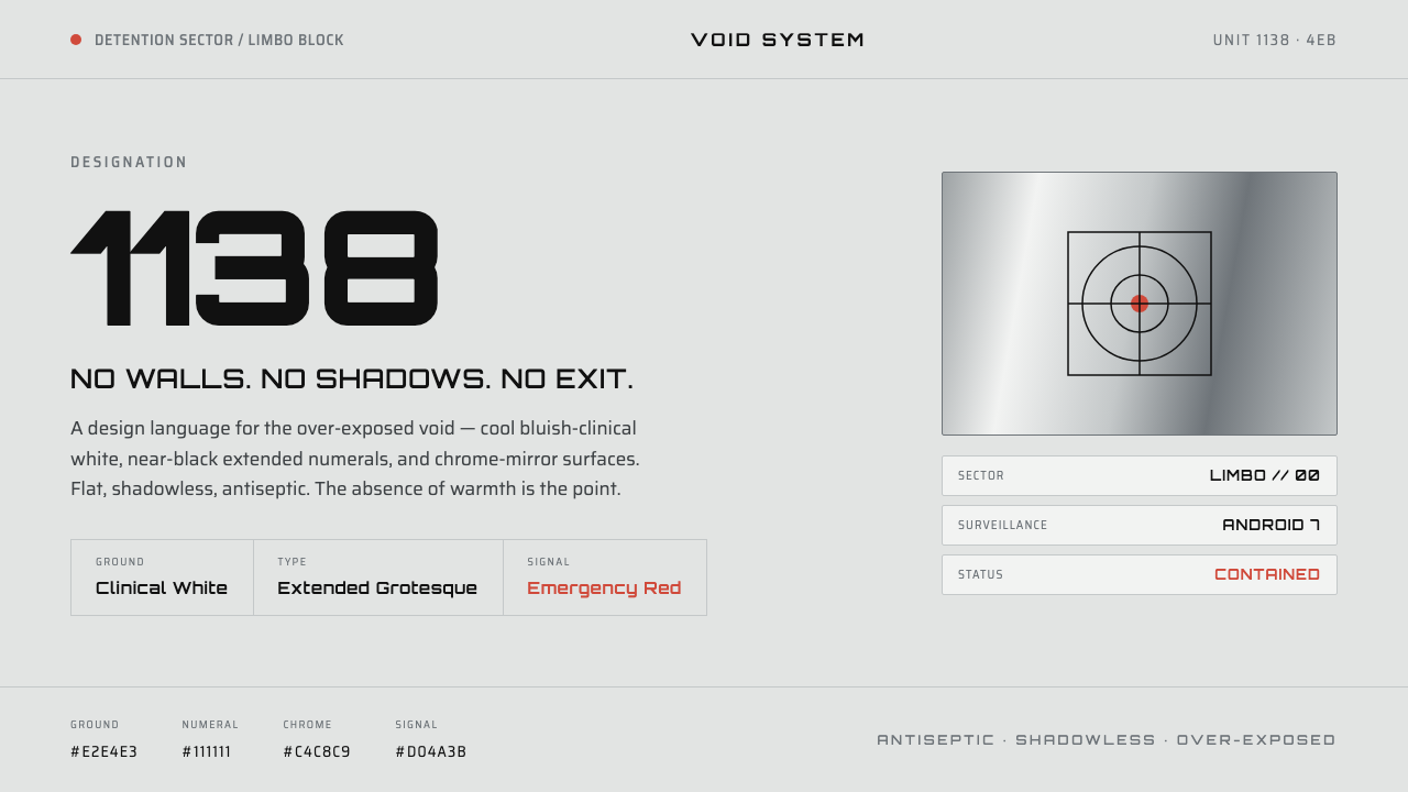 THX 1138Conformity as over-exposed void. Bluish-clinical white, black extended numera…
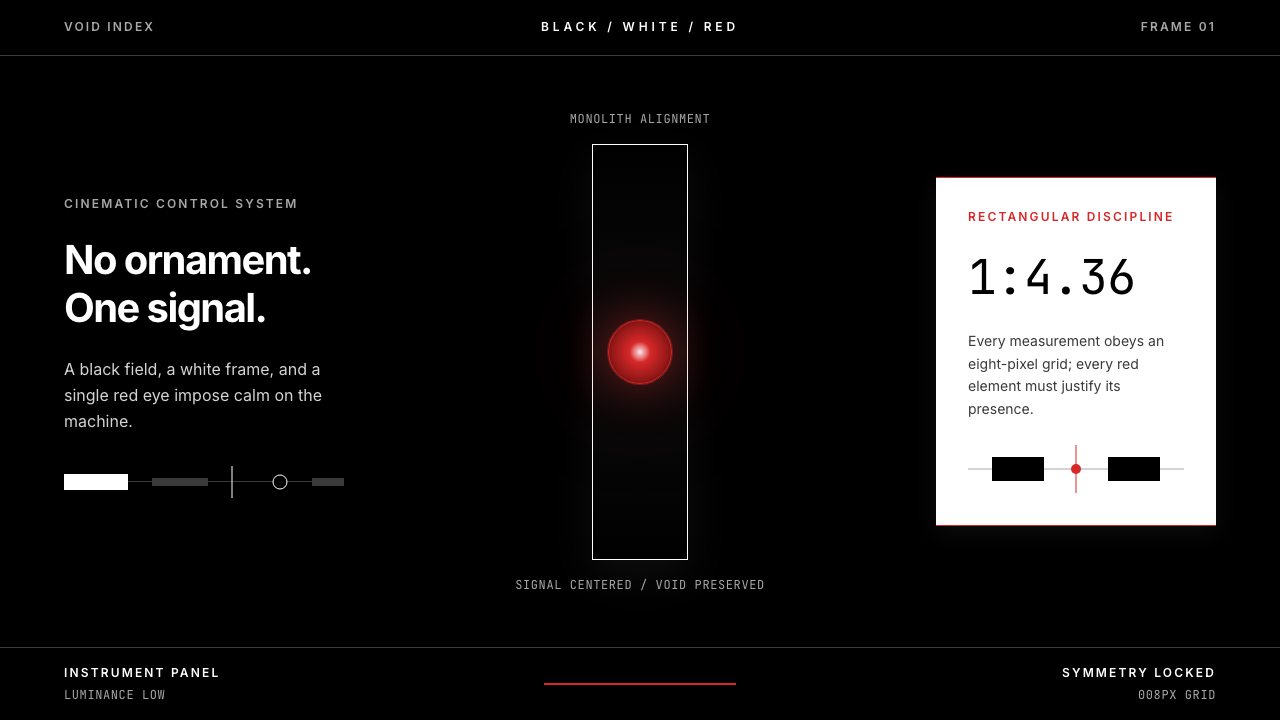 2001 — A Space OdysseyAbsolute restraint. Black void, white monolith geometry, one HAL-red signal.
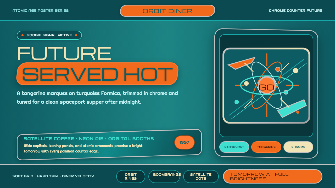 Atompunk / Raygun GothicTomorrow shines loud. Tangerine marquee type cuts through turquoise chrome ge…
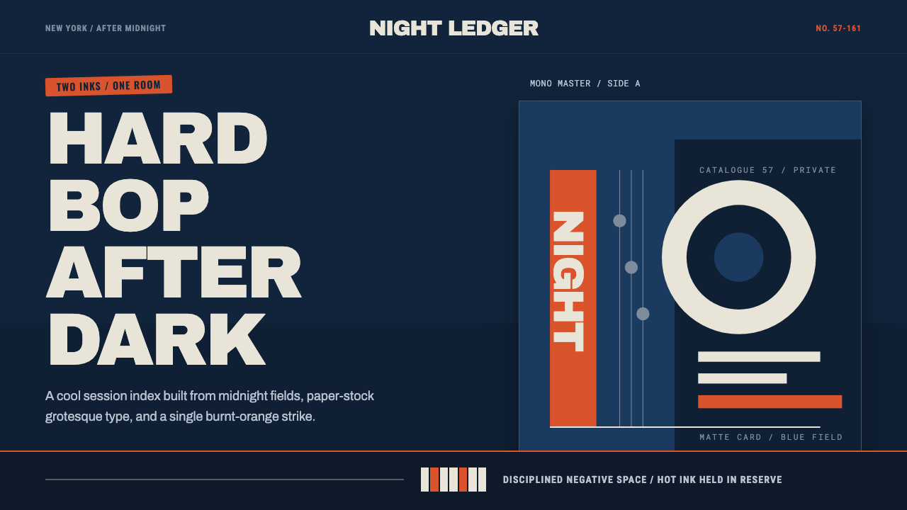 Blue Note JazzCool intelligence, printed flat. Midnight blue, paper type, and one burnt-ora…
 Saul Bass CorporateAuthority distilled. Deep blue geometry, tight Inter lockups, and white space…
 Moon (2009)Quiet light, one amber signal. Cool panel-white, condensed signage type, GERT…