What is Atompunk / Raygun Gothic?
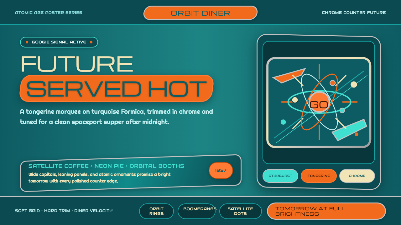
Raygun Gothic imagines the future the way 1950s Los Angeles coffee shops and pulp science-fiction covers did — all swept angles, chrome, and confident tomorrow.
Atompunk / Raygun Gothic in brief
Atompunk / Raygun Gothic fuses two parallel visual traditions from mid-century America into a single retro-futurist system: the built environment of Googie roadside architecture — coffee shops, motels, bowling alleys designed to be read by a driver at speed — and the illustrated imagination of pulp science fiction, where rockets and ray guns promised a clean, confident tomorrow. The result is a palette of saturated tangerine and turquoise set against brushed aluminum and polished chrome, applied through a specific, recurring vocabulary of shapes.
That shape vocabulary is deliberately narrow and instantly recognizable: the starburst (radiating lines from a central point, borrowed from the visual shorthand for an atomic explosion or a burst of energy), the boomerang (an asymmetric, swept curve used as a graphic accent or literal furniture and signage shape), the atom-orbit (concentric rings crossed by elliptical paths, standing in for the then-new science of atomic structure), and the parabola sweep (a long, low curve used for rooflines, counters, and sign supports). These motifs appear as isolated, confident marks rather than as dense pattern-fill.
Typography follows the same logic as roadside signage: wide, geometric capital letters, often set inside rounded marquee-style frames, designed to be legible and eye-catching rather than intimate or refined. The overall register is deliberately clean and mass-produced-looking — polished metal, crisp color blocks, confident angles — rather than intricate, handcrafted, or aged. This is the key distinction from adjacent retro-futurist styles built around Victorian brass and leather: Raygun Gothic imagines the future as bright, industrial, and optimistic, not as ornate machinery.
Where does Atompunk / Raygun Gothic come from?
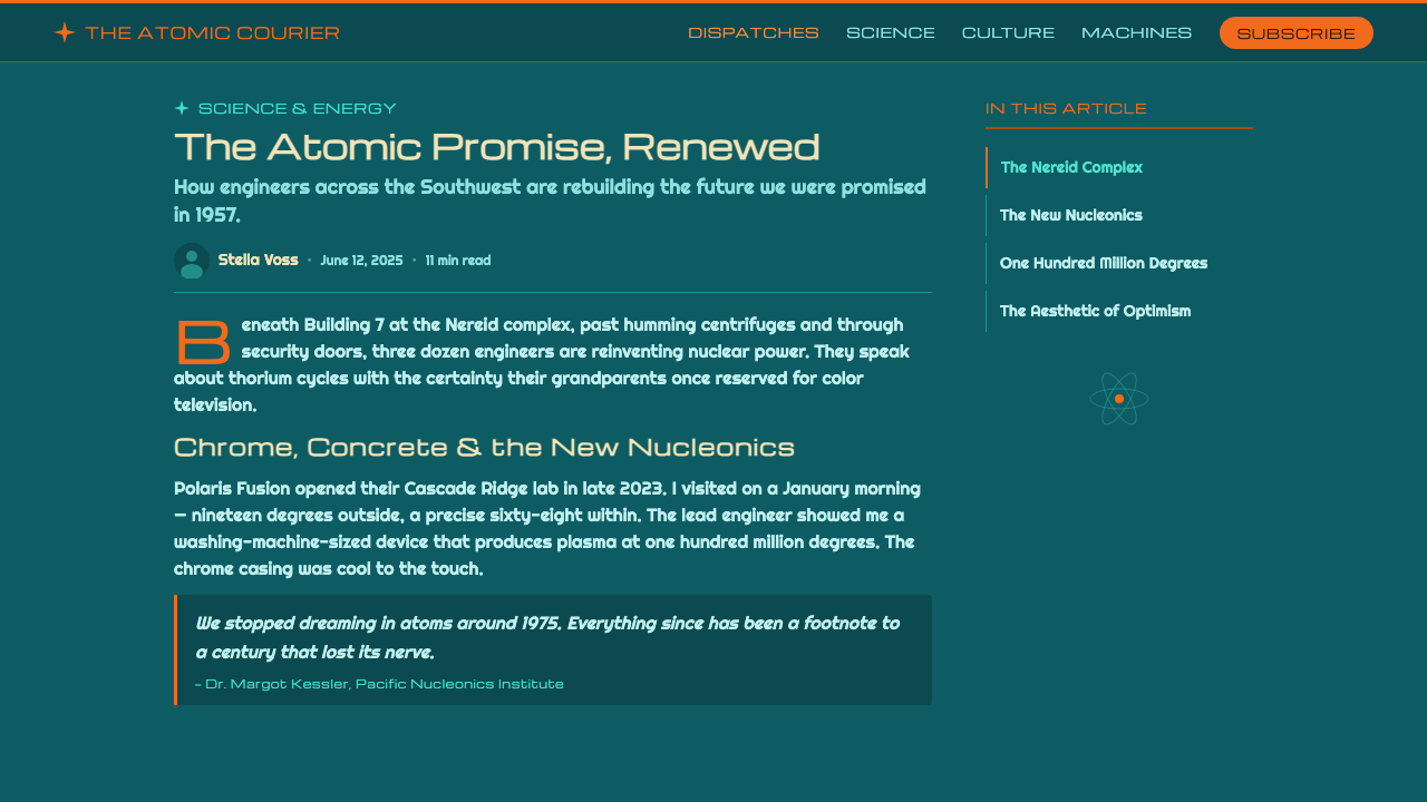
The name Googie comes from a specific building: a coffee shop called Googies, designed by architect John Lautner in 1949 at the corner of Sunset Boulevard and Crescent Heights in West Hollywood. The term itself was coined a few years later, in 1952, when architecture critic Douglas Haskell used the building as shorthand in a House and Home magazine article describing a wave of exuberant, futuristic roadside commercial buildings spreading across postwar Southern California — coffee shops, motels, bowling alleys, and gas stations built with upswept rooflines, cantilevered angles, glass walls, and oversized sign towers, all designed to catch a driver's eye at forty miles an hour rather than a pedestrian's at a walking pace.
Architect Wayne McAllister was among the style's most prolific practitioners, responsible for numerous Southern California drive-in restaurants and coffee shop chains whose designs helped define the visual grammar of the roadside atomic-age commercial strip. His work traced a path from the aerodynamic curves of Streamline Moderne in the 1930s into the fully realized Googie idiom of the postwar decades — architecture built explicitly for the automobile age, where a building's silhouette functioned as its own advertisement.
The same postwar optimism that shaped Googie architecture also reshaped consumer products — kitchen appliances, automobiles with dramatic tailfins, furniture and housewares carrying atomic and boomerang motifs. Design historian Thomas Hine later gave this broader consumer-goods aesthetic a name of its own, Populuxe, describing the exuberant, aspirational American product design of roughly 1954 to 1964. Googie architecture and Populuxe product design are siblings from the same cultural moment, sharing a visual vocabulary even though one lived in buildings and the other on shelves and driveways.
The other half of the style's name comes from an entirely different lineage: the illustrated visual imagination of 1930s–1950s pulp science fiction magazines and movie serials, where sleek rockets, chrome ray guns, and confident spacefarers promised an optimistic technological future — the Buck Rogers and Flash Gordon visual tradition. Novelist William Gibson gave this specific, dated brand of retro-futurism its lasting name, Raygun Gothic, in his 1981 short story 'The Gernsback Continuum,' which described the ghostly persistence of this imagined 1930s-through-1950s future in the real architecture and design left behind by it. This design system draws on both threads at once: the built Googie environment and the illustrated Raygun Gothic imagination, which converged into a coherent revival current running through the 1990s and beyond.
What defines the Atompunk / Raygun Gothic look?
Color
The palette centers on saturated tangerine orange and turquoise, used as bold accent blocks against brushed aluminum or polished chrome rather than against plain flat color. These two hues rarely blend or gradient into one another — they sit as distinct, confident color fields, the way a diner sign uses one bright color for its lettering and a different one for its frame.
Typography and Signage
Letterforms are wide, geometric, and built for distance legibility rather than intimacy — the visual logic of a roadside sign meant to be read from a moving car, not a printed page meant to be read up close. Text frequently sits inside a rounded, marquee-style frame or outline, borrowing directly from the shape of physical signage rather than from typesetting conventions.
Motif Vocabulary
A small, fixed set of shapes recurs throughout: the radiating starburst, the asymmetric boomerang curve, concentric atom-orbit rings, and the long, low parabola sweep. These appear as isolated, deliberate marks — a single starburst anchoring a corner, one boomerang shape used as a divider — rather than as a repeating all-over pattern.
Surface Finish
Metal surfaces alternate between brushed aluminum, which reads as a soft, directional sheen, and fully polished chrome, which reads as a hard mirror-bright highlight. The contrast between these two metal treatments — matte-directional versus mirror-bright — does much of the work that texture or pattern does in other styles.
Silhouette and Angle
Forms favor upswept rooflines, cantilevered angles, and dramatic asymmetric silhouettes over symmetrical or boxy shapes. A composition built in this style should look like it's leaning forward or reaching upward, echoing the way Googie buildings used exaggerated angles to appear dynamic even while standing still.
Clean Confidence vs. Ornate Grime
The defining discipline of this style is what it excludes: no aged patina, no intricate hand-tooled ornament, no visible wear or grime. Surfaces stay crisp and factory-fresh, angles stay confident rather than fussy — this is the deliberate opposite of adjacent retro-futurist styles built around Victorian brass, leather, and visible mechanism.
Who shaped Atompunk / Raygun Gothic?
Lautner designed the original Googies coffee shop in West Hollywood in 1949, the building whose exuberant, futuristic roadside style gave the entire movement its name. A former apprentice of Frank Lloyd Wright, he brought a sculptural, dramatically angled sensibility to commercial architecture that made buildings function as advertisements visible from a moving car.
McAllister designed dozens of Southern California drive-in restaurants and coffee shop chains, carrying the style from the aerodynamic curves of 1930s Streamline Moderne into the full postwar Googie idiom. His prolific output across the region helped standardize the visual grammar — upswept roofs, glass walls, tall sign towers — that defines the style today.
Haskell was the architecture critic who coined the term Googie in a 1952 House and Home magazine article, using Lautner's coffee shop building as shorthand for the wider wave of futuristic roadside commercial architecture he saw spreading across Southern California. The name was originally somewhat mocking in tone, but it stuck, and the style has been known by it ever since.
Gibson, the science-fiction novelist best known for coining the term 'cyberspace,' gave this style's other half its name in his 1981 short story 'The Gernsback Continuum,' coining the term Raygun Gothic to describe the specific, dated brand of 1930s-through-1950s retro-futurism — sleek rockets, chrome ray guns — that had once represented an imagined tomorrow.
Design historian Thomas Hine named the broader consumer-product side of this same aesthetic moment Populuxe, in his book of the same name, describing the exuberant, aspirational American product design of roughly 1954 to 1964 — the tailfinned cars and atomic-motif appliances that shared a visual language with Googie architecture even as they lived in showrooms and driveways rather than roadside buildings.
How do you use Atompunk / Raygun Gothic today?
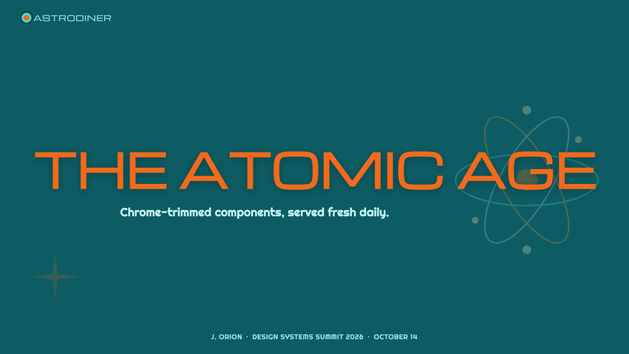
On presentation slides, this style is strongest as a cover treatment built like a roadside marquee: a bold tangerine or turquoise title set in wide geometric capitals inside a rounded sign-style frame, with a single starburst or boomerang shape anchoring a corner against a brushed-aluminum-toned background. Content slides should keep that metal-toned ground but reduce the motif vocabulary to small corner accents. Data slides benefit from the atom-orbit motif specifically — concentric rings and elliptical paths translate naturally into radial charts or orbit-style diagrams that feel native to the style rather than borrowed.
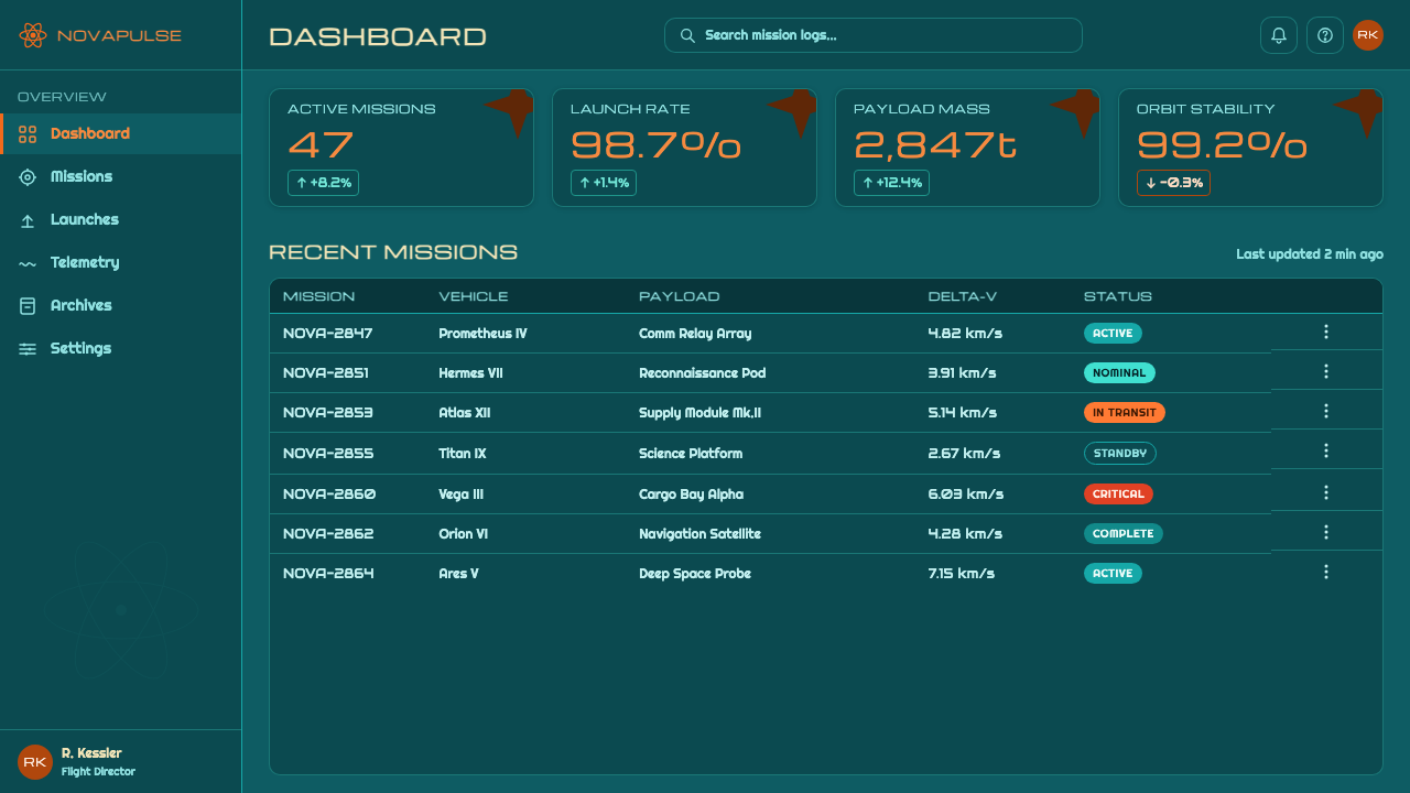
For web interfaces, the style suits products that want to feel confident, bold, and a little theatrical — entertainment platforms, gaming, hospitality, and brands leaning into a playful retro identity rather than a serious enterprise one. Dashboards can use brushed-metal-toned card backgrounds with tangerine and turquoise reserved for interactive states, and pricing pages can use the boomerang or starburst shape as a literal 'most popular' badge, echoing how Googie signage used shape as much as color to draw attention.
In editorial and marketing work, the style is well suited to travel, entertainment, nostalgia, and lifestyle brands that want a bold, optimistic tone. A magazine-style layout can borrow directly from roadside sign logic — a wide-capital headline inside a marquee frame functioning as the equivalent of a masthead — while marketing hero sections benefit from the dramatic asymmetric angles of Googie rooflines translated into diagonal section dividers.
A common mistake is treating this as generic '1950s retro' and reaching for a wider, softer palette of pastel diner colors, gingham, or chrome without the specific motif vocabulary. Without the starburst, boomerang, atom-orbit, and parabola sweep shapes doing structural work, the result reads as vague nostalgia rather than the specific Googie-and-pulp-science-fiction lineage this style draws from.
The second common mistake is adding aged texture, patina, or intricate ornamental detailing in an effort to make the style feel more 'crafted' — this contradicts the style's core discipline. Raygun Gothic is defined in part by what it is not: it is not weathered, not Victorian, not hand-tooled. Surfaces should stay crisp, angles confident, and metal finishes factory-fresh, because that clean industrial optimism is the entire point.
Atompunk / Raygun Gothic — FAQ
How is Raygun Gothic different from steampunk?
The two are often confused because both are retro-futurist styles that imagine technology from an earlier vantage point, but their source imagery and mood are opposite. Steampunk imagines the future through a Victorian lens — brass, leather, visible gears, aged patina, ornate hand-craftsmanship. Raygun Gothic imagines the future through a mid-twentieth-century American lens — chrome, brushed aluminum, saturated tangerine and turquoise, clean factory-fresh surfaces, and mass-produced confidence. Where steampunk is intricate and weathered, Raygun Gothic is crisp and optimistic.
Where does the name 'Googie' actually come from — does it mean anything?
It comes from the proper name of a single building: Googies, a coffee shop designed by architect John Lautner in 1949 at Sunset Boulevard and Crescent Heights in West Hollywood. Architecture critic Douglas Haskell used the building's name as shorthand for the wider style in a 1952 magazine article, and the label stuck to describe the whole wave of similarly exuberant roadside commercial architecture that followed, even though the coffee shop itself was eventually demolished.
Is Raygun Gothic literally about ray guns and spaceships, or is that too literal a reading?
The name references a specific visual lineage — the sleek rockets and chrome ray guns of 1930s-through-1950s pulp science fiction — but the design system built on it doesn't require literal ray guns or spaceships to feel authentic. What matters is the underlying vocabulary: starbursts, boomerangs, atom-orbit rings, parabola sweeps, tangerine and turquoise over chrome. Those elements carry the mood on their own, in the same way Googie coffee shops evoked the space age without depicting an actual rocket.
Does this style work in a dark-mode digital product, or does it need a light background?
It works especially well in dark or metal-toned settings, because the source architecture itself relied on artificial signage lighting against evening skies for much of its visual drama. A near-black or deep charcoal ground lets polished chrome highlights and saturated tangerine or turquoise accents read the way an illuminated sign does at dusk. A pure white background can work too, but it loses some of the theatrical, illuminated-signage quality that makes the style feel most authentic.
Is this style limited to American diner or roadside imagery, or can it apply to other product categories?
While its origins are specifically American roadside and pulp-illustration culture, the underlying formal logic — bold saturated accent colors against polished or brushed metal, a small fixed vocabulary of confident geometric shapes, wide signage-style typography — transfers well to any product wanting to feel bold, optimistic, and a little theatrical, regardless of category. The style is less well suited to contexts calling for quiet restraint, intimacy, or understated luxury, where its scale and confidence would read as too loud.
Related design styles
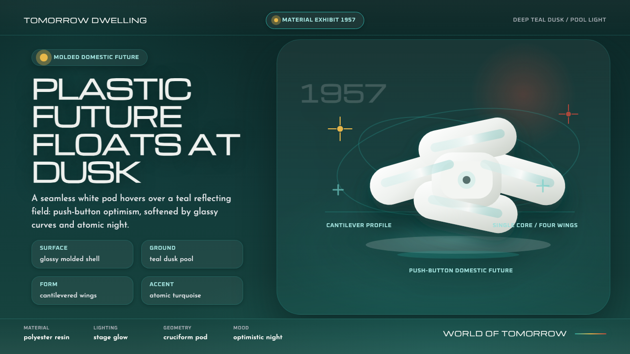 Monsanto House of the FuturePlastic optimism at dusk. Glossy white pod forms float over deep teal night.
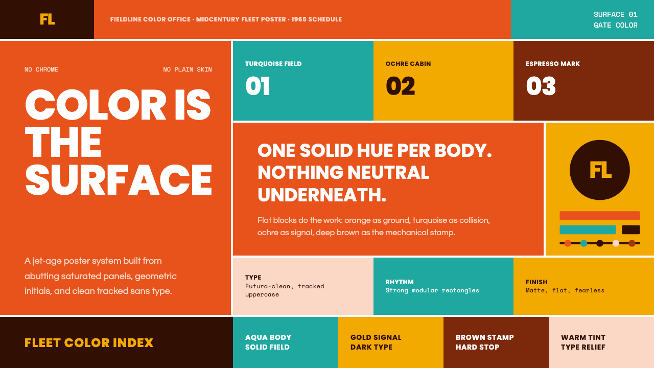 Braniff (Girard)Color becomes fuselage. Jellybean orange, turquoise blocks, and geometric san…
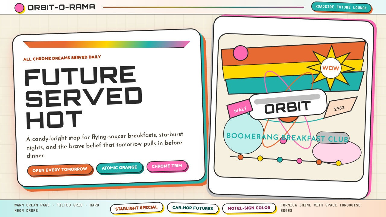 Googie / Space Age (1960s)Tomorrow pulls in grinning. Atomic orange, space turquoise, tilted signs and…
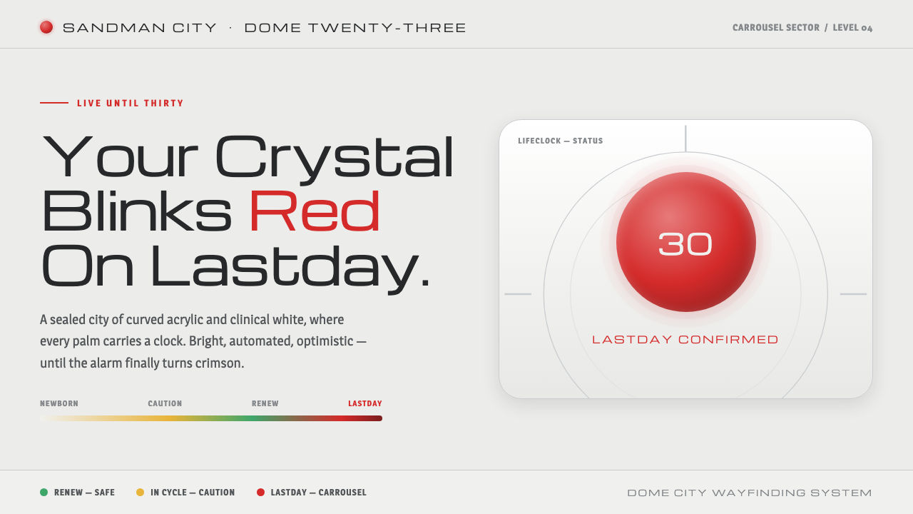 Logan's RunLive until thirty, then your palm crystal blinks red. Clinical mall-white, ch…
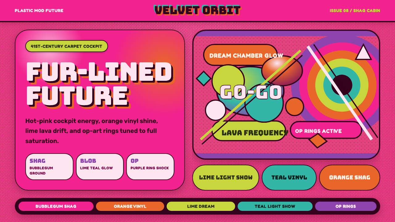 BarbarellaSpace-camp overload. Hot pink shag, lava blobs, and op-art rings collide.
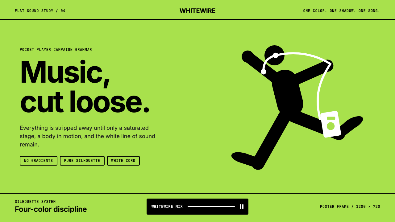 iPod Silhouette 2004Discipline dances. Lime flat-field, black silhouette, and one white cord carr…