What is Monsanto House of the Future?
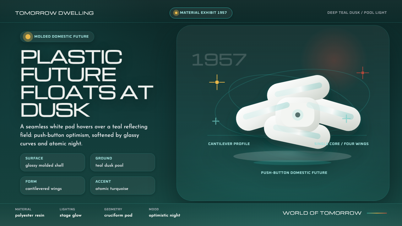
Monsanto House of the Future turned plastic into a promise — glossy white pod forms glowing against deep teal dusk, where domestic optimism feels engineered, weightless, and almost cinematic.
Monsanto House of the Future in brief
Monsanto House of the Future was a 1957 Disneyland Tomorrowland attraction: a glossy white cruciform structure made from four curved glass-reinforced-plastic wings cantilevered from a central concrete core. Engineered with MIT and designed with Goody, Clancy & Associates, it presented the home not as a permanent monument but as a material demonstration of what domestic life might become.
Its promise was distinctly atomic-age. The house proposed a plastic-built, push-button future in which the building and its furniture were molded from polyester resin. The result was less a conventional residence than a home-shaped exhibition: a seamless, futuristic object whose surfaces announced industrial possibility and technological confidence.
The visual identity comes from the contrast documented in photographs of the attraction. Luminous white plastic appears suspended above dark Tomorrowland planting and a still reflecting pool, while the surrounding dusk deepens toward teal-green shadow. The system therefore depends on opposition: bright against dark, smooth against organic, optimistic form against nocturnal atmosphere.

Where does Monsanto House of the Future come from?
The house opened at Disneyland in 1957, during an era when atomic-age and space-age modernism shaped popular images of tomorrow. Its setting mattered. Tomorrowland supplied the cultural frame: a designed environment where technology, domestic life, and entertainment could be presented as one coherent vision of the future.
Monsanto Chemical Company gave the project its material premise. Plastic was not treated as a hidden substitute for traditional construction; it became the visible argument. The entire structure, together with its furniture, was molded from polyester resin, allowing the attraction to stage a future in which industrial material could define the home from shell to interior.
MIT and Goody, Clancy & Associates are identified with the engineering and architectural work behind the house. Their collaboration produced the characteristic arrangement of curved glass-reinforced-plastic wings cantilevered from a concrete core. The form made technical novelty legible at a glance: the building appeared to float, yet its structural idea remained clearly organized around a central support.
Walt Disney Imagineering belongs to the credited project context, connecting the house to the broader authored world of Disneyland. The attraction drew on Atomic Age / Space Age modernism, Googie, and plastics futurism rather than on historical domestic architecture. Built in 1957 and demolished in 1967, it survives as a compact image of mid-century confidence: a bright future object set inside deep evening shadow.
What defines the Monsanto House of the Future look?
Luminous White
White is the system’s principal material signal. It should feel molded, seamless, and reflective rather than chalky or rustic. Against darkness, the pale surface becomes almost self-illuminating, turning every major form into an object of technological optimism.
Deep Teal Night
The background is not merely black. It belongs to a deep teal-green dusk that carries the atmosphere of Tomorrowland planting and reflected evening light. This darkness gives the white forms room to glow while keeping the mood atmospheric rather than sterile.
Pod Geometry
Forms should read as curved pods, wings, and rounded structural shells rather than flat rectangles. The cruciform arrangement supplies a strong organizing gesture, while softened corners and continuous surfaces suggest molded plastic shaped by industrial production.
Suspended Contrast
The central visual drama comes from apparent levitation. Bright forms should sit clearly apart from the dark field, with enough surrounding space to feel suspended. Depth is created through contrast and placement, not through ornate rendering or decorative texture.
Gloss and Reflection
Surfaces should suggest glossy molded resin: clean, continuous, and capable of catching a controlled highlight. Reflection belongs in the atmosphere as well as on the object, recalling the still pool that placed the bright house inside a second, darker image.
Optimistic Futurism
The mood is futuristic without becoming dystopian. Technology appears as an invitation to live differently: smooth, convenient, molded, and bright. The darkness supplies mystery, but the white house remains the emotional anchor and the promise at the center.

Who shaped Monsanto House of the Future?
Monsanto Chemical Company supplied the project’s defining material premise. Because the structure and its furniture were molded from polyester resin, the company’s presence is expressed through the house’s central claim: plastic could become the visible language of domestic futurism.
MIT is identified with the engineering of the house. Its association places the attraction within a culture of applied research and technical confidence, reinforcing the impression that the futuristic form was presented as an engineered possibility rather than a purely imaginary prop.
Goody, Clancy & Associates are identified as the architects behind the house. Their contribution is legible in the building’s curved wings, centralized concrete core, cruciform composition, and carefully staged sense of weightlessness.
Walt Disney Imagineering connects the house to the authored world of Disneyland Tomorrowland. The project therefore operated not only as architecture, but also as a designed encounter in which a future home could be seen, entered, and understood as part of a larger public vision.
How do you use Monsanto House of the Future today?
For presentation covers, use a deep teal night field as the stage and place one luminous white pod form where it feels suspended rather than grounded. Keep the title concise and bright, allowing the silhouette and the surrounding darkness to carry the first impression. A restrained accent can suggest reflected light, but the central relationship should remain white optimism against evening depth.
For content and data slides, translate the house’s structural logic into clear zones: a central organizing axis, rounded modules, and strong separation between illuminated information and dark space. Diagrams should feel molded and spatial rather than technical in a dry way. Use white for primary information, teal darkness for the field, and a limited highlight for emphasis so charts remain calm and legible.
For web dashboards and pricing pages, the style can turn dense information into a futuristic control room without becoming aggressive. Use dark teal as the environmental ground, bright white for cards and primary surfaces, and curved containers to soften the interface. Pricing tiers can be distinguished through shape, glow, or controlled reflective accents rather than a crowded spectrum of colors.
For editorial and marketing work, treat the house as a hero object inside a nocturnal scene. A feature page can open with a large white architectural silhouette, then move into dark editorial sections where captions and historical context appear like signals in the surrounding night. Marketing copy should emphasize material optimism, convenience, and the promise of a designed future rather than generic nostalgia.
The common mistake is to reduce the style to white objects on a black background. That loses the specific atmosphere of molded plastic at dusk. Avoid making every element glossy, every corner rounded, or every accent equally bright; the system needs hierarchy, quiet darkness, and one unmistakable luminous object to preserve its sense of optimism.

Monsanto House of the Future — FAQ
What is the Monsanto House of the Future style?
It is a dark, atmospheric interpretation of the 1957 Monsanto House of the Future at Disneyland Tomorrowland. Its core language combines glossy white molded forms, curved pod geometry, deep teal-green dusk, and the optimistic promise of plastic technology. The style is less about retro decoration than about staging a bright engineered object inside a quiet nocturnal environment.
Does the style require every surface to look glossy?
No. Gloss is the principal material cue, not a command to polish everything equally. The most effective compositions reserve strong reflection for the main pod or architectural object, while secondary information remains quieter. If every surface shines with the same intensity, the hierarchy disappears and the material story becomes visual noise.
Can this style be used with a light background?
It can, but the defining contrast becomes weaker. The documented visual core depends on luminous white plastic set against deep teal-green dusk, so a light background should be treated as a deliberate variation rather than the default. If the field becomes pale, preserve the sense of a dark atmospheric counterweight through framing, shadow, or a concentrated night-colored section.
How should imagery be treated in this system?
Imagery should emphasize silhouette, surface, and atmosphere. Architectural forms, reflective pools, dusk planting, and isolated highlights are more appropriate than busy scenes. Cropping should make the white object feel staged within darkness, allowing the image to communicate the central contrast before the viewer reads any caption.
Where does the style work best, and where can it struggle?
It works best for technology, architecture, future-facing products, dashboards, pricing systems, exhibitions, and campaigns that want to express engineered optimism. It can struggle when a product depends on warmth, handmade texture, organic abundance, or intimate softness. The style’s strength is its clear promise of a designed future; using it well means choosing contexts where that promise feels credible.
Related design styles
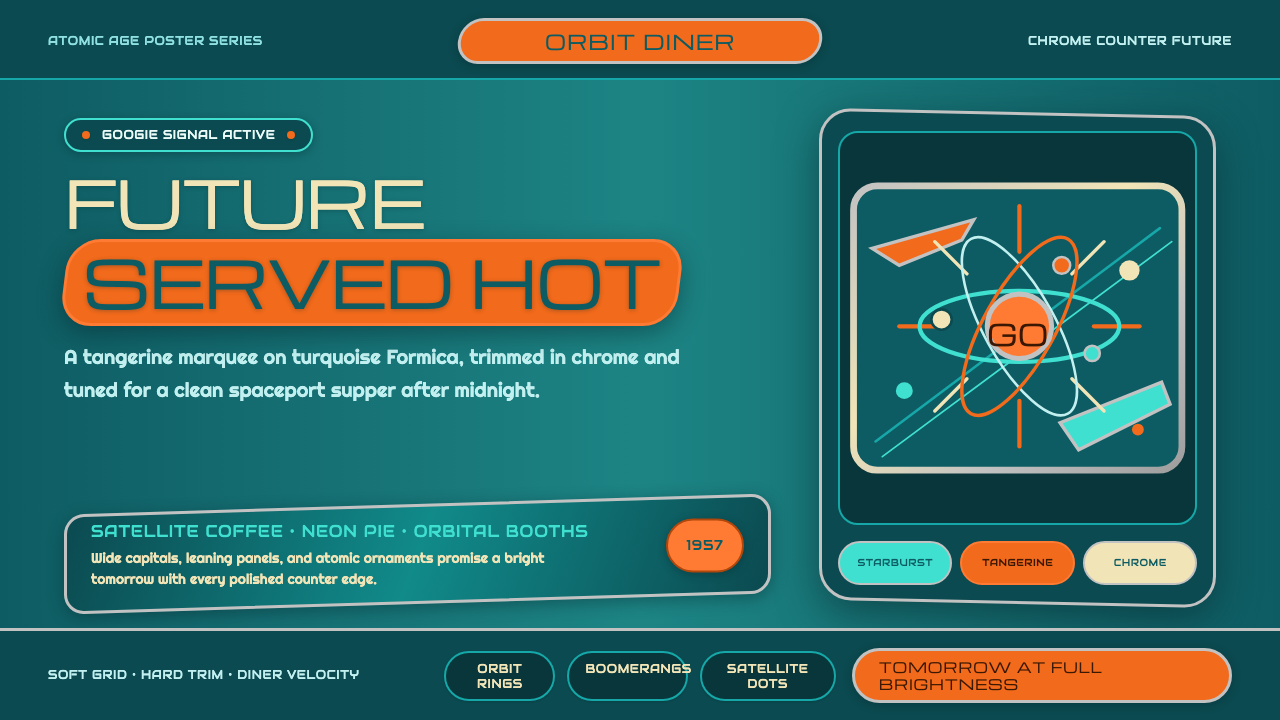 Atompunk / Raygun GothicTomorrow shines loud. Tangerine marquee type cuts through turquoise chrome ge…
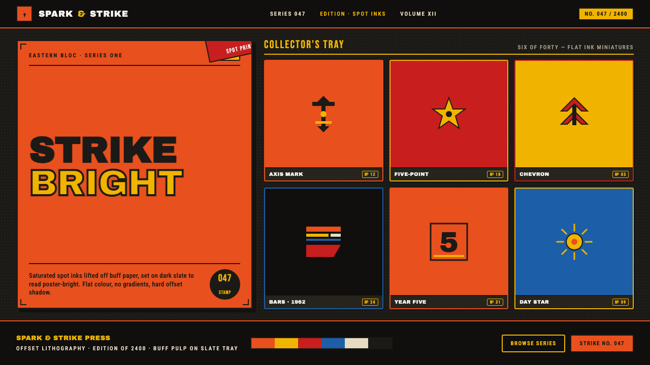 Matchbox LabelPropaganda for the pocket. Flat orange-red-yellow spot inks on dark slate, co…
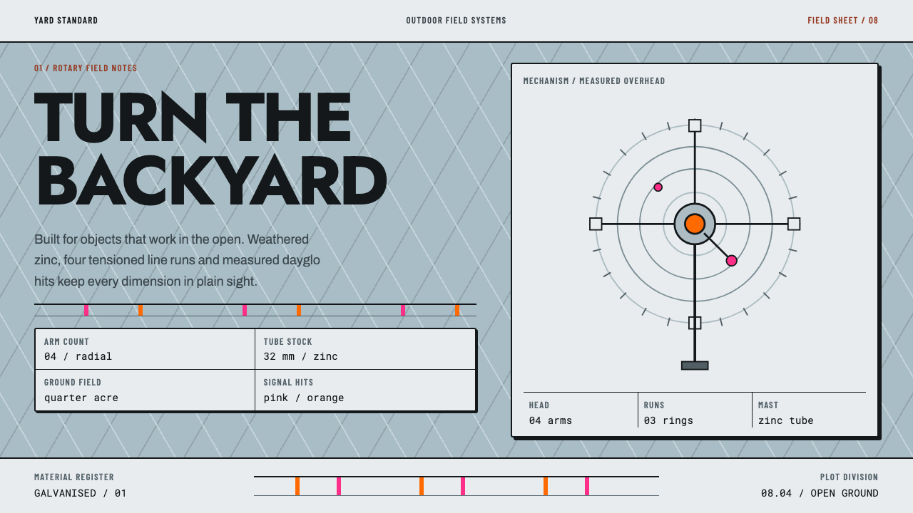 Hills Hoist SuburbiaUtility takes the lead. Weathered zinc, black outlines and dayglo hits set a…
 Miami Art Deco PastelSunlit Deco, not noir. Mint stucco, aqua bands and flamingo trim make it brea…
 Braniff (Girard)Color becomes fuselage. Jellybean orange, turquoise blocks, and geometric san…
 Googie / Space Age (1960s)Tomorrow pulls in grinning. Atomic orange, space turquoise, tilted signs and…