What is Things to Come (1936)?
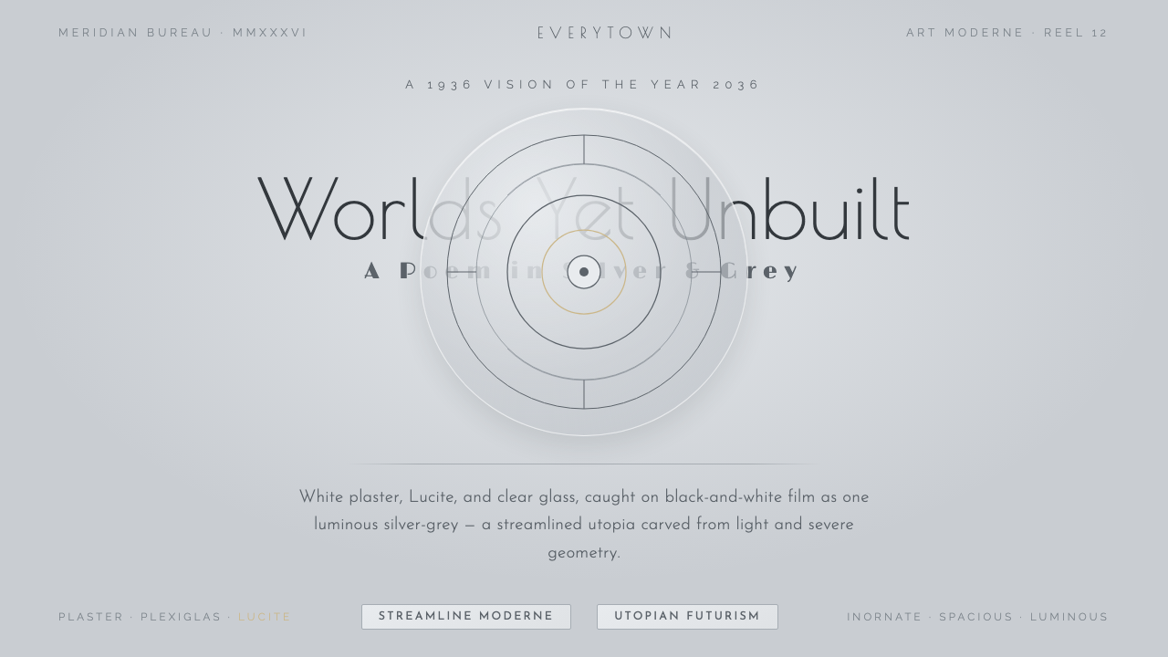
Things to Come imagines tomorrow not as darkness or machinery, but as a vast silver-grey civic interior where light itself becomes architecture.
Things to Come (1936) in brief
Things to Come is a 1936 British film, produced by Alexander Korda and directed by William Cameron Menzies, that projects its imagined future into the year 2036. Its Everytown is not a nostalgic city updated with gadgets. It is a gleaming underground metropolis built from white plaster, Plexiglas, Lucite, and glass: a setting whose surfaces appear luminous, ordered, spacious, and almost entirely free of ornament.
The visual language belongs to Art Moderne and Streamline Moderne, filtered through modernist utopian futurism. It favors pale silver-grey grounds over paper-like warmth, smooth planar architecture over masonry, and geometric refinement over historical decoration. Black-and-white film turns transparent and polished materials into a controlled spectrum of light, reflection, and shadow rather than a display of color.
As a contemporary design style, Things to Come distills that cinematic future into an interface language of cool luminosity. Poiret One contributes an elegant geometric display voice; concentric glass-disc dials suggest instruments, portals, and civic systems; transparent furnishings and minimal linework keep the space open. The result should feel visionary and severe, but never hostile: a future made calm through clarity.
Where does Things to Come (1936) come from?
The style begins with a deliberate temporal leap. Made in 1936, Things to Come pictured 2036 from the perspective of interwar Western Europe. That distance matters: the future is not represented as a cluttered accumulation of inventions, but as an architectural proposition. Everytown becomes an idealized civic environment in which collective life is organized through light, smooth surfaces, transparency, and disciplined space.
Its production context was British, through London Films, with Alexander Korda as producer and William Cameron Menzies as director. The film’s design identity is inseparable from that collaboration: the future is conceived as a total environment rather than a collection of isolated props. Architecture, furnishings, instruments, type, and atmosphere belong to one continuous visual system.
The materials named in the film’s world are central to its effect. White plaster establishes broad, clean planes. Plexiglas, Lucite, and glass introduce transmission, reflection, and apparent weightlessness. On monochrome film, these surfaces do not read as domestic or tactile; they merge into a luminous silver-grey environment whose brightness feels constructed rather than natural.
The closing sequence was praised as an Art Deco poem in gleaming silver and grey. That description captures the tension at the heart of the style. It carries the streamlined confidence of Art Moderne, yet strips away the richness usually associated with decorative luxury. The remaining beauty is formal: circles, discs, clean planes, precise silhouettes, and light treated as a material with public scale.
What defines the Things to Come (1936) look?
Silver-Grey Light
The ground is cool, pale, and luminous rather than creamy, warm, or nostalgic. Silver-grey is not merely a neutral backdrop; it is the atmosphere that joins walls, glass, instruments, and open space into one environment. Contrast should feel crisp and cinematic, with dark marks used to articulate structure rather than to make the composition heavy.
Light as Architecture
Brightness is structural. Broad illuminated planes create the sense of a city carved from light, while reflections imply volume without adding visual clutter. The style does not depend on dramatic darkness or theatrical glow. Its power comes from evenly controlled luminosity that makes space appear sanitary, civic, and almost frictionless.
Glass Discs and Concentric Geometry
Circular glass-disc forms are the style’s clearest motif. They can read as dials, windows, interfaces, or abstract civic machinery, especially when arranged concentrically. Their transparency is important: the circle should feel optical and architectural, not like a decorative badge. Geometry organizes attention through quiet precision rather than visual aggression.
Transparent Materiality
Plexiglas, Lucite, and glass establish a world where objects seem less opaque and less burdensome than ordinary furniture. In digital applications, transparency should suggest manufactured clarity and reflected light, not softness, haze, or watery atmosphere. Surfaces are smooth, hard, and cleanly bounded, preserving the sense that the environment has been engineered.
Geometric Display Type
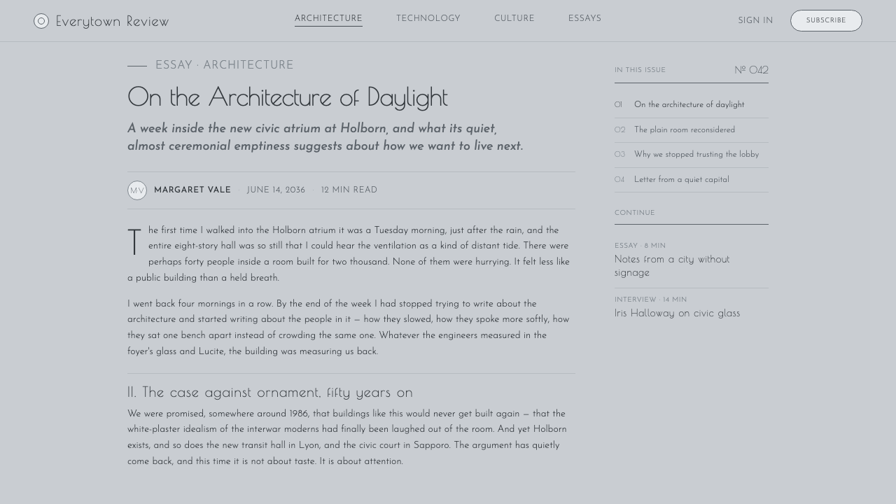
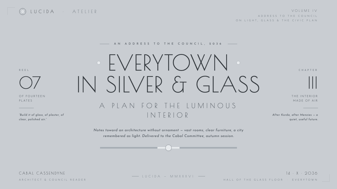
Poiret One gives the style an Art Moderne display voice: geometric, poised, and distinctly stylized without becoming ornate. It belongs where the interface needs ceremony, identity, or an architectural title. Supporting text should remain restrained and highly legible so that the display lettering reads as a designed event, not as an all-purpose texture.
Inornate Civic Space
Things to Come is streamlined without becoming domestic minimalism. Its emptiness has civic scale: open room around an element makes that element feel consequential, as if it belongs to a larger public system. Avoid nostalgic texture, decorative pattern, and crowded controls. The composition should imply a disciplined future whose confidence is expressed through room to breathe.
Who shaped Things to Come (1936)?
Korda produced Things to Come for the British production context associated with London Films. His role places the film’s ambitious future vision within a deliberately organized production frame: the city of 2036 is presented as a coherent world of architecture, material, and atmosphere rather than an incidental fantasy setting.
Menzies directed Things to Come. Under the film’s future-facing premise, Everytown becomes the vehicle for a highly unified visual proposition: an underground city of white plaster, transparent material, glass, silver-grey luminosity, and minimal geometric order.
Vincent Korda is identified among the key figures associated with Things to Come. Alongside Alexander Korda and William Cameron Menzies, his presence marks the film as a collaborative design achievement whose enduring significance lies in its total vision of a luminous, inornate future.
How do you use Things to Come (1936) today?
For presentation covers, treat the page as an illuminated civic facade. Use a spacious silver-grey field, a single architectural title in Poiret One, and a glass-disc or concentric geometric focal point. The title should appear composed into the environment rather than placed on top of it. Content slides need the opposite emphasis: quiet reading order, broad open margins, restrained dividers, and dark text that reads as a precise instrument marking.
Data and explanatory slides work especially well when information is treated as a system rather than decoration. Dials, concentric circles, fine geometric paths, and clear planar regions can frame a metric, a timeline, or a comparison without making it look retro-futurist for its own sake. Keep charts crisp and spacious. Let the silver-grey environment support interpretation while the essential values and labels carry the contrast.
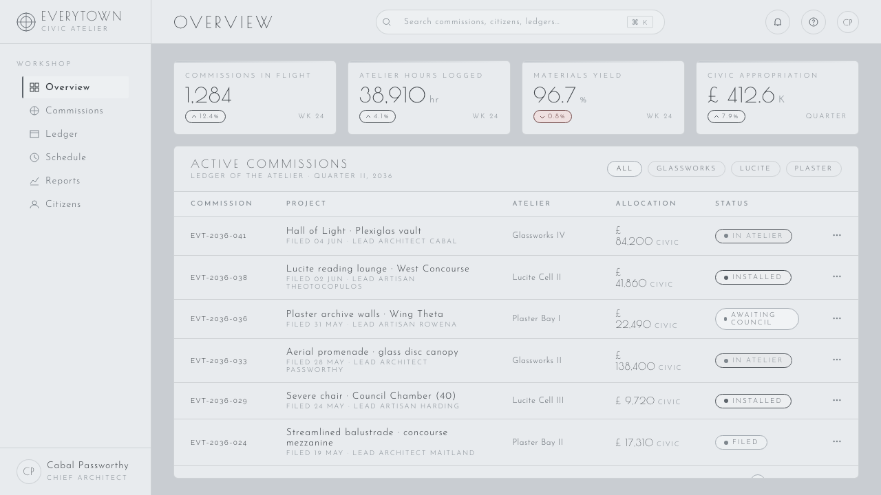
For web interfaces, this style suits dashboards, observability tools, planning systems, premium pricing pages, and product surfaces that benefit from calm authority. Give panels the feeling of glass and smooth plaster rather than opaque cards piled above a background. Navigation should be measured and typographic; controls should feel like parts of an instrument panel. Transparency is useful only when it preserves reading clarity and the impression of engineered order.
In editorial and marketing work, Things to Come is strongest when a subject can be framed as an idea about progress, systems, cities, science, or collective possibility. Use large quiet image areas, geometric caption zones, and headlines that feel architectural. The common mistake is confusing this language with generic dark sci-fi or lavish Art Deco. It needs neither darkness nor ornamental opulence: its identity depends on light silver-grey openness, streamlined restraint, and materials that appear clean enough to transmit light.
Things to Come (1936) — FAQ
Is Things to Come an Art Deco style?
It is related to Art Deco, but its most useful design classification is Art Moderne or Streamline Moderne. The closing sequence was praised as an Art Deco poem in silver and grey, yet the broader visual system is notably stripped down: smooth forms, transparency, pale luminosity, and almost no surface ornament. It takes Art Deco’s confidence in geometry and turns it toward a streamlined civic future.
Why is silver-grey more important than white?
The film’s materials include white plaster, but black-and-white cinematography makes the environment read as luminous silver-grey. That distinction prevents the style from becoming warm minimalism or blank clinical white. Silver-grey holds reflection, glass, depth, and cinematic atmosphere at once. It gives the design a cool future-facing character while leaving enough contrast for dark structural marks.
Can this style use a dark background?
A dark variant is possible, but it is not the central expression of the source material. Things to Come derives its identity from a future cast in light: white plaster, transparent materials, glass, and luminous silver-grey. If a dark field dominates, the design can quickly become generic science fiction and lose the spacious, inornate quality that makes the reference distinctive.
How should Poiret One be used?
Use it as a display face for titles, major labels, and moments that need architectural ceremony. Its geometric Art Moderne character is most effective when surrounded by open space and supported by quieter text. Using it everywhere weakens both readability and the sense of hierarchy. In this style, it should function like a designed landmark within the silver-grey environment.
Related design styles
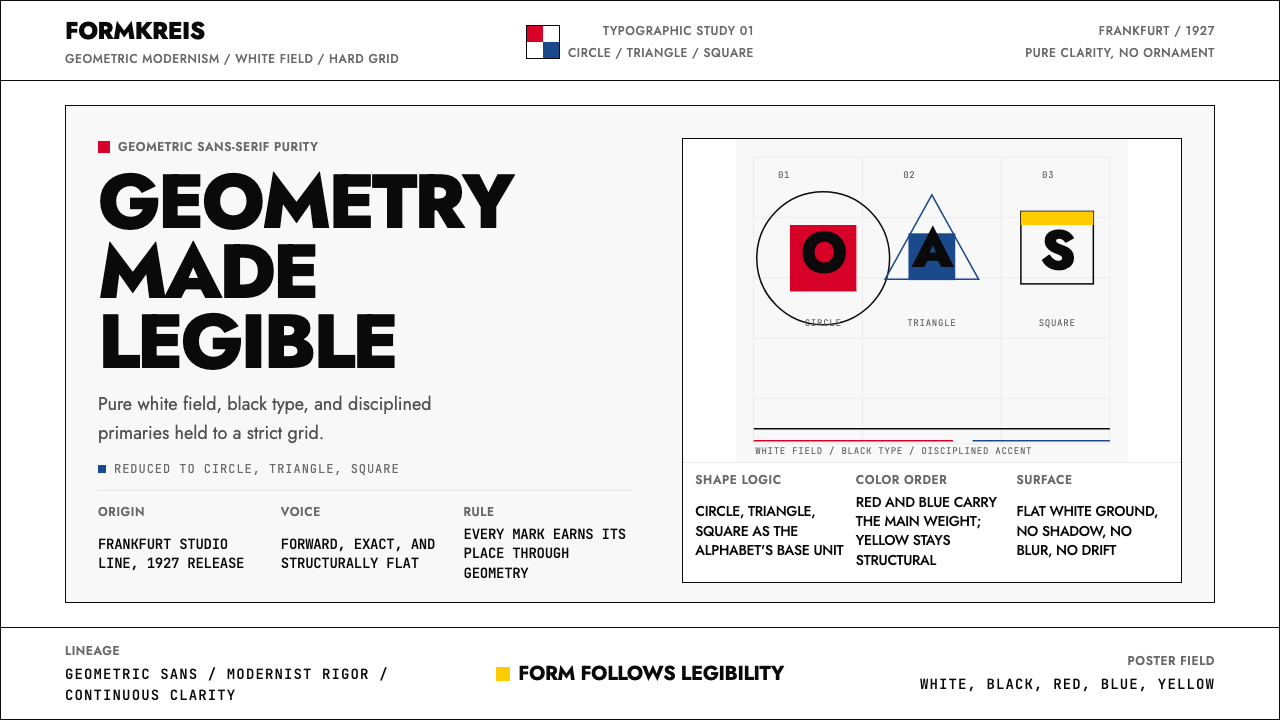 Futura Typeface (Renner, 1927)Geometry is legible. Black type and white fields, with red-blue-yellow anchor…
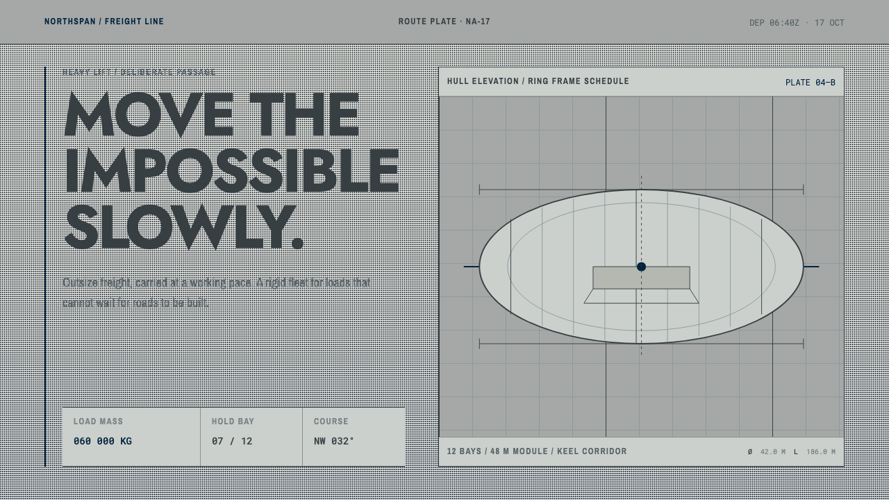 Hydrogen Airship FreightSlow freight is a capability. Matte aluminium grey, DIN grids, and a measured…
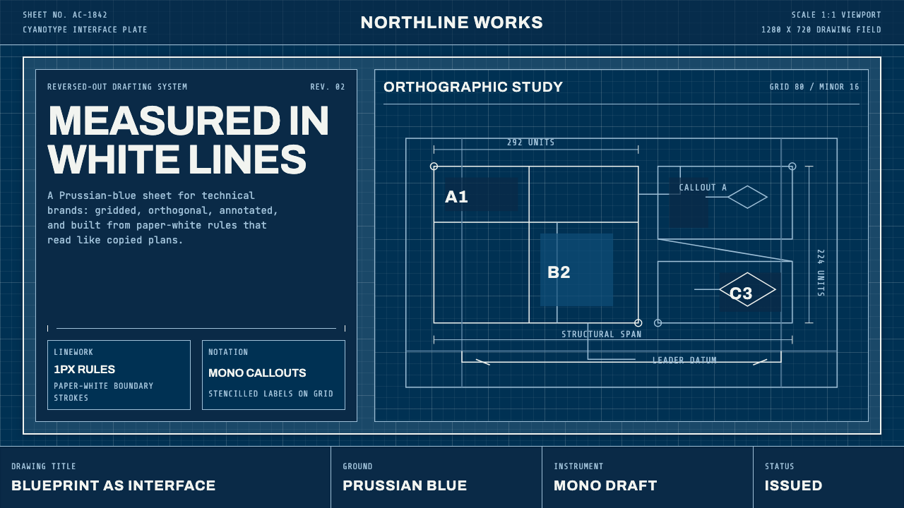 Architect CyanotypePrecision in negative. Prussian blue ground, paper-white grid, mono dimension…
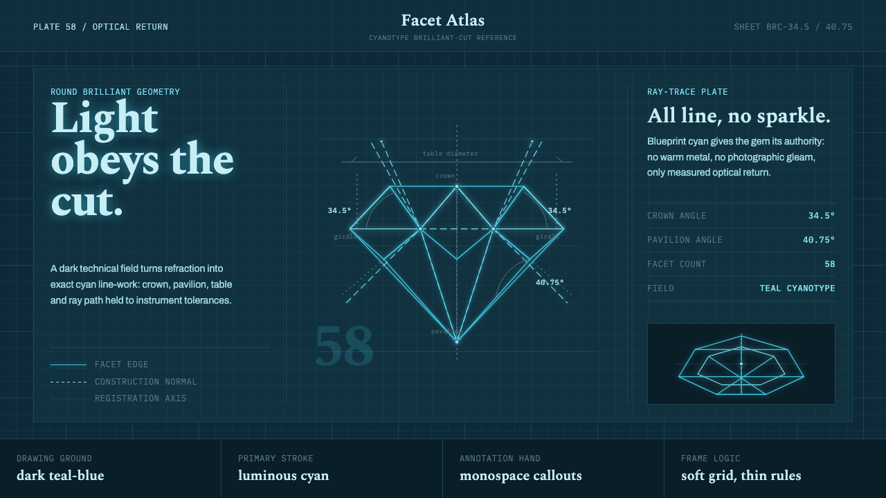 Brilliant Cut Facet DiagramOptics becomes blueprint. Cyan facet lines and ray paths glow on dark teal.
 Dessau GrayscaleAustere monochrome authority. Darkroom black, glazing gray, and a steel-windo…
 DIN 1451 SignageAuthorless and exact. Enamel gray grid, traffic-white DIN type, and RAL signa…