What is Tenet (2020 Inversion)?
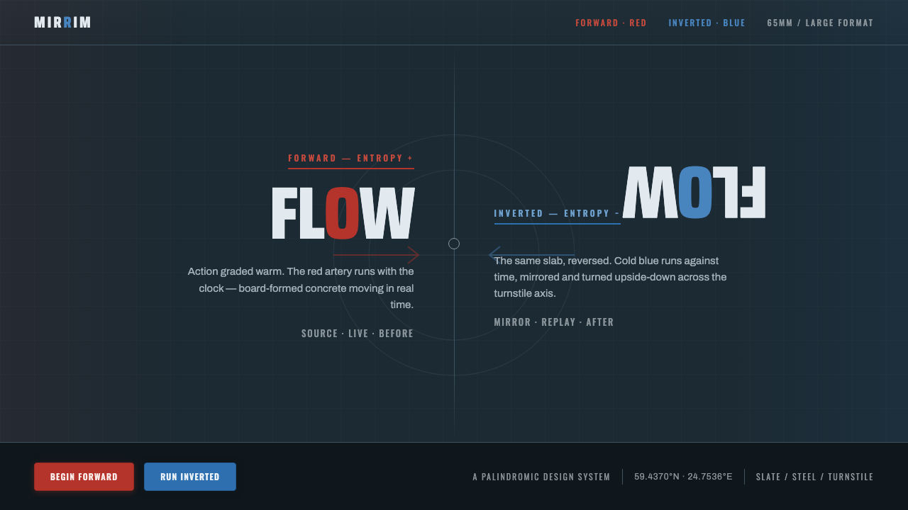
Time runs both ways: Tenet turns cold concrete, brushed steel, and a red-blue inversion into a visual system built around the pressure of symmetry.
Tenet (2020 Inversion) in brief
Tenet is Christopher Nolan’s 2020 espionage thriller, filmed by Hoyte van Hoytema across windswept European freeports and bunkers. Its visual language is built from cold, desaturated slate-blue concrete, brushed steel, and a severe industrial atmosphere. The world feels engineered rather than decorated: surfaces are heavy, spaces are exposed, and every visual decision suggests infrastructure under pressure.
The central idea is inversion. Red represents forward movement through time; blue represents inverted movement, running backward. These colors are not a general palette but a paired logic. They divide the same world into opposing states, like the two sides of a turnstile. The contrast is strongest when the colors remain disciplined, isolated, and structurally meaningful.
As an interface style, Tenet translates this cinematic logic into a dark slate-blue ground, steel-gray surfaces, bunker-slab geometry, and typography that can appear mirrored or palindromic. Components should feel capable of holding two conditions at once: forward and inverted, active and reversed, familiar and made strange by a change in direction.
Where does Tenet (2020 Inversion) come from?
The style belongs to the contemporary world of large-format IMAX blockbuster realism, but its emotional temperature is deliberately restrained. Instead of spectacle expressed through ornament or saturated fantasy, it builds intensity from scale, weather, mass, and material. Windswept European freeports and bunkers provide the environmental vocabulary: exposed infrastructure, hard surfaces, cold air, and spaces that feel designed for logistics rather than comfort.
Its industrial character also connects to Brutalist and infrastructural aesthetics. The reference is not historical Brutalism as a complete architectural doctrine, but the visual force of bunker slabs, concrete planes, steel assemblies, and monumental functional space. The result is a language of weight and containment. Geometry appears as construction: panels meet, surfaces divide, and axes organize movement.
The design system emerges by abstracting the film’s inversion mechanic into interface behavior. A turnstile becomes a compositional model: a central division, mirrored states, and a controlled exchange between red and blue. The system does not merely borrow the film’s dark atmosphere. It makes reversal legible through paired accents, reflected typographic structures, and components that can be read in forward or inverted modes.
What defines the Tenet (2020 Inversion) look?
Slate Atmosphere
The ground is dark, cold, and desaturated, closer to slate-blue concrete than pure black. This creates an environment of controlled visibility: surfaces recede, accents become consequential, and empty space feels pressurized rather than serene. Lightness should be reserved for steel-gray type, structural markings, and selective surfaces that need to emerge from the bunker-like field.
Red and Blue Inversion
Red and blue form a semantic pair rather than a decorative contrast. Red moves forward; blue runs inverted. Use them to distinguish states, directions, or opposing readings, and let the surrounding interface remain quiet. The strongest application is often one dominant accent with the other held in reserve, so inversion reads as an event instead of becoming ordinary color noise.
Bunker Geometry
Shapes should feel cut from slabs, panels, and structural planes. Rectangular fields, hard divisions, inset zones, and aligned seams create the impression of engineered mass. Corners are decisive and surfaces are broad. Geometry is not playful abstraction; it is the visible consequence of containment, construction, and controlled movement through space.
Mirrored Typography
Typography carries the inversion mechanic directly. Letterforms, labels, or headings may be reflected, split across an axis, or arranged so that their rhythm suggests a palindrome. The effect should remain legible and purposeful. Mirroring is most useful for paired states, directional controls, and moments where the interface needs to announce that its logic has turned.
Brushed Steel Hierarchy
Steel gray provides the middle register between the dark ground and the red-blue signal colors. It belongs to labels, secondary surfaces, separators, and operational information. Its character is cool and tactile without becoming glossy. Avoid turning every surface metallic; the suggestion of brushed steel works best when set against large areas of matte concrete darkness.
Axis and Tension
Composition is organized around an implied turnstile axis. A central seam, opposing margins, or mirrored blocks can establish the sense of two forces meeting and passing through one another. Balance comes from directional tension rather than symmetry alone. The layout should feel stable enough to operate, yet ready to rotate into another state.
Who shaped Tenet (2020 Inversion)?
Christopher Nolan is the director named in the source for Tenet. His film establishes the governing idea of inversion: time can move forward or backward, and visual form must make that opposition intelligible. For designers, his importance here is not a signature decoration but a structural premise that turns narrative reversal into a complete visual language.
Hoyte van Hoytema shot Tenet across windswept European freeports and bunkers, using large-format film and IMAX. The resulting reference is physical and spatial: cold air, desaturated concrete, brushed steel, and monumental environments carry as much meaning as the characters. His contribution defines the material atmosphere that this design system translates into interface surfaces.
Nathan Crowley is listed among the key figures associated with the source material. In this design reference, his name belongs to the production’s broader visual authorship: a world of industrial infrastructure, bunker geometry, and controlled spectacle. The useful lesson is that the style is built from coordinated systems of space, material, and motion rather than isolated graphic effects.
How do you use Tenet (2020 Inversion) today?
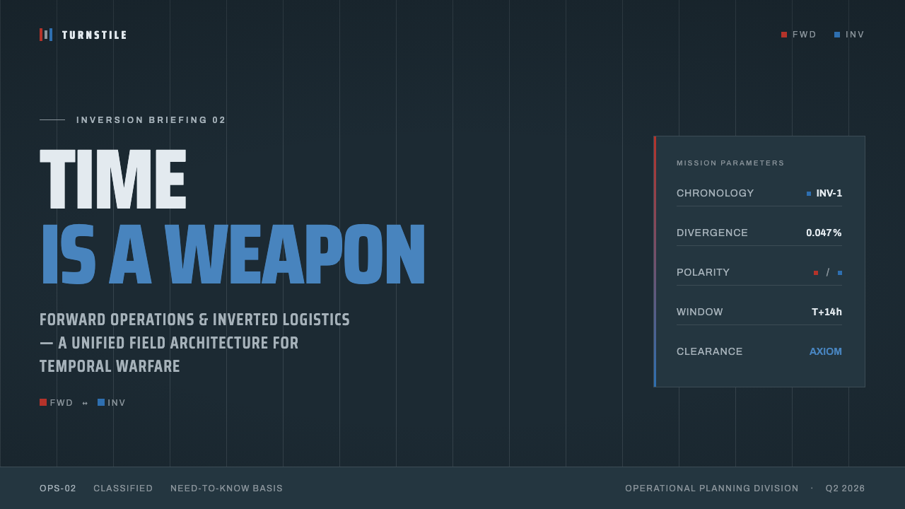
For presentation slides, use the Tenet system as a sequence of states. A cover can establish the dark slate-blue field, a severe title, and a single red or blue directional signal divided by an implied axis. Content slides should preserve that discipline: broad structural planes, steel-gray information, and clear transitions between forward and inverted sections. Data slides can use red and blue to distinguish opposing flows, but the chart structure should remain quiet and industrial.
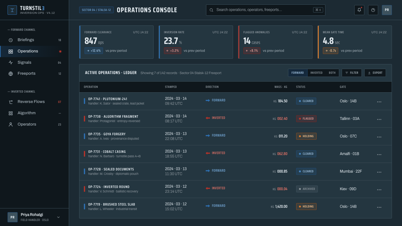
For web interfaces, the style suits dashboards, monitoring tools, operational workspaces, and pricing pages that need to communicate states clearly. Keep the environment dark and desaturated, use steel gray for durable hierarchy, and reserve red and blue for status, direction, or plan differentiation. Cards should feel like inset bunker panels, with hard boundaries and purposeful seams. A forward or inverted mode can become a meaningful interaction model rather than a cosmetic theme switch.
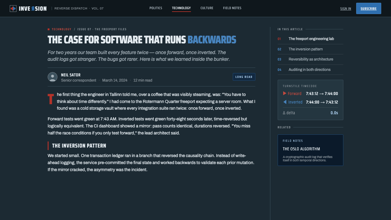
For editorial and marketing work, Tenet supports campaigns built around tension, duality, and transformation. Articles can place a strong central seam between argument and counterargument, or between an initial state and its reversal. Marketing pages can alternate red-forward and blue-inverted sections while retaining the same concrete ground and steel-gray typography. Imagery should feel exposed, weathered, infrastructural, and spatial rather than soft, decorative, or luxurious.
A common mistake is to treat the style as a generic dark interface with red and blue highlights scattered everywhere. That destroys the inversion logic. The accents need assigned meanings, the axis needs to be felt, and the industrial surfaces need room to remain quiet. Another mistake is overusing mirrored typography until reading becomes a puzzle. Reversal should clarify a change of state; if it only obstructs comprehension, it has become an effect without a function.
Tenet (2020 Inversion) — FAQ
Is Tenet best understood as a color palette or as a complete design system?
It is better understood as a complete system. The red-blue pair only works because it expresses forward and inverted movement. The dark slate-blue ground, brushed-steel hierarchy, bunker geometry, and mirrored typography all support that same idea. If the colors are removed from the logic of states and direction, the result becomes a generic dark interface rather than a Tenet-derived language.
Can the style work without mirrored typography?
Yes. Mirrored typography is one expression of inversion, not the entire identity of the style. A restrained interface can communicate the reference through the dark concrete atmosphere, red-blue state logic, steel-gray hierarchy, and turnstile-like composition. Use reflection selectively where reversal is important. For ordinary reading, clarity should remain stronger than the visual trick.
Does Tenet require a completely black interface?
No. The source describes a dark slate-blue ground, not a featureless black void. Slate-blue concrete gives the system more material presence and keeps the atmosphere cold without making every surface disappear. Black can appear as a deep structural note, but the broader field should suggest desaturated concrete and industrial space.
What products are a natural fit for this aesthetic?
It is a strong fit for interfaces concerned with operations, monitoring, logistics, security, transformation, or complex state changes. Dashboards and analytical tools can use the red-blue pair to make opposing conditions legible, while pricing pages can use forward and inverted modes to distinguish plans or pathways. It is less suitable when the product depends on softness, warmth, decorative richness, or an inviting domestic mood.
Related design styles
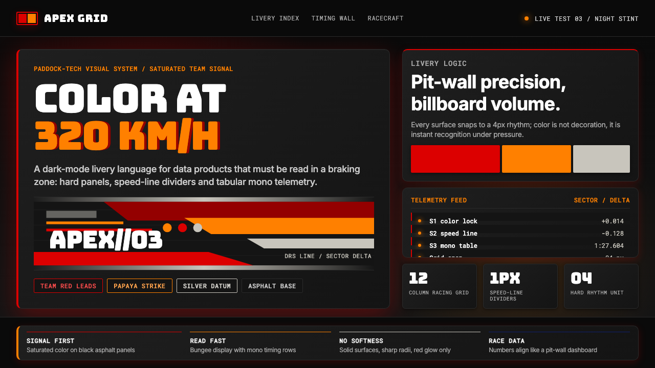 F1 Formula One LiverySpeed is legible. Ferrari red and papaya speed-lines cut through black teleme…
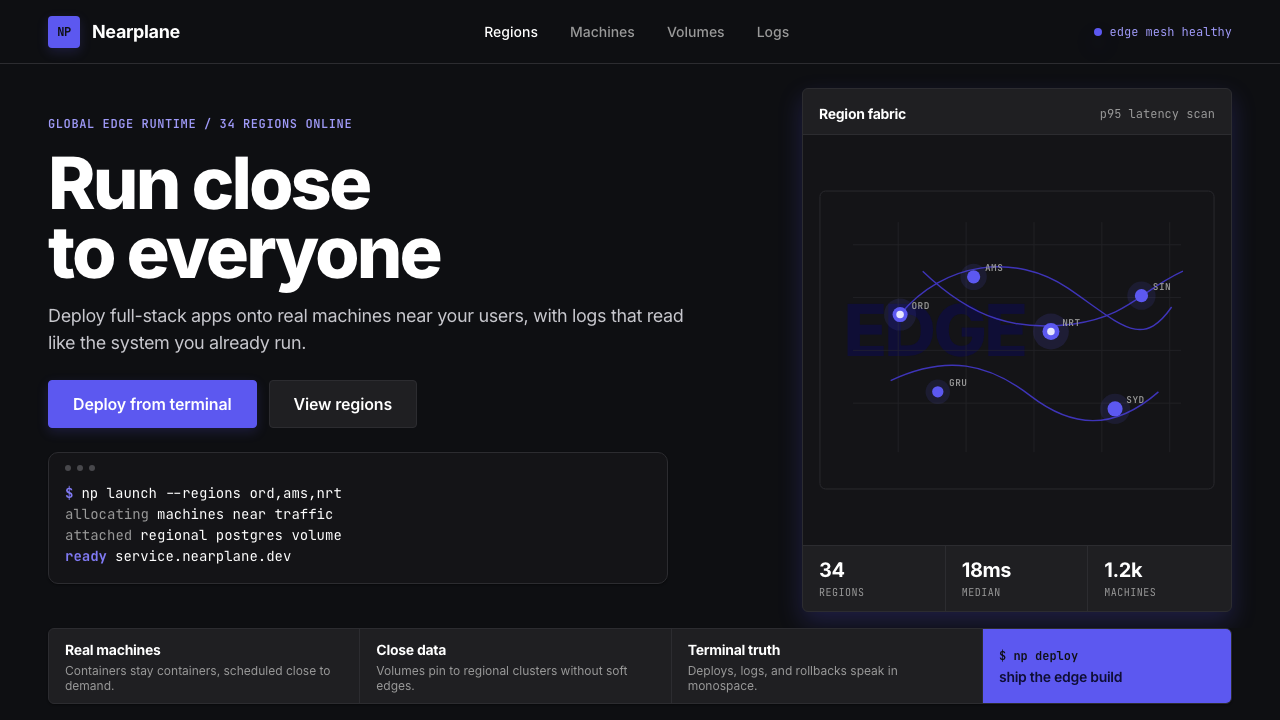 Fly.io Edge-Compute PurpleEdge-cloud with discipline. Electric purple nodes, Inter type, and terminal b…
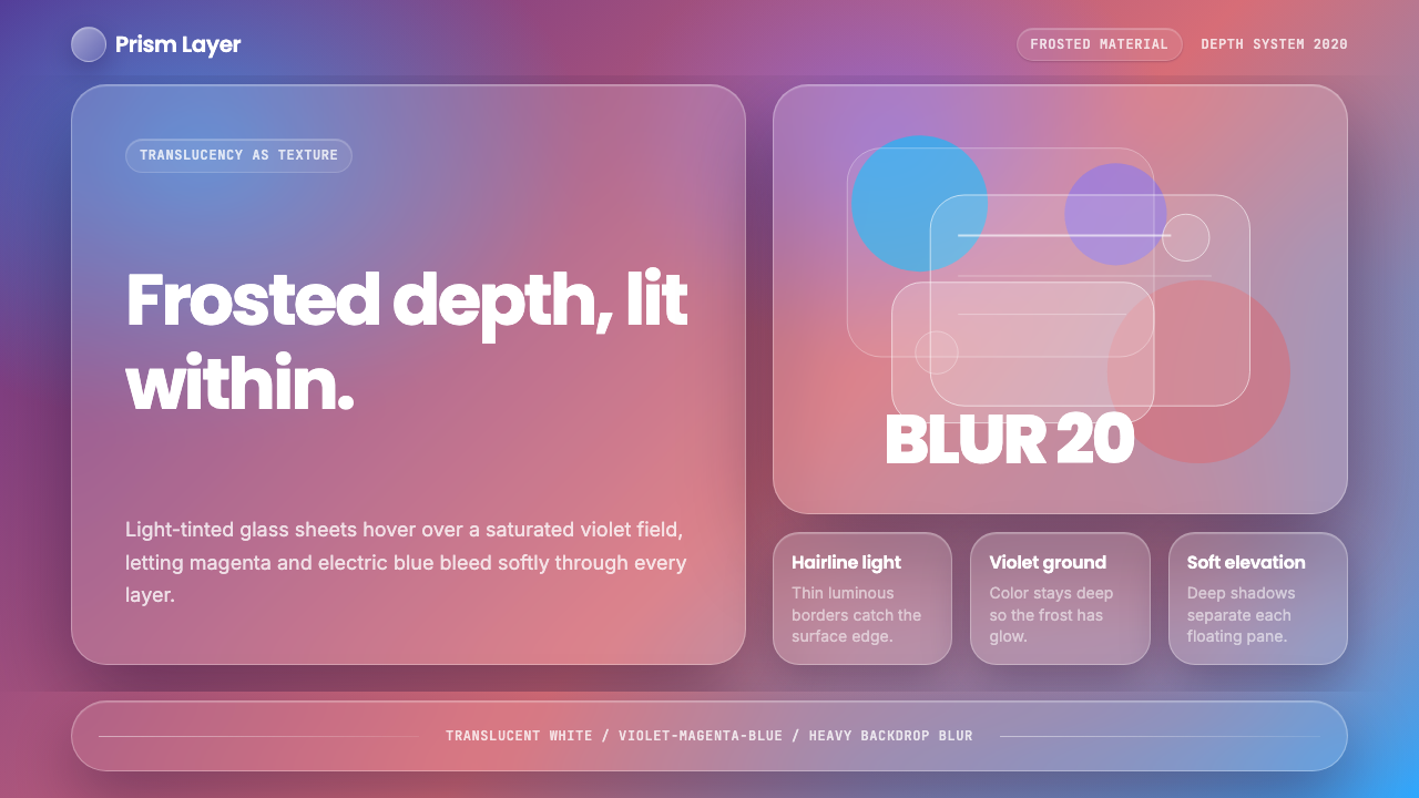 GlassmorphismDepth becomes the texture. White glass blurs violet, magenta, and electric bl…
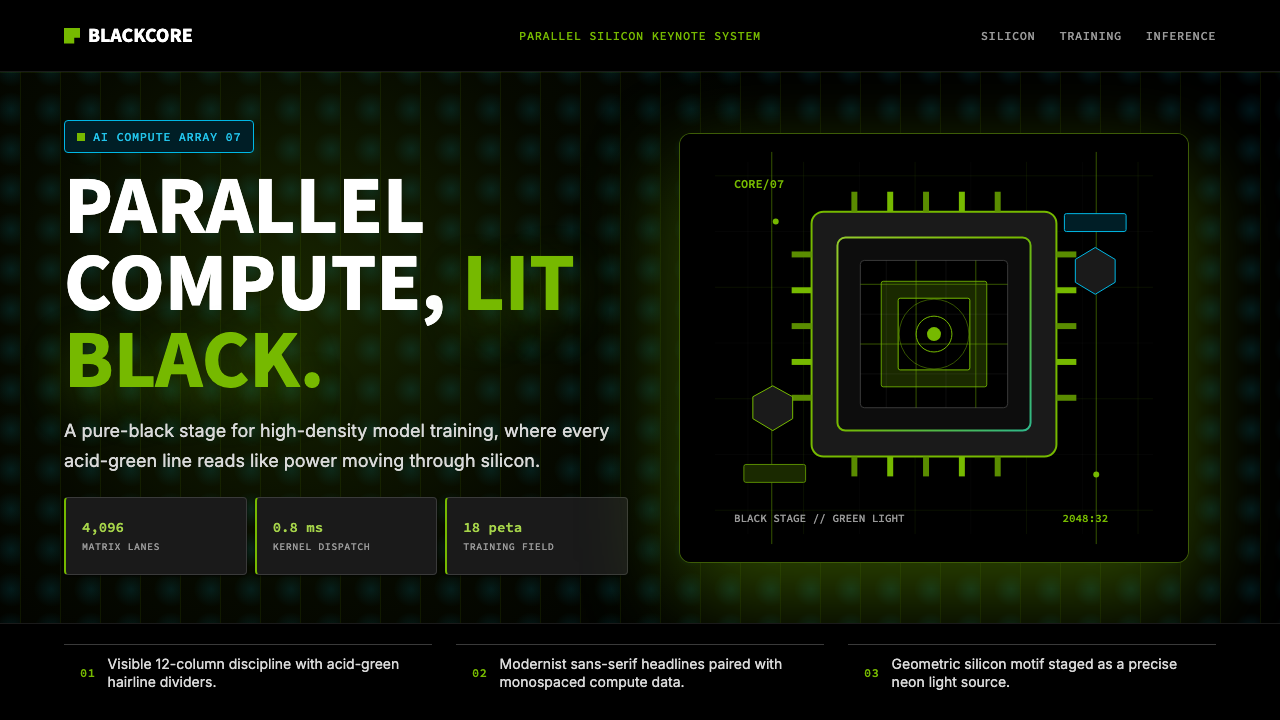 NVIDIA GPU Green-BlackPure black turns compute theatrical. Acid green hairlines and chip geometry s…
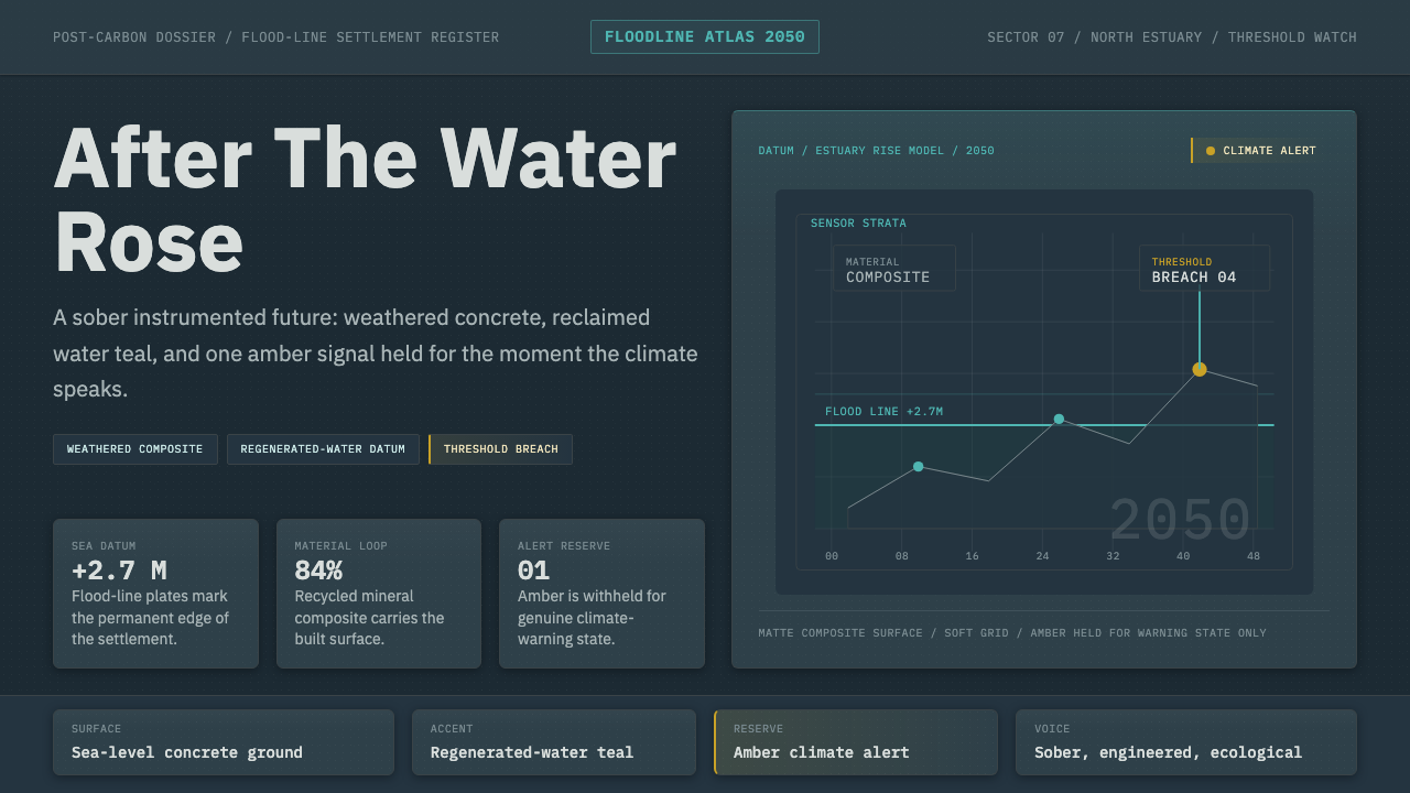 Cli-Fi 2050Pragmatic after the flood. Concrete blue-gray, muted teal, and one amber aler…
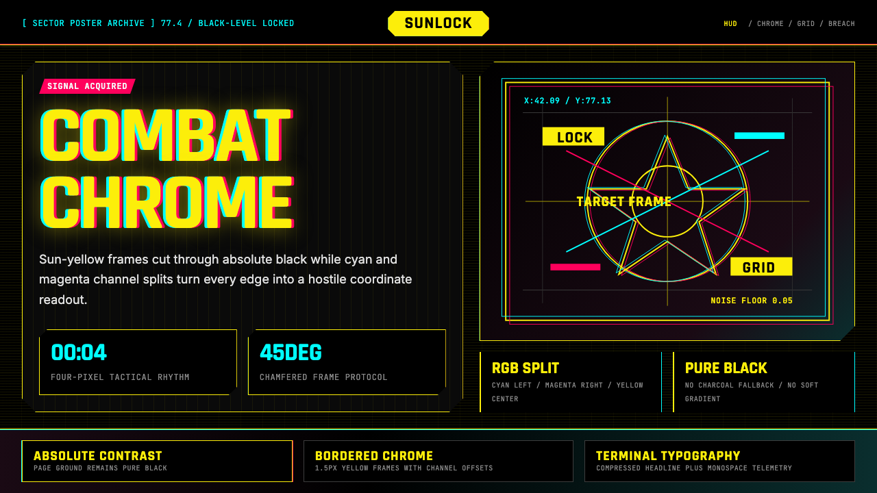 Cyberpunk 2077 Night City YellowCombat HUD on black. Sun-yellow chrome splits into magenta-cyan coordinate gr…