What is Glassmorphism?
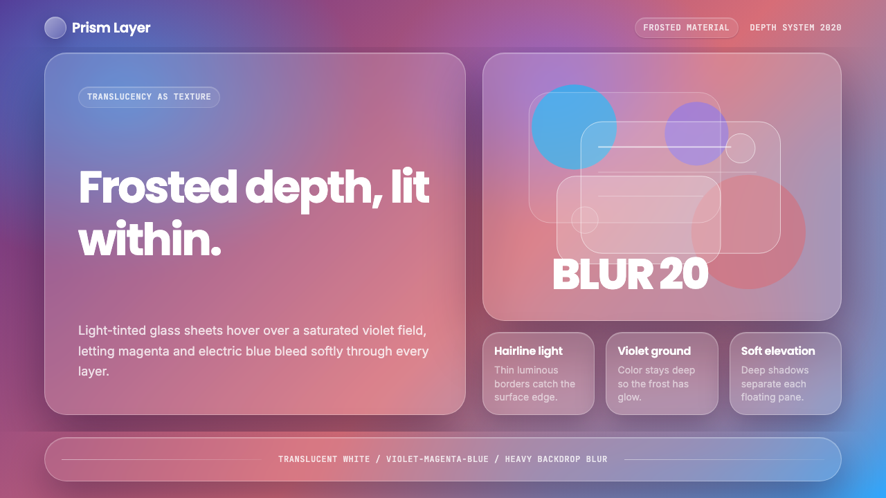
Glassmorphism turns depth into texture — pale translucent surfaces float over violet, magenta, and electric blue, making the interface itself feel illuminated.
Glassmorphism in brief
Glassmorphism is a digital interface style built around the appearance of frosted glass. Light-tinted translucent panels hover over a deeply colored background, while luminous edges clarify their boundaries and pronounced background blur transforms whatever lies beneath into a soft field of color. The result is neither flat nor conventionally three-dimensional: depth is communicated through transparency, overlap, and the changing visibility of the background.
Its recognizable palette begins with deep violet rather than white, cream, or neutral black. Saturated areas of magenta and electric blue move behind the translucent surfaces, giving the blur enough color to reveal itself. A panel placed over an empty or colorless ground merely looks pale; a panel placed over this vivid field looks like glass because traces of the underlying colors remain visible through the frost.
Glassmorphism belongs to a post-flat approach to interface depth. It does not restore realistic leather, metal, or other material imitations. Instead, it retains the simplicity of flat digital shapes while reintroducing spatial hierarchy through translucency. Panels seem to occupy different layers, borders catch imaginary light, and overlapping surfaces establish foreground and background without requiring heavy solid shadows.
Where does Glassmorphism come from?
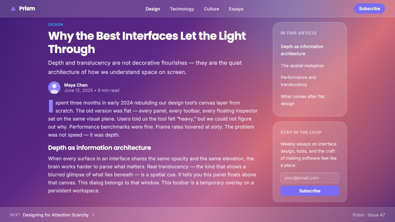
The term Glassmorphism was coined in 2020 by designer Michał Malewicz, alongside the arrival of macOS Big Sur. The name gave a clear identity to an interface treatment that combined pale translucent panels, frosted background color, luminous borders, and layered spatial organization. Its rapid circulation through the global design internet turned a recognizable system of depth into a named style.
The style did not emerge without precedent. Its roots lie in the translucent interface experiments of the 2010s, when digital products increasingly used blurred surfaces to preserve a sense of environmental context beneath menus and overlays. Glassmorphism intensified that idea. Rather than treating translucency as an occasional utility, it made frosted material the dominant visual language and gave the background an active role in every component.
macOS Big Sur popularized the approach by presenting translucency as part of a coherent interface environment. Panels and surrounding color were perceived together rather than as independent decorations. The glass needed a vivid scene behind it, and the violet, magenta, and electric-blue field needed the glass to soften and organize it. This mutual dependence distinguished the style from interfaces that simply lowered the opacity of isolated cards.
From 2020 onward, Glassmorphism spread globally through digital design culture as frosted-glass UI, neo-translucency, and post-flat depth. These descriptions emphasize different aspects of the same development: the material impression of frost, the renewed use of transparency, and the return of spatial layering after flat design. Its historical significance lies less in inventing translucency than in turning translucency into a complete and immediately recognizable system.
What defines the Glassmorphism look?
Translucent Surfaces
The central element is a light-tinted panel that reveals color without revealing detail. It must feel translucent rather than merely faint: enough of the background survives to connect the surface with its environment, but enough is obscured to separate foreground content. This tension between visibility and concealment produces the impression of frosted glass.
Saturated Ground
Deep violet forms the ground, with vivid magenta and electric blue providing the color events that appear through the glass. The background is not passive scenery. Its saturation determines whether the translucent layer feels luminous and dimensional. Neutral black, white, and cream remove the chromatic material that the frost is meant to transform.
Backdrop Blur
Blur acts on the scene behind a surface, turning distinct colored forms into atmospheric light. It should erase distracting detail while preserving broad differences between violet, magenta, and blue. If the underlying forms remain sharply legible, the panel appears transparent rather than frosted; if all color disappears, it appears opaque.
Luminous Edges
Thin, pale borders catch the eye like light grazing the edge of glass. Their role is structural as well as atmospheric: translucent surfaces can otherwise dissolve into similarly bright surroundings. The border should clarify the plane without becoming a heavy frame, allowing the interior blur and the surrounding color field to remain dominant.
Layered Depth
Depth is created by placing translucent planes over colored forms and, where necessary, over one another. Each overlap implies a different distance from the background. The hierarchy should remain easy to read: the ground carries color, glass organizes space, and solid content occupies the clearest foreground layer.
Inner Illumination
Glassmorphic surfaces appear lit from within because blurred color spreads beneath their pale skins while the edges remain bright. This illumination is an optical consequence of layering, not a separate decorative glow. When every object receives an unrelated halo, the scene loses material coherence and becomes a collection of luminous effects.
Who shaped Glassmorphism?
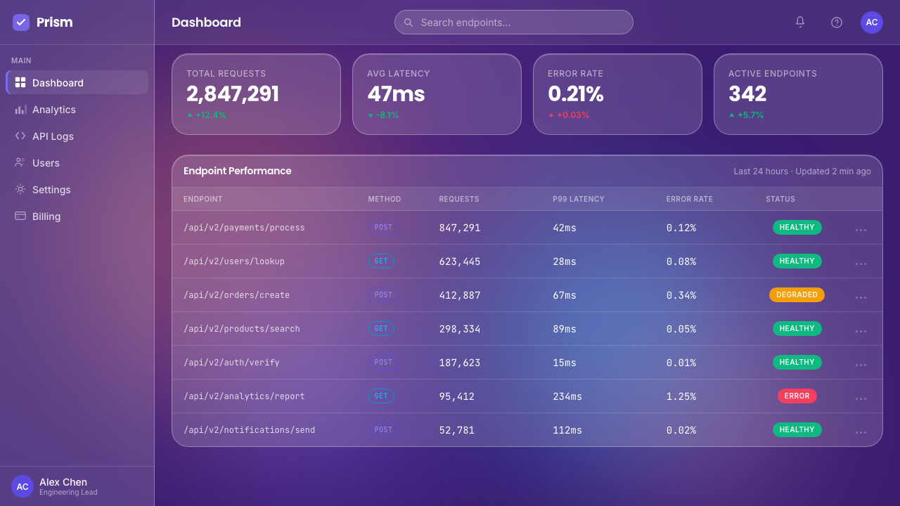
Malewicz coined the term Glassmorphism in 2020, giving a concise name to the emerging combination of frosted translucency, luminous borders, saturated backgrounds, and layered interface depth. The act of naming helped designers discuss the treatment as a coherent visual system rather than as a loose collection of blur and transparency effects.
Apple popularized the style through macOS Big Sur, bringing translucent surfaces and color-rich spatial layering into a widely visible interface environment. Its contribution was not the isolated use of blur, whose roots extend into the previous decade, but the presentation of translucency as a consistent language connecting panels, backgrounds, and hierarchy.
The macOS Big Sur team provided the prominent product context alongside which Glassmorphism was named in 2020. By coordinating frosted surfaces with the surrounding interface rather than treating them as occasional overlays, the team demonstrated how neo-translucency could operate at the scale of an entire digital environment.
How do you use Glassmorphism today?
For presentation covers, Glassmorphism works best when the title occupies one decisive translucent plane above a deep violet field. Magenta and electric-blue forms should sit partly behind that plane so their blurred color establishes depth without interfering with the words. A restrained luminous edge can define the cover object, while smaller metadata remains quieter and more solid.
Content slides should use fewer glass layers than the cover. One primary panel can hold the argument, with a secondary translucent area reserved for evidence, quotations, or supporting context. Data slides benefit from solid, clearly distinguishable marks placed above the glass; charts should not become translucent merely to match the theme, because the visual hierarchy depends on crisp information occupying the foremost layer.
For web dashboards and pricing interfaces, glass panels can separate modules while preserving awareness of the shared color environment. Important controls, labels, and numerical information should remain clear and solid inside them. Pricing tiers may be differentiated by their position over magenta or electric-blue regions, but the background color must not overpower comparison. The most important action should be clearer than the surrounding frost.
Editorial and marketing layouts can use Glassmorphism to frame introductions, feature summaries, product claims, and calls to action. Long reading passages are better placed on calmer surfaces, while the richest translucent effects belong around shorter statements and visual transitions. Marketing pages gain atmosphere when broad violet fields connect sections and the magenta-blue forms recur behind selected panels rather than behind every paragraph.
The most common mistake is confusing transparency with Glassmorphism. Simply making every card pale and see-through produces weak contrast and no convincing material logic. Effective use requires a saturated background worth blurring, clear separation between spatial layers, restrained luminous borders, and a foreground that remains readable. Too many overlapping panels turn deliberate depth into haze; too little background color leaves the glass visually empty.
Glassmorphism — FAQ
Is Glassmorphism simply transparency?
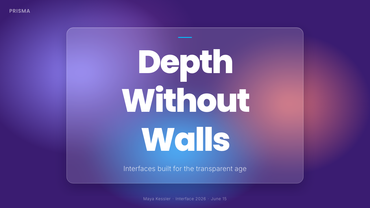
No. Transparency allows the background to remain visible, but Glassmorphism transforms that background through frost-like blur, light tinting, luminous boundaries, and deliberate layering. A transparent card can appear like a sheet of colored plastic. A glassmorphic panel appears to occupy space because the scene beneath it becomes softened while its edge remains perceptible.
Why does Glassmorphism need a colorful background?
The background supplies the visual material that the glass transforms. Deep violet establishes the field, while magenta and electric blue create recognizable changes beneath the panel. Without saturated color, blur has little to reveal: the surface may still be translucent, but it will lack the inner illumination and layered chromatic depth that define the style.
Can Glassmorphism be used on a light or neutral background?
A translucent treatment can be placed there, but it moves away from the pre-approved Glassmorphism language described here. This system depends on a deep violet ground and vivid magenta-blue forms. White, cream, and neutral black deprive the frost of chromatic depth, making the panels appear washed out, opaque, or merely transparent rather than internally lit.
How many glass layers should appear in one composition?
There is no fixed count, but every layer must communicate a distinct spatial or informational role. A background color field, one dominant glass plane, and a limited secondary overlay are often sufficient to establish the effect. Repetition without hierarchy weakens orientation: when every component floats at a different depth, none of them feels decisively foregrounded.
Where does Glassmorphism work poorly?
It struggles when dense information must compete with an active background, or when many overlapping panels obscure rather than organize content. The style is strongest where a small number of surfaces can establish clear hierarchy. Dashboards, pricing comparisons, slides, and marketing sections can use it effectively, but long text and detailed data require calmer planes and more solid foreground treatment.
Related design styles
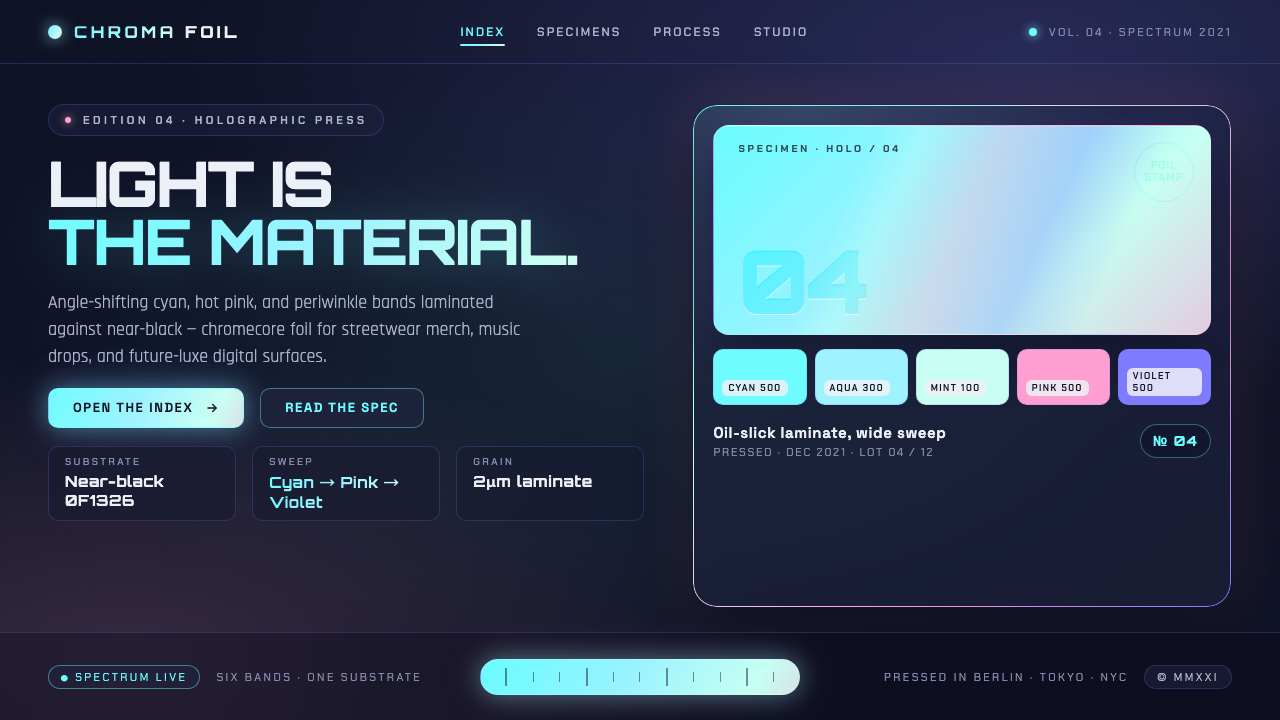 Holographic IridescentLight as material. Cyan-pink-violet foil sweeps anchored against near-black,…
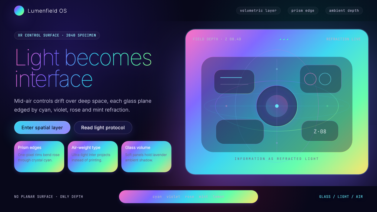 Holographic UI 2040Information made of light. Deep-space black, ultra-light Inter and prismatic…
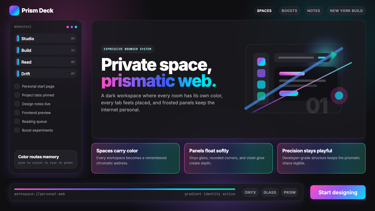 Arc Browser Prismatic (2023)Color is architecture. Pink-violet-cyan ribbons glow over onyx glass and roun…
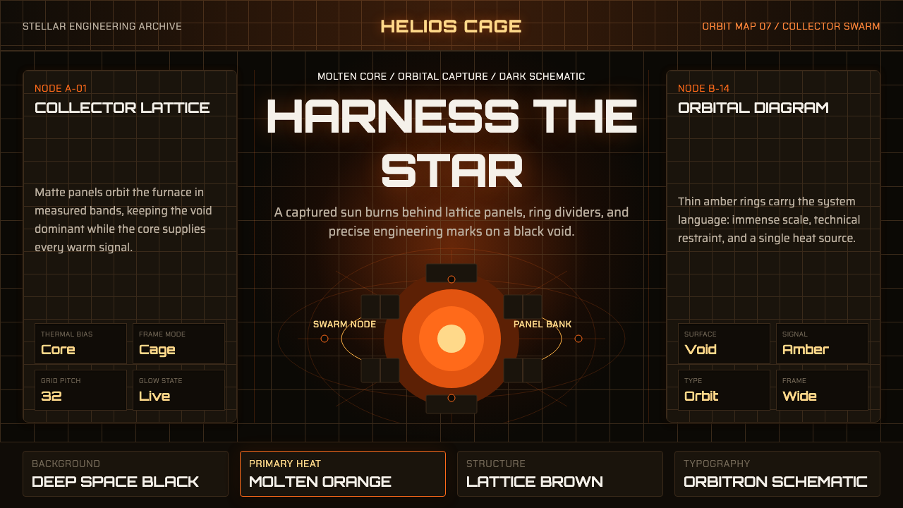 Dyson Sphere MegastructureCold void, captive heat. Molten orange core caged by brown lattice and orbita…
 Fly.io Edge-Compute PurpleEdge-cloud with discipline. Electric purple nodes, Inter type, and terminal b…
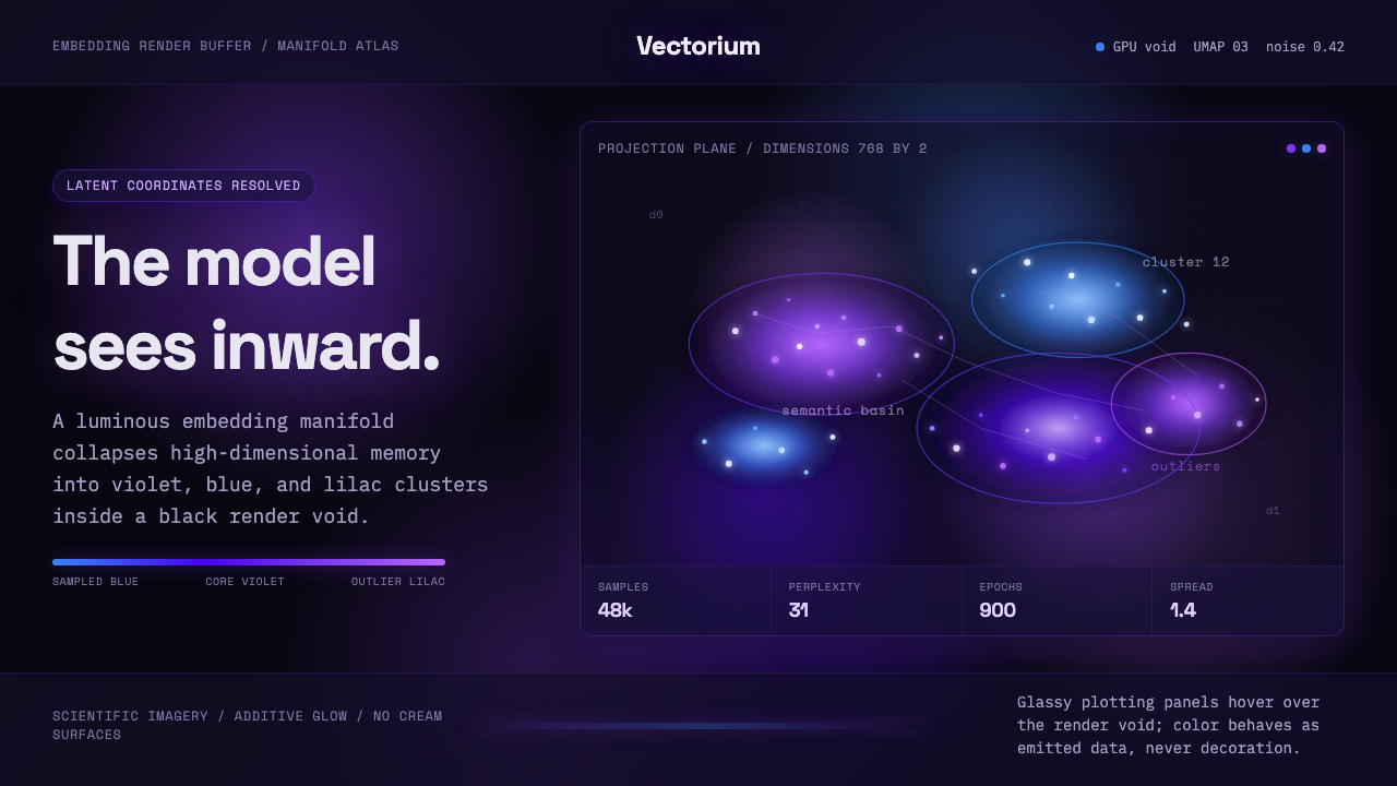 Latent SpaceSees the model from inside. Violet-blue point clouds glow on a black GPU void.