What is Holographic Iridescent?
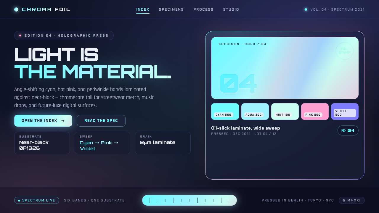
Holographic Iridescent turns light into a synthetic surface — cyan, pink, and violet slipping across near-black like oil shimmering on wet cement.
Holographic Iridescent in brief
Holographic Iridescent is a contemporary visual style built around the appearance of holo-foil: a thin, reflective laminate that separates incoming light into shifting bands of cyan, pink, violet, and occasional mint. These colors do not read as a conventional painted rainbow. They appear to travel across the surface, changing in emphasis as though the viewer, object, or light source had moved.
The dark substrate is as important as the iridescence. Near-black and deep navy grounds give the luminous bands somewhere to recede, flare, and regain depth. Without that darkness, the palette can collapse into an ordinary pastel gradient. With it, the color feels embedded in a material surface, like an oil slick spreading over black cement or metallic foil turning beneath a narrow beam of light.
Its emotional register is future-luxe rather than playful rainbow optimism. Grain, uneven luminosity, and broad directional sweeps prevent the surface from feeling sterile. The result is synthetic but tactile: polished enough for premium packaging, atmospheric enough for digital branding, and unmistakably shaped by internet-native gradient culture.
Where does Holographic Iridescent come from?
Holographic Iridescent does not descend from a single school, manifesto, or named designer. It emerged globally at the intersection of brand packaging, foil printing, and web-based gradient design. Its physical reference was oil-slick foil laminate: a manufactured surface whose color changes with light and viewing angle. Packaging and identity studios translated that optical event into a sign of novelty, premium finish, and synthetic precision.
Holographic-vinyl print houses and foil-stamp brand studios established the material vocabulary. Their work made iridescence reproducible across labels, wrappers, boxes, and branded surfaces. The attraction was not merely multicolor decoration. Foil made light itself participate in the identity: an otherwise dark object could appear restrained from one direction and suddenly release cyan, pink, or violet as it turned.
Digital studios then detached the effect from literal foil. Gradient-forward brand systems recreated its moving bands through layered color, luminous sweeps, and controlled grain. On screens, the style could imply a reflective laminate without reproducing one exactly. This translation aligned naturally with internet-native visual culture, where gradients could behave as atmosphere, interface hierarchy, and brand signature at the same time.
The broader holographic and holo-foil culture crested from roughly 2018 to 2021, alongside Y2K revival and chromecore aesthetics. Yet Holographic Iridescent remained distinct from generic chrome or rainbow treatments because it preserved the relationship between luminous color and dark substrate. Its lasting contribution is that relationship: not color floating freely, but colored light appearing to inhabit a deep synthetic material.
What defines the Holographic Iridescent look?
Color
Cyan usually leads, while pink, violet, and mint appear as neighboring flashes rather than equal stripes. The transitions should feel optical and angle-dependent, with some hues widening as others narrow or disappear. A complete, evenly distributed rainbow weakens the effect by making it decorative instead of material.
Dark Substrate
Near-black and deep navy form the visual anchor. They are not empty backgrounds but the apparent base material beneath the foil, preserving shadow between luminous passages and preventing every area from competing at equal intensity. Darkness gives the shimmer weight, mystery, and premium restraint.
Light as Material
The defining illusion is that color belongs to reflected light rather than pigment. Broad sweeps should seem attached to a surface, bending or thinning as that surface changes direction. Highlights feel embedded, not placed on top as decorative glow, and the strongest passages suggest a laminate catching light.
Directional Flow
Iridescence moves in elongated bands, folds, or sweeping arcs. The composition benefits from a clear direction of travel rather than color radiating uniformly from the center. This directional logic creates the impression of a sheet turning in space or an oil film being pulled across a dark plane.
Grain and Imperfection
Fine grain and slight irregularity keep the surface from reading as a generic digital gradient. Texture may resemble printed foil, compressed light, or the uneven edge of oil on cement. It should enrich the material impression without becoming coarse noise that obscures typography or structure.
Typography
Typography works best as a stable counterforce to the moving surface: clean, direct, and highly legible against dark fields. Pale neutral lettering can carry most information, while iridescent color is reserved for selected titles or emphasis. Elaborate display effects compete with the foil and quickly make the composition feel overstated.
Who shaped Holographic Iridescent?
Holographic-vinyl print houses are key collective makers behind the style's physical language. By producing angle-responsive films and printed surfaces for labels, packaging, and branded applications, they turned shifting cyan, pink, and violet into a repeatable commercial material rather than a singular optical accident.
Foil-stamp brand studios established iridescence as a marker of premium identity. Their contribution was compositional as well as technical: they learned to place reflective areas against restrained dark grounds, allowing a small change in angle to transform an otherwise quiet package into an event of colored light.
Gradient-forward digital brand studios translated the foil effect into screen-native imagery. Through layered sweeps, controlled luminosity, and grain, they preserved the sense of angle-shifting material without requiring physical reflection. This work helped the aesthetic crest within internet branding around 2021.
How do you use Holographic Iridescent today?
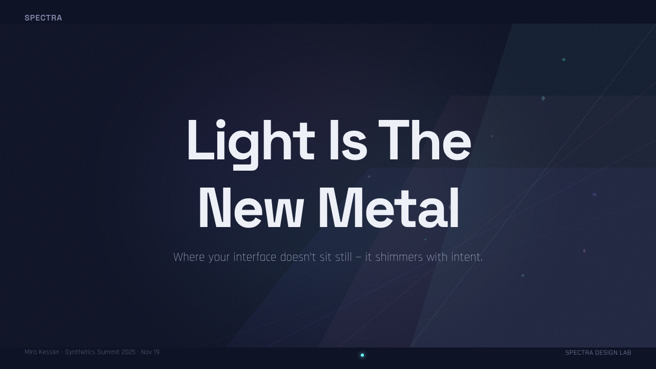
For presentation covers, use darkness as the field and let one broad iridescent sweep establish the visual identity. The title should sit in a calmer area with strong contrast, not directly over the busiest color transition. Content slides require greater restraint: keep most surfaces dark and neutral, use stable typographic hierarchy, and introduce small foil-like bands as section markers or emphasis.
Data slides should preserve analytical clarity. Charts can use cyan, pink, and violet to distinguish categories, but the colors should not all glow with equal force. Lead with one luminous hue, soften supporting series, and keep labels neutral. A restrained shimmer behind a key figure can create focus; placing active gradients inside every mark makes comparison difficult.
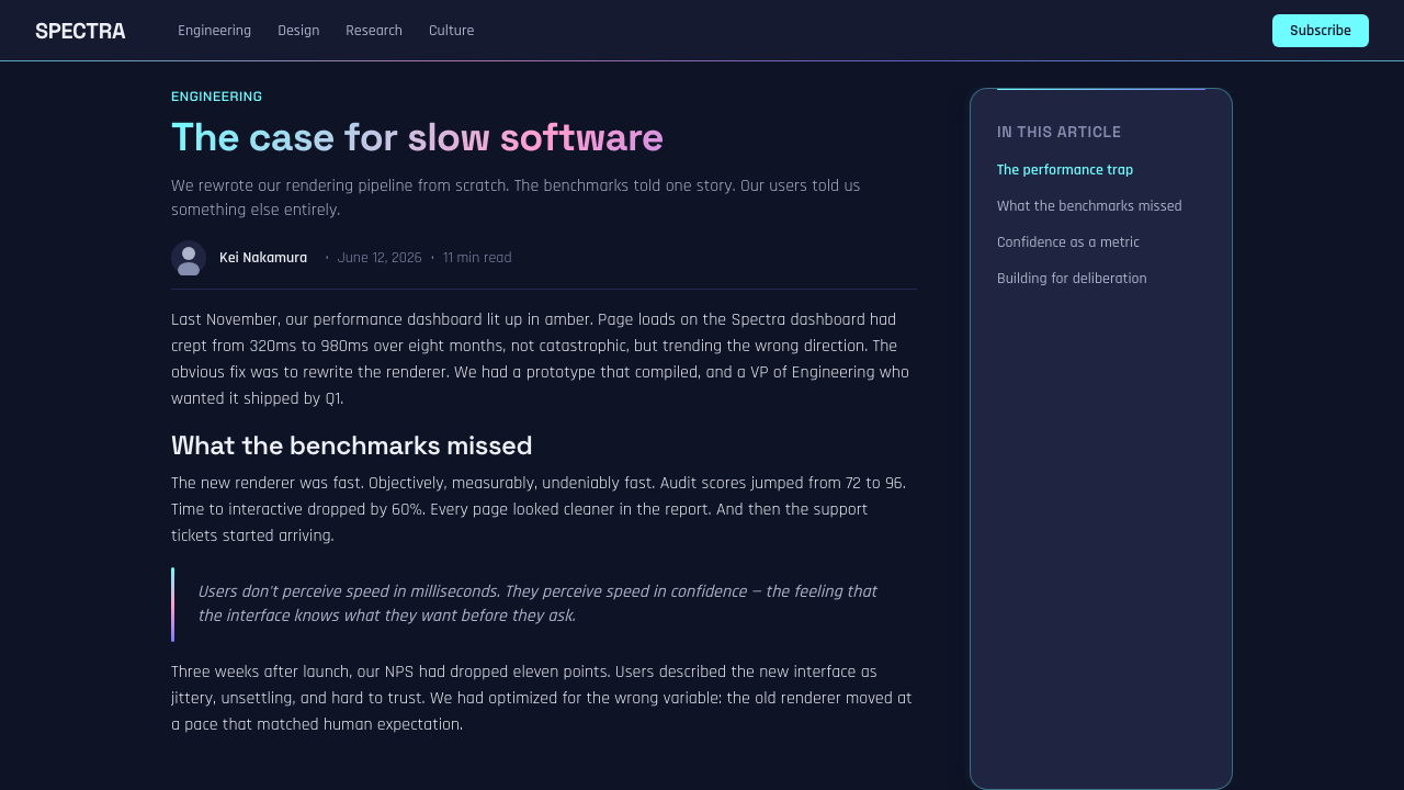
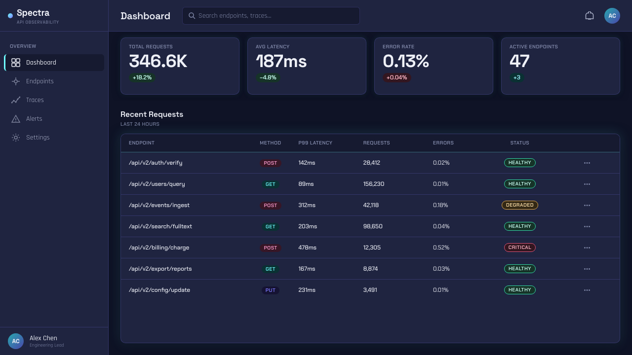
For web interfaces, the style suits dashboards, pricing pages, and premium product experiences when the iridescence is assigned a role. It can identify the selected plan, frame an important metric, or mark a primary action while near-black panels support scanning. Inputs, tables, and long text areas should remain comparatively quiet so that the luminous material behaves as hierarchy rather than wallpaper.
Editorial and marketing layouts can use full-bleed foil imagery as an opening atmosphere, then transition into dark, readable sections. Product stories benefit from close crops that show grain and shifting bands; campaign pages can alternate concentrated iridescent moments with generous black intervals. This rhythm preserves suspense and makes each return of color feel deliberate.
The most common mistake is treating Holographic Iridescent as a license for unrestricted rainbow gradients. When every panel, heading, border, and control carries the full spectrum, the illusion of reflective material disappears. Keep the dark substrate visible, let cyan lead, allow pink and violet to pass through selectively, and reserve the brightest sweep for the place that deserves attention.
Holographic Iridescent — FAQ
Is Holographic Iridescent simply another name for a rainbow gradient?
No. A rainbow gradient is primarily an arrangement of hues, while Holographic Iridescent imitates a material response to light. Its colors shift in directional bands, change in apparent width and intensity, and remain anchored to a dark substrate. The goal is not to display every hue but to suggest reflective foil turning in space.
Why is a near-black background so important?
The dark ground creates the depth that makes the shimmer believable. It separates luminous passages, gives weaker colors somewhere to recede, and keeps the surface from becoming uniformly bright. Against a pale ground, the same cyan, pink, and violet can resemble a soft digital gradient rather than oil-slick foil.
How is the style related to Y2K revival and chromecore?
They share an attraction to synthetic surfaces, technological nostalgia, and conspicuous digital finish. Holographic Iridescent participated in that broader culture as it crested from roughly 2018 to 2021. Its distinctive feature, however, is not chrome alone: it is the combination of angle-shifting cyan, pink, and violet with a deep dark base.
Can the style remain effective without real holographic foil?
Yes. Digital work can imply the material through directional color bands, uneven luminosity, restrained grain, and a clearly visible dark substrate. Exact physical simulation is unnecessary. What matters is preserving the logic of reflected light: color should appear to emerge from a surface and shift across it, not sit above it as a generic glow.
Where does Holographic Iridescent work poorly?
It struggles when large amounts of information must compete with an equally active background, or when a brand requires natural warmth and material simplicity. The style communicates synthetic luxury and technological spectacle. If applied without restraint to dense tables, long reading passages, or every interface control, its shimmer becomes visual noise and its premium character turns theatrical.
Related design styles
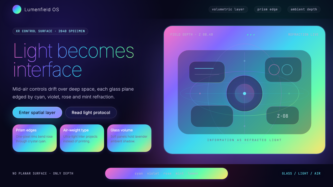 Holographic UI 2040Information made of light. Deep-space black, ultra-light Inter and prismatic…
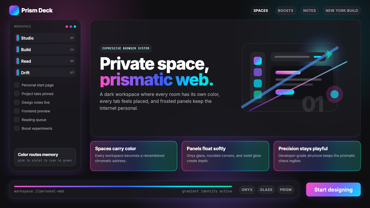 Arc Browser Prismatic (2023)Color is architecture. Pink-violet-cyan ribbons glow over onyx glass and roun…
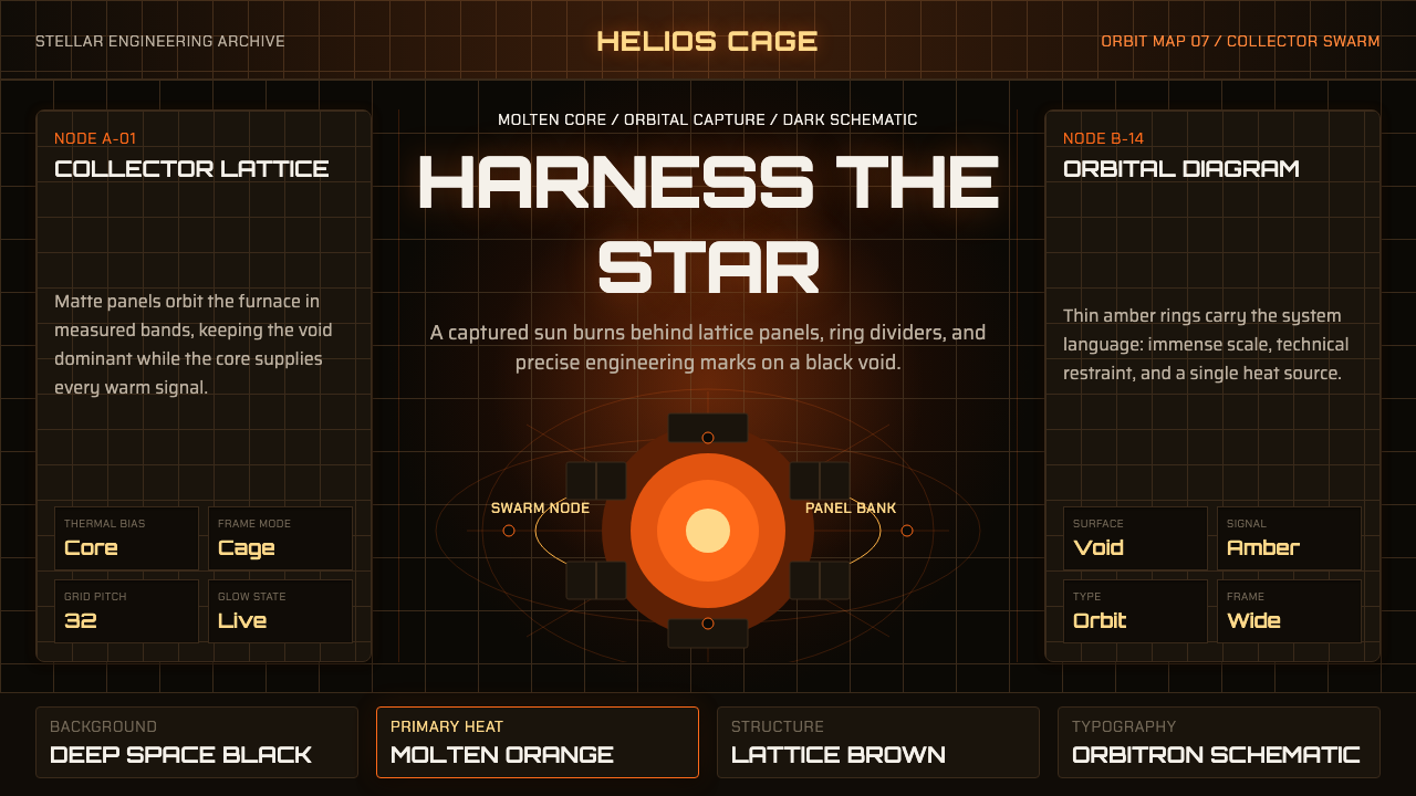 Dyson Sphere MegastructureCold void, captive heat. Molten orange core caged by brown lattice and orbita…
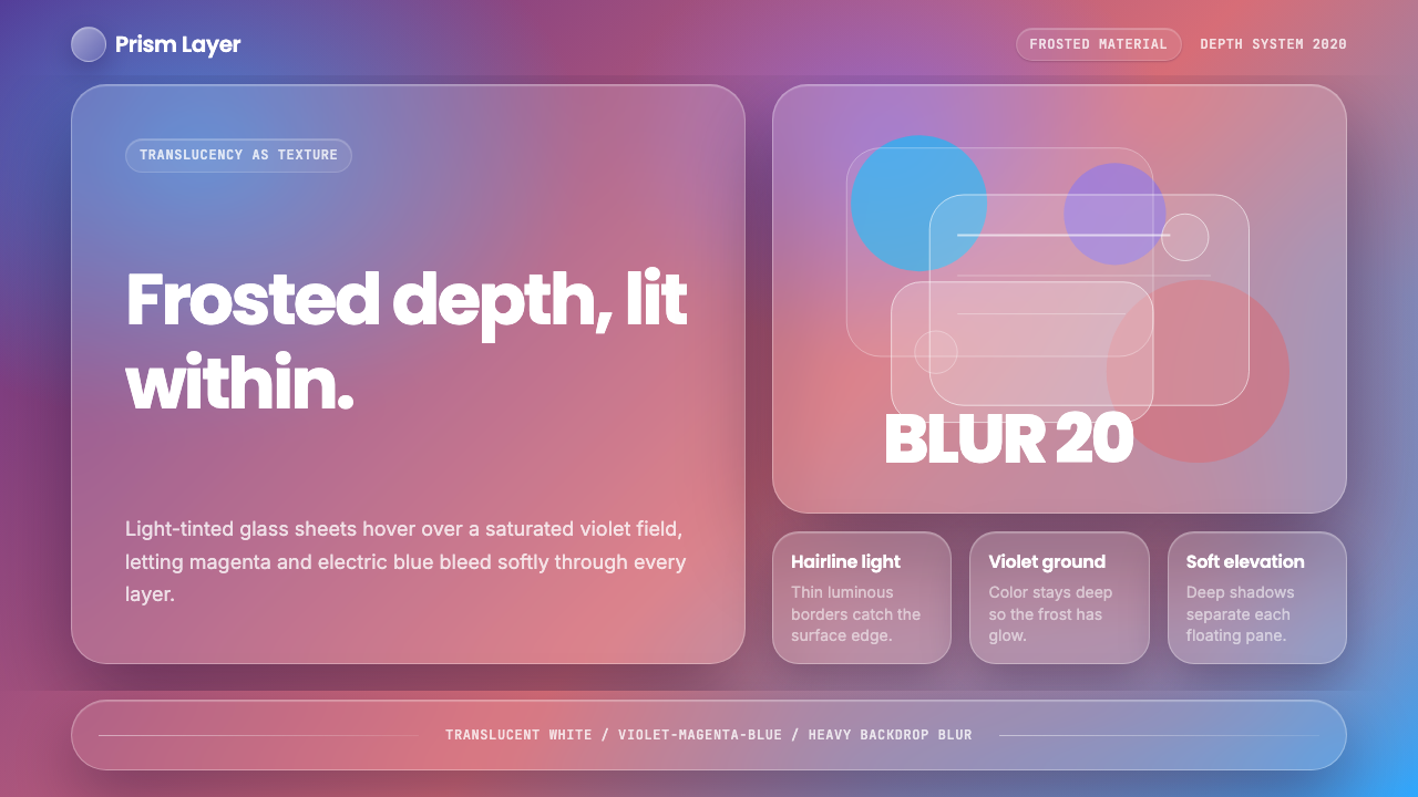 GlassmorphismDepth becomes the texture. White glass blurs violet, magenta, and electric bl…
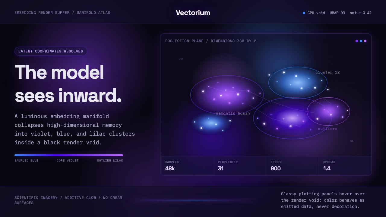 Latent SpaceSees the model from inside. Violet-blue point clouds glow on a black GPU void.
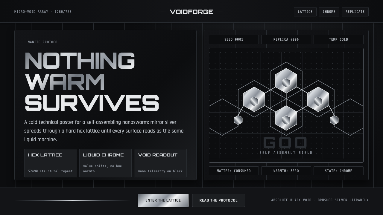 Nanopunk Grey GooColdness self-replicates. Chrome gradients and hex lattices spread across a b…