What is Tea Tin (Twinings 1837)?
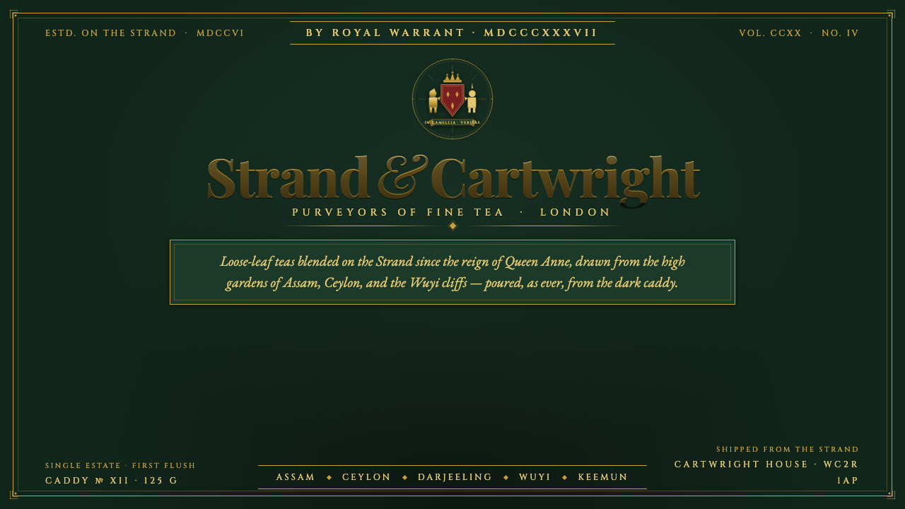
Tea Tin turns three centuries of Twinings heritage into a dark, engraved luxury: japanned green metal, matte gilt, English serifs, and a heraldic crest.
Tea Tin (Twinings 1837) in brief
Tea Tin is a heritage identity distilled from Twinings packaging: a dark japanned-green tin ground, matte gold lettering, refined English serifs, and the heraldic presence of a lion-and-unicorn crest. Its mood is not antique decoration for its own sake. It is the controlled authority of a tea caddy that has carried the same name, place, and visual promise across generations.
The system keeps the reading ground dark. Cream and pure white are excluded because the tin itself is the atmosphere: dense, lacquered, formal, and quietly tactile. Against it, gilt lettering behaves like engraved metal rather than bright digital yellow. Fine rules, framed labels, and capital letters create the impression of a carefully printed or stamped object.
Tea Tin belongs to the language of heritage brand identity, japanned-tin packaging, gilt heraldic engraving, and English serif typography. It is luxurious without becoming glossy, historical without becoming theatrical, and formal without relying on excessive ornament. Every element should feel inherited, maintained, and still useful.
Where does Tea Tin (Twinings 1837) come from?
The historical anchor is Twinings on London’s Strand. Twinings has poured tea from the same shop since 1706, giving the style an unusually concrete sense of place. This is not an imagined old-world mood assembled from generic references; it is a visual system built around continuity, locality, and the authority of a name that has remained attached to the same tea house.
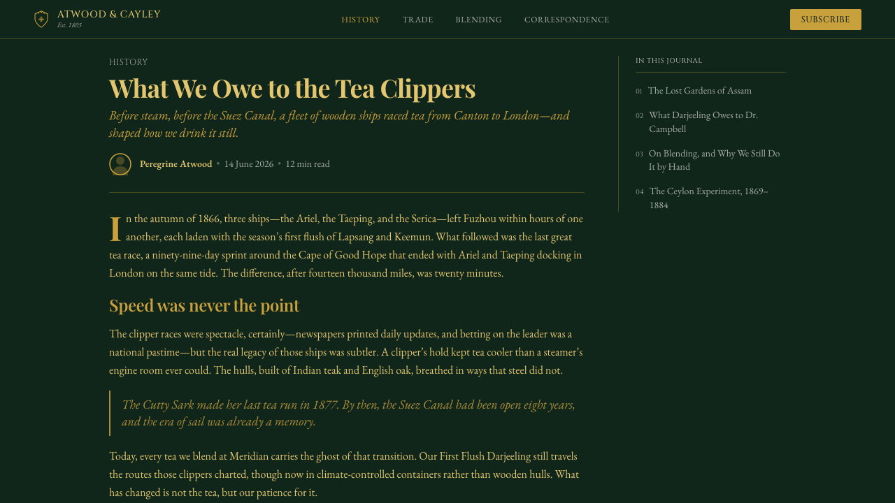
The Royal Warrant dating to 1837 supplies the system’s ceremonial register. It places the identity within a language of formal recognition, carefully preserved presentation, and public trust. In visual terms, that register appears through heraldic structure, engraved capitals, framed information, and gilt accents that signal importance without requiring loud color or reflective shine.
The wordmark has been in continuous use since 1787 and is described as one of the oldest unaltered logos in the world. That continuity explains why the typography must feel refined rather than fashionable. The serif wordmark is not a nostalgic accessory added to a modern layout; it is the principal carrier of recognition, age, and institutional memory.
The style extends from pre-1900 heritage into current revival tins. Its visual vocabulary therefore has to survive translation across time: the dark iron-green metal remains the ground, matte gold remains the principal accent, and the lion-and-unicorn crest remains a compact emblem of the brand’s inherited authority. The result is a screen language that recalls a physical caddy without pretending to be a photograph of one.
What defines the Tea Tin (Twinings 1837) look?
Japanned Green Ground
The background is a dark iron-green, recalling japanned metal rather than paper or canvas. It should feel deep and lacquered but remain visually quiet enough for text to lead. The ground is not an interchangeable dark mode; it is the defining material condition of the system. Light surfaces may appear only as small interior details, never as the primary reading field.
Matte Heritage Gilt
Gold is used as heritage gilt: warm, restrained, and slightly muted rather than luminous or metallic in a digital sense. It marks the wordmark, rules, labels, and selected signals of importance. The finish should suggest leaf, stamping, or aged metal. Bright gradients and glossy highlights weaken the historical character by turning inherited material into generic luxury styling.
English Serif Typography
Typography carries most of the identity. Refined English serifs provide authority, rhythm, and a sense of printed inheritance. Large capitals can act like engraved titling, while smaller text should remain composed and legible rather than ornate. The system gains coherence from changing scale, contrast, and spacing within a disciplined serif vocabulary, not from mixing fashionable display faces.
Heraldic Crest
The lion-and-unicorn crest is a compact emblem, not a decorative illustration to scatter across the page. It works best as a seal, header mark, or focal stamp that confirms the identity of the surrounding content. Its presence should feel deliberate and institutional. Repetition without hierarchy turns the crest into wallpaper and removes the sense of inherited significance.
Engraved Linework
Fine gilt rules and framed labels give the interface the logic of a tin label or engraved package panel. Lines should organize information, not create ornamental noise. Borders are most convincing when they enclose a meaningful unit such as a title, classification, or call to action. Their visual weight remains subordinate to the wordmark and crest, preserving a measured hierarchy.
Quiet Material Depth
Depth comes from contrast between the dark tin ground, matte gilt, and occasional restrained tonal variation. It does not come from soft interface shadows, glass effects, or simulated reflections. The desired impression is a preserved object viewed under calm light: tactile in suggestion, flat enough to remain clear, and formal enough to support dense information.
Who shaped Tea Tin (Twinings 1837)?
Thomas Twining is the named human anchor within the source history of this system. His presence connects the identity to the tea house and to the long continuity of the Twinings name. In design terms, that connection argues for a wordmark-led system: the brand name should feel established, carefully preserved, and more important than any temporary decorative treatment.
The Twinings tea house on London’s Strand is the place-based figure of the identity. Its continuity since 1706 gives the style a physical home and prevents the heritage language from becoming abstract. The tea house is expressed through the caddy ground, the formal label structure, and the feeling that every screen is presenting a carefully kept product from a real institution.
The Royal Warrant holders represent the formal authority attached to the identity, with a warrant dating to 1837. They are not treated as a character portrait but as a source of visual register: heraldic restraint, ceremonial framing, and a presentation language that implies recognition without shouting for attention.
How do you use Tea Tin (Twinings 1837) today?
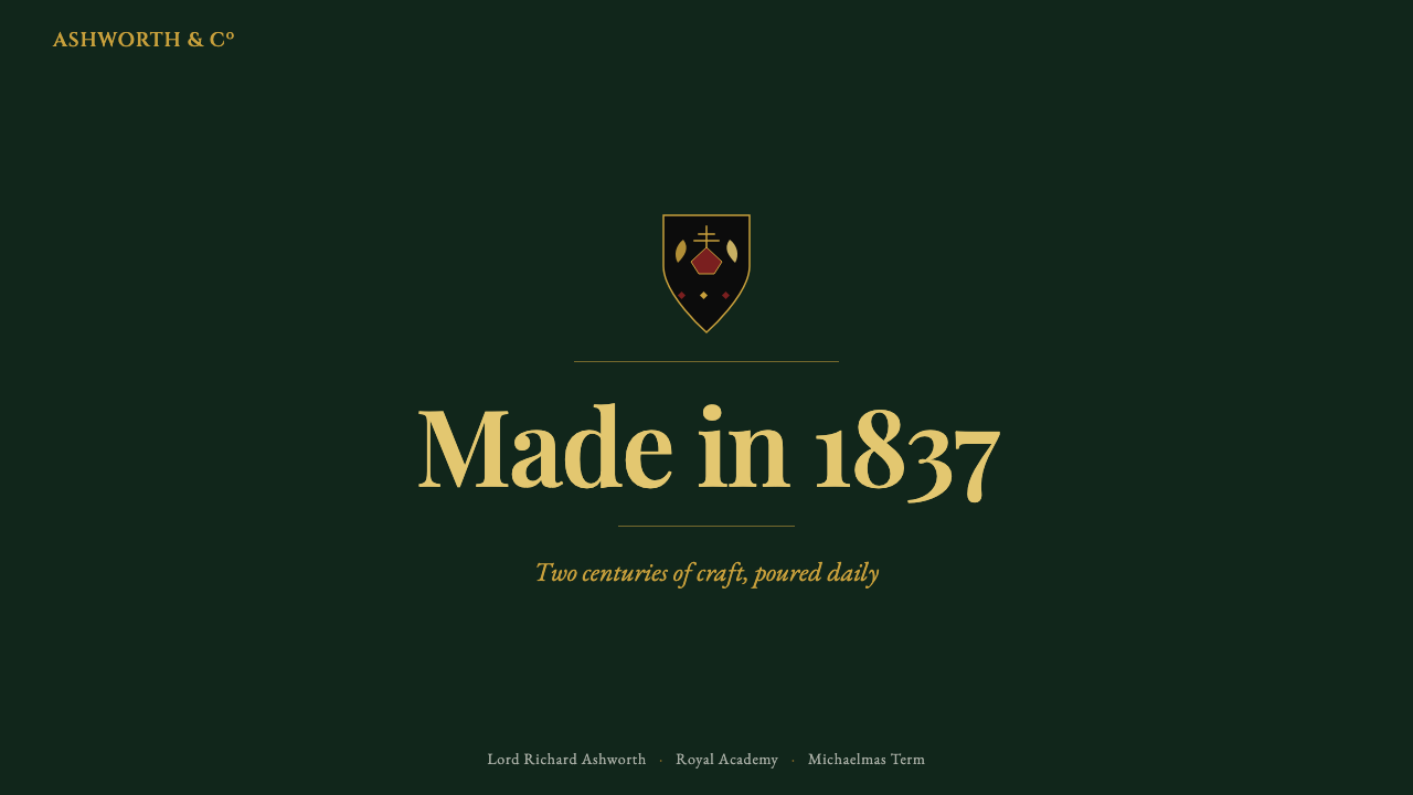
For presentation slides, use the dark japanned-green ground as the continuous stage. Cover slides can give the wordmark or a large serif title a generous field of darkness, with the crest or a gilt rule providing a measured point of ceremony. Content slides should rely on framed groups, engraved-style headings, and clear contrast between title, supporting text, and annotations. Data slides should treat charts as labeled package panels: restrained, legible, and organized by gilt rules rather than bright competing colors.
For web interfaces, Tea Tin suits dashboards, pricing pages, and other products that want to communicate trust, continuity, and premium care. Keep the reading surface dark and reserve gilt for primary actions, active states, key totals, or plan distinctions. Cards should feel like labeled compartments rather than floating glass panels. Navigation benefits from strong serif wordmarks and quiet separators, while dense information should be grouped through framing and spacing instead of a parade of badges.
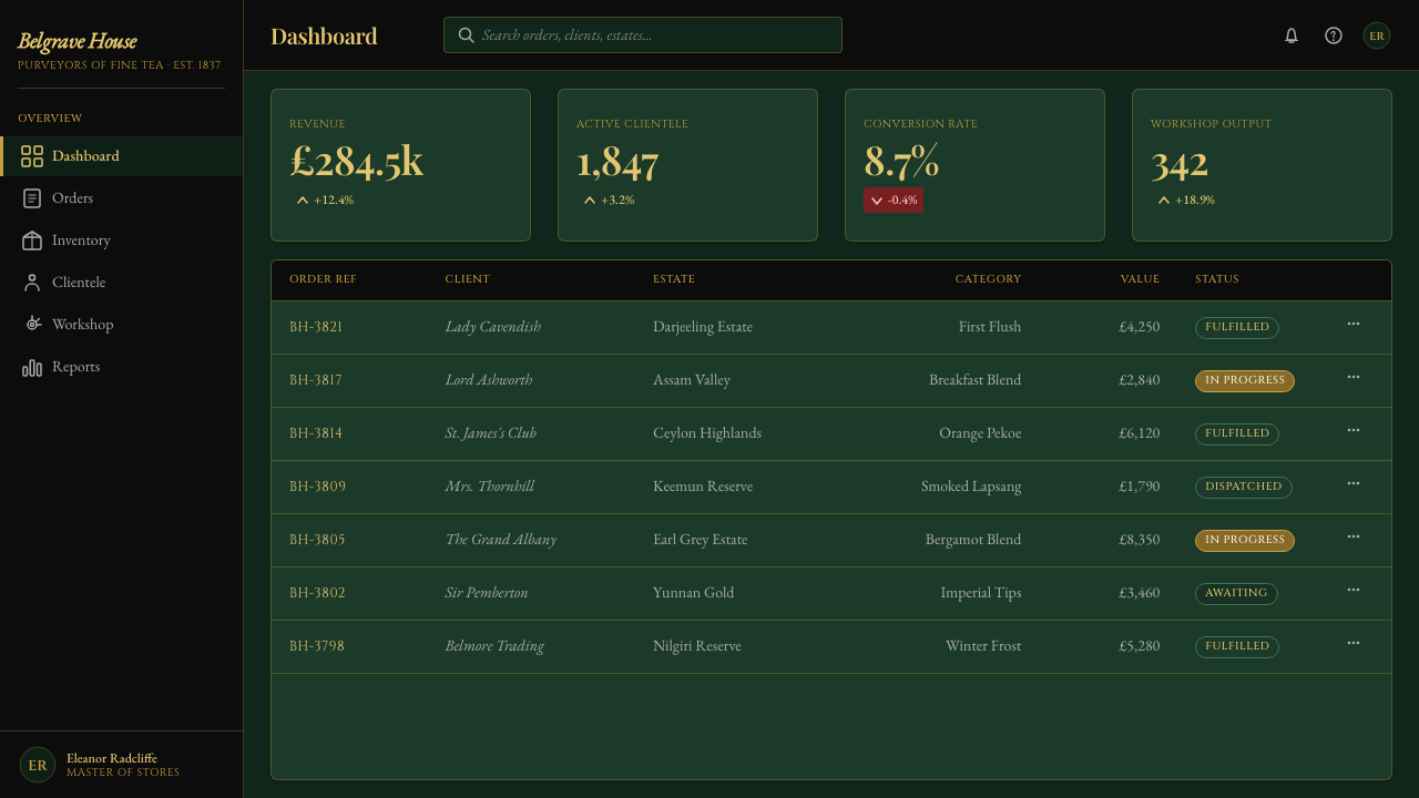
For editorial and marketing work, the system supports a sophisticated heritage voice. Articles can use a dark reading field, elegant serif titles, and narrow framed call-outs that resemble information printed on a caddy. Marketing pages can alternate between deep green fields and controlled gilt emphasis, using the crest as a seal of provenance rather than a repeated decoration. Product stories should feel curated and established, with language and layout working together to suggest care.
The common mistake is to confuse heritage luxury with visual excess. Too much gold, repeated crests, glossy highlights, ornate borders, or several competing serif styles make the system feel theatrical and cheap. The identity depends on restraint: the tin remains dark, gilt remains matte, the wordmark remains dominant, and every frame or emblem must justify its presence by clarifying hierarchy or reinforcing provenance.
Tea Tin (Twinings 1837) — FAQ
What is the defining idea behind Tea Tin?
Tea Tin treats heritage as a material and typographic system rather than a collection of nostalgic ornaments. The dark japanned-green ground stands for the caddy itself; matte gilt recalls leaf, stamping, and aged metal; English serifs carry the wordmark and institutional voice; the lion-and-unicorn crest supplies a formal seal. The result should feel inherited and maintained, not artificially distressed.
Can Tea Tin use a light or cream background?
The system should not use cream or pure white as its primary reading ground. Its defining atmosphere comes from the dark iron-green tin, so replacing that field with a light surface changes the identity rather than merely creating a variation. Small light details may appear inside labels or information units, but the overall composition should remain anchored in the dark japanned-green ground.
How should the gilt color be handled on screen?
Gilt should be matte, warm, and selective. It works as a marker of recognition across wordmarks, rules, labels, and important actions, but it should not flood the interface. Avoid turning it into a bright yellow gradient or a glossy metallic effect. The strongest reading is aged and printed: gold appears because the element matters, not because every surface is competing to look expensive.
Does Tea Tin work for modern dashboards and pricing pages?
Yes, when the product values trust, continuity, premium care, or established expertise. The dark ground can support dense information, while gilt and framing establish hierarchy around key totals, actions, and plan distinctions. The approach becomes unsuitable when the interface needs casual brightness, playful energy, or a deliberately transparent technical mood. The style should clarify the product’s character, not disguise a mismatch.
Related design styles
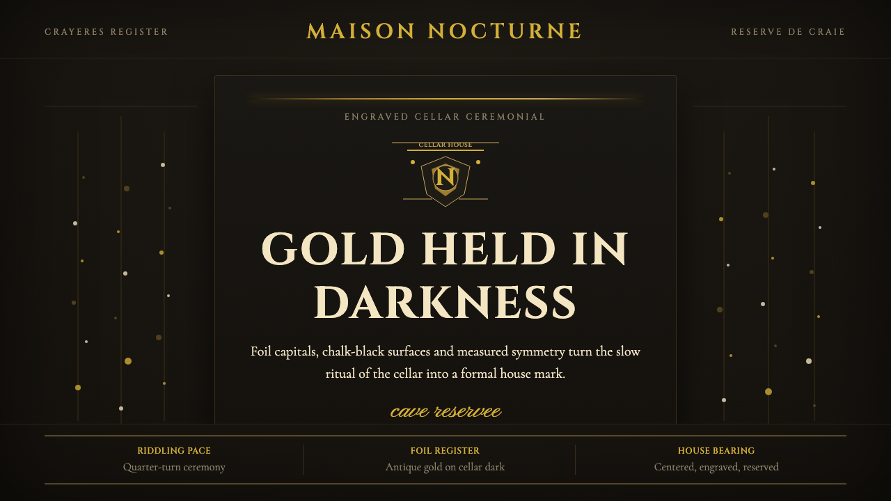 Champagne MaisonGrandeur without glitter. Cinzel capitals and gold foil rules glow in cellar…
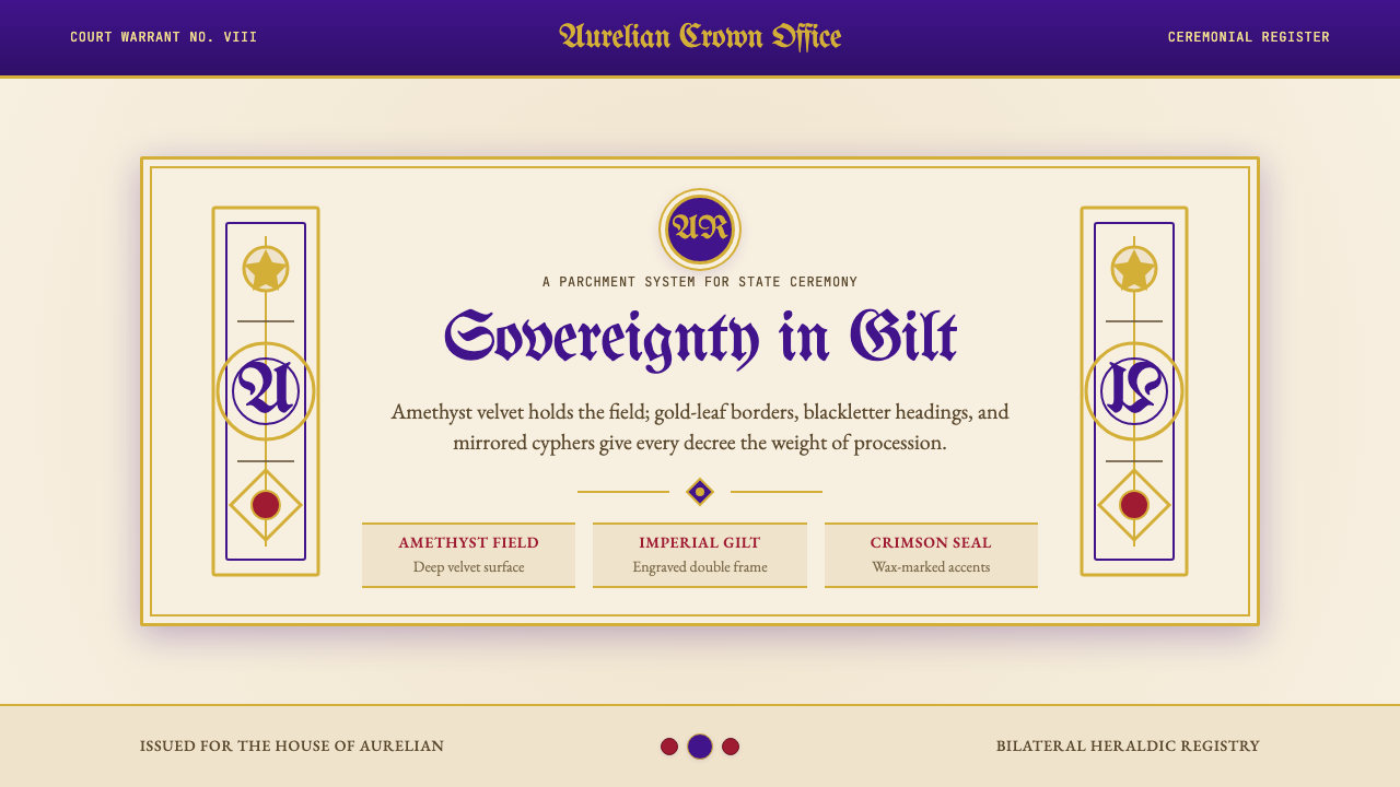 British Royal MonarchyCeremony becomes structure. Amethyst panels, gilt borders, blackletter, mirro…
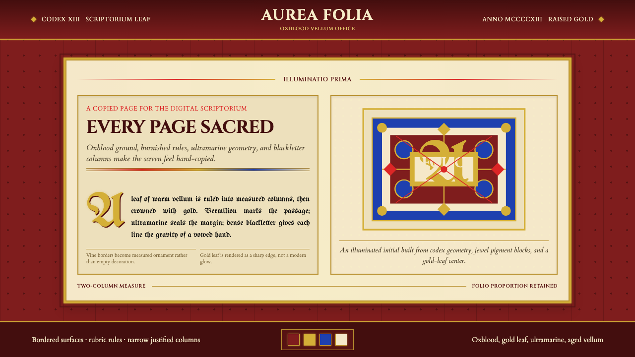 Medieval Illuminated ManuscriptTreats every page as sacred. Oxblood vellum, Cinzel capitals, gold-rule borde…
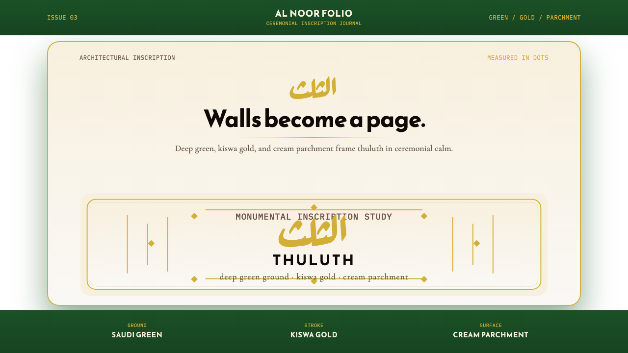 Saudi Thuluth CalligraphyMonumental calm in gold. Deep green, thuluth type, and cream parchment symmet…
 Wedgwood JasperwareMatte authority. Blue-grey clay ground carries raised white Baskerville relie…
 Badakhshan Lapis LazuliStone as manuscript. Ultramarine field, pyrite flecks, calcite veins, carved…