What is Tanjore Painting (Gold-leaf Tamil)?什么是 Tanjore Painting (Gold-leaf Tamil)?
Tanjore painting is South India's most opulent devotional art — every panel a blazing assembly of gold leaf, embedded gems, and raised gesso relief that turns temple lamplight into sacred theater.坦贾武尔画是南印度最华美的供奉艺术——每一幅画板都是金箔、镶嵌宝石与立体石膏浮雕的盛大集会,将庙宇油灯之光转化为神圣的视觉戏剧。
Tanjore Painting (Gold-leaf Tamil) in briefTanjore Painting (Gold-leaf Tamil) 速览
Tanjore painting — known in Tamil as Thanjavur Chitra — is a tradition of devotional panel art from the Kaveri delta region of Tamil Nadu, South India. Each work is executed on a wooden board prepared with a ground of chalk and adhesive, upon which the artist builds raised gesso relief to give crowns, jewelry, and thrones a literal three-dimensional presence. Over this relief, semi-precious stones — rubies, emeralds, sapphires, and garnets — are embedded directly into the surface. Gold leaf is then applied across large portions of the background and the deity's adornments, creating a panel that catches and scatters light in the manner of a reliquary rather than a picture.坦贾武尔画——泰米尔语称Thanjavur Chitra——是印度泰米尔纳德邦卡韦里河三角洲地区的供奉画板传统。每幅作品绘制于经白垩与黏合剂预处理的木板之上,画师在其上以石膏堆叠出立体浮雕,赋予王冠、珠宝与宝座真实的三维存在感。在这层浮雕之上,红宝石、祖母绿、蓝宝石与石榴石等半宝石被直接镶嵌入画面。金箔随后覆盖于大面积背景与神像的装饰之上,使整幅画板如同一件圣骨匣,而非普通画作——它捕获光线、折射光线。
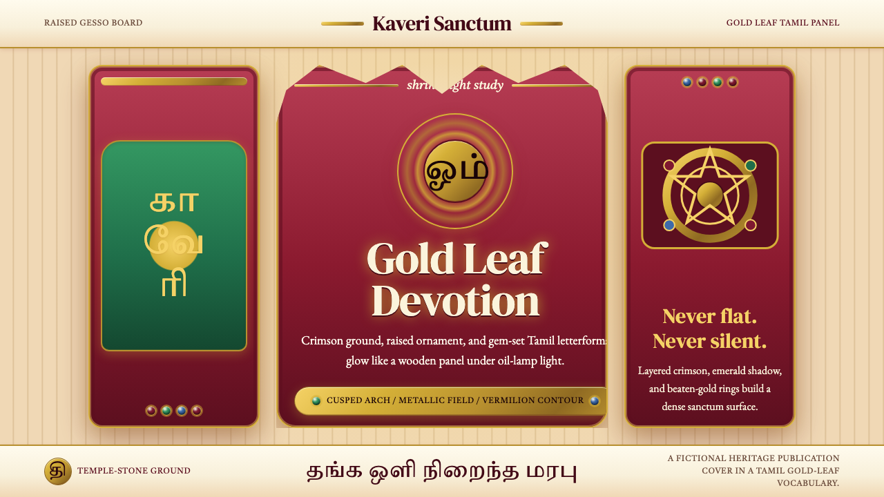
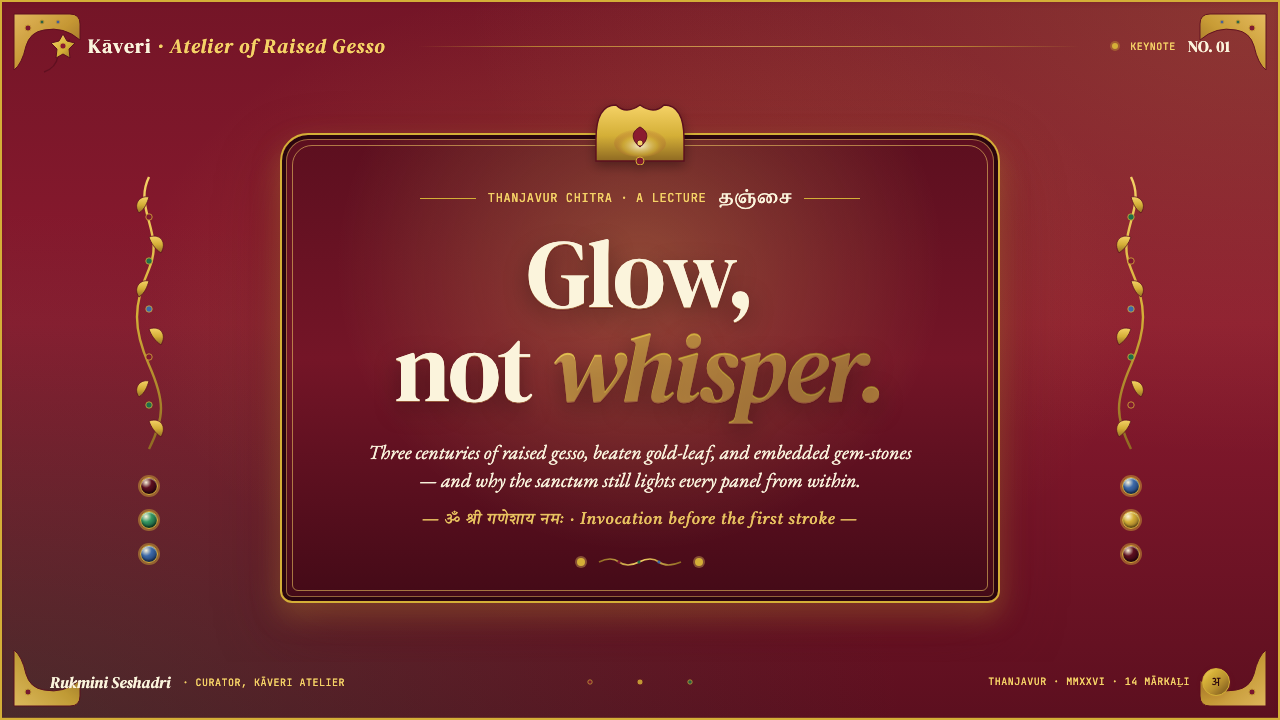
The aesthetic vocabulary of the tradition is dense, saturated, and intentionally overwhelming. Deep crimson grounds, often described as the color of temple velvet, establish the base register. Krishna-blue and emerald green occupy the mid-field as flesh tones and vegetal ornament respectively. Vermilion contour lines delineate every form with confident, brush-thick precision. At the center of each composition sits the deity — Krishna, Rama, Lakshmi, or Ganesh — framed inside a cusped multi-foil arch whose profile echoes the carved stone doorways of Dravidian temple architecture. The composition is bilateral and hierarchical: every element orbits the central sacred figure, and no area of the panel is permitted to rest empty.这一传统的美学词汇是致密的、饱和的、刻意令人目眩神迷的。深红色底面——常被形容为庙宇天鹅绒的颜色——奠定基础调性。克里希纳蓝与翡翠绿分别作为神灵肤色与植物纹饰占据中间层次。朱砂轮廓线以饱满、自信的笔触勾勒出每一处形态。每幅构图的中心坐落着主尊——克里希纳、罗摩、吉祥天女或象头神——被一座多瓣火焰拱门框围,其轮廓呼应着达罗毗荼神庙建筑中雕刻石门的形制。构图是双侧对称且有等级秩序的:每一个元素都围绕中心神像旋转,画板上没有任何区域被允许空置。
Translated to the digital and print world, the Tanjore idiom demands total commitment to its logic of abundance. It is not a palette to borrow selectively — it is a complete visual philosophy in which richness, symmetry, and sacred centrality are inseparable. Applying it well means understanding what each visual decision is doing: crimson signals devotion and gravity; gold signals the presence of the divine; the cusped arch signals sanctuary; gemstone accents signal that something is being offered, not merely displayed.将坦贾武尔语汇移植到数字与印刷世界,意味着对其丰盈逻辑的全然承诺。它不是一套可以选择性借用的色板——它是一套完整的视觉哲学,其中丰盛、对称与神圣的中心性不可分割。正确应用它需要理解每一个视觉决策的含义:深红传达虔诚与庄重;金色宣告神性的临在;弧形拱门标示圣所;宝石点缀表明这是一种供奉,而非单纯的展示。
See the Tanjore Painting (Gold-leaf Tamil) design system查看 Tanjore Painting (Gold-leaf Tamil) 完整设计系统
Where does Tanjore Painting (Gold-leaf Tamil) come from?Tanjore Painting (Gold-leaf Tamil) 从何而来?
The roots of Tanjore painting reach back to the devotional mural traditions of the Pallava and Chola dynasties, whose temple painters — working in fresco on the interior walls of shrines at Mahabalipuram and Thanjavur — established the visual grammar that Tanjore panel painting would later inherit: the centered deity framed by a canopy arch, the hierarchical scaling of figures by sacred importance, the use of jewel-bright mineral pigments, and the thick brush-drawn contour line as the primary vehicle of form. These murals, some dating to the eighth and ninth centuries, are the direct ancestors of the panel tradition.坦贾武尔画的根源可追溯至帕拉瓦王朝与朱罗王朝的壁画传统。这些朝代的庙宇画师——在马哈巴利普兰与坦贾武尔神殿的内壁上以湿壁画作业——确立了坦贾武尔板绘此后继承的视觉语法:以华盖拱门框围的中心神像、依神圣地位按比例缩放的人物等级、珠宝般明亮的矿物颜料,以及作为形态主要载体的粗重轮廓线。这些部分可追溯至八九世纪的壁画,是板绘传统的直系先祖。
The Tanjore panel painting tradition as a distinct form crystallized under the Nayak rulers of the sixteenth and seventeenth centuries, who governed the Thanjavur region as vassals of the Vijayanagara Empire. The Nayaks were prolific temple patrons — they expanded and elaborated the great Brihadeeswara temple complex, commissioning painted galleries, bronze processional sculptures, and the silk-and-gold textile offerings that became an integrated part of temple ritual. It was in this environment of competitive royal patronage that the panel painting form — portable, giftable, and suitable for domestic shrines — began to flourish alongside monumental temple art.坦贾武尔板绘作为一种独立形式的结晶,发生在十六至十七世纪那雅克统治者治下。那雅克人以毗奢耶那伽罗帝国附庸的身份统治坦贾武尔地区,是极为慷慨的庙宇赞助者——他们扩建并精饰了宏伟的布里哈迪斯瓦拉神庙建筑群,委托制作了彩绘廊道、铜铸游行神像,以及作为神庙仪式有机组成部分的丝金纺织品供奉物。正是在这种竞争性的王室赞助环境中,板绘形式——便携、可赠送、适合家庭神龛——开始在宏大的庙宇艺术之外蓬勃生长。
The tradition reached its peak of refinement and production under the Maratha rulers of Thanjavur, particularly during the reign of Serfoji II (1798–1832). The Marathas had arrived in the region in the late seventeenth century and, rather than displacing the existing Tamil artistic culture, absorbed and intensified it. Serfoji II was an extraordinary patron: he maintained a court that included European scientific instruments alongside Sanskrit manuscripts and Tamil devotional objects, and he actively supported the painter families — primarily Brahmin communities from the Raju caste — who were developing the raised-gesso and gold-leaf technique into its fully elaborated form. The Saraswati Mahal Library he founded in Thanjavur holds thousands of illustrated manuscripts that document the breadth of artistic production at his court.这一传统在坦贾武尔马拉塔统治者,尤其是塞尔福吉二世(1798—1832年在位)治下达到精炼与产量的巅峰。马拉塔人于十七世纪末抵达该地区,他们没有取代既有的泰米尔艺术文化,而是将其吸收并推向更高强度。塞尔福吉二世是一位卓越的赞助者:他的宫廷中既有欧洲科学仪器,也有梵文手稿和泰米尔供奉器物;他积极支持画师家族——主要是拉朱种姓的婆罗门社群——将石膏堆叠与金箔覆盖技术发展为完全成熟的形态。他在坦贾武尔创建的萨拉斯瓦蒂·马哈尔图书馆收藏有数千份图解手稿,记录了其宫廷艺术生产的广度。
The tradition was granted a Geographical Indication tag by the Indian government in 2007, formally recognizing Thanjavur as the protected place of origin for works produced in this style. This protected status has helped sustain the community of working artists — most of them descendants of the historic painter families — who continue to produce panels using the same wooden-board construction, raised gesso, stone-embedding, and gold-leaf application techniques that characterized the tradition at its height. Contemporary practitioners like S. Saravanan, who received the Padma Shri in recognition of his work, have helped bring the tradition to international audiences while maintaining fidelity to its technical demands.2007年,印度政府为这一传统授予地理标志认证,正式确认坦贾武尔为该风格作品的受保护原产地。这一保护地位有助于维系现役艺术家群体的生存——他们大多是历史画师家族的后裔,继续使用与传统鼎盛时期相同的木板构造、石膏堆叠、宝石镶嵌与金箔覆盖技术创作画板。当代传承者如荣获帕德玛·斯里勋章的S. 萨拉瓦南,在忠于传统技术要求的同时,帮助这一传统走向了国际观众。
What defines the Tanjore Painting (Gold-leaf Tamil) look?Tanjore Painting (Gold-leaf Tamil) 的视觉特征是什么?
Gold-Dominant Ground金箔主导的底面
Gold leaf covers a substantial portion — often well over a third — of any authentic Tanjore composition. It is not used as an accent but as a field: the background behind the deity, the throne, the arch interior, and much of the jewelry are all covered in beaten gold, applied in overlapping sheets and burnished to a high sheen. This gold ground is what distinguishes the tradition from other South Indian painting styles and gives it its quality of emanating light rather than merely reflecting it. In digital applications, this translates to rich metallic gradients that shift between warm amber and deep ochre, never flat fills.金箔覆盖任何正宗坦贾武尔构图的大面积区域——通常远超三分之一。它不用作点缀,而是作为底面:神像背后的背景、宝座、拱门内侧以及大部分珠宝饰品,都覆盖着层叠贴附、经过抛光至高光泽的金箔。这种金色底面正是将坦贾武尔传统与其他南印度绘画风格区别开来的关键,赋予它散发光芒而非仅仅反射光芒的特质。在数字应用中,这转化为在温暖琥珀色与深赭色之间流动的丰富金属渐变,而非平涂填色。
Jewel-Tone Color Field宝石色调的色彩场
The palette of Tanjore painting is the palette of the gem cabinet: deep crimson, the blue of sapphire, the green of emerald, and the orange of carnelian. These hues are deployed at maximum saturation against one another, with no soft transitions or washed-out intermediaries. The crimson ground — derived historically from vermilion and lac — anchors the composition with a sense of velvety weight. The deity's complexion reads in one of the canonical Tamil iconographic tones: Krishna-blue for the cosmic god, warm ochre for Lakshmi, forest-dark for Rama. Against these deep saturated grounds, the gold and gemstone accents become incandescent.坦贾武尔绘画的色板正是宝石柜的色板:深红、蓝宝石之蓝、祖母绿之绿与红玉髓之橙。这些色调以最高饱和度相互对置,没有柔和过渡或褪色的中间调。深红色底面——历史上源自朱砂与紫胶——以天鹅绒般的重量感锚定构图。神像肤色遵循泰米尔图像志的经典调性:宇宙之神采用克里希纳蓝,吉祥天女呈暖赭色,罗摩则为森林般的深暗色调。在这些浓郁饱和的底色映衬下,金箔与宝石点缀变得灼灼发光。
Raised Gesso Relief石膏堆叠浮雕
What separates Tanjore painting from flat panel painting traditions is its literal three-dimensionality. Before any pigment is applied, the artist builds up the jewelry, crown, throne, and architectural frame in chalk-and-adhesive gesso, modeling the relief by hand into forms that protrude from the board's surface. This relief is then gilded or painted. In person, a Tanjore panel casts micro-shadows as the viewer moves — the crown shifts, the lotus petals separate, the arch profile becomes a series of shadow-edged curves. In print and screen applications, this depth is evoked through ornamental border treatments that layer and overlap, through type that sits within framed registers rather than on open fields, and through the layering of decorative motifs that create visual depth without literal dimension.将坦贾武尔绘画与平面板绘传统区别开来的,是其字面意义上的三维性。在施加任何颜料之前,画师先以白垩与黏合剂调制的石膏堆叠出珠宝、王冠、宝座与建筑框架,用双手塑造出从画板表面凸出的浮雕形态。这层浮雕随后被镀金或着色。实物面前,坦贾武尔画板随着观者移动而投射微妙阴影——王冠轮廓移动,莲花花瓣分离,拱门轮廓呈现为一系列有阴影边缘的弧线。在印刷与屏幕应用中,这种深度通过层叠交叠的装饰边框处理得以唤起,通过置于框格而非开放底面的文字得以传达,通过制造视觉深度而不产生字面维度的装饰母题层叠得以实现。
Cusped Arch and Symmetrical Frame多瓣弧形拱门与对称框架
The visual signature of the Tanjore tradition is the cusped multi-foil arch — a frame whose inner edge describes a series of petal-like curves, derived from the carved stone doorways of Dravidian temple gopurams. This arch always encloses the central deity, transforming the painting from an image into a shrine. It is typically gilded and studded with gem inlays along its edge. The arch in turn sits within a rectilinear outer frame, creating a nested hierarchy of frames that draws the eye inward through successive thresholds. This multi-layered framing logic — arch within rectangle, rectangle within border pattern, border within outer rule — is the structural principle most directly applicable to contemporary design work.坦贾武尔传统最显著的视觉标志是多瓣火焰拱门——其内缘描绘出一系列花瓣形曲线,源自达罗毗荼神庙塔门(gopuram)的雕刻石门。这道拱门始终框围中心主尊,将画作从图像转变为圣龛。拱门通常镀金,其边缘嵌饰宝石镶嵌。拱门本身又位于一个矩形外框之内,形成嵌套的框架层级,引导视线经由层层门槛向内汇聚。这种多层框架逻辑——弧拱在矩形之内,矩形在边框纹样之内,边框在外缘线之内——是最可直接应用于当代设计工作的结构原则。
Dense Ornamental Fill致密的装饰性填充
Tanjore compositions do not tolerate emptiness. Every zone of the painting — the background flanking the arch, the throne platform below the deity, the corners of the panel, the space between figures — is filled with ornamental motifs: scrolling vines, lotus rosettes, peacocks, celestial musicians, and geometric diaper patterns derived from textile traditions. This density is not carelessness but philosophical commitment: in the devotional aesthetic of South Indian Vaishnavism and Shaivism, abundance and completeness are attributes of the divine, and an empty surface would suggest incompleteness, a gap in the sacred order. In design applications, this principle manifests as a preference for richly patterned backgrounds, filled borders, and layered ornamental details over any approach that leaves ground empty.坦贾武尔构图不容忍空白。画作的每一区域——拱门两侧的背景、神像下方的宝座台、画板四角、人物之间的空间——都被装饰母题填满:卷曲藤蔓、莲花花环、孔雀、天界乐师,以及源自纺织传统的几何菱格纹样。这种致密性不是随意为之,而是哲学承诺:在南印度毗湿奴派与湿婆派的供奉美学中,丰盛与完满是神性的属性,空白表面则意味着不完整——神圣秩序中的缺口。在设计应用中,这一原则体现为对富于图案的背景、填满的边框与层叠装饰细节的偏好,而非任何留有底面空白的做法。
Hieratic Scale and Sacred Centrality圣像比例与神圣的中心性
Tanjore figure composition follows the hieratic scaling principle: the size of a figure is determined not by its spatial position but by its divine rank. The primary deity dominates the panel at a scale impossible in naturalistic perspective; attendant figures, musicians, and devotees surround the central form at progressively smaller scales. This creates a composition that reads as a diagram of sacred hierarchy rather than a representation of physical space. The implied message is that the center is the most important thing in the image, and everything else exists in relation to it. In layout terms, this translates to a strong central axis, a dominant hero element, and supporting elements that orbit and reinforce rather than compete with the center.坦贾武尔人物构图遵循圣像比例原则:人物的大小不由其空间位置决定,而由其神圣等级决定。主尊以自然透视法中不可能存在的比例主导画板;侍从、乐师与信徒以逐渐缩小的比例围绕中心形象。这创造出一种作为神圣等级结构图示而非物理空间再现的构图。其隐含的信息是:中心是画面中最重要的事物,其他一切都与之相关而存在。在版面术语中,这转化为强烈的中轴线、主导性的英雄元素,以及围绕并强化而非竞争中心的辅助元素。
Vermilion Contour and Flat Flesh朱砂轮廓线与平涂肤色
All figures in the Tanjore tradition are delineated by a thick, confident vermilion or dark red contour line. This line does not model form through variation — it is consistent in weight and carries no shading information. Inside the contour, flesh tones are applied as flat, unmodulated fields: no gradient, no highlight, no shadow suggesting three-dimensional volume. The three-dimensionality of the image comes entirely from the raised gesso relief beneath, not from painted illusionism. This separation of outline and fill — contour as a structural decision, color as a declarative field — produces a visual language that is graphic and immediately legible at distance, similar in its logic to stained glass or cloisonné enamel.坦贾武尔传统中所有人物都以粗重、自信的朱砂或深红轮廓线加以界定。这条线不通过变化来塑造形态——它粗细一致,不携带任何阴影信息。轮廓线内部,肤色以平涂、未经调变的色块施加:没有渐变,没有高光,没有暗示三维体积的阴影。图像的三维性完全来自下方的石膏浮雕,而非绘画幻觉。这种轮廓线与填色的分离——轮廓作为结构决定,色彩作为宣告性色块——产生了一种在远处即可清晰辨读的图形化视觉语言,其逻辑类似于彩色玻璃窗或掐丝珐琅。
See the Tanjore Painting (Gold-leaf Tamil) design system查看 Tanjore Painting (Gold-leaf Tamil) 完整设计系统
Who shaped Tanjore Painting (Gold-leaf Tamil)?谁塑造了 Tanjore Painting (Gold-leaf Tamil)?
Serfoji II (1798–1832) was the Maratha king of Thanjavur whose reign marked the highest point of royal patronage for Tanjore panel painting. He maintained a cosmopolitan court that combined European scientific curiosity with deep engagement with Tamil and Sanskrit learning, and he actively sponsored the Brahmin painter families whose workshops produced the tradition's most refined works. The Saraswati Mahal Library he founded holds an extraordinary collection of illustrated manuscripts that document the full range of artistic production at his court. Many of the iconographic types and compositional conventions that define Tanjore painting today were codified and standardized during his reign.塞尔福吉二世(1798—1832年在位)是坦贾武尔的马拉塔国王,其统治时期标志着坦贾武尔板绘王室赞助的最高峰。他维持着一个融合欧洲科学求知精神与泰米尔、梵文学问深度投入的世界主义宫廷,积极赞助婆罗门画师家族——这些工坊产出了这一传统最精炼的作品。他创建的萨拉斯瓦蒂·马哈尔图书馆收藏着大量图解手稿,记录了其宫廷艺术生产的全貌。当今定义坦贾武尔绘画的许多图像志类型与构图惯例,都是在他统治期间被编纂与标准化的。
S. Saravanan is among the most celebrated living practitioners of Tanjore painting, honored with the Padma Shri — one of India's highest civilian awards — in recognition of his contributions to preserving and propagating the tradition. He has been instrumental in documenting the technical processes of gesso preparation, stone embedding, and gold-leaf application, and in training younger artists from both the traditional Brahmin painter communities and outside them. His work has been exhibited internationally and has played a significant role in establishing Tanjore painting as a serious object of scholarly and collector attention beyond South Asia.S. 萨拉瓦南是坦贾武尔绘画最受推崇的在世从业者之一,因其对保护和传播这一传统的贡献而荣获印度最高平民荣誉之一帕德玛·斯里勋章。他在记录石膏准备、宝石镶嵌与金箔覆盖等技术过程,以及培训来自传统婆罗门画师社群内外的年轻艺术家方面发挥了重要作用。他的作品曾在国际上展出,并在将坦贾武尔绘画确立为南亚以外学术界与收藏界严肃关注对象方面扮演了重要角色。
The transmission of Tanjore painting technique has historically been the work of specific Brahmin communities — primarily the Raju caste families of the Thanjavur region — who passed the craft from father to son across generations. These families maintained not only the technical knowledge of material preparation and pigment mixing but the iconographic programs: the prescribed proportions for each deity, the specific gemstone placements for each divine archetype, the correct sequence of stages in producing a panel. The knowledge was largely oral and embodied, transmitted through workshop apprenticeship rather than written manuals. The Geographical Indication registration of 2007 formally recognized these communities as the custodians of an irreplaceable cultural practice.坦贾武尔绘画技术的传承历来是特定婆罗门社群的工作——主要是坦贾武尔地区的拉朱种姓家族——他们跨越世代将这门技艺由父传子。这些家族不仅掌握材料准备与颜料调配的技术知识,还保有图像志程序:每位神明的规定比例、每种神圣原型的特定宝石位置、制作画板各阶段的正确顺序。这些知识基本上是口头与身体性的,通过工坊学徒传承而非书面手册传递。2007年的地理标志注册正式确认这些社群为不可替代的文化实践守护者。
Ramesh Babu is a contemporary Tanjore artist and educator who has worked extensively to adapt the tradition's visual language for new formats and audiences, including large-scale prints, archival-quality reproductions, and educational materials designed to introduce the tradition to viewers with no prior exposure to South Indian devotional art. His approach has been to work from the iconographic and technical foundations of the classical tradition while being transparent about which adaptations have been made for contemporary contexts — a methodology that has made his work useful both as art and as documentation.拉梅什·巴布是一位当代坦贾武尔艺术家与教育者,他广泛致力于将这一传统的视觉语言改编为新的格式与受众,包括大幅版画、档案级复制品,以及为向此前未曾接触南印度供奉艺术的观众介绍这一传统而设计的教育材料。他的做法是从经典传统的图像志与技术基础出发,同时对为当代语境所做的哪些改编保持透明——这一方法论使其作品既具有艺术价值,也具有文献价值。
The workshop system that produced Tanjore painting at its height was not the work of individual auteur artists but of organized court ateliers in which tasks — ground preparation, gesso modeling, pigment application, stone setting, gold leafing — were divided among specialists working in sequence. The Nayak courts of the sixteenth and seventeenth centuries established this atelier model, and the Maratha courts of the eighteenth and nineteenth centuries expanded and intensified it. Understanding this workshop origin is important for understanding the style's visual character: the confident division between outline and fill, the systematic repetition of iconographic types, and the consistency of technical standards across a large body of work all reflect the logic of organized craft production rather than individual artistic expression.在鼎盛时期生产坦贾武尔绘画的工坊体系,并非个别艺术家的作品,而是有组织的宫廷画室——在那里,底面准备、石膏塑形、颜料施加、宝石镶嵌、金箔覆盖等工序由按顺序协作的专业人员分工完成。十六至十七世纪的那雅克宫廷建立了这一画室模式,十八至十九世纪的马拉塔宫廷对其加以扩展与强化。理解这种工坊起源对于理解这种风格的视觉特性至关重要:轮廓线与填色之间自信的分工、图像志类型的系统性重复,以及大量作品中一致的技术标准,都反映了有组织的工艺生产逻辑,而非个人艺术表达。
How do you use Tanjore Painting (Gold-leaf Tamil) today?今天怎么用 Tanjore Painting (Gold-leaf Tamil)?
Applying the Tanjore visual language in contemporary design requires accepting its fundamental premise: this is an aesthetic of completeness, not restraint. Designers accustomed to working with generous white space and sparse layouts must set those instincts aside entirely. Tanjore-derived work should feel full, layered, and richly framed — every major element nested within an ornamental border, every background occupied by pattern or gold, every focal point anchored at the center of a symmetrical composition. The difficulty is not in adding richness but in doing so with the internal coherence that distinguishes the original tradition from pastiche.在当代设计中应用坦贾武尔视觉语言,需要接受其根本前提:这是一种完满的美学,而非克制的美学。习惯于充裕留白和简洁版面的设计师必须将这些本能完全搁置。坦贾武尔衍生作品应当感觉饱满、层次丰富、边框华美——每个主要元素嵌套在装饰性边框内,每块背景被纹样或金色占据,每个焦点锚定于对称构图的中心。难点不在于增添丰富性,而在于以区别原创传统与仿制品的内在连贯性来完成这种丰富性。
For presentation slides, the Tanjore approach works best on covers and section dividers, where the full visual intensity can be deployed without competing with informational content. A cover slide built on this system uses a deep crimson or midnight-blue ground, a centered title framed by a cusped or multi-arch border element derived from the tradition's architectural frames, gold-metallic type treatment, and jewel-tone accents — deep green or sapphire blue — at the corners and along the border. Content slides require more discipline: the background can shift to a muted warm ground that echoes the crimson without overwhelming text; the ornamental border continues but reduces in weight; the hierarchy is established through a combination of gold-colored headings and cream-toned body text. Data slides within this system work best with charts whose fills draw from the jewel palette — deep red bars, gold reference lines — and whose axes and labels appear in a contrasting light tone.在演示文稿中,坦贾武尔风格最适合用于封面页与章节分隔页,在这些地方,全部的视觉强度可以不与信息内容竞争地充分展开。以这套体系构建的封面页:使用深红色或午夜蓝底面,以源自这一传统建筑框架的多瓣弧拱或多重拱形边框元素居中框围标题,采用金属感金色的文字处理,并在角部与边框沿线设置宝石调强调色——深绿或蓝宝石蓝。内容页需要更多自律:背景可转为呼应深红色而不压制文字的静默暖调底面;装饰边框延续但降低视觉重量;层级通过金色标题与奶油色正文的组合加以建立。此体系下的数据页最适合色块从宝石色板取色的图表——深红色柱条、金色参考线——以及轴线与标签呈对比浅色调。
For web and digital product interfaces, the Tanjore system is best suited to contexts with high cultural specificity and low cognitive load demands: landing pages for luxury or heritage products, event pages for festivals or cultural institutions, editorial pages for arts and culture publications. It is not suited to utility-dense applications where users need to parse information rapidly. When applied to a web interface, the key structural decisions are: a warm deep-toned hero section with centered content, a gold or warm-metallic accent color for primary calls to action and interactive highlights, and an ornamental border or pattern treatment as a recurring motif between page sections. Navigation and utility elements should be visually quieter — using lighter tones from within the same warm palette — to create breathing room without abandoning the system.对于网页与数字产品界面,坦贾武尔体系最适合文化特殊性高、认知负荷要求低的场景:奢侈品或传统工艺品的落地页、节庆或文化机构的活动页、艺术文化出版物的编辑页面。它不适合用户需要快速解析信息的功能密集型应用。应用于网页界面时,关键结构决策是:带居中内容的温暖深调英雄区、主行动号召与交互高亮使用金色或暖金属感强调色、以装饰边框或纹样处理作为页面各区域之间的重复母题。导航与功能性元素应在视觉上更为低调——使用同一暖色系内的浅色调——以创造呼吸空间而不放弃整体体系。
For editorial and marketing work, the tradition's poster-like quality — bold symmetry, high contrast, centered focal point, richly framed — adapts directly to printed invitations, event posters, book covers, and cultural heritage marketing materials. The approach for a printed piece: establish a deep crimson or midnight ground, center the primary image or typographic element within an arch or multi-frame border, apply gold-metallic foil or gold-ink simulation to the border and primary typographic elements, and use emerald or sapphire accents at corners and secondary elements. For marketing copy within this system, restraint in language complements richness in imagery: brief, declarative, elevated language works better than verbose body text against these highly decorated grounds.对于编辑与营销内容,这一传统的海报式品质——大胆的对称、高对比度、居中焦点、华美边框——可直接应用于印刷邀请函、活动海报、书籍封面与文化遗产营销材料。印刷品的做法:建立深红色或午夜色底面,将主图像或文字元素居中置于拱形或多重边框内,对边框与主要文字元素应用金属金箔或金色油墨模拟,在角部与次要元素使用祖母绿或蓝宝石强调色。此体系中的营销文案,语言的克制与图像的丰富相互补:简短、宣告性、有高度的语言,在这些装饰繁复的底面上比冗长的正文更有效。
A common mistake when working with the Tanjore vocabulary is treating gold as a simple color rather than a material quality. In the original tradition, gold leaf has tactile and luminous properties that no flat yellow or ochre fill can replicate. In digital applications, this means gold should always be rendered as a gradient — shifting from warm amber through bright yellow-gold to deep ochre — and should incorporate subtle variation across large areas rather than reading as a uniform fill. A second common mistake is applying the style's density without its underlying hierarchical logic: adding pattern, ornament, and color everywhere without establishing a clear center creates visual chaos rather than sacred abundance. The style's richness depends on everything being organized in relation to a dominant central element — remove that center, and the composition loses its coherence entirely.使用坦贾武尔语汇时常见的错误,是将金色视为简单的颜色而非材料质感。在原始传统中,金箔具有任何平涂黄色或赭色都无法复制的触觉与发光特性。在数字应用中,这意味着金色应始终呈现为渐变——从暖琥珀色经由明亮黄金色到深赭色流动——并在大面积区域中包含微妙变化,而非读作均匀平涂。第二种常见错误是应用这种风格的致密性而缺失其内在的等级逻辑:在各处添加纹样、装饰与色彩,却不建立清晰的中心,产生的是视觉混乱而非神圣的丰盛。这种风格的丰富性依赖于一切都以一个主导的中心元素为参照来组织——移除那个中心,构图便会完全失去连贯性。
See the Tanjore Painting (Gold-leaf Tamil) design system查看 Tanjore Painting (Gold-leaf Tamil) 完整设计系统
Tanjore Painting (Gold-leaf Tamil) — FAQTanjore Painting (Gold-leaf Tamil) · 常见问题
Can Tanjore style work in a dark-mode digital interface?坦贾武尔风格能用于深色模式的数字界面吗?
Yes — the tradition's own palette is already dark-ground. The canonical Tanjore composition uses deep crimson, midnight blue, or dark emerald as its primary ground, with gold and jewel tones providing the luminous contrast. This makes it naturally compatible with dark interface contexts where other historical styles require significant adaptation. The key is to preserve the luminous quality of the gold elements: in a dark interface, gold accents should be rendered with sufficient contrast to read as genuinely incandescent against the ground, rather than as a muted decorative element. Body text and utility elements should use light, warm-toned type rather than pure white, maintaining the sense of warmth that the style's deep palette creates.可以——这一传统本身的色板就已经是深色底面。坦贾武尔的经典构图使用深红、午夜蓝或深翡翠绿作为主底面,以金色与宝石色调提供发光的对比。这使它与其他历史风格需要大幅改编的深色界面场景天然兼容。关键是保持金色元素的发光质感:在深色界面中,金色强调色应具有足够的对比度,在底面映衬下读作真正灼灼发光,而非静默的装饰元素。正文与功能性元素应使用浅暖调文字而非纯白,维持这种风格深色色板所创造的温暖感。
How do I incorporate this style without it reading as culturally appropriative?如何在融入这种风格的同时避免被解读为文化挪用?
The most important step is understanding the tradition's origin, context, and ongoing living practice before applying its visual language. Tanjore painting is not a historical artifact — it is a protected living tradition with active practitioners, a recognized geographical indication, and communities whose livelihood depends on its continued value. Applying the style responsibly means, at minimum, acknowledging the source explicitly in any public-facing work, avoiding the reproduction of specific sacred iconography outside its devotional context, and considering whether commissioning or licensing work from actual Tanjore artists is appropriate for the project. Treating the style as an aesthetic toolkit stripped of its cultural meaning is the practice to avoid; engaging with it as a living tradition to be respected and credited is the alternative.最重要的一步,是在应用这一视觉语言之前理解这一传统的起源、语境与仍在持续的活态实践。坦贾武尔绘画不是历史文物——它是一种受保护的活态传统,拥有活跃的从业者、获认证的地理标志,以及其生计依赖于这一传统持续价值的社群。负责任地应用这种风格,至少意味着在任何面向公众的作品中明确致谢其来源,避免在供奉语境之外复制特定的神圣图像志,并考虑委托或授权实际坦贾武尔艺术家的作品是否适合该项目。应避免将这种风格视为剥离其文化意义的纯粹美学工具箱;将其作为一种应被尊重与致谢的活态传统来对待,是正确的替代路径。
What distinguishes an authentic Tanjore-inspired design from one that merely uses bright colors and gold?真正受坦贾武尔启发的设计与仅仅使用明亮色彩和金色的设计有何区别?
Authenticity in Tanjore-derived design comes from structural fidelity, not surface color. Three elements are diagnostic. First, the hierarchical center: a genuine Tanjore-derived composition has a dominant central element — a figure, a product, a typographic statement — that everything else serves and frames. Second, the multi-layered frame: the composition is bounded by nested borders that work inward from the outer edge, creating a sense of threshold and enclosure rather than elements floating on a ground. Third, the discipline of the gold: gold is applied to specific zones — arches, borders, jewelry, typography — rather than scattered as an ambient texture. A design that uses crimson and gold but distributes its elements in an asymmetric, non-centered layout with a flat gold fill has borrowed the palette without understanding the structure.坦贾武尔衍生设计的真实性来自结构忠实度,而非表面色彩。三个元素可作为判断依据。其一,等级性的中心:真正的坦贾武尔衍生构图有一个主导的中心元素——人物、产品或文字陈述——其他一切都服务于并框围这个中心。其二,多层边框:构图由从外缘向内推进的嵌套边框界定,营造出门槛与围合感,而非元素漂浮于底面之上。其三,金色的自律:金色被施加于特定区域——拱门、边框、珠宝、文字——而非作为环境纹理散布各处。一幅使用深红与金色但将元素以非对称、非居中版面分布、金色平涂填充的设计,借用了色板而未理解其结构。
Is this style suitable for minimal or data-heavy interfaces?这种风格适合极简或数据密集型界面吗?
It is not well-suited to either. Tanjore's visual philosophy is one of maximum density and ornamental completeness — the opposite of minimal interface logic. Attempting to apply it to a data-heavy dashboard or analytical tool typically results in the decorative framing overwhelming the informational content, reducing readability and increasing cognitive load precisely where those qualities need to be minimized. The style performs best in contexts where the user is meant to pause, absorb, and be moved by an experience — a landing page, an invitation, a cultural heritage presentation — rather than scan, extract, and act. For data-heavy contexts that require warmth and cultural richness, a selective approach — using the jewel palette and gold accents in structural framing while keeping data zones visually quiet — can work, but it requires significant restraint in how much of the full vocabulary is deployed.它都不太适合。坦贾武尔的视觉哲学是最大密度与装饰完满——与极简界面逻辑恰好相反。试图将其应用于数据密集型仪表板或分析工具,通常会导致装饰性边框淹没信息内容,在最需要降低认知负荷的地方反而提升了认知负荷。这种风格在用户被期待停驻、吸收并被体验所感动的场景中表现最佳——落地页、邀请函、文化遗产展示——而非扫描、提取与行动的场景。对于需要温暖感与文化丰富性的数据密集型场景,一种选择性做法或许可行:在结构性边框中使用宝石色板与金色强调,同时保持数据区域在视觉上的安静——但这需要对完整词汇中应部署多少保持相当大的克制。
How does the Tanjore tradition relate to other Indian painting styles like Madhubani or Mughal miniature?坦贾武尔传统与马杜巴尼或莫卧儿细密画等其他印度绘画风格有何关联?
The three traditions share a common inheritance from India's deep history of court and temple patronage, but they represent quite distinct regional visual systems. Madhubani (from Bihar in North India) is a folk tradition executed on paper or cloth with mineral and vegetable pigments; it is characterized by intricate linear patterning, the absence of three-dimensional illusion, and a flat, high-contrast graphic quality — it shares Tanjore's density but not its material opulence or its raised-gesso dimensionality. Mughal miniature painting (from the northern court tradition, peaking in the sixteenth through eighteenth centuries) is distinguished by its extraordinary painterly refinement, use of lapis lazuli blue, and naturalistic figuration drawn from Persian and European influence — it is more spatially illusionistic and less iconographically formulaic than Tanjore, and it does not use the gold-leaf ground as a primary material. Tanjore is specifically a South Indian Dravidian tradition, embedded in Tamil Vaishnavite and Shaivite devotional practice, and its raised-gesso-and-gold-leaf technique has no direct parallel in other Indian regional schools.这三种传统共享印度深厚的宫廷与庙宇赞助历史遗产,但它们代表着截然不同的地区性视觉体系。马杜巴尼(源自北印度比哈尔邦)是以矿物与植物颜料在纸或布上绘制的民间传统,以错综复杂的线性图案、三维幻觉的缺席与平面高对比度的图形质感为特征——它与坦贾武尔共享致密性,但没有其材料上的奢华感或石膏浮雕的维度。莫卧儿细密画(源自北方宫廷传统,于十六至十八世纪达到顶峰)以非凡的绘画精炼度、青金石蓝的使用,以及受波斯与欧洲影响的写实性人物造型为区别——它在空间上更具幻觉性,在图像志上比坦贾武尔更少程式化,且不将金箔底面作为主要材料。坦贾武尔特定地是一种南印度达罗毗荼传统,根植于泰米尔毗湿奴派与湿婆派的供奉实践,其石膏堆叠与金箔覆盖技术在其他印度地区画派中没有直接的对应物。
Related design styles相关设计风格
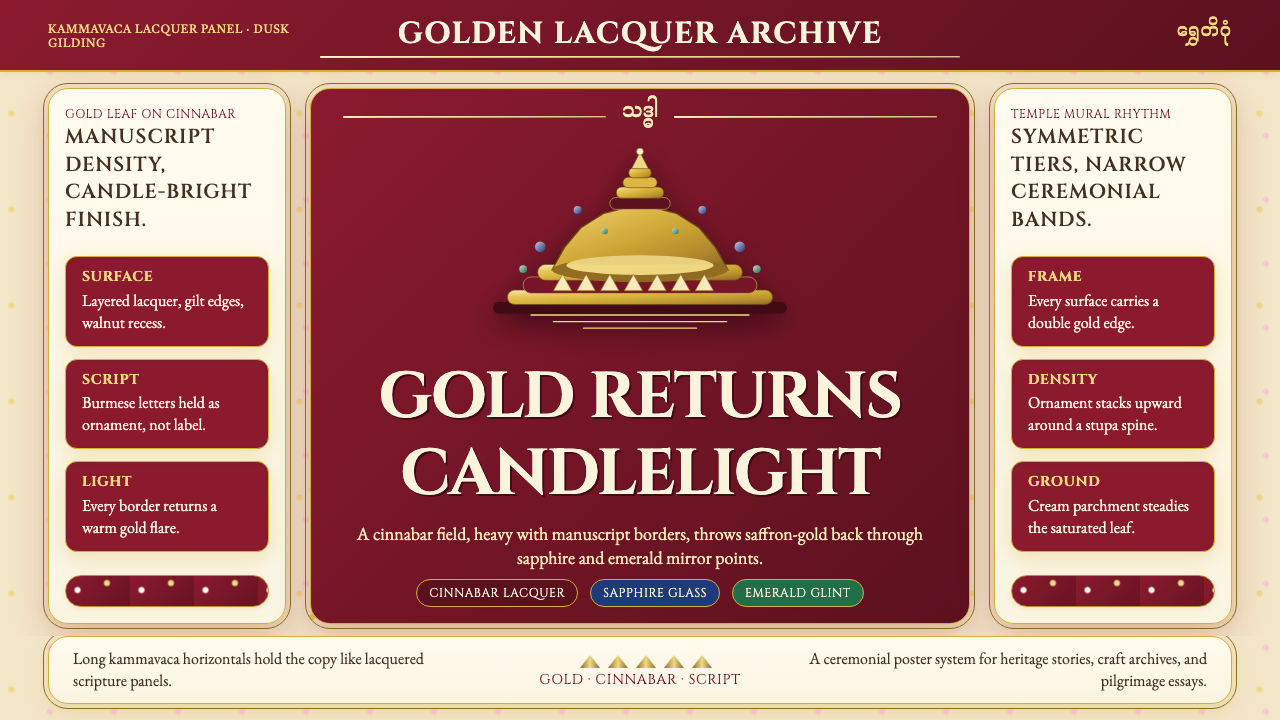 Burmese Shwedagon Gold-LacquerOpulence catches fire. Gold-leaf gradients on cinnabar panels frame a stupa s…虔诚的金色密度:朱漆面板上的金箔渐变,围出佛塔中轴。
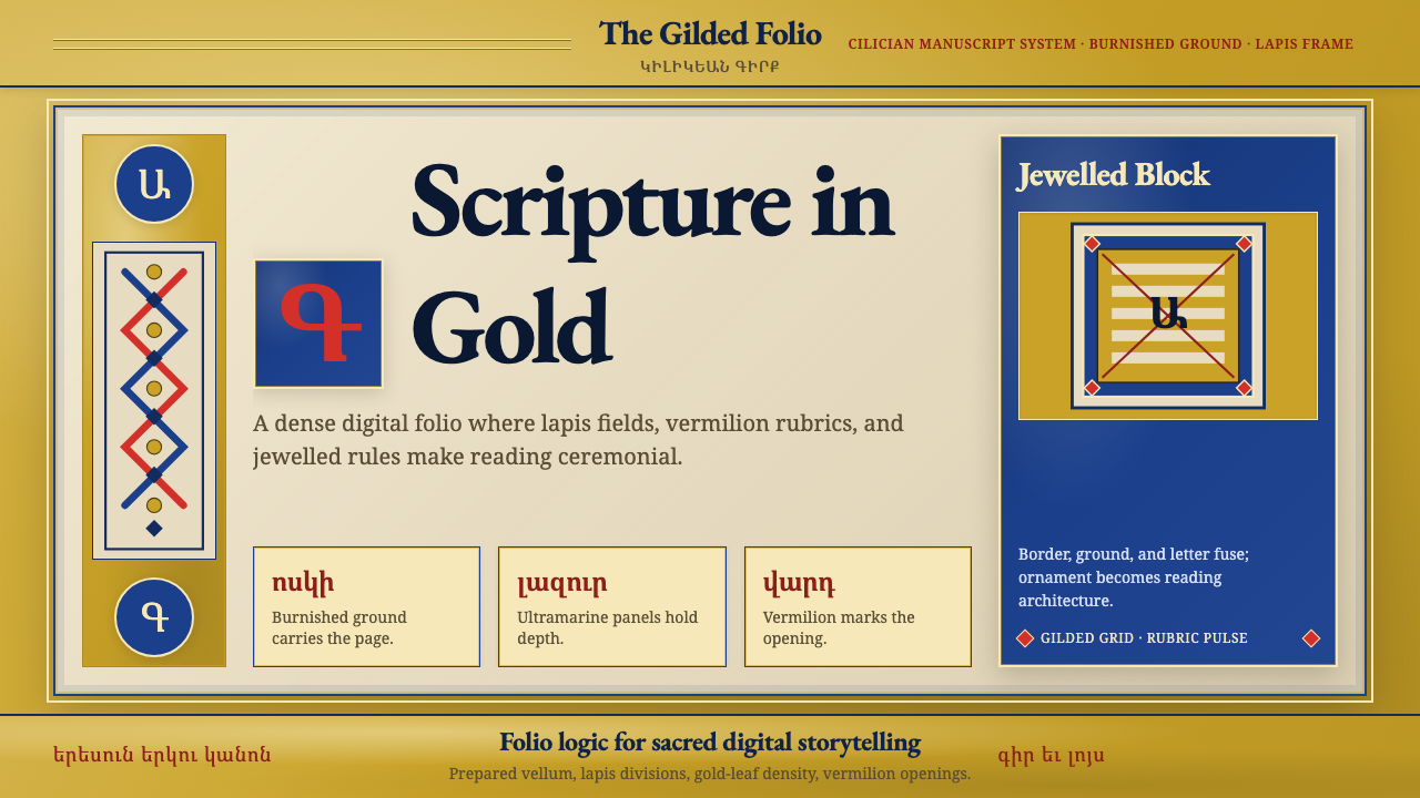 Armenian Illuminated ManuscriptGilded maximalism. Burnished gold, lapis frames, and vermilion initials build…鎏金极繁。金箔底、青金框与朱砂首字构成密实书页。
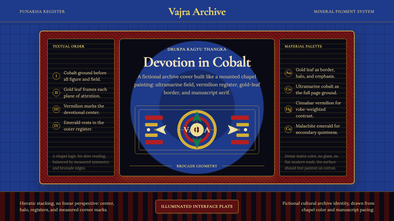 Bhutanese Drukpa Kagyu ThangkaDevotion made cobalt. Gold frames, Cormorant serif, and vermilion marks hold…钴蓝承载虔敬:金框、Cormorant 衬线与朱砂标记构成佛殿秩序。
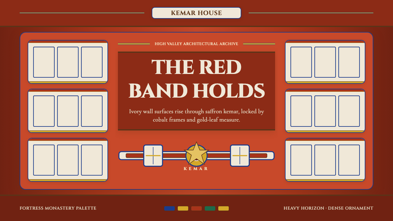 Bhutanese Dzong (Fortress Red)Monumental red holds the page. Cobalt frames and gold bands lock the fortress…厚重藏红掌控页面。钴蓝窗框与金色横带锁定宗堡节奏。
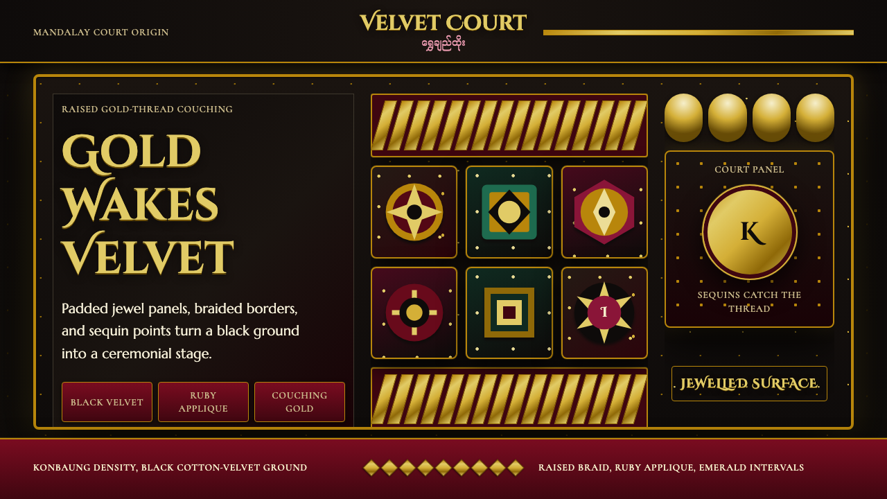 Burmese Kalaga TapestryVelvet becomes theater. Black ground, gold-thread borders, ruby and emerald p…黑绒如舞台。金线边框与红绿宝石色块密集闪耀。
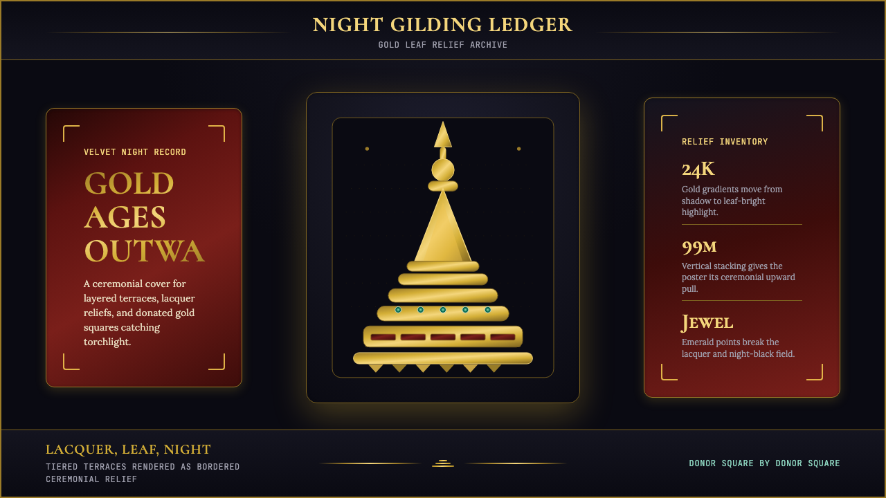 Burmese Shwedagon Stupa ReliefGold refuses restraint. Velvet black, teak-red lacquer, and tiered gradients…金色拒绝克制:黑夜、柚木红漆与层叠渐变堆出神圣密度。