What is Taíno Cemí?
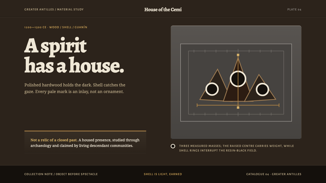
A cemí is a spirit and the object that holds it, and this style takes that literally: a resin-black page where light appears only where shell, gold-copper alloy or red pigment was once set into the wood.
Taíno Cemí in brief
Taíno Cemí is a design style drawn from the carved objects of the Taíno people of the Greater Antilles. A cemí, also spelled zemi, is both a spirit and the object that houses it. Between 1200 and 1500 CE, carvers across the islands cut three-pointed stone forms, called trigonoliths, from dense grey volcanic rock. They also carved in guayacan hardwood, polishing it until the wood's own resin rose to the surface as a black lustre.
Many of these carvings have a human face or an animal head at one end and the folded legs of a crouching frog at the other. Eyes and teeth were inlaid with shell, so a pale ring looks out from a body that is almost black. That contrast, a dark field interrupted by small, deliberate lights, is the visual core of the style.
The design system takes this material logic literally. The page is polished hardwood, deep to the point of black. Type follows the museum-editorial register that Spanish-language archaeology publishing actually uses, rather than inventing a Taíno lettering for a culture that had no writing system. Light arrives only where shell, a gold-copper alloy called guanín, or a little annatto red was actually set, and it is never spread across a surface as decoration. The tagline sums it up: light is earned.
Where does Taíno Cemí come from?
The tradition belongs to the Greater Antilles, the large islands of the northern Caribbean: Puerto Rico, Hispaniola, Cuba and Jamaica in the source material. Its reference period runs from about 1200 to 1500 CE and continues into the first contact with Spain in the fifteenth and sixteenth centuries. Within that period Taíno carving worked in two materials, stone and wood, and the source material treats them as a single stream: Taíno stone and wood carving, joined by the technique of shell inlay.
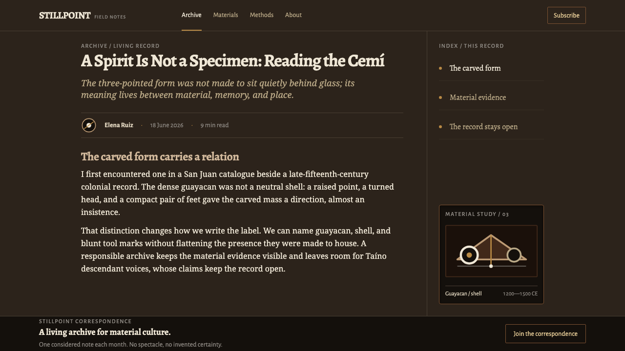
The stone side is the trigonolith. These are three-pointed forms cut from dense grey volcanic rock, a hard and unforgiving material that demands patient work. In many examples one end carries a human face or an animal head, while the other ends in the legs of a crouching frog. The three points give the object its distinctive silhouette, which reads at once as a figure and as an abstract form. The weight of the stone and the economy of its carving are the model for the style's heavy, quiet compositions.
The wood side is hardwood carving, and here the material logic becomes visual. Guayacan is a dense hardwood that can be polished until its own resin comes to the surface, leaving a lustre that is almost black. The source material also names the Vere hardwood zemi group among the movements behind the style. Into such dark surfaces carvers set shell for eyes and teeth. The same material list includes guanín, a gold-copper alloy, and annatto red, a plant pigment. Each of these is a place where light was deliberately introduced into a dark carved object.
The record that has come down to us is largely the objects themselves and the archaeological literature that describes them, much of it in Spanish. The Taíno had no writing system, which is why the style refuses to invent a script. The source material lists one individual name, George Latimer, among its key figures. It is a modern name, not the name of a carver. The makers of the cemí are anonymous, and a respectful use of the style keeps that in view: these are sacred objects, not decorative motifs.
What defines the Taíno Cemí look?
Resin-Black Ground
The page is polished hardwood, dark to the point of black but with a warm undertone that comes from resin rather than from a void. It has the lustre of a hand-worked surface, not the flatness of an empty screen. Large dark areas are not emptiness; they are the material from which the rest of the composition emerges.
Shell White
A pale, slightly warm white appears as small rings and shapes, like shell set in the eyes and teeth of a carving. It marks focal points: the active element, the key figure, the thing the reader should look at first. Because it is rare, it is magnetic. A pale ring in a dark field is the style's signature image.
Guanín Hairlines
Guanín, the gold-copper alloy, appears as fine lines with a warm metallic tone rather than as large fills. Hairlines trace a border, underline a title or divide two areas. The restraint matters: guanín was precious and used in small amounts, and a thin warm line on a dark ground has more presence than a broad gold surface ever could.
Annatto Red, Sparingly
A small amount of warm red, taken from annatto pigment, is the only other chromatic accent. It marks something that needs notice without alarming the reader. It is used in tiny quantities, usually as a mark or a thin detail, and never as a dominant colour. Without that restraint it would compete with the shell white and the guanín line.
Earned Light
The central rule: light appears only where an inlay would historically have been set. There is no ambient glow, no gradient wash, no evenly spread brightness. Every bright element must have a reason to exist, and every reason should be about meaning, not decoration. The rule keeps the interface quiet and makes anything that does shine feel significant.
Carved Planes and Tool Marks
Surfaces are hand-polished dark planes with the marks of the tool left visible. Depth is made from steps of dark against slightly less dark, as in a carved relief where shadow pools in the cut. There are no bevels, no glossy highlights and no soft shadows. The impression is of mass cut away and surface worked by hand.
Museum-Editorial Type
Type follows the register of Spanish-language archaeology and museum publications: calm, bookish and precise, with captions, plate numbers and measured line lengths. There is no invented Taíno lettering and no pseudo-glyph ornament, because the culture had no writing system and the style will not fake one. The typography frames the objects instead of competing with them.

Who shaped Taíno Cemí?
The only individual named among the style's key figures in the source material. His is a modern name, not a name from the carving workshops of 1200 to 1500 CE. The source material does not spell out his role, but his presence is a useful reminder that what we know of cemí reaches us through later study and description, while the people who made them are not named.
The anonymous carvers of the Greater Antilles who cut trigonoliths from volcanic rock and shaped guayacan hardwood into figures. They worked in the islands named in the source material, from Puerto Rico and Hispaniola to Cuba and Jamaica, within shared conventions of form, polish and inlay. The style honours them as a tradition rather than assigning invented names.
A group of carved hardwood zemis listed in the source material among the movements behind the style. It stands for the wooden counterpart of the stone trigonoliths, and its polished dark surfaces and inlaid features are the most direct model for the page: a near-black body, a pale ring and a few points of precious light.
How do you use Taíno Cemí today?
Taíno Cemí suits work that is reflective, scholarly, cultural or ceremonial: museums and exhibitions, archaeology and history publishing, heritage and language projects, documentary storytelling, and carefully made products about origin, craft and rarity. It is a dark-native style and assumes a mood of quiet attention, so it is strongest where the viewer is meant to slow down and look.
For presentation slides, a cover can be an unbroken near-black field with the title set in calm, bookish type and a single pale shell ring as the only bright element, plus one fine warm line beneath the title. Content slides should be dark and mostly empty, with one idea per slide and a caption-like note below, in the manner of a catalogue plate. Data slides keep the bars and lines in dark tones, and only the key data point is lit, as if inlaid in shell white or marked with a guanín line. Grid lines are barely there or absent.
On the web, dashboards translate the idea of earned light into a clear hierarchy. Dark panels sit on a dark ground, dividers are fine warm hairlines, and only the active item, the primary action or the key metric is lit. Pricing pages can present tiers as dark panels, with a pale ring or thin warm border marking the recommended plan. Hover states reveal light the way an inlay catches it, with a border or mark brightening, but nothing glows or floats. Forms should be understated, with hairline inputs and clear focus rings in shell white.
For editorial and marketing work, the style is ideal for exhibition sites, catalogues, long reads on archaeology and cultural histories. Captions should note object, material and place in a museum voice, and photography should show the carved objects against dark backgrounds, so that colour comes from the object. Marketing copy can be spare and factual. Let the pale ring and a hairline do the work of a logo-like accent without any additional ornament.
The most common mistake is to treat 'Taíno' as a licence for decoration. Inventing a faux Taíno typeface, scattering tribal-looking patterns or using the cemí figure as a logo or clip art all misrepresent a culture without a writing system and trivialise sacred objects. Other errors are visual: using wide gold gradients instead of fine guanín lines, adding neon glows, spreading brightness across the page, or treating resin-black as an empty void. Keep the dark deep and alive, the light rare and the use respectful.
Taíno Cemí — FAQ
What is a cemí?
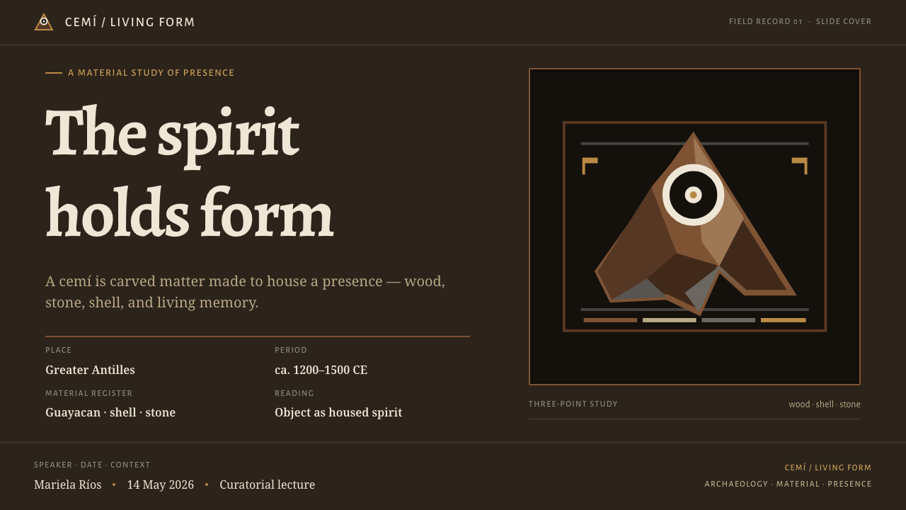
A cemí, also spelled zemi, is a spirit and the object that houses it. Taíno carvers of the Greater Antilles made them in stone, such as the three-pointed trigonoliths cut from volcanic rock, and in hardwood polished until its resin gave a black lustre. Eyes and teeth were often inlaid with shell.
What is guanín and how does the style use it?
Guanín is a gold-copper alloy, one of the precious materials that could be set into carved objects. In the style it appears only as fine warm lines, for borders, underlines and small details, never as a wide fill or gradient. Its rarity on the page echoes its rarity in the object.
Why is there no Taíno typeface?
Because the Taíno culture had no writing system, so any Taíno lettering would be an invention. The style instead uses the museum-editorial type register of Spanish-language archaeology publishing, which is where these objects are actually described. It is a way of being honest about what is known.
Does the style work on a light background?
It is built around a dark ground, because the effect depends on pale shell and warm metal being rare and visible against polished black wood. A light version would lose the logic of earned light. If you need light reading areas, keep them small and framed by the dark field so that the dark remains the material of the page.
Is it appropriate to use for commercial products?
It can be, with care. These forms come from the sacred objects of a particular people, so avoid turning the cemí figure into a logo, a mascot or decorative filler. The style fits cultural, educational and craft-minded products, where its restraint and respect for the source are part of the message. Credit the tradition, and let the objects speak.
Related design styles
 Ecuadorian Otavalo Cochineal LoomHandwoven gravity. Cochineal and cobalt stripes tense against charcoal, cut b…
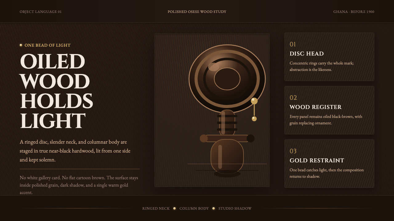 Akuaba Akan Fertility DollDarkness becomes sculpture. Near-black wood, ringed geometry, and one gold be…
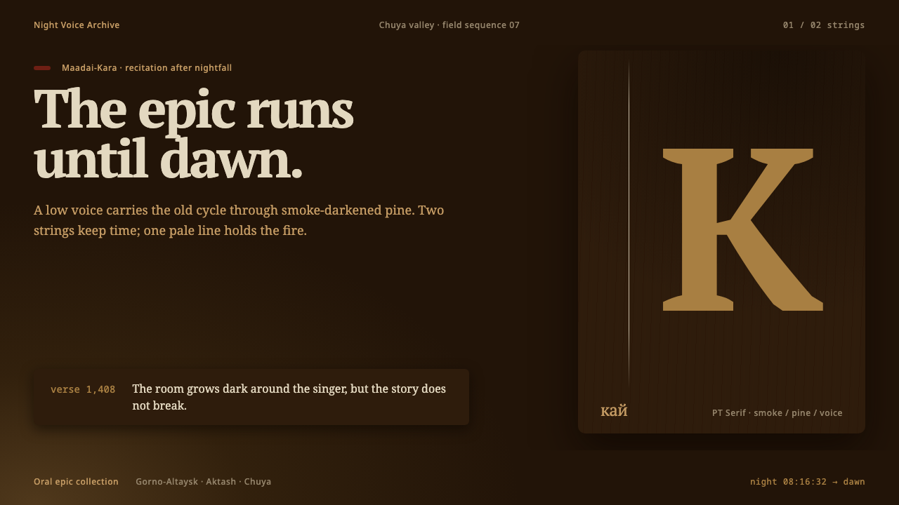 Altai Kai EpicEpic voice burns until dawn. Smoke-brown layers meet one pale string and a si…
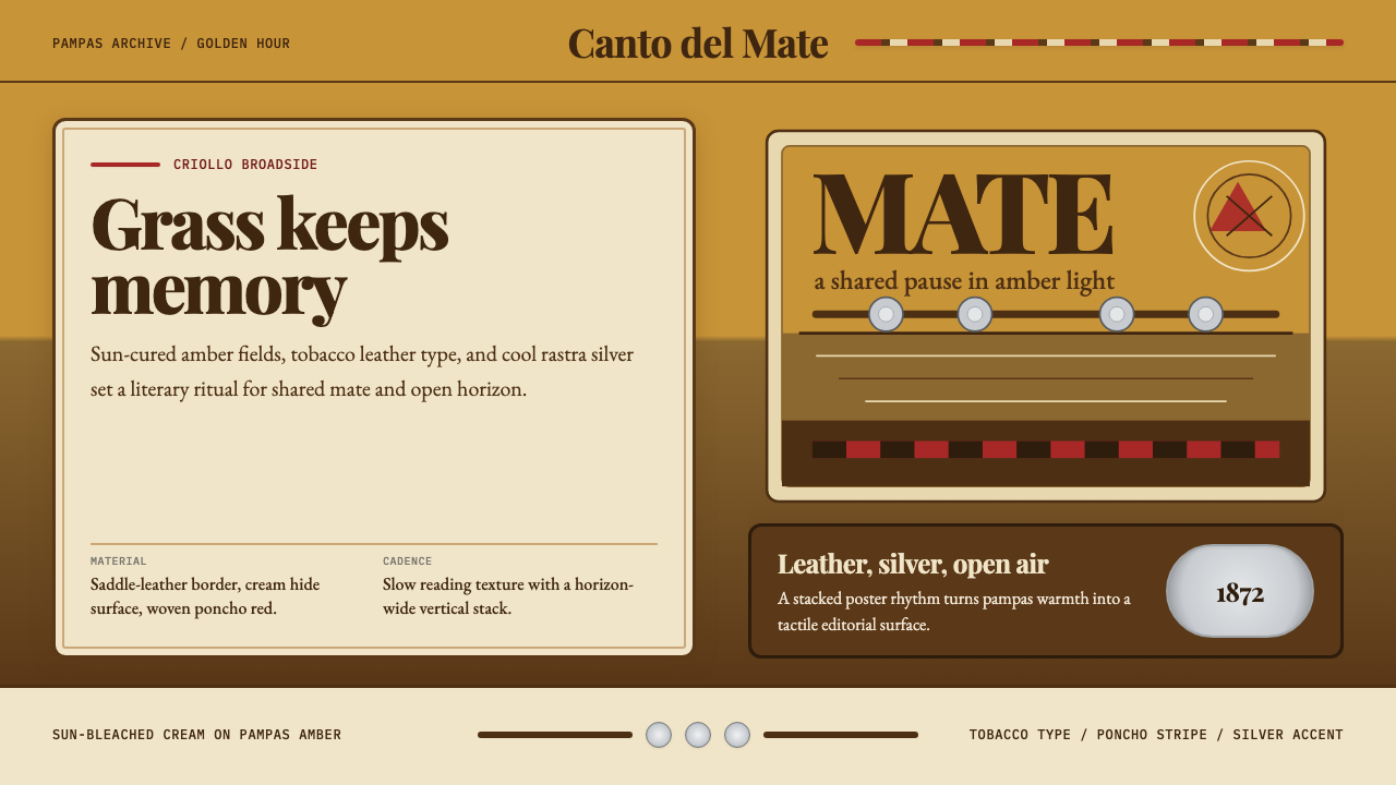 Argentine Gaucho (Pampas Mate Culture)Open grassland, printed warm. Amber fields, Playfair serif, and silver rastra…
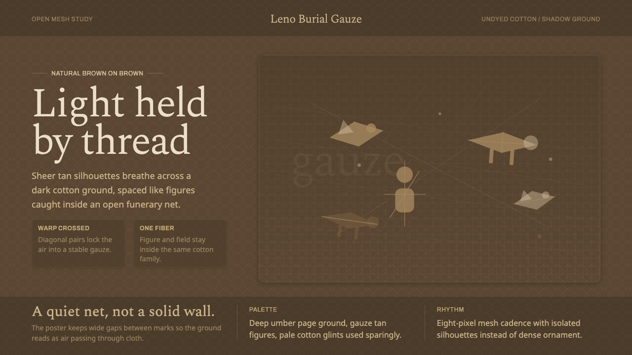 Chancay Gauze TextileQuiet woven dignity. Tan silhouettes float through a dark open cotton mesh.
 Cheese Affinage CavePatience reads as stone. Rind brown, mold green, and oak shelf grids glow in…