What is Szekely Gate?
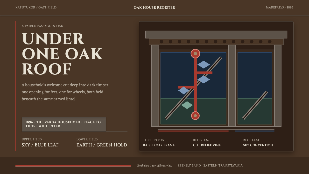
The Székely gate is a house for a threshold: oak posts, a shingled roof and a carved panel where a red vine climbs and its leaves turn sky blue.
Szekely Gate in brief
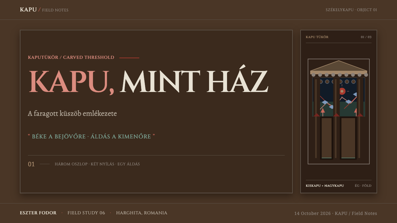
Szekely Gate is a design style drawn from the székelykapu, the carved wooden gatehouse of the Székely people of eastern Transylvania. It is not a door but a whole structure cut from oak. Three posts, called zábé, carry a lintel known as the kontyfa, through which a row of dovecote openings is punched. Over the lot sits a scalloped shingle roof, and a carved panel, the kaputükör, fills the field above two openings. The small opening is for people, the large one is for wagons, and they always come as a pair.
The ornament is flat and symbolic, not botanical. A thick-stemmed vine climbs in red, and its flowers are red too; the tulip is the familiar bloom of Hungarian folk ornament, and the style's own identifier names it. In the convention of Máréfalva, the leaves are painted blue for the Sky, while green holds the lower zone of the Earth. Cut into the diagonal brace, the hónaljkötés, in clean Roman capitals, is the year and the name of the owner, often accompanied by a blessing for those who come in and those who go out.
As a visual system, the style is dark, carved and ceremonial. The ground is tannin-dark oak, and the colours sit in it the way paint sits in open grain: absorbed, slightly uneven, never a plastic coat. Chisel marks are left unsanded because the depth of the relief, and the shadow that depth throws, are the thing itself. Weight comes from cut surfaces and thick forms. The result is a design that feels built rather than drawn, a threshold you have to pass through.
Where does Szekely Gate come from?
The gates belong to Székely Land, in eastern Transylvania, in Romania. The source material focuses on two villages in Harghita county: Máréfalva, known in Romanian as Satu Mare, and Parajd, known as Praid. The tradition reaches back to the seventeenth century, and the gates that survive in those two villages are largely older than 1900. They are not museum pieces but structures that stood at the edge of household yards, and their survival tells us how seriously a family took the line between the street and the home.
The makers were village gate-carvers, the kapufaragó. Their craft sits at the meeting point of two traditions that the source material lists separately: Hungarian folk woodcarving, which supplies the vocabulary of vine, flower and leaf, and Székely vernacular timber joinery, which supplies the structure of post, lintel, brace and roof. The diagonal brace is where the two meet. It stiffens the junction of post and beam, and it also provides a flat field on which the carver cuts the year and the owner's name. In a gate, structure and inscription are the same piece of wood.
Colour belongs to a third tradition, painted folk ornament of the Carpathian basin, and in Máréfalva it follows a rule of position rather than of nature. The upper zone belongs to the Sky and is painted blue, so the leaves there are blue even though no leaf is. The lower zone belongs to the Earth and holds green. Rosemary, the source material notes, must be green wherever it appears. The vine and flowers are red. Colour in this system is a statement about where something sits in the world, and the painter does not match it to a botanical specimen.
A gate also carries a record. The source material names the owner families of Máréfalva, whose names are cut into the braces together with the year, as one of its key references, so each gate states who lives behind it and when it was raised. It also cites the Kriza János Néprajzi Társaság, the Kriza János Ethnographic Society, a Transylvanian Hungarian body that stands for the documentary side of the tradition: collecting, describing and preserving what the village carvers made. The style inherits that double character. It is both a decorated entrance and a carefully lettered document.
What defines the Szekely Gate look?
Tannin-Dark Oak
The ground is oak darkened by tannin, a deep warm brown that sits near black without being black. It is the colour of old timber that has weathered and been handled for generations. Everything is read against it, so the page has a sense of material weight from the first glance. Text and ornament appear light or bright on this ground, as carving appears against shadow.
The Red Vine
A thick-stemmed vine climbs through the carved field in red, with red flowers. It is the central ornament and the main carrier of the palette's warmth. The stem is heavy and confident, never thin or twining delicately. As an interface motif it works as a vertical, growing line, suitable for borders, dividers and the rhythm of a long page.
Sky Blue Leaves and the Earth Zone
In Máréfalva's convention, leaves in the upper zone are painted blue for the Sky, while the lower zone holds green for the Earth, and rosemary stays green wherever it appears. Colour follows position, not botany. In layout terms this gives a simple rule: blue belongs in the upper register, green in the lower, and red in the vine that links them.
Relief Depth and Shadow
The ornament is carved in deep relief and the chisel marks are not sanded away. The depth of the cut, and the shadow it throws, are part of the object. In an interface this means depth is built into surfaces through inset edges and firm, directional shadows that feel cut rather than blurred. Shadow is structural information, not an effect added afterwards.
Paint in the Grain
Pigment is absorbed by open wood grain rather than sitting on a sealed surface. Reds and blues look stained and slightly irregular, with the wood showing through at the edges. This keeps the palette rich without gloss and prevents the ornament from feeling like a decal. Flat, opaque, glossy fills would contradict the material.
Roman Capitals on the Brace
Inscriptions are cut in clean Roman capitals: the year, the owner's name and often a blessing for those who enter and leave. They are set on the diagonal brace, with generous spacing and a firm, monumental feel. Lettering in this style is architectural. It reads as something carved to last, which makes it ideal for headings, dates and short ceremonial lines.
Gatehouse Structure
The form is a gatehouse: posts, a lintel with a dovecote punched through it, a scalloped shingle roof and a carved panel above two paired openings, one small and one large. The pair is a layout idea as much as an architectural one. Two unequal but related openings give a natural structure for comparisons, tiers and primary versus secondary content. The scalloped roof line provides a distinctive top edge.
Who shaped Szekely Gate?
The kapufaragó, literally the gate-carvers, were village craftsmen who cut the posts, lintels, braces and panels of the székelykapu. Their individual names are mostly not recorded in the source material, and the style honours them as a collective: a tradition of makers working inside shared conventions of form, colour and inscription.
The households whose names and years are cut into the diagonal braces of Máréfalva's gates. Their presence turns each gate into a statement of who lives there and when it was raised. For design, they are a reminder that this ornament has an addressee: it announces a particular family at a particular threshold, which is why inscription, not pattern alone, is central to the style.
The Kriza János Ethnographic Society, a Transylvanian Hungarian body named in the source material as a reference for the tradition. It represents the scholarly side of the story: describing the gates, their parts and their customs so that the conventions behind the style, such as the Sky and Earth colour zones, can be understood and credited correctly.
How do you use Szekely Gate today?
Szekely Gate suits work that carries heritage, craft, hospitality and ceremony. It fits cultural institutions, festivals, food and drink brands rooted in a place, handmade goods, storytelling projects and any product whose promise is welcome or belonging. It is a dark, weighty style with a warm centre, so it is strongest where the experience is meant to feel like entering somewhere.
For presentation slides, a cover can use the dark oak ground, with the title set in widely spaced capitals as if cut into a brace, and a red vine rising along one margin with a few blue leaves near the top. Content slides can borrow the paired openings: a narrow column for a short point beside a wide column for the main argument. Data slides should use heavy, simple forms. Bars or markers in red with blue as the secondary series, labels in capitals, and no hairline detail that would disappear against the dark ground.
On the web, a dark panel system with inset edges and firm shadows gives dashboards the feel of carved wood. Navigation can sit as a lintel across the top, and a scalloped edge or dovecote row can mark the transition into content. Pricing pages can use the pairing directly: two plans as a small and a large opening under one roof, with plan names in capitals as inscriptions. Red marks the primary action, blue marks information, and green is for confirmation or states that are grounded. Hover states deepen the relief rather than lifting the element.
In editorial and marketing work, the style supports slow, narrative content: cultural stories, event pages, restaurant and hospitality sites, and maker profiles. Use an inscription as a heading, and close with a short blessing-like line. Photography should show real wood, tools and hands, and any wood texture should come from genuine photography rather than glossy simulation. Copy should be warm and direct, addressing the visitor as someone being welcomed through a gate.
The most common mistakes come from treating the colours as arbitrary. Turning the blue leaves green because leaves are green breaks the Sky and Earth rule; scattering blue into the lower zone does the same. Sanding the style smooth, with glossy bevels and soft drop shadows, removes the chisel marks that give it meaning. Thin, delicate type disappears against the dark oak. Finally, avoid reducing it to a generic 'Transylvanian' trope. This is Székely carpentry and ornament from specific villages, and it should be credited as such.
Szekely Gate — FAQ
What is a székelykapu?
It is the carved wooden gate of the Székely people of eastern Transylvania, built as a whole gatehouse rather than a single door. Posts carry a lintel, a shingle roof covers the structure, and a carved panel fills the field above two openings, a small one for people and a large one for wagons. The source material focuses on the gates of Máréfalva and Parajd.
Why are the leaves blue?
In the convention of Máréfalva, the upper zone of the carved field belongs to the Sky and is painted blue, while the lower zone belongs to the Earth and holds green. Colour follows position, not nature. Rosemary is the exception that must always be green. Treating the blue leaves as a mistake and recolouring them misses the point of the system.
Does the style have to be dark?
Dark is native to it. The ground is tannin-dark oak, and the reds and blues are tuned to read against that depth. A light variant would lose the sense of carved relief catching shadow. If you need a light page, keep the dark oak for headers, frames and key panels and let the lighter areas serve only for long reading.
What is written on the diagonal brace?
The year and the owner's name, cut in clean Roman capitals, and often a blessing for those who enter and those who leave. Because the brace is both structure and inscription, the style treats lettering as architecture: spaced, upright and carved to last.
Is it only suitable for heritage and craft brands?
It is strongest there, but its structure travels. Paired openings suit comparisons, inscriptions suit ceremonial moments such as onboarding or milestones, and the dark, weighty ground suits products that want to feel solid and welcoming. It struggles with fast, light, playful or highly technical products where a carved, ceremonial register would feel heavy.
Related design styles
 Manjusha Anga Snake-ScrollLegend moves in three pigments. Green outline, pink drama, yellow divinity on…
 Balinese Kamasan PaintingAncient cloth, ordered as story. Ochre bands, soot outlines, indigo and gold…
 Oracle Bone 甲骨文Feels excavated, not restored. Tea-brown panels carry cinnabar glyphs and cra…
 Belarusian RushnykRed carries meaning. Madder rhombs crowd aged flax edges while the woven cent…
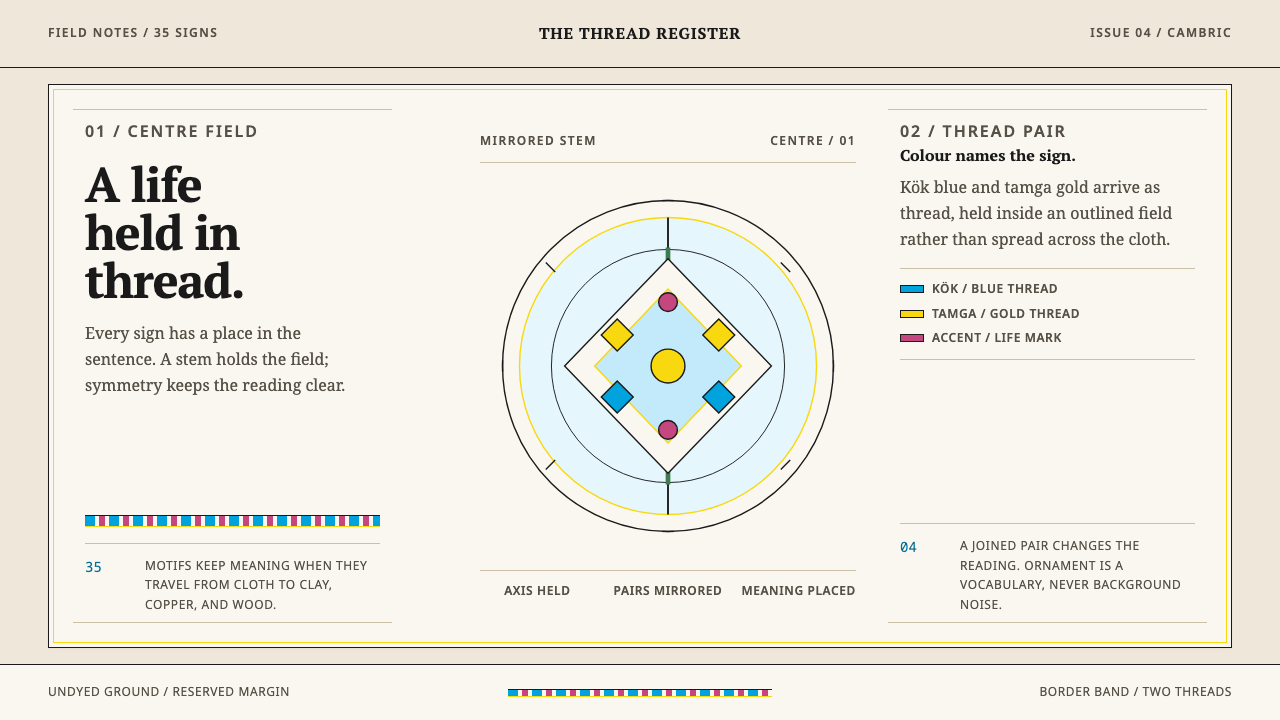 Crimean Tatar OrnekOrnament that can be read. Kök blue and tamga gold hold a mirrored stem on un…
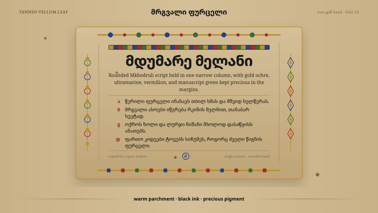 Georgian MkhedruliA manuscript breathes slowly. Tanned vellum, round Mkhedruli ink, ochre and u…