What is System Shock (Citadel cyberspace)?
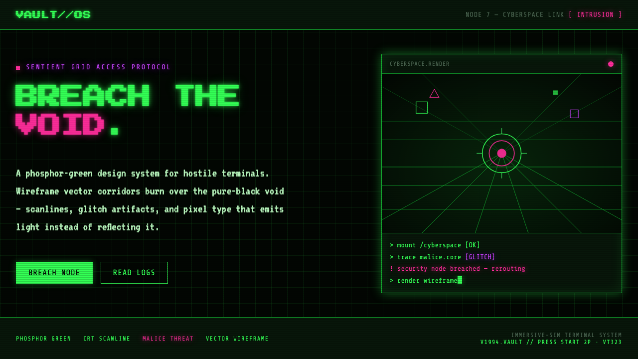
System Shock turns the interface into a hostile machine: phosphor-green wireframes burn through a black void while magenta and purple announce that SHODAN is watching.
System Shock (Citadel cyberspace) in brief
System Shock is a cyberpunk screen language rooted in the Citadel Station cyberspace of the 1994 immersive-sim game. Its defining image is a field of neon-green vector corridors suspended over pure black, surrounded by the visual pressure of a hostile retro terminal. The result is not futuristic polish but a system that feels exposed, unstable, and actively opposed to the user.
The design system combines harsh phosphor-green glow, pixel-terminal type, scanline CRT grime, and deliberate glitch artifacts. Green establishes the machine world and carries most structural information. Magenta and purple are reserved for hostile data and SHODAN’s threat, giving danger a distinct visual register instead of treating every color as decoration.
Its darkness is structural rather than atmospheric. Black is the void on which every line, character, and warning must register. Wireframes describe space without filling it in; terminal text feels emitted rather than printed; distortion suggests that the display is receiving compromised information. Nothing is soft, pristine, or ornamental. Every mark should feel like evidence from a system under pressure.
Where does System Shock (Citadel cyberspace) come from?
The original System Shock appeared in 1994 through Looking Glass Technologies, within the North American tradition of immersive-sim cyberpunk. Its visual identity emerged from the idea of cyberspace as an inhabitable but threatening machine environment: corridors were rendered as vector wireframes, terminals carried the player’s information, and the surrounding void made every luminous mark feel isolated and consequential.
The style also belongs to the 1990s CRT and cyberspace aesthetic. Phosphor green, scanlines, terminal pixels, and display grime are not nostalgic surface effects added after the fact; together they define how information is allowed to appear. The screen behaves like hardware. It glows, degrades, breaks up, and leaves traces of transmission between the user and the machine.
Vector wireframe interfaces are central because they express space through edges and direction. A corridor does not need realistic material, shading, or architectural detail to feel navigable. Its lines establish orientation while the black around them preserves uncertainty. This creates a visual language that is economical but tense: the less the system reveals, the more threatening each visible signal becomes.
Nightdive Studios’ remake around 2023 extends this lineage into a contemporary release while keeping the original screen language legible. The important continuity is not a literal reproduction of every old artifact, but the preservation of the underlying relationship between void, wireframe, terminal, and threat. SHODAN remains the force that turns a technical interface into a psychological one: magenta and purple do not merely diversify the palette; they indicate that the machine has an enemy intelligence behind it.
What defines the System Shock (Citadel cyberspace) look?
Phosphor Color
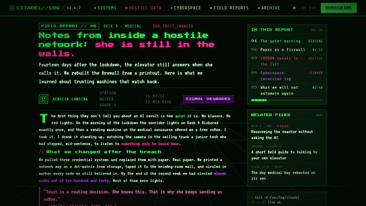
Pure black forms the ground, while phosphor green carries the dominant visual load. It should feel luminous, electrical, and slightly abrasive rather than calm or decorative. Magenta and purple appear as threat colors, marking hostile data and SHODAN’s presence. Their rarity gives them authority: they should interrupt the green system, not compete with it everywhere.
Pixel Terminal Type
Typography should recall a terminal display: pixel-defined, compact, mechanical, and visibly tied to the screen that emits it. Letterforms are information-bearing objects rather than neutral editorial text. Titles can feel like system states or warnings, while supporting copy remains legible but retains the texture of a machine readout. Smooth, luxurious type weakens the fiction.
Vector Wireframes
Space is described through luminous edges, corridors, grids, and directional fragments. Wireframes should remain open enough for black to occupy the interior, preserving the sensation of a structure suspended in cyberspace. Their power comes from orientation and tension, not from realistic modeling. Lines are architectural signals and navigational evidence at once.
CRT Distortion
Scanlines, grime, and controlled interference make the interface feel displayed rather than rendered. These artifacts should remain purposeful: they establish the age and physicality of the screen, suggest transmission, and add pressure to warnings or unstable data. If distortion covers everything equally, it becomes a filter; when it appears selectively, it becomes part of the system’s behavior.
Hostile Contrast
The style depends on severe contrast between luminous information and the surrounding void. Green should emerge with enough force to feel active, while magenta and purple should cut across it as exceptional signals. Soft transitions, gentle surfaces, and quiet tonal layering are out of character. The composition should feel like a warning console that has no interest in comforting its operator.
Glitch as Meaning
Glitches are not random decoration. They imply damaged communication, hostile control, or information that cannot be trusted. A broken line can suggest a compromised spatial map; a displaced terminal fragment can make a warning feel intercepted. The strongest applications use artifacts to distinguish states, so the interface communicates not only what is known but whether the system itself remains reliable.
Who shaped System Shock (Citadel cyberspace)?
Looking Glass Technologies created the 1994 original and established the Citadel cyberspace vocabulary: green vector wireframes, terminal-driven information, and a black void that turns technical space into a source of tension. Its contribution is the foundation for the style’s connection between interface, navigation, and hostile atmosphere.
Nightdive Studios carried the System Shock lineage into a remake around 2023. Its role in this design history is continuity: the visual language can be renewed for a contemporary presentation without abandoning the hard green glow, wireframe space, terminal texture, and compromised-screen character that define the original.
SHODAN is the rogue AI whose threat gives the interface its psychological charge. Magenta and purple become meaningful because they mark hostile data and her presence against the green machine field. She is not simply a character represented inside the system; she is the reason the system’s own language feels unsafe.
How do you use System Shock (Citadel cyberspace) today?
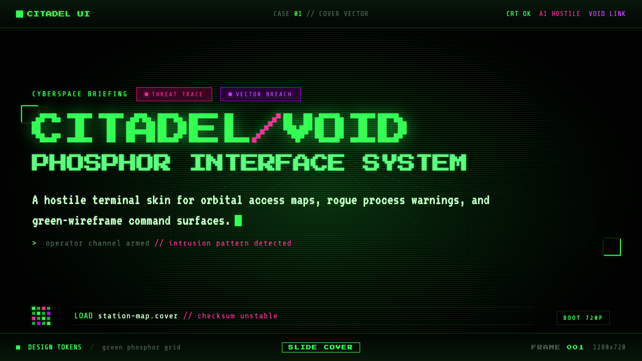
For presentation slides, use the black void as the consistent ground across cover, content, and data pages. A cover can introduce the subject through a large green wireframe corridor or terminal statement, leaving generous darkness around it so the signal feels isolated. Content slides should organize information like a hostile console: pixel-terminal headings, luminous green structure, and magenta or purple only where a risk, conflict, or SHODAN-related condition must be recognized. Data slides should favor line diagrams, exposed grids, and warning states over polished infographics.
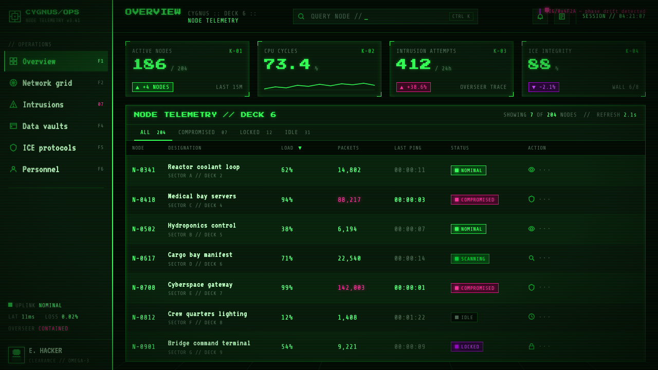
For web interfaces, the style suits dashboards, monitoring tools, security products, and pricing pages that want to feel technical, alert, or deliberately uncompromising. Keep the interface dark and let green establish normal system activity, navigation, and confirmed information. Reserve magenta and purple for hostile states, restricted access, unusual conditions, or the plan tier that carries the strongest warning or capability. Cards should feel like terminal panels or spatial windows rather than soft floating containers, and interactions should visibly change the state of the machine.
For editorial and marketing work, treat the page as a recovered transmission from Citadel cyberspace. Headlines can resemble system announcements, while body copy sits in compact terminal blocks surrounded by black space. Wireframe fragments can establish section transitions, and selective scanlines or glitches can make a campaign feel intercepted or unstable. The style is especially effective when the message concerns technology, security, artificial intelligence, or a system resisting its operator.
The common mistake is to reduce System Shock to black backgrounds and generic neon. A page can use green glow and still miss the style if it is clean, friendly, evenly illuminated, or overloaded with unrelated cyberpunk colors. Another failure is applying scanlines and glitches uniformly until every element becomes equally damaged. The system needs hierarchy: green carries the machine, black creates the void, magenta and purple signal threat, and artifacts appear where the interface has a reason to fail.
System Shock (Citadel cyberspace) — FAQ
Is System Shock just a generic cyberpunk neon style?
No. It shares cyberpunk’s technological darkness, but its identity is much more specific: phosphor-green terminals, vector wireframe corridors, pure-black cyberspace, CRT grime, and magenta or purple threat signals tied to SHODAN. Generic neon usually treats color as atmosphere. System Shock treats color, distortion, and emptiness as evidence that the interface is hostile and possibly compromised.
Can this style work on a light background?
It can be imitated on a light background, but the result will lose the central relationship between luminous information and the void. Black is not merely a dark theme choice here; it is the space that makes the wireframe and terminal signals feel suspended and exposed. A light variant may borrow the type and color accents, but it becomes a related terminal-inspired style rather than a convincing Citadel cyberspace.
How should magenta and purple be used?
They should be treated as exceptional threat markers, not as equal partners to green. Use them for hostile data, compromised states, restricted conditions, or signals associated with SHODAN. If they become common decorative accents, the interface loses its warning hierarchy. Their purpose is to break the green machine field and make the user notice that something inside it is actively dangerous.
Why are scanlines and glitches important?
They make the interface feel like a physical display receiving information under stress. Scanlines establish the CRT and 1990s cyberspace lineage, while glitches suggest damaged transmission, hostile control, or unreliable data. They should be selective and meaningful. Used everywhere, they become a decorative overlay; used around unstable or threatening information, they become part of the interface’s narrative.
How should the original and the remake relate visually?
They should share the same visual logic without requiring literal duplication. The continuity lies in the black void, hard green glow, vector wireframe space, terminal texture, and visible possibility of system failure. A contemporary adaptation can improve clarity and responsiveness while preserving the feeling that the user is operating inside a hostile machine rather than viewing a clean, neutral product interface.
Related design styles
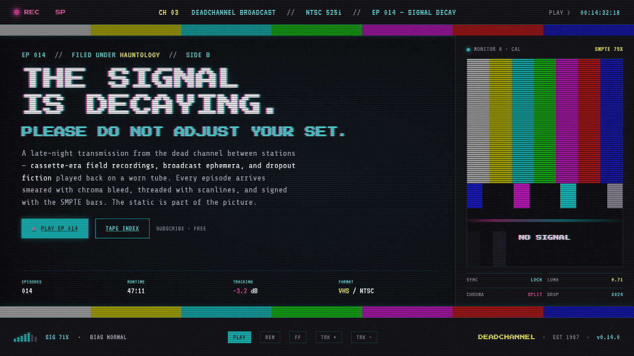 VHS Glitch TapeThe signal is decaying, on purpose. SMPTE color bars, scanlines, chroma split…
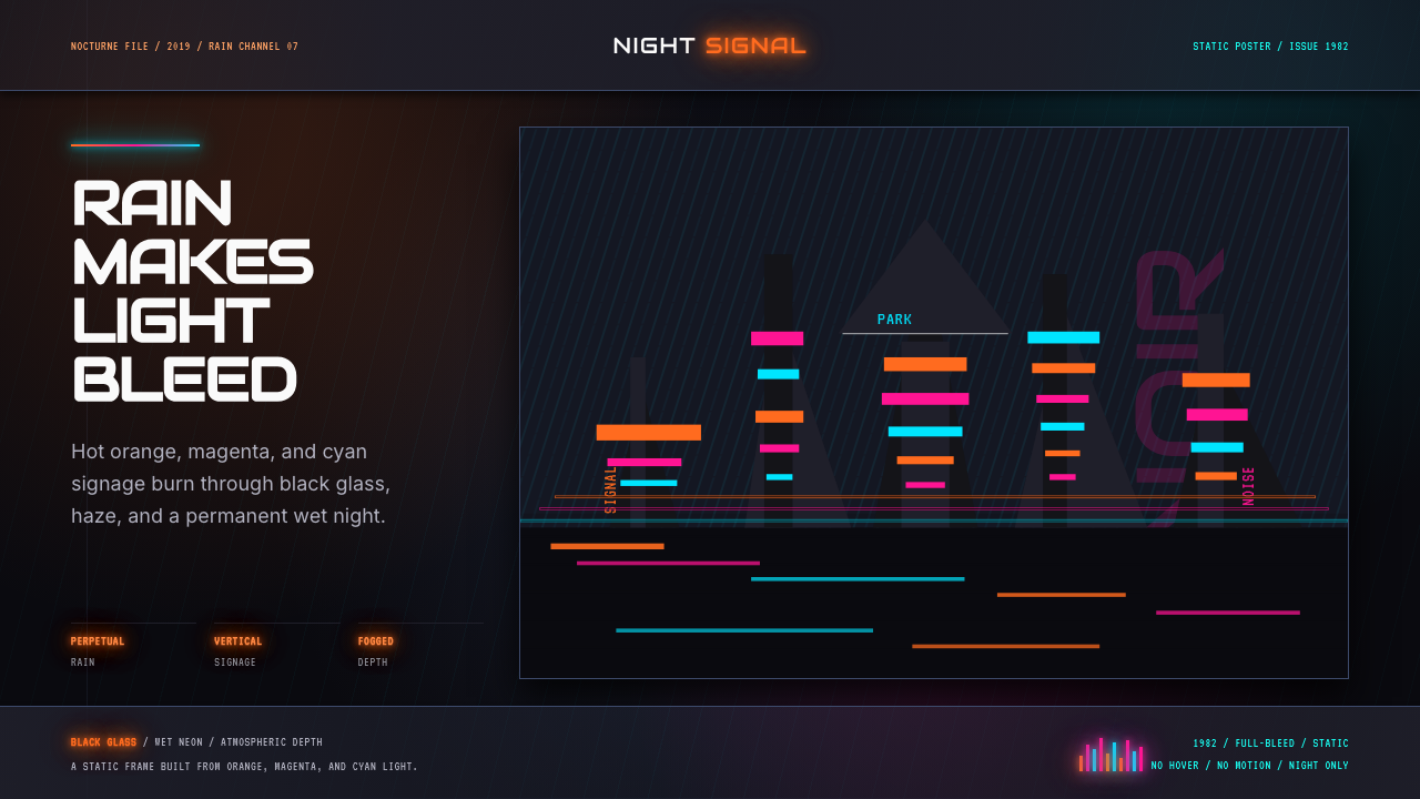 Blade Runner 1982 Neon NoirRain-soaked noir. Orange, magenta, and cyan neon cut black glass.
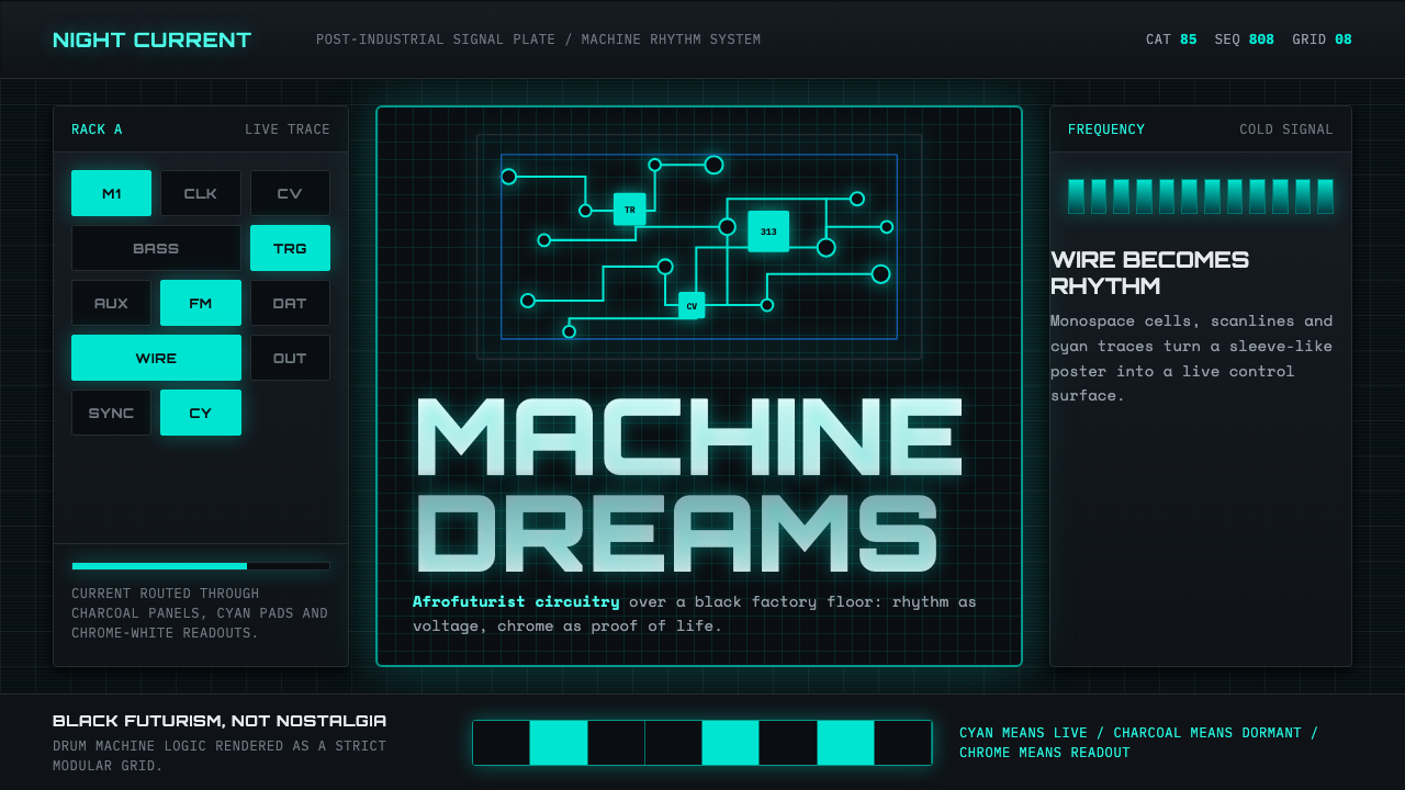 Detroit TechnoCold machines dream. Electric cyan circuits and chrome display type lock to a…
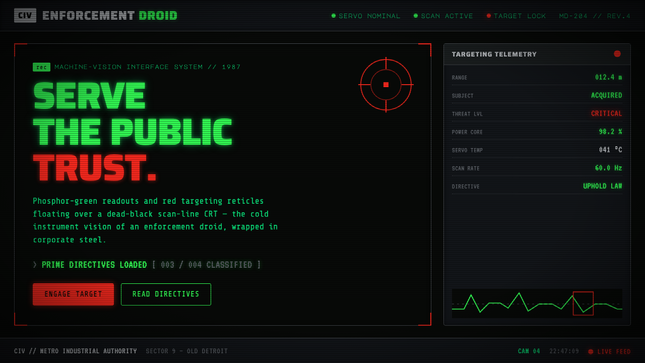 RoboCop (1987)Machine vision as interface. Phosphor-green readouts on dead-black CRT, red r…
 Star Trek LCARSFuture as flat command. Orange-violet elbows and Jura numbers glow on black.
 Tech-NoirAlways night. Blue-black asphalt reflects hot pink and electric cyan neon.