What is VHS Glitch Tape?
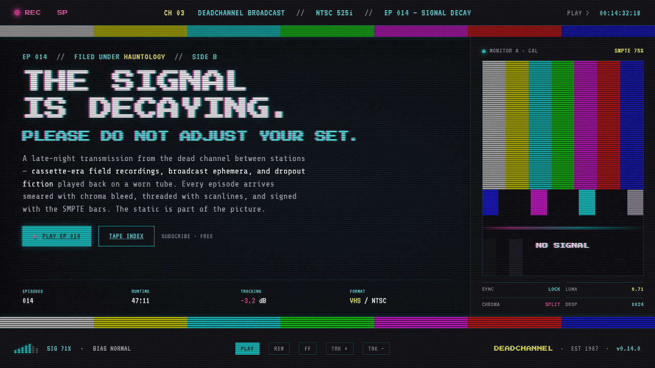
VHS Glitch Tape makes failure visible: color bars, scanlines, and cyan-magenta bleed flicker across the softly glowing black of an aging CRT.
VHS Glitch Tape in brief
VHS Glitch Tape is a dark visual language modeled on a worn videotape playing back through a CRT display. Its field is not a clean digital black, but a dimly luminous raster: horizontal scanlines interrupt the image, snow noise gathers in uneven patches, and the frame appears to be held together by an unstable electronic signal. The most recognizable artifact is the SMPTE color-bar test screen, treated not as a neutral calibration tool but as a fragment of broadcast infrastructure left inside the composition.
The style turns analog imperfection into subject matter. Tracking errors drag hot magenta-pink and cyan sideways across text, bars, and imagery; chroma seems to arrive a fraction away from luminance; thin horizontal disruptions suggest a tape that cannot quite lock to the display. Instead of hiding these defects behind a polished interface, VHS Glitch Tape frames them as evidence of a medium with age, friction, and memory.
At its core, the aesthetic is about the visible relationship between signal and screen. It does not simulate a generic retro past. It specifically evokes North American NTSC home-video and broadcast television culture from the VHS and CRT era, then reinterprets that vocabulary through analog-media nostalgia, glitch art, vaporwave, and hauntology. The resulting mood is technical, nocturnal, and strangely emotional: a familiar signal survives, but only in fragments.
Where does VHS Glitch Tape come from?
The visual source of VHS Glitch Tape lies in the home-video and broadcast environment of the 1980s through the early 1990s. VHS, associated with JVC as a format, belonged to a period when recorded moving images passed through physical tape and were viewed on CRT screens. Playback did not disappear into an invisible delivery system: the tape, the signal, and the display each left marks on what the viewer saw. A near-black screen could glow rather than sit flat, and a stable image could be interrupted by horizontal noise, tracking smears, or drifting color.
Broadcast television contributed the style’s clearest symbol: SMPTE color bars. Developed as a recognizable standard for color-bar testing, the screen carries an institutional, technical authority that changes when it is placed inside a design composition. In VHS Glitch Tape, color bars become a sign of transmission rather than a promise of perfect calibration. They imply a channel before programming, a test signal after programming, or a recording caught at the boundary between equipment and content.
The original artifacts were revived around the 2010s through vaporwave and glitch art. These movements did not merely reuse old television imagery as decoration; they made decay, interruption, and obsolete media central to the image. Analog-media nostalgia supplied the pull toward familiar hardware and recorded memory, while hauntology gave the fading signal a ghostly charge. The style’s emotional power comes from this tension: the artifact feels historically specific, yet its failure keeps it from becoming a tidy historical replica.
Norm Hoffman is named among the key figures of the vaporwave revival, alongside JVC and SMPTE as institutions or standards embedded in the style’s history. Together, those references explain why VHS Glitch Tape is not simply a dark palette with noisy overlays. Its visual vocabulary depends on a particular chain of associations: a physical video format, a television calibration image, CRT playback, and a later cultural revival that learned to see degradation as meaningful rather than accidental.
What defines the VHS Glitch Tape look?
Glowing CRT Black
The base is near-black, but it should never feel like inert ink. It has the faint presence of a tube display still energized in a dark room. That subtle glow gives scanlines and noise somewhere to live, preventing the composition from becoming a flat black interface with decorative damage pasted over it.
Scanline Raster
Horizontal scanlines are the style’s underlying rhythm. They make the screen read as a raster rather than an abstract dark background, and they introduce a steady mechanical cadence even when other elements are breaking apart. They should feel embedded in the display surface, not drawn as neat stripes sitting above every object.
Chroma Bleed
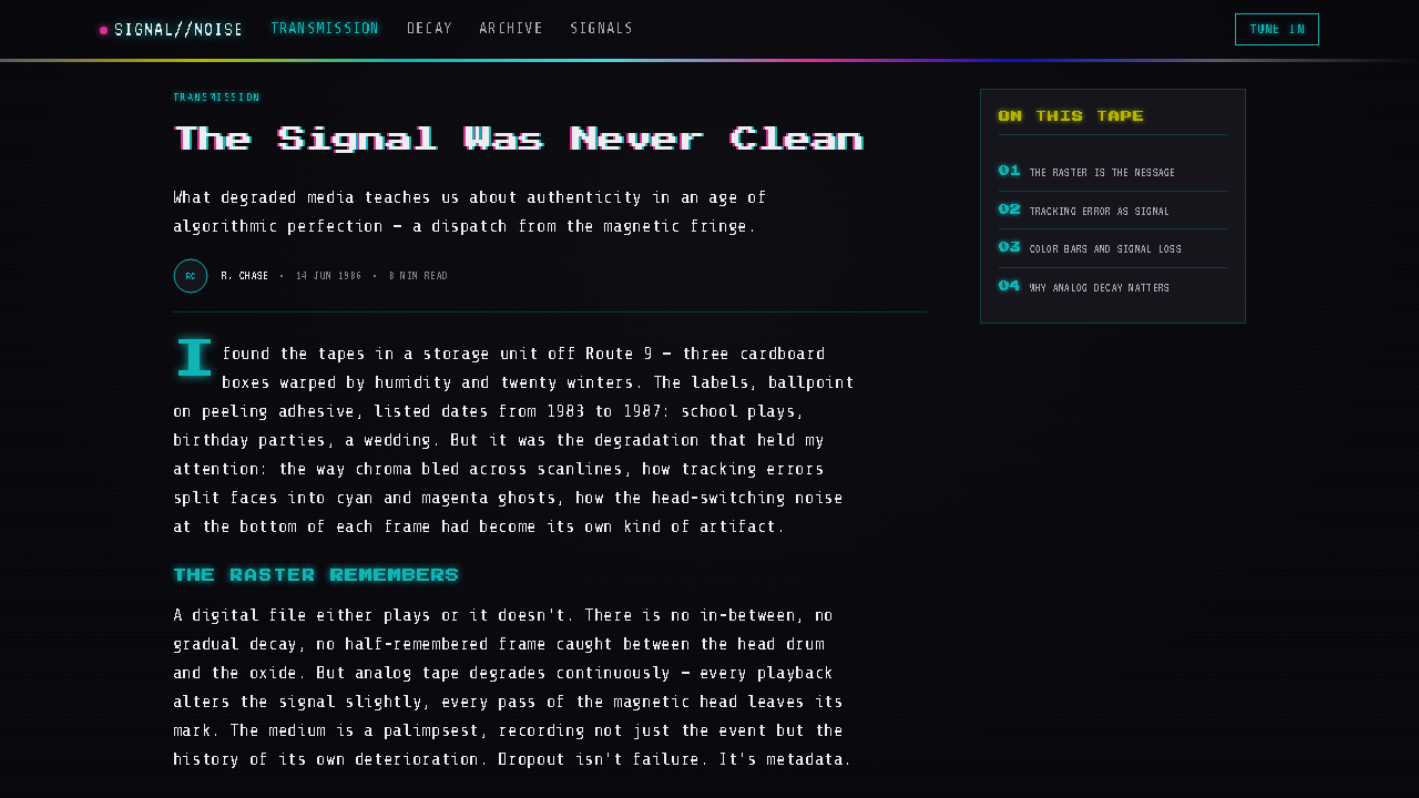
Cyan and hot magenta-pink are the dominant failure colors. They smear, split, and drift at edges, suggesting that color information is no longer perfectly aligned with the rest of the image. The effect is more convincing when it is selective: a title, bar edge, or isolated signal fragment can bleed while the surrounding field remains relatively restrained.
Tracking Error
Tracking errors create the sense of a playback mechanism struggling to hold the picture. They appear as lateral smears, broken horizontal bands, and momentary instability across the frame. Their role is not to make every element unreadable; it is to place brief pressure on an otherwise legible composition, as if the image may collapse and recover at any moment.
SMPTE Color Bars
Color bars are the signature artifact and should retain their status as a technical signal. Their saturated bands cut sharply through the dark CRT field, creating a compact contrast between ordered calibration and visible decay. Used as a full screen, crop, strip, or interruption, they immediately establish the broadcast and tape-based context.
Snow Noise
Snow noise is particulate and irregular, not a uniform decorative grain. It gives the image a field of electronic weather, sometimes quiet and sometimes dense enough to interrupt a signal. Its unevenness matters: noise should suggest interference entering the picture, not a polished texture applied consistently across the canvas.
Signal Before Surface
The style’s governing principle is that the medium remains visible. Clean digital surfaces, flawless gradients, and frictionless polish work against its logic because they erase the playback chain the aesthetic is trying to reveal. Every distortion should imply a signal traveling through tape and CRT hardware, rather than merely adding visual chaos.
Who shaped VHS Glitch Tape?
JVC is named as a key figure through the VHS format itself. Within this style’s history, the format matters because it ties the image to physical tape playback rather than an abstract retro idea. VHS Glitch Tape draws its characteristic instability from that association: the recording is a material object, and its age or imperfect playback can remain visible in the picture.
SMPTE is central because the color-bar standard supplies the style’s most immediate visual shorthand. In a conventional technical setting, the bars belong to testing and calibration. In a VHS Glitch Tape composition, they become an emotionally charged artifact of television transmission, carrying the sense that the viewer has encountered the system behind the program rather than the program itself.
Norm Hoffman is identified with the vaporwave revival that helped bring analog video artifacts back into contemporary visual culture around the 2010s. That revival is essential to the style’s current meaning: it shifts the damaged signal away from mere malfunction and toward nostalgia, cultural memory, and deliberate aesthetic choice.
How do you use VHS Glitch Tape today?
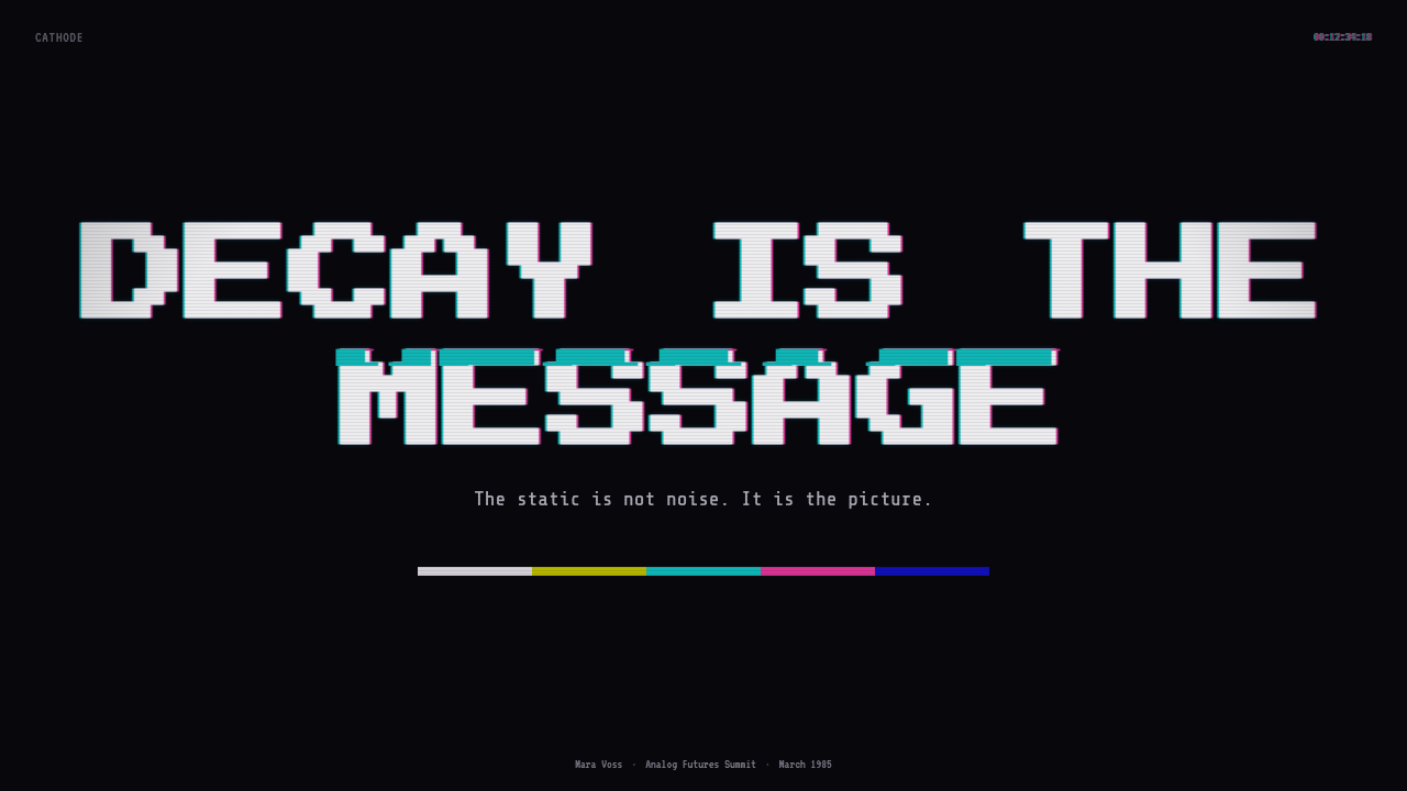
For presentation slides, VHS Glitch Tape works best when the deck has a clear relationship to media, technology, culture, or transmission. A cover can use a near-black CRT field interrupted by a cropped color-bar signal, a drifting cyan-magenta title, and restrained snow noise. The composition should establish the sensation of a channel being found, rather than attempting to explain every idea at once.
Content slides need more discipline than covers. Keep the main copy stable and readable, then place scanlines, a narrow signal interruption, or a small tracking smear around the edges of the information. For data slides, charts should remain legible first; use the color-bar logic to distinguish categories, and treat occasional distortion as an annotation of instability or transition rather than as a replacement for analytical clarity.
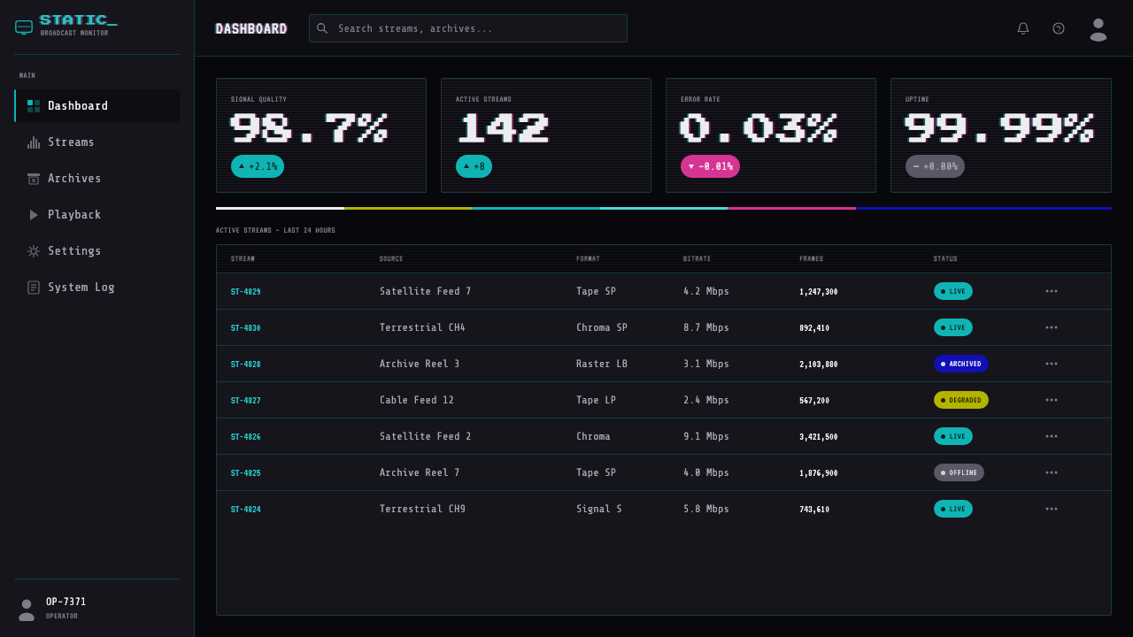
For web interfaces, the style is most persuasive in dashboards, media browsers, archival tools, event pages, and experimental product experiences. A dashboard can use the glowing near-black field as atmosphere while reserving the strongest chroma bleed for warnings, active states, or an incoming signal. Pricing pages can borrow the broadcast structure through strong bands and test-pattern interruptions, but the choices, labels, and paths to action must remain calmer than the surrounding aesthetic.
Editorial and marketing work benefits from the style’s capacity to make a message feel transmitted rather than simply published. Long-form layouts can use scanlines as a background condition, color bars as section breaks, and noise as an occasional interruption around pull quotes or media embeds. Campaign work can use a broken signal as a metaphor for memory, underground circulation, lost broadcasts, or an alternative channel—provided the concept genuinely supports that meaning.
The common mistake is applying cyan-magenta splitting, static, and scanlines to everything at the same intensity. That produces generic digital chaos and destroys the contrast that makes a degraded signal convincing. VHS Glitch Tape needs a stable carrier beneath the damage: readable content, a coherent dark field, and a small number of deliberate disruptions. The feeling should be that the signal is failing in specific places, not that the designer has abandoned control.
VHS Glitch Tape — FAQ
Is VHS Glitch Tape simply vaporwave?
They overlap, but they are not identical. VHS Glitch Tape is a focused visual language built from degraded videotape playback, CRT raster behavior, color bars, scanlines, noise, and chroma bleed. Vaporwave is one of the movements that revived these analog artifacts around the 2010s and gave them contemporary cultural resonance. The style can therefore be used in vaporwave work, but its technical visual vocabulary is narrower and more specifically tied to tape and television.
Why is the background near-black instead of pure black?
Because the intended reference is a CRT raster, not an empty digital canvas. The tube’s black floor appears to glow faintly, which gives the frame physical presence and lets scanlines, snow, and color bleed feel native to the screen. Pure black can remove that sense of energized display hardware and make the effects read like overlays rather than transmission artifacts.
Should text be heavily glitched throughout the design?
Usually no. The style depends on the tension between an intelligible signal and visible degradation. Let important text remain stable enough to be read, then use chroma splitting, tracking smears, or horizontal breaks on selected titles and moments of emphasis. If every word is equally disrupted, the design stops suggesting tape failure and starts behaving like an unreadable effect.
When do SMPTE color bars belong in a composition?
Use them when the design benefits from making broadcast infrastructure visible. They are especially effective as an opening signal, a cropped interruption, a section marker, or a frame that suggests testing, tuning, or transmission. Because the bars are so recognizable and saturated, they should carry a structural role. Treating them as an arbitrary decorative strip weakens the style’s connection to television culture.
What makes the aesthetic feel authentic rather than generically retro?
Authenticity comes from preserving the logic of a decaying signal. Start with the glowing CRT near-black, use scanlines as a screen condition, and let noise, tracking errors, and cyan-magenta bleed occur unevenly and with purpose. Color bars should read as a technical artifact, not a random rainbow. The design becomes convincing when every distortion implies a relationship to tape playback and television transmission.
Related design styles
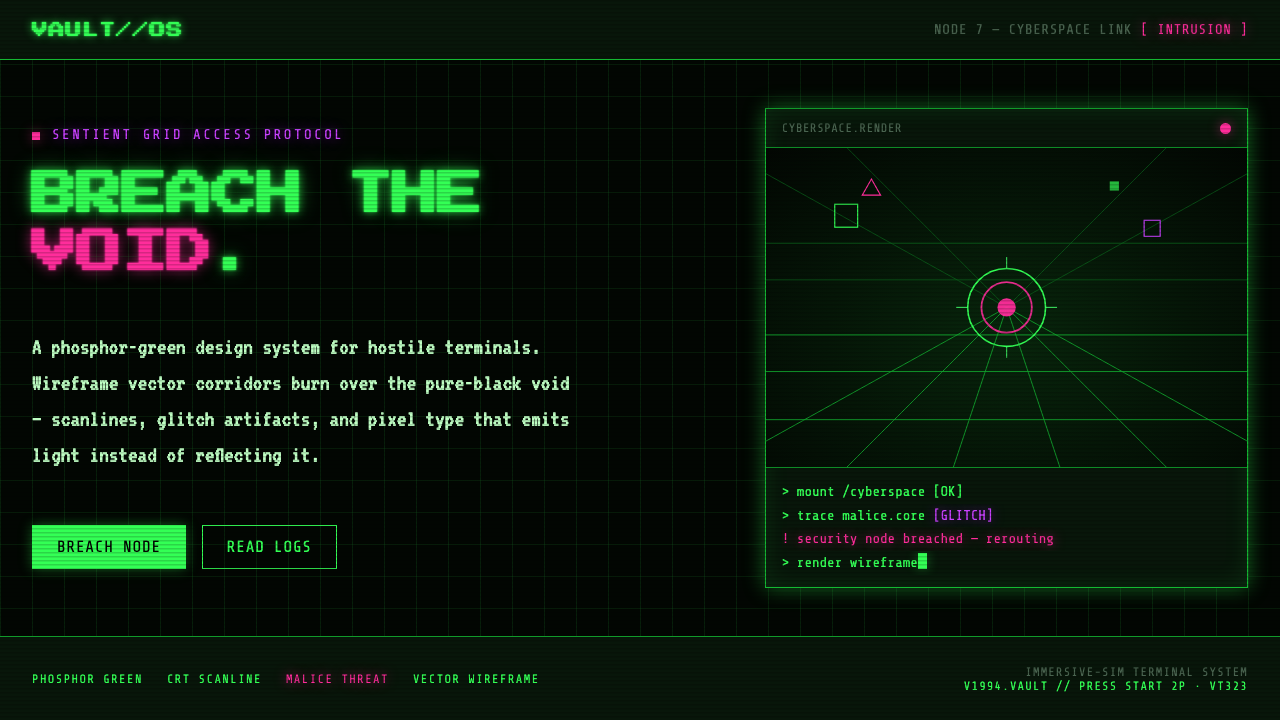 System ShockHostile retro terminal. Phosphor-green wireframes burn over black, magenta ma…
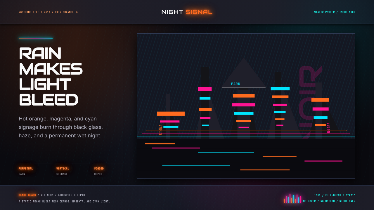 Blade Runner 1982 Neon NoirRain-soaked noir. Orange, magenta, and cyan neon cut black glass.
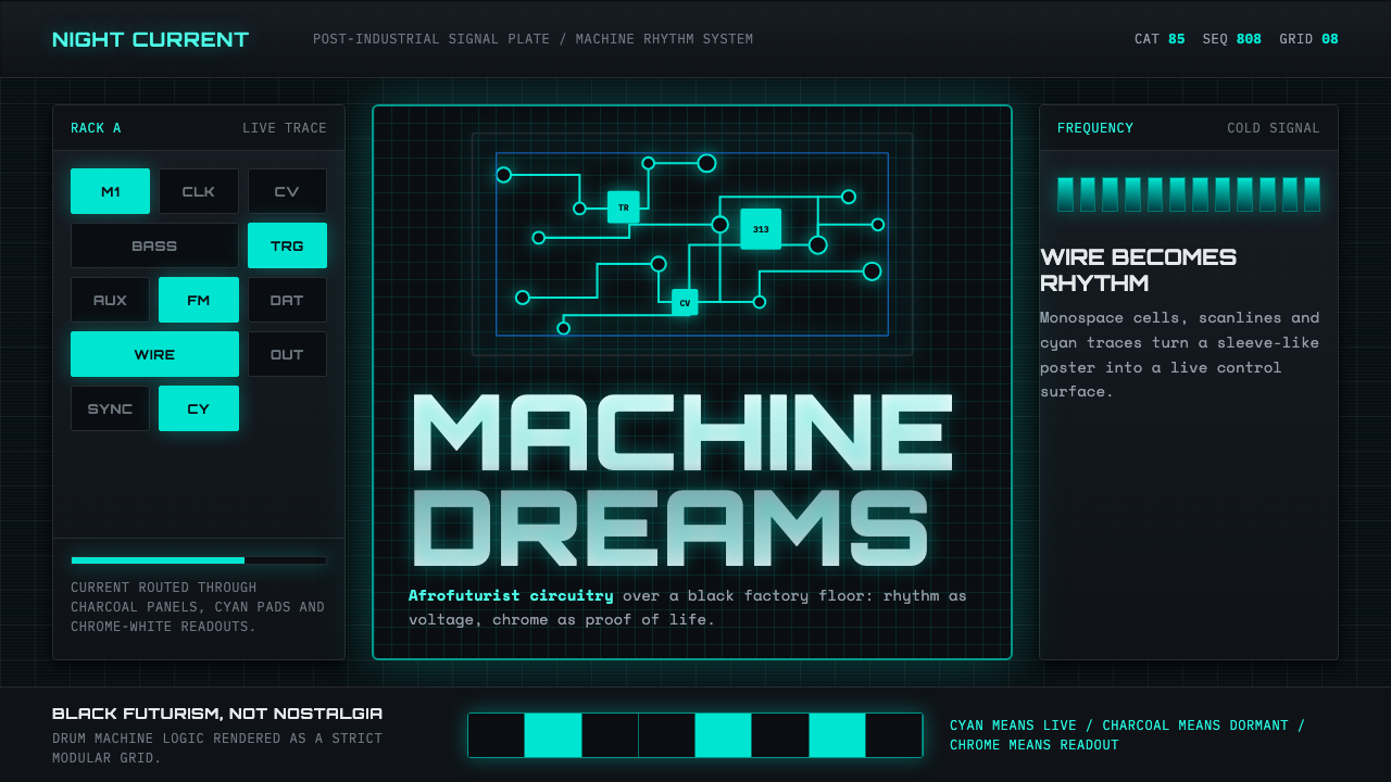 Detroit TechnoCold machines dream. Electric cyan circuits and chrome display type lock to a…
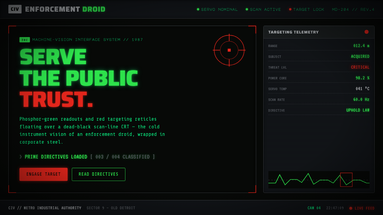 RoboCop (1987)Machine vision as interface. Phosphor-green readouts on dead-black CRT, red r…
 Star Trek LCARSFuture as flat command. Orange-violet elbows and Jura numbers glow on black.
 Tech-NoirAlways night. Blue-black asphalt reflects hot pink and electric cyan neon.